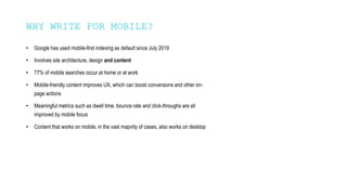
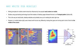
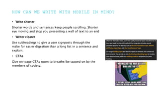
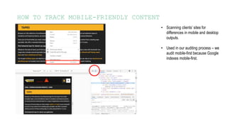
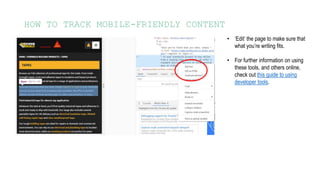
A digital agency with a
difference.
Data is in our DNA.
CONTENT ACADEMY
WRITING FOR MOBILE
WHAT WE WILL
DISCUSS
• Why it’s important to write for
mobile
• How we can write in a mobile-first
way
• How to track mobile-friendly
content
WHY WRITE FOR MOBILE?
• Google has used mobile-first indexing as default since July 2019
• Involves site architecture, design and content
• 77% of mobile searches occur at home or at work
• Mobile-friendly content improves UX, which can boost conversions and other on-
page actions
• Meaningful metrics such as dwell time, bounce rate and click-throughs are all
improved by mobile focus
• Content that works on mobile, in the vast majority of cases, also works on desktop
WHY WRITE FOR MOBILE?
• Writing principles for mobile content should be influenced by how people read content on mobile.
• Studies using eye-tracking technology found that readers of desktop pages followed the text in an F-shaped pattern (below left).
• This is the way we read books, desktop websites and probably how you’re reading this deck right now.
• However, on mobile (below right) users interact with the text very differently, holding their gaze and moving each chunk of text into the
middle of the screen.
HOW CAN WE WRITE
WITH MOBILE IN
MIND?
HOW CAN WE WRITE WITH MOBILE IN MIND?
• Write shorter
Shorter words and sentences keep people scrolling. Shorter
eye moving and stop you presenting a wall of text to an end
• Writer clearer
Use subheadings to give a user signposts through the
make for easier digestion than a long list in a sentence and
explain.
• CTAs
Give on-page CTAs room to breathe/be tapped on by the
members of society.
HOW CAN WE WRITE WITH MOBILE IN MIND?
• Write shorter
Save the technical jargon until it’s absolutely necessary. Get
and phrases: Needless to say – In actual fact – As we’ve
• Writer clearer
You have a matter of seconds to get and hold a reader’s
point. Tell the user why this page/product is what they’re
• CTAs
Is the application process quick and easy? Is it safe to
they call for more information direct from this page? If so,
less likely to leave.
HOW CAN WE WRITE WITH MOBILE IN MIND?
• On-page geography
Temper language to consider both the desktop and mobile
move depending on device – or disappear altogether!
• Get more from less in H1s
A consideration mainly for the supporting content we write. A good
and stick to a limit of six words or 55 characters for headlines.
content.
HOW TO TRACK MOBILE-
FRIENDLY CONTENT
HOW TO TRACK MOBILE-FRIENDLY CONTENT
• Scanning clients’ sites for
differences in mobile and desktop
outputs.
• Used in our auditing process – we
audit mobile-first because Google
indexes mobile-first.
HOW TO TRACK MOBILE-FRIENDLY CONTENT
• ‘Edit’ the page to make sure that
what you’re writing fits.
• For further information on using
these tools, and others online,
check out this guide to using
developer tools.
HOW TO TRACK MOBILE-FRIENDLY CONTENT
• Hemingway
http://hemingwayapp.com/
This tool grades your work’s readability and
to improve it.
• Grammarly
https://www.grammarly.com/
Can be added to Chrome and Office (I think!)
useful for writing ‘talking’ content.
ANY QUESTIONS?

Content Academy Writing for Mobile.pptx

  • 1.
    A digital agencywith a difference. Data is in our DNA. CONTENT ACADEMY WRITING FOR MOBILE
  • 2.
    WHAT WE WILL DISCUSS •Why it’s important to write for mobile • How we can write in a mobile-first way • How to track mobile-friendly content
  • 3.
  • 4.
    WHY WRITE FORMOBILE? • Google has used mobile-first indexing as default since July 2019 • Involves site architecture, design and content • 77% of mobile searches occur at home or at work • Mobile-friendly content improves UX, which can boost conversions and other on- page actions • Meaningful metrics such as dwell time, bounce rate and click-throughs are all improved by mobile focus • Content that works on mobile, in the vast majority of cases, also works on desktop
  • 5.
    WHY WRITE FORMOBILE? • Writing principles for mobile content should be influenced by how people read content on mobile. • Studies using eye-tracking technology found that readers of desktop pages followed the text in an F-shaped pattern (below left). • This is the way we read books, desktop websites and probably how you’re reading this deck right now. • However, on mobile (below right) users interact with the text very differently, holding their gaze and moving each chunk of text into the middle of the screen.
  • 6.
    HOW CAN WEWRITE WITH MOBILE IN MIND?
  • 7.
    HOW CAN WEWRITE WITH MOBILE IN MIND? • Write shorter Shorter words and sentences keep people scrolling. Shorter eye moving and stop you presenting a wall of text to an end • Writer clearer Use subheadings to give a user signposts through the make for easier digestion than a long list in a sentence and explain. • CTAs Give on-page CTAs room to breathe/be tapped on by the members of society.
  • 8.
    HOW CAN WEWRITE WITH MOBILE IN MIND? • Write shorter Save the technical jargon until it’s absolutely necessary. Get and phrases: Needless to say – In actual fact – As we’ve • Writer clearer You have a matter of seconds to get and hold a reader’s point. Tell the user why this page/product is what they’re • CTAs Is the application process quick and easy? Is it safe to they call for more information direct from this page? If so, less likely to leave.
  • 9.
    HOW CAN WEWRITE WITH MOBILE IN MIND? • On-page geography Temper language to consider both the desktop and mobile move depending on device – or disappear altogether! • Get more from less in H1s A consideration mainly for the supporting content we write. A good and stick to a limit of six words or 55 characters for headlines. content.
  • 10.
    HOW TO TRACKMOBILE- FRIENDLY CONTENT
  • 11.
    HOW TO TRACKMOBILE-FRIENDLY CONTENT • Scanning clients’ sites for differences in mobile and desktop outputs. • Used in our auditing process – we audit mobile-first because Google indexes mobile-first.
  • 12.
    HOW TO TRACKMOBILE-FRIENDLY CONTENT • ‘Edit’ the page to make sure that what you’re writing fits. • For further information on using these tools, and others online, check out this guide to using developer tools.
  • 13.
    HOW TO TRACKMOBILE-FRIENDLY CONTENT • Hemingway http://hemingwayapp.com/ This tool grades your work’s readability and to improve it. • Grammarly https://www.grammarly.com/ Can be added to Chrome and Office (I think!) useful for writing ‘talking’ content.
  • 14.

Editor's Notes

  • #5 Indexing – Google ‘reads’ the mobile version of the site (if available) before the desktop version 77% home or work - this is important because desktops/laptops could also be used in these places – but aren’t GPFans dwell time, bounce rate and click throughs all jumped up after site rebuild Last bullet: Downing weirdly allows more content on mobile than desktop in some cases. If you spot something like this, communicate with TAM.
  • #8 VISUAL/TECHNICAL ELEMENTS Keep eye moving: We scan read on mobile much more than desktop – especially true for commercial pages from a SERP. Write shorter also ties into our own CQS tool.
  • #9 SEMANTIC ELEMENTS Filler phrases: Great for hitting a links word count, not so much for this CTA: All these also work for a desktop user
  • #10 Geography: Don’t use specific language like top-left corner H1s: Having a headline that takes up huge amounts of space above the fold can look unoptimized and may put people off reading on.
  • #12 You could open pages on your own mobile, or you can do it from the desktop you’re using. Right click on the section you want to examine and click ‘inspect’ then toggle to the mobile view.
  • #13 You could edit the page locally to see if your text fits. For a deeper explanation of this, visit Pete’s Developer Tools deck from last year, which will be sent across the team.
  • #14 Grammarly: Office might need help from IT. Tone tool can help with email writing or other messaging.