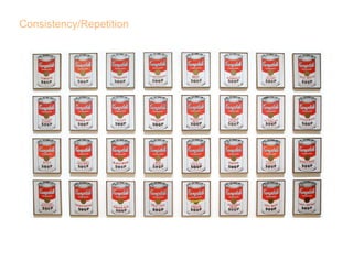
Consistency Repetition
•
1 like•658 views

This document repeats the phrase "Consistency/Repetition" ten times, emphasizing consistency and repetition as important concepts or themes. The short, repetitive structure highlights consistency and the repetitive nature of the content and message.
Report
Share
Report
Share
Download to read offline

Recommended
Pronunciation
This table provides descriptions of various affricate consonant ligatures in the International Phonetic Alphabet. It lists the tie bar ligatures used to represent affricate consonants, such as t͡s representing the voiceless alveolar affricate, along with the corresponding IPA character for each affricate sound. Affricates described include alveolar, postalveolar, alveolo-palatal, lateral, and labial-velar places of articulation in both voiced and voiceless manners.
Unit2 les3
This document discusses theatre for the deaf. It notes that theatre for the deaf was founded in 1967 and has grown from a group to full theatre productions, performing over 10,000 shows worldwide. Both deaf and hearing actors now perform together, with performances taking place a few times each theatre season. Hearing audiences can also attend to watch the sign language interpreters. Rehearsals last 4 weeks as actors must learn lines and musical rhythms/harmonies. Interpreters are placed in specific areas of the theatre depending on the style - outside the acting space, moving during scene changes, or freely following actors.
Matching
This document provides clues to match halves of words to form 15 meaningful words. It lists 15 word halves on the left side and 15 on the right side that can be combined to solve the word puzzle. The goal is to correctly pair the word halves using the clues provided.
Test
This document provides instructions for creating a basic PowerPoint presentation with different slide layouts, including:
1) Using bullet point slides to write text and insert objects from other files.
2) Creating an organizational chart with a title and staff members.
3) Embedding an Excel chart and adjusting its formatting.
4) Changing the design template and applying it to individual slides.
5) Preparing handouts and notes, previewing the slides, and using presenter tools.
Ithaca's Northside: Turning the Corner
The document provides a plan for improving the Northside neighborhood of Ithaca, New York. It was created through a collaborative planning process involving hundreds of residents and stakeholders. The plan identifies strengths of the neighborhood, such as affordable housing and community assets, but also challenges like the need for improved rental housing quality and a welcoming gateway to the neighborhood. The plan outlines goals and projects in nine areas - community building, open space, housing, youth, infrastructure, transportation, retail, public safety, and sustainability - with a focus on increasing social connections, activities for youth, and the overall livability and appearance of the neighborhood.
Balance
The document discusses different types of balance in images including symmetrical, asymmetrical, and radial balance. Symmetrical balance means both sides of an image are the same, asymmetrical means the sides are not the same, and radial balance refers to elements radiating in a circular path. It also discusses the rule of thirds for composing images by splitting them into 9 even sections and placing subjects off-center along vertical and horizontal lines.
Graphic design 2
It is my goal to not only model the latest fashions, but to model what it is to be healthy in this industry. Through trial and error, I have learned so much about diet, exercise and nutrition. I enjoy sharing the things I'm learning with women who match my passion for beauty without compromise. It takes a lot of hard work to be fit and healthy, but in the end, it's worth it.
White Space
The document discusses the importance of using white space in graphic design. It notes that too many words and pictures without white space can be overwhelming. White space provides breathing room and balances positive and negative space. It gives design an edgy, rich, or classic look when used properly but too much white space can become boring. Examples of where white space is used include margins, gutters, alleys, and text wraps.
Actionplan
activities and programs. This could be done through
to involve youth in the planning
The document discusses community building and youth development in the Northside neighborhood. It notes that while some activities have engaged residents, more is needed to connect neighbors. The diversity of the neighborhood is appreciated but ways to embrace it could be improved. It describes creating a youth activities catalogue, after school programs, and a youth council to give young people opportunities to get involved in the community.
process, few youth participated.
Alignment
The document appears to be an abstract picture with no clear meaning or message that can be summarized in 3 sentences or less. It contains random words and phrases such as "Lucia & Mark", "Alexander Ovechkin is to the right", and "abstract picture representing chaos" without any clear context or connection between the elements.
Proximity Unity
This document discusses the concept of proximity in design. Proximity refers to the relationship between graphical elements and how close they are to each other on a page or screen. Well-designed elements with thoughtful proximity can create connections that allow viewers to infer meanings and stories. The document provides two examples - an album cover showing two related figures and a billboard ad comparing the sizes of a Whopper and Big Mac - to demonstrate how proximity can communicate messages and purposes to viewers through the relationships between design elements.
Golden Rectangle
The document discusses the golden ratio and how it relates to golden rectangles. A golden rectangle is a rectangle whose side lengths are in the golden ratio, giving it aesthetically pleasing proportions. Graphic designers frequently use golden rectangles in layouts because their perfect mathematical proportions make designs feel comfortable and appealing to viewers.
Contrast
Type contrast refers to differences in font aspects like style, size, color, and alignment that draw attention. It includes contrasting regular text with italicized, bolded, or differently sized or colored words. Contrast in size compares large and small objects, with the larger catching the eye first. Contrast in color draws attention to brighter hues. Contrast in value uses differing shades, tints, sizes, or textures that are similar yet noticeable. Obvious contrast incorporates differences in elements like color, black and white, and object size.
Gestalt
Gestalt principles describe how humans naturally perceive visual elements as organized patterns and relationships rather than as independent items. Specifically, the principles of proximity, similarity, good continuation, and closure explain how close or similar objects are grouped together and incomplete images can still be understood based on implied connections. The law of prägnanz also notes our tendency to see a single clear image instead of multiple potential interpretations.
Graphic Design Principles
The document discusses several principles of graphic design:
1. Balance ensures visual elements are evenly distributed so that no section appears heavier than others, though intentional imbalance can create tension.
2. Alignment brings order through consistent positioning of type and graphics, making designs easier to read and navigate.
3. Consistency with repeating design elements shows readers where to go and helps them understand the layout.
4. Contrast uses differences in size, value, color, and type to make distinctions obvious.
Principles of Graphic Design: White Space
White space is the absence of text and graphics that can make a layout easier to follow, highlight certain elements, and help rest the eyes. It can be added through margins, paragraph spacing, line spacing of text, gutters between columns, and surrounding text and graphics. White space helps improve readability and guides the eye through a design.
Principles of Graphic Design: Golden Rectangle
The document defines the golden ratio and golden rectangle. A golden rectangle is a rectangle where the ratio between the longer and shorter sides is approximately 1.618, known as the golden ratio. Graphic designers often use golden rectangles because they are found in nature and are considered aesthetically pleasing. Mathematicians have also studied the golden ratio due to its unique mathematical properties.
5minadproj
This document outlines a student project to examine how advertising in the United States has changed over time. Students will be divided into groups to research advertising from different historical periods and how changes corresponded to events like the Industrial Revolution, new transportation and media, and consumption patterns. The goals are to show the evolution of advertising and relate shifts to specific historical contexts while developing students' critical analysis abilities.
Aztec Beer spoof ad
The document outlines a marketing plan for a new Aztec beer targeted towards young professionals in their 20s and 30s. It proposes positioning the beer as a high quality, yet affordable option that can be conveniently purchased online. The marketing strategy recommends using Indiana Jones as a symbol in internet advertisements to appeal to the target audience's familiarity with pop culture. Extensive online advertising is suggested to permeate websites frequented by the tech-savvy demographic.
Serentity Shine Marketing Plan Ppt
The document discusses marketing strategies in the 1920s-1980s, including the rise of radio broadcasting and its impact on advertising. It specifically outlines a marketing plan for "Serenity Shine", a soap product that would sponsor a soap opera on the radio as a way to advertise to middle-to-upper class female listeners. The radio sponsorship would allow the soap company to maximize profits by reaching a wide audience at a lower cost than print ads.
Alignment: Principles of Graphic Design
Alignment refers to arranging elements on a page in direct relation to each other to create a visually appealing and organized layout. Text and objects can be aligned in relation to each other or the page itself to reduce clutter. While alignment is generally used, breaking alignment is acceptable if it serves a clear purpose.
Proximity: Principles of Graphic Design
Proximity refers to the ability to see relationships between objects based on their distance from each other and connections through an intermediate object. The document discusses proximity and how it relates to understanding relationships between graphic or non-graphic objects based on their positioning and links.
Balance in Graphic Design
Balance adds equity and continuity to a graphic design by using aspects like color, spacing, white space, and proximity. This gives the design further character and life. Well-executed balance makes a graphic appear more lively and visually interesting.
Advanced Java[Extra Concepts, Not Difficult].docx
This is part 2 of my Java Learning Journey. This contains Hashing, ArrayList, LinkedList, Date and Time Classes, Calendar Class and more.
A Survey of Techniques for Maximizing LLM Performance.pptx
A Survey of Techniques for Maximizing LLM Performance
clinical examination of hip joint (1).pdf
described clinical examination all orthopeadic conditions .
PCOS corelations and management through Ayurveda.
This presentation includes basic of PCOS their pathology and treatment and also Ayurveda correlation of PCOS and Ayurvedic line of treatment mentioned in classics.
More Related Content
More from Armin Heurich
Actionplan
activities and programs. This could be done through
to involve youth in the planning
The document discusses community building and youth development in the Northside neighborhood. It notes that while some activities have engaged residents, more is needed to connect neighbors. The diversity of the neighborhood is appreciated but ways to embrace it could be improved. It describes creating a youth activities catalogue, after school programs, and a youth council to give young people opportunities to get involved in the community.
process, few youth participated.
Alignment
The document appears to be an abstract picture with no clear meaning or message that can be summarized in 3 sentences or less. It contains random words and phrases such as "Lucia & Mark", "Alexander Ovechkin is to the right", and "abstract picture representing chaos" without any clear context or connection between the elements.
Proximity Unity
This document discusses the concept of proximity in design. Proximity refers to the relationship between graphical elements and how close they are to each other on a page or screen. Well-designed elements with thoughtful proximity can create connections that allow viewers to infer meanings and stories. The document provides two examples - an album cover showing two related figures and a billboard ad comparing the sizes of a Whopper and Big Mac - to demonstrate how proximity can communicate messages and purposes to viewers through the relationships between design elements.
Golden Rectangle
The document discusses the golden ratio and how it relates to golden rectangles. A golden rectangle is a rectangle whose side lengths are in the golden ratio, giving it aesthetically pleasing proportions. Graphic designers frequently use golden rectangles in layouts because their perfect mathematical proportions make designs feel comfortable and appealing to viewers.
Contrast
Type contrast refers to differences in font aspects like style, size, color, and alignment that draw attention. It includes contrasting regular text with italicized, bolded, or differently sized or colored words. Contrast in size compares large and small objects, with the larger catching the eye first. Contrast in color draws attention to brighter hues. Contrast in value uses differing shades, tints, sizes, or textures that are similar yet noticeable. Obvious contrast incorporates differences in elements like color, black and white, and object size.
Gestalt
Gestalt principles describe how humans naturally perceive visual elements as organized patterns and relationships rather than as independent items. Specifically, the principles of proximity, similarity, good continuation, and closure explain how close or similar objects are grouped together and incomplete images can still be understood based on implied connections. The law of prägnanz also notes our tendency to see a single clear image instead of multiple potential interpretations.
Graphic Design Principles
The document discusses several principles of graphic design:
1. Balance ensures visual elements are evenly distributed so that no section appears heavier than others, though intentional imbalance can create tension.
2. Alignment brings order through consistent positioning of type and graphics, making designs easier to read and navigate.
3. Consistency with repeating design elements shows readers where to go and helps them understand the layout.
4. Contrast uses differences in size, value, color, and type to make distinctions obvious.
Principles of Graphic Design: White Space
White space is the absence of text and graphics that can make a layout easier to follow, highlight certain elements, and help rest the eyes. It can be added through margins, paragraph spacing, line spacing of text, gutters between columns, and surrounding text and graphics. White space helps improve readability and guides the eye through a design.
Principles of Graphic Design: Golden Rectangle
The document defines the golden ratio and golden rectangle. A golden rectangle is a rectangle where the ratio between the longer and shorter sides is approximately 1.618, known as the golden ratio. Graphic designers often use golden rectangles because they are found in nature and are considered aesthetically pleasing. Mathematicians have also studied the golden ratio due to its unique mathematical properties.
5minadproj
This document outlines a student project to examine how advertising in the United States has changed over time. Students will be divided into groups to research advertising from different historical periods and how changes corresponded to events like the Industrial Revolution, new transportation and media, and consumption patterns. The goals are to show the evolution of advertising and relate shifts to specific historical contexts while developing students' critical analysis abilities.
Aztec Beer spoof ad
The document outlines a marketing plan for a new Aztec beer targeted towards young professionals in their 20s and 30s. It proposes positioning the beer as a high quality, yet affordable option that can be conveniently purchased online. The marketing strategy recommends using Indiana Jones as a symbol in internet advertisements to appeal to the target audience's familiarity with pop culture. Extensive online advertising is suggested to permeate websites frequented by the tech-savvy demographic.
Serentity Shine Marketing Plan Ppt
The document discusses marketing strategies in the 1920s-1980s, including the rise of radio broadcasting and its impact on advertising. It specifically outlines a marketing plan for "Serenity Shine", a soap product that would sponsor a soap opera on the radio as a way to advertise to middle-to-upper class female listeners. The radio sponsorship would allow the soap company to maximize profits by reaching a wide audience at a lower cost than print ads.
Alignment: Principles of Graphic Design
Alignment refers to arranging elements on a page in direct relation to each other to create a visually appealing and organized layout. Text and objects can be aligned in relation to each other or the page itself to reduce clutter. While alignment is generally used, breaking alignment is acceptable if it serves a clear purpose.
Proximity: Principles of Graphic Design
Proximity refers to the ability to see relationships between objects based on their distance from each other and connections through an intermediate object. The document discusses proximity and how it relates to understanding relationships between graphic or non-graphic objects based on their positioning and links.
Balance in Graphic Design
Balance adds equity and continuity to a graphic design by using aspects like color, spacing, white space, and proximity. This gives the design further character and life. Well-executed balance makes a graphic appear more lively and visually interesting.
More from Armin Heurich (15)
Recently uploaded
Advanced Java[Extra Concepts, Not Difficult].docx
This is part 2 of my Java Learning Journey. This contains Hashing, ArrayList, LinkedList, Date and Time Classes, Calendar Class and more.
A Survey of Techniques for Maximizing LLM Performance.pptx
A Survey of Techniques for Maximizing LLM Performance
clinical examination of hip joint (1).pdf
described clinical examination all orthopeadic conditions .
PCOS corelations and management through Ayurveda.
This presentation includes basic of PCOS their pathology and treatment and also Ayurveda correlation of PCOS and Ayurvedic line of treatment mentioned in classics.
How to Add Chatter in the odoo 17 ERP Module
In Odoo, the chatter is like a chat tool that helps you work together on records. You can leave notes and track things, making it easier to talk with your team and partners. Inside chatter, all communication history, activity, and changes will be displayed.
What is the purpose of studying mathematics.pptx
Students often ask about what the purpose is for their learning. This PowerPoint highlights some really important reasons to study Mathematics.
DRUGS AND ITS classification slide share
Any substance (other than food) that is used to prevent, diagnose, treat, or relieve symptoms of a
disease or abnormal condition
Introduction to AI for Nonprofits with Tapp Network
Dive into the world of AI! Experts Jon Hill and Tareq Monaur will guide you through AI's role in enhancing nonprofit websites and basic marketing strategies, making it easy to understand and apply.
Advantages and Disadvantages of CMS from an SEO Perspective
Advantages and Disadvantages of CMS from an SEO Perspective
Thesis Statement for students diagnonsed withADHD.ppt
Presentation required for the master in Education.
How to Build a Module in Odoo 17 Using the Scaffold Method
Odoo provides an option for creating a module by using a single line command. By using this command the user can make a whole structure of a module. It is very easy for a beginner to make a module. There is no need to make each file manually. This slide will show how to create a module using the scaffold method.
Chapter 4 - Islamic Financial Institutions in Malaysia.pptx
Chapter 4 - Islamic Financial Institutions in Malaysia.pptxMohd Adib Abd Muin, Senior Lecturer at Universiti Utara Malaysia
This slide is special for master students (MIBS & MIFB) in UUM. Also useful for readers who are interested in the topic of contemporary Islamic banking.
Azure Interview Questions and Answers PDF By ScholarHat
Azure Interview Questions and Answers PDF By ScholarHat
Recently uploaded (20)
Group Presentation 2 Economics.Ariana Buscigliopptx
Group Presentation 2 Economics.Ariana Buscigliopptx
A Survey of Techniques for Maximizing LLM Performance.pptx
A Survey of Techniques for Maximizing LLM Performance.pptx
Film vocab for eal 3 students: Australia the movie
Film vocab for eal 3 students: Australia the movie
Introduction to AI for Nonprofits with Tapp Network
Introduction to AI for Nonprofits with Tapp Network
Advantages and Disadvantages of CMS from an SEO Perspective
Advantages and Disadvantages of CMS from an SEO Perspective
Thesis Statement for students diagnonsed withADHD.ppt
Thesis Statement for students diagnonsed withADHD.ppt
How to Build a Module in Odoo 17 Using the Scaffold Method
How to Build a Module in Odoo 17 Using the Scaffold Method
Chapter 4 - Islamic Financial Institutions in Malaysia.pptx
Chapter 4 - Islamic Financial Institutions in Malaysia.pptx
Azure Interview Questions and Answers PDF By ScholarHat
Azure Interview Questions and Answers PDF By ScholarHat