Download free for 30 days
Sign in
Upload
Language (EN)
Support
Business
Mobile
Social Media
Marketing
Technology
Art & Photos
Career
Design
Education
Presentations & Public Speaking
Government & Nonprofit
Healthcare
Internet
Law
Leadership & Management
Automotive
Engineering
Software
Recruiting & HR
Retail
Sales
Services
Science
Small Business & Entrepreneurship
Food
Environment
Economy & Finance
Data & Analytics
Investor Relations
Sports
Spiritual
News & Politics
Travel
Self Improvement
Real Estate
Entertainment & Humor
Health & Medicine
Devices & Hardware
Lifestyle
Change Language
Language
English
Español
Português
Français
Deutsche
Cancel
Save
EN
Uploaded by
ritavrinda
140 views
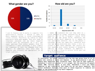
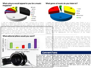
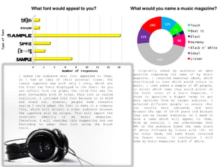
Commenting on the responses from my questionnaire
Education
◦
Entertainment & Humor
◦
Business
◦
Read more
0
Save
Share
Embed
Embed presentation
Download
Download to read offline
1
/ 5
2
/ 5
3
/ 5
4
/ 5
5
/ 5
More Related Content
PDF
design analysis
by
ritavrinda
PPT
부산국제영화제
by
Ma Ae-rin
PDF
Second draft process
by
ritavrinda
PDF
Mock up
by
ritavrinda
PDF
Final magazine
by
ritavrinda
PDF
beginning stages of media...
by
ritavrinda
PDF
NME DPS with notes attached
by
ritavrinda
PDF
NME and Rolling Stone front cover analysis
by
ritavrinda
design analysis
by
ritavrinda
부산국제영화제
by
Ma Ae-rin
Second draft process
by
ritavrinda
Mock up
by
ritavrinda
Final magazine
by
ritavrinda
beginning stages of media...
by
ritavrinda
NME DPS with notes attached
by
ritavrinda
NME and Rolling Stone front cover analysis
by
ritavrinda
More from ritavrinda
PDF
Mock up
by
ritavrinda
PDF
Second draft for my front cover
by
ritavrinda
PDF
Mock up advertisement
by
ritavrinda
PDF
Inspirations
by
ritavrinda
PDF
Creating my mast head
by
ritavrinda
PDF
Chosen photograph
by
ritavrinda
PDF
Advertisment
by
ritavrinda
PDF
First draft for front cover
by
ritavrinda
PDF
Creating my mast-head
by
ritavrinda
PDF
Front cover
by
ritavrinda
PDF
Front cover
by
ritavrinda
PPTX
Identifying the demands in the music market
by
ritavrinda
PPTX
NME and Rolling Stone front covers
by
ritavrinda
PPTX
Rolling stone and NME
by
ritavrinda
PDF
Toc design analysis
by
ritavrinda
PDF
design analysis
by
ritavrinda
PDF
experimenting with brushes
by
ritavrinda
PDF
Media Studies - school magazine project
by
ritavrinda
PDF
beginning stages of media...
by
ritavrinda
Mock up
by
ritavrinda
Second draft for my front cover
by
ritavrinda
Mock up advertisement
by
ritavrinda
Inspirations
by
ritavrinda
Creating my mast head
by
ritavrinda
Chosen photograph
by
ritavrinda
Advertisment
by
ritavrinda
First draft for front cover
by
ritavrinda
Creating my mast-head
by
ritavrinda
Front cover
by
ritavrinda
Front cover
by
ritavrinda
Identifying the demands in the music market
by
ritavrinda
NME and Rolling Stone front covers
by
ritavrinda
Rolling stone and NME
by
ritavrinda
Toc design analysis
by
ritavrinda
design analysis
by
ritavrinda
experimenting with brushes
by
ritavrinda
Media Studies - school magazine project
by
ritavrinda
beginning stages of media...
by
ritavrinda
Recently uploaded
PPTX
Types of counselling Directive, Non Directive, Eclectic Counselling
by
Priya Sush
PDF
How "Raiders of the Lost Ark" and "Ordinary People" Employ Non-Verbal Acting
by
6x5csns4pn
PPTX
Problem and Solution (PowerPoint Game Template)
by
acpaulite
PPTX
How to Create_Generate Engineering Change Orders ECOs in Odoo 18
by
Celine George
PPTX
13 February 2026 - Bullying in education prevalence, impact and responses acr...
by
EduSkills OECD
PPTX
WEEK 2 (2).pptx TLE COOKERY 10 QUARTER 4
by
ResynFayeCortez2
PPTX
How to Set Recurring Tasks in Odoo Projects
by
Celine George
PPTX
Plato's Insight model teaching and learning.pptx
by
NikhitaDS
PDF
PHARMACOLOGY 1 ( BP 404 T) Unit 1 (Cology 1)
by
Chetan Mali
PPTX
Renal Physiology- Functional anatomy of Kidney.pptx
by
Disha Soriya
PDF
The Sheep and the Goat: Beckett’s Subversion of Divine Justice in Waiting for...
by
sejadchokiya
PDF
Family and Marriage __ Sociology __ Jhasketan Kuanar __ NURSING VIBE ONLY .pdf
by
JK NURSING VIBES ONLY JHASKETAN KUANAR
PDF
Biological source, chemical constituents, and therapeutic efficacy of the fol...
by
Sai Meer College of Pharmacy
PDF
Four Stars Of Destiny By General Manoj Mukund Naravane
by
Aman744562
PPTX
Return For Exchange in Odoo 18 Inventory
by
Celine George
PPTX
Greengnorance Toolkit Module 2 Energy saving
by
Karl Donert
PPTX
A Memory of Two Mondays by Arthur Miller
by
DhatriParmar
PPTX
Greengnorance Toolkit Module 6 Water Resources
by
Karl Donert
PPTX
ELIMINATION NEEDS Fundamentals of Nursing .pptx
by
Sonali Gupta
PPTX
Renal Physiology -Nephron.pptx
by
Disha Soriya
Types of counselling Directive, Non Directive, Eclectic Counselling
by
Priya Sush
How "Raiders of the Lost Ark" and "Ordinary People" Employ Non-Verbal Acting
by
6x5csns4pn
Problem and Solution (PowerPoint Game Template)
by
acpaulite
How to Create_Generate Engineering Change Orders ECOs in Odoo 18
by
Celine George
13 February 2026 - Bullying in education prevalence, impact and responses acr...
by
EduSkills OECD
WEEK 2 (2).pptx TLE COOKERY 10 QUARTER 4
by
ResynFayeCortez2
How to Set Recurring Tasks in Odoo Projects
by
Celine George
Plato's Insight model teaching and learning.pptx
by
NikhitaDS
PHARMACOLOGY 1 ( BP 404 T) Unit 1 (Cology 1)
by
Chetan Mali
Renal Physiology- Functional anatomy of Kidney.pptx
by
Disha Soriya
The Sheep and the Goat: Beckett’s Subversion of Divine Justice in Waiting for...
by
sejadchokiya
Family and Marriage __ Sociology __ Jhasketan Kuanar __ NURSING VIBE ONLY .pdf
by
JK NURSING VIBES ONLY JHASKETAN KUANAR
Biological source, chemical constituents, and therapeutic efficacy of the fol...
by
Sai Meer College of Pharmacy
Four Stars Of Destiny By General Manoj Mukund Naravane
by
Aman744562
Return For Exchange in Odoo 18 Inventory
by
Celine George
Greengnorance Toolkit Module 2 Energy saving
by
Karl Donert
A Memory of Two Mondays by Arthur Miller
by
DhatriParmar
Greengnorance Toolkit Module 6 Water Resources
by
Karl Donert
ELIMINATION NEEDS Fundamentals of Nursing .pptx
by
Sonali Gupta
Renal Physiology -Nephron.pptx
by
Disha Soriya
Download