2. An international English-language news magazine
Edited by Will Dean
‘Quality, independent journalism including opinion,
insight, culture and more - all curated to bring you a
progressive and trustworthy look at a week”
The two things they particularly pride themselves on is
their progressive, independent outlook
Different sections of the magazine include the global
report- reflecting on the world’s week. Spotlight offers an
in-depth look at key issues that often go overlooked.
Features are long reads, interviews, essays and profiles.
Culture- latest news, reviews and in-depth interviews from
music, art, literature and more. Opinions are expert views
on some of the most challenging issues today
One editor of the magazine left in 2012 and became leader
of the Green party
What is The Guardian Weekly
3. The cover line ‘rue britannia!’ is an intertextual
reference to the British patriotic song from the
1700s. Written at a time of slavery and
colonisation, these two features are both
celebrated within the song, hence its controversy.
Through subverting the title from ‘Rule’ to ‘Rue’,
perhaps The Guardian are predicting a downfall for
Britain or communicating their liberal values
through their anti-colonisation stance
A pun on the historical phrase ‘The roaring 20s’
which was a time of booming and prosperity. This
phrase is cynically subverted, however, with a
point-of-view shot of the Australian bush fires.
They quite realistically pose the question ‘what
does success look like?’ and ‘are we really
booming?’- the prioritisation of the environment
over the economy shows their left stance
Intertextuality to the British spy thriller ‘The
Killing of Eve’- this British show is used to
cover international affairs, demonstrating
globalisation. The iconography of the lines at
the centre is a further intertextual ref. to guns
in spy films. Links to Trump’s intentional
assassination, perhaps villainising him
Intertextuality
4. Their intertextual references are less quite high brow, and
references are rarely done to films like they did for ‘The
Killing of Eve’
Other references are usually quite academic/intellectual e.g.
the ‘rule britannia’ song and a reference to The Roaring 20s’-
both references happen to be quite political but also
historical, which could be a source of inspiration for me
Why is intertextuality used? From the front covers in the
previous slide, it seems as though intertextuality is used to
create a sense of irreverent humour. Saying this, their uses
are quite nuanced because although they us intertextuality to
create humour, there’s also an underlying subtext of leftist
cynicism about the direction of our world - even the ‘The
Killing of Eve’ compares presidential behaviour to the
repeated killings of assassinations - an interesting
comparison
A sense of shared experience and viewpoints/ideologies are
also created through references
More on Intertextuality
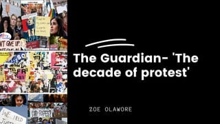
5. Textual AnalysisMise-en-scene
The scarf is a Palestinian Keffiyeh which has
become a symbol of Palestinian nationalism,
therefore this is worn as a sign of
resistance under Israeli oppression
The bright neon lights have become a blur due
to the shallow background although it
suggests a city location
The woman’s facial expression is one of
despair but it’s largely concealed- through
hiding her emotions is there a representation
of hidden struggles, she has to continue to
fight- very empowering representation of
women
Layout
The magazine is bordered by a thin white line
which gives the magazine a neat appearance
There is a high image to text ratio which
seems to be a convention of current affair
magazines and the text is concentrated at the
top of the magazine so that nothing obstructs
the reader’s view of the woman, highlights
her importance
The woman is centred in the middle of the
page- connotes a woman’s importance and place
in protest- quite a feminist representation
Photography
Shallow background places sharp focus on the woman
protesting at the front- the background seems to be
dominated by men suggesting a patriarchy, thus highlighting
her power in joining a revolution
Indirect mode of address- her eyes seem to be engaged with
something in the distance- suggesting that although she is
bold, there’s a sense of struggle she’s experiencing- this
is anchored with her red eyes, perhaps from crying? The
combination of these elements provokes empathy from a
leftist, western audience who often aren't in positions
where their lives depend on their protest
Her hand gesture seems to signify a movement although this
is ambiguous, thus providing an enigma code- encouraging
readers to read on
Focus on international protests- ideology of
internationalism
Typography
A serif font is used to connote sophistication,
authority and an established brand
‘The decade of PROTEST’- ‘protest’ is written in a
larger, eye-catching font thus allowing the magazine
to have an alarming, urgent effect which the yellow
colour contributes to
The definite article ‘The’, instead of ‘A’
suggesting that this decade has particular
significance and power
By producers having ‘PROTEST’ in such a bold font,
there seems to be a sense of celebration of
democracy, if not anarchy- this reveals their
viewpoints and ideology while subtly positioning the
audience to accept the revolution
6. Contents Page
There is a very high text to image ratio,
with solely a graphic and no images. This
reflects the high standard of education for
the audience- an audience which wants to be
informed rather than entertained- I will have
a higher proportion of images, however, as
I’m serving a young demographic
The contents layout is done so that on the
LHS they go into detail on their main
stories, and then provide a tail but on the
left hand side the contents of the magazine
is properly organised and less detailed
“Guturral reaction to…years of political and
social oppression”
“The return blows of the establishment passed
the revolution”- the language used is very
emotive, with populist words such as the
‘establishment’- this phrase distances The
Guardian from a place of privilege and power,
though it’s ironically written for the
liberal w/ relative power
Their coverage of femicide and a sexual
assault pandemic in India reveals their
feminist tone, but also an intersectional
approach as they acknowledge the
international struggles of women- relates to
their global perspective
Their leftist viewpoint is further revealed
by the topic focus in the contents page- for
example Maya Goodfellow’s opinion piece
refers to decolonising the curriculum and
facing Britain’s racist ‘past’- a very
controversial topic amongst the right and
centrists alike
‘Trump and the end of the anti-democracy
decade’- acknowledging Levi Strauss theory, a
binary opposition of Trump: democracy (this
connoting his authoritarian attitude perhaps)
is invoked, revealing their anti-republican
ideology as they pride themselves on their
liberal opinions
7. Inside articles
These two pages contain extremely emotive imagery and language which positions the audience in a anti-authoritarian or
anti-patriarchal seat- see image Hong Kong protest or the words ‘blood splattering her tiny legs’- there are also code
of objects further relating to protest e.g. the V for vendetta mask, a historical code to Guy Fawkes which has been
adopted by people protesting against politicians and banks. In regards to the blindfolds, there has been a wave of
women protesting against sexual harassment with blindfolds e.g. in Chile