Mr. Pixel’s Color Theory & Color Correction Tutorial


                        © Michael E. Stern
                Build A Better Photograph dot com
                          818-422-0696
Mr. Pixel’s Color Theory Primer & Color Correction
                      Tutorial


                   Color Models

                   Color Modes

                   Color Numbers

                   Color Correction


                       © Michael E. Stern
               Build A Better Photograph dot com
                         818-422-0696
Color Theory

Additive Color - Transmissive

Subtractive Color - Reflective


           © Michael E. Stern
    Build A Better Photograph dot com
              818-422-0696
Additive Color Theory
                              RGB


Red, green and blue wavelengths of light are added to black
and creates the colors our brains perceive.


                          © Michael E. Stern
                  Build A Better Photograph dot com
                            818-422-0696
Additive Color Theory
                           RGB


An equal RGB mixture of additive light produces neutral
gray values. An unequal RGB mixture produces color.


                       © Michael E. Stern
               Build A Better Photograph dot com
                         818-422-0696
Additive Color Theory
                          RGB
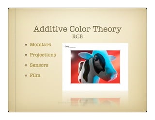
Monitors

Projections

Sensors

Film


                      © Michael E. Stern
              Build A Better Photograph dot com
                        818-422-0696
Subtractive Color Theory
                                CMYK
Varying percentages of cyan, magenta and yellow inks are applied to
white paper. This subtracts from the white paper.

If the percentage is balanced, gray is the result. If the percentage is
unbalanced, color is the result.


                               © Michael E. Stern
                       Build A Better Photograph dot com
                                 818-422-0696
Subtractive Color Theory
                                 CMYK
Theoretically equal amounts of cyan, magenta and yellow ink produce
neutral gray.

Inks contain impurities. These impurities produce browns instead of
grays.

Black ink is added to mitigate this issue. “K” identifies this ink. CMYK.


                                © Michael E. Stern
                        Build A Better Photograph dot com
                                  818-422-0696
Subtractive Color Theory
                               CMYK
Lithography is the prime example. Lithography is great technology but
there are two key issues to take into account as files are prepped for
printing:


          1) Gamut. The range of reproducible colors.
          2) Dot Gain. The amount of ink absorption.


                              © Michael E. Stern
                      Build A Better Photograph dot com
                                818-422-0696
Subtractive Color Theory
                               CMYK


     1) Gamut is adjusted by the 3-click color correction method.
     2) Dot gain is controlled by sharpening.


We correct files for the limitations of the chosen output technology.


                              © Michael E. Stern
                      Build A Better Photograph dot com
                                818-422-0696
Subtractive Color Theory
                                Gamut

Lithography and other forms of printing have limited reproduction
capabilities relative to the color range available in a digital image.

16.7 million theoretical color choices are available in an 8-bit image and
over 2 billion colors in a 16-bit image.

Depending on the method used to define and measure ink gamuts, there
are between 500,000 and 1.5 million color choices using CMYK.


                               © Michael E. Stern
                       Build A Better Photograph dot com
                                 818-422-0696
Subtractive Color Theory
                             Dot Gain


The ink dots spread and flatten upon impact causing a loss of sharpness
and color fidelity.

There are many ways to sharpen a file. The Smart Sharpen Filter is a
good beginning method for sharpening images.


                              © Michael E. Stern
                      Build A Better Photograph dot com
                                818-422-0696
Subtractive Color Theory
                     CMYK
Newsprint

Magazines

Posters

Ink-Jet


                    © Michael E. Stern
            Build A Better Photograph dot com
                      818-422-0696
Color Relationships
Color Models
           Describes Color Numerically


RGB - Red - Green - Blue - Light

CMYK - Cyan - Magenta - Yellow - Black - Inks

HSB - Hue/Color - Saturation/Richness - Brightness/Dark or Light

LAB - Lightness - A (Red/Green) - B (Blue/Yellow)


                         © Michael E. Stern
                 Build A Better Photograph dot com
                           818-422-0696
Color Modes
                     Assign Values

an intensity value - RGB

an ink percentage - CMYK

how colors look to the human eye - L*A*B

256 shades of gray - Grayscale

black or white- Bitmap

256 colors - Indexed

3 channel grayscale for specialized printing - Multichannel

                        © Michael E. Stern
                Build A Better Photograph dot com
                          818-422-0696
Printing


Reproducible Shadows

Reproducible Highlights

Rendering Intents


          © Michael E. Stern
  Build A Better Photograph dot com
            818-422-0696
Printing


The best results are achieved by running ink density tests
and creating custom paper profiles. But if you don’t want to
go to the trouble...


                          © Michael E. Stern
                  Build A Better Photograph dot com
                            818-422-0696
Printing

...then the 3-click color method is an excellent alternative.

This method sets the shadow and highlight endpoints to
match the shadow and highlight gamuts of a printer and
paper combination.

Also known as “setting the endpoints for output.”


                         © Michael E. Stern
                 Build A Better Photograph dot com
                           818-422-0696
Printing
           Tutorial


    3-Click Color

    Adding Noise

    Rendering Intent


        © Michael E. Stern
Build A Better Photograph dot com
          818-422-0696
Printing


The following method works on any digital image. Some digital images work well with
the 3-click method while some images work better with a 2-click method. Experience
will dictate which method is best for a particular image.
Printing

Select Threshold from the bottom of the Layers Panel
by clicking on the half black, half clear icon.

This is the infinitely editable Threshold Adjustment
Layer.

This is good.
Printing


Make sure you can see the Info Palette. Drag the Threshold’s slider all the way
left and slowly drag back towards the center. When the black areas begin to
appear, stop. With the Color Sampler Tool selected, click on this area.

What are the values in the Info Panel?
Printing


Drag the slider all the way to the right and slowly drag back towards the center.
When white areas begin to appear, stop. Click on this area. Note the numbers in
the Info palette. These pixel values are 254-255.

After you click OK, turn off the Threshold Adjustment Layer in the Layers Panel.
Printing
                                  Setting target shadow and highlight values


    Shadows                                                                                 Highlights


Open the Curves Adjustment Layer the same way you opened the Threshold Adjustment Layer.
One at a time double-click each of the 3 eyedropper tools. The Target Shadow and Target Highlight
Color dialog boxes open. In the RGB boxes and with the Shadow Eyedropper active, input 13 for
the shadows. Click OK. Do the same for the highlight numbers. Input 247. These numbers will vary
for different printer, paper and ink combinations. In this example the percentages are 5% and 97%.
Middle gray is pre-set to 128. Do not change this number.

Notice how the circle changes its’ position on the scale at the far left of the large red box.
Printing


When you have completed this step, click OK. Click Yes if you also get this dialog box.

Look and you will see the Curves Adjustment Layer floating above your Threshold
Adjustment Layer and Background in the Layers Panel.
Printing


Shift + Command (PC - Control) + N will bring up this dialogue box.

Make note of the settings and click OK.

Turn off the Curves Adjustment Layer.

                              © Michael E. Stern
                      Build A Better Photograph dot com
                                818-422-0696
Printing


Set the layer’s Blend Mode to Difference.
Printing


Both adjustment layers off. Difference and Background layers on. Wax on. Wax off.

Black is in reality middle gray because of how the Difference Blend Mode functions. The
gray pixels in the Difference layer cancel out the gray pixels in the Background layer
that are in registration with each other. Black is the result. Or close to it.

This is a way to identify where the middle grays are in an image. With the Eyedropper
Tool selected, (3x3 or 5x5) click on one or two target areas to set the point. Use the Info
Panel to monitor the targets. Try to get as close to equal as possible in all three
channels. This is important.
Printing


Turn off the Difference layer and turn Curves on.
Threshold can be deleted.

Re-open Curves by double-clicking its’ thumbnail icon.
Printing
            Highlight


                                           Mid-Tone

 Shadow


Select the shadow eyedropper and click on point one. Select the highlight eyedropper
and click point two. Repeat for the middle eyedropper.

That’s it. 3-click color at its’ finest. Experienced users can set the shadow and highlight
endpoints by eye. If an image contains gray, skip the Difference Blend Mode layer steps
and click on the gray area with the middle eyedropper tool.
Printing


An optional step with the Curves Adjustment Layer: select the mid point at the center
of the diagonal line. In the Input box type 128 if it’s not already set. Reducing the
Output number will darken the image. Increasing the Output number will lighten the
image. This is determined by taste and experience.

I move in increments of ten. I’m usually ten up or ten down. Highlight the small black
square by clicking on it. Hold down the shift key (while pressing the up or down arrow
key) to move the point in increments of ten.
Printing


Before


                    After
Adding Noise

The Histogram may look like this after 3-
click color. This is called penciling or
combing. Click the refresh button to update
the Histogram. This button will disappear
after refreshing.

Gaps represent missing information. While
the file may appear OK on screen, banding
or posterization will most likely show up in
print. To prevent this, add noise (random
pixels) to the file on a separate layer.


                                   Michael E. Stern
                         PHOTOGRAPHY EDUCATION CONSULTING
                                   CyberStern.com
Adding Noise

                           Make a new layer and input the settings
                           shown here.


Go to the Filter menu, select Noise and then select Add Noise.
                     © Michael E. Stern
             Build A Better Photograph dot com
                       818-422-0696
Adding Noise


2-3% for the amount. Make
sure Distribution and
Monochromatic are set
accordingly.

Click OK.
Adding Noise


Before


        © Michael E. Stern
Build A Better Photograph dot com
          818-422-0696
Adding Noise


After 3-click color
 correction, noise
   added and a
histogram refresh.
Rendering Intent

   Rendering intent aims to preserve numerical values,
   saturation levels or perceived color relationships.

   Perceptual is the preferred choice for photography in
   that by preserving color relationships one perceives a
   properly printed image.

   Colormetric aims to print colors per the assigned
   values in an image. When a color is out-of-gamut, the
   next nearest color is substituted. Usually a reject print.

   Saturation aims to preserve the richness of colors at
   the expense of accuracy and numbers.

   These are VERY simple explanations.


         © Michael E. Stern
 Build A Better Photograph dot com
           818-422-0696
© Michael E. Stern
Build A Better Photograph dot com
          818-422-0696
Color Correction Primer

Color Correction Primer

  • 1.
    Mr. Pixel’s ColorTheory & Color Correction Tutorial © Michael E. Stern Build A Better Photograph dot com 818-422-0696
  • 2.
    Mr. Pixel’s ColorTheory Primer & Color Correction Tutorial Color Models Color Modes Color Numbers Color Correction © Michael E. Stern Build A Better Photograph dot com 818-422-0696
  • 3.
    Color Theory Additive Color- Transmissive Subtractive Color - Reflective © Michael E. Stern Build A Better Photograph dot com 818-422-0696
  • 4.
    Additive Color Theory RGB Red, green and blue wavelengths of light are added to black and creates the colors our brains perceive. © Michael E. Stern Build A Better Photograph dot com 818-422-0696
  • 5.
    Additive Color Theory RGB An equal RGB mixture of additive light produces neutral gray values. An unequal RGB mixture produces color. © Michael E. Stern Build A Better Photograph dot com 818-422-0696
  • 6.
    Additive Color Theory RGB Monitors Projections Sensors Film © Michael E. Stern Build A Better Photograph dot com 818-422-0696
  • 7.
    Subtractive Color Theory CMYK Varying percentages of cyan, magenta and yellow inks are applied to white paper. This subtracts from the white paper. If the percentage is balanced, gray is the result. If the percentage is unbalanced, color is the result. © Michael E. Stern Build A Better Photograph dot com 818-422-0696
  • 8.
    Subtractive Color Theory CMYK Theoretically equal amounts of cyan, magenta and yellow ink produce neutral gray. Inks contain impurities. These impurities produce browns instead of grays. Black ink is added to mitigate this issue. “K” identifies this ink. CMYK. © Michael E. Stern Build A Better Photograph dot com 818-422-0696
  • 9.
    Subtractive Color Theory CMYK Lithography is the prime example. Lithography is great technology but there are two key issues to take into account as files are prepped for printing: 1) Gamut. The range of reproducible colors. 2) Dot Gain. The amount of ink absorption. © Michael E. Stern Build A Better Photograph dot com 818-422-0696
  • 10.
    Subtractive Color Theory CMYK 1) Gamut is adjusted by the 3-click color correction method. 2) Dot gain is controlled by sharpening. We correct files for the limitations of the chosen output technology. © Michael E. Stern Build A Better Photograph dot com 818-422-0696
  • 11.
    Subtractive Color Theory Gamut Lithography and other forms of printing have limited reproduction capabilities relative to the color range available in a digital image. 16.7 million theoretical color choices are available in an 8-bit image and over 2 billion colors in a 16-bit image. Depending on the method used to define and measure ink gamuts, there are between 500,000 and 1.5 million color choices using CMYK. © Michael E. Stern Build A Better Photograph dot com 818-422-0696
  • 12.
    Subtractive Color Theory Dot Gain The ink dots spread and flatten upon impact causing a loss of sharpness and color fidelity. There are many ways to sharpen a file. The Smart Sharpen Filter is a good beginning method for sharpening images. © Michael E. Stern Build A Better Photograph dot com 818-422-0696
  • 13.
    Subtractive Color Theory CMYK Newsprint Magazines Posters Ink-Jet © Michael E. Stern Build A Better Photograph dot com 818-422-0696
  • 14.
  • 15.
    Color Models Describes Color Numerically RGB - Red - Green - Blue - Light CMYK - Cyan - Magenta - Yellow - Black - Inks HSB - Hue/Color - Saturation/Richness - Brightness/Dark or Light LAB - Lightness - A (Red/Green) - B (Blue/Yellow) © Michael E. Stern Build A Better Photograph dot com 818-422-0696
  • 16.
    Color Modes Assign Values an intensity value - RGB an ink percentage - CMYK how colors look to the human eye - L*A*B 256 shades of gray - Grayscale black or white- Bitmap 256 colors - Indexed 3 channel grayscale for specialized printing - Multichannel © Michael E. Stern Build A Better Photograph dot com 818-422-0696
  • 17.
    Printing Reproducible Shadows Reproducible Highlights RenderingIntents © Michael E. Stern Build A Better Photograph dot com 818-422-0696
  • 18.
    Printing The best resultsare achieved by running ink density tests and creating custom paper profiles. But if you don’t want to go to the trouble... © Michael E. Stern Build A Better Photograph dot com 818-422-0696
  • 19.
    Printing ...then the 3-clickcolor method is an excellent alternative. This method sets the shadow and highlight endpoints to match the shadow and highlight gamuts of a printer and paper combination. Also known as “setting the endpoints for output.” © Michael E. Stern Build A Better Photograph dot com 818-422-0696
  • 20.
    Printing Tutorial 3-Click Color Adding Noise Rendering Intent © Michael E. Stern Build A Better Photograph dot com 818-422-0696
  • 21.
    Printing The following methodworks on any digital image. Some digital images work well with the 3-click method while some images work better with a 2-click method. Experience will dictate which method is best for a particular image.
  • 22.
    Printing Select Threshold fromthe bottom of the Layers Panel by clicking on the half black, half clear icon. This is the infinitely editable Threshold Adjustment Layer. This is good.
  • 23.
    Printing Make sure youcan see the Info Palette. Drag the Threshold’s slider all the way left and slowly drag back towards the center. When the black areas begin to appear, stop. With the Color Sampler Tool selected, click on this area. What are the values in the Info Panel?
  • 24.
    Printing Drag the sliderall the way to the right and slowly drag back towards the center. When white areas begin to appear, stop. Click on this area. Note the numbers in the Info palette. These pixel values are 254-255. After you click OK, turn off the Threshold Adjustment Layer in the Layers Panel.
  • 25.
    Printing Setting target shadow and highlight values Shadows Highlights Open the Curves Adjustment Layer the same way you opened the Threshold Adjustment Layer. One at a time double-click each of the 3 eyedropper tools. The Target Shadow and Target Highlight Color dialog boxes open. In the RGB boxes and with the Shadow Eyedropper active, input 13 for the shadows. Click OK. Do the same for the highlight numbers. Input 247. These numbers will vary for different printer, paper and ink combinations. In this example the percentages are 5% and 97%. Middle gray is pre-set to 128. Do not change this number. Notice how the circle changes its’ position on the scale at the far left of the large red box.
  • 26.
    Printing When you havecompleted this step, click OK. Click Yes if you also get this dialog box. Look and you will see the Curves Adjustment Layer floating above your Threshold Adjustment Layer and Background in the Layers Panel.
  • 27.
    Printing Shift + Command(PC - Control) + N will bring up this dialogue box. Make note of the settings and click OK. Turn off the Curves Adjustment Layer. © Michael E. Stern Build A Better Photograph dot com 818-422-0696
  • 28.
    Printing Set the layer’sBlend Mode to Difference.
  • 29.
    Printing Both adjustment layersoff. Difference and Background layers on. Wax on. Wax off. Black is in reality middle gray because of how the Difference Blend Mode functions. The gray pixels in the Difference layer cancel out the gray pixels in the Background layer that are in registration with each other. Black is the result. Or close to it. This is a way to identify where the middle grays are in an image. With the Eyedropper Tool selected, (3x3 or 5x5) click on one or two target areas to set the point. Use the Info Panel to monitor the targets. Try to get as close to equal as possible in all three channels. This is important.
  • 30.
    Printing Turn off theDifference layer and turn Curves on. Threshold can be deleted. Re-open Curves by double-clicking its’ thumbnail icon.
  • 31.
    Printing Highlight Mid-Tone Shadow Select the shadow eyedropper and click on point one. Select the highlight eyedropper and click point two. Repeat for the middle eyedropper. That’s it. 3-click color at its’ finest. Experienced users can set the shadow and highlight endpoints by eye. If an image contains gray, skip the Difference Blend Mode layer steps and click on the gray area with the middle eyedropper tool.
  • 32.
    Printing An optional stepwith the Curves Adjustment Layer: select the mid point at the center of the diagonal line. In the Input box type 128 if it’s not already set. Reducing the Output number will darken the image. Increasing the Output number will lighten the image. This is determined by taste and experience. I move in increments of ten. I’m usually ten up or ten down. Highlight the small black square by clicking on it. Hold down the shift key (while pressing the up or down arrow key) to move the point in increments of ten.
  • 33.
  • 34.
    Adding Noise The Histogrammay look like this after 3- click color. This is called penciling or combing. Click the refresh button to update the Histogram. This button will disappear after refreshing. Gaps represent missing information. While the file may appear OK on screen, banding or posterization will most likely show up in print. To prevent this, add noise (random pixels) to the file on a separate layer. Michael E. Stern PHOTOGRAPHY EDUCATION CONSULTING CyberStern.com
  • 35.
    Adding Noise Make a new layer and input the settings shown here. Go to the Filter menu, select Noise and then select Add Noise. © Michael E. Stern Build A Better Photograph dot com 818-422-0696
  • 36.
    Adding Noise 2-3% forthe amount. Make sure Distribution and Monochromatic are set accordingly. Click OK.
  • 37.
    Adding Noise Before © Michael E. Stern Build A Better Photograph dot com 818-422-0696
  • 38.
    Adding Noise After 3-clickcolor correction, noise added and a histogram refresh.
  • 39.
    Rendering Intent Rendering intent aims to preserve numerical values, saturation levels or perceived color relationships. Perceptual is the preferred choice for photography in that by preserving color relationships one perceives a properly printed image. Colormetric aims to print colors per the assigned values in an image. When a color is out-of-gamut, the next nearest color is substituted. Usually a reject print. Saturation aims to preserve the richness of colors at the expense of accuracy and numbers. These are VERY simple explanations. © Michael E. Stern Build A Better Photograph dot com 818-422-0696
  • 40.
    © Michael E.Stern Build A Better Photograph dot com 818-422-0696