Chapter 7: BiostatisticsI
By
Dr.Nagaratna S
Asst. Prof. Smt.Veeramma Gangasiri Degree College for Women, Kalaburagi
2.
Biostatistics I
• Measuresof central tendency: Mean, Median, Mode.
Measures of central tendency are summary statistics that represent the center point or typical value of a dataset. Examples of these measures
include the mean, median, and mode. These statistics indicate where most values in a distribution fall and are also referred to as the central
location of a distribution. You can think of central tendency as the propensity for data points to cluster around a middle value.
In statistics, the mean, median, and mode are the three most common measures of central tendency. Each one calculates the central point using a
different method. Choosing the best measure of central tendency depends on the type of data you have.
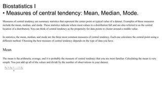
Mean
The mean is the arithmetic average, and it is probably the measure of central tendency that you are most familiar. Calculating the mean is very
simple. You just add up all of the values and divide by the number of observations in your dataset.
3.
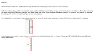
Median
The median isthe middle value. It is the value that splits the dataset in half, making it a natural measure of central tendency.
To find the median, order your data from smallest to largest, and then find the data point that has an equal number of values above it and below it. The method for locating
the median varies slightly depending on whether your dataset has an even or odd number of values. I’ll show you how to find the median for both cases. In the examples
below, I use whole numbers for simplicity, but you can have decimal places.
In the dataset with the odd number of observations, notice how the number 12 has six values above it and six below it. Therefore, 12 is the median of this dataset.
When there is an even number of values, you count in to the two innermost values and then take the average. The average of 27 and 29 is 28. Consequently, 28 is the
median of this dataset.
4.
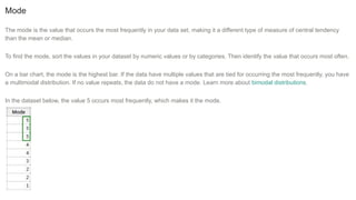
Mode
The mode isthe value that occurs the most frequently in your data set, making it a different type of measure of central tendency
than the mean or median.
To find the mode, sort the values in your dataset by numeric values or by categories. Then identify the value that occurs most often.
On a bar chart, the mode is the highest bar. If the data have multiple values that are tied for occurring the most frequently, you have
a multimodal distribution. If no value repeats, the data do not have a mode. Learn more about bimodal distributions.
In the dataset below, the value 5 occurs most frequently, which makes it the mode.
5.
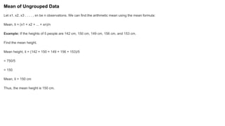
Mean of UngroupedData
Let x1, x2, x3 , . . . , xn be n observations. We can find the arithmetic mean using the mean formula:
Mean, x
̄ = (x1 + x2 + ... + xn)/n
Example: If the heights of 5 people are 142 cm, 150 cm, 149 cm, 156 cm, and 153 cm.
Find the mean height.
Mean height, x
̄ = (142 + 150 + 149 + 156 + 153)/5
= 750/5
= 150
Mean, x
̄ = 150 cm
Thus, the mean height is 150 cm.
6.
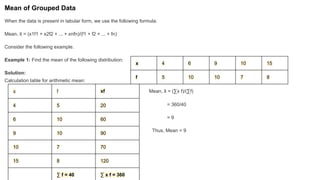
Mean of GroupedData
When the data is present in tabular form, we use the following formula:
Mean, x
̄ = (x1f1 + x2f2 + ... + xnfn)/(f1 + f2 + ... + fn)
Consider the following example.
Example 1: Find the mean of the following distribution:
Solution:
Calculation table for arithmetic mean:
Mean, x
̄ = (∑x f)/(∑f)
= 360/40
= 9
Thus, Mean = 9
x 4 6 9 10 15
f 5 10 10 7 8
x f xf
4 5 20
6 10 60
9 10 90
10 7 70
15 8 120
∑ f = 40 ∑ x f = 360
7.
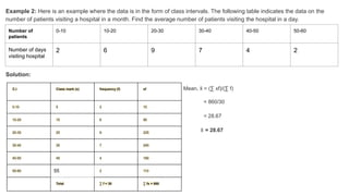
Example 2: Hereis an example where the data is in the form of class intervals. The following table indicates the data on the
number of patients visiting a hospital in a month. Find the average number of patients visiting the hospital in a day.
Solution:
Mean, x
̄ = (∑ xf)/(∑ f)
= 860/30
= 28.67
x
̄ = 28.67
Number of
patients
0-10 10-20 20-30 30-40 40-50 50-60
Number of days
visiting hospital
2 6 9 7 4 2
C.I Class mark (x) frequency (f) xf
0-10 5 2 10
10-20 15 6 90
20-30 25 9 225
30-40 35 7 245
40-50 45 4 180
50-60 55 2 110
Total ∑ f = 30 ∑ fx = 860
8.
Median of UngroupedData
Step 1: Arrange the data in ascending or descending order. Step 2: Let the total number of observations be n.
To find the median, we need to consider if n is even or odd. If n is odd, then use the formula:
Median = [(n + 1)/2]th
observation
Example 1: Let's consider the data: 56, 67, 54, 34, 78, 43, 23. What is the median?
Solution:
Arranging in ascending order, we get: 23, 34, 43, 54, 56, 67, 78. Here, n (number of observations) = 7
So, (7 + 1)/2 = 4
∴ Median = 4th
observation
Median = 54
If n is even, then use the formula:
Median = [(n/2)th
obs.+ ((n/2) + 1)th
obs.]/2
Example 2: Let's consider the data: 50, 67, 24, 34, 78, 43. What is the median?
Solution:
Arranging in ascending order, we get: 24, 34, 43, 50, 67, 78.
Here, n (no.of observations) = 6
6/2 = 3
Using the median formula,
Median = (3rd
observation + 4th
observation) / 2
= (43 + 50)/2
Median = 46.5
9.
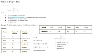
Median of GroupedData:
where,
● l = lower limit of median class
● c = cumulative frequency of the class preceding the median class
● n = total number of observations
● f = frequency of the median class
● h = class size
Example: Find the median marks for the following distribution:
Solution:
Classes 0-10 10-20 20-30 30-40 40-50
Frequency 2 12 22 8 6
Classes Number of
students
Cumulative
frequency
0-10 2 2
10-20 12 2 + 12 = 14
20-30 22 14 + 22 = 36
30-40 8 36 + 8 = 44
40-50 6 44 + 6 = 50
N = 50
N/2 = 50/2 = 25
Median Class = (20 - 30)
l = 20, f = 22, c = 14, h = 10
Using Median formula:
= 20 + (25 - 14)/22 × 10
= 20 + (11/22) × 10
= 20 + 5 = 25
∴ Median = 25
10.
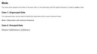
Mode
The value whichappears most often in the given data i.e. the observation with the highest frequency is called a mode of data.
Case 1: Ungrouped Data
For ungrouped data, we just need to identify the observation which occurs maximum times.
Mode = Observation with maximum frequency
Case 2: Grouped Data
Mode=3(Median)-2(Mean)
11.
Data summarizing: Frequencydistribution, Graphical presentation - bar diagram, pie diagram, histogram.
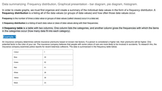
In order to create graphs, we must first organize and create a summary of the individual data values in the form of a frequency distribution. A
frequency distribution is a listing all of the data values (or groups of data values) and how often those data values occur.
Frequency is the number of times a data value or groups of data values (called classes) occur in a data set.
A frequency distribution is a listing of each data value or class of data values along with their frequencies.
A frequency table is a table with two columns. One column lists the categories, and another column gives the frequencies with which the items
in the categories occur (how many data fit into each category).
Example 1
An insurance company determines vehicle insurance premiums based on known risk factors. If a person is considered a higher risk, their premiums will be higher. One
potential factor is the color of your car. The insurance company believes that people with some colors of cars are more likely to be involved in accidents. To research this, the
insurance company examines police reports for recent total-loss collisions. The data is summarized in the frequency table below.
Colour f
Blue 25
Green 52
Red 41
White 36
Yellow 39
Black 23
12.
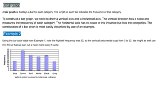
Bar graph
A bargraph is displays a bar for each category. The length of each bar indicates the frequency of that category.
To construct a bar graph, we need to draw a vertical axis and a horizontal axis. The vertical direction has a scale and
measures the frequency of each category. The horizontal axis has no scale in this instance but lists the categories. The
construction of a bar chart is most easily described by use of an example.
Example 2
Using the car color data from Example 1, note the highest frequency was 52, so the vertical axis needs to go from 0 to 52. We might as well use
0 to 55 so that we can put a hash mark every 5 units:
13.
Pie Chart
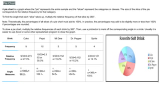
A piechart is a graph where the "pie" represents the entire sample and the "slices" represent the categories or classes. The size of the slice of the pie
corresponds to the relative frequency for that category.
To find the angle that each “slice” takes up, multiply the relative frequency of that slice by 360°.
Note: Theoretically, the percentages of all slices of a pie chart must add to 100%. In practice, the percentages may add to be slightly more or less than 100%
if percentages are rounded.
To draw a pie chart, multiply the relative frequencies of each drink by 360°. Then, use a protractor to mark off the corresponding angle in a circle. Usually it is
easier to use Excel or some other spreadsheet program to draw the graph.
Drink Coke Pepsi Mt Dew Dr. Pepper Sprite
Frequency 9 10 5 5 4
Relative
Frequency
9/33≈0.273
or 27.3%
10/33≈0.3
03 or
30.3%
5/33≈0.152
or 15.2%
5/33≈0.152
or 15.2%
4/33≈0.121
or 12.1%
Angle
Measures
9
33×360o≈
98.2o
10
33×360o≈
109.1o
5
33×360o≈
54.5o
5
33×360o
≈54.5o
4
33×360o ≈
43.6o
14.
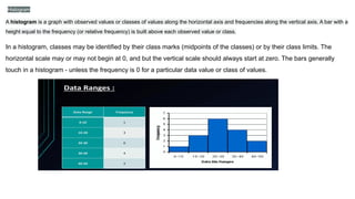
Histogram
A histogram isa graph with observed values or classes of values along the horizontal axis and frequencies along the vertical axis. A bar with a
height equal to the frequency (or relative frequency) is built above each observed value or class.
In a histogram, classes may be identified by their class marks (midpoints of the classes) or by their class limits. The
horizontal scale may or may not begin at 0, and but the vertical scale should always start at zero. The bars generally
touch in a histogram - unless the frequency is 0 for a particular data value or class of values.
15.
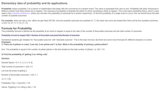
Elementary idea ofprobability and its applications.
Probability means possibility. It is a branch of mathematics that deals with the occurrence of a random event. The value is expressed from zero to one. Probability has been introduced in
Maths to predict how likely events are to happen. The meaning of probability is basically the extent to which something is likely to happen. This is the basic probability theory, which is also
used in the probability distribution, where you will learn the possibility of outcomes for a random experiment. To find the probability of a single event to occur, first, we should know the total
number of possible outcomes.
For example, when we toss a coin, either we get Head OR Tail, only two possible outcomes are possible (H, T). But when two coins are tossed then there will be four possible outcomes,
i.e {(H, H), (H, T), (T, H), (T, T)}.
Formula for Probability
The probability formula is defined as the possibility of an event to happen is equal to the ratio of the number of favourable outcomes and the total number of outcomes.
Probability of event to happen P(E) = Number of favourable outcomes/Total Number of outcomes
Sometimes students get mistaken for “favourable outcome” with “desirable outcome”. This is the basic formula. But there are some more formulas for different situations or events.
Examples:
1) There are 6 pillows in a bed, 3 are red, 2 are yellow and 1 is blue. What is the probability of picking a yellow pillow?
Ans: The probability is equal to the number of yellow pillows in the bed divided by the total number of pillows, i.e. 2/6 = 1/3.
2) Find the probability of ‘getting 3 on rolling a die’.
Solution:
Sample Space = S = {1, 2, 3, 4, 5, 6}
Total number of outcomes = n(S) = 6
Let A be the event of getting 3.
Number of favourable outcomes = n(A) = 1
i.e. A = {3}
Probability, P(A) = n(A)/n(S) = 1/6
Hence, P(getting 3 on rolling a die) = 1/6
16.
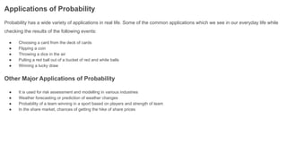
Applications of Probability
Probabilityhas a wide variety of applications in real life. Some of the common applications which we see in our everyday life while
checking the results of the following events:
● Choosing a card from the deck of cards
● Flipping a coin
● Throwing a dice in the air
● Pulling a red ball out of a bucket of red and white balls
● Winning a lucky draw
Other Major Applications of Probability
● It is used for risk assessment and modelling in various industries
● Weather forecasting or prediction of weather changes
● Probability of a team winning in a sport based on players and strength of team
● In the share market, chances of getting the hike of share prices

![Median of Ungrouped Data
Step 1: Arrange the data in ascending or descending order. Step 2: Let the total number of observations be n.
To find the median, we need to consider if n is even or odd. If n is odd, then use the formula:
Median = [(n + 1)/2]th
observation
Example 1: Let's consider the data: 56, 67, 54, 34, 78, 43, 23. What is the median?
Solution:
Arranging in ascending order, we get: 23, 34, 43, 54, 56, 67, 78. Here, n (number of observations) = 7
So, (7 + 1)/2 = 4
∴ Median = 4th
observation
Median = 54
If n is even, then use the formula:
Median = [(n/2)th
obs.+ ((n/2) + 1)th
obs.]/2
Example 2: Let's consider the data: 50, 67, 24, 34, 78, 43. What is the median?
Solution:
Arranging in ascending order, we get: 24, 34, 43, 50, 67, 78.
Here, n (no.of observations) = 6
6/2 = 3
Using the median formula,
Median = (3rd
observation + 4th
observation) / 2
= (43 + 50)/2
Median = 46.5](https://image.slidesharecdn.com/chapter7biostatisticsi-250906152311-eee855fe/85/Chapter-7_-Biostatistics-I-Central-Tendencies-8-320.jpg)


![Lesson3 lpart one - Measures mean [Autosaved].pptx](https://cdn.slidesharecdn.com/ss_thumbnails/lesson2-measuresmeanautosaved-241011173812-613e1e66-thumbnail.jpg?width=640&height=640&fit=bounds)


