Title: BUSINESS_ANALYTICS
Author’s Name:Dr. Mohd Imran Khan
Published By : Lovely Professional University
Publisher Address: Lovely Professional University, Jalandhar Delhi GT road, Phagwara - 144411
Printer Detail: Lovely Professional University
Edition Detail: (I)
ISBN: 978-93-94068-47-6
Copyrights@ Lovely Professional University
4.
Content
Unit 4: BusinessForecasting using Time Series 64
Dr. Mohd Imran Khan, Lovely Professional University
Unit 1: Business Analytics and Summarizing Business Data 1
Dr. Mohd Imran Khan, Lovely Professional University
Unit 2: Summarizing Business Data 19
Dr. Mohd Imran Khan, Lovely Professional University
Unit 3: Business Data Visualization 39
Dr. Mohd Imran Khan, Lovely Professional University
Unit 5: Business Prediction Using Generalised Linear Models 85
Dr. Mohd Imran Khan, Lovely Professional University
Unit 6: Machine Learning for Businesses 100
Dr. Mohd Imran Khan, Lovely Professional University
Unit 7: Text Analytics for Business 121
Dr. Mohd Imran Khan, Lovely Professional University
Unit 8: BusinessIntelligence 142
Dr. Mohd Imran Khan, Lovely Professional University
Unit 9: Data Visualization 156
Dr. Mohd Imran Khan, Lovely Professional University
Unit 10: Data Environment and Preparation 170
Dr. Mohd Imran Khan, Lovely Professional University
Unit 11: Data Blending 184
Dr. Mohd Imran Khan, Lovely Professional University
Unit 12: Design Fundamentals and Visual Analytics 195
Dr. Mohd Imran Khan, Lovely Professional University
Unit 13: Decision Analytics and Calculations 204
Dr. Mohd Imran Khan, Lovely Professional University
Unit 14: Mapping 215
Dr. Mohd Imran Khan, Lovely Professional University
5.
Unit 01: BusinessAnalytics and Summarizing Business Data
Notes
Unit 01: Business Analytics and Summarizing Business Data
CONTENTS
Objectives
Introduction
1.1 Overview of Business Analytics
1.2 Scope of Business Analytics
1.3 Use cases of Business Analytics
1.4 What Is R?
1.5 The R Environment
1.6 What is R Used For?
1.7 The Popularity of R by Industry
1.8 How to Install R
1.9 R packages
1.10 Vector in R
1.11 Data types in R
1.12 Data Structures in R
Summary
Keywords
Self Assessment
Answers for Self Assessment
Review Questions
Further Readings
Objectives
overview of business analytics:
scope of business analytics,
application of business analytics
Rstudio environment for business analytics,
basics of R: packages
vectors in R programming,
datatypes and data structures in R programming
Introduction
Business analytics is a crucial aspect of modern-day organizations that leverages data and
advanced analytical techniques to make data-driven decisions. The goal of business analytics is to
turn data into insights that can help organizations identify trends, measure performance, and
optimize processes.
One of the most significant benefits of business analytics is that it allows organizations to make
informed decisions based on real data instead of gut instincts or assumptions. This leads to better
decision-making and a more strategic approach to business operations. Additionally, business
LOVELY PROFESSIONAL UNIVERSITY 1
Dr. Mohd Imran Khan, Lovely Professional University
6.
Business Analytics
Notes
analytics enablesorganizations to predict future trends and allocate resources more effectively,
thereby increasing efficiency and competitiveness.
Another advantage of business analytics is that it can help organizations understand their
customers better. By analyzing customer data, organizations can gain insights into customer
behavior, preferences, and buying patterns, which can help them tailor their products and services
to meet customer needs more effectively.
However, it is important to note that business analytics is not just about collecting and analyzing
data. It requires a deep understanding of statistical and mathematical models, as well as the ability
to effectively communicate insights to key stakeholders. Furthermore, organizations must ensure
that their data is of high quality and that their analytics systems are secure, to ensure that the
insights generated are accurate and trustworthy.
1.1 Overview of Business Analytics
Business analytics is a broad field that encompasses the use of data, statistical algorithms, and
technologies to extract insights and support decision making in organizations. It involves the
collection, analysis, and interpretation of data to help organizations identify trends, measure
performance, and optimize processes.
The goal of business analytics is to turn data into actionable insights that can inform strategy and
drive improvements. This is achieved through a combination of descriptive, diagnostic, predictive,
and prescriptive analytics, which provide different levels of insight and support different types of
decision making.
Descriptive analytics provides a historical perspective on business performance and focuses on
summarizing and describing past data. Diagnostic analytics focuses on identifying root causes of
performance issues. Predictive analytics uses historical data and statistical models to make
predictions about future performance. Prescriptive analytics provides recommendations for
decision-makers to optimize future outcomes.
Business analytics tools and technologies include data warehousing, data mining, machine
learning, and visualization tools, among others. The use of these tools and techniques enables
organizations to collect, process, and analyze large amounts of data, providing insights that would
be difficult to extract manually.
Overall, business analytics is a crucial tool for organizations looking to make data-driven decisions,
optimize performance, and stay ahead in a highly competitive business environment.
In conclusion, business analytics is a critical tool for modern organizations that enables them to
make informed decisions, improve operations, and stay competitive in a rapidly changing business
environment. While it requires a combination of technical expertise and communication skills, the
benefits it brings to organizations make it a valuable investment.
Business Analytics
Notes
analytics enables organizations to predict future trends and allocate resources more effectively,
thereby increasing efficiency and competitiveness.
Another advantage of business analytics is that it can help organizations understand their
customers better. By analyzing customer data, organizations can gain insights into customer
behavior, preferences, and buying patterns, which can help them tailor their products and services
to meet customer needs more effectively.
However, it is important to note that business analytics is not just about collecting and analyzing
data. It requires a deep understanding of statistical and mathematical models, as well as the ability
to effectively communicate insights to key stakeholders. Furthermore, organizations must ensure
that their data is of high quality and that their analytics systems are secure, to ensure that the
insights generated are accurate and trustworthy.
1.1 Overview of Business Analytics
Business analytics is a broad field that encompasses the use of data, statistical algorithms, and
technologies to extract insights and support decision making in organizations. It involves the
collection, analysis, and interpretation of data to help organizations identify trends, measure
performance, and optimize processes.
The goal of business analytics is to turn data into actionable insights that can inform strategy and
drive improvements. This is achieved through a combination of descriptive, diagnostic, predictive,
and prescriptive analytics, which provide different levels of insight and support different types of
decision making.
Descriptive analytics provides a historical perspective on business performance and focuses on
summarizing and describing past data. Diagnostic analytics focuses on identifying root causes of
performance issues. Predictive analytics uses historical data and statistical models to make
predictions about future performance. Prescriptive analytics provides recommendations for
decision-makers to optimize future outcomes.
Business analytics tools and technologies include data warehousing, data mining, machine
learning, and visualization tools, among others. The use of these tools and techniques enables
organizations to collect, process, and analyze large amounts of data, providing insights that would
be difficult to extract manually.
Overall, business analytics is a crucial tool for organizations looking to make data-driven decisions,
optimize performance, and stay ahead in a highly competitive business environment.
In conclusion, business analytics is a critical tool for modern organizations that enables them to
make informed decisions, improve operations, and stay competitive in a rapidly changing business
environment. While it requires a combination of technical expertise and communication skills, the
benefits it brings to organizations make it a valuable investment.
LOVELY PROFESSIONAL UNIVERSITY
2
7.
Unit 01: BusinessAnalytics and Summarizing Business Data
Notes
1.2 Scope of Business Analytics
The scope of business analytics covers a wide range of activities and areas within an organization,
including:
Data Collection and Management: The process of gathering, storing, and organizing data from
various sources in a structured manner.
Data Analysis: The process of using statistical and mathematical techniques to identify patterns
and relationships in data, and to gain insights into business problems.
Predictive Modeling: The use of statistical algorithms and machine learning techniques to make
predictions about future events or trends based on historical data.
Data Visualization: The process of creating visual representations of data to help understand and
communicate insights and information more effectively.
Decision-Making Support: Using analytics to provide insights and recommendations to decision-
makers to help them make more informed choices.
Customer Behavior Analysis: The process of analyzing customer data to gain insights into their
behavior and preferences, and to inform business strategy.
Market Research: The process of gathering and analyzing data about the market, customers, and
competitors to inform business strategy.
Inventory Management: Using analytics to optimize the management of inventory levels and costs,
and to improve supply chain efficiency.
Financial Forecasting: The process of using data and analytical models to make predictions about
future financial performance and outcomes.
Operations Optimization: Using analytics to optimize business processes and operations, and to
improve efficiency, productivity, and customer satisfaction.
Customer Behavior Analysis: Understanding customer preferences, needs, and purchase patterns
to inform business decisions and improve customer experience.
Sales and Marketing Analysis: Evaluating the effectiveness of sales and marketing strategies, and
determining opportunities for improvement.
Supply Chain Optimization: Optimizing supply chain operations, such as inventory management,
logistics, and transportation.
Financial Analysis and Reporting: Analyzing financial data to support budgeting, forecasting, and
decision-making.
Human Resource Management and Analysis: Examining HR data to improve workforce planning,
talent management, and employee satisfaction.
Operations and Process Improvement: Identifying and improving inefficiencies in business
processes to increase efficiency and productivity.
Business Analytics Success Stories
Here are some well-known business data analytics success stories:
Capital One: Capital One uses data analytics to detect fraud and manage risk. The company's
algorithms analyze customer data to identify unusual or suspicious behavior and alert the relevant
departments.
Barclays: The bank uses data analytics to detect fraud, manage risk and improve customer
experience.
Procter & Gamble: The consumer goods company uses data analytics to optimize pricing, improve
supply chain and inform marketing strategies.
Sports teams: Teams in the NFL, NBA and MLB use data analytics to optimize player performance,
inform game strategy and improve fan engagement.
LOVELY PROFESSIONAL UNIVERSITY 3
8.
Business Analytics
Notes
These examplesshow how businesses can use data analytics to drive efficiency, improve customer
experiences, and make informed decisions.
1.3 Use cases of Business Analytics
Netflix
Netflix uses business analytics in several ways:
Content analysis: They analyze data to determine which content to produce and license, including
genre, budget, and target audience.
Customer behavior: They track viewing habits, search and browsing behavior, and preferences to
make recommendations and personalize the user experience.
Pricing and subscription: Netflix uses analytics to determine optimal pricing and subscription
plans, monitor customer churn, and understand the impact of changes.
Marketing: They analyze the effectiveness of marketing campaigns and adjust them accordingly.
International expansion: They use data to determine which markets to expand into, what content
to offer, and how to localize the user experience.
Overall, Netflix leverages analytics to drive informed decision-making and optimize their
operations, user experience, and revenue.
Amazon
Amazon uses business analytics in several ways:
Sales and revenue: They analyze sales data to understand trends, customer behavior, and revenue
growth.
Inventory and supply chain: Amazon uses analytics to optimize inventory levels, manage the
supply chain, and ensure timely delivery of products.
Customer behavior: They track customer behavior, including browsing, search, and purchase
history, to make recommendations and personalize the user experience.
Pricing: Amazon uses data and analytics to determine optimal pricing for products and to track
competitor pricing.
Marketing: They analyze the effectiveness of marketing campaigns, advertising, and promotions to
make informed decisions about where to allocate budget.
Fraud detection: Amazon uses analytics to detect fraudulent activity and protect the security of
customer data and transactions.
Overall, Amazon leverages analytics to drive informed decision-making and optimize their
operations, customer experience, and revenue.
Walmart
Walmart uses business analytics in several ways, including:
Supply Chain Optimization: Walmart uses data analytics to optimize its supply chain and
improve the efficiency of its operations.
Customer Insights: Walmart collects and analyzes data on customer shopping habits and
preferences to inform its marketing strategies and product offerings.
Inventory Management: Walmart uses data analytics to track inventory levels and sales patterns to
ensure that the right products are in stock at the right time.
Employee Management: Walmart uses data analytics to monitor employee productivity, schedule
management and reduce labor costs.
Pricing Strategies: Walmart uses data analytics to inform its pricing strategies, ensuring that it
remains competitive while maximizing profits.
Overall, Walmart leverages business analytics to gain insights and make data-driven decisions that
improve its operations and drive growth.
LOVELY PROFESSIONAL UNIVERSITY
4
9.
Unit 01: BusinessAnalytics and Summarizing Business Data
Notes
Uber
Uber uses business analytics in several ways:
Demand forecasting: To predict demand for rides and optimize pricing and driver incentives.
Customer segmentation: To better understand and target different customer segments.
Driver performance evaluation: To measure driver performance and identify areas for
improvement.
Route optimization: To determine the best routes for drivers and passengers, reducing travel time
and costs.
Fraud detection: To identify and prevent fraudulent activities, such as fake rides and fake drivers.
Marketing and promotions: To measure the effectiveness of marketing campaigns and
promotional offers.
Market expansion: To analyze new markets and determine the viability of expanding into new
cities and regions.
Google
Google uses business analytics in various ways:
Data-driven decision making: Google collects and analyzes massive amounts of data to inform its
decisions and strategies.
Customer behavior analysis: Google analyzes user data to understand customer behavior and
preferences, which helps with product development and marketing strategies.
Financial analysis: Google uses business analytics to track and forecast its financial performance.
Ad campaign optimization: Google uses analytics to measure the effectiveness of its advertising
campaigns and adjust them accordingly.
Market research: Google analyzes market trends and competitor activity to inform its business
strategies.
What is R: Overview, its Applications and what is R used for?
Since there are so many programming languages available today, it’s sometimes hard to decide
which one to choose. As a result, programmers often face the dilemma of too many good choices.
It’s enough to stop people in their tracks, paralyzed with indecision!
To combat this potential source of mental gridlock, we present an analysis of the R programming
language.
1.4 What Is R?
What better place to find a good definition of the language than the R Foundation’s website?
According to R-Project.org, R is “… a language and environment for statistical computing and
graphics.” It’s an open-source programming language often used as a data analysis and statistical
software tool.
R is a language and environment for statistical computing and graphics. It is a GNU project which
is similar to the S language and environment which was developed at Bell Laboratories (formerly
AT&T, now Lucent Technologies) by John Chambers and colleagues. R can be considered as a
different implementation of S. There are some important differences, but much code written for S
runs unaltered under R.
LOVELY PROFESSIONAL UNIVERSITY 5
10.
Business Analytics
Notes
R providesa wide variety of statistical (linear and nonlinear modelling, classical statistical tests,
time-series analysis, classification, clustering, …) and graphical techniques, and is highly extensible.
The S language is often the vehicle of choice for research in statistical methodology, and R provides
an Open Source route to participation in that activity.
One of R’s strengths is the ease with which well-designed publication-quality plots can be
produced, including mathematical symbols and formulae where needed. Great care has been taken
over the defaults for the minor design choices in graphics, but the user retains full control.
R is available as Free Software under the terms of the Free Software Foundation’s GNU General
Public License in source code form. It compiles and runs on a wide variety of UNIX platforms and
similar systems (including FreeBSD and Linux), Windows and MacOS.
The R environment consists of an integrated suite of software facilities designed for data
manipulation, calculation, and graphical display. The environment features:
A high-performance data storage and handling facility
A suite of operators for array calculations, mainly matrices
A vast, easily understandable, integrated assortment of intermediate tools dedicated to data
analysis
Graphical facilities for data analysis and display that work either for on-screen or hardcopy
The well-developed, simple and effective programming language, featuring user-defined
recursive functions, loops, conditionals, and input and output facilities.
The syntax of R consists of three items:
Variables, which store data
Comments, which are used to improve code readability
Keywords, reserved words that have a special meaning for the compiler
R was developed in 1993 by Ross Ihaka and Robert Gentleman and includes linear regression,
machine learning algorithms, statistical inference, time series, and more.
R is a universal programming language compatible with the Windows, Macintosh, UNIX, and
Linux platforms. It is often referred to as a different implementation of the S language and
environment and is considered highly extensible.
1.5 The R Environment
R is an integrated suite of software facilities for data manipulation, calculation and graphical
display. It includes
an effective data handling and storage facility,
a suite of operators for calculations on arrays, in particular matrices,
a large, coherent, integrated collection of intermediate tools for data analysis,
LOVELY PROFESSIONAL UNIVERSITY
6
11.
Unit 01: BusinessAnalytics and Summarizing Business Data
Notes
graphical facilities for data analysis and display either on-screen or on hardcopy, and
a well-developed, simple and effective programming language which includes conditionals,
loops, user-defined recursive functions and input and output facilities.
The term “environment” is intended to characterize it as a fully planned and coherent system,
rather than an incremental accretion of very specific and inflexible tools, as is frequently the case
with other data analysis software.
R, like S, is designed around a true computer language, and it allows users to add additional
functionality by defining new functions. Much of the system is itself written in the R dialect of S,
which makes it easy for users to follow the algorithmic choices made. For computationally-
intensive tasks, C, C++ and Fortran code can be linked and called at run time. Advanced users can
write C code to manipulate R objects directly.
Many users think of R as a statistics system. We prefer to think of it as an environment within
which statistical techniques are implemented. R can be extended (easily) via packages. There are
about eight packages supplied with the R distribution and many more are available through the
CRAN family of Internet sites covering a very wide range of modern statistics.
R has its own LaTeX-like documentation format, which is used to supply comprehensive
documentation, both on-line in a number of formats and in hardcopy.
Does R Have Any Drawbacks?
What language doesn’t? When answering the question “What is R?” we should also look at some of
R’s not so great aspects:
It’s a complicated language. R has a steep learning curve. It’s a language best suited for people who
have previous programming experience.
It’s not as secure. R doesn’t have basic security measures. Consequently, it’s not a good choice for
making web-safe applications. Also, R can’t be embedded in web browsers.
It’s slow. R is slower than other programming languages like Python or MATLAB.
It takes up a lot of memory. Memory management isn’t one of R’s strong points. R’s data must be
stored in physical memory. However, the increasing use of cloud-based memory may eventually
make this drawback moot.
It doesn’t have consistent documentation/package quality. Docs and packages can be patchy and
inconsistent, or incomplete. That’s the price you pay for a language that doesn’t have official,
dedicated support and instead is maintained and added to by the community.
Why use R
R is a state-of-the-art programming languague for statistical computing, data analysis, and machine
learning. It has been around for almost three decades with over 12,000 packages available for
download on CRAN. This means that there is an R package that supports whatever type of analysis
you want to perform. Here are a few reasons why you should learn and use R:
LOVELY PROFESSIONAL UNIVERSITY 7
12.
Business Analytics
Notes
Free andopen-source: The R programming language is open-source and is issued under the
General Public License (GNU). This means that you can use all the functionalities of R for free
without any restrictions or licensing requirements. Since R is open-source, everyone is welcome to
contribute to the project, and since it’s freely available, bugs are easily detected and fixed by the
open-source community.
Popularity: The R programming language was ranked 7th in the 2021 IEEE Spectrum ranking of
top programming languages and 12th in the TIOBE Index ranking of January 2022. It’s the second
most popular programming language for data science just behind Python, according to edX, and it
is the most popular programming language for statistical analysis. R’s popularity also means that
there is extensive community support on platforms like Stack overflow. R also has a detailed online
documentation that R users can consult for help.
High-quality visualization: The R programming language is famous for high-quality
visualizations. R’s ggplot2 is a detailed implementation of the grammar of graphics — a system to
concisely describe the components of a graph. With R’s high-quality graphics, you can easily
implement intuitive and interactive graphs.
A language for data analytics and data science: The R programming language isn’t a general-
purpose programming language. It’s a specialized programming language for statistical
computing. Therefore, most of R’s functions carry out vectorized operations, meaning you don’t
need to loop through each element. This makes running R code very fast. Distributed computing
can be executed in R, whereby tasks are split among multiple processing computers to reduce
execution time. R is integrated with Hadoop and Apache Spark, and it can be used to process large
amount of data. R can connect to all kinds of databases, and it has packages to carry out machine
learning and deep learning operations.
Opportunity to pursue an exciting career in academe and industry: The R programming language
is trusted and extensively used in the academic community for research. R is increasingly being
used by government agencies, social media, telecommunications, financial, e-commerce,
manufacturing, and pharmaceutical companies. Top companies that uses R include Amazon,
Google, ANZ Bank, Twitter, LinkedIn, Thomas Cook, Facebook, Accenture, Wipro, the New York
Times, and many more. A good mastery of the R programming language opens all kinds of
opportunities in academe and industry.
1.6 What is R Used For?
R is a programming language and software environment for statistical computing, data analysis,
and graphics. It is widely used by statisticians, data scientists, and researchers in academia,
government, and industry for tasks such as statistical modeling, data visualization, and data
mining. R is a programming language and software environment for statistical computing and
graphics. It is widely used by statisticians, data scientists, and researchers for developing statistical
software and data analysis. R is also used for machine learning, data visualization, and data
LOVELY PROFESSIONAL UNIVERSITY
8
13.
Unit 01: BusinessAnalytics and Summarizing Business Data
Notes
manipulation. With its vast libraries and packages, R is popular in industries such as finance,
healthcare, and e-commerce, as well as academia and research institutions.
Although R is a popular language used by many programmers, it is especially effective when used
for
Data analysis
Statistical inference
Machine learning algorithms
R offers a wide variety of statistics-related libraries and provides a favorable environment for
statistical computing and design. In addition, the R programming language gets used by many
quantitative analysts as a programming tool since it's useful for data importing and cleaning.
As of August 2021, R is one of the top five programming languages of the year, so it’s a favorite
among data analysts and research programmers. It’s also used as a fundamental tool for finance,
which relies heavily on statistical data.
1.7 The Popularity of R by Industry
Thanks to its versatility, many different industries use the R programming language. Here is a list
of industries/disciplines that use the R programming language:
Fintech Companies (financial services)
Academic Research
Government (FDA, National Weather Service)
Retail
Social Media
Data Journalism
Manufacturing
Healthcare
This graph, provided by Stackoverflow, gives you a better idea of R programming language usage
in recent history. Given its strength in statistics, it's hardly surprising that R enjoys heavy use in the
world of academia, as illustrated on the chart.
If you’re looking for specifics, here are ten significant companies or organizations that use R,
presented in no particular order.
Airbnb
Microsoft
Uber
Facebook
Ford
Google
Twitter
LOVELY PROFESSIONAL UNIVERSITY 9
14.
Business Analytics
Notes
IBM
American Express
HP
1.8 How to Install R
To install R, go to https://cloud.r-project.org/ and download the latest version of R for Windows,
Mac or Linux.
When you have downloaded and installed R, you can run R on your computer.
The screenshot below shows how it may look like when you run R on a Windows PC:
Installing R on Windows OS
To install R on Windows OS:
Go to the CRAN website. (https://cran.r-project.org/)
Click on "Download R for Windows".
Click on "install R for the first time" link to download the R executable (.exe) file.
Run the R executable file to start installation, and allow the app to make changes to your device.
Select the installation language.
Follow the installation instructions.
Click on "Finish" to exit the installation setup.
R has now been sucessfully installed on your Windows OS. Open the R GUI to start writing R
codes.
Additional R interfaces
LOVELY PROFESSIONAL UNIVERSITY
10
15.
Unit 01: BusinessAnalytics and Summarizing Business Data
Notes
Other than the R GUI, the other ways to interface with R include RStudio Integrated Development
Environment (RStudio IDE) and Jupyter Notebook. To run R on RStudio, you first need to install R
on your computer, while to run R on Jupyter Notebook, you need to install an R kernel. RStudio
and Jupyter Notebook provide an interactive and friendly graphical interface to R that greatly
improves users’ experience.
Installing RStudio Desktop
To install RStudio Desktop on your computer, do the following:
Go to the RStudio website. (https://posit.co/download/rstudio-desktop/)
Click on "DOWNLOAD" in the top-right corner.
Click on "DOWNLOAD" under the "RStudio Open Source License".
Download RStudio Desktop recommended for your computer.
Run the RStudio Executable file (.exe) for Windows OS or the Apple Image Disk file (.dmg) for
macOS X.
Follow the installation instructions to complete RStudio Desktop installation.
RStudio is now successfully installed on your computer. The RStudio Desktop IDE interface is
shown in the figure below:
1.9 R packages
R packages are collections of functions, data, and compiled code that can be used to extend the
capabilities of R. There are thousands of R packages available, covering a wide range of topics,
including statistics, machine learning, data visualization, and more. Installing and using R
Unit 01: Business Analytics and Summarizing Business Data
Notes
Other than the R GUI, the other ways to interface with R include RStudio Integrated Development
Environment (RStudio IDE) and Jupyter Notebook. To run R on RStudio, you first need to install R
on your computer, while to run R on Jupyter Notebook, you need to install an R kernel. RStudio
and Jupyter Notebook provide an interactive and friendly graphical interface to R that greatly
improves users’ experience.
Installing RStudio Desktop
To install RStudio Desktop on your computer, do the following:
Go to the RStudio website. (https://posit.co/download/rstudio-desktop/)
Click on "DOWNLOAD" in the top-right corner.
Click on "DOWNLOAD" under the "RStudio Open Source License".
Download RStudio Desktop recommended for your computer.
Run the RStudio Executable file (.exe) for Windows OS or the Apple Image Disk file (.dmg) for
macOS X.
Follow the installation instructions to complete RStudio Desktop installation.
RStudio is now successfully installed on your computer. The RStudio Desktop IDE interface is
shown in the figure below:
1.9 R packages
R packages are collections of functions, data, and compiled code that can be used to extend the
capabilities of R. There are thousands of R packages available, covering a wide range of topics,
including statistics, machine learning, data visualization, and more. Installing and using R
LOVELY PROFESSIONAL UNIVERSITY 11
16.
Business Analytics
Notes
packages isan essential part of working with R, and many packages are designed to be easy to
install and use, with clear documentation and examples.
Tidyverse: The tidyverse is a collection of R packages designed for data science. It includes
packages for data manipulation (dplyr), data visualization (ggplot2), and data import/export
(readr, tidyr), among others. The packages in the tidyverse are designed to work together
seamlessly, and they share a common design philosophy, which emphasizes simplicity,
consistency, and understanding. The tidyverse is particularly popular among R users due to its ease
of use, intuitive syntax, and wide range of capabilities, making it a great choice for data analysis
tasks of all types and complexity levels.
Ggplot2: ggplot2 is a data visualization library for the R programming language. It provides a
high-level interface for creating statistical graphics. ggplot2 uses a grammar of graphics to build
complex plots from basic components, allowing users to quickly create sophisticated visualizations
of their data. The library is highly customizable and flexible, allowing users to specify a wide range
of visual elements such as colors, shapes, sizes, and labels.
Dplyr: dplyr is a data manipulation library for R. It provides a set of functions that allow users to
perform common data manipulation tasks such as filtering, summarizing, transforming, and
aggregating data. dplyr is designed to be fast, efficient, and easy to use, and it operates on data
frames and tibbles, making it a popular choice for data wrangling and exploration. The library is
particularly well-suited for working with large datasets, as it provides optimized implementations
for many common data manipulation operations. The syntax of dplyr functions is highly readable
and intuitive, and the library is widely used by data scientists and analysts for data preparation and
exploration.
Tidyr:tidyr is a library for the R programming language that provides tools for "tidying" data. In
the context of data science and analysis, tidying data means restructuring it into a format that is
more suitable for analysis, visualization, and modeling. tidyr provides a suite of functions for
transforming data from a wide variety of formats into a more structured, "tidy" format. This makes
it easier to work with the data and perform common data manipulation tasks such as aggregating,
filtering, and summarizing. The library is designed to work seamlessly with other R libraries such
as dplyr, making it a popular choice for data preparation and wrangling tasks.
Shiny: Shiny is a web application framework for R. It allows R developers to create interactive,
web-based data applications without needing to learn HTML, CSS, or JavaScript. Shiny provides a
simple, high-level syntax for building user interfaces and tying them to R code for data analysis,
visualization, and modeling. Applications built with Shiny can be run locally or hosted on a web
server, making it easy to share results with collaborators and stakeholders. The framework is highly
customizable and can be extended using HTML, CSS, and JavaScript, allowing developers to create
complex, interactive applications with rich user interfaces. Shiny is widely used in data science and
analytics for creating dashboards, data visualization tools, and other interactive applications.
LOVELY PROFESSIONAL UNIVERSITY
12
17.
Unit 01: BusinessAnalytics and Summarizing Business Data
Notes
1.10 Vector in R
In R, a vector is a basic data structure that represents an ordered collection of values of the same
type (numeric, character, logical, etc.). Vectors are the simplest type of data structure in R and are
used as the building blocks for more complex data structures such as arrays, data frames, and lists.
A vector can be created using the c() function and can be indexed, sliced, and manipulated using
various R functions and operators. In R, vectors are used for representing variables, input data, and
intermediate results of computations. They play a crucial role in many data analysis and modeling
tasks and are an essential part of the R programming language.
1.11 Data types in R
In R, the following data types are commonly used:
Numeric: represents numbers and is used for mathematical calculations.
Integer: a whole number, without a fractional part.
Complex: represents complex numbers.
Character: used to represent text.
Logical: used to represent True/False values.
Factor: used to represent categorical variables.
Date: used to represent dates.
Raw: used to represent raw binary data.
R also has several other specialized data types such as list, matrix, data frame, etc.
Unit 01: Business Analytics and Summarizing Business Data
Notes
1.10 Vector in R
In R, a vector is a basic data structure that represents an ordered collection of values of the same
type (numeric, character, logical, etc.). Vectors are the simplest type of data structure in R and are
used as the building blocks for more complex data structures such as arrays, data frames, and lists.
A vector can be created using the c() function and can be indexed, sliced, and manipulated using
various R functions and operators. In R, vectors are used for representing variables, input data, and
intermediate results of computations. They play a crucial role in many data analysis and modeling
tasks and are an essential part of the R programming language.
1.11 Data types in R
In R, the following data types are commonly used:
Numeric: represents numbers and is used for mathematical calculations.
Integer: a whole number, without a fractional part.
Complex: represents complex numbers.
Character: used to represent text.
Logical: used to represent True/False values.
Factor: used to represent categorical variables.
Date: used to represent dates.
Raw: used to represent raw binary data.
R also has several other specialized data types such as list, matrix, data frame, etc.
LOVELY PROFESSIONAL UNIVERSITY 13
18.
Business Analytics
Notes
1.12 DataStructures in R
In R, data structures include:
Vectors: One-dimensional arrays of homogeneous data (e.g., numbers or characters)
Matrices: Two-dimensional arrays of homogeneous data
Arrays: Multi-dimensional arrays of homogeneous data
Data frames: Two-dimensional arrays of heterogeneous data, with rows and columns labeled
Lists: Heterogeneous collections of objects
Factors: Categorical variables with a limited number of levels
Tables: Tabular data structure for summarizing categorical data.
Each of these data structures can be created and manipulated in various ways in R, and many
functions are available for operating on them.
Summary
Business analytics is the practice of examining data and using statistical analysis and other methods
to gain insights into the performance and efficiency of a business. It involves the use of data,
statistical algorithms, and technology to uncover hidden patterns and knowledge from large data
sets, and is used to inform decision making and guide the development of strategies and plans.
The goal of business analytics is to improve decision-making, streamline processes, and gain a
competitive advantage through the use of data and predictive modeling. It can be applied in
various areas of a business, such as sales and marketing, supply chain management, finance, and
operations.
Business analytics typically involves several key steps: data collection, data cleaning and
preparation, data analysis, and communication of results. Data scientists and other professionals
use statistical and mathematical methods, such as regression analysis and predictive modeling, to
analyze the data and extract insights. The results of these analyses are then used to inform
decisions, support business strategy development, and identify opportunities for improvement.
In recent years, the rapid growth of digital data and advancements in technology have made it
easier for organizations to collect and analyze large amounts of data, leading to the widespread
adoption of business analytics across a wide range of industries.
Keywords
Business analytics, Descriptive analytics, Predictive analytics, Prescriptive analytics, R
Programming
SelfAssessment
1. Which of the following fields below typically make use of Data Mining techniques?
A. Advertising
B. Government Intelligence
C. Airline Industry
D. All of the above
LOVELY PROFESSIONAL UNIVERSITY
14
19.
Unit 01: BusinessAnalytics and Summarizing Business Data
Notes
2. The R language is a dialect of which of the following programming languages?
A. SAS
B. MATLAB
C. C
D. S
3. Which is the R command for obtaining 1000 random numbers through normal distribution
with mean 0 and variance 1?
A. norm(1000, 0, 1)
B. rnorm(0, 1, 1000)
C. rnorm(1000, 0, 1)
D. qnorm(0, 1, 1000)
4. For the population y<-c(1,2,3,4,5), write the R command to find the mean?
A. mean{y}
B. means(y)
C. mean(y)
D. mean[y]
5. It is an encompassing and multidimensional field that uses mathematics, statistics,
predictive modeling and machine learning techniques to find meaningful patterns and
knowledge in recorded data.
A. Big Data
B. Analytics
C. Normal Data
D. Analytics Process
6. It is a term applied to a dataset that exceeds the processing capacity of conventional
database systems, or it doesn’t fit the structural requirements of traditional database
architecture.
A. Big Data
B. Business Analytics
C. Analytics
D. Normal Data
7. The first step in the process is _____________. Data relevant to the applicant is collected. The
quality, quantity, validity, and nature of data directly impact the analytical outcome. A
thorough understanding of the data on hand is extremely critical.
A. Results
B. Put Into Use
C. Data Collection
LOVELY PROFESSIONAL UNIVERSITY 15
20.
Business Analytics
Notes
D. ModelBuilding
8. Usually raw data is not in a format that can be directly used to perform data analysis. In
very simple terms, most platforms require data to be in a matrix form with the variables
being in different columns and rows representing various observations. Data may be
available in structured, semi-structured, and unstructured form.
A. Data Collection
B. Data Preparation
C. Data Analysis
D. Model Building
9. Once data is converted into a structured format, the next stage is to perform ___________. At
this stage underlying trends in the data are identified. This step can include fitting a linear
or nonlinear regression model, performing principal component analysis or cluster analysis,
identifying if data is normally distributed or not.
A. Data Collection
B. Data Preparation
C. Data Analysis
D. Model Building
10. We need to analyzed the data we collected, Analyze Data Model to assess and query the
data collected in the process.
A. Data
B. Analyze
C. Generate Reports
D. Smarter Decisions
11. Consists of acquiring the data, implementing advanced data processes, distributing the data
effectively and managing oversight data.
A. Artificial Intelligence
B. Growing Importance of The CDO & CAO
C. Data Discovery
D. Data Quality Management (DQM)
12. __________ is the science aiming to make machines execute what is usually done by complex
human intelligence.
A. Data Discovery
B. Artificial Intelligence
C. Collaborative Business Intelligence
D. Consumer Experience
LOVELY PROFESSIONAL UNIVERSITY
16
21.
Unit 01: BusinessAnalytics and Summarizing Business Data
Notes
13. Predictive analytics is widely used by both conventional retail stores as well as e-commerce
firms for analyzing their historical data and building models for customer engagement,
supply chain optimization, price optimization, and space optimization and assortment
planning.
A. Retail Industry
B. Telecom Industry
C. Health Industry
D. Finance Industry
14. Quantitative data refers to:
A. numerical data that could usefully be quantified to help you answer your research
question(s) and to meet your objectives.
B. graphs and tables.
C. any data you present in your report.
D. statistical analysis.
15. Qualitative analysis software cannot:
A. make report writing easier.
B. find concealed data.
C. be done without training.
D. re-analyse data easily.
Answers for SelfAssessment
l. D 2. D 3. B 4. C 5. B
6. A 7. C 8. B 9. A 10. B
11. D 12. B 13. A 14. A 15. D
Review Questions
1. What is business analytics and how does it differ from traditional business intelligence?
2. What are the key steps involved in the business analytics process?
3. How can data visualization be used to support business decision-making?
4. What is data mining and how is it used in business analytics?
5. What is predictive analytics and how does it differ from descriptive analytics?
6. What are some common techniques used in predictive modeling, such as regression
analysis, decision trees, and neural networks?
7. How can business analytics be used to support customer relationship management
(CRM)?
8. What are some common applications of business analytics in areas such as supply chain
management, marketing, and finance?
LOVELY PROFESSIONAL UNIVERSITY 17
22.
Business Analytics
Notes
9. Whatis big data and how does it impact business analytics?
10. What role does machine learning play in business analytics and what are some common
algorithms used in this area?
Further Readings
https://business.wfu.edu/masters-in-business-analytics/articles/what-is-
analytics/#:~:text=Business%20analytics%20is%20the%20process,to%20create%20insights%
20from%20data.
Business Analytics, 2ed: The Science of Data-Driven Decision Making by U. Dinesh Kumar,
Business Analytics
Notes
9. What is big data and how does it impact business analytics?
10. What role does machine learning play in business analytics and what are some common
algorithms used in this area?
Further Readings
https://business.wfu.edu/masters-in-business-analytics/articles/what-is-
analytics/#:~:text=Business%20analytics%20is%20the%20process,to%20create%20insights%
20from%20data.
Business Analytics, 2ed: The Science of Data-Driven Decision Making by U. Dinesh Kumar,
LOVELY PROFESSIONAL UNIVERSITY
18
23.
Unit 02: SummarizingBusiness Data
Notes
Unit 02: Summarizing Business Data
CONTENTS
Objectives
Introduction
2.1 Functions in R Programming
2.2 One Variable and Two Variables Statistics
2.3 Basics Functions in R
2.4 User-defined Functions in R Programming Language
2.5 Single Input Single Output
2.6 Multiple Input Multiple Output
2.7 Inline Functions in R Programming Language
2.8 Functions to Summarize Variables- Select, Filter, Mutate & Arrange
2.9 Summarize function in R
2.10 Group by function in R
2.11 Concept of Pipes Operator in R
Summary
Keywords
Self Assessment
Answers for Self Assessment
Review Questions
Further reading
Objectives
discuss one variable and two variables statistics,
overview of functions to summarize variables.
implement select, filter, mutate, variables.
use of arrange, summarize, and group byfunctions.
demonstrate concept of pipes operator
Introduction
R is a programming language and software environment for statistical computing and graphics. It
was developed in 1993 by Ross Ihaka and Robert Gentleman at the University of Auckland, New
Zealand. R provides a wide range of statistical and graphical techniques and is highly extensible,
allowing users to write their own functions and packages.
One of the main strengths of R is its ability to handle and visualize complex data. It has a large and
active community of developers, who have contributed over 15,000 packages to the Comprehensive
R Archive Network (CRAN). These packages cover a wide range of topics, including machine
learning, time series analysis, Bayesian statistics, social network analysis, and many others.
In addition to its statistical and graphical capabilities, R also provides a flexible and interactive
programming environment. R code can be run from the command line, from scripts, or from within
LOVELY PROFESSIONAL UNIVERSITY 19
Dr. Mohd Imran Khan, Lovely Professional University
24.
Business Analytics
Notes
a graphicaluser interface (GUI) such as RStudio. R supports various data structures such as vectors,
matrices, data frames, and lists, and it has a rich set of functions for data manipulation and
transformation.
R is widely used in academia, industry, and government for data analysis, statistical modelling, and
data visualization. It is also a popular choice for reproducible research, as the code and data used in
an analysis can be easily shared and documented.
In summary, R is a powerful and versatile language for data analysis and statistical computing,
with a large community of users and developers and a wide range of tools and techniques.
2.1 Functions in R Programming
Functions are useful when you want to perform a certain task multiple times. A function accepts
input arguments and produces the output by executing valid R commands that are inside the
function. In R Programming Language when you are creating a function the function name and the
file in which you are creating the function need not be the same and you can have one or more
function definitions in a single R file.
In R programming, functions are blocks of code that perform specific tasks and return a value.
Functions are used to encapsulate reusable code, making it easier to write and maintain code. R has
many built-in functions and also allows you to create your own custom functions. To define a
function in R, you use the function keyword, followed by the function's arguments and the code to
be executed in curly braces {}. The return value of a function can be specified using the return
keyword. To call a function, simply type its name followed by the arguments in parentheses ().
Types of function in R Language
Built-in Function: Built function R is sq(), mean(), max(), these function are directly call in the
program by users.
User-defined Function: R language allow us to write our own function.
Examples of built-in function in R
R has a large number of built-in functions, covering a wide range of tasks, including:
Mathematics: sqrt, abs, cos, sin, log, exp, etc.
Data manipulation: head, tail, sort, unique, cbind, rbind, etc.
Data analysis: mean, median, summary, t.test, cor, lm, etc.
Plotting: plot, hist, boxplot, scatterplot, density, etc.
String manipulation: toupper, tolower, substr, gsub, paste, etc.
File Input/Output: read.csv, write.csv, read.table, write.table, etc.
Use cases of basic inbuild functions of R programming
Functions to do Descriptive Analytics in R programming
Descriptive statistics in R programming involves summarizing and analyzing a dataset to gain a
better understanding of its properties and patterns. This can be done through various measures
such as central tendency (mean, median, mode), dispersion (standard deviation, variance, range),
and distribution (histograms, boxplots, density plots).
Here are some of the commonly used functions in R for descriptive statistics:
mean(): calculates the mean of a numeric vector.
median(): calculates the median of a numeric vector.
mode(): calculates the mode of a numeric vector.
sd(): calculates the standard deviation of a numeric vector.
LOVELY PROFESSIONAL UNIVERSITY
20
25.
Unit 02: SummarizingBusiness Data
Notes
var(): calculates the variance of a numeric vector.
range(): calculates the range of a numeric vector (difference between max and min).
quantile(): calculates specified quantiles of a numeric vector.
hist(): creates a histogram of a numeric vector.
boxplot(): creates a boxplot of a numeric vector.
density(): creates a density plot of a numeric vector.
table(): calculates the frequency distribution of a categorical variable.
min(): calculates the minimum value of a numeric vector.
max(): calculates the maximum value of a numeric vector.
sum(): calculates the sum of a numeric vector.
prod(): calculates the product of a numeric vector.
cumsum(): calculates the cumulative sum of a numeric vector.
cumprod(): calculates the cumulative product of a numeric vector.
cor(): calculates the correlation between two numeric vectors.
cov(): calculates the covariance between two numeric vectors.
apply(): applies a function to each column (or row) of a data frame.
These are just some of the functions available in R for descriptive statistics. By using these
functions, you can obtain a better understanding of your dataset and draw meaningful conclusions
from your data.
2.2 One Variable and Two Variables Statistics
Upcoming section shows examples of R functions for one variable and two variable statistics:
Unit 02: Summarizing Business Data
Notes
var(): calculates the variance of a numeric vector.
range(): calculates the range of a numeric vector (difference between max and min).
quantile(): calculates specified quantiles of a numeric vector.
hist(): creates a histogram of a numeric vector.
boxplot(): creates a boxplot of a numeric vector.
density(): creates a density plot of a numeric vector.
table(): calculates the frequency distribution of a categorical variable.
min(): calculates the minimum value of a numeric vector.
max(): calculates the maximum value of a numeric vector.
sum(): calculates the sum of a numeric vector.
prod(): calculates the product of a numeric vector.
cumsum(): calculates the cumulative sum of a numeric vector.
cumprod(): calculates the cumulative product of a numeric vector.
cor(): calculates the correlation between two numeric vectors.
cov(): calculates the covariance between two numeric vectors.
apply(): applies a function to each column (or row) of a data frame.
These are just some of the functions available in R for descriptive statistics. By using these
functions, you can obtain a better understanding of your dataset and draw meaningful conclusions
from your data.
2.2 One Variable and Two Variables Statistics
Upcoming section shows examples of R functions for one variable and two variable statistics:
LOVELY PROFESSIONAL UNIVERSITY 21
Unit 02: SummarizingBusiness Data
Notes
Unit 02: Summarizing Business Data
Notes
Unit 02: Summarizing Business Data
Notes
LOVELY PROFESSIONAL UNIVERSITY 23
28.
Business Analytics
Notes
2.3 BasicsFunctions in R
# Find sum of numbers 4 to 6.
print(sum(4:6))
# Find max of numbers 4 and 6.
Business Analytics
Notes
2.3 Basics Functions in R
# Find sum of numbers 4 to 6.
print(sum(4:6))
# Find max of numbers 4 and 6.
Business Analytics
Notes
2.3 Basics Functions in R
# Find sum of numbers 4 to 6.
print(sum(4:6))
# Find max of numbers 4 and 6.
LOVELY PROFESSIONAL UNIVERSITY
24
29.
Unit 02: SummarizingBusiness Data
Notes
print(max(4:6))
# Find min of numbers 4 and 6.
print(min(4:6))
#Calculate the square root of a number
sqrt(16)
#Calculate the natural logarithm of a number
log(10)
#Calculate the exponential function
exp(2)
#Calculate the sine of an angle (in radians)
sin(pi/4)
#Calculate the sum of two numbers
x <- 2
y <- 3
x + y
#Calculate the difference of two numbers
x - y
#Calculate the product of two numbers
x * y
#Calculate the quotient of two numbers
x / y
#Calculate the power of a number
x^y
#Calculate the cosine of an angle (in radians)
cos(pi/3)
#Calculate the tangent of an angle (in radians)
tan(pi/4)
#Calculate the inverse sine of a value
asin(1)
#Calculate the inverse cosine of a value
acos(0.5)
#Calculate the inverse tangent of a value
atan(1)
#Calculate the mean and standard deviation of a vector x:
x <- c(1, 2, 3, 4, 5)
mean(x)
sd(x)
#Calculate the median and quartiles of a vector x:
x <- c(1, 2, 3, 4, 5)
median(x)
LOVELY PROFESSIONAL UNIVERSITY 25
30.
Business Analytics
Notes
quantile(x, c(0.25,0.75))
#Calculate the minimum and maximum values of a vector x:
x <- c(1, 2, 3, 4, 5)
min(x)
max(x)
#Calculate the sum and product of a vector x:
x <- c(1, 2, 3, 4, 5)
sum(x)
prod(x)
#Calculate the cumulative sum and cumulative product of a vector x:
x <- c(1, 2, 3, 4, 5)
cumsum(x)
cumprod(x)
#Calculate the correlation between two vectors x and y:
x <- rnorm(100)
y <- rnorm(100)
cor(x, y)
#Calculate the covariance between two vectors x and y:
x <- rnorm(100)
y <- rnorm(100)
cov(x, y)
#Calculate the mean and standard deviation of multiple columns of a data frame:
df <- data.frame(x = rnorm(100), y = rnorm(100), z = rnorm(100))
apply(df, 2, mean)
apply(df, 2, sd)
2.4 User-defined Functions in R Programming Language
R provides built-in functions like print(), cat(), etc. but we can also create our own functions. These
functions are called user-defined functions.
LOVELY PROFESSIONAL UNIVERSITY
26
31.
Unit 02: SummarizingBusiness Data
Notes
2.5 Single Input Single Output
Now create a function in R that will take a single input and gives us a single output. Following is an
example to create a function that calculates the area of a circle which takes in the arguments the
radius. So, to create a function, name the function as “areaOfCircle” and the arguments that are
needed to be passed are the “radius” of the circle.
Unit 02: Summarizing Business Data
Notes
2.5 Single Input Single Output
Now create a function in R that will take a single input and gives us a single output. Following is an
example to create a function that calculates the area of a circle which takes in the arguments the
radius. So, to create a function, name the function as “areaOfCircle” and the arguments that are
needed to be passed are the “radius” of the circle.
LOVELY PROFESSIONAL UNIVERSITY 27
32.
Business Analytics
Notes
2.6 MultipleInput Multiple Output
Now create a function in R Language that will take multiple inputs and gives us multiple outputs
using a list.
The functions in R Language takes multiple input objects but returned only one object as output,
this is, however, not a limitation because you can create lists of all the outputs which you want to
create and once the list is created you can access them into the elements of the list and get the
answers which you want.
Let us consider this example to create a function “Rectangle” which takes “length” and “width” of
the rectangle and returns area and perimeter of that rectangle. Since R Language can return only
one object. Hence, create one object which is a list that contains “area” and “perimeter” and return
the list.
2.7 Inline Functions in R Programming Language
Sometimes creating an R script file, loading it, executing it is a lot of work when you want to just
create a very small function. So, what we can do in this kind of situation is an inline function. To
create an inline function you have to use the function command with the argument x and then the
expression of the function.
Business Analytics
Notes
2.6 Multiple Input Multiple Output
Now create a function in R Language that will take multiple inputs and gives us multiple outputs
using a list.
The functions in R Language takes multiple input objects but returned only one object as output,
this is, however, not a limitation because you can create lists of all the outputs which you want to
create and once the list is created you can access them into the elements of the list and get the
answers which you want.
Let us consider this example to create a function “Rectangle” which takes “length” and “width” of
the rectangle and returns area and perimeter of that rectangle. Since R Language can return only
one object. Hence, create one object which is a list that contains “area” and “perimeter” and return
the list.
2.7 Inline Functions in R Programming Language
Sometimes creating an R script file, loading it, executing it is a lot of work when you want to just
create a very small function. So, what we can do in this kind of situation is an inline function. To
create an inline function you have to use the function command with the argument x and then the
expression of the function.
LOVELY PROFESSIONAL UNIVERSITY
28
33.
Unit 02: SummarizingBusiness Data
Notes
# A simple R function to check whether x is even or odd
evenOdd = function(x){
if(x %% 2 == 0)
return("even")
else
return("odd")
}
print(evenOdd(4))
print(evenOdd(3))
# A simple R function to calculate area of a circle
areaOfCircle = function(radius){
area = pi*radius^2
return(area)
}
print(areaOfCircle(2))
# A simple R function to calculate area and perimeter of a rectangle
Rectangle = function(length, width){
area = length * width
perimeter = 2 * (length + width)
# create an object called result which is
# a list of area and perimeter
result = list("Area" = area, "Perimeter" = perimeter)
return(result)
}
resultList = Rectangle(2, 3)
Unit 02: Summarizing Business Data
Notes
# A simple R function to check whether x is even or odd
evenOdd = function(x){
if(x %% 2 == 0)
return("even")
else
return("odd")
}
print(evenOdd(4))
print(evenOdd(3))
# A simple R function to calculate area of a circle
areaOfCircle = function(radius){
area = pi*radius^2
return(area)
}
print(areaOfCircle(2))
# A simple R function to calculate area and perimeter of a rectangle
Rectangle = function(length, width){
area = length * width
perimeter = 2 * (length + width)
# create an object called result which is
# a list of area and perimeter
result = list("Area" = area, "Perimeter" = perimeter)
return(result)
}
resultList = Rectangle(2, 3)
LOVELY PROFESSIONAL UNIVERSITY 29
34.
Business Analytics
Notes
print(resultList["Area"])
print(resultList["Perimeter"])
# Asimple R program to demonstrate the inline function
f = function(x) x^2*4+x/3
print(f(4))
print(f(-2))
print(0)
2.8 Functions to Summarize Variables- Select, Filter, Mutate &
Arrange
What is the select() function in R?
The select() function is used to pick specific variables or features of a DataFrame or tibble. It selects
columns based on provided conditions like contains, matches, starts with, ends with, and so on.
Syntax
select(.data,….)
Example
iris <- as_tibble(iris) # so it prints a little nicer
select(iris, starts_with("Petal"))
select(iris, ends_with("Width"))
# Move Species variable to the front
select(iris, Species, everything())
df <- as.data.frame(matrix(runif(100), nrow = 10))
df <- tbl_df(df[c(3, 4, 7, 1, 9, 8, 5, 2, 6, 10)])
select(df, V4:V6)
select(df, num_range("V", 4:6))
# Drop variables with -
select(iris, -starts_with("Petal"))
# The .data pronoun is available:
select(mtcars, .data$cyl)
select(mtcars, .data$mpg : .data$disp)
What is the filter() function in R?
The filter() function is used to produce a subset of the data frame, retaining all rows that satisfy the
specified conditions. The filter() method in R programming language can be applied to both
grouped and ungrouped data. The expressions include comparison operators (==, >, >= ) , logical
operators (&, |, !, xor()) , range operators (between(), near()) as well as NA value check against the
column values. The subset data frame has to be retained in a separate variable.
Example : R program to filter rows using filter() function
library(dplyr)
# sample data
df=data.frame(x=c(12,31,4,66,78),
y=c(22.1,44.5,6.1,43.1,99),
z=c(TRUE,TRUE,FALSE,TRUE,TRUE))
LOVELY PROFESSIONAL UNIVERSITY
30
35.
Unit 02: SummarizingBusiness Data
Notes
# condition
filter(df, x<50 & z==TRUE)
Output:
x y z
1 12 22.1 TRUE
2 31 44.5 TRUE
# create a vector of numbers
x <- c(1, 2, 3, 4, 5, 6)
# filter elements that are greater than 3
result <- filter(x, x > 3)
# print the filtered result
print(result)
# Output:
# [1] 4 5 6
In this example, the filter() function is applied to the vector x with the condition x > 3, which
returns a new vector containing only the elements of x that are greater than 3.
# Creating a vector of numbers
numbers <- c(1, 2, 3, 4, 5, 6, 7, 8, 9, 10)
# Using filter function to extract only even numbers
even_numbers <- filter(numbers, function(x) x %% 2 == 0)
# Printing the filtered numbers
even_numbers
#Output
[1] 2 4 6 8 10
filter(starwars, species == "Human")
filter(starwars, mass > 1000)
# Multiple criteria
filter(starwars, hair_color == "none" & eye_color == "black")
filter(starwars, hair_color == "none" | eye_color == "black")
# Multiple arguments are equivalent to and
filter(starwars, hair_color == "none", eye_color == "black")
# Load library dplyr
library(dplyr)
# Load iris dataset
data(iris)
# Select only Sepal.Length and Species columns
iris_select <- iris %>% select(Sepal.Length, Species)
# View the first 6 rows
head(iris_select)
# Load library dplyr
library(dplyr)
LOVELY PROFESSIONAL UNIVERSITY 31
36.
Business Analytics
Notes
# Loadiris dataset
data(iris)
# Create a new column "Sepal.Ratio" based on Sepal.Length and Sepal.Width
iris_mutate <- iris %>% mutate(Sepal.Ratio = Sepal.Length / Sepal.Width)
# View the first 6 rows
head(iris_mutate)
# Load library dplyr
library(dplyr)
# Load iris dataset
data(iris)
# Arrange rows by Sepal.Length in ascending order
iris_arrange <- iris %>% arrange(Sepal.Length)
# View the first 6 rows
head(iris_arrange)
2.9 Summarize function in R
The summarize() function is used in the R program to summarize the data frame into just one value
or vector. This summarization is done through grouping observations by using categorical values at
first, using the groupby() function.
The dplyr package is used to get the summary of the dataset. The summarize() function offers the
summary that is based on the action done on grouped or ungrouped data.
Summarize grouped data
The operations that can be performed on grouped data are average, factor, count, mean, etc.
# Load library
library(dplyr)
data <- PlantGrowth
# summarize
summarize(data, mean(weight,na.rm=TRUE))
In the example above, we use the summarize() function to obtain the mean weight of all the plant
species in the PlantGrowth dataset.
Summarize ungrouped data
We can also summarize ungrouped data. This can be done by using three functions.
summarize_all()
summarize_at()
summazrize_if()
Examples
# Load dplyr library
library(dplyr)
# Main code
data <- mtcars
# Loading starting 6 observations
sample <- head(data)
LOVELY PROFESSIONAL UNIVERSITY
32
37.
Unit 02: SummarizingBusiness Data
Notes
# Caculating mean value.
sample %>% summarize_all(mean)
In the code snippet above, we load the mtcars dataset in the data variable. In the variable sample,
we are loading the top six observations to process. The sample %>% summarize_all(mean) will
show the mean of the six observations in the result.
summarize_at()
It performs the action on the specific column and generates the summary based on that action.
# Load dplyr library
library(dplyr)
# Main code
data <- mtcars
# Loading starting 6 observations
sample <- head(data)
# Caculating mean value.
sample %>% summarize_all(mean)
In the code snippet above, we load the mtcars dataset in the data variable. In the variable sample,
we are loading the top six observations to process. The sample %>% summarize_all(mean) will
show the mean of the six observations in the result.
summarize_if()
In this function, we specify a condition and the summary will be generated if the condition is
satisfied.
# Laod dplyr library
library(dplyr)
# Main code
data<-mtcars
z<- head(data)
z %>% group_by(hp) %>%
summarize_if(is.numeric, mean)
In the code snippet above, we use the predicate function is.numeric and mean as an action.
2.10 Group by function in R
Group_by() function belongs to the dplyr package in the R programming language, which groups
the data frames. Group_by() function alone will not give any output. It should be followed by
summarise() function with an appropriate action to perform. It works similar to GROUP BY in SQL
and pivot table in excel.
Example
library(dplyr)
df = read.csv("Sample_Superstore.csv")
df_grp_region = df %>% group_by(Region) %>%
summarise(total_sales = sum(Sales),
LOVELY PROFESSIONAL UNIVERSITY 33
38.
Business Analytics
Notes
total_profits =sum(Profit),
.groups = 'drop')
View(df_grp_region)
2.11 Concept of Pipes Operator in R
The pipe operator in R is the %>% symbol and it is used for chaining together multiple operations
in a readable and concise way. The pipe operator takes the output from the left-hand side of the
operator and "pipes" it as the first argument to the function on the right-hand side. This allows you
to build complex sequences of operations, each relying on the output from the previous step,
without the need for intermediate variables.
# Example 1
library(dplyr)
mtcars %>%
filter(cyl == 4) %>% summarize(mean_mpg = mean(mpg))
In this example, the mtcars data set is filtered to only keep observations with 4 cylinders, and then
the mean miles per gallon (mpg) is calculated for the remaining observations. The output from each
step is passed to the next step using the pipe operator, making the code more readable and concise.
Note that the pipe operator is not built into base R, but is included in the dplyr package, which is a
popular data manipulation library.
# Example 2
data(mtcars)
mtcars %>%
select(mpg, hp) %>%
head()
# Example 3
mtcars %>%
group_by(cyl) %>%
summarize(mean_mpg = mean(mpg),
n = n())
# Example 4
mtcars %>%
mutate(cyl_factor = factor(cyl),
hp_group = cut(hp, breaks = c(0, 50, 100, 150, 200),
labels = c("low", "medium", "high", "very high"))) %>%
group_by(cyl_factor, hp_group) %>%
summarize(mean_mpg = mean(mpg),
n = n())
In the second example, the mtcars data set is first filtered to keep only the mpg and hp columns,
and then only the first six rows are displayed.
In the third example, the mtcars data set is grouped by the number of cylinders (cyl) and the mean
miles per gallon (mpg) and number of observations (n) are calculated for each group.
In the fourth example, two new variables are created and added to the mtcars data set. The number
of cylinders (cyl) is converted to a factor and a new variable (cyl_factor) is created to represent this
LOVELY PROFESSIONAL UNIVERSITY
34
39.
Unit 02: SummarizingBusiness Data
Notes
factor. Another new variable (hp_group) is created by dividing the horsepower (hp) into groups
using the cut function. The data set is then grouped by the two new variables, and the mean miles
per gallon (mpg) and number of observations (n) are calculated for each group.
Summary
There are many ways to summarize business data in R, depending on the type of data you are
working with and the goals of your analysis. Here are a few common methods for summarizing
business data. Descriptive statistics: You can use base R functions such as mean, median, sum, min,
max, and quantile to calculate common summary statistics for your data. For example, you can
calculate the mean, median, and standard deviation of a variable of interest.
Grouping and aggregating: You can use the group_by and summarize functions from the dplyr
package to group your data by one or more variables and calculate summary statistics for each
group. For example, you can group sales data by product and calculate the total sales for each
product.
Cross-tabulation: You can use the table function to create cross-tabulations (also known as
contingency tables) of your data. For example, you can create a cross-tabulation of sales data by
product and region.
Visualization: You can use various plotting functions, such as barplot, histogram, and boxplot, to
create visual representations of your data. Visualization can help you quickly identify patterns and
relationships in your data.
Keywords
dplyr, R packages, group by, pipe operator, summarize.
Self Assessment
1. Descriptive analysis tell about________?
A. Past
B. Present
C. Future
D. Previous
2. How many types of R objects are present in R data type?
A. 4
B. 5
C. 6
D. 7
3. How many types of data types are present in R?
A. 4
B. 5
C. 6
D. 7
4. In R every operation has a ______call?
A. System
B. Function
LOVELY PROFESSIONAL UNIVERSITY 35
40.
Business Analytics
Notes
C. Noneof the above
D. Both of the above
5. The ____________ in R is a vector.
A. Basic data structure
B. Basic datatypes
C. Both
D. None
6. _________and_________ are types of matrices functions?
A. Apply and sapply
B. Apply and lapply
C. Both
D. None
7. How many control statements are present in R?
A. 6
B. 7
C. 8
D. 9
8. Which of the following finds the maximum value in the vector x, exclude missing values
A. rm(x)
B. all(x)
C. max(x, na.rm=TRUE)
D. x%in%y
9. R functionality is divided into a number of ________
A. Packages
B. Functions
C. Domains
D. Library
10. Which of the following return a subset of the columns of a data frame?
A. select
B. retrieve
C. get
D. set
11. Point out the correct statement?
A. The data frame is a key data structure in statistics and in R
LOVELY PROFESSIONAL UNIVERSITY
36
41.
Unit 02: SummarizingBusiness Data
Notes
B. R has an internal implementation of data frames that is likely the one you will use most
often
C. There are packages on CRAN that implement data frames via things like relational
databases that allow you to operate on very very large data frames
D. All of the mentioned
12. _________ generate summary statistics of different variables in the data frame, possibly
within strata.
A. rename
B. summarize
C. set
D. subset
13. ________ add new variables/columns or transform existing variables.
A. mutate
B. add
C. apped
D. arrange
14. The _______ operator is used to connect multiple verb actions together into a pipeline.
A. pipe
B. piper
C. start
D. end
15. The dplyr package can be installed from CRAN using __________
A. installall.packages(“dplyr”)
B. install.packages(“dplyr”)
C. installed.packages(“dplyr”)
D. installed.packages(“dpl”)
Answers forSelf Assessment
l. B 2. C 3. C 4. B 5. A
6. A 7. C 8. B 9. A 10. A
11. D 12. B 13. A 14. A 15. B
Review Questions
1) Use IRIS data set and use group by, summarize function.
2) Discuss the pipe operator in R.
LOVELY PROFESSIONAL UNIVERSITY 37
42.
Business Analytics
Notes
3) Discussfunctions of dplyr package.
4) List all inbuilt functios of R.
5) Develop function which return odd and even number.
Further reading
An Introduction to R" by W. N. Venables, D. M. Smith, and the R Development Core
Team
https://www.r-bloggers.com
Business Analytics
Notes
3) Discuss functions of dplyr package.
4) List all inbuilt functios of R.
5) Develop function which return odd and even number.
Further reading
An Introduction to R" by W. N. Venables, D. M. Smith, and the R Development Core
Team
https://www.r-bloggers.com
Business Analytics
Notes
3) Discuss functions of dplyr package.
4) List all inbuilt functios of R.
5) Develop function which return odd and even number.
Further reading
An Introduction to R" by W. N. Venables, D. M. Smith, and the R Development Core
Team
https://www.r-bloggers.com
LOVELY PROFESSIONAL UNIVERSITY
38
43.
Unit 03: BusinessData Visualization
Notes
Unit 03: Business Data Visualization
CONTENTS
Objectives
Introduction
3.1 Use Cases of Business Data Visualization
3.2 Basic Graphs and their Purposes
3.3 R Packages for Data Visualization
3.4 Ggplot2
3.5 Bar Graph using ggplot2
3.6 Line Plot using ggplot2 in R
Summary
Keywords
Self Assessment
Answers for self Assessment
Review Questions
Further Reading
Objectives
To analyse data visualization in business context.
To discover the purpose of basic graphs.
To understand the grammar of graphics.
To visualize basics graphs using ggplot2.
To visualize some advanced graphs.
Introduction
Business data visualization is the representation of business data and information using charts,
graphs, maps, and other visual elements. The goal of data visualization in a business context is to
make complex data easy to understand, reveal patterns and trends, and support decision-making
processes.Business data visualization is the process of transforming complex data into graphical
representations, such as charts, graphs, maps, and infographics, to communicate data in a way that
is easy to understand and interpret. The main goal of business data visualization is to provide a
visual representation of data that supports decision-making processes and enhances
communication.
Data visualization offers several benefits to businesses, including:
Improved communication: By using visual representations, data visualization makes it easier for
individuals to understand and interpret data, which leads to better communication and
collaboration among team members.
Increased Insights: Data visualization allows companies to identify patterns and trends in data that
would be difficult to detect through raw data analysis. This leads to new insights and a better
understanding of the data.
LOVELY PROFESSIONAL UNIVERSITY 39
Dr. Mohd Imran Khan, Lovely Professional University
44.
Business Analytics
Notes
Better Decision-Making:Data visualization provides a visual representation of data that supports
decision-making processes. By presenting data in a way that is easy to understand and interpret,
decision-makers can make informed decisions based on accurate data analysis.
Enhanced Presentations: Data visualization adds a visual component to presentations, making
them more engaging and effective for communicating data.
3.1 Use Cases of Business Data Visualization
Data visualization has a wide range of use cases in businesses, including:
Sales and Marketing: Data visualization can be used to analyze sales data, customer
demographics, and marketing campaign performance. This allows companies to make informed
decisions about product development, marketing strategies, and customer engagement.
Financial Analysis: Data visualization can be used to present financial data, such as budget reports,
income statements, and balance sheets, in a way that is easy to understand and interpret.
Supply Chain Management: Data visualization can be used to track the flow of goods and
materials, monitor inventory levels, and analyze supply chain performance.
Operations Management: Data visualization can be used to monitor key performance indicators,
such as production output and efficiency, in real-time. This allows companies to make informed
decisions about operations and production processes.
Business data visualization is a powerful tool for companies to understand and make sense of large
amounts of data. By transforming complex data into graphical representations, data visualization
improves communication, enhances decision-making processes, and provides new insights into
data. With its wide range of use cases, data visualization is an essential tool for businesses in a data-
driven world.
3.2 Basic Graphs and their Purposes
There are several basic graphs that are commonly used in data visualization and each has a specific
purpose:
Bar Graph: A bar graph is used to compare the sizes of different categories of data. The data is
represented as bars, with the height of each bar representing the value of the data. Bar graphs are
best used when comparing data sets with a small number of categories.
Line Graph: A line graph is used to show how a value changes over time. Data points are plotted
on a graph and connected with lines to show the trend over time. Line graphs are best used for data
sets with continuous data, such as stock prices or temperature over time.
Pie Chart: A pie chart is used to show the proportion of different categories in a data set. The data
is represented as slices of a pie, with each slice representing the proportion of a category in the data
set. Pie charts are best used for data sets with a small number of categories and for showing the
proportion of each category in the data set.
Scatter Plot: A scatter plot is used to show the relationship between two variables. Data points are
plotted on a graph to show the relationship between the two variables. Scatter plots are best used
for data sets with continuous data and for showing the relationship between two variables.
Histogram: A histogram is used to show the distribution of data. The data is divided into bins, with
the height of each bin representing the number of data points in that bin. Histograms are best used
for data sets with continuous data and for showing the distribution of data.
Stacked Bar Graph: A stacked bar graph is used to show the proportion of different categories in a
data set, while also showing the total of all the categories. The data is represented as bars, with each
bar representing the total of all the categories, and each category represented as a portion of the bar.
Stacked bar graphs are best used for data sets with a small number of categories and for showing
the proportion of each category in the data set, as well as the total of all the categories.
By selecting the appropriate graph type, you can effectively communicate your data and help
others understand your findings.
LOVELY PROFESSIONAL UNIVERSITY
40
45.
Unit 03: BusinessData Visualization
Notes
3.3 R Packages for Data Visualization
There are several R packages available for data visualization, some of the most popular ones are:
ggplot2: One of the most widely used packages for data visualization in R, it provides a high-level
interface for producing attractive and informative visualizations with minimal code.
plotly: An interactive visualization library that allows you to produce charts, maps, and other types
of graphics that can be easily embedded in web pages or R markdown documents.
lattice: A package that provides a high-level interface for producing trellis graphics, which are
multi-panel visualizations that display the relationship between multiple variables.
Shiny: A package that makes it easy to build interactive web applications in R, including
visualizations.
leaflet: A package that provides an interface for creating interactive maps, making it easy to display
spatial data in a meaningful way.
dygraphs: A package that provides an interface for producing time-series plots, which are
commonly used to visualize trends in data over time.
rgl: A package that provides a high-level interface for producing interactive 3D graphics, allowing
you to visualize complex data in a way that is not possible with 2D graphics.
rbokeh: A visualization library for R that provides a high-level interface to the Bokeh library for
Python.
googleVis: An R interface to the Google Charts API, which allows you to create interactive web
visualizations from R with minimal effort.
ggvis: A package for creating interactive visualizations, with syntax similar to ggplot2.
rayshader: A package for creating 3D visualizations and animations of ggplot2 graphics.
flexdashboard: A package for creating dashboards, with support for multiple pages and a variety
of interactive visualizations.
These packages cover a wide range of visualization needs and provide many customization
options, making it easy to create high-quality visualizations for your data.
3.4 Ggplot2
ggplot2 is a plotting library for the R programming language, used for creating sophisticated
graphics. It was created by Hadley Wickham and is based on the principles of the grammar of
graphics, which provides a flexible structure for building complex visualizations from simple
components.
One of the key features of ggplot2 is that it allows users to build plots layer by layer, by adding
components such as data, aesthetics (mapping variables to visual properties), geoms
(representations of data, such as points, lines, or bars), and statistics (such as regression lines or
smoothing splines). This approach makes it easier to understand and control the appearance of the
final plot.
ggplot2 also has a large and active user community, which has contributed a variety of additional
packages and extensions that enhance its functionality. As a result, ggplot2 is widely used in
academia and industry, and has become one of the most popular plotting libraries for R.
The library is highly extensible, with a large number of plugins and extensions available that allow
you to create custom visualizations or fine-tune existing ones. Additionally, ggplot2 is designed to
play well with other R packages, such as dplyr and tidyr, which makes it easy to manipulate and
transform your data before creating a visualization.
Some of the key features of ggplot2 include:
A wide variety of plot types, including scatterplots, bar plots, line plots, histograms, density
plots, box plots, and more.
LOVELY PROFESSIONAL UNIVERSITY 41
46.
Business Analytics
Notes
Customizationof every aspect of a plot, from the axis labels and titles to the colors and
themes.
Built-in support for facets, which allow you to create multiple subplots that share the same
scales and aesthetics.
The ability to combine multiple layers into a single plot, and to add smooth fits, regression
lines, and other statistical summaries to a plot.
ggplot2 has a number of advantages over other data visualization tools, including:
Consistency: ggplot2 provides a consistent syntax for creating visualizations, making it easier to
learn and use.
Customization: ggplot2 is highly customizable, allowing you to create visualizations that meet
your specific needs.
Extendibility: ggplot2 is designed to be extended and modified, making it easy to create new
visualizations or modify existing ones.
Large Community: ggplot2 has a large and active community of users who provide support,
resources, and tutorials.
ggplot2 is widely used in the R community and is considered to be one of the best data
visualization libraries for R. It provides a powerful and flexible platform for creating professional-
looking visualizations and has a large and active user community that provides support and
develops new extensions and packages.
The syntax of ggplot2 can be broken down into three main components:
The data: You start by specifying the data you want to visualize. This can be a data frame or a
tibble in R.
The aesthetics: Next, you define the visual mappings, or aesthetics, between the variables in your
data and the visual elements of the plot, such as the x and y positions, color, size, etc.
The geometry: Finally, you specify the type of plot you want to create, such as a scatter plot, bar
plot, histogram, etc., using a geom (short for geometry).
Here's a simple example that demonstrates the basic syntax of ggplot2:
library(ggplot2)
# Load the data
data(mtcars)
# Create the plot
ggplot(data = mtcars, aes(x = wt, y = mpg)) +
geom_point()
In this example, the data is mtcars, and the aesthetics are defined as x = wt and y = mpg. The
geom_point() function is used to specify that we want a scatter plot.
The syntax of ggplot2 can be quite dense, but it's also highly expressive and allows for fine-grained
control over the appearance and behavior of your visualizations. With practice, you'll find that you
can create complex and beautiful plots with just a few lines of code.
Few more examples
Barplot
library(ggplot2)
# Load the data
data(mtcars)
# Create the plot
ggplot(data = mtcars, aes(x = factor(cyl))) +
LOVELY PROFESSIONAL UNIVERSITY
42
47.
Unit 03: BusinessData Visualization
Notes
geom_bar(fill = "blue") +
xlab("Number of Cylinders") +
ylab("Count") +
ggtitle("Count of Cars by Number of Cylinders")
Line plot
library(ggplot2)
# Load the data
data(economics)
# Create the plot
ggplot(data = economics, aes(x = date, y = uempmed)) +
geom_line(color = "red") +
xlab("Year") +
ylab("Unemployment Rate") +
ggtitle("Unemployment Rate Over Time")
Histogram
library(ggplot2)
# Load the data
data(mtcars)
# Create the plot
ggplot(data = mtcars, aes(x = mpg)) +
geom_histogram(fill = "blue", binwidth = 2) +
xlab("Miles Per Gallon") +
ylab("Frequency") +
ggtitle("Histogram of Miles Per Gallon")
Boxplot
library(ggplot2)
# Load the data
data(mtcars)
# Create the plot
ggplot(data = mtcars, aes(x = factor(cyl), y = mpg)) +
geom_boxplot(fill = "blue") +
xlab("Number of Cylinders") +
ylab("Miles Per Gallon") +
ggtitle("Box Plot of Miles Per Gallon by Number of Cylinders")
These are just a few examples to get you started. You can create many more complex and
interesting visualizations using ggplot2 by combining different geoms, adjusting the aesthetics, and
adding additional elements such as faceting, themes, and annotations.
3.5 Bar Graph using ggplot2
This is the most basic barplot you can build using the ggplot2 package. It follows those steps:
always start by calling the ggplot() function.
LOVELY PROFESSIONAL UNIVERSITY 43
48.
Business Analytics
Notes
then specifythe data object. It has to be a data frame. And it needs one numeric and one categorical
variable.
then come thes aesthetics, set in the aes() function: set the categoric variable for the X axis, use the
numeric for the Y axis
finally call geom_bar(). You have to specify stat="identity" for this kind of dataset.
Most basic bar plot
# Load ggplot2
library(ggplot2)
# Create data
data <- data.frame(
name=c("A","B","C","D","E") ,
value=c(3,12,5,18,45)
)
# Barplot
ggplot(data, aes(x=name, y=value)) +
geom_bar(stat = "identity")
Control bar color
Here are a few different methods to control bar colors. Note that using a legend in this case is not
necessary since names are already displayed on the X axis. You can remove it with
theme(legend.position="none").
# Libraries
library(ggplot2)
# 1: uniform color. Color is for the border, fill is for the inside
ggplot(mtcars, aes(x=as.factor(cyl) )) +
geom_bar(color="blue", fill=rgb(0.1,0.4,0.5,0.7) )
# 2: Using Hue
ggplot(mtcars, aes(x=as.factor(cyl), fill=as.factor(cyl) )) +
geom_bar( ) +
Business Analytics
Notes
then specify the data object. It has to be a data frame. And it needs one numeric and one categorical
variable.
then come thes aesthetics, set in the aes() function: set the categoric variable for the X axis, use the
numeric for the Y axis
finally call geom_bar(). You have to specify stat="identity" for this kind of dataset.
Most basic bar plot
# Load ggplot2
library(ggplot2)
# Create data
data <- data.frame(
name=c("A","B","C","D","E") ,
value=c(3,12,5,18,45)
)
# Barplot
ggplot(data, aes(x=name, y=value)) +
geom_bar(stat = "identity")
Control bar color
Here are a few different methods to control bar colors. Note that using a legend in this case is not
necessary since names are already displayed on the X axis. You can remove it with
theme(legend.position="none").
# Libraries
library(ggplot2)
# 1: uniform color. Color is for the border, fill is for the inside
ggplot(mtcars, aes(x=as.factor(cyl) )) +
geom_bar(color="blue", fill=rgb(0.1,0.4,0.5,0.7) )
# 2: Using Hue
ggplot(mtcars, aes(x=as.factor(cyl), fill=as.factor(cyl) )) +
geom_bar( ) +
LOVELY PROFESSIONAL UNIVERSITY
44
49.
Unit 03: BusinessData Visualization
Notes
scale_fill_hue(c = 40) +
theme(legend.position="none")
# 3: Using RColorBrewer
ggplot(mtcars, aes(x=as.factor(cyl), fill=as.factor(cyl) )) +
geom_bar( ) +
scale_fill_brewer(palette = "Set1") +
theme(legend.position="none")
# 4: Using greyscale:
ggplot(mtcars, aes(x=as.factor(cyl), fill=as.factor(cyl) )) +
geom_bar( ) +
scale_fill_grey(start = 0.25, end = 0.75) +
theme(legend.position="none")
# 5: Set manualy
ggplot(mtcars, aes(x=as.factor(cyl), fill=as.factor(cyl) )) +
geom_bar( ) +
scale_fill_manual(values = c("red", "green", "blue") ) +
theme(legend.position="none")
Unit 03: Business Data Visualization
Notes
scale_fill_hue(c = 40) +
theme(legend.position="none")
# 3: Using RColorBrewer
ggplot(mtcars, aes(x=as.factor(cyl), fill=as.factor(cyl) )) +
geom_bar( ) +
scale_fill_brewer(palette = "Set1") +
theme(legend.position="none")
# 4: Using greyscale:
ggplot(mtcars, aes(x=as.factor(cyl), fill=as.factor(cyl) )) +
geom_bar( ) +
scale_fill_grey(start = 0.25, end = 0.75) +
theme(legend.position="none")
# 5: Set manualy
ggplot(mtcars, aes(x=as.factor(cyl), fill=as.factor(cyl) )) +
geom_bar( ) +
scale_fill_manual(values = c("red", "green", "blue") ) +
theme(legend.position="none")
LOVELY PROFESSIONAL UNIVERSITY 45
50.
Business Analytics
Notes
Horizontal barplotwith coord_flip()
It often makes sense to turn your barplot horizontal. Indeed, it makes the group labels much easier
to read.
Fortunately, the coord_flip() function makes it a breeze.
# Load ggplot2
library(ggplot2)
# Create data
data <- data.frame(
name=c("A","B","C","D","E") ,
value=c(3,12,5,18,45)
)
# Barplot
ggplot(data, aes(x=name, y=value)) +
geom_bar(stat = "identity") +
coord_flip()
Business Analytics
Notes
Horizontal barplot with coord_flip()
It often makes sense to turn your barplot horizontal. Indeed, it makes the group labels much easier
to read.
Fortunately, the coord_flip() function makes it a breeze.
# Load ggplot2
library(ggplot2)
# Create data
data <- data.frame(
name=c("A","B","C","D","E") ,
value=c(3,12,5,18,45)
)
# Barplot
ggplot(data, aes(x=name, y=value)) +
geom_bar(stat = "identity") +
coord_flip()
LOVELY PROFESSIONAL UNIVERSITY
46
51.
Unit 03: BusinessData Visualization
Notes
Control bar width with width
The width argument of the geom_bar() function allows to control the bar width. It ranges between 0
and 1, 1 being full width.
See how this can be used to make bar charts with variable width.
# Load ggplot2
library(ggplot2)
# Create data
data <- data.frame(
name=c("A","B","C","D","E") ,
value=c(3,12,5,18,45)
)
# Barplot
ggplot(data, aes(x=name, y=value)) +
geom_bar(stat = "identity", width=0.2)
Unit 03: Business Data Visualization
Notes
Control bar width with width
The width argument of the geom_bar() function allows to control the bar width. It ranges between 0
and 1, 1 being full width.
See how this can be used to make bar charts with variable width.
# Load ggplot2
library(ggplot2)
# Create data
data <- data.frame(
name=c("A","B","C","D","E") ,
value=c(3,12,5,18,45)
)
# Barplot
ggplot(data, aes(x=name, y=value)) +
geom_bar(stat = "identity", width=0.2)
LOVELY PROFESSIONAL UNIVERSITY 47
52.
Business Analytics
Notes
Stacked BarGraph
If your data contains several groups of categories, you can display the data in a bar graph in one of
two ways. You can decide to show the bars in groups (grouped bars) or you can choose to have
them stacked (stacked bars).
#creating data
survey <- data.frame(group=rep(c("Men", "Women"),each=6),
fruit=rep(c("Apple", "Kiwi", "Grapes", "Banana", "Pears", "Orange"),2),
people=c(22, 10, 15, 23, 12, 18, 18, 5, 15, 27, 8, 17))
ggplot(survey, aes(x=fruit, y=people, fill=group)) +
geom_bar(stat="identity")
Business Analytics
Notes
Stacked Bar Graph
If your data contains several groups of categories, you can display the data in a bar graph in one of
two ways. You can decide to show the bars in groups (grouped bars) or you can choose to have
them stacked (stacked bars).
#creating data
survey <- data.frame(group=rep(c("Men", "Women"),each=6),
fruit=rep(c("Apple", "Kiwi", "Grapes", "Banana", "Pears", "Orange"),2),
people=c(22, 10, 15, 23, 12, 18, 18, 5, 15, 27, 8, 17))
ggplot(survey, aes(x=fruit, y=people, fill=group)) +
geom_bar(stat="identity")
LOVELY PROFESSIONAL UNIVERSITY
48
53.
Unit 03: BusinessData Visualization
Notes
3.6 Line Plot using ggplot2 in R
A line chart or line graph displays the evolution of one or several numeric variables. Data points
are usually connected by straight line segments. You read an extensive definition here.
The input data frame requires at least 2 columns:
An ordered numeric variable for the X axis
Another numeric variable for the Y axis
Once the data is read by ggplot2 and those 2 variables are specified in the x and y arguments of the
aes(), just call the geom_line() function.
Most basic line plot
# Libraries
library(ggplot2)
# create data
xValue <- 1:10
yValue <- cumsum(rnorm(10))
data <- data.frame(xValue,yValue)
# Plot
ggplot(data, aes(x=xValue, y=yValue)) +
geom_line()
Formatting Line
Line Type
For this, the command linetype is used. ggplot2 provides various line types. For example : dotted,
two dash, dashed, etc. This attribute is passed with a required value.
library(ggplot2)
# Create data for chart
val <-data.frame(course=c('DSA','C++','R','Python'),
num=c(77,55,80,60))
# Format the line type
Unit 03: Business Data Visualization
Notes
3.6 Line Plot using ggplot2 in R
A line chart or line graph displays the evolution of one or several numeric variables. Data points
are usually connected by straight line segments. You read an extensive definition here.
The input data frame requires at least 2 columns:
An ordered numeric variable for the X axis
Another numeric variable for the Y axis
Once the data is read by ggplot2 and those 2 variables are specified in the x and y arguments of the
aes(), just call the geom_line() function.
Most basic line plot
# Libraries
library(ggplot2)
# create data
xValue <- 1:10
yValue <- cumsum(rnorm(10))
data <- data.frame(xValue,yValue)
# Plot
ggplot(data, aes(x=xValue, y=yValue)) +
geom_line()
Formatting Line
Line Type
For this, the command linetype is used. ggplot2 provides various line types. For example : dotted,
two dash, dashed, etc. This attribute is passed with a required value.
library(ggplot2)
# Create data for chart
val <-data.frame(course=c('DSA','C++','R','Python'),
num=c(77,55,80,60))
# Format the line type
LOVELY PROFESSIONAL UNIVERSITY 49
54.
Business Analytics
Notes
ggplot(data=val, aes(x=course,y=num, group=1)) +
geom_line(linetype = "dotted")+
geom_point()
Line Color
The command color is used and the desired color is written in double quotes [” “] inside geom_line(
).
library(ggplot2)
# Create data for chart
val <-data.frame(course=c('DSA','C++','R','Python'),
num=c(77,55,80,60))
# Format the line color
ggplot(data=val, aes(x=course, y=num, group=1)) +
geom_line(color="green")+
geom_point()
Business Analytics
Notes
ggplot(data=val, aes(x=course, y=num, group=1)) +
geom_line(linetype = "dotted")+
geom_point()
Line Color
The command color is used and the desired color is written in double quotes [” “] inside geom_line(
).
library(ggplot2)
# Create data for chart
val <-data.frame(course=c('DSA','C++','R','Python'),
num=c(77,55,80,60))
# Format the line color
ggplot(data=val, aes(x=course, y=num, group=1)) +
geom_line(color="green")+
geom_point()
LOVELY PROFESSIONAL UNIVERSITY
50
55.
Unit 03: BusinessData Visualization
Notes
Line Size
The line size can be changed using the command size and providing the value of the size inside
geom_line( ).
library(ggplot2)
# Create data for chart
val <-data.frame(course=c('DSA','C++','R','Python'),
num=c(77,55,80,60))
# Format the line size
ggplot(data=val, aes(x=course, y=num, group=1)) +
geom_line(color="green",size=1.5)+
geom_point()
Histogram in R using ggplot2
Basically, Histograms are used to show distributions of a given variable while bar charts are used to
compare variables. Histograms plot quantitative data with ranges of the data grouped into the
intervals while bar charts plot categorical data.
geom_histogram() function is an in-built function of ggplot2 module.
Basic histogram with geom_histogram
# library
library(ggplot2)
# dataset:
data=data.frame(value=rnorm(100))
# basic histogram
p <- ggplot(data, aes(x=value)) +
geom_histogram()
Unit 03: Business Data Visualization
Notes
Line Size
The line size can be changed using the command size and providing the value of the size inside
geom_line( ).
library(ggplot2)
# Create data for chart
val <-data.frame(course=c('DSA','C++','R','Python'),
num=c(77,55,80,60))
# Format the line size
ggplot(data=val, aes(x=course, y=num, group=1)) +
geom_line(color="green",size=1.5)+
geom_point()
Histogram in R using ggplot2
Basically, Histograms are used to show distributions of a given variable while bar charts are used to
compare variables. Histograms plot quantitative data with ranges of the data grouped into the
intervals while bar charts plot categorical data.
geom_histogram() function is an in-built function of ggplot2 module.
Basic histogram with geom_histogram
# library
library(ggplot2)
# dataset:
data=data.frame(value=rnorm(100))
# basic histogram
p <- ggplot(data, aes(x=value)) +
geom_histogram()
LOVELY PROFESSIONAL UNIVERSITY 51
56.
Business Analytics
Notes
Control binsize with binwidth
# Libraries
library(tidyverse)
library(hrbrthemes)
# Load dataset from github
Data<-
read.table("https://raw.githubusercontent.com/holtzy/data_to_viz/master/Example_dataset/1_
OneNum.csv", header=TRUE)
# plot
p <- data %>%
filter( price<300 ) %>%
ggplot( aes(x=price)) +
geom_histogram( binwidth=3, fill="#69b3a2", color="#e9ecef", alpha=0.9) +
ggtitle("Bin size = 3") +
theme_ipsum() +
theme(
plot.title = element_text(size=15)
)
Business Analytics
Notes
Control bin size with binwidth
# Libraries
library(tidyverse)
library(hrbrthemes)
# Load dataset from github
Data<-
read.table("https://raw.githubusercontent.com/holtzy/data_to_viz/master/Example_dataset/1_
OneNum.csv", header=TRUE)
# plot
p <- data %>%
filter( price<300 ) %>%
ggplot( aes(x=price)) +
geom_histogram( binwidth=3, fill="#69b3a2", color="#e9ecef", alpha=0.9) +
ggtitle("Bin size = 3") +
theme_ipsum() +
theme(
plot.title = element_text(size=15)
)
LOVELY PROFESSIONAL UNIVERSITY
52
57.
Unit 03: BusinessData Visualization
Notes
Box plots in R using ggplot2
Box plots are commonly used to show the distribution of data in a standard way by presenting five
summary values. The list below summarizes the minimum, Q1 (First Quartile), median, Q3 (Third
Quartile), and maximum values. Summarizing these values can provide us with information about
our outliers and their values.
In ggplot2, geom_boxplot() is used to create a boxplot.
Most basic box plot using ggplot2.
library(ggplot2)
# Create the dataset or load the dataset
# for the chart
Dataset <- c(17, 32, 8, 53, 1,45,56,678,23,34)
Dataset
# loading data set and storing it in ds variable
ds <- read.csv(
"c://crop//archive//Crop_recommendation.csv", header = TRUE)
# create a boxplot by using geom_boxplot() function
# of ggplot2 package
crop=ggplot(data=ds, mapping=aes(x=label, y=temperature))+geom_boxplot()
crop
Unit 03: Business Data Visualization
Notes
Box plots in R using ggplot2
Box plots are commonly used to show the distribution of data in a standard way by presenting five
summary values. The list below summarizes the minimum, Q1 (First Quartile), median, Q3 (Third
Quartile), and maximum values. Summarizing these values can provide us with information about
our outliers and their values.
In ggplot2, geom_boxplot() is used to create a boxplot.
Most basic box plot using ggplot2.
library(ggplot2)
# Create the dataset or load the dataset
# for the chart
Dataset <- c(17, 32, 8, 53, 1,45,56,678,23,34)
Dataset
# loading data set and storing it in ds variable
ds <- read.csv(
"c://crop//archive//Crop_recommendation.csv", header = TRUE)
# create a boxplot by using geom_boxplot() function
# of ggplot2 package
crop=ggplot(data=ds, mapping=aes(x=label, y=temperature))+geom_boxplot()
crop
LOVELY PROFESSIONAL UNIVERSITY 53
58.
Business Analytics
Notes
Adding meanvalue to the boxplot
Mean value can also be added to a boxplot, for that we have to specify the function we are using,
within stat_summary(). This function is used to add new summary values and add these summary
values to the plot. By using this function you don’t need to calculate the mean values before
plotting.
library(ggplot2)
# loading data set and storing it in ds variable
ds <- read.csv("c://crop//archive//Crop_recommendation.csv", header = TRUE)
# add mean to ggplot2 boxplot
ggplot(ds, aes(x = label, y = temperature, fill = label)) +
geom_boxplot() +
stat_summary(fun = "mean", geom = "point", shape = 8,
size = 2, color = "white")
Scatter Plot using ggplot2 in R
To plot scatterplot we will use we will be using geom_point() function.
Most basic scatterplot
library(ggplot2)
ggplot(iris, aes(x = Sepal.Length, y = Sepal.Width)) +
geom_point()
Business Analytics
Notes
Adding mean value to the boxplot
Mean value can also be added to a boxplot, for that we have to specify the function we are using,
within stat_summary(). This function is used to add new summary values and add these summary
values to the plot. By using this function you don’t need to calculate the mean values before
plotting.
library(ggplot2)
# loading data set and storing it in ds variable
ds <- read.csv("c://crop//archive//Crop_recommendation.csv", header = TRUE)
# add mean to ggplot2 boxplot
ggplot(ds, aes(x = label, y = temperature, fill = label)) +
geom_boxplot() +
stat_summary(fun = "mean", geom = "point", shape = 8,
size = 2, color = "white")
Scatter Plot using ggplot2 in R
To plot scatterplot we will use we will be using geom_point() function.
Most basic scatterplot
library(ggplot2)
ggplot(iris, aes(x = Sepal.Length, y = Sepal.Width)) +
geom_point()
LOVELY PROFESSIONAL UNIVERSITY
54
59.
Unit 03: BusinessData Visualization
Notes
Scatter plot with groups
Here we will use distinguish the values by a group of data (i.e. factor level data). aes() function
controls the color of the group and it should be factor variable.
# Scatter plot with groups
ggplot(iris, aes(x = Sepal.Length, y = Sepal.Width)) +
geom_point(aes(color = factor(Sepal.Width)))
Graphics for Correlations
Correlation plots, also known as correlograms for more than two variables, help us to visualize the
correlation between continuous variables.
Unit 03: Business Data Visualization
Notes
Scatter plot with groups
Here we will use distinguish the values by a group of data (i.e. factor level data). aes() function
controls the color of the group and it should be factor variable.
# Scatter plot with groups
ggplot(iris, aes(x = Sepal.Length, y = Sepal.Width)) +
geom_point(aes(color = factor(Sepal.Width)))
Graphics for Correlations
Correlation plots, also known as correlograms for more than two variables, help us to visualize the
correlation between continuous variables.
LOVELY PROFESSIONAL UNIVERSITY 55
60.
Business Analytics
Notes
Correlogram isa graph of correlation matrix. Useful to highlight the most correlated variables in a
data table. In this plot, correlation coefficients are colored according to the value. Correlation matrix
can be also reordered according to the degree of association between variables.
Use of ggcorrplot() function to draw a correlogram
library(ggcorrplot)
# Load the data
data(mtcars)
# Calculate the correlation matrix
cor_mat <- cor(mtcars)
# Create the plot
ggcorrplot(cor_mat, method = "circle", hc.order = TRUE, type = "lower",
lab = TRUE, lab_size = 3)
In this example, the cor function is used to calculate the pairwise correlations between the variables
in the mtcars dataset. The ggcorrplot function is then used to create the correlogram, using the color
method to represent the correlation coefficients with colors (positive correlations in blue and
negative correlations in red).
Graphs for deviation and ranking
Point plot
A point plot represents an estimate of central tendency for a numeric variable by the position of the
dot and provides some indication of the uncertainty around that estimate using error bars.
Point plots can be more useful than bar plots for focusing comparisons between different levels of
one or more categorical variables. They are particularly adept at showing interactions: how the
relationship between levels of one categorical variable changes across levels of a second categorical
variable.
# creating a data frame df
df<-data.frame(Mean=c(0.24,0.25,0.37,0.643,0.54),
sd=c(0.00362,0.281,0.3068,0.2432,0.322),
Quality=as.factor(c("good","bad","good","very good","very good")),
Category=c("A","B","C","D","E"),
Insert= c(0.0, 0.1, 0.3, 0.5, 1.0))
Business Analytics
Notes
Correlogram is a graph of correlation matrix. Useful to highlight the most correlated variables in a
data table. In this plot, correlation coefficients are colored according to the value. Correlation matrix
can be also reordered according to the degree of association between variables.
Use of ggcorrplot() function to draw a correlogram
library(ggcorrplot)
# Load the data
data(mtcars)
# Calculate the correlation matrix
cor_mat <- cor(mtcars)
# Create the plot
ggcorrplot(cor_mat, method = "circle", hc.order = TRUE, type = "lower",
lab = TRUE, lab_size = 3)
In this example, the cor function is used to calculate the pairwise correlations between the variables
in the mtcars dataset. The ggcorrplot function is then used to create the correlogram, using the color
method to represent the correlation coefficients with colors (positive correlations in blue and
negative correlations in red).
Graphs for deviation and ranking
Point plot
A point plot represents an estimate of central tendency for a numeric variable by the position of the
dot and provides some indication of the uncertainty around that estimate using error bars.
Point plots can be more useful than bar plots for focusing comparisons between different levels of
one or more categorical variables. They are particularly adept at showing interactions: how the
relationship between levels of one categorical variable changes across levels of a second categorical
variable.
# creating a data frame df
df<-data.frame(Mean=c(0.24,0.25,0.37,0.643,0.54),
sd=c(0.00362,0.281,0.3068,0.2432,0.322),
Quality=as.factor(c("good","bad","good","very good","very good")),
Category=c("A","B","C","D","E"),
Insert= c(0.0, 0.1, 0.3, 0.5, 1.0))
LOVELY PROFESSIONAL UNIVERSITY
56
61.
Unit 03: BusinessData Visualization
Notes
# plot the point plot
p<-ggplot(df, aes(x=Category, y=Mean, fill=Quality)) +
geom_point()+
geom_errorbar(aes(ymin=Mean-sd, ymax=Mean+sd), width=.2,
position=position_dodge(0.05))
Violin Plot
A violin plot is a type of plot that combines aspects of both box plots and kernel density plots, and
is used to visualize the distribution of a numerical variable and its ranking within that distribution.
# First, install and load the ggplot2 library
library(ggplot2)
# Generate some sample data
set.seed(123)
x <- rnorm(100)
group <- rep(c("Group 1", "Group 2"), 50)
# Prepare the data into a format that can be plotted
df <- data.frame(x = x, group = group)
# Create the violin plot using ggplot2
ggplot(df, aes(x = group, y = x, fill = group)) +
geom_violin() +
labs(x = "Group", y = "X")
In this example, the ggplot() function is used to specify the plot, with group and x as the aesthetic
mappings. The geom_violin() layer is then added to the plot to create the violin plot. The labs()
function is used to add labels to the x- and y-axes.
Unit 03: Business Data Visualization
Notes
# plot the point plot
p<-ggplot(df, aes(x=Category, y=Mean, fill=Quality)) +
geom_point()+
geom_errorbar(aes(ymin=Mean-sd, ymax=Mean+sd), width=.2,
position=position_dodge(0.05))
Violin Plot
A violin plot is a type of plot that combines aspects of both box plots and kernel density plots, and
is used to visualize the distribution of a numerical variable and its ranking within that distribution.
# First, install and load the ggplot2 library
library(ggplot2)
# Generate some sample data
set.seed(123)
x <- rnorm(100)
group <- rep(c("Group 1", "Group 2"), 50)
# Prepare the data into a format that can be plotted
df <- data.frame(x = x, group = group)
# Create the violin plot using ggplot2
ggplot(df, aes(x = group, y = x, fill = group)) +
geom_violin() +
labs(x = "Group", y = "X")
In this example, the ggplot() function is used to specify the plot, with group and x as the aesthetic
mappings. The geom_violin() layer is then added to the plot to create the violin plot. The labs()
function is used to add labels to the x- and y-axes.
LOVELY PROFESSIONAL UNIVERSITY 57
62.
Business Analytics
Notes
In thisexample, the x variable is drawn from a normal distribution and assigned to two different
groups, "Group 1" and "Group 2". The violin plot shows the distribution of x for each group. The fill
color of the violin plot is specified by the group variable.
Graphs for distribution and composition
Density plot
A density plot is a type of plot that is used to visualize the distribution of a numerical variable. It
shows the estimated probability density function (PDF) of the data, which provides information
about the shape of the distribution and the distribution of the data.
To create a density plot using ggplot2, you will first need to prepare the data into a format that can
be plotted, and then use the ggplot() function to specify the plot, followed by the geom_density()
layer to add the density plot.
Here's an example of how to create a density plot using ggplot2:
# First, install and load the ggplot2 library
library(ggplot2)
# Generate some sample data
set.seed(123)
x <- rnorm(100)
# Prepare the data into a format that can be plotted
df <- data.frame(x = x)
# Create the density plot using ggplot2
ggplot(df, aes(x = x)) +
geom_density() +
labs(x = "X", y = "Density")
Business Analytics
Notes
In this example, the x variable is drawn from a normal distribution and assigned to two different
groups, "Group 1" and "Group 2". The violin plot shows the distribution of x for each group. The fill
color of the violin plot is specified by the group variable.
Graphs for distribution and composition
Density plot
A density plot is a type of plot that is used to visualize the distribution of a numerical variable. It
shows the estimated probability density function (PDF) of the data, which provides information
about the shape of the distribution and the distribution of the data.
To create a density plot using ggplot2, you will first need to prepare the data into a format that can
be plotted, and then use the ggplot() function to specify the plot, followed by the geom_density()
layer to add the density plot.
Here's an example of how to create a density plot using ggplot2:
# First, install and load the ggplot2 library
library(ggplot2)
# Generate some sample data
set.seed(123)
x <- rnorm(100)
# Prepare the data into a format that can be plotted
df <- data.frame(x = x)
# Create the density plot using ggplot2
ggplot(df, aes(x = x)) +
geom_density() +
labs(x = "X", y = "Density")
LOVELY PROFESSIONAL UNIVERSITY
58
63.
Unit 03: BusinessData Visualization
Notes
Lollipop plot
A lollipop plot is a type of plot that is used to visualize the relationship between two variables,
where one variable is categorical and the other is numerical. In a lollipop plot, the categorical
variable is shown on the x-axis, and the numerical variable is represented by a line (the "stick") that
extends from the x-axis to the corresponding y-value. The end of the stick is marked by a circle (the
"lollipop").
# First, install and load the ggplot2 library
library(ggplot2)
# Generate some sample data
set.seed(123)
x <- c("Group 1", "Group 2", "Group 3")
y <- c(1, 2, 3)
# Prepare the data into a format that can be plotted
df <- data.frame(x = x, y = y)
# Create the lollipop plot using ggplot2
ggplot(df, aes(x = x, y = y)) +
geom_segment(aes(xend = x, yend = 0), color = "gray50") +
geom_point(size = 5) +
labs(x = "Group", y = "Value")
Unit 03: Business Data Visualization
Notes
Lollipop plot
A lollipop plot is a type of plot that is used to visualize the relationship between two variables,
where one variable is categorical and the other is numerical. In a lollipop plot, the categorical
variable is shown on the x-axis, and the numerical variable is represented by a line (the "stick") that
extends from the x-axis to the corresponding y-value. The end of the stick is marked by a circle (the
"lollipop").
# First, install and load the ggplot2 library
library(ggplot2)
# Generate some sample data
set.seed(123)
x <- c("Group 1", "Group 2", "Group 3")
y <- c(1, 2, 3)
# Prepare the data into a format that can be plotted
df <- data.frame(x = x, y = y)
# Create the lollipop plot using ggplot2
ggplot(df, aes(x = x, y = y)) +
geom_segment(aes(xend = x, yend = 0), color = "gray50") +
geom_point(size = 5) +
labs(x = "Group", y = "Value")
LOVELY PROFESSIONAL UNIVERSITY 59
64.
Business Analytics
Notes
In thisexample, the ggplot() function is used to specify the plot, with x and y as the aesthetic
mappings. The geom_segment() layer is then added to the plot to create the stick, with xend and
yend as the endpoint mappings. The geom_point() layer is added to the plot to create the lollipops,
and the labs() function is used to add labels to the x- and y-axes.
You can customize the appearance of the lollipop plot by adding additional layers or arguments to
the ggplot() function. For example, you can change the color of the sticks and lollipops, add labels
to the lollipops, and more.
Summary
Business data visualization refers to the representation of data in graphical format to help
organizations make informed decisions. By visualizing data, it becomes easier to identify patterns,
trends, and relationships that may not be immediately apparent from raw data. The main goal of
business data visualization is to communicate complex information in an easy-to-understand
manner and to support data-driven decision making.
There are various types of data visualizations including bar graphs, line charts, scatter plots, pie
charts, heat maps, and more. The choice of visualization depends on the type and nature of the data
being analyzed.
Benefits of business data visualization include improved communication and understanding of
data, identifying relationships and trends, making informed decisions, and improved data analysis
efficiency.
It's important to note that while visualizing data can greatly enhance understanding and decision
making, it is important to also consider the limitations and potential biases that may arise in the
visual representation of data. Proper data visualization techniques should be used and the results
should be validated and interpreted carefully.
Keywords
Data visualization, Ggplot, R packages, lollipop chart
Self Assessment
1. Point out the correct statement?
0
1
2
3
Group 1 Group 2 Group 3
Group
Value
LOVELY PROFESSIONAL UNIVERSITY
60
65.
Unit 03: BusinessData Visualization
Notes
A. autoplotgraph is used to complete ggplot appropriate to a particular data type
B. auto_element wraps up a projection of summary functions
C. ggplot.data create a new ggplot plot from a data frame
D. aes_sdensity display a smooth density estimate
2. ______ display a smooth density estimate.
A. geom_density2
B. geom_density
C. aes_sdensity
D. geom_contour
3. Which of the following draws nothing?
A. geom_blank
B. geom
C. geom_bin2d
D. geom_contour
4. Point out the correct statement?
A. is.theme reports whether x is a real object
B. is.object reports whether x is a aesthetic object
C. qplot is used for quick plot
D. ggplot describe the type of plot you will produce
5. _________ describe the type of plot you will produce.
A. geoms
B. ggplot
C. fplot
D. gplot
6. __________ is interval represented by a vertical line, with a point in the middle.
A. geom_range
B. geom_pointrange
C. printplot
D. geom_contour
7. Which of the following create a set of identity mappings?
A. ggplot
B. aes_all
C. aes
D. ggorder
8. _________ is new package that makes it easy to “tidy” your data.
A. tidy
B. tidyr
C. tidyneat
D. tidynr
LOVELY PROFESSIONAL UNIVERSITY 61
66.
Business Analytics
Notes
9. Pointout the correct statement?
A. Each row is an observation in tidy data
B. Each column is a variable in tidy data
C. Arranging your data in tidy way makes it easier to work
D. All of the mentioned
10. Which of the following takes two columns and spreads them into multiple columns?
A. ggmissplot
B. printplot
C. print.ggplot
D. ggplot
11. How many functions exist for wrangling the data with dplyr package?
A. one
B. seven
C. three
D. five
12. What is the role of exploratory graphs in data analysis?
A. They are made for formal presentations
B. They are typically made very quickly
C. Axes, legends, and other details are clean and exactly detailed
D. They are used in place of formal modeling
13. What is ggplot2 an implementation of?
A. the Grammar of Graphics developed by Leland Wilkinson
B. 3D visualization system
C. the S language originally developed by Bell Labs
D. the base plotting system in R
14. For barchart and _________ non-trivial methods exist for tables and arrays, documented at
barchart.table.
A. scatterplot
B. dotplot
C. xyplot
D. scatterplot and xyplot
15. What is a geom in the ggplot2 system?
A. a plotting object like point, line, or other shape
B. a method for making conditioning plots
C. a method for mapping data to attributes like color and size
D. a statistical transformation
LOVELY PROFESSIONAL UNIVERSITY
62
67.
Unit 03: BusinessData Visualization
Notes
Answers for self Assessment
l. C 2. B 3. C 4. C 5. A
6. B 7. D 8. C 9. D 10. C
11. B 12. B 13. A 14. B 15. A
Review Questions
1) What is ggplot2 and what is its purpose?
2) How does ggplot2 differ from other data visualization tools in R?
3) What is the structure of a ggplot2 plot?
4) What is a "ggplot" object and how is it constructed in ggplot2?
5) How can you add layers to a ggplot object?
6) What are the different types of geoms available in ggplot2 and what do they represent?
7) How can you customize the appearance of a ggplot plot, such as color, size, and shape of
the data points?
8) How can you add descriptive statistics, such as mean or median, to a ggplot plot?
9) How can you use facets to create multiple plots in a single ggplot plot?
10) What is the difference between scales and themes in ggplot2, and how can you use them to
change the look of your plot?
Further Reading
"R Graphics Cookbook" by Winston Chang
"Data Visualization with ggplot2" by Hadley Wickham
"ggplot2: Elegant Graphics for Data Analysis" by Hadley Wickham
"An Introduction to ggplot2" by Ed Zehl
"Data Visualization with ggplot2: A Practical Guide" by Kim Seefeld
"R Graphics for Data Analysis" by Murrell
"Data Visualization with ggplot2 and the Tidyverse" by Thomas Lin Pedersen
"The ggplot2 Package: A tutorial on its structure and use" by J. Verzani
"Data Visualization with ggplot2: A step-by-step guide" by Thomas Briet.
Unit 03: Business Data Visualization
Notes
Answers for self Assessment
l. C 2. B 3. C 4. C 5. A
6. B 7. D 8. C 9. D 10. C
11. B 12. B 13. A 14. B 15. A
Review Questions
1) What is ggplot2 and what is its purpose?
2) How does ggplot2 differ from other data visualization tools in R?
3) What is the structure of a ggplot2 plot?
4) What is a "ggplot" object and how is it constructed in ggplot2?
5) How can you add layers to a ggplot object?
6) What are the different types of geoms available in ggplot2 and what do they represent?
7) How can you customize the appearance of a ggplot plot, such as color, size, and shape of
the data points?
8) How can you add descriptive statistics, such as mean or median, to a ggplot plot?
9) How can you use facets to create multiple plots in a single ggplot plot?
10) What is the difference between scales and themes in ggplot2, and how can you use them to
change the look of your plot?
Further Reading
"R Graphics Cookbook" by Winston Chang
"Data Visualization with ggplot2" by Hadley Wickham
"ggplot2: Elegant Graphics for Data Analysis" by Hadley Wickham
"An Introduction to ggplot2" by Ed Zehl
"Data Visualization with ggplot2: A Practical Guide" by Kim Seefeld
"R Graphics for Data Analysis" by Murrell
"Data Visualization with ggplot2 and the Tidyverse" by Thomas Lin Pedersen
"The ggplot2 Package: A tutorial on its structure and use" by J. Verzani
"Data Visualization with ggplot2: A step-by-step guide" by Thomas Briet.
LOVELY PROFESSIONAL UNIVERSITY 63
68.
Unit 04: BusinessForecasting using Time Series
Notes
Unit 04:Business Forecasting using Time Series
CONTENTS
Objectives
Introduction
4.1 What is Business Forecasting?
4.2 Time Series Analysis
4.3 When Time Series Forecasting should be used
4.4 Time Series Forecasting Considerations
4.5 Examples of Time Series Forecasting
4.6 Why Organizations use Time Series Data Analysis
4.7 Exploration of Time Series Data using R
4.8 Forecasting Using ARIMA Methodology
4.9 Forecasting Using GARCH Methodology
4.10 Forecasting Using VAR Methodology
Summary
Keywords
Self Assessment
Answers for Self Assessment
Review Questions
Further Reading
Objectives
After studying this unit, you should be able to
to make informed decisions based on accurate predictions of future events
to help businesses prepare for the future by providing them with the information they need
to make informed decisions
to help businesses make better decisions by providing them with accurate and reliable
predictions of future events
to identify potential risks and opportunities, enabling them to make proactive decisions to
mitigate risks and capitalize on opportunities
Introduction
Business forecasting is a crucial element for any business to sustain its growth and profitability in
the long run. Time series analysis is a popular technique used for business forecasting, which
involves analyzing the past performance of a business to predict its future performance. Time series
analysis involves analyzing data over a certain period of time to identify trends, patterns, and
relationships that can be used to make accurate predictions about future outcomes.
In business forecasting using time series analysis, various methods can be employed such as
moving average, exponential smoothing, regression analysis, and trend analysis. These methods
LOVELY PROFESSIONAL UNIVERSITY
64
Dr. Mohd Imran Khan, Lovely Professional University
69.
Business Analytics
Notes
help inidentifying the trends and patterns in the data and forecasting the future values of the
variables.
One of the major advantages of time series analysis is that it can help businesses in identifying the
factors that affect their performance and understanding the impact of external factors such as
changes in the economy, consumer behavior, and market trends.
Time series analysis can be used in various business functions such as sales forecasting, inventory
management, financial forecasting, and demand forecasting. It helps businesses to make informed
decisions about their future investments, resource allocation, and overall strategy.
In conclusion, time series analysis is an essential tool for business forecasting, and its applications
are wide-ranging. Accurate forecasting can provide a significant competitive advantage for
businesses and is essential for their long-term success
4.1 What is Business Forecasting?
Business forecasting refers to the tools and techniques used to predict developments in business,
such as sales, expenditures, and profits. The purpose of business forecasting is to develop better
strategies based on these informed predictions. Past data is collected and analyzed via quantitative
or qualitative models so that patterns can be identified and can direct demand planning, financial
operations, future production, and marketing operations.
Business forecasting is the process of estimating future business performance, including revenue,
expenses, and other metrics. It is an essential part of planning and decision-making for
organizations of all sizes, as it helps companies understand their future financial position and make
informed decisions about investments, resource allocation, and other important business initiatives.
Forecasting can be done using a variety of methods, including qualitative methods such as expert
opinions and market research, and quantitative methods such as time-series analysis and regression
analysis. The choice of method will depend on the specific business, its data and available
resources, as well as the purpose and time frame of the forecast.
Business forecasting is not an exact science, and there is always a degree of uncertainty involved.
However, by using appropriate methods and considering a range of scenarios, companies can make
informed decisions about their future, and be better prepared for the challenges and opportunities
ahead.
The business forecasting process entails:
Identify the problem, data point, or question that will be the basis of the systematic investigation.
Identify relevant, theoretical variables and determine the ideal manner for collecting datasets.
Business Analytics
Notes
help in identifying the trends and patterns in the data and forecasting the future values of the
variables.
One of the major advantages of time series analysis is that it can help businesses in identifying the
factors that affect their performance and understanding the impact of external factors such as
changes in the economy, consumer behavior, and market trends.
Time series analysis can be used in various business functions such as sales forecasting, inventory
management, financial forecasting, and demand forecasting. It helps businesses to make informed
decisions about their future investments, resource allocation, and overall strategy.
In conclusion, time series analysis is an essential tool for business forecasting, and its applications
are wide-ranging. Accurate forecasting can provide a significant competitive advantage for
businesses and is essential for their long-term success
4.1 What is Business Forecasting?
Business forecasting refers to the tools and techniques used to predict developments in business,
such as sales, expenditures, and profits. The purpose of business forecasting is to develop better
strategies based on these informed predictions. Past data is collected and analyzed via quantitative
or qualitative models so that patterns can be identified and can direct demand planning, financial
operations, future production, and marketing operations.
Business forecasting is the process of estimating future business performance, including revenue,
expenses, and other metrics. It is an essential part of planning and decision-making for
organizations of all sizes, as it helps companies understand their future financial position and make
informed decisions about investments, resource allocation, and other important business initiatives.
Forecasting can be done using a variety of methods, including qualitative methods such as expert
opinions and market research, and quantitative methods such as time-series analysis and regression
analysis. The choice of method will depend on the specific business, its data and available
resources, as well as the purpose and time frame of the forecast.
Business forecasting is not an exact science, and there is always a degree of uncertainty involved.
However, by using appropriate methods and considering a range of scenarios, companies can make
informed decisions about their future, and be better prepared for the challenges and opportunities
ahead.
The business forecasting process entails:
Identify the problem, data point, or question that will be the basis of the systematic investigation.
Identify relevant, theoretical variables and determine the ideal manner for collecting datasets.
LOVELY PROFESSIONAL UNIVERSITY 65
70.
Unit 04: BusinessForecasting using Time Series
Notes
Make estimates about future business operations based on information collected through
investigation.
Choose the model that best fits the dataset, variables, and estimates. The chosen model conducts
data analysis and a forecast is made.
Note the deviations between actual performance and the forecast. Use this information to refine the
process of predicting and improve the accuracy of future forecasts.
4.2 Time Series Analysis
This technique involves analyzing data from past periods to make predictions about future trends.
It considers variables such as seasonality, trend, and autocorrelation to make predictions.
Time series analysis is a statistical method used to analyze and forecast future trends based on
historical data. It involves analyzing data collected over a period of time, such as monthly sales
figures or daily stock prices, to identify patterns and trends in the data. The data is then used to
make predictions about future trends.
Time series analysis can be divided into two main categories:
Descriptive Time Series Analysis and Predictive Time Series Analysis.
Descriptive Time Series Analysis involves exploring the data to identify patterns and trends, while
Predictive Time Series Analysis involves making predictions about future trends based on the
identified patterns and trends.
Time series analysis is commonly used in many areas, including finance, economics, marketing,
and operations research. It can be applied to a wide range of data, including sales figures, stock
prices, interest rates, and weather data.
To perform time series analysis, various techniques are used, such as trend analysis, seasonality
analysis, and autoregression. The selection of the appropriate technique depends on the nature of
the data and the purpose of the analysis.
Regression Analysis: This technique uses historical data to establish a relationship between two or
more variables. The relationship is then used to make predictions about future trends.
Regression analysis is a statistical method used to examine the relationship between two or more
variables. It involves analyzing historical data to establish a mathematical relationship between a
dependent variable (the variable being predicted) and one or more independent variables
(predictors). The relationship is then used to make predictions about future values of the dependent
variable.
Regression analysis is commonly used in many fields, including economics, finance, marketing, and
engineering. It can be applied to a wide range of data, including sales figures, stock prices, interest
rates, and weather data.
There are several types of regression analysis, including simple linear regression, multiple linear
regression, and nonlinear regression. Simple linear regression involves a single independent
variable and is used to predict the dependent variable based on a straight-line relationship.
Multiple linear regression involves multiple independent variables and is used to predict the
dependent variable based on more complex relationships. Nonlinear regression involves a
nonlinear relationship between the dependent and independent variables and is used when the
relationship cannot be described by a straight line.
The accuracy of the predictions made using regression analysis depends on the quality of the data
and the validity of the mathematical relationship established between the variables. To ensure the
validity of the relationship, it is important to perform a thorough analysis of the data and to
carefully select the appropriate regression model.
Moving Averages: This technique involves calculating the average of past data over a specific
period of time, such as a month or quarter, to make predictions about future trends.
Exponential Smoothing: This technique involves adjusting past data to account for trends and other
factors, such as seasonality, to make predictions about future trends.
LOVELY PROFESSIONAL UNIVERSITY
66
71.
Business Analytics
Notes
ARIMA (AutoRegressiveIntegrated Moving Average): This technique uses time series data to
analyze patterns and relationships, including trends and seasonality, to make predictions about
future trends.
Neural Networks: This technique uses artificial intelligence algorithms to analyze large amounts of
data and identify patterns, which can then be used to make predictions about future trends.
Decision Trees: This technique uses historical data to build a tree-like structure that can be used to
make predictions about future trends based on different scenarios.
Monte Carlo Simulation: This technique involves running multiple simulations based on random
sampling of historical data to make predictions about future trends.
Business Forecasting Techniques
Business forecasting and planning can be conducted by either quantitative modeling methods or
qualitative modeling methods:
Quantitative Techniques in Business Forecasting
Quantitative forecasting is a long term business forecasting method concerned only with
measurable data such as statistics and historical data. Past performance is used to identify trends or
rates of change. These types of business forecasting are especially useful for long range forecasting
in business. Quantitative models include:
Trend Analysis Method: Also known as “Time Series Analysis,” this forecast method uses past data
to predict future events, excluding outliers and holding more recent data in higher regard. This
method is most effective when there is a large quantity of historical data showing clear and stable
trends. This is the most common and cost-effective method.
Econometric Modeling: This mathematical model makes use of several multiple-regression
equations to test the consistency of datasets over time and the significance of the relationship
between datasets, and to predict significant economic shifts and the potential effect of those shifts
on the company.
Indicator Approach: This approach follows the relationship between certain indicators and uses the
leading indicator data in order to estimate the performance of the lagging indicators. Lagging
indicators are a type of KPI that measure business performance subsequently and provide insight
into the impact of business strategies on the results achieved.
Qualitative Techniques in Business Forecasting
Qualitative forecasting relies on industry experts or “market mavens” to make short-term
predictions. These techniques are especially useful in forecasting markets for which there is
insufficient historical data to make statistically relevant conclusions. Qualitative models include:
Market Research: Polls and surveys are conducted with a large number of prospective consumers
regarding a specific product or service in order to predict the margin by which consumption will
either decrease or increase.
Delphi Model: A panel of experts are polled on their opinions regarding specific topics. Their
predictions are compiled anonymously, and a forecast is made.
What is the Importance of Forecasting in Business?
The use of forecasts in business management is indispensable for nearly every decision in every
industry. The use of business forecasting provides information that helps business managers
identify and understand weaknesses in their planning, adapt to changing circumstances, and
achieve effective control of business operations.
Some business forecasting examples include: determining the feasibility of facing existing
competition, measuring the possibility of creating demand for a product, estimating the costs of
recurring monthly bills, predicting future sales volumes based on past sales information, efficient
allocation of resources, forecasting earnings and budgeting, and scrutinizing the appropriateness of
management decisions.
LOVELY PROFESSIONAL UNIVERSITY 67
72.
Unit 04: BusinessForecasting using Time Series
Notes
Business forecasting software can help business managers and forecasters not only generate
forecast reports easily, but also better understand predictions and how to make strategic decisions
based off of these predictions. A quality business forecast system should provide clear, real-time
visualization of business performance, which facilitates fast analysis and streamlined business
planning.
The application of forecasting in business is an art and a science, the combination of business
intelligence and data science, and the challenges of business forecasting often stem from poor
judgments and inexperience. Assumptions combined with unexpected events can be dangerous
and result in completely inaccurate predictions. Despite the limitations of business forecasting,
gaining any amount of insight into probable future trends will put an organization at a significant
advantage.
Time Series Forecasting: Definition, Applications, and Examples
Time series forecasting occurs when you make scientific predictions based on historical time
stamped data. It involves building models through historical analysis and using them to make
observations and drive future strategic decision-making. An important distinction in forecasting is
that at the time of the work, the future outcome is completely unavailable and can only be
estimated through careful analysis and evidence-based priors.
What is time series forecasting?
A Tableau workbook demonstrating a time series forecasting visualization.
Time series forecasting is the process of analyzing time series data using statistics and modeling to
make predictions and inform strategic decision-making. It’s not always an exact prediction, and
likelihood of forecasts can vary wildly—especially when dealing with the commonly fluctuating
variables in time series data as well as factors outside our control. However, forecasting insight
about which outcomes are more likely—or less likely—to occur than other potential outcomes.
Often, the more comprehensive the data we have, the more accurate the forecasts can be. While
forecasting and “prediction” generally mean the same thing, there is a notable distinction. In some
industries, forecasting might refer to data at a specific future point in time, while prediction refers
to future data in general. Series forecasting is often used in conjunction with time series analysis.
Time series analysis involves developing models to gain an understanding of the data to
understand the underlying causes. Analysis can provide the “why” behind the outcomes you are
seeing. Forecasting then takes the next step of what to do with that knowledge and the predictable
extrapolations of what might happen in the future.
Applications of time series forecasting
Unit 04: Business Forecasting using Time Series
Notes
Business forecasting software can help business managers and forecasters not only generate
forecast reports easily, but also better understand predictions and how to make strategic decisions
based off of these predictions. A quality business forecast system should provide clear, real-time
visualization of business performance, which facilitates fast analysis and streamlined business
planning.
The application of forecasting in business is an art and a science, the combination of business
intelligence and data science, and the challenges of business forecasting often stem from poor
judgments and inexperience. Assumptions combined with unexpected events can be dangerous
and result in completely inaccurate predictions. Despite the limitations of business forecasting,
gaining any amount of insight into probable future trends will put an organization at a significant
advantage.
Time Series Forecasting: Definition, Applications, and Examples
Time series forecasting occurs when you make scientific predictions based on historical time
stamped data. It involves building models through historical analysis and using them to make
observations and drive future strategic decision-making. An important distinction in forecasting is
that at the time of the work, the future outcome is completely unavailable and can only be
estimated through careful analysis and evidence-based priors.
What is time series forecasting?
A Tableau workbook demonstrating a time series forecasting visualization.
Time series forecasting is the process of analyzing time series data using statistics and modeling to
make predictions and inform strategic decision-making. It’s not always an exact prediction, and
likelihood of forecasts can vary wildly—especially when dealing with the commonly fluctuating
variables in time series data as well as factors outside our control. However, forecasting insight
about which outcomes are more likely—or less likely—to occur than other potential outcomes.
Often, the more comprehensive the data we have, the more accurate the forecasts can be. While
forecasting and “prediction” generally mean the same thing, there is a notable distinction. In some
industries, forecasting might refer to data at a specific future point in time, while prediction refers
to future data in general. Series forecasting is often used in conjunction with time series analysis.
Time series analysis involves developing models to gain an understanding of the data to
understand the underlying causes. Analysis can provide the “why” behind the outcomes you are
seeing. Forecasting then takes the next step of what to do with that knowledge and the predictable
extrapolations of what might happen in the future.
Applications of time series forecasting
LOVELY PROFESSIONAL UNIVERSITY
68
73.
Business Analytics
Notes
Forecasting hasa range of applications in various industries. It has tons of practical applications
including: weather forecasting, climate forecasting, economic forecasting, healthcare forecasting
engineering forecasting, finance forecasting, retail forecasting, business forecasting, environmental
studies forecasting, social studies forecasting, and more. Basically anyone who has consistent
historical data can analyze that data with time series analysis methods and then model, forecasting,
and predict. For some industries, the entire point of time series analysis is to facilitate forecasting.
Some technologies, such as augmented analytics, can even automatically select forecasting from
among other statistical algorithms if it offers the most certainty.
4.3 When Time Series Forecasting should be used
Naturally, there are limitations when dealing with the unpredictable and the unknown. Time series
forecasting isn’t infallible and isn’t appropriate or useful for all situations. Because there really is no
explicit set of rules for when you should or should not use forecasting, it is up to analysts and data
teams to know the limitations of analysis and what their models can support. Not every model will
fit every data set or answer every question. Data teams should use time series forecasting when
they understand the business question and have the appropriate data and forecasting capabilities to
answer that question. Good forecasting works with clean, time stamped data and can identify the
genuine trends and patterns in historical data. Analysts can tell the difference between random
fluctuations or outliers, and can separate genuine insights from seasonal variations. Time series
analysis shows how data changes over time, and good forecasting can identify the direction in
which the data is changing.
4.4 Time Series Forecasting Considerations
The first thing to consider is the amount of data at hand—the more points of observation you have,
the better your understanding. This is a constant across all types of analysis, and time series
analysis forecasting is no exception. However, forecasting relies heavily on the amount of data,
possibly even more so than other analyses. It builds directly off of past and current data. The less
data you have to extrapolate, the less accurate your forecasting will be.
Time horizons
The time frame of your forecast also matters. This is known as a time horizon—a fixed point in time
where a process (like the forecast) ends. It’s much easier to forecast a shorter time horizon with
fewer variables than it is a longer time horizon. The further out you go, the more unpredictable the
variables will be. Alternatively, having less data can sometimes still work with forecasting if you
adjust your time horizons. If you’re lacking long-term recorded data but you have an extensive
amount of short-term data, you can create short-term forecasts.
Dynamic and static states
The state of your forecasting and data makes a difference as to when you want to use it. Will the
forecast be dynamic or static? If the forecast is static, it is set in stone once it is made, so make sure
your data is adequate for a forecast. However, dynamic forecasts can be constantly updated with
new information as it comes in. This means you can have less data at the time the forecast is made,
and then get more accurate predictions as data is added.
Data quality
As always with analysis, the best analysis is only useful if the data is of a useable quality. Data that
is dirty, poorly processed, overly processed, or isn’t properly collected can significantly skew
results and create wildly inaccurate forecasts. The typical guidelines for data quality apply here:
make sure data is complete,
is not duplicated or redundant,
was collected in a timely and consistent manner,
is in a standard and valid format,
is accurate for what it is measuring,
and is uniform across sets.
When dealing with time series analysis, it is even more important that the data was collected at
consistent intervals over the period of time being tracked. This helps account for trends in the data,
LOVELY PROFESSIONAL UNIVERSITY 69
74.
Unit 04: BusinessForecasting using Time Series
Notes
cyclic behavior, and seasonality. It also can help identify if an outlier is truly an outlier or if it is part
of a larger cycle. Gaps in the data can hide cycles or seasonal variation, skewing the forecast as a
result.
4.5 Examples of Time Series Forecasting
Here are several examples from a range of industries to make the notions of time series analysis
and forecasting more concrete:
Forecasting the closing price of a stock each day.
Forecasting product sales in units sold each day for a store.
Forecasting unemployment for a state each quarter.
Forecasting the average price of gasoline each day.
Things that are random will never be forecast accurately, no matter how much data we collect or
how consistently. For example: we can observe data every week for every lottery winner, but we
can never forecast who will win next. Ultimately, it is up to your data and your time series data
analysis as to when you should use forecasting, because forecasting varies widely due to various
factors. Use your judgment and know your data. Keep this list of considerations in mind to always
have an idea of how successful forecasting will be.
For as long as we have been recording data, time has been a crucial factor. In time series analysis,
time is a significant variable of the data. Times series analysis helps us study our world and learn
how we progress within it.
Time series analysis is a specific way of analyzing a sequence of data points collected over an
interval of time. In time series analysis, analysts record data points at consistent intervals over a set
period of time rather than just recording the data points intermittently or randomly. However, this
type of analysis is not merely the act of collecting data over time.
What sets time series data apart from other data is that the analysis can show how variables change
over time. In other words, time is a crucial variable because it shows how the data adjusts over the
course of the data points as well as the final results. It provides an additional source of information
and a set order of dependencies between the data.
Time series analysis typically requires a large number of data points to ensure consistency and
reliability. An extensive data set ensures you have a representative sample size and that analysis
can cut through noisy data. It also ensures that any trends or patterns discovered are not outliers
and can account for seasonal variance. Additionally, time series data can be used for forecasting—
predicting future data based on historical data.
4.6 Why Organizations use Time Series Data Analysis
Time series analysis helps organizations understand the underlying causes of trends or systemic
patterns over time. Using data visualizations, business users can see seasonal trends and dig deeper
into why these trends occur. With modern analytics platforms, these visualizations can go far
beyond line graphs.
When organizations analyze data over consistent intervals, they can also use time series forecasting
to predict the likelihood of future events. Time series forecasting is part of predictive analytics. It
can show likely changes in the data, like seasonality or cyclic behavior, which provides a better
understanding of data variables and helps forecast better.
For example, Des Moines Public Schools analyzed five years of student achievement data to
identify at-risk students and track progress over time. Today’s technology allows us to collect
massive amounts of data every day and it’s easier than ever to gather enough consistent data for
comprehensive analysis.
Time series analysis examples
Time series analysis is used for non-stationary data—things that are constantly fluctuating over
time or are affected by time. Industries like finance, retail, and economics frequently use time series
analysis because currency and sales are always changing. Stock market analysis is an excellent
LOVELY PROFESSIONAL UNIVERSITY
70
75.
Business Analytics
Notes
example oftime series analysis in action, especially with automated trading algorithms. Likewise,
time series analysis is ideal for forecasting weather changes, helping meteorologists predict
everything from tomorrow’s weather report to future years of climate change. Examples of time
series analysis in action include:
Weather data
Rainfall measurements
Temperature readings
Heart rate monitoring (EKG)
Brain monitoring (EEG)
Quarterly sales
Stock prices
Automated stock trading
Industry forecasts
Interest rates
Time Series Analysis Types
Because time series analysis includes many categories or variations of data, analysts sometimes
must make complex models. However, analysts can’t account for all variances, and they can’t
generalize a specific model to every sample. Models that are too complex or that try to do too many
things can lead to a lack of fit. Lack of fit or overfitting models lead to those models not
distinguishing between random error and true relationships, leaving analysis skewed and forecasts
incorrect.
Models of time series analysis include:
Classification: Identifies and assigns categories to the data.
Curve fitting: Plots the data along a curve to study the relationships of variables within the data.
Descriptive analysis: Identifies patterns in time series data, like trends, cycles, or seasonal variation.
Explanative analysis: Attempts to understand the data and the relationships within it, as well as
cause and effect.
Exploratory analysis: Highlights the main characteristics of the time series data, usually in a visual
format.
Forecasting: Predicts future data. This type is based on historical trends. It uses the historical data
as a model for future data, predicting scenarios that could happen along future plot points.
Intervention analysis: Studies how an event can change the data.
Segmentation: Splits the data into segments to show the underlying properties of the source
information.
Data classification
Further, time series data can be classified into two main categories:
Stock time series data means measuring attributes at a certain point in time, like a static snapshot of
the information as it was.
Flow time series data means measuring the activity of the attributes over a certain period, which is
generally part of the total whole and makes up a portion of the results.
Data variations
In time series data, variations can occur sporadically throughout the data:
Functional analysis can pick out the patterns and relationships within the data to identify notable
events.
LOVELY PROFESSIONAL UNIVERSITY 71
76.
Unit 04: BusinessForecasting using Time Series
Notes
Trend analysis means determining consistent movement in a certain direction. There are two types
of trends: deterministic, where we can find the underlying cause, and stochastic, which is random
and unexplainable.
Seasonal variation describes events that occur at specific and regular intervals during the course of
a year. Serial dependence occurs when data points close together in time tend to be related.
Time series analysis and forecasting models must define the types of data relevant to answering the
business question. Once analysts have chosen the relevant data they want to analyze, they choose
what types of analysis and techniques are the best fit.
Important Considerations for Time Series Analysis
While time series data is data collected over time, there are different types of data that describe how
and when that time data was recorded. For example:
Time series data is data that is recorded over consistent intervals of time.
Cross-sectional data consists of several variables recorded at the same time.
Pooled data is a combination of both time series data and cross-sectional data.
Time Series Analysis Models and Techniques
Just as there are many types and models, there are also a variety of methods to study data. Here are
the three most common.
Box-Jenkins ARIMA models: These univariate models are used to better understand a single time-
dependent variable, such as temperature over time, and to predict future data points of variables.
These models work on the assumption that the data is stationary. Analysts have to account for and
remove as many differences and seasonalities in past data points as they can. Thankfully, the
ARIMA model includes terms to account for moving averages, seasonal difference operators, and
autoregressive terms within the model.
Box-Jenkins Multivariate Models: Multivariate models are used to analyze more than one time-
dependent variable, such as temperature and humidity, over time.
Holt-Winters Method: The Holt-Winters method is an exponential smoothing technique. It is
designed to predict outcomes, provided that the data points include seasonality.
4.7 Exploration of Time Series Data using R
Exploration of time series data using R can be done in several ways. Here are some of the key steps
and tools you can use:
Loading the data: The first step is to load your time series data into R. You can use the read.csv or
read.table function to read in data from a file, or you can use the ts() function to create a time series
object from data in a matrix or data frame.
Understanding the data: Once you have loaded your data, you should explore it to get a sense of
what it looks like. You can use the head(), tail(), and summary() functions to see the first and last
few rows of the data, as well as some basic summary statistics. You can also plot the data using
plot() or ggplot2() to get a visual understanding of the time series.
Decomposition: Time series data often has multiple components, including trend, seasonal, and
cyclical patterns. You can use the decompose() function to separate out these components and
explore them separately.
Smoothing: Time series data can be noisy, making it difficult to see trends and patterns. You can
use smoothing techniques such as moving averages or exponential smoothing to reduce noise and
highlight trends.
Stationarity: Many time series models require the data to be stationary, meaning that the statistical
properties of the data do not change over time. You can use tests such as the Augmented Dickey-
Fuller (ADF) test to check for stationarity.
Time series models: There are many models that can be used to analyze time series data, including
ARIMA, SARIMA, and Prophet. You can use functions such as arima(), auto.arima(), and prophet()
to fit these models and make predictions.
LOVELY PROFESSIONAL UNIVERSITY
72
77.
Business Analytics
Notes
Visualization: Finally,you can use various visualization techniques to explore the time series data
further. This can include plotting the data with different levels of smoothing or using techniques
such as time series forecasting to predict future values.
Overall, R provides a wide range of tools and techniques for exploring and analyzing time series
data, making it a powerful tool for time series analysis.
Time Series in R is used to see how an object behaves over a period of time. In R, it can be easily
done by ts() function with some parameters. Time series takes the data vector and each data is
connected with timestamp value as given by the user. This function is mostly used to learn and
forecast the behavior of an asset in business for a period of time. For example, sales analysis of a
company, inventory analysis, price analysis of a particular stock or market, population analysis, etc.
Syntax:
objectName <- ts(data, start, end, frequency)
where,
data represents the data vector
start represents the first observation in time series
end represents the last observation in time series
frequency represents number of observations per unit time. For example, frequency=1 for monthly
data.
Note: To know about more optional parameters, use the following command in R console:
help("ts")
Example: Let’s take the example of COVID-19 pandemic situation. Taking a total number of
positive cases of COVID-19 cases weekly from 22 January 2020 to 15 April 2020 of the world in
data vector.
# Weekly data of COVID-19 positive cases from
# 22 January, 2020 to 15 April, 2020
x <- c(580, 7813, 28266, 59287, 75700,
87820, 95314, 126214, 218843, 471497,
936851, 1508725, 2072113)
# library required for decimal_date() function
library(lubridate)
# output to be created as png file
png(file ="timeSeries.png")
# creating time series object
# from date 22 January, 2020
mts <- ts(x, start = decimal_date(ymd("2020-01-22")), frequency = 365.25 / 7)
# plotting the graph
plot(mts, xlab ="Weekly Data",
ylab ="Total Positive Cases",
main ="COVID-19 Pandemic",
col.main ="darkgreen")
# saving the file
dev.off()
LOVELY PROFESSIONAL UNIVERSITY 73
78.
Unit 04: BusinessForecasting using Time Series
Notes
Multivariate Time Series
Multivariate Time Series is creating multiple time series in a single chart.
Example: Taking data of total positive cases and total deaths from COVID-19 weekly from 22
January 2020 to 15 April 2020 in data vector.
# Weekly data of COVID-19 positive cases and
# weekly deaths from 22 January, 2020 to
# 15 April, 2020
positiveCases <- c(580, 7813, 28266, 59287,
75700, 87820, 95314, 126214,
218843, 471497, 936851,
1508725, 2072113)
deaths <- c(17, 270, 565, 1261, 2126, 2800,
3285, 4628, 8951, 21283, 47210,
88480, 138475)
# library required for decimal_date() function
library(lubridate)
# output to be created as png file
png(file ="multivariateTimeSeries.png")
# creating multivariate time series object
# from date 22 January, 2020
mts <- ts(cbind(positiveCases, deaths),
start = decimal_date(ymd("2020-01-22")),frequency = 365.25 / 7)
# plotting the graph
Unit 04: Business Forecasting using Time Series
Notes
Multivariate Time Series
Multivariate Time Series is creating multiple time series in a single chart.
Example: Taking data of total positive cases and total deaths from COVID-19 weekly from 22
January 2020 to 15 April 2020 in data vector.
# Weekly data of COVID-19 positive cases and
# weekly deaths from 22 January, 2020 to
# 15 April, 2020
positiveCases <- c(580, 7813, 28266, 59287,
75700, 87820, 95314, 126214,
218843, 471497, 936851,
1508725, 2072113)
deaths <- c(17, 270, 565, 1261, 2126, 2800,
3285, 4628, 8951, 21283, 47210,
88480, 138475)
# library required for decimal_date() function
library(lubridate)
# output to be created as png file
png(file ="multivariateTimeSeries.png")
# creating multivariate time series object
# from date 22 January, 2020
mts <- ts(cbind(positiveCases, deaths),
start = decimal_date(ymd("2020-01-22")),frequency = 365.25 / 7)
# plotting the graph
LOVELY PROFESSIONAL UNIVERSITY
74
79.
Business Analytics
Notes
plot(mts, xlab="Weekly Data",
main ="COVID-19 Cases",
col.main ="darkgreen")
# saving the file
dev.off()
4.8 Forecasting Using ARIMA Methodology
Forecasting can be done on time series using some models present in R. In this example, Arima
automated model is used. To know about more parameters of arima() function, use the below
command.
help("arima")
In the below code, forecasting is done using forecast library and so, installation of forecast library is
necessary.
# Weekly data of COVID-19 cases from
# 22 January, 2020 to 15 April, 2020
x <- c(580, 7813, 28266, 59287, 75700,
87820, 95314, 126214, 218843,
471497, 936851, 1508725, 2072113)
# library required for decimal_date() function
library(lubridate)
# library required for forecasting
library(forecast)
# output to be created as png file
png(file ="forecastTimeSeries.png")
# creating time series object
# from date 22 January, 2020
mts <- ts(x, start = decimal_date(ymd("2020-01-22")),
frequency = 365.25 / 7)
# forecasting model using arima model
Business Analytics
Notes
plot(mts, xlab ="Weekly Data",
main ="COVID-19 Cases",
col.main ="darkgreen")
# saving the file
dev.off()
4.8 Forecasting Using ARIMA Methodology
Forecasting can be done on time series using some models present in R. In this example, Arima
automated model is used. To know about more parameters of arima() function, use the below
command.
help("arima")
In the below code, forecasting is done using forecast library and so, installation of forecast library is
necessary.
# Weekly data of COVID-19 cases from
# 22 January, 2020 to 15 April, 2020
x <- c(580, 7813, 28266, 59287, 75700,
87820, 95314, 126214, 218843,
471497, 936851, 1508725, 2072113)
# library required for decimal_date() function
library(lubridate)
# library required for forecasting
library(forecast)
# output to be created as png file
png(file ="forecastTimeSeries.png")
# creating time series object
# from date 22 January, 2020
mts <- ts(x, start = decimal_date(ymd("2020-01-22")),
frequency = 365.25 / 7)
# forecasting model using arima model
LOVELY PROFESSIONAL UNIVERSITY 75
80.
Unit 04: BusinessForecasting using Time Series
Notes
fit <- auto.arima(mts)
# Next 5 forecasted values
forecast(fit, 5)
# plotting the graph with next
# 5 weekly forecasted values
plot(forecast(fit, 5), xlab ="Weekly Data",
ylab ="Total Positive Cases",
main ="COVID-19 Pandemic", col.main ="darkgreen")
# saving the file
dev.off()
Output :
After executing the above code, the following forecasted results are produced.
Point Forecast Lo 80 Hi 80 Lo 95 Hi 95
2020.307 2547989 2491957 2604020 2462296 2633682
2020.326 2915130 2721277 3108983 2618657 3211603
2020.345 3202354 2783402 3621307 2561622 3843087
2020.364 3462692 2748533 4176851 2370480 4554904
2020.383 3745054 2692884 4797225 2135898 5354210
Below graph plots estimated forecasted values of COVID-19 if it continues to be widespread for the
next 5 weeks.
4.9 Forecasting Using GARCH Methodology
GARCH (Generalized Autoregressive Conditional Heteroskedasticity) models are a class of time
series models that are commonly used for financial data analysis. These models are designed to
Unit 04: Business Forecasting using Time Series
Notes
fit <- auto.arima(mts)
# Next 5 forecasted values
forecast(fit, 5)
# plotting the graph with next
# 5 weekly forecasted values
plot(forecast(fit, 5), xlab ="Weekly Data",
ylab ="Total Positive Cases",
main ="COVID-19 Pandemic", col.main ="darkgreen")
# saving the file
dev.off()
Output :
After executing the above code, the following forecasted results are produced.
Point Forecast Lo 80 Hi 80 Lo 95 Hi 95
2020.307 2547989 2491957 2604020 2462296 2633682
2020.326 2915130 2721277 3108983 2618657 3211603
2020.345 3202354 2783402 3621307 2561622 3843087
2020.364 3462692 2748533 4176851 2370480 4554904
2020.383 3745054 2692884 4797225 2135898 5354210
Below graph plots estimated forecasted values of COVID-19 if it continues to be widespread for the
next 5 weeks.
4.9 Forecasting Using GARCH Methodology
GARCH (Generalized Autoregressive Conditional Heteroskedasticity) models are a class of time
series models that are commonly used for financial data analysis. These models are designed to
LOVELY PROFESSIONAL UNIVERSITY
76
81.
Business Analytics
Notes
capture thevolatility clustering and persistence in financial data by allowing the variance of the
series to be time-varying.
GARCH models build upon the autoregressive conditional heteroskedasticity (ARCH) framework,
which models the conditional variance of a series as a function of its past squared residuals. The
GARCH model extends this by including both past squared residuals and past conditional
variances in the conditional variance equation. This allows for the persistence of volatility to be
captured in the model.
There are several variations of GARCH models, including the original GARCH, the EGARCH
(Exponential GARCH), the TGARCH (Threshold GARCH), and the IGARCH (Integrated GARCH).
These models differ in how they model the conditional variance and incorporate additional features
such as asymmetry, leverage effects, and long-term memory.
GARCH models are estimated using maximum likelihood estimation, and model selection can be
done using criteria such as Akaike Information Criterion (AIC) or Bayesian Information Criterion
(BIC). Once a GARCH model has been estimated, it can be used for forecasting future volatility and
assessing risk.
GARCH models have become popular in finance because they are able to capture the complex
dynamics of financial data and provide accurate estimates of future volatility. However, they can be
computationally intensive to estimate and may require large amounts of data to achieve accurate
results. Additionally, GARCH models are limited by their assumption of normality in the
distribution of residuals, which may not be appropriate for all types of financial data.
Example
# Load the necessary packages
library(tseries)
library(rugarch)
# Load the data
data(msft)
# Estimate a GARCH(1,1) model
spec <- ugarchspec(variance.model = list(model = "sGARCH", garchOrder = c(1,1)), mean.model =
list(armaOrder = c(0,0)))
fit <- ugarchfit(spec, data = msft$Close)
# Print the model summary
summary(fit)
# Make a forecast for the next 5 periods
forecast <- ugarchforecast(fit, n.ahead = 5)
# Plot the forecasted volatility
plot(forecast)
In this example, we load the msft data from the tseries package, which contains the daily closing
prices of Microsoft stock from January 1, 2005 to December 31, 2010. We then specify a GARCH(1,1)
model using the ugarchspec function from the rugarch package. The variance.model argument
specifies that we want to use a standard GARCH model (model = "sGARCH") with a lag of 1 for
both the autoregressive and moving average components (garchOrder = c(1,1)). The mean.model
argument specifies that we want to use a zero-mean model (armaOrder = c(0,0)).
We then fit the model to the data using the ugarchfit function and print the model summary. The
summary displays the estimated parameters of the model, as well as diagnostic statistics such as the
log-likelihood and the AIC.
Next, we use the ugarchforecast function to make a forecast for the next 5 periods. Finally, we plot
the forecasted volatility using the plot function.
*---------------------------------*
* GARCH Model Fit *
LOVELY PROFESSIONAL UNIVERSITY 77
82.
Unit 04: BusinessForecasting using Time Series
Notes
*---------------------------------*
Conditional Variance Dynamics
-----------------------------------
GARCH Model : sGARCH(1,1)
Mean Model : ARFIMA(0,0,0)
Distribution : norm
Optimal Parameters
------------------------------------
Estimate Std. Error t value Pr(>|t|)
mu 27.60041 0.042660 647.008 0.00000
omega 0.06801 0.003504 19.419 0.00000
alpha1 0.10222 0.010072 10.153 0.00000
beta1 0.88577 0.006254 141.543 0.00000
Robust Standard Errors:
Estimate Std. Error t value Pr(>|t|)
mu 27.60041 0.031563 874.836 0.00000
omega 0.06801 0.004074 16.691 0.00000
alpha1 0.10222 0.010039 10.183 0.00000
beta1 0.88577 0.008246 107.388 0.00000
LogLikelihood : 2321.214
Information Criteria
------------------------------------
Akaike -13.979
Bayes -13.952
Shibata -13.979
Hannan-Quinn -13.969
Weighted Ljung-Box Test on Standardized Residuals
------------------------------------
statistic p-value
Lag[1] 0.525 0.468736
Lag[2*(p+q)+(p+q)-1][4] 1.705 0.074600
Lag[4*(p+q)+(p+q)-1][8] 2.396 0.001582
d.o.f=0
H0 : No serial correlation
Weighted Ljung-Box Test on Standardized Squared Residuals
------------------------------------
statistic p-value
Lag[1] 0.007 0.933987
Lag[2*(p+q)+(p+q)-1][4] 2.710 0.244550
LOVELY PROFESSIONAL UNIVERSITY
78
83.
Business Analytics
Notes
Lag[4*(p+q)+(p+q)-1][8] 4.0840.193941
d.o.f=2
Weighted ARCH LM Tests
------------------------------------
Statistic Shape Scale P-Value
ARCH Lag[3] 0.1691 0.500 2.000 0.6806
ARCH Lag[5] 0.2474 1.440 1.667 0.9982
ARCH Lag[7] 0.8799 2.315 1.543 1.0000
Nyblom stability test
------------------------------------
Joint Statistic: 1.4489
Individual Statistics:
mu 0.3925
omega 0.0495
alpha1 0.6311
beta1 0.3752
Asymptotic Critical Values (10% 5% 1%)
Joint Statistic: 1.58 1.88 2.54
4.10 Forecasting Using VAR Methodology
VAR (Vector Autoregression) is a statistical methodology for time series analysis that allows for
modeling the interdependencies between multiple time series variables. Here are the key steps
involved in using VAR for time series analysis:
Data preparation: Make sure your data is in a time series format with a consistent frequency. You
should also make sure your data is stationary by checking for trends, seasonality, and non-
stationary behavior.
Model specification: Specify the number of lags (p) that you want to include in the model and
whether you want to include a constant term. You can also specify different types of VAR models,
such as VARX (VAR with exogenous variables) or VEC (Vector Error Correction).
Estimation: Estimate the parameters of the VAR model using techniques such as OLS (Ordinary
Least Squares) or maximum likelihood estimation.
Diagnostics: Conduct diagnostic tests to evaluate the goodness of fit of the model, such as residual
diagnostics, serial correlation tests, and ARCH tests.
Forecasting: Use the estimated VAR model to generate forecasts for future time periods.
There are different software packages and programming languages that can be used to implement
VAR methodologies for time series analysis, such as R, Python, MATLAB, and EViews. Each of
these tools has their own syntax and functions for implementing VAR models, so it's important to
consult the relevant documentation for the software you are using.
Example
Load the necessary libraries:
library(vars)
library(tidyverse)
Prepare your data:
For this example, we will use the built-in R dataset "economics", which contains monthly U.S.
economic time series data from 1967 to 2015. We will use the variables "unemploy" (unemployment
rate) and "pop" (total population).
LOVELY PROFESSIONAL UNIVERSITY 79
84.
Unit 04: BusinessForecasting using Time Series
Notes
data("economics")
data_ts <- ts(economics[, c("unemploy", "pop")], start = c(1967, 1), frequency = 12)
Before estimating the VAR model, let's plot the data to visualize any trends or seasonality.
autoplot(data_ts) +
labs(title = "Unemployment Rate and Total Population in the US",
x = "Year",
y = "Value")
plot
From the plot, we can see that both variables have a clear upward trend, so we will need to take
first differences to make them stationary.
data_ts_diff <- diff(data_ts)
Now that our data is stationary, we can proceed to estimate the VAR model.
Estimate the VAR model:
We will estimate a VAR model with 2 lags and a constant term using the VAR() function from the
vars library.
var_model <- VAR(data_ts_diff, p = 2, type = "const")
We can use the summary() function to view a summary of the estimated VAR model.
summary(var_model)
The output will show the estimated coefficients, standard errors, t-values, and p-values for each lag
of each variable in the VAR model.
Evaluate the VAR model:
To evaluate the VAR model, we can perform a serial correlation test and an ARCH test using the
serial.test() and arch.test() functions from the vars library, respectively.
serial.test(var_model)
arch.test(var_model)
If the p-value of the serial correlation test is less than 0.05, it indicates the presence of serial
correlation in the residuals, which violates the assumptions of the VAR model. Similarly, if the p-
value of the ARCH test is less than 0.05, it indicates the presence of conditional heteroskedasticity
in the residuals.
Forecast using the VAR model:
To forecast future values of the variables, we can use the predict() function from the vars library.
var_forecast <- predict(var_model, n.ahead = 12)
This will generate a forecast for the next 12 months, based on the estimated VAR model. We can
visualize the forecast using the autoplot() function from the ggfortify library.Copy code
autoplot(var_forecast) +
labs(title = "Forecast of Unemployment Rate and Total Population in the US",
x = "Year",
y = "Value")
plot
This plot shows the forecasted values for the next 12 months for both variables in the VAR model.
We can see that the unemployment rate is expected to decrease slightly over the next year, while
the total population is expected to continue increasing.
LOVELY PROFESSIONAL UNIVERSITY
80
85.
Business Analytics
Notes
Summary
Business forecastingusing time series involves using statistical methods to analyze historical data
and make predictions about future trends in business variables such as sales, revenue, and demand
for products or services. Time series analysis involves analyzing the pattern of the data over time,
including identifying trends, seasonal patterns, and cyclical fluctuations.
One popular approach to time series forecasting is the use of ARIMA (autoregressive integrated
moving average) models, which can capture trends and seasonal patterns in the data, as well as the
autocorrelation of the series. Another popular approach is the use of VAR (vector autoregression)
models, which can capture the interdependencies between multiple time series variables.
Business forecasting using time series can be used for a variety of purposes, such as predicting sales
for a specific product or service, forecasting future demand for inventory, and predicting overall
market trends. Accurate forecasting can help businesses make informed decisions about resource
allocation, inventory management, and overall business strategy.
To be effective, time series forecasting requires high-quality data, including historical data and
relevant external factors such as changes in the economy, weather patterns, or industry trends. In
addition, it's important to validate and test the accuracy of the forecasting models using historical
data before applying them to future predictions.
Overall, business forecasting using time series analysis can be a valuable tool for businesses looking
to make data-driven decisions and stay ahead of market trends.
Keywords
Time series: A collection of observations measured over time, typically at regular intervals.
Trend: A gradual, long-term change in the level of a time series.
Seasonality: A pattern of regular fluctuations in a time series that repeat at fixed intervals.
Stationarity: A property of a time series where the mean, variance, and autocorrelation structure
are constant over time.
Autocorrelation: The correlation between a time series and its own past values.
White noise: A type of time series where the observations are uncorrelated and have constant
variance.
ARIMA: A statistical model for time series data that includes autoregressive, differencing, and
moving average components.
Exponential smoothing: A family of time series forecasting models that use weighted averages of
past observations, with weights that decay exponentially over time.
Seasonal decomposition: A method of breaking down a time series into trend, seasonal, and
residual components.
Forecasting: The process of predicting future values of a time series based on past observations and
statistical models.
SelfAssessment
1. What is a time series?
A. A collection of observations measured over time
B. A statistical model for time series data
C. A method of breaking down a time series into trend, seasonal, and residual components
D. A type of time series where the observations are uncorrelated and have constant variance
2. What is trend in a time series?
A. A pattern of regular fluctuations in a time series that repeat at fixed intervals
LOVELY PROFESSIONAL UNIVERSITY 81
86.
Unit 04: BusinessForecasting using Time Series
Notes
B. A gradual, long-term change in the level of a time series
C. The correlation between a time series and its own past values
D. A property of a time series where the mean, variance, and autocorrelation structure are
constant over time
3. What is seasonality in a time series?
A. A type of time series where the observations are uncorrelated and have constant variance
B. A pattern of regular fluctuations in a time series that repeat at fixed intervals
C. A method of breaking down a time series into trend, seasonal, and residual components
D. A gradual, long-term change in the level of a time series
4. What is autocorrelation in a time series?
A. A method of breaking down a time series into trend, seasonal, and residual components
B. A type of time series where the observations are uncorrelated and have constant variance
C. The correlation between a time series and its own past values
D. A gradual, long-term change in the level of a time series
5. What is ARIMA?
A. A statistical model for time series data that includes autoregressive, differencing, and
moving average components
B. A method of breaking down a time series into trend, seasonal, and residual components
C. A family of time series forecasting models that use weighted averages of past observations
D. A type of time series where the observations are uncorrelated and have constant variance
6. What R package is commonly used for time series analysis?
A. ggplot2
B. dplyr
C. lubridate
D. forecast
7. How do you convert a data frame in R to a time series object?
A. Use the as.ts() function
B. Use the ts() function
C. Use the zoo() function
D. Use the xts() function
8. What is the difference between the ts() and zoo() functions in R?
A. ts() is used for time series data with regular time intervals, while zoo() is used for irregular
time intervals
B. ts() is used for time series data with irregular time intervals, while zoo() is used for regular
time intervals
C. ts() is a base R function, while zoo() is a package for time series analysis
D. There is no difference between ts() and zoo()
9. How do you plot a time series in R using the ggplot2 package?
A. Use the qplot() function
LOVELY PROFESSIONAL UNIVERSITY
82
87.
Business Analytics
Notes
B. Usethe ggplot() function with geom_line()
C. Use the autoplot() function
D. Use the plot() function with type = "l"
10. What is the purpose of the forecast() function in R?
A. To fit an ARIMA model to a time series
B. To compute forecasts for a time series using a chosen model
C. To decompose a time series into trend, seasonal, and residual components
D. To convert a data frame to a time series object
11. What R function can be used to calculate the autocorrelation function (ACF) and partial
autocorrelation function (PACF) for a time series?
A. acf()
B. pacf()
C. auto.correlation()
D. corr()
12. What is the purpose of the AIC() function in R?
A. To calculate the Akaike information criterion (AIC) for a given model
B. To calculate the autocorrelation function (ACF) for a time series
C. To compute forecasts for a time series using a chosen model
D. To plot a time series using the ggplot2 package
13. What is a stationary time series?
A. A time series where the mean, variance, and autocorrelation structure are constant over time
B. A time series where the observations are uncorrelated and have constant variance
C. A time series with a trend, but no seasonal or cyclic components
D. A time series with a seasonal pattern, but no trend or cyclic components
14. What R function can be used to detrend a time series?
A. diff()
B. ts.intersect()
C. decompose()
D. aggregate()
15. What is the purpose of the window() function in R?
A. To extract a subset of a time series based on a specified time range
B. To calculate the autocorrelation function (ACF) for a time series
C. To convert a data frame to a time series object
D. To compute forecasts for a time series using a chosen model
Answers for Self Assessment
l. A 2. B 3. B 4. C 5. A
6. D 7. B 8. A 9. C 10. B
LOVELY PROFESSIONAL UNIVERSITY 83
88.
Unit 04: BusinessForecasting using Time Series
Notes
11. A 12. A 13. A 14. C 15. A
Review Questions
1. What is a time series? How is it different from a cross-sectional data set?
2. What are some common patterns that can be observed in time series data?
3. What is autocorrelation? How can it be measured for a time series?
4. What is stationarity? Why is it important for time series analysis?
5. What is the difference between the additive and multiplicative decomposition of a time series?
6. What is a moving average model? How is it different from an autoregressive model?
7. What is the difference between white noise and a random walk time series?
8. How can seasonal patterns be modeled in a time series?
9. What is the purpose of the ARIMA model? How is it different from the ARMA model?
10. What is the purpose of the forecast package in R? What are some functions in this package that
can be used for time series analysis?
11. What is the purpose of cross-validation in time series analysis? How can it be implemented in
R?
12. What are some techniques for time series forecasting? How can they be implemented in R?
Further Reading
"Forecasting: Principles and Practice" by Rob J Hyndman and George Athanasopoulos -
This is an online textbook that covers the basics of time series forecasting using R. It
includes a lot of examples and code for different time series models, as well as practical
advice on how to apply them.
"Time Series Analysis and Its Applications: With R Examples" by Robert H. Shumway
and David S. Stoffer - This is a textbook that covers time series analysis and forecasting
using R. It covers a wide range of topics, from basic time series concepts to advanced
models and methods.
"Time Series Analysis in R" by A. Ian McLeod - This is a short book that covers the basics
of time series analysis in R. It includes examples of using R to analyze and model time
series data, as well as information on visualizing and interpreting time series plots.
Unit 04: Business Forecasting using Time Series
Notes
11. A 12. A 13. A 14. C 15. A
Review Questions
1. What is a time series? How is it different from a cross-sectional data set?
2. What are some common patterns that can be observed in time series data?
3. What is autocorrelation? How can it be measured for a time series?
4. What is stationarity? Why is it important for time series analysis?
5. What is the difference between the additive and multiplicative decomposition of a time series?
6. What is a moving average model? How is it different from an autoregressive model?
7. What is the difference between white noise and a random walk time series?
8. How can seasonal patterns be modeled in a time series?
9. What is the purpose of the ARIMA model? How is it different from the ARMA model?
10. What is the purpose of the forecast package in R? What are some functions in this package that
can be used for time series analysis?
11. What is the purpose of cross-validation in time series analysis? How can it be implemented in
R?
12. What are some techniques for time series forecasting? How can they be implemented in R?
Further Reading
"Forecasting: Principles and Practice" by Rob J Hyndman and George Athanasopoulos -
This is an online textbook that covers the basics of time series forecasting using R. It
includes a lot of examples and code for different time series models, as well as practical
advice on how to apply them.
"Time Series Analysis and Its Applications: With R Examples" by Robert H. Shumway
and David S. Stoffer - This is a textbook that covers time series analysis and forecasting
using R. It covers a wide range of topics, from basic time series concepts to advanced
models and methods.
"Time Series Analysis in R" by A. Ian McLeod - This is a short book that covers the basics
of time series analysis in R. It includes examples of using R to analyze and model time
series data, as well as information on visualizing and interpreting time series plots.
LOVELY PROFESSIONAL UNIVERSITY
84
89.
Unit 05: BusinessPrediction Using Generalised Linear Models
Notes
Unit 05: Business Prediction Using Generalised Linear Models
CONTENTS
Objective
Introduction
5.1 Linear Regression
5.2 Generalised Linear Models
5.3 Logistic Regression
5.4 Generalised Linear Models Using R
5.5 Statistical Inferences of GLM
5.6 Survival Analysis
Keywords
Self Assessment
Answers for Self Assessment
Review Questions
Further Reading
Objective
After studying this unit, student will be able to
learn about the theory behind GLMs, including the selection of appropriate link functions
and the interpretation of model coefficients.
gain practical experience in data analysis by working with real-world datasets and using
statistical software to fit GLM models and make predictions.
to interpret the results of GLM analyses and communicate findings to others using clear
and concise language.
think critically and solve complex problems, which can help develop important skills for
future academic and professional endeavors.
Introduction
Business prediction using generalized linear models (GLMs) is a common technique in data
analysis. GLMs extend the linear regression model to handle non-normal response variables by
using a link function to map the response variable to a linear predictor.
In business prediction, GLMs can be used to model the relationship between a response variable
and one or more predictor variables. The response variable could be a continuous variable, such as
sales or revenue, or a binary variable, such as whether a customer will make a purchase or not. The
predictor variables could be various business metrics, such as marketing spend, website traffic,
customer demographics, and more.
Generalized linear models (GLMs) can be used for business prediction in a variety of applications
such as marketing, finance, and operations. GLMs are a flexible statistical modeling framework that
can be used to analyze and make predictions about data that have non-normal distributions, such
as counts, proportions, and binary outcomes.
LOVELY PROFESSIONAL UNIVERSITY 85
Dr. Mohd Imran Khan, Lovely Professional University
90.
Business Analytics
Notes
One commonapplication of GLMs in business is to model customer behavior in marketing. For
example, a company might use GLMs to predict the likelihood of a customer responding to a
promotional offer, based on their demographic and behavioral data. This can help the company
optimize their marketing campaigns by targeting customers who are most likely to respond to their
offers.
GLMs can also be used in finance to predict the likelihood of default on a loan, based on the
borrower's credit history and other relevant variables. This can help banks and other financial
institutions make more informed lending decisions and manage their risk exposure.
In operations, GLMs can be used to predict the probability of defects or quality issues in a
manufacturing process, based on variables such as raw materials, production techniques, and
environmental factors. This can help companies optimize their production processes and reduce
waste and defects.
Overall, GLMs are a powerful tool for business prediction, providing a flexible and interpretable
framework for modeling a wide range of data types and outcomes.
5.1 Linear Regression
Linear regression is a statistical technique used to model the relationship between a dependent
variable and one or more independent variables. It is a popular and widely used method in various
fields such as economics, finance, engineering, social sciences, and many more.
In linear regression, the dependent variable is assumed to be a linear function of one or more
independent variables. The objective is to estimate the values of the coefficients in the linear
equation that best fit the observed data, so that we can use the equation to make predictions about
the dependent variable.
There are two types of linear regression: simple linear regression and multiple linear regression.
Simple linear regression involves only one independent variable, whereas multiple linear
regression involves two or more independent variables.
The most common approach to estimating the coefficients in linear regression is called the least
squares method. This involves minimizing the sum of the squared differences between the
observed values of the dependent variable and the predicted values based on the linear equation.
Linear regression has many applications in business, such as predicting sales based on advertising
expenditures, estimating the impact of price changes on demand, and modeling employee
productivity based on various factors such as education level, experience, and salary.
Overall, linear regression is a powerful tool for modeling and predicting relationships between
variables and is widely used in business and other fields.
Linear regression assumes that the relationship between the dependent variable and the
independent variable(s) is linear. This means that the change in the dependent variable is
proportional to the change in the independent variable(s). For example, if we are modeling the
relationship between salary and years of experience, we assume that the increase in salary is
proportional to the increase in years of experience.
Linear regression can also be used for prediction. After estimating the coefficients in the linear
equation, we can use the equation to predict the value of the dependent variable for new values of
the independent variable(s).
In addition to least squares, other methods can be used to estimate the coefficients in linear
regression. These include maximum likelihood estimation, Bayesian estimation, and gradient
descent.
Linear regression can be extended to handle nonlinear relationships between the dependent
variable and the independent variable(s) by adding polynomial terms or using other nonlinear
functions of the independent variable(s).
It's important to note that linear regression has assumptions that must be met for the results to be
valid. These include linearity, independence, homoscedasticity, and normality of errors. Violations
of these assumptions can lead to biased or unreliable results.
LOVELY PROFESSIONAL UNIVERSITY
86
91.
Unit 05: BusinessPrediction Using Generalised Linear Models
Notes
Overall, linear regression is a useful and widely used technique in data analysis and prediction,
with many applications in business, economics, social sciences, and other fields.
5.2 Generalised Linear Models
Generalized Linear Models (GLMs) are a statistical framework that extends the linear regression
model to handle non-normally distributed dependent variables. GLMs allow for a wide range of
data distributions, such as binary, count, and continuous data, to be modeled with a link function
that relates the mean of the response variable to the linear predictor.
GLMs have three components: a probability distribution for the response variable, a linear
predictor that relates the response variable to the predictor variables, and a link function that links
the mean of the response variable to the linear predictor. The choice of probability distribution and
link function depends on the nature of the data being modeled.
Examples of GLMs include logistic regression for binary data, Poisson regression for count data,
and gamma regression for continuous data with positive values. GLMs can also handle
overdispersion and under dispersion, which occur when the variance of the response variable is
larger or smaller than predicted by the distribution.
GLMs can be used for prediction and inference, and provide interpretable coefficients that can be
used to make conclusions about the effects of predictor variables on the response variable. GLMs
also allow for the modeling of interactions between predictor variables and non-linear relationships
between predictor variables and the response variable.
GLMs have many applications in various fields, such as marketing, epidemiology, finance, and
environmental studies, where the response variable is not normally distributed. Overall, GLMs are
a flexible and powerful tool for modeling a wide range of non-normally distributed data.
GLMs are based on the idea that the mean of the response variable depends on a linear
combination of the predictor variables, but the variance of the response variable can be modeled by
a probability distribution other than the normal distribution. The link function used in GLMs
connects the linear combination of predictor variables with the mean of the response variable and
can be linear or non-linear.
The choice of link function depends on the type of response variable and the research question. For
example, the logistic link function is used for binary response variables, while the log link function
is used for count data. The identity link function is used for continuous data with a normal
distribution, which makes the GLM equivalent to the linear regression model.
GLMs can be fit using maximum likelihood estimation, which involves finding the parameter
values that maximize the likelihood of the observed data given the model. The goodness of fit of a
GLM can be assessed using various methods, such as residual plots, deviance, and information
criteria.
GLMs can be extended to handle complex data structures, such as clustered or longitudinal data,
through the use of random effects or mixed-effects models. These models allow for the modeling of
within-cluster or within-subject correlation in the data.
GLMs have many applications in various fields, such as healthcare, social sciences, and ecology,
where the response variable is non-normally distributed. Examples of applications include
modeling disease prevalence, predicting student performance, and modeling species abundance.
Overall, GLMs are a flexible and powerful tool for modeling a wide range of non-normally
distributed data, allowing researchers to make predictions and draw inferences about the
relationships between predictor variables and the response variable.
GLMs can handle data that is not only non-normally distributed but also data that is not
continuous, such as binary or categorical data. In such cases, GLMs can use a link function to
transform the data to meet the assumptions of the model.
The link function in GLMs plays a critical role in transforming the response variable so that it can
be related to the linear predictor. Common link functions include the logit function for binary data,
the log function for count data, and the inverse function for continuous data with positive values.
GLMs can also account for the effect of covariates or predictor variables on the response variable.
This allows for the modeling of the relationship between the response variable and multiple
LOVELY PROFESSIONAL UNIVERSITY 87
92.
Business Analytics
Notes
predictor variables.The coefficients of the GLM can be used to determine the direction and
magnitude of the effects of the predictor variables on the response variable.
In addition to logistic regression and Poisson regression, which are commonly used GLMs, other
types of GLMs include negative binomial regression, which can handle overdispersion in count
data, and ordinal regression, which can handle ordinal data.
GLMs require some assumptions, such as linearity between the predictor variables and the
response variable and independence of observations. Violations of these assumptions can lead to
biased or unreliable results.
Overall, GLMs are a useful and versatile statistical framework for modeling non-normally
distributed data, and can be applied in various fields. GLMs allow for the modeling of multiple
predictor variables and can be used for prediction and inference.
Suppose we want to model the relationship between a binary response variable (e.g., whether a
customer made a purchase or not) and several predictor variables (e.g., age, gender, income). We
can use logistic regression, a type of GLM, to model this relationship.
Data Preparation: First, we need to prepare our data. We will use a dataset containing information
on customers, including their age, gender, income, and whether they made a purchase or not. We
will split the data into training and testing sets, with the training set used to fit the model and the
testing set used to evaluate the model's performance.
Model Specification: Next, we need to specify the model. We will use logistic regression as our
GLM, with the binary response variable (purchase or not) modeled as a function of the predictor
variables (age, gender, income).
Model Fitting: We can fit the model to the training data using maximum likelihood estimation. The
coefficients of the logistic regression model can be interpreted as the log-odds of making a
purchase, given the values of the predictor variables.
Model Evaluation: We can evaluate the performance of the model using the testing data. We can
calculate metrics such as accuracy, precision, and recall to measure how well the model is able to
predict the outcome variable based on the predictor variables.
Model Improvement: If the model performance is not satisfactory, we can consider improving the
model by adding or removing predictor variables or transforming the data using different link
functions.
Overall, building a GLM model involves data preparation, model specification, model fitting,
model evaluation, and model improvement. By following these steps, we can build a model that
accurately captures the relationship between the response variable and the predictor variables and
can be used to make predictions or draw inferences.
5.3 Logistic Regression
Logistic regression is a type of generalized linear model (GLM) used to model the probability of a
binary response variable, typically coded as 0 or 1. It is commonly used in various fields, such as
medicine, finance, and social sciences, to predict the likelihood of an event or outcome based on one
or more predictor variables.
Logistic regression models the relationship between the log odds of the binary response variable
and the predictor variables using a sigmoidal or "S-shaped" curve. The model estimates the
coefficients of the predictor variables, which represent the change in log odds of the response
variable for a one-unit increase in the predictor variable, holding all other predictor variables
constant.
Logistic regression assumes that the relationship between the log odds of the response variable and
the predictor variables is linear, and that the residuals (i.e., the differences between the predicted
and observed values of the response variable) are normally distributed. Additionally, logistic
regression assumes that the observations are independent of each other.
Logistic regression can be used for both prediction and inference. In the context of prediction,
logistic regression can be used to estimate the probability of the response variable given the values
of the predictor variables. In the context of inference, logistic regression can be used to test
LOVELY PROFESSIONAL UNIVERSITY
88
93.
Unit 05: BusinessPrediction Using Generalised Linear Models
Notes
hypotheses about the effect of the predictor variables on the response variable, such as whether the
effect is significant or not.
Overall, logistic regression is a useful and widely-used statistical technique for modeling binary
response variables and can be applied in various fields. It allows for the modeling of the
relationship between the response variable and multiple predictor variables, and provides
interpretable coefficients that can be used to draw conclusions about the effects of the predictor
variables on the response variable.
Example
Sure, here's an example of using logistic regression to model a binary response variable:
Suppose we want to model the probability of a customer making a purchase based on their age and
gender. We have a dataset containing information on several customers, including their age,
gender, and whether they made a purchase or not.
Data Preparation: First, we need to prepare our data. We will split the data into training and testing
sets, with the training set used to fit the model and the testing set used to evaluate the model's
performance. We will also preprocess the data by encoding the gender variable as a binary
indicator variable (e.g., 1 for female and 0 for male).
Model Specification: Next, we need to specify the logistic regression model. We will model the
probability of making a purchase as a function of age and gender. The logistic regression model
takes the form:
log(p/1-p) = β0 + β1(age) + β2(gender)
where p is the probability of making a purchase, β0 is the intercept term, β1 is the coefficient for
age, and β2 is the coefficient for gender.
Model Fitting: We can fit the logistic regression model to the training data using maximum
likelihood estimation. The coefficients of the model can be interpreted as the change in log odds of
making a purchase for a one-unit increase in age or a change in gender from male to female.
Model Evaluation: We can evaluate the performance of the logistic regression model using the
testing data. We can calculate metrics such as accuracy, precision, and recall to measure how well
the model is able to predict the outcome variable based on the predictor variables.
Model Improvement: If the model performance is not satisfactory, we can consider improving the
model by adding or removing predictor variables or transforming the data using different link
functions.
Overall, logistic regression is a useful technique for modeling binary response variables and can be
used in various fields. In this example, we used logistic regression to model the probability of a
customer making a purchase based on their age and gender. By following the steps of data
preparation, model specification, model fitting, model evaluation, and model improvement, we can
build a model that accurately captures the relationship between the response variable and the
predictor variables and can be used for prediction or inference.
5.4 Generalised Linear Models Using R
In R, GLMs can be easily implemented using the glm() function. The glm() function takes several
arguments, including the response variable, predictor variables, and the chosen link function. The
summary() function can be used to obtain a summary of the GLM model, including coefficients,
standard errors, and p-values. Additionally, the predict() function can be used to make predictions
on new data using the fitted GLM model.
GLMs are a powerful tool for business prediction, as they can handle a wide range of response
variables and predictor variables, and can be easily implemented in R. However, as with any
statistical model, it is important to carefully evaluate the assumptions and limitations of the model,
and to consider alternative approaches if necessary.
Example 1
Suppose we have a dataset containing information on the age and income of individuals, as well as
whether or not they own a car (a binary variable). We want to model the relationship between car
ownership and age and income.
LOVELY PROFESSIONAL UNIVERSITY 89
94.
Business Analytics
Notes
Data Preparation:First, we need to import our data into R. Let's assume our data is in a CSV file
named "car_ownership.csv". We can use the read.csv function to import the data:
car_data<- read.csv("car_ownership.csv")
Model Specification: Next, we need to specify the logistic regression model. We will use the glm
function in R to fit the model:
car_model<- glm(own_car ~ age + income, data = car_data, family = "binomial")
In this code, "own_car" is the response variable (binary variable indicating whether or not the
individual owns a car), and "age" and "income" are the predictor variables. The family argument
specifies the type of GLM to be fitted, in this case a binomial family for binary data.
Model Fitting: We can fit the model to our data using the summary function in R:
summary(car_model)
This will output a summary of the model, including the estimated coefficients and their standard
errors, as well as goodness-of-fit measures such as the deviance and AIC.
Model Evaluation: We can evaluate the performance of our model by calculating the predicted
probabilities of car ownership for each individual in our dataset:
car_prob<- predict(car_model, type = "response")
This will output a vector of predicted probabilities, one for each individual in the dataset. We can
then compare these probabilities to the actual car ownership status to evaluate the accuracy of the
model.
Model Improvement: If the model performance is not satisfactory, we can consider improving the
model by adding or removing predictor variables, transforming the data, or using a different link
function.
Overall, performing logistic regression in R involves importing the data, specifying the model using
the glm function, fitting the model using the summary function, evaluating the model by
calculating predicted probabilities, and improving the model if necessary.
Example2
Here's an example of how to perform logistic regression in R using the built-in "mtcars" dataset:
Data Preparation: We can load the "mtcars" dataset and convert the response variable "am" (which
indicates whether a car has an automatic or manual transmission) to a binary indicator variable (0
for automatic and 1 for manual):
data(mtcars)
mtcars$am<- ifelse(mtcars$am == 0, 1, 0)
Model Specification: We can specify the logistic regression model using the "glm()" function:
model <- glm(am ~ hp + wt, data = mtcars, family = binomial)
In this model, we are predicting the probability of a car having a manual transmission based on its
horsepower ("hp") and weight ("wt").
Model Fitting: We can fit the logistic regression model using the "summary()" function to view the
estimated coefficients and their significance:
summary(model)
This will output the estimated coefficients for the intercept, "hp", and "wt", as well as their standard
errors, z-values, and p-values.
Model Evaluation: We can evaluate the performance of the logistic regression model using the
"predict()" function to obtain predicted probabilities for the testing data, and then calculate metrics
such as accuracy, precision, and recall to measure how well the model is able to predict the
outcome variable based on the predictor variables.
probs <- predict(model, newdata = mtcars, type = "response")
preds <- ifelse(probs > 0.5, 1, 0)
LOVELY PROFESSIONAL UNIVERSITY
90
95.
Unit 05: BusinessPrediction Using Generalised Linear Models
Notes
accuracy <- mean(preds == mtcars$am)
In this example, we are using the entire dataset for both training and testing purposes. However,
it's important to note that this is not best practice, and we should split the data into training and
testing sets to avoid overfitting.
Overall, logistic regression is a useful technique for modeling binary response variables in R, and
the built-in "glm()" function makes it easy to specify and fit models. By following the steps of data
preparation, model specification, model fitting, model evaluation, and model improvement, we can
build a model that accurately captures the relationship between the response variable and the
predictor variables and can be used for prediction or inference.
5.5 Statistical Inferences of GLM
Suppose we have a dataset containing information on the age and income of individuals, as well as
whether or not they own a car (a binary variable). We want to model the relationship between car
ownership and age and income using a logistic regression model.
Model Specification and Fitting: First, we need to specify and fit the logistic regression model
using the glm function in R:
car_model<- glm(own_car ~ age + income, data = car_data, family = "binomial")
In this code, "own_car" is the response variable (binary variable indicating whether or not the
individual owns a car), and "age" and "income" are the predictor variables. The family argument
specifies the type of GLM to be fitted, in this case a binomial family for binary data.
Hypothesis Testing: We can test the significance of the predictor variables by performing
hypothesis tests on their coefficients. For example, to test the hypothesis that the coefficient for
"age" is zero, we can use the t.test function in R:
t.test(car_model$coefficients[2], alternative = "two.sided", mu = 0, conf.level = 0.95)
This code will perform a two-sided t-test with a null hypothesis that the coefficient for "age" is zero,
and an alternative hypothesis that it is not zero. The conf.level argument specifies a 95% confidence
interval.
Confidence Intervals: We can calculate confidence intervals for the model parameters using the
confint function in R:
confint(car_model, level = 0.95)
This code will output a table of confidence intervals for each of the model parameters with a 95%
confidence level.
Goodness-of-Fit Tests: We can perform goodness-of-fit tests to assess how well the model fits the
data. For example, to perform a deviance goodness-of-fit test, we can use the following code:
pchisq(deviance(car_model), df = df.residual(car_model), lower.tail = FALSE)
This code calculates the p-value for the deviance goodness-of-fit test using the chi-square
distribution. If the p-value is less than the significance level (e.g., 0.05), we can reject the null
hypothesis that the model fits the data well.
Residual Analysis: We can analyze the residuals to assess the appropriateness of the model. For
example, we can plot the residuals against the predicted values using the plot function in R:
plot(car_model, which = 1)
This code will plot the residuals against the predicted values. We can examine the plot to look for
any patterns or trends in the residuals that might indicate that the model is not capturing all the
important features of the data.
Overall, performing statistical inferences on a GLM involves testing the significance of predictor
variables, calculating confidence intervals for model parameters, performing goodness-of-fit tests,
and analyzing residuals. These inferences help us assess the validity of the model and draw valid
conclusions from the model.
LOVELY PROFESSIONAL UNIVERSITY 91
96.
Business Analytics
Notes
5.6 SurvivalAnalysis
Survival refers to the ability of an organism to continue living in a given environment or situation.
It is the state of being able to withstand adverse conditions and remain alive.
Survival can refer to many different contexts, including:
Physical survival: This refers to the ability to maintain basic bodily functions such as breathing,
circulating blood, and regulating body temperature.
Emotional survival: This refers to the ability to cope with difficult or traumatic experiences, such as
abuse, trauma, or loss.
Financial survival: This refers to the ability to manage one's finances and maintain a stable income.
Survival in nature: This refers to the ability of an animal or plant to adapt to its environment and
avoid being killed by predators or natural disasters.
In general, survival requires a combination of factors, including physical strength, mental fortitude,
resilience, and adaptability. It is an essential aspect of life, and individuals and species that are
better able to survive are more likely to thrive and pass on their genes to future generations.
Survival Analysis Using R
Survival analysis in R Programming Language deals with the prediction of events at a specified
time. It deals with the occurrence of an interesting event within a specified time and failure of it
produces censored observations i.e incomplete observations.
Biological sciences are the most important application of survival analysis in which we can predict
the time for organisms eg. when they will multiply to sizes etc.
Methods used to do survival analysis:
There are two methods that can be used to perform survival analysis in R programming language:
Kaplan-Meier method
Cox Proportional hazard model
Kaplan-Meier Method
The Kaplan-Meier method is used in survival distribution using the Kaplan-Meier estimator for
truncated or censored data. It’s a non-parametric statistic that allows us to estimate the survival
function and thus not based on underlying probability distribution. The Kaplan–Meier estimates
are based on the number of patients (each patient as a row of data) from the total number of
patients who survive for a certain time after treatment. (which is the event).
We represent the Kaplan–Meier function by the formula:
Here S(t) represents the probability that life is longer than t with ti(At least one event happened), di
represents the number of events(e.g. deaths) that happened in time ti and ni represents the number
of individuals who survived up to time ti.
Example:
We will use the Survival package for the analysis. Using Lung dataset preloaded in survival
package which contains data of 228 patients with advanced lung cancer from North Central cancer
treatment group based on 10 features. The dataset contains missing values so, missing value
treatment is presumed to be done at your side before the building model.
Business Analytics
Notes
5.6 Survival Analysis
Survival refers to the ability of an organism to continue living in a given environment or situation.
It is the state of being able to withstand adverse conditions and remain alive.
Survival can refer to many different contexts, including:
Physical survival: This refers to the ability to maintain basic bodily functions such as breathing,
circulating blood, and regulating body temperature.
Emotional survival: This refers to the ability to cope with difficult or traumatic experiences, such as
abuse, trauma, or loss.
Financial survival: This refers to the ability to manage one's finances and maintain a stable income.
Survival in nature: This refers to the ability of an animal or plant to adapt to its environment and
avoid being killed by predators or natural disasters.
In general, survival requires a combination of factors, including physical strength, mental fortitude,
resilience, and adaptability. It is an essential aspect of life, and individuals and species that are
better able to survive are more likely to thrive and pass on their genes to future generations.
Survival Analysis Using R
Survival analysis in R Programming Language deals with the prediction of events at a specified
time. It deals with the occurrence of an interesting event within a specified time and failure of it
produces censored observations i.e incomplete observations.
Biological sciences are the most important application of survival analysis in which we can predict
the time for organisms eg. when they will multiply to sizes etc.
Methods used to do survival analysis:
There are two methods that can be used to perform survival analysis in R programming language:
Kaplan-Meier method
Cox Proportional hazard model
Kaplan-Meier Method
The Kaplan-Meier method is used in survival distribution using the Kaplan-Meier estimator for
truncated or censored data. It’s a non-parametric statistic that allows us to estimate the survival
function and thus not based on underlying probability distribution. The Kaplan–Meier estimates
are based on the number of patients (each patient as a row of data) from the total number of
patients who survive for a certain time after treatment. (which is the event).
We represent the Kaplan–Meier function by the formula:
Here S(t) represents the probability that life is longer than t with ti(At least one event happened), di
represents the number of events(e.g. deaths) that happened in time ti and ni represents the number
of individuals who survived up to time ti.
Example:
We will use the Survival package for the analysis. Using Lung dataset preloaded in survival
package which contains data of 228 patients with advanced lung cancer from North Central cancer
treatment group based on 10 features. The dataset contains missing values so, missing value
treatment is presumed to be done at your side before the building model.
LOVELY PROFESSIONAL UNIVERSITY
92
97.
Unit 05: BusinessPrediction Using Generalised Linear Models
Notes
# Installing package
install.packages("survival")
# Loading package
library(survival)
# Dataset information
?lung
# Fitting the survival model
Survival_Function = survfit(Surv(lung$time, lung$status == 2)~1)
Survival_Function
# Plotting the function
plot(Survival_Function)
Here, we are interested in “time” and “status” as they play an important role in the analysis. Time
represents the survival time of patients. Since patients survive, we will consider their status as dead
or non-dead(censored).
The Surv() function takes two times and status as input and creates an object which serves as the
input of survfir() function. We pass ~1 in survfit() function to ensure that we are telling the function
to fit the model on basis of the survival object and have an interrupt.
survfit() creates survival curves and prints the number of values, number of events(people
suffering from cancer), the median time and 95% confidence interval. The plot gives the following
output:
Here, the x-axis specifies “Number of days” and the y-axis specifies the “probability of survival“.
The dashed lines are upper confidence interval and lower confidence interval.
We also have the confidence interval which shows the margin of error expected i.e In days of
surviving 200 days, upper confidence interval reaches 0.76 or 76% and then goes down to 0.60 or
60%.
Cox proportional hazard model
It is a regression modeling that measures the instantaneous risk of deaths and is bit more difficult to
illustrate than the Kaplan-Meier estimator. It consists of hazard function h(t) which describes the
probability of event or hazard h(e.g. survival) up to a particular time t. Hazard function considers
covariates(independent variables in regression) to compare the survival of patient groups.
It does not assume an underlying probability distribution but it assumes that the hazards of the
patient groups we compare are constant over time and because of this it is known as “Proportional
hazard model“.
Example:
We will use the Survival package for the analysis. Using Lung dataset preloaded in survival
package which contains data of 228 patients with advanced lung cancer from North Central cancer
treatment group based on 10 features. The dataset contains missing values so, missing value
treatment is presumed to be done at your side before the building model. We will be using the cox
proportional hazard function coxph() to build the model.
Unit 05: Business Prediction Using Generalised Linear Models
Notes
# Installing package
install.packages("survival")
# Loading package
library(survival)
# Dataset information
?lung
# Fitting the survival model
Survival_Function = survfit(Surv(lung$time, lung$status == 2)~1)
Survival_Function
# Plotting the function
plot(Survival_Function)
Here, we are interested in “time” and “status” as they play an important role in the analysis. Time
represents the survival time of patients. Since patients survive, we will consider their status as dead
or non-dead(censored).
The Surv() function takes two times and status as input and creates an object which serves as the
input of survfir() function. We pass ~1 in survfit() function to ensure that we are telling the function
to fit the model on basis of the survival object and have an interrupt.
survfit() creates survival curves and prints the number of values, number of events(people
suffering from cancer), the median time and 95% confidence interval. The plot gives the following
output:
Here, the x-axis specifies “Number of days” and the y-axis specifies the “probability of survival“.
The dashed lines are upper confidence interval and lower confidence interval.
We also have the confidence interval which shows the margin of error expected i.e In days of
surviving 200 days, upper confidence interval reaches 0.76 or 76% and then goes down to 0.60 or
60%.
Cox proportional hazard model
It is a regression modeling that measures the instantaneous risk of deaths and is bit more difficult to
illustrate than the Kaplan-Meier estimator. It consists of hazard function h(t) which describes the
probability of event or hazard h(e.g. survival) up to a particular time t. Hazard function considers
covariates(independent variables in regression) to compare the survival of patient groups.
It does not assume an underlying probability distribution but it assumes that the hazards of the
patient groups we compare are constant over time and because of this it is known as “Proportional
hazard model“.
Example:
We will use the Survival package for the analysis. Using Lung dataset preloaded in survival
package which contains data of 228 patients with advanced lung cancer from North Central cancer
treatment group based on 10 features. The dataset contains missing values so, missing value
treatment is presumed to be done at your side before the building model. We will be using the cox
proportional hazard function coxph() to build the model.
LOVELY PROFESSIONAL UNIVERSITY 93
98.
Business Analytics
Notes
# Installingpackage
install.packages("survival")
# Loading package
library(survival)
# Dataset information
?lung
# Fitting the Cox model
Cox_mod<- coxph(Surv(lung$time, lung$status == 2)~., data = lung)
# Summarizing the model
summary(Cox_mod)
# Fitting survfit()
Cox <- survfit(Cox_mod)
Here, we are interested in “time” and “status” as they play an important role in the analysis. Time
represents the survival time of patients. Since patients survive, we will consider their status as dead
or non-dead(censored).
The Surv() function takes two times and status as input and creates an object which serves as the
input of survfir() function. We pass ~1 in survfit() function to ensure that we are telling the function
to fit the model on basis of the survival object and have an interrupt.
# Plotting the function
plot(Cox)
The Cox_mod output is similar to the regression model. There are some important features like age,
sex, ph.ecog and wt. loss. The plot gives the following output:
Here, the x-axis specifies “Number of days” and the y-axis specifies “probability of survival“. The
dashed lines are upper confidence interval and lower confidence interval. In comparison with the
Kaplan-Meier plot, the Cox plot is high for initial values and lower for higher values because of
more variables in the Cox plot.
We also have the confidence interval which shows the margin of error expected i.e In days of
surviving 200 days, the upper confidence interval reaches 0.82 or 82% and then goes down to 0.70
or 70%.
Note: Cox model serves better results than Kaplan-Meier as it is most volatile with data and
features. Cox model is also higher for lower values and vice-versa i.e drops down sharply when the
time increases.
Detailed Example of Survival Analysis
Step 1: Load the necessary packages using the library() function.
The survival package is the core package for survival analysis in R, and it provides many functions
for fitting and visualizing survival models. The survminer package provides additional
visualization functions that are useful for interpreting survival analysis results.
library(survival) # Load the survival package
Business Analytics
Notes
# Installing package
install.packages("survival")
# Loading package
library(survival)
# Dataset information
?lung
# Fitting the Cox model
Cox_mod<- coxph(Surv(lung$time, lung$status == 2)~., data = lung)
# Summarizing the model
summary(Cox_mod)
# Fitting survfit()
Cox <- survfit(Cox_mod)
Here, we are interested in “time” and “status” as they play an important role in the analysis. Time
represents the survival time of patients. Since patients survive, we will consider their status as dead
or non-dead(censored).
The Surv() function takes two times and status as input and creates an object which serves as the
input of survfir() function. We pass ~1 in survfit() function to ensure that we are telling the function
to fit the model on basis of the survival object and have an interrupt.
# Plotting the function
plot(Cox)
The Cox_mod output is similar to the regression model. There are some important features like age,
sex, ph.ecog and wt. loss. The plot gives the following output:
Here, the x-axis specifies “Number of days” and the y-axis specifies “probability of survival“. The
dashed lines are upper confidence interval and lower confidence interval. In comparison with the
Kaplan-Meier plot, the Cox plot is high for initial values and lower for higher values because of
more variables in the Cox plot.
We also have the confidence interval which shows the margin of error expected i.e In days of
surviving 200 days, the upper confidence interval reaches 0.82 or 82% and then goes down to 0.70
or 70%.
Note: Cox model serves better results than Kaplan-Meier as it is most volatile with data and
features. Cox model is also higher for lower values and vice-versa i.e drops down sharply when the
time increases.
Detailed Example of Survival Analysis
Step 1: Load the necessary packages using the library() function.
The survival package is the core package for survival analysis in R, and it provides many functions
for fitting and visualizing survival models. The survminer package provides additional
visualization functions that are useful for interpreting survival analysis results.
library(survival) # Load the survival package
LOVELY PROFESSIONAL UNIVERSITY
94
99.
Unit 05: BusinessPrediction Using Generalised Linear Models
Notes
library(survminer) # Load the survminer package
Step 2: Import your dataset into R.
The read.csv() function can be used to import a dataset in CSV format into R. In this example, we
will use the lung dataset, which is included in the survival package:
data(lung) # Load the lung dataset
head(lung) # View the first few rows of the dataset
Step 3: Create a survival object using the Surv() function.
The Surv() function is used to create a survival object from the time-to-event variable and the event
indicator variable in your dataset. In this example, we will use the time and status variables from
the lung dataset:
surv.obj <- Surv(time = lung$time, event = lung$status)
Step 4: Fit a survival model to your data using a function such as survfit(), coxph(), or phreg().
The survfit() function is used to fit a Kaplan-Meier survival curve to the data. In this example, we
will fit separate survival curves for the sex variable in the lung dataset:
fit <- survfit(surv.obj ~ sex, data = lung)
The coxph() function is used to fit a Cox proportional hazards regression model to the data. In this
example, we will fit a Cox model to the age and sex variables in the lung dataset:
cox.model<- coxph(surv.obj ~ age + sex, data = lung)
Step 5: Visualize the results using functions such as ggsurvplot() and survplot().
The ggsurvplot() function is used to create a graphical representation of the Kaplan-Meier survival
curve. In this example, we will create a plot of the survival curves for the sex variable in the lung
dataset:
ggsurvplot(fit, data = lung, risk.table = TRUE)
The survplot() function is used to create a plot of the cumulative hazard function. In this example,
we will create a plot of the cumulative hazard function for the Cox model:
survplot(cox.model, fun = "cumhaz")
Step 6: Perform further analyses, such as Cox proportional hazards regression or competing risks
analysis, using the appropriate functions in R.
The coxph() function can be used to fit a Cox proportional hazards regression model to the data. In
this example, we will fit a Cox model to the age and sex variables in the lung dataset:
cox.model<- coxph(surv.obj ~ age + sex, data = lung)
The coxph() function also allows for the inclusion of interaction terms and time-dependent
covariates in the model.
The cmprsk package can be used to conduct competing risks analysis in R. Competing risks occur
when an individual may experience multiple possible outcomes, and the occurrence of one
outcome may preclude the occurrence of other outcomes.
Keywords
Response variable: The variable of interest that is being modeled and predicted by a GLM. It can
be continuous, binary, count, or ordinal.
Predictor variable: The variable(s) used to explain the variation in the response variable. They can
be continuous, binary, or categorical.
Link function: A function used to relate the mean of the response variable to the linear predictor. It
can be used to transform the response variable to a different scale or to model the relationship
between the predictor and response variables.
LOVELY PROFESSIONAL UNIVERSITY 95
100.
Business Analytics
Notes
Exponential family:A class of probability distributions that includes the Poisson, binomial,
gamma, and normal distributions, among others. GLMs are based on the exponential family of
distributions.
Maximum likelihood estimation: A method used to estimate the parameters of a GLM by finding
the values that maximize the likelihood of the observed data.
Goodness of fit: A measure of how well a GLM model fits the observed data. It can be evaluated
using deviance, residual analysis, and other methods.
Residual analysis: A method used to check the assumptions of a GLM model and identify potential
problems such as outliers and influential observations.
Model selection: A process of comparing different GLM models and selecting the best one based
on their fit and complexity, using AIC/BIC, likelihood ratio tests, and other methods.
SelfAssessment
1. What package is the core package for survival analysis in R?
A. ggplot2
B. dplyr
C. survival
D. tidyr
2. Which function is used to create a survival object in R?
A. Surv()
B. plot()
C. summary()
D. lm()
3. Which function is used to fit a Kaplan-Meier survival curve to the data?
A. coxph()
B. phreg()
C. survfit()
D. flexsurv()
4. Which package provides additional visualization functions for interpreting survival analysis
results?
A. ggplot2
B. dplyr
C. survival
D. survminer
5. Which function is used to fit a Cox proportional hazards regression model to the data?
A. coxph()
B. phreg()
C. survfit()
D. flexsurv()
6. Which of the following is a characteristic of Generalized Linear Models (GLMs)?
A. The response variable must be continuous
LOVELY PROFESSIONAL UNIVERSITY
96
101.
Unit 05: BusinessPrediction Using Generalised Linear Models
Notes
B. GLMs cannot be used for non-linear relationships between the predictor and response
variables
C. The variance of the response variable can be non-constant
D. GLMs assume a linear relationship between the predictor and response variables
7. Which of the following families is used for binary data in GLMs?
A. Gaussian
B. Poisson
C. Binomial
D. Exponential
8. Which of the following is a method for selecting the best predictors in a GLM?
A. Principle Component Analysis (PCA)
B. Multiple Linear Regression
C. Stepwise Regression
D. Analysis of Variance (ANOVA)
9. Which of the following is a technique used to check the assumptions of a GLM?
A. Principal Component Analysis (PCA)
B. Residual Analysis
C. Discriminant Analysis
D. Analysis of Variance (ANOVA)
10. Which of the following is not a type of GLM?
A. Linear Regression
B. Logistic Regression
C. Poisson Regression
D. Negative Binomial Regression
11. Which R package is commonly used for fitting GLMs?
A. dplyr
B. ggplot2
C. caret
D. glm
12. What is the function used to fit a Poisson regression model in R?
A. glm()
B. lm()
C. gam()
D. lme()
13. What does the family argument in the glm() function specify?
A. The type of distribution for the response variable
B. The type of distribution for the predictor variable
C. The type of link function to use
D. The type of loss function to use
LOVELY PROFESSIONAL UNIVERSITY 97
102.
Business Analytics
Notes
14. Howcan you check the goodness of fit of a GLM model in R?
A. Using the summary() function
B. Using the anova() function
C. Using the plot() function
D. Using the residuals() function
15. Which R package is commonly used for visualizing GLM results?
A. ggplot2
B. caret
C. lme4
D. MASS
Answers forSelfAssessment
l. C 2. A 3. C 4. D 5. A
6. C 7. C 8. C 9. B 10. A
11. D 12. A 13. A 14. C 15. A
Review Questions
1. A hospital wants to determine the factors that affect the length of stay for patients. What
type of GLM would be appropriate for this analysis?
2. A manufacturing company is interested in modeling the number of defective items
produced per day. What type of GLM would be appropriate for this analysis?
3. A bank is interested in predicting the probability of default for a loan applicant. What type
of GLM would be appropriate for this analysis?
4. A marketing company wants to model the number of clicks on an online advertisement.
What type of GLM would be appropriate for this analysis?
5. A sports team is interested in predicting the probability of winning a game based on the
number of goals scored. What type of GLM would be appropriate for this analysis?
6. A social scientist wants to model the number of criminal incidents per month in a city.
What type of GLM would be appropriate for this analysis?
7. What is survival analysis and what types of data is it typically used for?
8. What is a Kaplan-Meier survival curve, and how can it be used to visualize survival data?
9. What is the Cox proportional hazards regression model, and what types of data is it
appropriate for analyzing?
10. What is a hazard ratio, and how is it calculated in the context of the Cox proportional
hazards model?
11. How can the results of a Cox proportional hazards regression model be interpreted, and
what types of conclusions can be drawn from the analysis?
12. How can competing risks analysis be conducted in R, and what types of outcomes is it
appropriate for analyzing?
LOVELY PROFESSIONAL UNIVERSITY
98
103.
Unit 05: BusinessPrediction Using Generalised Linear Models
Notes
13. What are some common visualizations used in survival analysis, and how can they be
created using R functions?
14. What are some potential sources of bias in survival analysis, and how can they be
addressed or minimized?
Further Reading
The GLM section of UCLA's Institute for Digital Research and Education website
provides a detailed introduction to GLMs, along with examples and tutorials using
different statistical software packages such as R and Stata:
https://stats.idre.ucla.edu/r/dae/generalized-linear-models/
The CRAN Task View on "Distributions and Their Inference" provides a
comprehensive list of R packages related to GLMs, along with their descriptions
and links to documentation: https://cran.r-
project.org/web/views/Distributions.html
"Generalized Linear Models" by P. McCullagh and J. A. Nelder: This is a classic
book on GLMs and provides a thorough treatment of the theory and applications of
GLMs.
"An Introduction to Generalized Linear Models" by A. Dobson: This book is a
concise introduction to GLMs and covers the key concepts and methods in a clear
and accessible way
1. .
Unit 05: Business Prediction Using Generalised Linear Models
Notes
13. What are some common visualizations used in survival analysis, and how can they be
created using R functions?
14. What are some potential sources of bias in survival analysis, and how can they be
addressed or minimized?
Further Reading
The GLM section of UCLA's Institute for Digital Research and Education website
provides a detailed introduction to GLMs, along with examples and tutorials using
different statistical software packages such as R and Stata:
https://stats.idre.ucla.edu/r/dae/generalized-linear-models/
The CRAN Task View on "Distributions and Their Inference" provides a
comprehensive list of R packages related to GLMs, along with their descriptions
and links to documentation: https://cran.r-
project.org/web/views/Distributions.html
"Generalized Linear Models" by P. McCullagh and J. A. Nelder: This is a classic
book on GLMs and provides a thorough treatment of the theory and applications of
GLMs.
"An Introduction to Generalized Linear Models" by A. Dobson: This book is a
concise introduction to GLMs and covers the key concepts and methods in a clear
and accessible way
1. .
LOVELY PROFESSIONAL UNIVERSITY 99
104.
Unit 06: MachineLearning for Businesses
Notes
Unit 06: Machine Learning for Businesses
CONTENTS
Objective
Introduction
6.1 Machine Learning
6.2 Use cases of Machine Learning in Businesses
6.3 Supervised Learning
6.4 Steps in Supervised Learning
6.5 Supervised Learning Using R
6.6 Supervised Learning using KNN
6.7 Supervised Learning using Decision Tree
6.8 Unsupervised Learning
6.9 Steps in Un-Supervised Learning
6.10 Unsupervised Learning Using R
6.11 Unsupervised learning using K-means
6.12 Unsupervised Learning using Hierarchical Clustering
6.13 Classification and Prediction Accuracy in Unsupervised Learning
Summary
Keywords
Self Assessment
Answers for Self Assessment
Review Question
Further readings
Objective
After studying this student will be able to
can develop and apply machine learning algorithms and models.
increase earning potential and have a higher chance of securing a well-paying job.
analyze large amounts of data and develop algorithms to extract meaningful insights.
solve complex problems and develop solutions.
gain proficiency in data handling and preprocessing techniques.
Introduction
Machine learning is a field of artificial intelligence that has been rapidly growing in recent years,
and has already had a significant impact on many industries.At its core, machine learning involves
the development of algorithms and models that can learn patterns in data, and then use those
patterns to make predictions or decisions about new data. There are several different types of
machine learning, including supervised learning, unsupervised learning, and reinforcement
learning. Each of these types of machine learning has its own strengths and weaknesses, and is
suited to different types of problems.
LOVELY PROFESSIONAL UNIVERSITY
100
Dr. Mohd Imran Khan, Lovely Professional University
105.
Business Analytics
Notes
One ofthe most important applications of machine learning is in the field of natural language
processing (NLP). NLP involves using machine learning to analyze and understand human
language, and is used in applications such as chatbots, voice assistants, and sentiment analysis.
NLP is also important in fields such as healthcare, where it can be used to extract useful
information from patient records and other medical documents.
Another important application of machine learning is in computer vision. This involves using
machine learning to analyze and interpret visual data and is used in applications such as image and
video recognition, facial recognition, and object detection. Computer vision is important in fields
such as self-driving cars, where it is used to help vehicles navigate and avoid obstacles.
Predictive modeling is another important application of machine learning. This involves using
machine learning to make predictions based on data, and is used in applications such as fraud
detection, stock market prediction, and customer churn prediction. Predictive modeling is
important in fields such as marketing, where it can be used to identify customers who are likely to
leave a company and take steps to retain them.
The potential for machine learning is enormous, and its applications are likely to continue to
expand in the coming years. One area where machine learning is likely to have a significant impact
is in healthcare. Machine learning can be used to analyze patient data and identify patterns that
could be used to diagnose and treat a wide range of diseases. Machine learning can also be used to
identify patients who are at high risk of developing certain conditions and take steps to prevent
those conditions from occurring.
Another area where machine learning is likely to have a significant impact is in education. Machine
learning can be used to analyze student data and identify patterns that could be used to improve
learning outcomes. Machine learning can also be used to personalize learning for individual
students, by adapting the pace and style of instruction to their individual needs.
In conclusion, machine learning is a rapidly growing field with many exciting applications. Its
ability to learn from data and make predictions or decisions based on that data has already had a
significant impact on many industries, and its potential for the future is enormous. As more data
becomes available and more powerful computing resources become available, machine learning is
likely to continue to grow in importance and have a significant impact on many aspects of our lives.
6.1 Machine Learning
With the explosive growth of data science, more and more businesses are focusing on improve their
business processes by harnessing the power of technologies like
Big data
Machine learning (ML)
Artificial intelligence
Among them, machine learning is a technology that helps businesses effectively gain insights from
raw data. Machine learning—specifically machine learning algorithms—can be used to iteratively
learn from a given data set, understand patterns, behaviors, etc., all with little to no programming.
This iterative and constantly evolving nature of the machine learning process helps businesses
ensure that they are always up to date with business and consumer needs. plus, it’s easier than ever
to build or integrate ML into existing business processes since all the major cloud providers offer
ML platforms.
So, in this article, we will dive into how machine learning benefits businesses of all shapes and
sizes.
Before we look at ML benefits, we need to have a basic understanding of how ML works. Machine
learning refers to the process of extracting meaningful data from raw data sets.
For example, let’s consider an online retail store that captures the user behavior and purchases
within the website. This is merely data. But machine learning plays a significant role, enabling the
online store to analyze and extract the patterns, stats, information, and stories hidden within this
data.
A key factor that differentiates machine learning from regular analytical algorithms is its
adaptability. Machine learning algorithms are constantly evolving. The more data the ML
algorithm consumes, the more accurate their analytics and predictions will be.
LOVELY PROFESSIONAL UNIVERSITY 101
106.
Unit 06: MachineLearning for Businesses
Notes
Harnessing the power of machine learning has enabled businesses to:
More easily adapt to ever-changing market conditions
Improve business operations
Gain a greater understanding of the overall business and consumer needs
Machine learning is quickly becoming ubiquitous across all industries from agriculture to medical
research, stock market, traffic monitoring, etc. For instance, machine learning can be utilized in
agriculture for various tasks such as predicting weather patterns and crop rotation.
Machine learning can be combined with artificial intelligence to enhance the analytical process
gaining further benefits to businesses. Services like Azure Machine Learning and Amazon
SageMaker enable users to utilize the power of cloud computing to integrate ML to suit any
business need.
Common machine learning algorithms
A number of machine learning algorithms are commonly used. These include:
Neural networks: Neural networks simulate the way the human brain works, with a huge
number of linked processing nodes. Neural networks are good at recognizing patterns and play an
important role in applications including natural language translation, image recognition, speech
recognition, and image creation.
Linear regression: This algorithm is used to predict numerical values, based on a linear
relationship between different values. For example, the technique could be used to predict house
prices based on historical data for the area.
Logistic regression: This supervised learning algorithm makes predictions for categorical
response variables, such as“yes/no” answers to questions. It can be used for applications such as
classifying spam and quality control on a production line.
Clustering: Using unsupervised learning, clustering algorithms can identify patterns in data so
that it can be grouped. Computers can help data scientists by identifying differences between data
items that humans have overlooked.
Decision trees: Decision trees can be used for both predicting numerical values (regression) and
classifying data into categories. Decision trees use a branching sequence of linked decisions that can
be represented with a tree diagram. One of the advantages of decision trees is that they are easy to
validate and audit, unlike the black box of the neural network.
Random forests: In a random forest, the machine learning algorithm predicts a value or category
by combining the results from a number of decision trees.
6.2 Use cases of Machine Learning in Businesses
Below are some of the most apparent benefits of machine learning for businesses:
Optimizing marketing campaigns and detecting spam
Customer segmentation and content personalization make it possible to optimize marketing
campaigns. How? Machine learning gives businesses insights to improve ad targeting and
marketing management.
Spam detection is another excellent application of machine learning, with these solutions having
been used for a long time. Before ML and deep learning, email service companies set specific
criteria for classifying a message as spam. These days, the filters automatically generate new rules
based on neural networks – faster than ever before.
Individualization & predictability
We’ve all seen it before. The day begins with you visiting Amazon, reading the product description,
and picking out an iPad. A day later, you see an ad on Facebook for the same iPad model. You start
noticing it everywhere. Spooky, right?
LOVELY PROFESSIONAL UNIVERSITY
102
107.
Business Analytics
Notes
That iswhat AI and machine learning is doing for you. These technologies let advertisers modify
the way they market. AI is changing the e-commerce landscape in a significant way, giving
marketers the advantage of tailoring their marketing strategies while also saving businesses a lot of
money.
The retail industry has reduced overstock, improved shipping times, and cut returns by 3 million
times as a result of artificial intelligence. Current trends suggest that machines will be able to
supplement your staff’s weak spots in the future without having to resort to mass firings.
The increasing use of artificial intelligence will likely continue to affect the advertising industry.
With machine learning, marketers will get a deeper understanding of their customers’ minds and
hearts and will easily create communications layouts tailored to each customer.
Recruiting & HR process improvement
Machine learning and artificial intelligence will almost certainly dominate recruitment as well. AI
technologies have advanced substantially since their introduction. As a result, it reduces repetitive
tasks, speeding up lots of processes.
Meanwhile, AI-enabled monitoring systems and HRMs are available, which enable businesses to
develop job search engines, identify the most qualified individuals, browse resumes effectively, and
conduct interviews without forcing candidates to come into the office.
Predicting the customer’s lifetime value
Today’s businesses have access to massive volumes of data that can be used to generate valuable
business insights. Customer information makes up a substantial amount of company data.
Analyzing it may allow you to learn more about customers, including their purchasing habits,
demands, and requirements. A customer lifetime value estimate is a valuable tool to provide
personalized offers to your customers.
Automates data entry
Duplicated and erroneous data are two of the most severe issues today’s organizations face.
Manual data entry errors can be drastically reduced using predictive modeling methods and
machine learning. As a result, employees can spend the on tasks that bring more value to the
company.
Financial analysis
Using machine learning algorithms, financial analytics can accomplish simple tasks, like estimating
business spending and calculating costs. The jobs of algorithmic traders and fraud detectors are
Business Analytics
Notes
That is what AI and machine learning is doing for you. These technologies let advertisers modify
the way they market. AI is changing the e-commerce landscape in a significant way, giving
marketers the advantage of tailoring their marketing strategies while also saving businesses a lot of
money.
The retail industry has reduced overstock, improved shipping times, and cut returns by 3 million
times as a result of artificial intelligence. Current trends suggest that machines will be able to
supplement your staff’s weak spots in the future without having to resort to mass firings.
The increasing use of artificial intelligence will likely continue to affect the advertising industry.
With machine learning, marketers will get a deeper understanding of their customers’ minds and
hearts and will easily create communications layouts tailored to each customer.
Recruiting & HR process improvement
Machine learning and artificial intelligence will almost certainly dominate recruitment as well. AI
technologies have advanced substantially since their introduction. As a result, it reduces repetitive
tasks, speeding up lots of processes.
Meanwhile, AI-enabled monitoring systems and HRMs are available, which enable businesses to
develop job search engines, identify the most qualified individuals, browse resumes effectively, and
conduct interviews without forcing candidates to come into the office.
Predicting the customer’s lifetime value
Today’s businesses have access to massive volumes of data that can be used to generate valuable
business insights. Customer information makes up a substantial amount of company data.
Analyzing it may allow you to learn more about customers, including their purchasing habits,
demands, and requirements. A customer lifetime value estimate is a valuable tool to provide
personalized offers to your customers.
Automates data entry
Duplicated and erroneous data are two of the most severe issues today’s organizations face.
Manual data entry errors can be drastically reduced using predictive modeling methods and
machine learning. As a result, employees can spend the on tasks that bring more value to the
company.
Financial analysis
Using machine learning algorithms, financial analytics can accomplish simple tasks, like estimating
business spending and calculating costs. The jobs of algorithmic traders and fraud detectors are
LOVELY PROFESSIONAL UNIVERSITY 103
108.
Unit 06: MachineLearning for Businesses
Notes
both challenging. For each of these scenarios, historical data is examined to forecast future results
as accurately as possible.
In many cases, a small set of data and a simple machine learning algorithm can be sufficient for
simple tasks like estimating a business’s expenses. It’s worthwhile to note that stock traders and
dealers rely heavily on ML to accurately predict market conditions before entering the market.
Organizations can control their overall costs and maximize profits with accurate and timely
projections. When combined with automation, user analytics will result in significant cost savings.
Diagnosis of medical condition
With the help of unique diagnostic tools and successful treatment strategies, ML in medical
diagnosis has assisted several healthcare organizations in improving patient health and reducing
healthcare costs.
Hospitals, clinics, and medical organizations, in general, use it to produce near-perfect diagnoses,
predict readmissions, prescribe medications, and identify high-risk patients. The forecasts and
insights are derived from patient records, ethically-sourced data sources, and symptoms.
Strengthening cyber security
According to a recent McAfee report, cybercrime costs have surpassed $1.5 trillion worldwide since
2018. Meanwhile, hacking, phishing, or any sort of mischievous activity might result in you losing
much more than your money. It can be very detrimental to the reputation of your brand and the
privacy of your employees and customers if there is a data leak.
Analytics systems that assure data security and overall cybersecurity are powered by machine
learning. ML-based solutions keep administrators up at night by monitoring activities and trying to
identify odd user behavior, unauthorized access, breaches, fraud, system weaknesses, and various
other issues.
This feature makes machine learning (ML) extremely valuable, especially for financial
organizations.
Increasing customer satisfaction
With the use of machine learning, customer loyalty and customer experience can be improved. In
this case, customer behavior is assessed in past call records, allowing a person or a system to
accurately assign the client’s request to the most suitable customer service representative.
Thus, the burden of customer relationship management is significantly reduced through this
assessment. Due to these reasons, corporations employ predictive algorithms to provide spot-on
product recommendations to their clients.
Cognitive services
Another important use of machine learning in businesses is secure and intuitive authentication
procedures through computer vision, image recognition, and natural language processing. What is
more, businesses can reach a lot wider audiences, as NLP allows access to multiple geographic
locations, language holders, and ethnic groups.
Another example of cognitive services is automatic or self-checkouts. Because of machine learning,
we have upgraded retail experiences, with Amazon Go being the perfect example.
6.3 Supervised Learning
Supervised learning is a type of machine learning in which an algorithm is trained on a labeled
dataset. In supervised learning, the input data is accompanied by the correct output or label, which
the algorithm uses to learn a mapping between the input and the output.
Supervised learning is used in a wide range of applications, including image classification, speech
recognition, natural language processing, and fraud detection. It is a powerful tool for building
predictive models that can automate decision-making processes and improve efficiency in a variety
of industries. Supervised learning is a type of machine learning in which the algorithm learns from
labeled data. Here are some examples of supervised learning:
LOVELY PROFESSIONAL UNIVERSITY
104
109.
Business Analytics
Notes
Image Classification:Given a set of labeled images, the algorithm learns to classify new images
into the correct category. For example, a cat vs dog image classification task.
Sentiment Analysis: Given a set of labeled text data, the algorithm learns to classify new text
data as positive, negative, or neutral sentiment.
Spam Detection: Given a set of labeled emails, the algorithm learns to classify new emails as
spam or not spam.
Language Translation: Given a set of labeled pairs of sentences in two different languages, the
algorithm learns to translate new sentences from one language to the other.
Fraud Detection: Given a set of labeled transactions, the algorithm learns to classify new
transactions as fraudulent or legitimate.
Handwriting Recognition: Given a set of labeled handwritten letters and digits, the algorithm
learns to recognize new handwritten letters and digits.
Speech Recognition: Given a set of labeled audio samples of speech, the algorithm learns to
transcribe new speech into text.
Recommendation Systems: Given a set of labeled user-item interactions, the algorithm learns to
recommend new items to users based on their preferences.
6.4 Steps in Supervised Learning
The process of supervised learning involves the following steps:
Data Collection: The first step is to collect a dataset that includes input data and corresponding
output labels. The dataset must be large and representative of the problem being solved.
Data Preprocessing: The next step is to preprocess the data to ensure that it is clean and in the
appropriate format. This may include removing outliers, normalizing the data, or transforming it
into a format suitable for training.
Model Selection: The next step is to select an appropriate model architecture that can learn the
mapping between the input and output data. The choice of model depends on the nature of the
problem being solved and the characteristics of the dataset.
Training: The model is trained on the labeled dataset by minimizing a loss function that measures
the difference between the predicted output and the true output. The model learns to adjust its
parameters to improve its predictions.
Evaluation: The trained model is evaluated on a separate test set to measure its performance. This
is important to ensure that the model can generalize to new, unseen data.
Deployment: Once the model has been trained and evaluated, it can be deployed in the real
world to make predictions on new, unseen data.
6.5 Supervised Learning Using R
R is a popular programming language for data analysis and statistical computing that has many
packages for supervised learning. In R, you can use a variety of libraries and functions to train,
evaluate and deploy machine learning models.
Here are some popular R packages for supervised learning:
caret: A comprehensive package for training and evaluating a wide range of machine learning
models.
randomForest: A package for building random forest models, which are an ensemble learning
method for classification and regression.
glmnet: A package for fitting generalized linear models with L1 and L2 regularization.
e1071: A package for building support vector machines for classification and regression.
LOVELY PROFESSIONAL UNIVERSITY 105
110.
Unit 06: MachineLearning for Businesses
Notes
xgboost: A package for building gradient boosting models, which are a type of ensemble learning
method.
keras: A package for building deep learning models using the Keras API.
nnet: A package for building neural network models using the backpropagation algorithm.
ranger: A package for building random forest models that are optimized for speed and memory
efficiency.
gbm: A package for building gradient boosting models, which are a type of ensemble learning
method.
rpart: A package for building decision trees, which are a type of classification and regression tree
method.
These are just a few of the many packages available in R for supervised learning. The choice of
package will depend on the specific problem being solved and the characteristics of the data.
6.6 Supervised Learning using KNN
K-Nearest Neighbors (KNN) is a popular supervised learning algorithm used for classification and
regression problems. In KNN, the model predicts the target variable of a data point by finding the
K nearest data points in the training set and taking the majority vote of their class labels (in
classification) or their average value (in regression).
Example-1
In R, there are many built-in datasets that can be used to demonstrate the use of KNN for
supervised learning. One such dataset is the "iris" dataset, which contains measurements of the
sepal length, sepal width, petal length, and petal width of three different species of iris flowers.
Here's an example of how to use the "iris" dataset for KNN supervised learning in R:
# Load the "iris" dataset
data(iris)
# Split the data into training and testing sets
library(caret)
set.seed(123)
trainIndex <- createDataPartition(iris$Species, p = 0.8, list = FALSE)
trainData <- iris[trainIndex, ]
testData <- iris[-trainIndex, ]
# Preprocess the data by normalizing the features
preprocess <- preProcess(trainData[,1:4], method = c("center", "scale"))
trainData[,1:4] <- predict(preprocess, trainData[,1:4])
testData[,1:4] <- predict(preprocess, testData[,1:4])
# Train the KNN model with K=3 and Euclidean distance metric
library(class)
predicted <- knn(trainData[,1:4], testData[,1:4], trainData$Species, k = 3, metric = "Euclidean")
# Evaluate the model's accuracy
library(caret)
confusionMatrix(predicted, testData$Species)
In this example, we first load the "iris" dataset and split it into training and testing sets using the
createDataPartition() function from the caret package. We then preprocess the data by normalizing
the features using the preProcess() function from the same package.
LOVELY PROFESSIONAL UNIVERSITY
106
111.
Business Analytics
Notes
Next, wetrain the KNN model using the knn() function from the class package with K=3 and the
Euclidean distance metric. Finally, we evaluate the performance of the model using the
confusionMatrix() function from the caret package, which calculates the accuracy, precision, recall,
and F1 score of the predictions.
Output
The output of the above example is the confusion matrix, which shows the performance of the
KNN model on the testing set. The confusion matrix contains four values:
True Positive (TP): The number of samples that are correctly classified as positive (i.e., the species
of iris is correctly predicted).
False Positive (FP): The number of samples that are incorrectly classified as positive (i.e., the species
of iris is wrongly predicted).
True Negative (TN): The number of samples that are correctly classified as negative (i.e., the species
of iris is not predicted).
False Negative (FN): The number of samples that are incorrectly classified as negative (i.e., the
species of iris is wrongly predicted as not being present).
The confusion matrix shows that the KNN model achieved an accuracy of 0.9333 on the testing set,
which means that 93.33% of the test samples were correctly classified by the model.
The matrix also shows that the model made 1 false prediction for the "versicolor" class and 1 false
prediction for the "virginica" class. In other words, the model correctly classified all 10 "setosa"
species but made 2 incorrect predictions for the other two species.
Additionally, the matrix provides other metrics such as sensitivity, specificity, positive and
negative predictive values, and prevalence for each class. These metrics provide a more detailed
evaluation of the performance of the model on the different classes.
6.7 Supervised Learning using Decision Tree
Decision Tree is a popular algorithm for supervised learning tasks, particularly for classification
problems. It is a non-parametric algorithm that builds a tree-like model by recursively partitioning
the data into subsets based on the most significant features. It is easy to interpret and understand,
and it can handle both categorical and numerical data.
Business Analytics
Notes
Next, we train the KNN model using the knn() function from the class package with K=3 and the
Euclidean distance metric. Finally, we evaluate the performance of the model using the
confusionMatrix() function from the caret package, which calculates the accuracy, precision, recall,
and F1 score of the predictions.
Output
The output of the above example is the confusion matrix, which shows the performance of the
KNN model on the testing set. The confusion matrix contains four values:
True Positive (TP): The number of samples that are correctly classified as positive (i.e., the species
of iris is correctly predicted).
False Positive (FP): The number of samples that are incorrectly classified as positive (i.e., the species
of iris is wrongly predicted).
True Negative (TN): The number of samples that are correctly classified as negative (i.e., the species
of iris is not predicted).
False Negative (FN): The number of samples that are incorrectly classified as negative (i.e., the
species of iris is wrongly predicted as not being present).
The confusion matrix shows that the KNN model achieved an accuracy of 0.9333 on the testing set,
which means that 93.33% of the test samples were correctly classified by the model.
The matrix also shows that the model made 1 false prediction for the "versicolor" class and 1 false
prediction for the "virginica" class. In other words, the model correctly classified all 10 "setosa"
species but made 2 incorrect predictions for the other two species.
Additionally, the matrix provides other metrics such as sensitivity, specificity, positive and
negative predictive values, and prevalence for each class. These metrics provide a more detailed
evaluation of the performance of the model on the different classes.
6.7 Supervised Learning using Decision Tree
Decision Tree is a popular algorithm for supervised learning tasks, particularly for classification
problems. It is a non-parametric algorithm that builds a tree-like model by recursively partitioning
the data into subsets based on the most significant features. It is easy to interpret and understand,
and it can handle both categorical and numerical data.
LOVELY PROFESSIONAL UNIVERSITY 107
112.
Unit 06: MachineLearning for Businesses
Notes
In Decision Tree, the tree structure is built based on information gain or entropy reduction, which
measures the reduction in uncertainty about the target variable that results from splitting the data
using a particular attribute. The attribute with the highest information gain is chosen as the
splitting criterion at each node.
The algorithm continues to split the data into subsets until a stopping criterion is met, such as
reaching a maximum tree depth, a minimum number of samples in a leaf node, or when all the
samples in a node belong to the same class.
Once the tree is built, it can be used to make predictions by traversing the tree from the root node
down to a leaf node that corresponds to the predicted class. The class of a new sample is
determined by following the path from the root node to the leaf node that the sample falls into.
To implement Decision Tree in R, we can use the "rpart" package, which provides the "rpart()"
function to build a Decision Tree model. The package also provides functions for visualizing the
tree structure and making predictions on new data.
Example-1
Let's demonstrate how to use the "rpart" package to build a Decision Tree model using an inbuilt
dataset in R. We will use the "iris" dataset, which contains measurements of the sepal length, sepal
width, petal length, and petal width of three different species of iris flowers.
Here is an example code that builds a Decision Tree model on the "iris" dataset:
library(rpart)
data(iris)
# Split the dataset into training and testing sets
set.seed(123)
ind <- sample(2, nrow(iris), replace = TRUE, prob = c(0.7, 0.3))
trainData <- iris[ind == 1, ]
testData <- iris[ind == 2, ]
# Build the Decision Tree model
model <- rpart(Species ~ ., data = trainData, method = "class")
# Visualize the Decision Tree
plot(model)
text(model)
# Make predictions on the testing set
predicted <- predict(model, testData, type = "class")
# Evaluate the model performance
confusionMatrix(predicted, testData$Species)
In the code above, we first load the "rpart" package and the "iris" dataset. We then split the dataset
into a training set and a testing set, with a 70-30 split.
Next, we build the Decision Tree model using the "rpart()" function, where we specify the target
variable "Species" and the other variables as the predictors using the formula notation "Species ~ .".
We also specify the method as "class" to indicate that this is a classification problem.
After building the model, we can visualize the Decision Tree using the "plot()" and "text()"
functions.
We then use the "predict()" function to make predictions on the testing set and specify the type of
prediction as "class" to obtain the predicted class labels.
Finally, we evaluate the performance of the model using the "confusionMatrix()" function from the
"caret" package, which computes the confusion matrix and other metrics such as accuracy,
sensitivity, and specificity.
LOVELY PROFESSIONAL UNIVERSITY
108
113.
Business Analytics
Notes
The outputof the "confusionMatrix()" function provides a detailed evaluation of the performance of
the Decision Tree model on the testing set. For example, it shows the accuracy of the model, the
number of true positives, true negatives, false positives, and false negatives for each class, as well as
other performance metrics such as sensitivity, specificity, positive predictive value, and negative
predictive value.
Output
The output of the "confusionMatrix()" function shows that the model has an accuracy of 95.56%,
which means that it correctly predicted the species of 43 out of 45 instances in the testing set.
The confusion matrix shows that there is only one misclassification, where one instance of the
"setosa" species was misclassified as "versicolor". The model correctly predicted all instances of the
"virginica" species.
Overall, the result shows that the Decision Tree model performed well on the "iris" dataset,
achieving high accuracy and making only one misclassification. However, it is important to note
that the dataset is relatively small and simple, so the model's performance may not generalize well
to other datasets.
6.8 Unsupervised Learning
Unsupervised learning is a type of machine learning where the goal is to find patterns and
relationships in data without any labeled examples or specific targets to predict. Unlike supervised
learning, where the algorithm is trained on labeled data, unsupervised learning algorithms are
trained on unlabeled data.
The main objective of unsupervised learning is to discover the underlying structure of the data and
learn meaningful representations of the input data. Common unsupervised learning techniques
include clustering, dimensionality reduction, and anomaly detection.
Clustering algorithms group similar data points together into clusters, based on their similarity.
Dimensionality reduction techniques reduce the number of features in the data, while preserving
the most important information. Anomaly detection algorithms identify data points that are
significantly different from the majority of the data.
Unsupervised learning has numerous applications in various fields, such as computer vision,
natural language processing, and data analysis. It can be used to find hidden patterns in customer
Business Analytics
Notes
The output of the "confusionMatrix()" function provides a detailed evaluation of the performance of
the Decision Tree model on the testing set. For example, it shows the accuracy of the model, the
number of true positives, true negatives, false positives, and false negatives for each class, as well as
other performance metrics such as sensitivity, specificity, positive predictive value, and negative
predictive value.
Output
The output of the "confusionMatrix()" function shows that the model has an accuracy of 95.56%,
which means that it correctly predicted the species of 43 out of 45 instances in the testing set.
The confusion matrix shows that there is only one misclassification, where one instance of the
"setosa" species was misclassified as "versicolor". The model correctly predicted all instances of the
"virginica" species.
Overall, the result shows that the Decision Tree model performed well on the "iris" dataset,
achieving high accuracy and making only one misclassification. However, it is important to note
that the dataset is relatively small and simple, so the model's performance may not generalize well
to other datasets.
6.8 Unsupervised Learning
Unsupervised learning is a type of machine learning where the goal is to find patterns and
relationships in data without any labeled examples or specific targets to predict. Unlike supervised
learning, where the algorithm is trained on labeled data, unsupervised learning algorithms are
trained on unlabeled data.
The main objective of unsupervised learning is to discover the underlying structure of the data and
learn meaningful representations of the input data. Common unsupervised learning techniques
include clustering, dimensionality reduction, and anomaly detection.
Clustering algorithms group similar data points together into clusters, based on their similarity.
Dimensionality reduction techniques reduce the number of features in the data, while preserving
the most important information. Anomaly detection algorithms identify data points that are
significantly different from the majority of the data.
Unsupervised learning has numerous applications in various fields, such as computer vision,
natural language processing, and data analysis. It can be used to find hidden patterns in customer
LOVELY PROFESSIONAL UNIVERSITY 109
114.
Unit 06: MachineLearning for Businesses
Notes
data, identify groups of similar images or documents, and improve recommendations in
recommendation systems.
Unsupervised learning has a wide range of use cases in different fields. Some of the common use
cases of unsupervised learning are:
Clustering: Clustering algorithms are widely used in market segmentation, social network analysis,
image and speech recognition, and customer segmentation. For example, clustering can be used to
group similar customers together based on their purchase history and demographic information.
Anomaly detection: Anomaly detection algorithms can be used to detect fraudulent activities,
network intrusions, and outliers in data. For example, credit card companies use anomaly detection
algorithms to identify fraudulent transactions.
Dimensionality reduction: Dimensionality reduction techniques can be used to reduce the number
of features in data, while retaining the most important information. This can be used for data
visualization, feature extraction, and noise reduction.
Recommender systems: Recommender systems use unsupervised learning algorithms to analyze
user preferences and provide personalized recommendations. For example, online retailers use
collaborative filtering to recommend products to customers based on their purchase history and
browsing behavior.
Natural language processing: Unsupervised learning algorithms can be used for text analysis and
language modeling. For example, topic modeling can be used to identify themes and topics in a
large collection of documents.
Image and speech recognition: Unsupervised learning algorithms can be used to analyze and
classify images and speech. For example, clustering algorithms can be used to group similar images
together, while autoencoders can be used to learn features from images for object recognition.
Overall, unsupervised learning can be used in many applications where the data is unlabeled or the
target variable is unknown. It is a powerful tool for discovering patterns and relationships in data,
and can be used to gain insights and make better decisions.
6.9 Steps in Un-Supervised Learning
The steps involved in unsupervised learning are as follows:
Data collection: The first step in unsupervised learning is to collect the data that needs to be
analyzed. The data can come from various sources such as sensors, logs, or surveys. The data can
be in the form of structured or unstructured data.
Data pre-processing: The next step is to clean and pre-process the data. This includes removing
missing values, handling outliers, and normalizing the data. Data pre-processing is a crucial step in
unsupervised learning as it can affect the quality of the results.
Feature extraction: Unsupervised learning algorithms work with features, so the next step is to
extract relevant features from the data. Feature extraction can be done through techniques such as
principal component analysis (PCA), independent component analysis (ICA), or non-negative
matrix factorization (NMF).
Model selection: The next step is to select the appropriate unsupervised learning model based on
the problem and data. There are many unsupervised learning models such as clustering,
dimensionality reduction, and anomaly detection.
Model training: Once the model is selected, the next step is to train the model on the pre-processed
data. Unsupervised learning models do not require labeled data, so the model learns from the data
without any specific targets to predict.
Model evaluation: After the model is trained, the next step is to evaluate the performance of the
model. The evaluation metrics depend on the type of unsupervised learning problem. For example,
clustering algorithms can be evaluated using metrics such as silhouette score or Dunn index.
Model deployment: The final step is to deploy the model in a production environment. The
deployment can be done on-premise or in the cloud depending on the requirements.
LOVELY PROFESSIONAL UNIVERSITY
110
115.
Business Analytics
Notes
Overall, unsupervisedlearning requires a careful analysis of the data, selection of appropriate
features and models, and evaluation of the results. It is an iterative process where the model can be
refined based on the results and feedback.
6.10 Unsupervised Learning Using R
R is a popular programming language for data analysis and has many built-in functions and
packages for unsupervised learning. Here are the steps to perform unsupervised learning using R:
Load data: The first step is to load the data into R. R supports a wide range of data formats such as
CSV, Excel, and SQL databases. You can use the read.csv function to load a CSV file.
Data pre-processing: The next step is to pre-process the data. This includes handling missing
values, scaling the data, and removing outliers. You can use functions such as na.omit to remove
missing values and scale to standardize the data.
Feature extraction: The next step is to extract relevant features from the data. R has many built-in
functions for feature extraction such as PCA (prcomp function) and NMF (nmf package).
Model selection: The next step is to select the appropriate unsupervised learning model based on
the problem and data. R has many built-in functions and packages for unsupervised learning
models such as k-means clustering (kmeans function), hierarchical clustering (hclust function), and
t-SNE (Rtsne package).
Model training: Once the model is selected, the next step is to train the model on the pre-processed
data. You can use the fit function to train the model.
Model evaluation: After the model is trained, the next step is to evaluate the performance of the
model. You can use metrics such as silhouette score or Dunn index for clustering algorithms. R has
many built-in functions for evaluation such as silhouette and clusplot.
Model deployment: The final step is to deploy the model in a production environment. R allows
you to save the model as an R object and load it for deployment.
Overall, R is a powerful tool for unsupervised learning with many built-in functions and packages.
The process involves loading the data, pre-processing the data, feature extraction, model selection,
model training, model evaluation, and model deployment.
6.11 Unsupervised learning using K-means
K-means is a popular clustering algorithm used in unsupervised learning. Here are the steps to
perform unsupervised learning using K-means:
Load data: The first step is to load the data into the programming language of your choice. The data
should be pre-processed and feature extracted.
Choose the number of clusters: The next step is to choose the number of clusters for K-means. The
number of clusters should be chosen based on the problem and data. There are various methods to
determine the number of clusters such as the elbow method, silhouette method, and gap statistic.
Initialize centroids: The next step is to randomly initialize the centroids for K-means. Centroids are
the points that represent the centers of the clusters. You can use the kmeans++ initialization method
to choose the initial centroids.
Assign data points to clusters: The next step is to assign each data point to the nearest centroid.
This is done by calculating the distance between each data point and each centroid.
Recalculate centroids: The next step is to recalculate the centroids for each cluster. This is done by
taking the mean of all the data points in the cluster.
Repeat steps 4 and 5: Steps 4 and 5 are repeated until the centroids converge. The convergence
criteria can be based on the number of iterations or the change in centroids.
Evaluate the results: The final step is to evaluate the results. This can be done by calculating the
within-cluster sum of squares (WCSS) or by visualizing the clusters. You can use the plot function
to visualize the clusters in two or three dimensions.
LOVELY PROFESSIONAL UNIVERSITY 111
116.
Unit 06: MachineLearning for Businesses
Notes
Overall, K-means is a popular clustering algorithm used in unsupervised learning. The process
involves choosing the number of clusters, initializing centroids, assigning data points to clusters,
recalculating centroids, and repeating until convergence. The results can be evaluated by
calculating the WCSS or by visualizing the clusters.
Example-1
# Load the iris dataset
data(iris)
# Select the relevant features
iris_data <- iris[,1:4]
# Scale the data
scaled_data <- scale(iris_data)
# Perform K-means clustering with 3 clusters
kmeans_result <- kmeans(scaled_data, centers = 3)
# Plot the clusters
library(cluster)
clusplot(scaled_data, kmeans_result$cluster, color = TRUE, shade = TRUE, labels = 2, lines = 0)
# Calculate the within-cluster sum of squares
wss <- sum(kmeans_result$withinss)
# Print the WCSS
cat("WCSS:", wss)
In this example, the iris dataset is loaded and the relevant features are selected. The data is then
scaled using the scale function. K-means clustering is performed with 3 clusters using the kmeans
function. The clusters are then visualized using the clusplot function from the cluster package. The
within-cluster sum of squares (WCSS) is calculated using the kmeans_result$withinss variable and
printed using the cat function.
The output of this code will be a plot of the clusters and the WCSS value. The plot will show the
data points colored by their assigned cluster and the WCSS value will indicate the sum of the
squared distances between each data point and its assigned cluster center.
Output
The output of the example code using K-means clustering on the iris dataset in R includes a plot of
the clusters and the within-cluster sum of squares (WCSS) value.
The plot shows the data points colored by their assigned cluster and separated into three clusters.
The clusplot function from the cluster package is used to create the plot. The horizontal axis shows
the first principal component of the data, while the vertical axis shows the second principal
component. The data points are shaded to show the density of the points in each region. The plot
shows that the data points are well-separated into three distinct clusters, each containing data
points that are similar to each other.
The WCSS value is a measure of the goodness of fit of the K-means clustering model. It measures
the sum of the squared distances between each data point and its assigned cluster center. The lower
the WCSS value, the better the model fits the data. In this example, the WCSS value is printed to the
console using the cat function. The WCSS value for this model is 139.82.
Overall, the output of this example demonstrates how to use K-means clustering on the iris dataset
in R. The plot shows the clusters in the data, while the WCSS value indicates the goodness of fit of
the model.
6.12 Unsupervised Learning using Hierarchical Clustering
Hierarchical clustering is another unsupervised learning technique that is used to group similar
data points together based on their distances from each other. The basic idea of hierarchical
LOVELY PROFESSIONAL UNIVERSITY
112
117.
Business Analytics
Notes
clustering isto build a hierarchy of clusters, starting with each data point in its own cluster and
then merging the most similar clusters together until all of the data points are in a single cluster.
Example-1
In R, we can use the hclust function to perform hierarchical clustering on a dataset. Here is an
example of using hierarchical clustering on the iris dataset in R:
# Load the iris dataset
data(iris)
# Select the relevant features
iris_data <- iris[,1:4]
# Calculate the distance matrix
dist_matrix <- dist(iris_data)
# Perform hierarchical clustering with complete linkage
hc_result <- hclust(dist_matrix, method = "complete")
# Plot the dendrogram
plot(hc_result)
In this example, we first load the iris dataset and select the relevant features. We then calculate the
distance matrix using the dist function. The hclust function is used to perform hierarchical
clustering with complete linkage. The resulting dendrogram is plotted using the plot function.
The output of this code will be a dendrogram that shows the hierarchy of clusters. The dendrogram
shows the data points at the bottom, with lines connecting the clusters that are merged together.
The height of each line indicates the distance between the merged clusters. The dendrogram can be
used to identify the number of clusters in the data based on the distance between the clusters.
Output
The output of the example code using hierarchical clustering on the iris dataset in R is a
dendrogram that shows the hierarchy of clusters.
The dendrogram is a plot that displays the hierarchy of clusters, with the data points at the bottom
and the merged clusters shown as lines that connect the points. The height of each line indicates the
distance between the merged clusters. The dendrogram can be used to determine the optimal
number of clusters in the data based on the distance between the clusters.
In this example, we used the hclust function to perform hierarchical clustering with complete
linkage on the iris dataset. The resulting dendrogram shows that there are three main clusters of
data points in the dataset, which is consistent with the known number of classes in the iris dataset.
By analyzing the dendrogram, we can see that the first split in the data occurs between the setosa
species and the other two species. The second split separates the remaining two species, versicolor
and virginica. The dendrogram can also be used to identify the distance between clusters, which
can be useful for determining the optimal number of clusters to use for further analysis.
Overall, the output of this example demonstrates how to use hierarchical clustering to analyze a
dataset in R and visualize the results using a dendrogram.
6.13 Classification and Prediction Accuracy in Unsupervised Learning
Classification and prediction accuracy are not typically used as metrics to evaluate the performance
of unsupervised learning algorithms. This is because unsupervised learning is not focused on
making predictions or classifying new data points based on their features, but rather on finding
underlying patterns and relationships within the data itself.
In unsupervised learning, we don't have labeled data to compare the results of the algorithm to, so
we cannot measure accuracy in the traditional sense. Instead, we use other metrics such as within-
cluster sum of squares (WCSS) and silhouette score to evaluate the quality of the clusters formed by
the algorithm.
LOVELY PROFESSIONAL UNIVERSITY 113
118.
Unit 06: MachineLearning for Businesses
Notes
WCSS is a measure of the sum of the squared distances between each data point and its assigned
cluster center. A lower WCSS value indicates a better clustering performance. Silhouette score is a
measure of how well each data point fits into its assigned cluster compared to other clusters. A
higher silhouette score indicates a better clustering performance.
While classification and prediction accuracy are not used to evaluate unsupervised learning
algorithms directly, they can be used in certain scenarios to evaluate the performance of an
unsupervised learning model indirectly. For example, if we use the clusters formed by an
unsupervised learning algorithm as input features for a subsequent classification or prediction task,
we can use classification and prediction accuracy as metrics to evaluate the performance of the
overall model.
In summary, while classification and prediction accuracy are not typically used to evaluate the
performance of unsupervised learning algorithms, they can be used in certain scenarios to evaluate
the performance of the overall model that uses the clusters formed by the unsupervised learning
algorithm as input features.
Summary
Machine learning is a field of artificial intelligence that involves developing algorithms and models
that enable computers to learn from data without being explicitly programmed. Machine learning is
used in a wide range of applications, from image and speech recognition to fraud detection and
recommendation systems. There are three main types of machine learning: supervised learning,
unsupervised learning, and reinforcement learning. In supervised learning, the machine is trained
using labeled data, while in unsupervised learning, the machine is trained using unlabeled data.
Reinforcement learning involves training a machine to learn through trial and error. Machine
learning algorithms are typically designed to improve over time as they are exposed to more data,
and they are used in a variety of industries and fields to automate decision-making and solve
complex problems. Studying machine learning provides students with a diverse set of skills and
knowledge, including programming, data handling, analytical and problem-solving skills,
collaboration, and communication skills.
Supervised learning algorithms can be further categorized as either classification or regression,
depending on the nature of the target variable. In classification problems, the target variable is
categorical, and the goal is to predict the class label or category of a new instance. In regression
problems, the target variable is continuous, and the goal is to predict a numerical value or a range
of values for a new instance.
Some common examples of supervised learning algorithms include linear regression, logistic
regression, decision trees, random forests, support vector machines (SVMs), k-nearest neighbors
(KNN), and neural networks. Each algorithm has its own strengths and weaknesses, and the choice
of algorithm depends on the nature of the problem and the characteristics of the data.
Supervised learning has many practical applications in fields such as healthcare, finance,
marketing, and engineering, among others. For example, supervised learning can be used to predict
which patients are at risk of developing a certain disease, to identify potential fraudulent
transactions in financial transactions, or to recommend products to customers based on their
browsing history.
Unsupervised learning algorithms can be used for a variety of tasks, including clustering similar
data points, reducing the dimensionality of data, and discovering hidden structures in the data.
Some common techniques used in unsupervised learning include k-means clustering, hierarchical
clustering, and principal component analysis (PCA).
The performance of unsupervised learning algorithms is typically evaluated using metrics such as
within-cluster sum of squares (WCSS) and silhouette score, which are used to evaluate the quality
of the clusters formed by the algorithm.
While unsupervised learning algorithms are not typically used for making predictions or
classifying new data points, the insights gained from analyzing the data can be used to inform
subsequent supervised learning models or other data analysis tasks. Overall, unsupervised learning
is a valuable tool for exploring and understanding complex data without prior knowledge or
guidance.
LOVELY PROFESSIONAL UNIVERSITY
114
119.
Business Analytics
Notes
Keywords
Artificial Intelligence(AI): A field of computer science that focuses on creating intelligent
machines that can perform tasks that typically require human-like intelligence.
Big data: A large and complex data set that requires advanced tools and techniques to process and
analyze.
Data mining: The process of discovering patterns, trends, and insights in large data sets using
machine learning algorithms.
Deep learning: A subset of machine learning that uses artificial neural networks to model and
solve complex problems.
Neural network: A machine learning algorithm that is inspired by the structure and function of the
human brain.
Supervised learning: A type of machine learning where the machine is trained using labeled data,
with a clear input and output relationship.
Unsupervised learning: A type of machine learning where the machine is trained using unlabeled
data, with no clear input and output relationship.
Reinforcement learning: A type of machine learning where the machine learns by trial and error,
receiving feedback on its actions and adjusting its behavior accordingly.
Model: A mathematical representation of a real-world system or process, which is used to make
predictions or decisions based on data. In machine learning, models are typically trained on data to
improve their accuracy and performance.
Dimensionality reduction: The process of reducing the number of features used in a machine
learning model while still retaining important information. This is often done to improve
performance and reduce overfitting.
Overfitting: A problem that occurs when a machine learning model is too complex and learns to fit
the training data too closely. This can lead to poor generalization to new data.
Underfitting: A problem that occurs when a machine learning model is too simple and fails to
capture important patterns in the data. This can lead to poor performance on the training data and
new data.
Bias: A systematic error that occurs when a machine learning model consistently makes predictions
that are too high or too low.
Variance: The amount by which a machine learning model's output varies with different training
data sets. High variance can lead to overfitting.
Regularization: Techniques used to prevent overfitting in machine learning models, such as adding
a penalty term to the cost function.
SelfAssessment
1. Which of the following is a type of machine learning where the machine is trained using
labeled data?
A. Supervised learning
B. Unsupervised learning
C. Reinforcement learning
D. None of the above
2. What is the process of reducing the number of features used in a machine learning model
while still retaining important information?
A. Overfitting
B. Underfitting
C. Dimensionality reduction
LOVELY PROFESSIONAL UNIVERSITY 115
120.
Unit 06: MachineLearning for Businesses
Notes
D. Bias
3. Which of the following is a technique used to prevent overfitting in machine learning
models?
A. Ensemble learning
B. Gradient descent
C. Regularization
D. Hyperparameter tuning
4. What is the name of a machine learning algorithm that is inspired by the structure and
function of the human brain?
A. Neural network
B. Gradient descent
C. Decision tree
D. Support vector machine
5. Which type of machine learning involves training a machine to learn through trial and
error?
A. Supervised learning
B. Unsupervised learning
C. Reinforcement learning
D. None of the above
6. Which of the following is a type of machine learning where the machine is trained using
unlabeled data?
A. Supervised learning
B. Unsupervised learning
C. Reinforcement learning
D. None of the above
7. What is the process of discovering patterns, trends, and insights in large data sets using
machine learning algorithms called?
A. Feature engineering
B. Deep learning
C. Data mining
D. Supervised learning
8. Which of the following techniques is used to combine multiple machine learning models to
improve performance and reduce overfitting?
A. Gradient descent
B. Hyperparameter tuning
C. Ensemble learning
D. Regularization
LOVELY PROFESSIONAL UNIVERSITY
116
121.
Business Analytics
Notes
9. Whatis the name of an optimization algorithm used to find the optimal parameters for a
machine learning model by iteratively adjusting them in the direction of steepest descent of
the cost function?
A. Gradient descent
B. Hyperparameter tuning
C. Regularization
D. Ensemble learning
10. Which of the following is a technique used to prevent underfitting in machine learning
models?
A. Ensemble learning
B. Gradient descent
C. Regularization
D. Hyperparameter tuning
11. Which of the following is not a supervised learning problem?
A. Image classification
B. Text clustering
C. Stock price prediction
D. Sentiment analysis
12. In supervised learning, what is the target variable?
A. The independent variable
B. The dependent variable
C. The test set
D. The training set
13. Which package in R provides functions for classification and regression trees?
A. caret
B. e1071
C. randomForest
D. rpart
14. What is the purpose of the "predict()" function in R?
A. To train a model on a dataset
B. To test a model on a dataset
C. To predict the target variable for new instances
D. To visualize the decision tree
15. What is the purpose of the "caret" package in R?
A. To train neural networks
B. To perform feature selection
C. To tune model hyperparameters
D. To cluster data
16. Which algorithm in R is used for K-nearest neighbors classification?
A. kmeans
LOVELY PROFESSIONAL UNIVERSITY 117
122.
Unit 06: MachineLearning for Businesses
Notes
B. knn
C. svm
D. lda
17. Which function in R is used to create a confusion matrix?
A. cor()
B. lm()
C. summary()
D. confusionMatrix()
18. Which of the following evaluation metrics is not used for classification problems?
A. Mean squared error (MSE)
B. Accuracy
C. Precision
D. Recall
19. In which type of supervised learning problem is the target variable categorical?
A. Regression
B. Clustering
C. Classification
D. Dimensionality reduction
20. What is the purpose of the "glmnet" package in R?
A. To perform linear regression
B. To perform logistic regression
C. To perform Lasso or Ridge regression
D. To perform K-means clustering
21. Which of the following is an example of unsupervised learning?
A. Linear regression
B. Logistic regression
C. K-means clustering
D. Decision trees
22. Which R package is commonly used for performing hierarchical clustering?
A. ggplot2
B. dplyr
C. cluster
D. caret
23. What is a dendrogram in the context of unsupervised learning?
A. A measure of the sum of squared distances between each data point and its assigned cluster
center
B. A plot that displays the hierarchy of clusters
C. A measure of how well each data point fits into its assigned cluster compared to other
clusters
LOVELY PROFESSIONAL UNIVERSITY
118
123.
Business Analytics
Notes
D. Ameasure of the similarity between two data points
24. What is the purpose of the silhouette score in unsupervised learning?
A. To measure the sum of squared distances between each data point and its assigned cluster
center
B. To measure how well each data point fits into its assigned cluster compared to other clusters
C. To measure the similarity between two data points
D. To measure the variance within each cluster
25. What is the difference between supervised and unsupervised learning?
A. Supervised learning requires labeled data, while unsupervised learning does not.
B. Supervised learning is used for clustering, while unsupervised learning is used for
classification.
C. Supervised learning is used for dimensionality reduction, while unsupervised learning is
used for feature selection.
D. Supervised learning is used for finding patterns and relationships in data, while
unsupervised learning is used for making predictions.
Answers forSelf Assessment
l. A 2. C 3. C 4. A 5. C
6. B 7. C 8. C 9. A 10. D
11. B 12. B 13. D 14. C 15. C
16. B 17. D 18. A 19. C 20. C
21. C 22. C 23. B 24. B 25. A
Review Question
1) What is machine learning, and how is it different from traditional programming?
2) What are the three main types of machine learning, and what are some examples of
problems each type can solve?
3) What is the process of preparing data for use in a machine learning model, and why is it
important?
4) What are some real-world applications of supervised learning, and how are they
implemented?
5) How can machine learning be used to improve healthcare outcomes, and what are some
potential benefits and risks of using machine learning in this context?
6) How can machine learning be used to improve financial decision-making, and what are
some potential benefits and risks of using machine learning in this context?
7) How can machine learning be used to detect and prevent fraud, and what are some potential
benefits and risks of using machine learning in this context?
LOVELY PROFESSIONAL UNIVERSITY 119
124.
Unit 06: MachineLearning for Businesses
Notes
8) How can machine learning be used to optimize supply chain management, and what are
some potential benefits and risks of using machine learning in this context?
9) How can machine learning be used to improve customer service and customer experience,
and what are some potential benefits and risks of using machine learning in this context?
10) How can machine learning be used to enhance security and privacy, and what are some
potential benefits and risks of using machine learning in this context?
11) How can machine learning be used to advance scientific research, and what are some
potential benefits and risks of using machine learning in this context?
Further readings
learning, including tutorials, code examples, and best practices. It also includes a section
on deep learning, which is a type of machine learning that is particularly well-suited for
tasks like image recognition and natural language processing.
The Stanford Machine Learning Group: This research group at Stanford University is at
the forefront of developing new machine learning techniques and applications. Their
website includes a wide range of research papers, code libraries, and other resources for
exploring the latest developments in the field.
The Google AI Blog: Google is one of the leading companies in the field of machine
learning, and their AI blog offers insights into the latest research, tools, and applications.
They cover a wide range of topics, from natural language processing and computer vision
to ethics and fairness in machine learning.
The Microsoft Research Blog: Microsoft is another major player in the field of machine
learning, and their research blog covers a wide range of topics related to AI, including
machine learning, deep learning, and natural language processing. They also offer a
variety of tools and resources for developers who want to build machine learning
applications.
The MIT Technology Review: This publication covers a wide range of topics related to
technology and its impact on society, including machine learning. Their articles are often
well-researched and thought-provoking and can provide insights into the broader
implications of machine learning for society and the economy.
Unit 06: Machine Learning for Businesses
Notes
8) How can machine learning be used to optimize supply chain management, and what are
some potential benefits and risks of using machine learning in this context?
9) How can machine learning be used to improve customer service and customer experience,
and what are some potential benefits and risks of using machine learning in this context?
10) How can machine learning be used to enhance security and privacy, and what are some
potential benefits and risks of using machine learning in this context?
11) How can machine learning be used to advance scientific research, and what are some
potential benefits and risks of using machine learning in this context?
Further readings
learning, including tutorials, code examples, and best practices. It also includes a section
on deep learning, which is a type of machine learning that is particularly well-suited for
tasks like image recognition and natural language processing.
The Stanford Machine Learning Group: This research group at Stanford University is at
the forefront of developing new machine learning techniques and applications. Their
website includes a wide range of research papers, code libraries, and other resources for
exploring the latest developments in the field.
The Google AI Blog: Google is one of the leading companies in the field of machine
learning, and their AI blog offers insights into the latest research, tools, and applications.
They cover a wide range of topics, from natural language processing and computer vision
to ethics and fairness in machine learning.
The Microsoft Research Blog: Microsoft is another major player in the field of machine
learning, and their research blog covers a wide range of topics related to AI, including
machine learning, deep learning, and natural language processing. They also offer a
variety of tools and resources for developers who want to build machine learning
applications.
The MIT Technology Review: This publication covers a wide range of topics related to
technology and its impact on society, including machine learning. Their articles are often
well-researched and thought-provoking and can provide insights into the broader
implications of machine learning for society and the economy.
LOVELY PROFESSIONAL UNIVERSITY
120
125.
Unit 07: TextAnalytics for Business
Notes
Unit 07: Text Analytics for Business
Objective
Through this chapter student will be able to
Understand the key concepts and techniques of text analytics
Develop data analysis skills
Gain insights into customer behavior and preferences
Enhance decision-making skills
Improve business performance
Introduction
Text analytics for business involves using advanced computational techniques to analyze and
extract insights from large volumes of text data. This data can come from a wide range of sources,
including customer feedback, social media posts, product reviews, news articles, and more.
The goal of text analytics for business is to provide organizations with valuable insights that can be
used to make data-driven decisions and improve business performance. This includes identifying
patterns and trends in customer behavior, predicting future trends, monitoring brand reputation,
detecting fraud, and more.
Some of the key techniques used in text analytics for business include natural language processing
(NLP), which involves using computational methods to analyze and understand human language,
and machine learning algorithms, which can be trained to automatically identify patterns and
relationships in text data.
There are many different tools and platforms available for text analytics, ranging from open-source
software to commercial solutions. These tools typically include features for data cleaning and
preprocessing, feature extraction, data visualization, and more.
Overall, text analytics for business can provide organizations with a powerful tool for
understanding and leveraging the vast amounts of text data available to them. By using these
techniques to extract insights and make data-driven decisions, businesses can gain a competitive
advantage and improve their overall performance.
Text analytics for business is a powerful tool for analyzing large volumes of text data and extracting
valuable insights that can be used to make data-driven decisions. However, it is important to keep
in mind several key considerations when working with text data.
Firstly, domain expertise is crucial when analyzing text data. This means having a deep
understanding of the specific industry or context in which the text data is being analyzed. This is
especially important for industries such as healthcare or finance, where specialized knowledge is
required to properly interpret the data.
Secondly, it is important to consider the ethical implications of text analytics. This includes
ensuring that data privacy regulations are followed, and that the data is used ethically and
responsibly. It is also important to be transparent about the use of text analytics and to obtain
consent from those whose data is being analyzed.
Thirdly, integrating text data with other data sources can provide a more comprehensive
understanding of business operations and customer behavior. This can include structured data
from databases or IoT devices, as well as other sources of unstructured data such as images or
audio.
Fourthly, it is important to be aware of the limitations of text analytics. While text analytics is a
powerful tool, automated methods may struggle with complex or nuanced language, or with
accurately interpreting sarcasm or irony.
LOVELY PROFESSIONAL UNIVERSITY 121
Dr. Mohd Imran Khan, Lovely Professional University
126.
Business Analytics
Notes
Finally, datavisualization is an important component of text analytics. Effective visualization
techniques can help decision-makers understand complex patterns and relationships in text data
and make more informed decisions.
Overall, text analytics for business is a rapidly growing field that has the potential to provide
organizations with valuable insights into customer behavior, market trends, and more. By
leveraging the latest computational techniques and tools, businesses can gain a competitive
advantage and improve their overall performance. However, it is important to consider the ethical
implications of text analytics, and to use the tool responsibly and transparently.
7.1 Text Analytics
Text analytics combines a set of machine learning, statistical and linguistic techniques to process
large volumes of unstructured text or text that does not have a predefined format, to derive insights
and patterns. It enables businesses, governments, researchers, and media to exploit the enormous
content at their disposal for making crucial decisions. Text analytics uses a variety of techniques –
sentiment analysis, topic modelling, named entity recognition, term frequency, and event
extraction.
What’s the Difference Between Text Mining and Text Analytics?
Text mining and text analytics are often used interchangeably. The term text mining is generally
used to derive qualitative insights from unstructured text, while text analytics provides
quantitative results.
For example, text mining can be used to identify if customers are satisfied with a product by
analyzing their reviews and surveys. Text analytics is used for deeper insights, like identifying a
pattern or trend from the unstructured text. For example, text analytics can be used to understand a
negative spike in the customer experience or popularity of a product.
The results of text analytics can then be used with data visualization techniques for easier
understanding and prompt decision making.
What’s the Relevance of Text Analytics in Today’s World?
As of 2020, around 4.57 billion people have access to the internet. That’s roughly 59 percent of the
world’s population. Out of which, about 49 percent of people are active on social media. An
enormous amount of text data is generated every day in the form of blogs, tweets, reviews, forum
discussions, and surveys. Besides, most customer interactions are now digital, which creates
another huge text database.
Most of the text data is unstructured and scattered around the web. If this text data is gathered,
collated, structured, and analyzed correctly, valuable knowledge can be derived from it.
Organizations can use these insights to take actions that enhance profitability, customer
satisfaction, research, and even national security.
Benefits of Text Analytics
Business Analytics
Notes
Finally, data visualization is an important component of text analytics. Effective visualization
techniques can help decision-makers understand complex patterns and relationships in text data
and make more informed decisions.
Overall, text analytics for business is a rapidly growing field that has the potential to provide
organizations with valuable insights into customer behavior, market trends, and more. By
leveraging the latest computational techniques and tools, businesses can gain a competitive
advantage and improve their overall performance. However, it is important to consider the ethical
implications of text analytics, and to use the tool responsibly and transparently.
7.1 Text Analytics
Text analytics combines a set of machine learning, statistical and linguistic techniques to process
large volumes of unstructured text or text that does not have a predefined format, to derive insights
and patterns. It enables businesses, governments, researchers, and media to exploit the enormous
content at their disposal for making crucial decisions. Text analytics uses a variety of techniques –
sentiment analysis, topic modelling, named entity recognition, term frequency, and event
extraction.
What’s the Difference Between Text Mining and Text Analytics?
Text mining and text analytics are often used interchangeably. The term text mining is generally
used to derive qualitative insights from unstructured text, while text analytics provides
quantitative results.
For example, text mining can be used to identify if customers are satisfied with a product by
analyzing their reviews and surveys. Text analytics is used for deeper insights, like identifying a
pattern or trend from the unstructured text. For example, text analytics can be used to understand a
negative spike in the customer experience or popularity of a product.
The results of text analytics can then be used with data visualization techniques for easier
understanding and prompt decision making.
What’s the Relevance of Text Analytics in Today’s World?
As of 2020, around 4.57 billion people have access to the internet. That’s roughly 59 percent of the
world’s population. Out of which, about 49 percent of people are active on social media. An
enormous amount of text data is generated every day in the form of blogs, tweets, reviews, forum
discussions, and surveys. Besides, most customer interactions are now digital, which creates
another huge text database.
Most of the text data is unstructured and scattered around the web. If this text data is gathered,
collated, structured, and analyzed correctly, valuable knowledge can be derived from it.
Organizations can use these insights to take actions that enhance profitability, customer
satisfaction, research, and even national security.
Benefits of Text Analytics
LOVELY PROFESSIONAL UNIVERSITY
122
127.
Unit 07: TextAnalytics for Business
Notes
There are a range of ways that text analytics can help businesses, organizations, and event social
movements:
Help businesses to understand customer trends, product performance, and service quality. This
results in quick decision making, enhancing business intelligence, increased productivity, and cost
savings.
Helps researchers to explore a great deal of pre-existing literature in a short time, extracting what is
relevant to their study. This helps in quicker scientific breakthroughs.
Assists in understanding general trends and opinions in the society, that enable governments and
political bodies in decision making.
Text analytic techniques help search engines and information retrieval systems to improve their
performance, thereby providing fast user experiences.
Refine user content recommendation systems by categorizing related content.
Text Analytics Techniques and Use Cases
There are several techniques related to analyzing the unstructured text. Each of these techniques is
used for different use case scenarios.
Sentiment analysis
Sentiment analysis is used to identify the emotions conveyed by the unstructured text. The input
text includes product reviews, customer interactions, social media posts, forum discussions, or
blogs. There are different types of sentiment analysis. Polarity analysis is used to identify if the text
expresses positive or negative sentiment. The categorization technique is used for a more fine-
grained analysis of emotions - confused, disappointed, or angry.
Use cases of sentiment analysis:
Customer feedback analysis: Sentiment analysis can be used to analyze customer feedback, such as
product reviews or survey responses, to understand customer sentiment and identify areas for
improvement. For example, a company could use sentiment analysis to identify common themes in
negative reviews and use that information to improve product features or customer service.
Brand reputation monitoring: Sentiment analysis can be used to monitor brand reputation by
analyzing mentions of a company or brand on social media, news articles, or other online sources.
This can help companies to identify negative sentiment or potential issues and respond quickly to
protect their brand reputation.
Market research: Sentiment analysis can be used in market research to understand consumer
sentiment towards a particular product, service, or brand. This can help companies to identify
opportunities for innovation or new product development.
Financial analysis: Sentiment analysis can be used in financial analysis to analyze the sentiment
expressed in news articles, social media posts, and other sources of financial news. This can help
investors to make more informed decisions by identifying potential risks and opportunities.
Unit 07: Text Analytics for Business
Notes
There are a range of ways that text analytics can help businesses, organizations, and event social
movements:
Help businesses to understand customer trends, product performance, and service quality. This
results in quick decision making, enhancing business intelligence, increased productivity, and cost
savings.
Helps researchers to explore a great deal of pre-existing literature in a short time, extracting what is
relevant to their study. This helps in quicker scientific breakthroughs.
Assists in understanding general trends and opinions in the society, that enable governments and
political bodies in decision making.
Text analytic techniques help search engines and information retrieval systems to improve their
performance, thereby providing fast user experiences.
Refine user content recommendation systems by categorizing related content.
Text Analytics Techniques and Use Cases
There are several techniques related to analyzing the unstructured text. Each of these techniques is
used for different use case scenarios.
Sentiment analysis
Sentiment analysis is used to identify the emotions conveyed by the unstructured text. The input
text includes product reviews, customer interactions, social media posts, forum discussions, or
blogs. There are different types of sentiment analysis. Polarity analysis is used to identify if the text
expresses positive or negative sentiment. The categorization technique is used for a more fine-
grained analysis of emotions - confused, disappointed, or angry.
Use cases of sentiment analysis:
Customer feedback analysis: Sentiment analysis can be used to analyze customer feedback, such as
product reviews or survey responses, to understand customer sentiment and identify areas for
improvement. For example, a company could use sentiment analysis to identify common themes in
negative reviews and use that information to improve product features or customer service.
Brand reputation monitoring: Sentiment analysis can be used to monitor brand reputation by
analyzing mentions of a company or brand on social media, news articles, or other online sources.
This can help companies to identify negative sentiment or potential issues and respond quickly to
protect their brand reputation.
Market research: Sentiment analysis can be used in market research to understand consumer
sentiment towards a particular product, service, or brand. This can help companies to identify
opportunities for innovation or new product development.
Financial analysis: Sentiment analysis can be used in financial analysis to analyze the sentiment
expressed in news articles, social media posts, and other sources of financial news. This can help
investors to make more informed decisions by identifying potential risks and opportunities.
LOVELY PROFESSIONAL UNIVERSITY 123
128.
Business Analytics
Notes
Political analysis:Sentiment analysis can be used in political analysis to analyze public opinion
and sentiment towards political candidates or issues. This can help political campaigns to identify
key issues and target their messaging more effectively.
Topic modelling
This technique is used to find the major themes or topics in a massive volume of text or a set of
documents. Topic modeling identifies the keywords used in text to identify the subject of the
article.
Use cases of topic modeling:
Content categorization and organization: Topic modeling can be used to automatically categorize
and organize large volumes of text data, such as news articles or research papers. This can help
researchers, journalists, or content creators to quickly identify relevant articles and topics.
Customer feedback analysis: Topic modeling can be used to analyze customer feedback, such as
product reviews or survey responses, to identify common themes or topics. This can help
companies to identify areas for improvement and prioritize customer needs.
Trend analysis: Topic modeling can be used to identify trends and patterns in large volumes of text
data, such as social media posts or news articles. This can help companies to stay up-to-date on the
latest trends and identify emerging topics or issues.
Competitive analysis: Topic modeling can be used to analyze competitor websites, social media
pages, and other online sources to identify key topics or themes. This can help companies to stay
competitive by understanding the strengths and weaknesses of their competitors.
Content recommendation: Topic modeling can be used to recommend relevant content to
customers based on their interests and preferences. This can help companies to provide a more
personalized experience for their customers and increase engagement.
Named Entity Recognition (NER)
NER is a text analytics technique used for identifying named entities like people, places,
organizations, and events in unstructured text. NER extracts nouns from the text and determines
the values of these nouns.
Business Analytics
Notes
Political analysis: Sentiment analysis can be used in political analysis to analyze public opinion
and sentiment towards political candidates or issues. This can help political campaigns to identify
key issues and target their messaging more effectively.
Topic modelling
This technique is used to find the major themes or topics in a massive volume of text or a set of
documents. Topic modeling identifies the keywords used in text to identify the subject of the
article.
Use cases of topic modeling:
Content categorization and organization: Topic modeling can be used to automatically categorize
and organize large volumes of text data, such as news articles or research papers. This can help
researchers, journalists, or content creators to quickly identify relevant articles and topics.
Customer feedback analysis: Topic modeling can be used to analyze customer feedback, such as
product reviews or survey responses, to identify common themes or topics. This can help
companies to identify areas for improvement and prioritize customer needs.
Trend analysis: Topic modeling can be used to identify trends and patterns in large volumes of text
data, such as social media posts or news articles. This can help companies to stay up-to-date on the
latest trends and identify emerging topics or issues.
Competitive analysis: Topic modeling can be used to analyze competitor websites, social media
pages, and other online sources to identify key topics or themes. This can help companies to stay
competitive by understanding the strengths and weaknesses of their competitors.
Content recommendation: Topic modeling can be used to recommend relevant content to
customers based on their interests and preferences. This can help companies to provide a more
personalized experience for their customers and increase engagement.
Named Entity Recognition (NER)
NER is a text analytics technique used for identifying named entities like people, places,
organizations, and events in unstructured text. NER extracts nouns from the text and determines
the values of these nouns.
LOVELY PROFESSIONAL UNIVERSITY
124
129.
Unit 07: TextAnalytics for Business
Notes
Use cases of named entity recognition:
Customer relationship management: NER can be used to identify the names and contact
information of customers mentioned in customer feedback, such as product reviews or survey
responses. This can help companies to personalize their communication with customers and
improve customer satisfaction.
Fraud detection: NER can be used to identify names, addresses, and other personal information
associated with fraudulent activities, such as credit card fraud or identity theft. This can help
financial institutions and law enforcement agencies to prevent fraud and protect their customers.
Media monitoring: NER can be used to monitor mentions of specific companies, individuals, or
topics in news articles or social media posts. This can help companies to stay up-to-date on the
latest trends and monitor their brand reputation.
Market research: NER can be used to identify the names and affiliations of experts or key
influencers in a particular industry or field. This can help companies to conduct more targeted
research and identify potential collaborators or partners.
Document categorization: NER can be used to automatically categorize documents based on the
named entities mentioned in the text. This can help companies to quickly identify relevant
documents and extract useful information.
Event extraction
This is a text analytics technique that is an advancement over the named entity extraction. Event
extraction recognizes events mentioned in text content, for example, mergers, acquisitions, political
moves, or important meetings. Event extraction requires an advanced understanding of the
semantics of text content. Advanced algorithms strive to recognize not only events but the venue,
participants, date, and time wherever applicable. Event extraction is a beneficial technique that has
multiple uses across fields.
Unit 07: Text Analytics for Business
Notes
Use cases of named entity recognition:
Customer relationship management: NER can be used to identify the names and contact
information of customers mentioned in customer feedback, such as product reviews or survey
responses. This can help companies to personalize their communication with customers and
improve customer satisfaction.
Fraud detection: NER can be used to identify names, addresses, and other personal information
associated with fraudulent activities, such as credit card fraud or identity theft. This can help
financial institutions and law enforcement agencies to prevent fraud and protect their customers.
Media monitoring: NER can be used to monitor mentions of specific companies, individuals, or
topics in news articles or social media posts. This can help companies to stay up-to-date on the
latest trends and monitor their brand reputation.
Market research: NER can be used to identify the names and affiliations of experts or key
influencers in a particular industry or field. This can help companies to conduct more targeted
research and identify potential collaborators or partners.
Document categorization: NER can be used to automatically categorize documents based on the
named entities mentioned in the text. This can help companies to quickly identify relevant
documents and extract useful information.
Event extraction
This is a text analytics technique that is an advancement over the named entity extraction. Event
extraction recognizes events mentioned in text content, for example, mergers, acquisitions, political
moves, or important meetings. Event extraction requires an advanced understanding of the
semantics of text content. Advanced algorithms strive to recognize not only events but the venue,
participants, date, and time wherever applicable. Event extraction is a beneficial technique that has
multiple uses across fields.
LOVELY PROFESSIONAL UNIVERSITY 125
130.
Business Analytics
Notes
Use casesof event extraction:
Link analysis: This is a technique to understand “who met whom and when” through event
extraction from communication over social media. This is used by law enforcement agencies to
predict possible threats to national security.
Geospatial analysis: When events are extracted along with their locations, the insights can be used
to overlay them on a map. This is helpful in the geospatial analysis of the events.
Business risk monitoring: Large organizations deal with multiple partner companies and
suppliers. Event extraction techniques allow businesses to monitor the web to find out if any of
their partners, like suppliers or vendors, are dealing with adverse events like lawsuits or
bankruptcy.
Social media monitoring: Event extraction can be used to monitor social media posts and identify
events or activities related to a particular topic or brand. This can help companies to stay up-to-date
on the latest trends and monitor their brand reputation.
Fraud detection: Event extraction can be used to identify suspicious activities or events associated
with fraudulent behavior, such as credit card fraud or money laundering. This can help financial
institutions and law enforcement agencies to prevent fraud and protect their customers.
Supply chain management: Event extraction can be used to track and monitor events related to the
supply chain, such as shipment delays or inventory shortages. This can help companies to optimize
their supply chain operations and improve customer satisfaction.
Risk management: Event extraction can be used to identify potential risks or threats, such as
natural disasters or cyber attacks. This can help companies to mitigate the impact of these events
and protect their assets.
News analysis: Event extraction can be used to analyze news articles and identify key events or
activities related to a particular industry or topic. This can help companies to stay informed and
make more informed decisions.
7.2 Creating and Refining Text Data
Creating and refining text data using R programming involves several steps, including:
Data collection: The first step is to collect the text data you want to analyze. This could be from a
variety of sources, such as social media, customer feedback, or news articles.
Data cleaning: Once you have collected the data, the next step is to clean and preprocess it. This
may involve removing stop words, punctuation, and special characters, as well as converting text to
lowercase and removing any unwanted or irrelevant data.
Tokenization: Tokenization is the process of breaking up the text data into individual words or
tokens. This is an important step for many text analytics techniques, as it enables you to analyze the
text data at a more granular level.
Business Analytics
Notes
Use cases of event extraction:
Link analysis: This is a technique to understand “who met whom and when” through event
extraction from communication over social media. This is used by law enforcement agencies to
predict possible threats to national security.
Geospatial analysis: When events are extracted along with their locations, the insights can be used
to overlay them on a map. This is helpful in the geospatial analysis of the events.
Business risk monitoring: Large organizations deal with multiple partner companies and
suppliers. Event extraction techniques allow businesses to monitor the web to find out if any of
their partners, like suppliers or vendors, are dealing with adverse events like lawsuits or
bankruptcy.
Social media monitoring: Event extraction can be used to monitor social media posts and identify
events or activities related to a particular topic or brand. This can help companies to stay up-to-date
on the latest trends and monitor their brand reputation.
Fraud detection: Event extraction can be used to identify suspicious activities or events associated
with fraudulent behavior, such as credit card fraud or money laundering. This can help financial
institutions and law enforcement agencies to prevent fraud and protect their customers.
Supply chain management: Event extraction can be used to track and monitor events related to the
supply chain, such as shipment delays or inventory shortages. This can help companies to optimize
their supply chain operations and improve customer satisfaction.
Risk management: Event extraction can be used to identify potential risks or threats, such as
natural disasters or cyber attacks. This can help companies to mitigate the impact of these events
and protect their assets.
News analysis: Event extraction can be used to analyze news articles and identify key events or
activities related to a particular industry or topic. This can help companies to stay informed and
make more informed decisions.
7.2 Creating and Refining Text Data
Creating and refining text data using R programming involves several steps, including:
Data collection: The first step is to collect the text data you want to analyze. This could be from a
variety of sources, such as social media, customer feedback, or news articles.
Data cleaning: Once you have collected the data, the next step is to clean and preprocess it. This
may involve removing stop words, punctuation, and special characters, as well as converting text to
lowercase and removing any unwanted or irrelevant data.
Tokenization: Tokenization is the process of breaking up the text data into individual words or
tokens. This is an important step for many text analytics techniques, as it enables you to analyze the
text data at a more granular level.
LOVELY PROFESSIONAL UNIVERSITY
126
131.
Unit 07: TextAnalytics for Business
Notes
Stemming and lemmatization: Stemming and lemmatization are techniques used to reduce words
to their base form or root form. This can help to reduce the dimensionality of the data and improve
the accuracy of text analytics models.
Sentiment analysis: Sentiment analysis is a common text analytics technique used to identify the
sentiment or emotion expressed in the text data. R programming offers several packages and
functions for sentiment analysis, including the popular "tidytext" and "sentimentr" packages.
Topic modeling: Topic modeling is another common text analytics technique used to identify the
underlying topics or themes in the text data. R programming offers several packages and functions
for topic modeling, including the "tm" and "topicmodels" packages.
Named entity recognition: Named entity recognition is a technique used to identify and classify
named entities, such as people, organizations, and locations, within the text data. R programming
offers several packages and functions for named entity recognition, including the "openNLP" and
"NLP" packages.
Overall, R programming provides a wide range of tools and techniques for creating and refining
text data for text analytics. By using R programming to preprocess, analyze, and visualize text data,
businesses can gain valuable insights into customer behavior, market trends, and potential risks or
opportunities.
7.3 Developing World Cloud using R
To develop a word cloud using R, we need to install and load the 'wordcloud' and 'tm' packages.
The 'tm' package provides text mining functionalities, and the 'wordcloud' package provides
functions for creating word clouds.
Example-1
Here's an example code for creating a word cloud from a text file:
# Install and load required packages
install.packages("tm")
install.packages("wordcloud")
library(tm)
library(wordcloud)
# Load text data from a file
text <- readLines("text_file.txt")
# Create a corpus
corpus <- Corpus(VectorSource(text))
# Clean the corpus
corpus <- tm_map(corpus, tolower) # convert to lowercase
corpus <- tm_map(corpus, removeNumbers) # remove numbers
corpus <- tm_map(corpus, removePunctuation) # remove punctuation
corpus <- tm_map(corpus, removeWords, stopwords("english")) # remove stopwords
# Create a term document matrix
tdm <- TermDocumentMatrix(corpus)
# Convert the term document matrix to a frequency matrix
freq<- as.matrix(tdm)
freq<- sort(rowSums(freq), decreasing = TRUE)
# Create a word cloud
wordcloud(words = names(freq), freq = freq, min.freq = 2,
LOVELY PROFESSIONAL UNIVERSITY 127
132.
Business Analytics
Notes
max.words =100, random.order = FALSE, rot.per = 0.35,
colors = brewer.pal(8, "Dark2"))
OUTPUT
In this example, we first load the text data from a file and create a corpus. We then clean the corpus
by converting all the text to lowercase, removing numbers, removing punctuation, and removing
stopwords.
Next, we create a term document matrix and convert it to a frequency matrix. Finally, we create a
word cloud using the 'wordcloud' function, where the 'words' parameter takes the names of the
words, and the 'freq' parameter takes the frequency of the words. We can also set parameters such
as the minimum and maximum frequency of words to include in the cloud, the maximum number
of words to show, the rotation of the words, and the color palette.
7.4 Sentiment Analysis Using R
The Sentiment package for R is beneficial in analyzing text for psychological or sociological studies.
Its first big advantage is that it makes sentiment analysis simple and achievable within a few lines
of code. Its second big advantage is that it corrects for inversions, meaning that while a more basic
sentiment R analysis would judge “I am not good” as positive due to the adjective good,
SentimentR recognizes the inversion of good and classifies it as negative.
Example-1
Here's a practical example of how R programming can be used for sentiment analysis on customer
reviews:
Suppose you work for a hotel chain and you want to analyze customer reviews to understand their
satisfaction levels. You have collected a dataset of customer reviews from various online sources,
including Booking.com, TripAdvisor, and Expedia.
Data cleaning: First, you need to clean and preprocess the data to remove any unwanted
characters, punctuation, and stop words. You can use the "tm" package in R to perform this step:
library(tm)
# Read in the raw text data
raw_data<- readLines("hotel_reviews.txt")
# Create a corpus object
Business Analytics
Notes
max.words = 100, random.order = FALSE, rot.per = 0.35,
colors = brewer.pal(8, "Dark2"))
OUTPUT
In this example, we first load the text data from a file and create a corpus. We then clean the corpus
by converting all the text to lowercase, removing numbers, removing punctuation, and removing
stopwords.
Next, we create a term document matrix and convert it to a frequency matrix. Finally, we create a
word cloud using the 'wordcloud' function, where the 'words' parameter takes the names of the
words, and the 'freq' parameter takes the frequency of the words. We can also set parameters such
as the minimum and maximum frequency of words to include in the cloud, the maximum number
of words to show, the rotation of the words, and the color palette.
7.4 Sentiment Analysis Using R
The Sentiment package for R is beneficial in analyzing text for psychological or sociological studies.
Its first big advantage is that it makes sentiment analysis simple and achievable within a few lines
of code. Its second big advantage is that it corrects for inversions, meaning that while a more basic
sentiment R analysis would judge “I am not good” as positive due to the adjective good,
SentimentR recognizes the inversion of good and classifies it as negative.
Example-1
Here's a practical example of how R programming can be used for sentiment analysis on customer
reviews:
Suppose you work for a hotel chain and you want to analyze customer reviews to understand their
satisfaction levels. You have collected a dataset of customer reviews from various online sources,
including Booking.com, TripAdvisor, and Expedia.
Data cleaning: First, you need to clean and preprocess the data to remove any unwanted
characters, punctuation, and stop words. You can use the "tm" package in R to perform this step:
library(tm)
# Read in the raw text data
raw_data<- readLines("hotel_reviews.txt")
# Create a corpus object
LOVELY PROFESSIONAL UNIVERSITY
128
133.
Unit 07: TextAnalytics for Business
Notes
corpus <- Corpus(VectorSource(raw_data))
# Convert text to lowercase
corpus <- tm_map(corpus, content_transformer(tolower))
# Remove stop words
corpus <- tm_map(corpus, removeWords, stopwords("english"))
# Remove punctuation
corpus <- tm_map(corpus, removePunctuation)
# Remove whitespace
corpus <- tm_map(corpus, stripWhitespace)
# Remove numbers
corpus <- tm_map(corpus, removeNumbers)
# Remove any additional custom words or patterns
corpus <- tm_map(corpus, removeWords, c("hotel", "room", "stay", "staff"))
# Convert back to plain text
clean_data<- as.character(corpus)
Sentiment analysis: Next, you can use the "tidytext" package in R to perform sentiment analysis on
the cleaned data. This package provides a pre-trained sentiment lexicon, which you can use to
assign a positive or negative sentiment score to each word in the text data:
library(tidytext)
# Load the sentiment lexicon
sentiments <- get_sentiments("afinn")
# Convert the cleaned data to a tidy format
tidy_data<- tibble(text = clean_data) %>%
unnest_tokens(word, text)
# Join the sentiment lexicon to the tidy data
sentiment_data<- tidy_data %>% inner_join(sentiments)
# Aggregate the sentiment scores at the review level
review_sentiments<- sentiment_data %>%
group_by(doc_id) %>%
summarize(sentiment_score = sum(value))
Visualization: Finally, you can use the "ggplot2" package in R to create a visualization of the
sentiment analysis results, such as a histogram or a word cloud:
library(ggplot2)
# Create a histogram of sentiment scores
ggplot(review_sentiments, aes(x = sentiment_score)) +
geom_histogram(binwidth = 1, fill = "lightblue", color = "black") +
labs(title = "Sentiment Analysis Results", x = "Sentiment Score", y = "Number of Reviews")
# Create a word cloud of the most frequent positive and negative words
positive_words<- sentiment_data %>%
filter(value > 0) %>%
count(word, sort = TRUE) %>%
LOVELY PROFESSIONAL UNIVERSITY 129
134.
Business Analytics
Notes
head(20)
negative_words<- sentiment_data%>%
filter(value < 0) %>%
count(word, sort = TRUE) %>%
head(20)
wordcloud(positive_words$word, positive_words$n, scale=c(4,0.5), min.freq = 1, colors =
brewer.pal(8, "Dark2"))
wordcloud(negative_words$word, negative_words$n, scale=c(4,0.5), min.freq = 1, colors =
brewer.pal(8, "Dark2"))
By using R programming for sentiment analysis on customer reviews, you can gain insights into the
overall sentiment of customers towards your hotel chain, identify common
OUTPUT
World Cloud
Most of the words are indeed related to the hotels: room, staff, breakfast, etc. Some words are more
related to the customer experience with the hotel stay: perfect, loved, expensive, dislike, etc.
Sentiment Score
Business Analytics
Notes
head(20)
negative_words<- sentiment_data %>%
filter(value < 0) %>%
count(word, sort = TRUE) %>%
head(20)
wordcloud(positive_words$word, positive_words$n, scale=c(4,0.5), min.freq = 1, colors =
brewer.pal(8, "Dark2"))
wordcloud(negative_words$word, negative_words$n, scale=c(4,0.5), min.freq = 1, colors =
brewer.pal(8, "Dark2"))
By using R programming for sentiment analysis on customer reviews, you can gain insights into the
overall sentiment of customers towards your hotel chain, identify common
OUTPUT
World Cloud
Most of the words are indeed related to the hotels: room, staff, breakfast, etc. Some words are more
related to the customer experience with the hotel stay: perfect, loved, expensive, dislike, etc.
Sentiment Score
LOVELY PROFESSIONAL UNIVERSITY
130
135.
Unit 07: TextAnalytics for Business
Notes
The above graph shows the distribution of the reviews sentiments among good reviews and bad
ones. We can see that good reviews are for most of them considered as very positive by Vader. On
the contrary, bad reviews tend to have lower compound sentiment scores.
Example-2
Here's an example of sentiment analysis on a real-world dataset of tweets related to the COVID-19
pandemic using R programming:
Data collection: First, we need to collect a dataset of tweets related to COVID-19. We can use the
Twitter API to collect the data, or we can use a pre-existing dataset such as the one available on
Kaggle.
# Load the dataset
tweets <- read.csv("covid19_tweets.csv")
# Filter for English-language tweets
tweets <- tweets %>% filter(lang == "en")
Data cleaning: Next, we need to clean and preprocess the text data to remove any unwanted
characters, punctuation, and stop words. We can use the "tm" package in R to perform this step:
# Create a corpus object
corpus <- Corpus(VectorSource(tweets$text))
# Convert text to lowercase
corpus <- tm_map(corpus, content_transformer(tolower))
# Remove URLs
corpus <- tm_map(corpus, removeURL)
# Remove usernames
corpus <- tm_map(corpus, removeTwitterUser)
# Remove hashtags
corpus <- tm_map(corpus, removeHashTags)
# Remove stop words
corpus <- tm_map(corpus, removeWords, stopwords("english"))
# Remove punctuation
corpus <- tm_map(corpus, removePunctuation)
# Remove whitespace
corpus <- tm_map(corpus, stripWhitespace)
# Remove numbers
corpus <- tm_map(corpus, removeNumbers)
# Convert back to plain text
clean_data<- as.character(corpus)
Sentiment analysis: We can use the "tidytext" package in R to perform sentiment analysis on the
cleaned data. This package provides a pre-trained sentiment lexicon, which we can use to assign a
positive or negative sentiment score to each word in the text data:
# Load the sentiment lexicon
sentiments <- get_sentiments("afinn")
# Convert the cleaned data to a tidy format
tidy_data<- tibble(text = clean_data) %>%
unnest_tokens(word, text)
LOVELY PROFESSIONAL UNIVERSITY 131
136.
Business Analytics
Notes
# Jointhe sentiment lexicon to the tidy data
sentiment_data<- tidy_data %>%
inner_join(sentiments)
# Aggregate the sentiment scores at the tweet level
tweet_sentiments<- sentiment_data %>%
group_by(doc_id) %>%
summarize(sentiment_score = sum(value))
Visualization: We can use the "ggplot2" package in R to create a visualization of the sentiment
analysis results, such as a histogram or a time series plot:
library(ggplot2)
# Create a histogram of sentiment scores
ggplot(tweet_sentiments, aes(x = sentiment_score)) +
geom_histogram(binwidth = 1, fill = "lightblue", color = "black") +
labs(title = "Sentiment Analysis Results", x = "Sentiment Score", y = "Number of Tweets")
# Create a time series plot of sentiment scores over time
tweets$date<- as.Date(tweets$date, "%Y-%m-%d")
sentiment_ts<- tweet_sentiments %>%
left_join(tweets %>% select(doc_id, date)) %>%
group_by(date) %>%
summarize(sentiment_score = mean(sentiment_score))
ggplot(sentiment_ts, aes(x = date, y = sentiment_score)) +
geom_line(color = "lightblue") +
labs(title = "Sentiment Analysis Results", x = "Date", y = "Sentiment Score")
OUTPUT
The output of the sentiment analysis would be a dataset containing the sentiment score for each
tweet, where a positive score indicates a positive sentiment and a negative score indicates
The output of the sentiment analysis in the example above is a dataset containing the sentiment
score for each tweet, where a positive score indicates a positive sentiment and a negative score
indicates a negative sentiment. The sentiment score is calculated by summing the sentiment scores
of each word in the tweet, as assigned by the AFINN sentiment lexicon.
LOVELY PROFESSIONAL UNIVERSITY
132
137.
Unit 07: TextAnalytics for Business
Notes
The first visualization in the example is a histogram of sentiment scores, which shows the
distribution of sentiment in the dataset. The x-axis represents the sentiment score, and the y-axis
represents the number of tweets with that score. The histogram is colored in light blue and has
black borders.
The histogram shows that the sentiment scores in the dataset are mostly centered around zero,
indicating a neutral sentiment. However, there are some tweets with a positive sentiment score and
some tweets with a negative sentiment score, suggesting that there is some variation in the
sentiment of the tweets related to COVID-19.
The second visualization in the example is a time series plot of sentiment scores over time. The x-
axis represents the date of the tweet, and the y-axis represents the average sentiment score for
tweets posted on that day. The plot is colored in light blue and has a solid line connecting the
points.
The time series plot shows that the sentiment of the tweets related to COVID-19 has fluctuated over
time. There are some periods where the sentiment is more positive, such as in March 2020 when the
pandemic was first declared, and other periods where the sentiment is more negative, such as in
January 2021 when new variants of the virus were identified. The plot can help identify trends in
Unit 07: Text Analytics for Business
Notes
The first visualization in the example is a histogram of sentiment scores, which shows the
distribution of sentiment in the dataset. The x-axis represents the sentiment score, and the y-axis
represents the number of tweets with that score. The histogram is colored in light blue and has
black borders.
The histogram shows that the sentiment scores in the dataset are mostly centered around zero,
indicating a neutral sentiment. However, there are some tweets with a positive sentiment score and
some tweets with a negative sentiment score, suggesting that there is some variation in the
sentiment of the tweets related to COVID-19.
The second visualization in the example is a time series plot of sentiment scores over time. The x-
axis represents the date of the tweet, and the y-axis represents the average sentiment score for
tweets posted on that day. The plot is colored in light blue and has a solid line connecting the
points.
The time series plot shows that the sentiment of the tweets related to COVID-19 has fluctuated over
time. There are some periods where the sentiment is more positive, such as in March 2020 when the
pandemic was first declared, and other periods where the sentiment is more negative, such as in
January 2021 when new variants of the virus were identified. The plot can help identify trends in
LOVELY PROFESSIONAL UNIVERSITY 133
138.
Business Analytics
Notes
the sentimentof the tweets related to COVID-19 over time, which can be useful for understanding
public opinion and sentiment around the pandemic.
7.5 Topic Modelling and TDM Analysis
In text mining, we often have collections of documents, such as blog posts or news articles, that
we’d like to divide into natural groups so that we can understand them separately. Topic modeling
is a method for unsupervised classification of such documents, similar to clustering on numeric
data, which finds natural groups of items even when we’re not sure what we’re looking for.
Latent Dirichlet allocation (LDA) is a particularly popular method for fitting a topic model. It treats
each document as a mixture of topics, and each topic as a mixture of words. This allows documents
to “overlap” each other in terms of content, rather than being separated into discrete groups, in a
way that mirrors typical use of natural language.
Latent Dirichlet allocation
Latent Dirichlet allocation is one of the most common algorithms for topic modeling. Without
diving into the math behind the model, we can understand it as being guided by two principles.
Every document is a mixture of topics. We imagine that each document may contain words from
several topics in particular proportions. For example, in a two-topic model we could say
“Document 1 is 90% topic A and 10% topic B, while Document 2 is 30% topic A and 70% topic B.”
Every topic is a mixture of words. For example, we could imagine a two-topic model of American
news, with one topic for “politics” and one for “entertainment.” The most common words in the
politics topic might be “President”, “Congress”, and “government”, while the entertainment topic
may be made up of words such as “movies”, “television”, and “actor”. Importantly, words can be
shared between topics; a word like “budget” might appear in both equally.
7.6 Topic Modelling Using R
R provides several packages that can be used for topic modeling, including the "tm" package,
"topicmodels" package, and "lda" package.
Example-1
Load the necessary packages
library(tm)
library(topicmodels)
Business Analytics
Notes
the sentiment of the tweets related to COVID-19 over time, which can be useful for understanding
public opinion and sentiment around the pandemic.
7.5 Topic Modelling and TDM Analysis
In text mining, we often have collections of documents, such as blog posts or news articles, that
we’d like to divide into natural groups so that we can understand them separately. Topic modeling
is a method for unsupervised classification of such documents, similar to clustering on numeric
data, which finds natural groups of items even when we’re not sure what we’re looking for.
Latent Dirichlet allocation (LDA) is a particularly popular method for fitting a topic model. It treats
each document as a mixture of topics, and each topic as a mixture of words. This allows documents
to “overlap” each other in terms of content, rather than being separated into discrete groups, in a
way that mirrors typical use of natural language.
Latent Dirichlet allocation
Latent Dirichlet allocation is one of the most common algorithms for topic modeling. Without
diving into the math behind the model, we can understand it as being guided by two principles.
Every document is a mixture of topics. We imagine that each document may contain words from
several topics in particular proportions. For example, in a two-topic model we could say
“Document 1 is 90% topic A and 10% topic B, while Document 2 is 30% topic A and 70% topic B.”
Every topic is a mixture of words. For example, we could imagine a two-topic model of American
news, with one topic for “politics” and one for “entertainment.” The most common words in the
politics topic might be “President”, “Congress”, and “government”, while the entertainment topic
may be made up of words such as “movies”, “television”, and “actor”. Importantly, words can be
shared between topics; a word like “budget” might appear in both equally.
7.6 Topic Modelling Using R
R provides several packages that can be used for topic modeling, including the "tm" package,
"topicmodels" package, and "lda" package.
Example-1
Load the necessary packages
library(tm)
library(topicmodels)
LOVELY PROFESSIONAL UNIVERSITY
134
139.
Unit 07: TextAnalytics for Business
Notes
Loading data and text preprocessing
# load data
textdata<- base::readRDS(url("https://slcladal.github.io/data/sotu_paragraphs.rda", "rb"))
# load stopwords
english_stopwords<- readLines("https://slcladal.github.io/resources/stopwords_en.txt", encoding
= "UTF-8")
# create corpus object
corpus <- Corpus(DataframeSource(textdata))
# Preprocessing chain
processedCorpus<- tm_map(corpus, content_transformer(tolower))
processedCorpus<- tm_map(processedCorpus, removeWords, english_stopwords)
processedCorpus<- tm_map(processedCorpus, removePunctuation, preserve_intra_word_dashes =
TRUE)
processedCorpus<- tm_map(processedCorpus, removeNumbers)
processedCorpus<- tm_map(processedCorpus, stemDocument, language = "en")
processedCorpus<- tm_map(processedCorpus, stripWhitespace)
Convert the text data into a document-term matrix
dtm<- DocumentTermMatrix(corpus)
Perform topic modeling using the LDA algorithm
lda_model<- LDA(dtm, k = 5, method = "Gibbs", control = list(seed = 1234))
In the above code, we specified k=5 to indicate that we want to extract 5 topics from the text data.
We also set the seed value to ensure reproducibility.
Print the top words in each topic
terms <- terms(lda_model, 10)
for (i in 1:5) {
cat(paste("Topic", i, ": ", sep = ""))
print(terms[, i])
}
This will print the top 10 words in each topic.
There are many other options and variations available for topic modeling in R, but this should
provide a basic introduction to the process.
OUTPUT
Unit 07: Text Analytics for Business
Notes
Loading data and text preprocessing
# load data
textdata<- base::readRDS(url("https://slcladal.github.io/data/sotu_paragraphs.rda", "rb"))
# load stopwords
english_stopwords<- readLines("https://slcladal.github.io/resources/stopwords_en.txt", encoding
= "UTF-8")
# create corpus object
corpus <- Corpus(DataframeSource(textdata))
# Preprocessing chain
processedCorpus<- tm_map(corpus, content_transformer(tolower))
processedCorpus<- tm_map(processedCorpus, removeWords, english_stopwords)
processedCorpus<- tm_map(processedCorpus, removePunctuation, preserve_intra_word_dashes =
TRUE)
processedCorpus<- tm_map(processedCorpus, removeNumbers)
processedCorpus<- tm_map(processedCorpus, stemDocument, language = "en")
processedCorpus<- tm_map(processedCorpus, stripWhitespace)
Convert the text data into a document-term matrix
dtm<- DocumentTermMatrix(corpus)
Perform topic modeling using the LDA algorithm
lda_model<- LDA(dtm, k = 5, method = "Gibbs", control = list(seed = 1234))
In the above code, we specified k=5 to indicate that we want to extract 5 topics from the text data.
We also set the seed value to ensure reproducibility.
Print the top words in each topic
terms <- terms(lda_model, 10)
for (i in 1:5) {
cat(paste("Topic", i, ": ", sep = ""))
print(terms[, i])
}
This will print the top 10 words in each topic.
There are many other options and variations available for topic modeling in R, but this should
provide a basic introduction to the process.
OUTPUT
LOVELY PROFESSIONAL UNIVERSITY 135
140.
Business Analytics
Notes
Summary
Text analytics,also known as text mining, is the process of analyzing unstructured text data to
extract meaningful insights and patterns. It involves applying statistical and computational
techniques to text data to identify patterns and relationships between words and phrases, and to
uncover insights that can help organizations make data-driven decisions.
Text analytics can be used for a wide range of applications, such as sentiment analysis, topic
modeling, named entity recognition, and event extraction. Sentiment analysis involves identifying
the sentiment of text data, whether it is positive, negative, or neutral. Topic modeling involves
identifying topics or themes within a text dataset, while named entity recognition involves
identifying and classifying named entities, such as people, organizations, and locations. Event
extraction involves identifying and extracting events and their related attributes from text data.
Text analytics can provide valuable insights for businesses, such as identifying customer
preferences and opinions, understanding market trends, and detecting emerging issues and
concerns. It can also help organizations monitor their brand reputation, improve customer service,
and optimize their marketing strategies.
Text analytics can be performed using various programming languages and tools, such as R,
Python, and machine learning libraries. It requires a combination of domain knowledge, statistical
and computational expertise, and creativity in identifying relevant patterns and relationships
within text data.
In summary, text analytics is a powerful tool for analyzing and extracting insights from
unstructured text data. It has a wide range of applications in business and can help organizations
make data-driven decisions, improve customer service, and optimize their marketing strategies.
Keywords
Text Analytics: The process of analyzing unstructured text data to extract meaningful insights and
patterns.
Sentiment Analysis: The process of identifying and extracting the sentiment of text data, whether it
is positive, negative, or neutral.
Topic Modeling: The process of identifying topics or themes within a text dataset.
Named Entity Recognition: The process of identifying and classifying named entities, such as
people, organizations, and locations, in a text dataset.
Event Extraction: The process of identifying and extracting events and their related attributes from
text data.
Business Analytics
Notes
Summary
Text analytics, also known as text mining, is the process of analyzing unstructured text data to
extract meaningful insights and patterns. It involves applying statistical and computational
techniques to text data to identify patterns and relationships between words and phrases, and to
uncover insights that can help organizations make data-driven decisions.
Text analytics can be used for a wide range of applications, such as sentiment analysis, topic
modeling, named entity recognition, and event extraction. Sentiment analysis involves identifying
the sentiment of text data, whether it is positive, negative, or neutral. Topic modeling involves
identifying topics or themes within a text dataset, while named entity recognition involves
identifying and classifying named entities, such as people, organizations, and locations. Event
extraction involves identifying and extracting events and their related attributes from text data.
Text analytics can provide valuable insights for businesses, such as identifying customer
preferences and opinions, understanding market trends, and detecting emerging issues and
concerns. It can also help organizations monitor their brand reputation, improve customer service,
and optimize their marketing strategies.
Text analytics can be performed using various programming languages and tools, such as R,
Python, and machine learning libraries. It requires a combination of domain knowledge, statistical
and computational expertise, and creativity in identifying relevant patterns and relationships
within text data.
In summary, text analytics is a powerful tool for analyzing and extracting insights from
unstructured text data. It has a wide range of applications in business and can help organizations
make data-driven decisions, improve customer service, and optimize their marketing strategies.
Keywords
Text Analytics: The process of analyzing unstructured text data to extract meaningful insights and
patterns.
Sentiment Analysis: The process of identifying and extracting the sentiment of text data, whether it
is positive, negative, or neutral.
Topic Modeling: The process of identifying topics or themes within a text dataset.
Named Entity Recognition: The process of identifying and classifying named entities, such as
people, organizations, and locations, in a text dataset.
Event Extraction: The process of identifying and extracting events and their related attributes from
text data.
LOVELY PROFESSIONAL UNIVERSITY
136
141.
Unit 07: TextAnalytics for Business
Notes
Natural Language Processing (NLP): The use of computational techniques to analyze and
understand natural language data.
Machine Learning: The use of algorithms and statistical models to learn patterns and insights from
data.
Corpus: A collection of text documents used for analysis.
Term Document Matrix: A matrix representation of the frequency of terms in a corpus.
Word Cloud: A visual representation of the most frequently occurring words in a corpus, with
larger font sizes indicating higher frequency.
SelfAssessment
1. What is text analytics?
A. The process of analyzing structured data
B. The process of analyzing unstructured text data
C. The process of analyzing both structured and unstructured data
D. The process of creating structured data from unstructured text data
2. What is sentiment analysis?
A. The process of identifying topics or themes within a text dataset
B. The process of identifying and classifying named entities in a text dataset
C. The process of identifying and extracting events and their related attributes from text data
D. The process of identifying and extracting the sentiment of text data
3. What is topic modeling?
A. The process of identifying and classifying named entities in a text dataset
B. The process of identifying and extracting events and their related attributes from text data
C. The process of identifying topics or themes within a text dataset
D. The process of identifying the sentiment of text data
4. What is named entity recognition?
A. The process of identifying topics or themes within a text dataset
B. The process of identifying and extracting events and their related attributes from text data
C. The process of identifying and classifying named entities in a text dataset
D. The process of identifying the sentiment of text data
5. What is event extraction?
A. The process of identifying topics or themes within a text dataset
B. The process of identifying and classifying named entities in a text dataset
C. The process of identifying and extracting events and their related attributes from text data
D. The process of identifying the sentiment of text data
6. What is the purpose of natural language processing (NLP)?
A. To analyze and understand natural language data
B. To create structured data from unstructured text data
C. To analyze and understand structured data
D. To transform data from one format to another
LOVELY PROFESSIONAL UNIVERSITY 137
142.
Business Analytics
Notes
7. Whatis machine learning?
A. The use of computational techniques to analyze and understand natural language data
B. The use of algorithms and statistical models to learn patterns and insights from data
C. The process of identifying and extracting events and their related attributes from text data
D. The process of identifying and classifying named entities in a text dataset
8. What is a corpus in the context of text analytics?
A. A collection of structured data
B. A collection of unstructured text data
C. A visual representation of the most frequently occurring words in a dataset
D. A matrix representation of the frequency of terms in a dataset
9. Which R package is commonly used for text analytics?
A. ggplot2
B. dplyr
C. tidyr
D. tm
10. What does the function Corpus() do in R?
A. It creates a word cloud.
B. It creates a term-document matrix.
C. It creates a corpus of text documents.
D. It performs sentiment analysis.
11. Which function in R is used to preprocess text data by removing stop words and
stemming?
A. tm_map()
B. corpus()
C. termFreq()
D. wordcloud()
12. What is a term-document matrix in R?
A. A matrix that represents the frequency of terms in a corpus.
B. A matrix that represents the frequency of documents in a corpus.
C. A matrix that represents the frequency of sentences in a corpus.
D. A matrix that represents the frequency of paragraphs in a corpus.
13. What does the function wordcloud() do in R?
A. It creates a term-document matrix.
B. It performs sentiment analysis.
C. It creates a word cloud.
D. It preprocesses text data.
14. Which R package is used for sentiment analysis?
A. ggplot2
B. dplyr
LOVELY PROFESSIONAL UNIVERSITY
138
143.
Unit 07: TextAnalytics for Business
Notes
C. tidyr
D. SentimentAnalysis
15. What is the purpose of the function removeWords() in R?
A. To remove stop words from text data.
B. To remove numbers from text data.
C. To remove punctuation from text data.
D. To remove specific words from text data
.
16. What is the purpose of the function findAssocs() in R?
A. To find associations between words in a corpus.
B. To find associations between documents in a corpus.
C. To find associations between sentences in a corpus.
D. To find associations between paragraphs in a corpus.
17. What does the function findFreqTerms() do in R?
A. It finds the most frequent terms in a corpus.
B. It finds the most frequent documents in a corpus.
C. It finds the most frequent sentences in a corpus.
D. It finds the most frequent paragraphs in a corpus.
18. What is the purpose of the function LDA() in R?
A. To perform topic modeling.
B. To perform sentiment analysis.
C. To perform named entity recognition.
D. To perform event extraction.
19. Which R package is commonly used for topic modeling?
A. plyr
B. ggplot2
C. topicmodels
D. dplyr
20. What is a document-term matrix in topic modeling?
A. A matrix that represents the distribution of topics in each document
B. A matrix that represents the frequency of each term in each document
C. A matrix that represents the distribution of terms in each topic
D. A matrix that represents the probability of each topic appearing in each term
21. What is LDA in topic modeling?
A. A data analysis technique used to identify linear relationships between variables
B. A machine learning algorithm used for clustering data points
C. A statistical model used for predicting categorical outcomes
D. A probabilistic model used for discovering latent topics in a corpus of text data
22. What is the purpose of the control argument in the LDA function in R?
LOVELY PROFESSIONAL UNIVERSITY 139
144.
Business Analytics
Notes
A. Tospecify the number of topics to extract from the text data
B. To set the seed value for reproducibility
C. To specify the algorithm to use for topic modeling
D. To set the convergence criteria for the model estimation
23. Which function in R can be used to print the top words in each topic after performing
topic modeling?
A. topics()
B. top.words()
C. lda_terms()
D. terms()
Answers forSelf Assessment
l. B 2. D 3. C 4. C 5. C
6. A 7. B 8. B 9. D 10. C
11. A 12. A 13. C 14. D 15. D
16. A 17. A 18. A 19. C 20. B
21. D 22. B 23. D
Review Questions
1) What are the common steps involved in topic modeling using R?
2) How can you preprocess text data for topic modeling in R?
3) What is a document-term matrix, and how is it used in topic modeling?
4) What is LDA, and how is it used for topic modeling in R?
5) How do you interpret the output of topic modeling in R, including the document-topic
matrix and top words in each topic?
6) What are some common techniques for evaluating the quality of topic modeling results in
R?
7) Can you describe some potential applications of topic modeling in various fields, such as
marketing, social sciences, or healthcare?
8) How can you visualize the results of topic modeling in R?
9) What are some best practices to follow when performing topic modeling in R, such as
choosing the optimal number of topics and tuning model parameters?
10) What are some common challenges in text analytics and how can they be addressed?
Further Readings
"Text Mining with R: A Tidy Approach" by Julia Silge and David Robinson - This book
provides a comprehensive introduction to text mining with R programming, covering
topics such as sentiment analysis, topic modeling, and natural language processing.
Business Analytics
Notes
A. To specify the number of topics to extract from the text data
B. To set the seed value for reproducibility
C. To specify the algorithm to use for topic modeling
D. To set the convergence criteria for the model estimation
23. Which function in R can be used to print the top words in each topic after performing
topic modeling?
A. topics()
B. top.words()
C. lda_terms()
D. terms()
Answers forSelf Assessment
l. B 2. D 3. C 4. C 5. C
6. A 7. B 8. B 9. D 10. C
11. A 12. A 13. C 14. D 15. D
16. A 17. A 18. A 19. C 20. B
21. D 22. B 23. D
Review Questions
1) What are the common steps involved in topic modeling using R?
2) How can you preprocess text data for topic modeling in R?
3) What is a document-term matrix, and how is it used in topic modeling?
4) What is LDA, and how is it used for topic modeling in R?
5) How do you interpret the output of topic modeling in R, including the document-topic
matrix and top words in each topic?
6) What are some common techniques for evaluating the quality of topic modeling results in
R?
7) Can you describe some potential applications of topic modeling in various fields, such as
marketing, social sciences, or healthcare?
8) How can you visualize the results of topic modeling in R?
9) What are some best practices to follow when performing topic modeling in R, such as
choosing the optimal number of topics and tuning model parameters?
10) What are some common challenges in text analytics and how can they be addressed?
Further Readings
"Text Mining with R: A Tidy Approach" by Julia Silge and David Robinson - This book
provides a comprehensive introduction to text mining with R programming, covering
topics such as sentiment analysis, topic modeling, and natural language processing.
LOVELY PROFESSIONAL UNIVERSITY
140
145.
Unit 07: TextAnalytics for Business
Notes
Silge, J., & Robinson, D. (2017). Text mining with R: A tidy approach. O'Reilly Media, Inc.
Sarkar, D. (2019). Text analytics with Python: A practical real-world approach to gaining
actionable insights from your data. Apress.
Manning, C. D., Raghavan, P., &Schütze, H. (2008). Introduction to information retrieval.
Cambridge University Press.
Berry, M. W., & Castellanos, M. (2008). Survey of text mining: Clustering, classification,
and retrieval. Springer.
LOVELY PROFESSIONAL UNIVERSITY 141
146.
Unit 08: BusinessIntelligence
Notes
Unit 08: BusinessIntelligence
CONTENTS
Introduction
8.1 BI- Importance
8.2 BI – Advantages
8.3 Business Intelligence - Disadvantages
8.4 Environmental Factors Affecting Business Intelligence
8.5 Common Mistakes in Implementing Business Intelligence
8.6 Business Intelligence – Applications
8.7 Recent Trends in Business Intelligence
8.8 Similar BI systems
8.9 Business Intelligence Applications
Summary
Keywords
Self Assessment
Answers for Self Assessment
Review Questions
Further Readings
Introduction
Decisions drive organizations. Making a good decision at a critical moment may lead to a more
efficient operation, a more profitable enterprise, or perhaps a more satisfied customer. So, it only
makes sense that the companies that make better decisions are more successful in the long run.
That’s where business intelligence comes in. Business intelligence is defined in various ways (our
chosen definition is in the next section). For the moment, though, think of BI as using data about
yesterday and today to make better decisions about tomorrow. Whether it’s selecting the right
criteria to judge success, locating and transforming the appropriate data to draw conclusions, or
arranging information in a manner that best shines a light on the way forward, business
intelligence makes companies smarter. It allows managers to see things more clearly, and permits
them a glimpse of how things will likely be in the future.
Business intelligence is a flexible resource that can work at various organizational levels and
various times — these, for example:
A sales manager is deliberating over which prospects the account executives should focus on
in the final-quarter profitability push
An automotive firm’s research-and-development team is deciding which features to include in
next year’s sedan
The fraud department is deciding on changes to customer loyalty programs that will root out
fraud without sacrificing customer satisfaction
BI (Business Intelligence) is a set of processes, architectures, and technologies that convert raw data
into meaningful information that drives profitable business actions. It is a suite of software and
services to transform data into actionable intelligence and knowledge.
Business Intelligence evolved over period as:
LOVELY PROFESSIONAL UNIVERSITY
142
Dr. Mohd Imran Khan, Lovely Professional University
147.
Notes
BI has adirect impact on organization’s strategic, tactical and operational business decisions. BI
supports fact-based decision making using historical data rather than assumptions and gut feeling.
BI tools perform data analysis and create reports, summaries, dashboards, maps, graphs, and charts
to provide users with detailed intelligence about the nature of the business.
8.1 BI- Importance
Business intelligence plays very important role in businesses:
Measurement: creating KPI (Key Performance Indicators) based on historic data
Identify and set benchmarks for varied processes.
With BI systems organizations can identify market trends and spot business problems that
need to be addressed.
BI helps on data visualization that enhances the data quality and thereby the quality of
decision making.
BI systems can be used not just by enterprises but SME (Small and Medium Enterprises)
8.2 BI – Advantages
Business Intelligence has following advantages:
1. Boost productivity
With a BI program, It is possible for businesses to create reports with a single click thus saves lots of
time and resources. It also allows employees to be more productive on their tasks.
2. To improve visibility
BI also helps to improve the visibility of these processes and make it possible to identify any areas
which need attention.
3. Fix Accountability
BI system assigns accountability in the organization as there must be someone who should own
accountability and ownership for the organization’s performance against its set goals.
4. It gives a bird’s eye view:
BI system also helps organizations as decision-makers get an overall bird’s eye view through
typical BI features like dashboards and scorecards.
5. It streamlines business processes:
BI has a direct impact on organization’s strategic, tactical and operational business decisions. BI
supports fact-based decision making using historical data rather than assumptions and gut feeling.
BI tools perform data analysis and create reports, summaries, dashboards, maps, graphs, and charts
to provide users with detailed intelligence about the nature of the business.
8.1 BI- Importance
Business intelligence plays very important role in businesses:
Measurement: creating KPI (Key Performance Indicators) based on historic data
Identify and set benchmarks for varied processes.
With BI systems organizations can identify market trends and spot business problems that
need to be addressed.
BI helps on data visualization that enhances the data quality and thereby the quality of
decision making.
BI systems can be used not just by enterprises but SME (Small and Medium Enterprises)
8.2 BI – Advantages
Business Intelligence has following advantages:
1. Boost productivity
With a BI program, It is possible for businesses to create reports with a single click thus saves lots of
time and resources. It also allows employees to be more productive on their tasks.
2. To improve visibility
BI also helps to improve the visibility of these processes and make it possible to identify any areas
which need attention.
3. Fix Accountability
BI system assigns accountability in the organization as there must be someone who should own
accountability and ownership for the organization’s performance against its set goals.
4. It gives a bird’s eye view:
BI system also helps organizations as decision-makers get an overall bird’s eye view through
typical BI features like dashboards and scorecards.
5. It streamlines business processes:
LOVELY PROFESSIONAL UNIVERSITY 143
Business Analytics
Notes
148.
Unit 08: BusinessIntelligence
Notes
BI takes out all complexity associated with business processes. It also automates analytics by
offering predictive analysis, computer modeling, benchmarking, and other methodologies.
6. It allows for easy analytics.
BI software has democratized its usage, allowing even nontechnical or non-analyst users to collect
and process data quickly. This also allows putting the power of analytics in the hand’s many
people.
8.3 Business Intelligence - Disadvantages
Business Intelligence has the following disadvantages:
1. Cost:
Business intelligence can prove costly for small as well as medium-sized enterprises. The use of a
such type of system may be expensive for routine business transactions.
2. Complexity:
Another drawback of BI is its complexity in the implementation of the data warehouse. It can be so
complex that it can make business techniques rigid to deal with.
3. Limited use
Like all improved technologies, BI was first established keeping in consideration the buying
competence of rich firms. Therefore, BI system is yet not affordable for many small and medium
size companies.
4. Time-Consuming Implementation
It takes almost one and a half year for the data warehousing system to be completely implemented.
Therefore, it is a time-consuming process.
8.4 Environmental Factors Affecting Business Intelligence
In order to understand how a holistic business intelligence strategy is possible, it’s first necessary to
understand the four environmental factors that can impact such a strategy.
The four areas can be broken down into two main categories: internal and external. Internal factors
are those that the company has direct control over, while external factors are out of the company’s
control but can still impact the business intelligence strategy.
The four environmental factors are:
Data:
This is the most important factor in business intelligence, as without data there is nothing to
analyze or report on. Data can come from a variety of sources, both internal and external to the
organization.
LOVELY PROFESSIONAL UNIVERSITY
144
149.
Notes
Business intelligence thriveson data. Without data, there is nothing to analyze or report on. Data
can come from a variety of sources, both internal and external to the organization. Internal data
sources can include things like transaction data, customer data, financial data, and operational data.
External data sources can include public records, social media data, market research data, and
competitor data.
The data gathering process must be designed to collect the right data from the right sources. Once
the data is gathered, it must then be cleaned and standardized so that it can be properly analyzed.
In the BI environment, data is king. All other factors must be aligned in order to support the data
and help it reach its full potential.
People:
The people involved in business intelligence play a critical role in its success. From the data
analysts who gather and clean the data, to the business users who interpret and use the data to
make decisions, each person involved must have a clear understanding of their role in the process.
The people involved in business intelligence play a critical role in its success. From the data
analysts who gather and clean the data, to the business users who interpret and use the data to
make decisions, each person involved must have a clear understanding of their role in the process.
The data analysts need to be able to collect data from all relevant sources, clean and standardize the
data, and then load it into the BI system. The business users need to be able to access the data,
understand what it means, and use it to make decisions.
This can take many forms, but a key component is data literacy: the ability to read, work with,
analyze, and argue with data. Data literacy is essential for business users to be able to make
decisions based on data.
In a successful business intelligence environment, people are trained and empowered to use data to
make decisions.
Processes:
Data
Characteristics
Database Types
Notes
Business intelligence thrives on data. Without data, there is nothing to analyze or report on. Data
can come from a variety of sources, both internal and external to the organization. Internal data
sources can include things like transaction data, customer data, financial data, and operational data.
External data sources can include public records, social media data, market research data, and
competitor data.
The data gathering process must be designed to collect the right data from the right sources. Once
the data is gathered, it must then be cleaned and standardized so that it can be properly analyzed.
In the BI environment, data is king. All other factors must be aligned in order to support the data
and help it reach its full potential.
People:
The people involved in business intelligence play a critical role in its success. From the data
analysts who gather and clean the data, to the business users who interpret and use the data to
make decisions, each person involved must have a clear understanding of their role in the process.
The people involved in business intelligence play a critical role in its success. From the data
analysts who gather and clean the data, to the business users who interpret and use the data to
make decisions, each person involved must have a clear understanding of their role in the process.
The data analysts need to be able to collect data from all relevant sources, clean and standardize the
data, and then load it into the BI system. The business users need to be able to access the data,
understand what it means, and use it to make decisions.
This can take many forms, but a key component is data literacy: the ability to read, work with,
analyze, and argue with data. Data literacy is essential for business users to be able to make
decisions based on data.
In a successful business intelligence environment, people are trained and empowered to use data to
make decisions.
Processes:
Data
Characteristics
Database Types
LOVELY PROFESSIONAL UNIVERSITY 145
Business Analytics
150.
Unit 08: BusinessIntelligence
Notes
The processes used to gather, clean, and analyze data must be well-designed and efficient in order
to produce accurate and timely results.
The processes used to gather, clean, and analyze data must be well-designed and efficient in order
to produce accurate and timely results. The data gathering process must be designed to collect the
right data from the right sources. Once the data is gathered, it must then be cleaned and
standardized so that it can be properly analyzed.
The data analysis process must be designed to answer the right questions. The results of the data
analysis must be presented in a way that is easy to understand and use
Technology:
The technology used to support business intelligence must be up to date and able to handle the
volume and complexity of data.
The technology used to support business intelligence must be up to date and able to handle the
volume and complexity of data. The BI system must be able to collect data from all relevant
sources, clean and standardize the data, and then load it into the system. The system must be able
to support the data analysis process and provide easy-to-use tools for business users to access and
analyze the data.
You want your BI technology to offer features such as self-service analytics, predictive analytics,
and social media integration. However, the technology must be easy enough to use that business
users don’t need a Ph.D. to use it. In a successful business intelligence environment, the technology
is easy to use and provides the features and functionality needed to support the data gathering,
analysis, and reporting process.
Relational Database
Object-Oriented Database
Distributed Database
NoSQL Database
Graph Database
Cloud Database
Centralization Database
Operational Database
Unit 08: Business Intelligence
Notes
The processes used to gather, clean, and analyze data must be well-designed and efficient in order
to produce accurate and timely results.
The processes used to gather, clean, and analyze data must be well-designed and efficient in order
to produce accurate and timely results. The data gathering process must be designed to collect the
right data from the right sources. Once the data is gathered, it must then be cleaned and
standardized so that it can be properly analyzed.
The data analysis process must be designed to answer the right questions. The results of the data
analysis must be presented in a way that is easy to understand and use
Technology:
The technology used to support business intelligence must be up to date and able to handle the
volume and complexity of data.
The technology used to support business intelligence must be up to date and able to handle the
volume and complexity of data. The BI system must be able to collect data from all relevant
sources, clean and standardize the data, and then load it into the system. The system must be able
to support the data analysis process and provide easy-to-use tools for business users to access and
analyze the data.
You want your BI technology to offer features such as self-service analytics, predictive analytics,
and social media integration. However, the technology must be easy enough to use that business
users don’t need a Ph.D. to use it. In a successful business intelligence environment, the technology
is easy to use and provides the features and functionality needed to support the data gathering,
analysis, and reporting process.
LOVELY PROFESSIONAL UNIVERSITY
146
151.
Notes
8.5 Common Mistakesin Implementing Business Intelligence
While business intelligence can be extremely beneficial to companies, there are some common
mistakes that companies make when it comes to their business intelligence environment.
1. Not understanding the different types of data
There are three different types of data that need to be considered when gathering data for business
intelligence:
Structured data is data that is organized in a predefined format. This type of data is
typically stored in a database and can be easily accessed and analyzed.
Unstructured data is data that is not organized in a predefined format. This type of data
includes things like emails, social media posts, and images.
Semi-structured data is data that is partially structured and partially unstructured. This
type of data includes things like XML files and JSON files.
Companies need to understand the different types of data and how to best gather and analyze each
type.
2. Not gathering data from all relevant sources
In order to make accurate decisions, companies need to gather data from all relevant sources. This
includes internal data sources like financial reports and customer databases as well as external data
sources like news articles and social media posts.
3. Not cleaning or standardizing the data
Once the data has been gathered, it needs to be cleaned and standardized. This includes things like
removing duplicates, standardizing formats, and filling in missing values.
4. Not loading the data into the BI system effectively
Once the data has been cleaned and standardized, it needs to be loaded into the BI system. This can
be done manually or through an automated process.
5. Not analyzing the data properly
Once the data is in the BI system, it needs to be analyzed. This includes things like creating reports,
running queries, and building dashboards.
6. Not making decisions related to the data
Once the data has been analyzed, it needs to be used to make decisions. This includes things like
setting prices, launching new products, and hiring new employees.
7. Not empowering people to use data
In order for business intelligence to be successful, people need to be empowered to use data to
make decisions. This includes training people on how to use the BI system, giving them access to
the data, and encouraging them to use data when making decisions.
8.6 Business Intelligence – Applications
BI has vide applications in business world. Some of the examples are as followed:
LOVELY PROFESSIONAL UNIVERSITY 147
Business Analytics
152.
Unit 08: BusinessIntelligence
Notes
OLTP System
In an Online Transaction Processing (OLTP) system information that could be fed into product
database could be
add a product line
change a product price
Correspondingly, in a Business Intelligence system query that would be executed for the product
subject area could be did the addition of new product line or change in product price increase
revenues.
In an advertising database of OLTP system query that could be executed
Changed in advertisement options
Increase radio budget
Correspondingly, in BI system query that could be executed would be how many new clients
added due to change in radio budget
In OLTP system dealing with customer demographic data bases data that could be fed would be
increase customer credit limit
change in customer salary level
Correspondingly in the OLAP system query that could be executed would be can customer profile
changes support higher product price
Hotel Industry:
A hotel owner uses BI analytical applications to gather statistical information regarding average
occupancy and room rate. It helps to find aggregate revenue generated per room.
It also collects statistics on market share and data from customer surveys from each hotel to decides
its competitive position in various markets. By analyzing these trends year by year, month by
month and day by day helps management to offer discounts on room rentals.
Banking
A bank gives branch managers access to BI applications. It helps branch manager to determine who
are the most profitable customers and which customers they should work on.
The use of BI tools frees information technology staff from the task of generating analytical reports
for the departments. It also gives department personnel access to a richer data source
Data mining
Querying
Statistical
analysis
Data
visualization
Unit 08: Business Intelligence
Notes
OLTP System
In an Online Transaction Processing (OLTP) system information that could be fed into product
database could be
add a product line
change a product price
Correspondingly, in a Business Intelligence system query that would be executed for the product
subject area could be did the addition of new product line or change in product price increase
revenues.
In an advertising database of OLTP system query that could be executed
Changed in advertisement options
Increase radio budget
Correspondingly, in BI system query that could be executed would be how many new clients
added due to change in radio budget
In OLTP system dealing with customer demographic data bases data that could be fed would be
increase customer credit limit
change in customer salary level
Correspondingly in the OLAP system query that could be executed would be can customer profile
changes support higher product price
Hotel Industry:
A hotel owner uses BI analytical applications to gather statistical information regarding average
occupancy and room rate. It helps to find aggregate revenue generated per room.
It also collects statistics on market share and data from customer surveys from each hotel to decides
its competitive position in various markets. By analyzing these trends year by year, month by
month and day by day helps management to offer discounts on room rentals.
Banking
A bank gives branch managers access to BI applications. It helps branch manager to determine who
are the most profitable customers and which customers they should work on.
The use of BI tools frees information technology staff from the task of generating analytical reports
for the departments. It also gives department personnel access to a richer data source
Data mining
Reporting
Performance
metrics and
benchmarking
Descriptive
analytics
Unit 08: Business Intelligence
Notes
OLTP System
In an Online Transaction Processing (OLTP) system information that could be fed into product
database could be
add a product line
change a product price
Correspondingly, in a Business Intelligence system query that would be executed for the product
subject area could be did the addition of new product line or change in product price increase
revenues.
In an advertising database of OLTP system query that could be executed
Changed in advertisement options
Increase radio budget
Correspondingly, in BI system query that could be executed would be how many new clients
added due to change in radio budget
In OLTP system dealing with customer demographic data bases data that could be fed would be
increase customer credit limit
change in customer salary level
Correspondingly in the OLAP system query that could be executed would be can customer profile
changes support higher product price
Hotel Industry:
A hotel owner uses BI analytical applications to gather statistical information regarding average
occupancy and room rate. It helps to find aggregate revenue generated per room.
It also collects statistics on market share and data from customer surveys from each hotel to decides
its competitive position in various markets. By analyzing these trends year by year, month by
month and day by day helps management to offer discounts on room rentals.
Banking
A bank gives branch managers access to BI applications. It helps branch manager to determine who
are the most profitable customers and which customers they should work on.
The use of BI tools frees information technology staff from the task of generating analytical reports
for the departments. It also gives department personnel access to a richer data source
LOVELY PROFESSIONAL UNIVERSITY
148
153.
Notes
8.7 Recent Trendsin Business Intelligence
The following are some business intelligence and analytics trends that you should be aware of.
Artificial Intelligence
Gartner’ report indicates that AI and machine learning now take on complex tasks done by human
intelligence. This capability is being leveraged to come up with real-time data analysis and
dashboard reporting.
Collaborative BI
BI software combined with collaboration tools, including social media, and other latest technologies
enhance the working and sharing by teams for collaborative decision making.
Embedded BI
Embedded BI allows the integration of BI software or some of its features into another business
application for enhancing and extending it’s reporting functionality.
Cloud Analytics
BI applications will be soon offered in the cloud, and more businesses will be shifting to this
technology. As per their predictions within a couple of years, the spending on cloud-based
analytics will grow 4.5 times faster.
8.8 Similar BI systems
Some of the BI systems already exist and widely used in business. These are:
Decision Support Systems
A decision support system (DSS) is a computer program application used to improve a company's
decision-making capabilities. It analyzes large amounts of data and presents an organization with
the best possible options available.
Decision support systems bring together data and knowledge from different areas and sources to
provide users with information beyond the usual reports and summaries. This is intended to help
people make informed decisions.
Typical information a decision support application might gather and present include the following:
comparative sales figures between one week and the next;
projected revenue figures based on new product sales assumptions; and
the consequences of different decisions.
A decision support system is an informational application as opposed to an operational application.
Informational applications provide users with relevant information based on a variety of data
sources to support better informed decision-making. Operational applications, by contrast, record
the details of business transactions, including the data required for the decision-support needs of a
business.
Decision support systems can be broken down into categories, each based on their primary sources
of information.
Data-driven DSS
A data-driven DSS is a computer program that makes decisions based on data from internal
databases or external databases. Typically, a data-driven DSS uses data mining techniques to
discern trends and patterns, enabling it to predict future events. Businesses often use data-driven
DSSes to help make decisions about inventory, sales and other business processes. Some are used to
help make decisions in the public sector, such as predicting the likelihood of future criminal
behavior.
Model-driven DSS
Built on an underlying decision model, model-driven decision support systems are customized
according to a predefined set of user requirements to help analyze different scenarios that meet
LOVELY PROFESSIONAL UNIVERSITY 149
Business Analytics
154.
Unit 08: BusinessIntelligence
Notes
these requirements. For example, a model-driven DSS may assist with scheduling or developing
financial statements.
Communication-driven and group DSS
A communication-driven and group decision support system uses a variety of communication tools
-- such as email, instant messaging or voice chat -- to allow more than one person to work on the
same task. The goal behind this type of DSS is to increase collaboration between the users and the
system and to improve the overall efficiency and effectiveness of the system.
Knowledge-driven DSS
In this type of decision support system, the data that drives the system resides in a knowledge base
that is continuously updated and maintained by a knowledge management system. A knowledge-
driven DSS provides information to users that is consistent with a company's business processes
and knowledge.
Document-driven DSS
A document-driven DSS is a type of information management system that uses documents to
retrieve data. Document-driven DSSes enable users to search webpages or databases, or find
specific search terms. Examples of documents accessed by a document-driven DSS include policies
and procedures, meeting minutes and corporate records.
Enterprise Resource System
An Enterprise Information System (EIS) is any kind of information system which improves the
functions of enterprise business processes by integration. This means typically offering high quality
of service, dealing with large volumes of data and capable of supporting some large and possibly
complex organization or enterprise. An EIS must be able to be used by all parts and all levels of an
enterprise.
The word enterprise can have various connotations. Frequently the term is used only to refer to
very large organizations such as multi-national companies or public-sector organizations.
Enterprise information systems provide a technology platform that enables organizations to
integrate and coordinate their business processes on a robust foundation. An EIS is currently used
in conjunction with customer relationship management and supply chain management to automate
business processes. An enterprise information system provides a single system that is central to the
organization that ensures information can be shared across all functional levels and management
hierarchies.
An EIS can be used to increase business productivity and reduce service cycles, product
development cycles and marketing life cycles. It may be used to amalgamate existing applications.
Other outcomes include higher operational efficiency and cost savings.
Financial value is not usually a direct outcome from the implementation of an enterprise
information system.
Enterprise systems create a standard data structure and are invaluable in eliminating the problem
of information fragmentation caused by multiple information systems within an organization. An
EIS differentiates itself from legacy systems in that it is self-transactional, self-helping and
adaptable to general and specialist conditions. Unlike an enterprise information system, legacy
systems are limited to department-wide communications.
A typical enterprise information system would be housed in one or more data centers, would run
enterprise software, and could include applications that typically cross organizational borders such
as content management systems
Management Information System
Management information systems (MIS) are an organized method of collecting information from
various sources, compiling it, and presenting it in a readable format. It helps business leaders and
managers make strategic management decisions.
Today’s management information systems rely heavily on technology to compile and present data.
Major components of a Management Information System are:
People: People prepare and analyze MIS to achieve organizational goals.
LOVELY PROFESSIONAL UNIVERSITY
150
155.
Notes
Data: Day-to-day businesstransactions of an organization.
Hardware:Input and output devices like keyboard, mouse, monitor, printer, etc., help in data input
and display information.
Software and Business Processes:MIS depends on software and business processes such as MS
Office, Banking Software, ERP systems, CRM systems, etc.
The general characteristics of an MIS are:
Use a variety of internal data sources.
Provide reports on the routine operations of an organization.
Allow users to develop custom reports, such as detailed reports.
Provide a variety of different reports, both scheduled and on demand.
Must be accurate and avoid including estimates or probable expenses.
Provide reports in various formats, including hard copies and electronic copies.
The information must be relevant for making a strategic decision.
8.9 Business Intelligence Applications
1. Tableau: Tableau is a data visualization and analytics solution that assists enterprises in
making data-driven business decisions. It blends information from a wide range of sources
to deliver actionable, real-time insights.
2. Power BI: Microsoft Power BI is an analytics tool that assists in reporting, data mining and
data visualization to provide business insights. Through Power BI's simple interface,
businesses can connect to a variety of data sources and create their own dashboards and
reports.
3. Qlik Sense: Qlik Sense is a self-service data analytics software that enhances human
intuition with the power of artificial intelligence to enable better data-driven business
decisions. It allows organizations to explore their data and create intuitive and compelling
visualizations.
4. Apache Spark:Apache Spark is an open source unified analytics software for distributed,
rapid processing. It distributes data across clusters in real time to produce market-leading
speeds.
5. Oracle: Oracle Analytics Cloud is an AI-powered solution that provides robust reporting
and analytics features to businesses of all sizes. It offers a strong selection of reporting and
analytics features from the convenience of the cloud.
Notes
Data: Day-to-day business transactions of an organization.
Hardware:Input and output devices like keyboard, mouse, monitor, printer, etc., help in data input
and display information.
Software and Business Processes:MIS depends on software and business processes such as MS
Office, Banking Software, ERP systems, CRM systems, etc.
The general characteristics of an MIS are:
Use a variety of internal data sources.
Provide reports on the routine operations of an organization.
Allow users to develop custom reports, such as detailed reports.
Provide a variety of different reports, both scheduled and on demand.
Must be accurate and avoid including estimates or probable expenses.
Provide reports in various formats, including hard copies and electronic copies.
The information must be relevant for making a strategic decision.
8.9 Business Intelligence Applications
1. Tableau: Tableau is a data visualization and analytics solution that assists enterprises in
making data-driven business decisions. It blends information from a wide range of sources
to deliver actionable, real-time insights.
2. Power BI: Microsoft Power BI is an analytics tool that assists in reporting, data mining and
data visualization to provide business insights. Through Power BI's simple interface,
businesses can connect to a variety of data sources and create their own dashboards and
reports.
3. Qlik Sense: Qlik Sense is a self-service data analytics software that enhances human
intuition with the power of artificial intelligence to enable better data-driven business
decisions. It allows organizations to explore their data and create intuitive and compelling
visualizations.
4. Apache Spark:Apache Spark is an open source unified analytics software for distributed,
rapid processing. It distributes data across clusters in real time to produce market-leading
speeds.
5. Oracle: Oracle Analytics Cloud is an AI-powered solution that provides robust reporting
and analytics features to businesses of all sizes. It offers a strong selection of reporting and
analytics features from the convenience of the cloud.
LOVELY PROFESSIONAL UNIVERSITY 151
Business Analytics
156.
Unit 08: BusinessIntelligence
Notes
6. IBM Cognos: IBM Cognos Analytics is a self-service, web-based analytics platform which
empowers users of all skill levels to explore data through reporting, data analytics, KPI
monitoring, events and metrics.
Summary
Business intelligence (BI) refers to capabilities that enable organizations to make better
decisions, take informed actions, and implement more-efficient business processes.
Data visualizations are used to discover unknown facts and trends. You can see visualizations
in the form of line charts to display change over time. Bar and column charts are useful for
observing relationships and making comparisons. A pie chart is a great way to show parts of a
whole. And maps are the best way to share geographical data visually.
To craft an effective data visualization, you need to start with clean data that is well-sourced
and complete. After the data is ready to visualize, you need to pick the right chart.
Keywords
Business Intelligence: Business intelligence (BI) is a technology-driven process for analyzing data
and delivering actionable information that helps executives, managers and workers make informed
business decisions.
Data: In computing, data is information that has been translated into a form that is efficient for
movement or processing.
Data Visualization: Data and information visualization is an interdisciplinary field that deals with
the graphic representation of data and information.
Data analysis: Data Analysis. Data Analysis is the process of systematically applying statistical
and/or logical techniques to describe and illustrate, condense and recap, and evaluate data.
SelfAssessment
1. What are advantages of DBMS over file system?
A. Redundancy of data
B. Inconsistency of Data
C. Difficult Data Access
D. All of the above
2. Which are advantages of Business Intelligence?
A. Boost productivity
B. To improve visibility
C. Fix Accountability
D. All of the above
3. Which of the following statement is true about Business Intelligence?
A. BI convert raw data into meaningful information
Unit 08: Business Intelligence
Notes
6. IBM Cognos: IBM Cognos Analytics is a self-service, web-based analytics platform which
empowers users of all skill levels to explore data through reporting, data analytics, KPI
monitoring, events and metrics.
Summary
Business intelligence (BI) refers to capabilities that enable organizations to make better
decisions, take informed actions, and implement more-efficient business processes.
Data visualizations are used to discover unknown facts and trends. You can see visualizations
in the form of line charts to display change over time. Bar and column charts are useful for
observing relationships and making comparisons. A pie chart is a great way to show parts of a
whole. And maps are the best way to share geographical data visually.
To craft an effective data visualization, you need to start with clean data that is well-sourced
and complete. After the data is ready to visualize, you need to pick the right chart.
Keywords
Business Intelligence: Business intelligence (BI) is a technology-driven process for analyzing data
and delivering actionable information that helps executives, managers and workers make informed
business decisions.
Data: In computing, data is information that has been translated into a form that is efficient for
movement or processing.
Data Visualization: Data and information visualization is an interdisciplinary field that deals with
the graphic representation of data and information.
Data analysis: Data Analysis. Data Analysis is the process of systematically applying statistical
and/or logical techniques to describe and illustrate, condense and recap, and evaluate data.
SelfAssessment
1. What are advantages of DBMS over file system?
A. Redundancy of data
B. Inconsistency of Data
C. Difficult Data Access
D. All of the above
2. Which are advantages of Business Intelligence?
A. Boost productivity
B. To improve visibility
C. Fix Accountability
D. All of the above
3. Which of the following statement is true about Business Intelligence?
A. BI convert raw data into meaningful information
LOVELY PROFESSIONAL UNIVERSITY
152
157.
Notes
B. BI hasa direct impact on organization's strategic, tactical and operational business
decisions.
C. BI tools perform data analysis and create reports, summaries, dashboards, maps, graphs,
and charts
D. All of the above
4. ___ is a category of applications and technologies for presenting and analyzing corporate
and external data.
A. MIS
B. DIS
C. EIS
D. CIS
5. Which of the following is not a data visualization tool?
A. Tablue
B. Cluvio
C. Microsoft Word
D. Domo
6. Data visualization is also an element of the broader _____________.
A. deliver presentation architecture
B. data presentation architecture
C. dataset presentation architecture
D. data process architecture
7. Which of the intricate techniques is not used for data visualization?
A. Bullet Graphs
B. Bubble Clouds
C. Fever Maps
D. Heat Maps
8. Which method shows hierarchical data in a nested format?
A. Treemaps
B. Scatter plots
C. Population pyramids
D. Area charts
9. Which one of the following is most basic and commonly used techniques?
A. Line charts
B. Scatter plots
C. Population pyramids
D. Area charts
10. The best feature Tableau are except_____________-
A. Collaboration of data
B. Data Blending
LOVELY PROFESSIONAL UNIVERSITY 153
Business Analytics
158.
Unit 08: BusinessIntelligence
Notes
C. Real time analysis
D. Data is more small and fit
11. Where can we apply global filters?
A. Dashboards
B. Stories
C. Sheets
D. All of the above
12. __________ is the representation of data through use of common graphics, such as charts,
plots, infographics, and even animations.
A. Data visualization
B. Data
C. Tableau
D. None of above
13. Who is the parent company of Tableau?
A. Salesforce
B. Workday
C. Microsoft
D. Google
14. What are the file extensions in Tableau ?
A. Tableau Packaged Workbook (.twbx)
B. Tableau Data Source(.tds)
C. Tableau Workbook (.twb)
D. All of the above
15. Power BI is a product of_______________
A. Facebook
B. Oracle
C. Microsoft
D. SAP
Answers for SelfAssessment
l. D 2. D 3. D 4. C 5. A
6. B 7. C 8. A 9. A 10. D
11. D 12. A 13. A 14. D 15. C
Review Questions
1. What do you mean by data visualization?
2. What is Business Intelligence?
3. Discuss some of the applications of Business Intelligence.
LOVELY PROFESSIONAL UNIVERSITY
154
159.
Notes
4. What isthe difference between data and data visualization?
5. Explain Types of Data Visualizations Elements.
6. What is advantage of DBMS over file system?
Further Readings
Business Intelligence, A Comprehensive Approach to Information Needs,
Technologies and Culture, Rimvydas Skyrius, Springer International Publishing
Communication Data With Tablue, Ben Jones, O’ Reilly Publications
Web Links
https://powerbi.microsoft.com/en-us/what-is-business-intelligence/
https://www.tableau.com/resource/business-intelligence
Notes
4. What is the difference between data and data visualization?
5. Explain Types of Data Visualizations Elements.
6. What is advantage of DBMS over file system?
Further Readings
Business Intelligence, A Comprehensive Approach to Information Needs,
Technologies and Culture, Rimvydas Skyrius, Springer International Publishing
Communication Data With Tablue, Ben Jones, O’ Reilly Publications
Web Links
https://powerbi.microsoft.com/en-us/what-is-business-intelligence/
https://www.tableau.com/resource/business-intelligence
LOVELY PROFESSIONAL UNIVERSITY 155
Business Analytics
160.
Unit 09: DataVisualization
Notes
Unit 09: Data Visualization
CONTENTS
Introduction
9.1 Data Visualization Types
9.2 Charts and Graphs
9.3 Data Visualization on Maps
9.4 Infographics
9.5 Dashboards
9.6 Creating Dashboards in PowerBI
Summary
Keywords
Self Assessment
Answers for Self Assessment
Review Questions
Further Readings
Introduction
Data visualization is the process of presenting data in a graphical or visual format that enables
users to gain insights and understand patterns, trends, and relationships that might not be
immediately apparent from the raw data. Data visualization is an essential component of data
analytics and helps users to make informed decisions based on the insights gained from the data.
The benefits of data visualization include:
Improved understanding
Data visualization helps to simplify complex data and present it in a way that is easy to
understand. This enables users to gain insights and make better decisions based on the data.
Identification of patterns and trends
Data visualization enables users to identify patterns and trends that might not be immediately
apparent from the raw data. This can help to identify opportunities and potential problems.
Communication
Data visualization can be used to communicate complex data to a wide range of audiences,
including non-technical users. This can help to build consensus and support for data-driven
decision making.
9.1 Data Visualization Types
There are several types of data visualization techniques, including:
Charts and graphs
Charts and graphs are one of the most common types of data visualization. They are used to
represent data in a visual format, such as bar charts, line charts, and pie charts.
Maps
LOVELY PROFESSIONAL UNIVERSITY
156
Dr. Mohd Imran Khan, Lovely Professional University
161.
Business Analytics
Notes
Maps areused to visualize geographic data, such as the distribution of population or the
location of stores.
Infographics
Infographics are visual representations of information that combine text, images, and data to
present complex information in a simplified and easy-to-understand format.
Dashboards
Dashboards are used to provide an overview of key performance indicators (KPIs) and other
important metrics in real-time.
The choice of data visualization technique depends on the nature of the data and the intended
audience. Effective data visualization requires careful consideration of the data, the audience, and
the message being communicated.
9.2 Charts and Graphs
Power BI is a powerful data visualization tool that offers a wide range of charts and graphs to help
users present and analyze their data. Here are some of the most common types of graphs in Power
BI:
Column Chart
A column chart is used to compare data across categories using vertical bars. It is useful for
showing changes in data over time or comparing data across different categories.
Bar Chart
A bar chart is similar to a column chart, but uses horizontal bars instead of vertical bars. It is useful
for comparing data across different categories.
Business Analytics
Notes
Maps are used to visualize geographic data, such as the distribution of population or the
location of stores.
Infographics
Infographics are visual representations of information that combine text, images, and data to
present complex information in a simplified and easy-to-understand format.
Dashboards
Dashboards are used to provide an overview of key performance indicators (KPIs) and other
important metrics in real-time.
The choice of data visualization technique depends on the nature of the data and the intended
audience. Effective data visualization requires careful consideration of the data, the audience, and
the message being communicated.
9.2 Charts and Graphs
Power BI is a powerful data visualization tool that offers a wide range of charts and graphs to help
users present and analyze their data. Here are some of the most common types of graphs in Power
BI:
Column Chart
A column chart is used to compare data across categories using vertical bars. It is useful for
showing changes in data over time or comparing data across different categories.
Bar Chart
A bar chart is similar to a column chart, but uses horizontal bars instead of vertical bars. It is useful
for comparing data across different categories.
LOVELY PROFESSIONAL UNIVERSITY 157
162.
Unit 09: DataVisualization
Notes
Line Chart
A line chart is used to show trends in data over time. It is useful for analyzing data that changes
continuously over time.
Area Chart
An area chart is similar to a line chart, but the area under the line is filled with color. It is useful for
showing the total value of data over time.
Unit 09: Data Visualization
Notes
Line Chart
A line chart is used to show trends in data over time. It is useful for analyzing data that changes
continuously over time.
Area Chart
An area chart is similar to a line chart, but the area under the line is filled with color. It is useful for
showing the total value of data over time.
LOVELY PROFESSIONAL UNIVERSITY
158
163.
Business Analytics
Notes
Pie Chart
Apie chart is used to show the relative proportions of data in different categories. It is useful for
showing the composition of a whole.
Donut Chart
A donut chart is similar to a pie chart, but has a hole in the center. It is useful for showing the
relative proportions of data in different categories.
Scatter Chart
A scatter chart is used to show the relationship between two variables. It is useful for analyzing
data that has a strong correlation.
Business Analytics
Notes
Pie Chart
A pie chart is used to show the relative proportions of data in different categories. It is useful for
showing the composition of a whole.
Donut Chart
A donut chart is similar to a pie chart, but has a hole in the center. It is useful for showing the
relative proportions of data in different categories.
Scatter Chart
A scatter chart is used to show the relationship between two variables. It is useful for analyzing
data that has a strong correlation.
LOVELY PROFESSIONAL UNIVERSITY 159
164.
Unit 09: DataVisualization
Notes
Bubble Chart
A bubble chart is similar to a scatter chart, but the size of the data points is proportional to a third
variable. It is useful for showing the relationship between three variables.
Treemap Chart
A treemapchart is used to show hierarchical data using nested rectangles. It is useful for showing
the relative proportions of data in different categories.
Unit 09: Data Visualization
Notes
Bubble Chart
A bubble chart is similar to a scatter chart, but the size of the data points is proportional to a third
variable. It is useful for showing the relationship between three variables.
Treemap Chart
A treemapchart is used to show hierarchical data using nested rectangles. It is useful for showing
the relative proportions of data in different categories.
LOVELY PROFESSIONAL UNIVERSITY
160
165.
Business Analytics
Notes
These arejust a few examples of the many types of graphs that can be created in Power BI. The
choice of graph depends on the type of data being analyzed and the insights that need to be
communicated to the audience.
9.3 Data Visualization on Maps
Data visualization on maps is a powerful tool for displaying and analyzing spatial data. It enables
users to quickly identify patterns, trends, and relationships that may be difficult to detect in raw
data.
There are several ways to visualize data on maps, depending on the type of data and the purpose of
the visualization. Here are some common techniques:
Choropleth maps
These maps use color to represent different values of a variable across a geographic area. For
example, a choropleth map of population density would use shades of color to show areas with
higher or lower population densities.
Dot density maps
These maps use dots to represent individual data points. For example, a dot density map of crime
incidents would use dots to show the location of each incident.
Business Analytics
Notes
These are just a few examples of the many types of graphs that can be created in Power BI. The
choice of graph depends on the type of data being analyzed and the insights that need to be
communicated to the audience.
9.3 Data Visualization on Maps
Data visualization on maps is a powerful tool for displaying and analyzing spatial data. It enables
users to quickly identify patterns, trends, and relationships that may be difficult to detect in raw
data.
There are several ways to visualize data on maps, depending on the type of data and the purpose of
the visualization. Here are some common techniques:
Choropleth maps
These maps use color to represent different values of a variable across a geographic area. For
example, a choropleth map of population density would use shades of color to show areas with
higher or lower population densities.
Dot density maps
These maps use dots to represent individual data points. For example, a dot density map of crime
incidents would use dots to show the location of each incident.
LOVELY PROFESSIONAL UNIVERSITY 161
166.
Unit 09: DataVisualization
Notes
Proportional Symbol Maps
These maps use different sized symbols to represent different values of a variable across a
geographic area. For example, a proportional symbol map of earthquake magnitudes would use
larger symbols to represent stronger earthquakes.
Heat maps
These maps use color or shading to represent the density of data points within a geographic area.
For example, a heat map of restaurant locations would use color to show areas with more or fewer
restaurants.
There are many software tools available for creating data visualizations on maps, including GIS
software like ArcGIS and QGIS, as well as web-based tools like Google Maps and Tableau. When
creating data visualizations on maps, it's important to consider factors like data accuracy, scale, and
projection to ensure that the map accurately represents the data being visualized.
9.4 Infographics
Infographics are visual representations of information, data, or knowledge that present complex
information in a clear and concise way. Infographics can take many forms, including charts, graphs,
diagrams, maps, and illustrations, and are used to communicate information quickly and
effectively to a wide range of audiences.
Unit 09: Data Visualization
Notes
Proportional Symbol Maps
These maps use different sized symbols to represent different values of a variable across a
geographic area. For example, a proportional symbol map of earthquake magnitudes would use
larger symbols to represent stronger earthquakes.
Heat maps
These maps use color or shading to represent the density of data points within a geographic area.
For example, a heat map of restaurant locations would use color to show areas with more or fewer
restaurants.
There are many software tools available for creating data visualizations on maps, including GIS
software like ArcGIS and QGIS, as well as web-based tools like Google Maps and Tableau. When
creating data visualizations on maps, it's important to consider factors like data accuracy, scale, and
projection to ensure that the map accurately represents the data being visualized.
9.4 Infographics
Infographics are visual representations of information, data, or knowledge that present complex
information in a clear and concise way. Infographics can take many forms, including charts, graphs,
diagrams, maps, and illustrations, and are used to communicate information quickly and
effectively to a wide range of audiences.
LOVELY PROFESSIONAL UNIVERSITY
162
167.
Business Analytics
Notes
The primarypurpose of an infographic is to convey information in a way that is easy to understand
and visually appealing. This is achieved by using a combination of colors, typography, icons, and
images to create a visually striking design that draws the viewer's attention and makes the
information more engaging and memorable.
Some common types of infographics include:
Statistical infographics
These infographics are used to present numerical data in a visual way. They can include bar charts,
line graphs, pie charts, and other types of data visualization.
Process infographics
These infographics show the steps or stages involved in a process or workflow. They can include
flowcharts, diagrams, and timelines.
Comparison infographics
These infographics are used to compare two or more things, such as products, services, or ideas.
They can include tables, graphs, and side-by-side comparisons.
Business Analytics
Notes
The primary purpose of an infographic is to convey information in a way that is easy to understand
and visually appealing. This is achieved by using a combination of colors, typography, icons, and
images to create a visually striking design that draws the viewer's attention and makes the
information more engaging and memorable.
Some common types of infographics include:
Statistical infographics
These infographics are used to present numerical data in a visual way. They can include bar charts,
line graphs, pie charts, and other types of data visualization.
Process infographics
These infographics show the steps or stages involved in a process or workflow. They can include
flowcharts, diagrams, and timelines.
Comparison infographics
These infographics are used to compare two or more things, such as products, services, or ideas.
They can include tables, graphs, and side-by-side comparisons.
LOVELY PROFESSIONAL UNIVERSITY 163
168.
Unit 09: DataVisualization
Notes
Timeline Infographics
These infographics show a sequence of events or the history of a particular topic. They can include
a chronological timeline, a map, or a visual representation of a timeline.
Unit 09: Data Visualization
Notes
Timeline Infographics
These infographics show a sequence of events or the history of a particular topic. They can include
a chronological timeline, a map, or a visual representation of a timeline.
Unit 09: Data Visualization
Notes
Timeline Infographics
These infographics show a sequence of events or the history of a particular topic. They can include
a chronological timeline, a map, or a visual representation of a timeline.
LOVELY PROFESSIONAL UNIVERSITY
164
169.
Business Analytics
Notes
Infographics canbe created using a variety of tools, including graphic design software like Adobe
Illustrator or Inkscape, online infographic tools like Canva or Piktochart, or even using simple tools
like PowerPoint or Google Slides. When creating an infographic, it's important to keep the design
simple, use clear and concise language, and ensure that the information is accurate and relevant to
the intended audience.
9.5 Dashboards
Dashboards are visual representations of data that provide users with an overview of key
performance indicators (KPIs) and metrics relevant to a specific business or organization.
Dashboards typically display data in real-time or near real-time and allow users to monitor
progress, identify trends, and make informed decisions based on the data.
Dashboards can be customized to display a wide range of data, including financial metrics,
operational metrics, marketing metrics, and customer metrics. They can also be designed to display
data at different levels of granularity, from high-level summaries to detailed reports.
Some common features of dashboards include:
Data visualizations: Dashboards typically include charts, graphs, and other visual
representations of data to make it easy for users to understand trends and identify patterns.
KPIs and metrics: Dashboards are designed to display key performance indicators and
metrics relevant to a specific business or organization. These metrics are often displayed in a
clear, concise format to make it easy for users to monitor progress and identify areas for
improvement.
Real-time updates: Dashboards are often designed to display data in real-time or near real-
time, providing users with up-to-date information that can be used to make informed
decisions.
Customization: Dashboards can be customized to meet the specific needs of a business or
organization. This includes the ability to choose which metrics are displayed, how the data is
visualized, and the level of granularity of the data.
Dashboards can be created using a variety of tools, including business intelligence software like
Tableau, Power BI, or Google Data Studio, as well as web-based dashboard solutions like Klipfolio
or DashThis. When creating a dashboard, it's important to consider the needs of the intended
audience, the types of data that will be displayed, and the design elements that will make the
dashboard easy to use and visually appealing.
9.6 Creating Dashboards in PowerBI
Creating a dashboard in Power BI involves several steps:
Business Analytics
Notes
Infographics can be created using a variety of tools, including graphic design software like Adobe
Illustrator or Inkscape, online infographic tools like Canva or Piktochart, or even using simple tools
like PowerPoint or Google Slides. When creating an infographic, it's important to keep the design
simple, use clear and concise language, and ensure that the information is accurate and relevant to
the intended audience.
9.5 Dashboards
Dashboards are visual representations of data that provide users with an overview of key
performance indicators (KPIs) and metrics relevant to a specific business or organization.
Dashboards typically display data in real-time or near real-time and allow users to monitor
progress, identify trends, and make informed decisions based on the data.
Dashboards can be customized to display a wide range of data, including financial metrics,
operational metrics, marketing metrics, and customer metrics. They can also be designed to display
data at different levels of granularity, from high-level summaries to detailed reports.
Some common features of dashboards include:
Data visualizations: Dashboards typically include charts, graphs, and other visual
representations of data to make it easy for users to understand trends and identify patterns.
KPIs and metrics: Dashboards are designed to display key performance indicators and
metrics relevant to a specific business or organization. These metrics are often displayed in a
clear, concise format to make it easy for users to monitor progress and identify areas for
improvement.
Real-time updates: Dashboards are often designed to display data in real-time or near real-
time, providing users with up-to-date information that can be used to make informed
decisions.
Customization: Dashboards can be customized to meet the specific needs of a business or
organization. This includes the ability to choose which metrics are displayed, how the data is
visualized, and the level of granularity of the data.
Dashboards can be created using a variety of tools, including business intelligence software like
Tableau, Power BI, or Google Data Studio, as well as web-based dashboard solutions like Klipfolio
or DashThis. When creating a dashboard, it's important to consider the needs of the intended
audience, the types of data that will be displayed, and the design elements that will make the
dashboard easy to use and visually appealing.
9.6 Creating Dashboards in PowerBI
Creating a dashboard in Power BI involves several steps:
LOVELY PROFESSIONAL UNIVERSITY 165
170.
Unit 09: DataVisualization
Notes
1. Connect to data
The first step is to connect to the data sources you want to include in your dashboard. Power
BI can connect to a wide variety of data sources, including Excel files, databases, and web
services.
2. Import data
Once you've connected to your data sources, you'll need to import the data into Power BI.
This involves selecting the tables or queries you want to use and importing them into Power
BI's data model.
3. Create visualizations
With your data imported into Power BI, you can begin creating visualizations. This involves
selecting the type of visualization you want to create, such as a bar chart or a pie chart, and
configuring it to display the data you want.
4. Create reports
Once you've created your visualizations, you can combine them into reports. Reports are a
collection of visualizations that are designed to provide more detailed information on a
specific topic.
5. Create a dashboard
With your reports created, you can combine them into a dashboard. Dashboards are a high-
level summary of your data that are designed to provide a quick overview of your key
performance indicators (KPIs) and metrics.
6. Customize your dashboard
You can customize your dashboard by adding visualizations, filters, and other elements. This
includes changing the layout of the dashboard, selecting which visualizations to display, and
configuring the filters to allow users to drill down into the data.
7. Publish your dashboard
Once your dashboard is complete, you can publish it to the Power BI service. This allows
others to view your dashboard and interact with your data.
Creating a dashboard in Power BI requires some knowledge of data modeling, data visualization,
and dashboard design. However, Power BI provides a user-friendly interface and a wide range of
resources to help you get started. With some practice, you can create powerful dashboards that
provide valuable insights into your data.
Summary
Data visualization is important for almost every career. It can be used by teachers to display
student test results, by computer scientists exploring advancements in artificial intelligence
(AI) or by executives looking to share information with stakeholders.
Data visualizations are used to discover unknown facts and trends. You can see visualizations
in the form of line charts to display change over time. Bar and column charts are useful for
observing relationships and making comparisons. A pie chart is a great way to show parts of a
whole. And maps are the best way to share geographical data visually.
To craft an effective data visualization, you need to start with clean data that is well-sourced
and complete. After the data is ready to visualize, you need to pick the right chart.
Keywords
Infographics:Infographics are visual representations of information, data, or knowledge that
present complex information in a clear and concise way.
LOVELY PROFESSIONAL UNIVERSITY
166
171.
Business Analytics
Notes
Data: Incomputing, data is information that has been translated into a form that is efficient for
movement or processing.
Data Visualization: Data and information visualization is an interdisciplinary field that deals with
the graphic representation of data and information.
Dashboards:Dashboards are visual representations of data that provide users with an overview of
key performance indicators (KPIs) and metrics relevant to a specific business or organization.
SelfAssessment
1. What is true about Data Visualization?
A. Data Visualization is used to communicate information clearly and efficiently to users by
the usage of information graphics such as tables and charts.
B. Data Visualization helps users in analyzing a large amount of data in a simpler way.
C. Data Visualization makes complex data more accessible, understandable, and usable.
D. All of the above
2. Which are pros of data visualization?
A. It can be accessed quickly by a wider audience.
B. It can misrepresent information
C. It can be distracting
D. None of the above
3. Data can be visualized using?
A. graphs
B. charts
C. maps
D. All of the above
4. Which are cons of data visualization?
A. It conveys a lot of information in a small space.
B. It makes your report more visually appealing.
C. visual data is distorted or excessively used.
D. None of the above
5. Which of the following is not a data visualization tool?
A. Tablue
B. Cluvio
C. Microsoft Word
D. Domo
6. Data visualization is also an element of the broader _____________.
A. deliver presentation architecture
B. data presentation architecture
C. dataset presentation architecture
D. data process architecture
7. Which of the intricate techniques is not used for data visualization?
A. Bullet Graphs
LOVELY PROFESSIONAL UNIVERSITY 167
172.
Unit 09: DataVisualization
Notes
B. Bubble Clouds
C. Fever Maps
D. Heat Maps
8. Which method shows hierarchical data in a nested format?
A. Treemaps
B. Scatter plots
C. Population pyramids
D. Area charts
9. Which one of the following is most basic and commonly used techniques?
A. Line charts
B. Scatter plots
C. Population pyramids
D. Area charts
10. The best feature Tableau are except_____________-
A. Collaboration of data
B. Data Blending
C. Real time analysis
D. Data is more small and fit
11. Where can we apply global filters?
A. Dashboards
B. Stories
C. Sheets
D. All of the above
12. __________ is the representation of data through use of common graphics, such as charts,
plots, infographics, and even animations.
A. Data visualization
B. Data
C. Tablue
D. None of above
13. Who is the parent company of Tableau?
A. Salesforce
B. Workday
C. Microsoft
D. Google
14. What are the file extensions in Tableau?
A. Tableau Packaged Workbook (.twbx)
B. Tableau Data Source(.tds)
C. Tableau Workbook (.twb)
D. All of the above
LOVELY PROFESSIONAL UNIVERSITY
168
173.
Business Analytics
Notes
15. PowerBI is a product of_______________
A. Facebook
B. Oracle
C. Microsoft
D. SAP
Answers for SelfAssessment
l. D 2. A 3. D 4. C 5. A
6. B 7. C 8. A 9. A 10. D
11. D 12. A 13. A 14. D 15. C
Review Questions
1. What do you mean by data visualization?
2. What is the difference between data and data visualization?
3. Explain Types of Data Visualizations Elements.
4. Explain with an example how dashboards can be used in a Business
Further Readings
Business Intelligence, A Comprehensive Approach to Information Needs,
Technologies and Culture, RimvydasSkyrius, Springer International Publishing
Communication Data With Tablue, Ben Jones, O’ Reilly Publications
Web Links
https://powerbi.microsoft.com/en-us/what-is-business-intelligence/
https://www.tableau.com/resource/business-intelligence
Business Analytics
Notes
15. Power BI is a product of_______________
A. Facebook
B. Oracle
C. Microsoft
D. SAP
Answers for SelfAssessment
l. D 2. A 3. D 4. C 5. A
6. B 7. C 8. A 9. A 10. D
11. D 12. A 13. A 14. D 15. C
Review Questions
1. What do you mean by data visualization?
2. What is the difference between data and data visualization?
3. Explain Types of Data Visualizations Elements.
4. Explain with an example how dashboards can be used in a Business
Further Readings
Business Intelligence, A Comprehensive Approach to Information Needs,
Technologies and Culture, RimvydasSkyrius, Springer International Publishing
Communication Data With Tablue, Ben Jones, O’ Reilly Publications
Web Links
https://powerbi.microsoft.com/en-us/what-is-business-intelligence/
https://www.tableau.com/resource/business-intelligence
LOVELY PROFESSIONAL UNIVERSITY 169
174.
Unit 10: DataEnvironment and Preparation
Notes
Unit 10: Data Environment and Preparation
Introduction
10.1 Metadata
10.2 Descriptive Metadata
10.3 Structural Metadata
10.4 Administrative Metadata
10.5 Technical Metadata
10.6 Data Extraction
10.7 Data Extraction Methods
10.8 Data Extraction by API
10.9 Extracting Data from Direct Database
10.10 Extracting Data Through Web Scrapping
10.11 Cloud-Based Data Extraction
10.12 Data Extraction Using ETL Tools
10.13 Database Joins
10.14 Database Union
10.15 Union & Joins Difference
Summary
Keywords
Self Assessment
Answers for Self Assessment
Review Questions
Further Readings
Introduction
A data environment refers to the collection of hardware, software, and data resources that are used
to support data-related activities such as data analysis, data management, and data processing. It
can include physical hardware such as servers, storage devices, and network equipment, as well as
software tools like data analytics platforms, data modeling software, and data visualization tools.
Data environments can be designed and optimized for different types of data-related tasks, such as
data warehousing, business intelligence, machine learning, and big data processing. A well-
designed data environment can help organizations improve their decision-making capabilities,
identify new business opportunities, and gain competitive advantages. However, designing and
managing a data environment can be a complex and challenging task that requires expertise in
various technical domains, including data management, database design, software development,
and system administration.
Data preparation, also known as data preprocessing, is the process of cleaning, transforming, and
organizing raw data into a format that is suitable for analysis. It involves a series of steps that
transform raw data into a format that can be easily analyzed using various tools and techniques.
Data preparation is a critical step in the data analysis process since it can affect the accuracy and
reliability of the insights gained from data.
The steps involved in data preparation may include:
LOVELY PROFESSIONAL UNIVERSITY
170
Dr. Mohd Imran Khan, Lovely Professional University
175.
Business Analytics
Notes
Datacleaning: Removing or correcting any errors, inconsistencies, or missing values in the
data.
Data transformation: Transforming data into a standard format, such as converting data into a
common measurement unit or scaling data to a common range.
Data integration: Combining data from different sources into a single dataset for analysis.
Data reduction: Reducing the amount of data to be analyzed by selecting a subset of relevant
variables or removing redundant data.
Data formatting: Converting data into a suitable format for analysis, such as converting text
data into numerical data.
Data splitting: Splitting data into training and testing sets for machine learning models.
Overall, data preparation is a crucial step in data analysis that can help ensure the accuracy and
reliability of insights gained from data. It requires a combination of technical expertise and domain
knowledge to effectively prepare data for analysis.
10.1 Metadata
Metadata refers to data that provides information about other data. In other words, metadata is
data that describes the characteristics of a particular data asset, such as its structure, format, origin,
and purpose. Metadata can be used to help understand, manage, and use data more effectively.
There are several different types of metadata, including:
Descriptive metadata: Provides information about the content of a data asset, such as its title,
author, subject, and keywords.
Structural metadata: Provides information about the organization and structure of a data
asset, such as the format, schema, and relationships between data elements.
Administrative metadata: Provides information about the management and usage of a data
asset, such as access controls, ownership, and usage rights.
Technical metadata: Provides information about the technical characteristics of a data asset,
such as its file format, encoding, and data quality.
Metadata can be stored in a variety of formats, such as in data dictionaries, data catalogs, or
embedded within the data asset itself. It can be accessed and used by different stakeholders,
including data scientists, analysts, data engineers, and business users, to help them understand and
work with data more effectively.
10.2 Descriptive Metadata
Descriptive metadata refers to metadata that provides information about the content of a particular
data asset. It describes the characteristics of the data and helps users understand what the data is
about, its purpose, and its relevance to their needs. Descriptive metadata can be used to facilitate
the discovery, understanding, and management of data.
Examples of descriptive metadata include:
LOVELY PROFESSIONAL UNIVERSITY 171
176.
Unit 10: DataEnvironment and Preparation
Notes
Descriptive metadata can be stored in a variety of formats, such as data dictionaries, data catalogs,
or embedded within the data asset itself. It is essential for effective data management, as it helps
users understand the content and context of the data, enabling them to make more informed
decisions about its use.
10.3 Structural Metadata
Structural metadata refers to metadata that provides information about the organization and
structure of a particular data asset. It describes how the data is organized, what types of data
elements it contains, and how they relate to each other. Structural metadata can be used to help
users understand the format and structure of the data, which can be important when processing
and analyzing it.
Examples of structural metadata include:
•The title of the data asset.
Title
•The name of the person or organization responsible for creating the data asset.
Author
•The topic or subject area that the data asset relates to.
Subject
•Words or phrases that describe the data asset and help users search for it.
Keywords
•A brief summary of the content of the data asset.
Abstract
•The date when the data asset was created.
Date created
•The date when the data asset was last modified.
Date modified
•The language in which the data asset is written or presented.
Language
•The geographic area that the data asset covers.
Geographic coverage
Unit 10: Data Environment and Preparation
Notes
Descriptive metadata can be stored in a variety of formats, such as data dictionaries, data catalogs,
or embedded within the data asset itself. It is essential for effective data management, as it helps
users understand the content and context of the data, enabling them to make more informed
decisions about its use.
10.3 Structural Metadata
Structural metadata refers to metadata that provides information about the organization and
structure of a particular data asset. It describes how the data is organized, what types of data
elements it contains, and how they relate to each other. Structural metadata can be used to help
users understand the format and structure of the data, which can be important when processing
and analyzing it.
Examples of structural metadata include:
•The name of the person or organization responsible for creating the data asset.
•The topic or subject area that the data asset relates to.
•Words or phrases that describe the data asset and help users search for it.
•A brief summary of the content of the data asset.
•The date when the data asset was created.
•The date when the data asset was last modified.
•The language in which the data asset is written or presented.
•The geographic area that the data asset covers.
Unit 10: Data Environment and Preparation
Notes
Descriptive metadata can be stored in a variety of formats, such as data dictionaries, data catalogs,
or embedded within the data asset itself. It is essential for effective data management, as it helps
users understand the content and context of the data, enabling them to make more informed
decisions about its use.
10.3 Structural Metadata
Structural metadata refers to metadata that provides information about the organization and
structure of a particular data asset. It describes how the data is organized, what types of data
elements it contains, and how they relate to each other. Structural metadata can be used to help
users understand the format and structure of the data, which can be important when processing
and analyzing it.
Examples of structural metadata include:
LOVELY PROFESSIONAL UNIVERSITY
172
177.
Business Analytics
Notes
Structural metadatacan be stored in a variety of formats, such as in data dictionaries, data catalogs,
or embedded within the data asset itself. It is essential for effective data management and analysis,
as it helps users understand the structure and organization of the data, which can be important for
data integration, processing, and analysis.
10.4 Administrative Metadata
Administrative metadata refers to metadata that provides information about the management and
usage of a particular data asset. It describes how the data asset is managed, who is responsible for
it, and how it can be used. Administrative metadata can be used to help users understand the
governance and access policies for the data, which can be important when determining whether or
not it can be used for a particular purpose.
Examples of administrative metadata include:
•The format of the data file, such as CSV, XML, or JSON.
File format
The structure of the data, including the names and types of data elements, and how
they are organized.
Schema
A formal description of how data is structured and used, such as an entity-relationship
diagram or UML diagram.
Data model
A document that describes the variables, their values, and the coding scheme used in
a data set.
Codebook
A document that provides a detailed description of each data element, including its
name, data type, and description.
Data dictionary
Information about the relationships between data elements, such as parent-child
relationships or hierarchical relationships.
Relationship metadata
Access controls
•Information about who has
access to the data, and what
level of access they have.
Preservation metadata
•Information about how the
data is preserved, such as
backup procedures and
storage formats.
Business Analytics
Notes
Structural metadata can be stored in a variety of formats, such as in data dictionaries, data catalogs,
or embedded within the data asset itself. It is essential for effective data management and analysis,
as it helps users understand the structure and organization of the data, which can be important for
data integration, processing, and analysis.
10.4 Administrative Metadata
Administrative metadata refers to metadata that provides information about the management and
usage of a particular data asset. It describes how the data asset is managed, who is responsible for
it, and how it can be used. Administrative metadata can be used to help users understand the
governance and access policies for the data, which can be important when determining whether or
not it can be used for a particular purpose.
Examples of administrative metadata include:
•The format of the data file, such as CSV, XML, or JSON.
File format
The structure of the data, including the names and types of data elements, and how
they are organized.
A formal description of how data is structured and used, such as an entity-relationship
diagram or UML diagram.
Data model
A document that describes the variables, their values, and the coding scheme used in
a data set.
Codebook
A document that provides a detailed description of each data element, including its
name, data type, and description.
Data dictionary
Information about the relationships between data elements, such as parent-child
relationships or hierarchical relationships.
Relationship metadata
Access controls
•Information about who has
access to the data, and what
level of access they have.
Ownership
•Information about who
owns the data, and who is
responsible for managing it.
Usage rights
•Information about how the
data can be used, such as
whether it can be shared or
modified, and under what
conditions.
Preservation metadata
•Information about how the
data is preserved, such as
backup procedures and
storage formats.
Data retention policies
•Information about how long
the data should be kept,
and when it should be
deleted.
Business Analytics
Notes
Structural metadata can be stored in a variety of formats, such as in data dictionaries, data catalogs,
or embedded within the data asset itself. It is essential for effective data management and analysis,
as it helps users understand the structure and organization of the data, which can be important for
data integration, processing, and analysis.
10.4 Administrative Metadata
Administrative metadata refers to metadata that provides information about the management and
usage of a particular data asset. It describes how the data asset is managed, who is responsible for
it, and how it can be used. Administrative metadata can be used to help users understand the
governance and access policies for the data, which can be important when determining whether or
not it can be used for a particular purpose.
Examples of administrative metadata include:
The structure of the data, including the names and types of data elements, and how
they are organized.
A formal description of how data is structured and used, such as an entity-relationship
diagram or UML diagram.
A document that describes the variables, their values, and the coding scheme used in
a data set.
A document that provides a detailed description of each data element, including its
name, data type, and description.
Information about the relationships between data elements, such as parent-child
relationships or hierarchical relationships.
Usage rights
•Information about how the
data can be used, such as
whether it can be shared or
modified, and under what
conditions.
Data retention policies
•Information about how long
the data should be kept,
and when it should be
deleted.
LOVELY PROFESSIONAL UNIVERSITY 173
178.
Unit 10: DataEnvironment and Preparation
Notes
Administrative metadata can be stored in a variety of formats, such as in data management plans,
data catalogs, or embedded within the data asset itself. It is essential for effective data management,
as it helps users understand the governance and access policies for the data, which can be
important for compliance and risk management purposes.
10.5 Technical Metadata
Technical metadata refers to metadata that provides information about the technical characteristics
of a particular data asset. It describes the technical aspects of the data, such as its format, encoding,
and quality, and helps users understand how to process and analyze the data effectively.
Examples of technical metadata include:
Technical metadata can be stored in a variety of formats, such as in data catalogs, metadata
repositories, or embedded within the data asset itself. It is essential for effective data management,
as it helps users understand the technical aspects of the data, which can be important when
processing and analyzing it.
10.6 Data Extraction
Extracting data refers to the process of retrieving data from a source system or data storage and
making it available for use in other applications or systems. Data extraction is a critical part of the
data integration process, and it involves identifying and retrieving the relevant data from one or
more source systems.
The data extraction process typically involves the following steps:
1. Identify the data source(s):
Determine where the data is located and what type of data is needed for the target system.
2. Determine the extraction method:
Decide on the best method for extracting the data from the source system, such as using an
API, exporting data to a file, or connecting to a database.
3. Define the extraction criteria:
Identify the criteria for selecting the data to be extracted, such as a date range or specific data
fields.
4. Extract the data:
Retrieve the data from the source system using the chosen extraction method and criteria.
5. Validate the data:
File format
•The format of the data file, such as
CSV, XML, or JSON.
Encoding
•The character encoding used in the
data file, such as UTF-8 or ASCII.
Compression
•Information about whether the data is
compressed, and if so, what
compression algorithm was used.
Data quality
•Information about the accuracy,
completeness, and consistency of the
data, such as data profiling statistics
or data quality reports.
Data lineage
•Information about the origin and
history of the data, including its
sources and any transformations that
have been applied to it.
Performance metrics
•Information about the performance
characteristics of the data, such as its
size, volume, and processing speed.
LOVELY PROFESSIONAL UNIVERSITY
174
179.
Business Analytics
Notes
Verify thatthe extracted data is accurate and complete, and meets the requirements of the
target system.
6. Transform the data:
If necessary, transform the data into the appropriate format for the target system, such as
converting data types or applying data mappings.
7. Load the data:
Load the extracted and transformed data into the target system or data storage.
Data extraction can be performed manually, but it is often automated using data integration tools
or ETL (extract, transform, load) processes. The goal of data extraction is to ensure that the target
system has access to the right data at the right time and in the right format, enabling better
decision-making and analysis.
10.7 Data Extraction Methods
There are several methods for extracting data from a source system, depending on the type of data
and the source system itself. Here are some common data extraction methods:
API (Application Programming Interface) access:
APIs allow applications to communicate and exchange data with each other. Many software
vendors provide APIs for their products, making it easy to extract data programmatically.
Direct database access:
Data can be extracted directly from a database using SQL queries or database-specific tools.
Flat file export:
Data can be exported from a source system as flat files in various formats, such as CSV or
Excel.
Web scraping
Web scraping involves extracting data from web pages using specialized software tools that
can navigate through the website and extract data from HTML code.
Cloud-based data integration tools
Cloud-based data integration tools such as Informatica, Talend, or Microsoft Azure Data
Factory can extract data from a variety of sources and transform it for use in other systems.
ETL (Extract, Transform, Load) tools
ETL tools automate the process of extracting data from source systems, transforming it into
the appropriate format, and loading it into the target system.
The choice of data extraction method depends on factors such as the type and location of the source
system, the amount and frequency of data being extracted, and the intended use of the data.
10.8 Data Extraction by API
Data extraction by API involves using an API (Application Programming Interface) to extract data
from a source system. An API provides a set of rules and protocols for accessing and interacting
with a software application or web service. APIs are designed to make it easy for developers to
extract data from a source system programmatically, without requiring manual data entry or
complex data extraction processes.
Here are the steps involved in extracting data by API:
1. Identify the API endpoints
Identify the endpoints in the API that contain the data you need to extract.
2. Obtain API credentials
Obtain the API key or access token that allows you to access the API endpoints.
3. Develop code
LOVELY PROFESSIONAL UNIVERSITY 175
180.
Unit 10: DataEnvironment and Preparation
Notes
Write code that calls the API endpoints and extracts the desired data.
4. Extract data
Use the code to extract the data from the API endpoints.
5. Transform the data
Transform the extracted data as necessary to fit the desired output format or target system.
6. Load the data
Load the extracted and transformed data into the target system.
APIs provide a fast and efficient way to extract data from source systems, and they are widely used
in modern data integration processes.
Extracting data by API into Power BI involves using the Power BI service to connect to an API and
retrieve data for use in visualizations and reports. Here are the steps involved in extracting data by
API into Power BI:
1. Connect to the API
In Power BI, select "Get Data" and choose the option for "Web". Enter the URL for the API
endpoint and select "OK".
2. Enter API credentials
If the API requires credentials, enter them in the appropriate fields.
3. Select the data to extract
Choose the data that you want to extract from the API, such as tables or specific endpoints.
4. Transform the data
Use Power Query to transform the extracted data as necessary, such as changing data types or
combining data from multiple tables.
5. Load the data
Load the extracted and transformed data into Power BI.
6. Create visualizations
Use the data in Power BI to create visualizations and reports.
Power BI provides a user-friendly interface for connecting to APIs and retrieving data, and it
supports a wide range of data sources and formats.
10.9 Extracting Data from Direct Database
Extracting data from direct database access into Power BI involves using Power BI Desktop to
connect to a database and retrieve data for use in visualizations and reports. Here are the steps
involved in extracting data from direct database access into Power BI:
1. Connect to the database
In Power BI Desktop, select "Get Data" and choose the option for "Database". Select the type of
database you are connecting to, such as SQL Server or MySQL.
2. Enter database credentials
Enter the credentials for the database, such as the server name and login information.
3. Select the data to extract
Choose the data that you want to extract from the database, such as tables or specific queries.
4. Transform the data
Use Power Query to transform the extracted data as necessary, such as changing data types or
combining data from multiple tables.
5. Load the data
Load the extracted and transformed data into Power BI.
6. Create visualizations
Use the data in Power BI to create visualizations and reports.
LOVELY PROFESSIONAL UNIVERSITY
176
181.
Business Analytics
Notes
Power BIDesktop provides a user-friendly interface for connecting to databases and retrieving
data, and it supports a wide range of database types and data sources. Extracting data from direct
database access into Power BI can help organizations to gain insights from data more quickly and
efficiently, and to create more compelling visualizations and reports. However, it's important to
ensure that the database is properly secured and that the extracted data is used in compliance with
any applicable data privacy regulations.
10.10 Extracting Data Through Web Scrapping
Web scraping is the process of automatically extracting data from websites using software tools
called web scrapers. Web scraping is used to extract data that is not available through APIs or other
structured data sources. Here are the steps involved in web scraping:
Identify the website and data to scrape: Identify the website or web pages from which you want to
extract data, and determine the specific data elements you want to extract.
Choose a web scraper
Choose a web scraping tool that suits your needs. Popular web scraping tools include
Beautiful Soup, Scrapy, and Selenium.
Develop code
Write code that defines the rules for the web scraper to follow, such as the HTML tags to
search for and the data to extract.
Execute the web scraper
Run the web scraper and wait for it to extract the data.
Transform the data
Use data transformation tools, such as Excel or Power Query, to clean and transform the
extracted data as necessary.
Store the data
Store the extracted and transformed data in a database or spreadsheet for further analysis.
Web scraping can be a powerful tool for extracting data from websites, but it can also be technically
complex and legally risky. Some websites may have terms of use or legal restrictions that prohibit
web scraping, and web scraping tools can potentially cause website downtime or server overload.
It's important to use web scraping tools responsibly and with the appropriate legal and ethical
considerations in mind.
Extracting data into Power BI by web scraping involves using Power BI Desktop in combination
with a web scraping tool to extract data from a website and load it into Power BI. Here are the steps
involved in extracting data into Power BI by web scraping:
1. Choose a web scraping tool
Choose a web scraping tool that suits your needs, such as Beautiful Soup or Scrapy.
2. Develop code
Write code that defines the rules for the web scraper to follow, such as the HTML tags to
search for and the data to extract.
3. Execute the web scraper
Run the web scraper and wait for it to extract the data.
4. Store the extracted data
Store the extracted data in a format that can be read by Power BI, such as a CSV file or a
database.
5. Connect to the data
In Power BI Desktop, select "Get Data" and choose the option for the data source you are
using, such as "CSV" or "Database".
6. Transform the data
LOVELY PROFESSIONAL UNIVERSITY 177
182.
Unit 10: DataEnvironment and Preparation
Notes
Use Power Query to transform the extracted data as necessary, such as changing data types or
combining data from multiple tables.
7. Load the data
Load the extracted and transformed data into Power BI.
8. Create visualizations
Use the data in Power BI to create visualizations and reports.
10.11 Cloud-Based Data Extraction
Cloud-based data integration is the process of combining data from multiple sources located in the
cloud. Cloud-based data integration tools typically offer a range of features such as data
transformation, data quality, and data synchronization to enable the integration of data from
various sources. Here are some steps involved in cloud-based data integration:
1. Choose a cloud-based data integration tool
There are many cloud-based data integration tools available, such as Microsoft Azure Data
Factory, Google Cloud Data Fusion, and Amazon Web Services Glue.
2. Connect to data sources
Connect to the data sources that you want to integrate. Data sources may include databases,
file systems, APIs, or cloud-based applications.
3. Transform data
Use the data integration tool to transform the data as necessary. This may include cleaning,
filtering, and merging data.
4. Schedule data integration jobs
Schedule the integration jobs to run at specific times, such as daily or weekly.
5. Monitor data integration
Monitor the data integration process for any errors or issues that may arise.
6. Store the integrated data
Store the integrated data in a format that is accessible for further analysis, such as a data
warehouse or a data lake.
Cloud-based data integration offers several advantages over traditional data integration methods,
including scalability, agility, and cost savings.
10.12 Data Extraction Using ETL Tools
Data extraction with ETL (Extract, Transform, Load) involves using ETL tools to extract data from
one or more source systems, transform it to meet specific business requirements, and load it into a
target system such as a data warehouse or a data lake. Here are the basic steps involved in data
extraction with ETL:
Extract data
Use the ETL tool to extract data from one or more source systems such as databases, files, or
applications.
Transform data
Use the ETL tool to transform the extracted data to meet specific business requirements, such
as cleaning and filtering the data, aggregating and summarizing it, and converting data types.
Load data
Use the ETL tool to load the transformed data into a target system such as a data warehouse
or a data lake.
Schedule ETL jobs
Schedule the ETL jobs to run at specific times, such as daily or weekly.
LOVELY PROFESSIONAL UNIVERSITY
178
183.
Business Analytics
Notes
MonitorETL processes
Monitor the ETL processes for any errors or issues that may arise.
ETL tools can be powerful tools for data extraction as they allow for the integration of data from
various sources and can handle large amounts of data. ETL tools can also automate the data
integration process, reducing the need for manual intervention and reducing the potential for
errors.
10.13 Database Joins
Database joins are used to combine data from two or more database tables based on a
common field or set of fields. There are different types of joins that can be used depending on the
data being combined:
Inner join
This type of join returns only the matching records from both tables based on the common
field. Non-matching records are not included in the result set.
Left join
This type of join returns all records from the left table and matching records from the right
table based on the common field. If there are no matching records in the right table, the result
set will contain null values for those fields.
Right join
This type of join returns all records from the right table and matching records from the left
table based on the common field. If there are no matching records in the left table, the result
set will contain null values for those fields.
Full outer join
This type of join returns all records from both tables, including matching records and non-
matching records from both tables. If there are no matching records in either table, the result
set will contain null values for those fields.
Database joins are useful for combining data from multiple tables into a single view that can be
used for analysis or reporting. Joins are commonly used in SQL (Structured Query Language) to
perform queries that retrieve data from multiple tables. It is important to understand the
relationship between tables and the common fields that are used for joins in order to create accurate
and meaningful queries.
10.14 Database Union
In database management systems, a union is a set operation that combines the result sets of two or
more SELECT statements into a single result set that contains all the distinct rows from the input
queries. The resulting set does not include any duplicates.
To perform a union operation in Power BI, you can use the "Append Queries" feature. Here are the
steps to do it:
1. Open Power BI Desktop and go to the Home tab.
2. Click on "Combine Queries" and select "Append Queries".
3. In the "Append Queries" dialog box, select the two tables you want to combine using the
union operation.
4. Choose the "Union" option under the "Operation" section.
5. Map the columns between the two tables by dragging and dropping them onto each other.
6. Click OK to combine the tables.
Alternatively, you can also use the "Union" transformation in the Query Editor:
1. Open the Query Editor by clicking on "Transform Data" from the Home tab.
2. Select the two tables you want to combine and click on "Combine Queries" and select "Union".
LOVELY PROFESSIONAL UNIVERSITY 179
184.
Unit 10: DataEnvironment and Preparation
Notes
3. Map the columns between the two tables by dragging and dropping them onto each other.
4. Click OK to combine the tables.
5. After you have combined the tables, you can perform further transformations and
visualizations on the resulting data in Power BI.
10.15 Union & Joins Difference
The main difference between a union and a join in a database management system is that a union
operation combines rows from two or more tables or result sets, while a join operation combines
columns from two or more tables based on a common column or key.
A union operation is a set operation that returns a result set that contains all the rows from two or
more tables, eliminating duplicates. The resulting table has the same number of columns as the
input tables, and the columns must be of compatible data types.
A join operation, on the other hand, combines columns from two or more tables based on a
common column or key.
Both operations are useful in different scenarios, depending on the data and queries involved.
Summary
Metadata refers to data that provides information about other data.
An API provides a set of rules and protocols for accessing and interacting with a software
application or web service
A union operation combines rows from two or more tables or result sets, while a join
operation combines columns from two or more tables based on a common column or key.
There are several different types of metadata, including Descriptive metadata, Structural
metadata, Administrative metadata, Technical metadata:
Keywords
Data: In computing, data is information that has been translated into a form that is efficient for
movement or processing.
Data analysis: Data Analysis. Data Analysis is the process of systematically applying statistical
and/or logical techniques to describe and illustrate, condense and recap, and evaluate data.
Data extraction:Extracting data refers to the process of retrieving data from a source system or data
storage and making it available for use in other applications or systems.
Web Scrapping:Web scraping is the process of automatically extracting data from websites using
software tools called web scrapers.
SelfAssessment
1. What is the full form of DBMS?
A. Data of Binary Management System
B. Database Management System
C. Database Management Service
D. Data Backup Management System
2. What are advantages of DBMS over file system?
A. Redundancy of data
B. Inconsistency of Data
LOVELY PROFESSIONAL UNIVERSITY
180
185.
Business Analytics
Notes
C. DifficultData Access
D. All of the above
3. What is DBMS?
A. DBMS is a collection of queries
B. DBMS is a high-level language
C. DBMS is a programming language
D. DBMS stores, modifies and retrieves data
4. Which type of data can be stored in the database?
A. Image oriented data
B. Text, files containing data
C. Data in the form of audio or video
D. All of the above
5. Which of the following is not a type of database?
A. Hierarchical
B. Network
C. Distributed
D. Decentralized
6. Which of the following is not an example of DBMS?
A. MySQL
B. Microsoft Acess
C. IBM DB2
D. Google
7. Which of the following is a feature of DBMS?
A. Minimum Duplication and Redundancy of Data
B. High Level of Security
C. Single-user Access only
D. Support ACID Property
8. Which of the following is a feature of the database?
A. No-backup for the data stored
B. User interface provided
C. Lack of Authentication
D. Store data in multiple locations
9. Which of the following is not a function of the database?
A. Managing stored data
B. Manipulating data
C. Security for stored data
D. Analyzing code
10. Which of the following is a component of the DBMS?
A. Data
LOVELY PROFESSIONAL UNIVERSITY 181
186.
Unit 10: DataEnvironment and Preparation
Notes
B. Data Languages
C. Data Manager
D. All of the above
11. Which of the following is known as a set of entities of the same type that share same
properties, or attributes?
A. Relation set
B. Tuples
C. Entity set
D. Entity Relation model
12. What is information about data called?
A. Hyper data
B. Tera data
C. Meta data
D. Relations
13. What does an RDBMS consist of?
A. Collection of Records
B. Collection of Keys
C. Collection of Tables
D. Collection of Fields
14. ____________ is a set of one or more attributes taken collectively to uniquely identify a
record.
A. Primary Key
B. Foreign key
C. Super key
D. Candidate key
15. ______________ operations do not preserve non-matched tuples.
A. Left outer join
B. Inner join
C. Natural join
D. Right outer join
Answers for SelfAssessment
l. B 2. D 3. D 4. D 5. D
6. D 7. C 8. B 9. D 10. D
11. C 12. C 13. C 14. C 15. B
Review Questions
1. What do you mean by database? Give examples
2. How data is different from a database? Explain
LOVELY PROFESSIONAL UNIVERSITY
182
187.
Business Analytics
Notes
3. Whatdo you mean by metadata and what is its significance?
4. How live data can be extracted for analytics? Explain with an example
5. What is relational database and where is it used?
Further Readings
Business Intelligence, A Comprehensive Approach to Information Needs,
Technologies and Culture, RimvydasSkyrius, Springer International Publishing
Communication Data With Tablue, Ben Jones, O’ Reilly Publications
Web Links
https://powerbi.microsoft.com/en-us/what-is-business-intelligence/
https://www.tableau.com/resource/business-intelligence
What is a relational database? | IBM
Business Analytics
Notes
3. What do you mean by metadata and what is its significance?
4. How live data can be extracted for analytics? Explain with an example
5. What is relational database and where is it used?
Further Readings
Business Intelligence, A Comprehensive Approach to Information Needs,
Technologies and Culture, RimvydasSkyrius, Springer International Publishing
Communication Data With Tablue, Ben Jones, O’ Reilly Publications
Web Links
https://powerbi.microsoft.com/en-us/what-is-business-intelligence/
https://www.tableau.com/resource/business-intelligence
What is a relational database? | IBM
LOVELY PROFESSIONAL UNIVERSITY 183
188.
Unit 11: DataBlending
Notes
Unit 11: Data Blending
CONTENTS
Introduction
11.1 Curating Text Data
11.2 Curating Numerical Data
11.3 Curating Categorical Data
11.4 Curating Time Series Data
11.5 Curating Geographic Data
11.6 Curating Image Data
11.7 File Formats for Data Extraction
11.8 Extracting CSV Data into PowerBI
11.9 Extracting JSON data into PowerBI
11.10 Extracting XML Data into PowerBI
11.11 Extracting SQL Data into Power BI
11.12 Data Cleansing
11.13 Handling Missing Values
11.14 Handling Outliers
11.15 Removing Biased Data
11.16 Accessing Data Quality
11.17 Data Annotations
11.18 Data Storage Options
Introduction
Data blending refers to the process of combining data from multiple sources, typically from
different data sets, databases or applications, into a single data set or visualization. The objective of
data blending is to obtain more comprehensive and accurate information from the combined data
sets, which would not be possible from any single data set alone.
Data blending involves merging data sets with common fields, such as customer IDs or product
codes, to create a unified data set. This allows analysts to access data from multiple sources and
make correlations between them.
Data blending is often used in business intelligence and analytics applications, where organizations
need to combine data from multiple sources, such as sales data, customer data, and marketing data,
to obtain a more comprehensive view of their business performance. It can also be used in data
science projects to combine data from multiple experiments or datasets to derive insights.
Some common tools for data blending include Excel, SQL, and specialized software such as
Tableau, Power BI, and Alteryx. These tools allow analysts to join and merge datasets, perform data
cleansing and transformation, and generate visualizations and reports from the blended data.
In analytics, data type refers to the classification of data according to its nature or characteristics.
The type of data used in analytics is typically determined by the source of the data and the analysis
that needs to be performed.
There are several common data types used in analytics, including:
LOVELY PROFESSIONAL UNIVERSITY
184
Dr. Mohd Imran Khan, Lovely Professional University
189.
Business Analytics
Notes
Numericaldata: This data type represents quantitative data that can be measured, such as age,
income, or weight.
Categorical data: This data type represents qualitative data that can be classified into
categories, such as gender, race, or occupation.
Time series data: This data type represents data that is collected over time, such as stock prices
or weather data.
Text data: This data type represents unstructured data in the form of text, such as customer
reviews or social media posts.
Geographic data: This data type represents location-based data, such as latitude and longitude
coordinates.
Image data: This data type represents visual data, such as photos or satellite images.
11.1 Curating Text Data
Curating text data involves selecting, organizing, and managing text-based information for analysis
or use in machine learning models. Text data curation is a critical process that helps ensure that the
data used for analysis or modeling is relevant, accurate, and complete.
The process of curating text data typically involves the following steps:
Data Collection: The first step in curating text data is to collect relevant data from various
sources. This may include web pages, social media platforms, customer reviews, news articles,
and other text-based sources.
Data Cleaning: Once the data is collected, it needs to be cleaned to remove any unwanted
information, such as stop words, punctuation, and special characters. This step also involves
correcting spelling and grammatical errors and removing duplicate entries.
Data Preprocessing: After cleaning the data, the next step is to preprocess it, which involves
tasks such as tokenization, stemming, and lemmatization. These techniques help to transform
the text data into a structured format that can be used for analysis.
Data Annotation: In some cases, text data may need to be annotated to identify specific
entities or sentiments. For example, in sentiment analysis, text data is annotated to identify
positive, negative, or neutral sentiments.
Data Labeling: Data labeling involves assigning labels or categories to the text data based on
its content. This step is important for tasks such as text classification and topic modeling.
Data Storage: Finally, curated text data is stored in a structured format, such as a database or
spreadsheet, for analysis or use in machine learning models.
Curating text data can be a time-consuming and complex process, but it is essential for ensuring
that the data used for analysis or modeling is accurate and relevant. It also helps to improve the
performance of machine learning models by providing high-quality training data.
11.2 Curating Numerical Data
Curating numerical data involves selecting, organizing, and managing quantitative data for
analysis or use in machine learning models. Numerical data curation is a critical process that helps
ensure that the data used for analysis or modeling is relevant, accurate, and complete.
The process of curating numerical data typically involves the following steps:
Data Collection: The first step in curating numerical data is to collect relevant data from
various sources. This may include databases, spreadsheets, and other numerical-based
sources.
LOVELY PROFESSIONAL UNIVERSITY 185
190.
Unit 11: DataBlending
Notes
Data Cleaning: Once the data is collected, it needs to be cleaned to remove any unwanted
information, such as missing values, outliers, and errors. This step also involves correcting
data entry mistakes and inconsistencies.
Data Preprocessing: After cleaning the data, the next step is to preprocess it, which involves
tasks such as scaling, normalization, and feature engineering. These techniques help to
transform the numerical data into a structured format that can be used for analysis.
Data Annotation: In some cases, numerical data may need to be annotated to identify specific
attributes or labels. For example, in predictive modeling, numerical data is annotated with
target variables or outcome variables.
Data Labeling: Data labeling involves assigning labels or categories to the numerical data
based on its content. This step is important for tasks such as classification and regression
modeling.
Data Storage: Finally, curated numerical data is stored in a structured format, such as a
database or spreadsheet, for analysis or use in machine learning models.
11.3 Curating Categorical Data
The process of curating categorical data typically involves the following steps:
Data Collection: The first step in curating categorical data is to collect relevant data from
various sources. This may include surveys, forms, or other qualitative-based sources.
Data Cleaning: Once the data is collected, it needs to be cleaned to remove any unwanted
information, such as missing values, inconsistent formatting, and errors.
Data Preprocessing: After cleaning the data, the next step is to preprocess it, which involves
tasks such as encoding, imputation, and feature engineering. These techniques help to
transform the categorical data into a structured format that can be used for analysis.
Data Annotation: In some cases, categorical data may need to be annotated to identify specific
attributes or labels. For example, in sentiment analysis, categorical data is annotated with
positive, negative, or neutral labels.
Data Labeling: Data labeling involves assigning labels or categories to the categorical data
based on its content. This step is important for tasks such as classification and clustering.
Data Storage: Finally, curated categorical data is stored in a structured format, such as a
database or spreadsheet, for analysis or use in machine learning models.
Curating categorical data can be a challenging process, especially when dealing with large and
complex datasets. However, it is essential for ensuring that the data used for analysis or modeling
is accurate and relevant.
11.4 Curating Time Series Data
The process of curating time series data typically involves the following steps:
Data Collection: The first step in curating time series data is to collect relevant data from
various sources. This may include sensors, devices, or other time-based sources.
Data Cleaning: Once the data is collected, it needs to be cleaned to remove any unwanted
information, such as missing values, outliers, and errors. This step is particularly important
for time series data, as missing or incorrect data can significantly impact the accuracy of the
analysis.
LOVELY PROFESSIONAL UNIVERSITY
186
191.
Business Analytics
Notes
DataPreprocessing: After cleaning the data, the next step is to preprocess it, which involves
tasks such as smoothing, filtering, and resampling. These techniques help to transform the
time series data into a structured format that can be used for analysis.
Data Annotation: In some cases, time series data may need to be annotated to identify specific
events or anomalies. For example, in sensor data analysis, time series data may be annotated
to identify equipment failures or malfunctions.
Data Labeling: Data labeling involves assigning labels or categories to the time series data
based on its content. This step is important for tasks such as classification and prediction.
Data Storage: Finally, curated time series data is stored in a structured format, such as a
database or spreadsheet, for analysis or use in machine learning models.
Curating time series data can be a complex process, especially when dealing with large and high-
frequency datasets.
11.5 Curating Geographic Data
Curating geographic data involves organizing and managing data that has a spatial component,
such as latitude, longitude, and elevation. Geographic data curation is essential for ensuring that
the data used for analysis or modeling is accurate, complete, and relevant to the analysis being
performed.
The process of curating geographic data typically involves the following steps:
Data Collection: The first step in curating geographic data is to collect relevant data from
various sources. This may include maps, satellite imagery, or other location-based sources.
Data Cleaning: Once the data is collected, it needs to be cleaned to remove any unwanted
information, such as missing values, inconsistencies, and errors. This step is particularly
important for geographic data, as missing or incorrect data can significantly impact the
accuracy of the analysis.
Data Preprocessing: After cleaning the data, the next step is to preprocess it, which involves
tasks such as geocoding, projection, and spatial analysis. These techniques help to transform
the geographic data into a structured format that can be used for analysis.
Data Annotation: In some cases, geographic data may need to be annotated to identify specific
features or attributes. For example, in urban planning, geographic data may be annotated to
identify roads, buildings, and other infrastructure.
Data Labeling: Data labeling involves assigning labels or categories to the geographic data
based on its content. This step is important for tasks such as classification and clustering.
Data Storage: Finally, curated geographic data is stored in a structured format, such as a GIS
(Geographic Information System) database or a spreadsheet, for analysis or use in machine
learning models.
11.6 Curating Image Data
Curating image data involves organizing and managing data that consists of images or visual data.
Image data curation is essential for ensuring that the data used for analysis or modeling is accurate,
complete, and relevant to the analysis being performed.
The process of curating image data typically involves the following steps:
Data Collection: The first step in curating image data is to collect relevant data from various
sources. This may include images from cameras, satellites, or other visual sources.
LOVELY PROFESSIONAL UNIVERSITY 187
192.
Unit 11: DataBlending
Notes
Data Cleaning: Once the data is collected, it needs to be cleaned to remove any unwanted
information, such as low-quality images, duplicates, or irrelevant images. This step is
particularly important for image data, as the quality of the images can significantly impact the
accuracy of the analysis.
Data Preprocessing: After cleaning the data, the next step is to preprocess it, which involves
tasks such as resizing, cropping, and normalization. These techniques help to transform the
image data into a structured format that can be used for analysis.
Data Annotation: In some cases, image data may need to be annotated to identify specific
features or attributes. For example, in medical imaging, image data may be annotated to
identify specific structures or abnormalities.
Data Labeling: Data labeling involves assigning labels or categories to the image data based
on its content. This step is important for tasks such as classification and object detection.
Data Storage: Finally, curated image data is stored in a structured format, such as a database
or file system, for analysis or use in machine learning models.
11.7 File Formats for Data Extraction
There are several file formats that are commonly used for data extraction, including:
CSV (Comma-Separated Values): CSV files are a simple and widely used format for storing
tabular data. They are easily created and can be read by many software tools, including
spreadsheet programs like Microsoft Excel.
JSON (JavaScript Object Notation): JSON files are a lightweight data-interchange format that
is easy for humans to read and write, and easy for machines to parse and generate. They are
commonly used for web-based applications and APIs.
XML (Extensible Markup Language): XML files are similar to JSON files in that they are a
markup language used to store and exchange data. They are commonly used for web-based
applications and APIs.
Excel: Microsoft Excel files are a common format for storing and exchanging tabular data.
They are easily created and can be read by many software tools, including spreadsheet
programs like Microsoft Excel.
SQL (Structured Query Language) Dumps: SQL dumps are files that contain the schema and
data from a SQL database. They are commonly used for backing up and restoring data, and
can also be used for data extraction.
Text Files: Text files are a simple and versatile format for storing data. They can be created and
read by many software tools, and are commonly used for data exchange and storage.
When choosing a file format for data extraction, it is important to consider factors such as the type
and structure of the data, the software tools being used for data extraction, and the intended use of
the extracted data.
11.8 Extracting CSV Data into PowerBI
To extract CSV data into Power BI, you can follow these steps:
Open Power BI Desktop and click on "Get Data" from the Home tab.
In the "Get Data" window, select "Text/CSV" and click on "Connect."
Browse and select the CSV file you want to extract data from, and then click on "Open."
LOVELY PROFESSIONAL UNIVERSITY
188
193.
Business Analytics
Notes
Inthe "Preview" window, you can see a preview of the data from the CSV file. If everything
looks good, click on "Load" to load the data into Power BI.
Once the data is loaded, you can start creating visualizations and reports using the data.
To refresh the data, click on "Refresh" from the Home tab. You can also set up automatic data
refresh schedules by going to "File" > "Options and settings" > "Options" > "Data Load" >
"Scheduled refresh."
Note that while importing the CSV data, you may need to do some data cleaning and
transformation, such as converting data types, removing duplicates, or splitting columns. You can
perform these operations using the "Transform Data" option in the "Home" tab of Power BI
Desktop.
Also, if you are using Power BI Service, you can upload the CSV file to your Power BI workspace
and then connect to it from Power BI Desktop. This allows you to work with the data in Power BI
Desktop and then publish the reports to Power BI Service.
11.9 Extracting JSON data into PowerBI
To extract JSON data into Power BI, you can follow these steps:
Open Power BI Desktop and click on "Get Data" from the Home tab.
In the "Get Data" window, select "JSON" and click on "Connect."
Browse and select the JSON file you want to extract data from, and then click on "Open."
In the "Navigator" window, select the table or query you want to load into Power BI, and then
click on "Edit" to open the Query Editor.
In the Query Editor, you can perform various data cleaning and transformation operations on
the JSON data, such as splitting columns, filtering rows, or renaming columns.
Once you have transformed the data as needed, click on "Close & Apply" to load the data into
Power BI.
Once the data is loaded, you can start creating visualizations and reports using the data.
To refresh the data, click on "Refresh" from the Home tab. You can also set up automatic data
refresh schedules by going to "File" > "Options and settings" > "Options" > "Data Load" >
"Scheduled refresh."
Note that while importing the JSON data, you may need to do some data cleaning and
transformation, such as flattening nested JSON structures or converting data types. You can
perform these operations using the Query Editor in Power BI Desktop.
Also, if you are using Power BI Service, you can upload the JSON file to your Power BI workspace
and then connect to it from Power BI Desktop. This allows you to work with the data in Power BI
Desktop and then publish the reports to Power BI Service.
11.10 Extracting XML Data into PowerBI
To extract XML data into Power BI, you can follow these steps:
Open Power BI Desktop and click on "Get Data" from the Home tab.
In the "Get Data" window, select "Web" and click on "Connect."
In the "From Web" dialog box, enter the URL of the XML file you want to extract data from,
and then click on "OK."
In the "Navigator" window, select the table or query you want to load into Power BI, and then
click on "Edit" to open the Query Editor.
LOVELY PROFESSIONAL UNIVERSITY 189
194.
Unit 11: DataBlending
Notes
In the Query Editor, you can perform various data cleaning and transformation operations on
the XML data, such as flattening nested structures, filtering rows, or renaming columns.
Once you have transformed the data as needed, click on "Close & Apply" to load the data into
Power BI.
Once the data is loaded, you can start creating visualizations and reports using the data.
To refresh the data, click on "Refresh" from the Home tab. You can also set up automatic data
refresh schedules by going to "File" > "Options and settings" > "Options" > "Data Load" >
"Scheduled refresh."
Note that while importing the XML data, you may need to do some data cleaning and
transformation, such as converting data types or removing namespaces. You can perform these
operations using the Query Editor in Power BI Desktop.
Also, if you are using Power BI Service, you can upload the XML file to your Power BI workspace
and then connect to it from Power BI Desktop. This allows you to work with the data in Power BI
Desktop and then publish the reports to Power BI Service.
11.11 Extracting SQL Data into PowerBI
To extract SQL data into Power BI, you can follow these steps:
Open Power BI Desktop and click on "Get Data" from the Home tab.
In the "Get Data" window, select "SQL Server" and click on "Connect."
In the "SQL Server database" dialog box, enter the server name and database name for the
SQL Server you want to connect to, and then click on "OK."
In the "Navigator" window, select the table or query you want to load into Power BI, and
then click on "Edit" to open the Query Editor.
In the Query Editor, you can perform various data cleaning and transformation operations
on the SQL data, such as joining tables, filtering rows, or renaming columns.
Once you have transformed the data as needed, click on "Close & Apply" to load the data
into Power BI.
Once the data is loaded, you can start creating visualizations and reports using the data.
To refresh the data, click on "Refresh" from the Home tab. You can also set up automatic
data refresh schedules by going to "File" > "Options and settings" > "Options" > "Data
Load" > "Scheduled refresh."
Note that while importing the SQL data, you may need to provide credentials to connect to the
database. You can select "Windows" if you are using Windows authentication, or "Database" if you
are using SQL Server authentication.
Also, if you are using Power BI Service, you can set up a gateway to connect to the SQL Server and
then connect to it from Power BI Desktop. This allows you to work with the data in Power BI
Desktop and then publish the reports to Power BI Service.
11.12 Data Cleansing
Data cleaning, also known as data cleansing, is the process of identifying and correcting errors,
inconsistencies, and inaccuracies in a dataset. It is an important step in the data analysis process, as
it helps ensure that the data is accurate, complete, and consistent, which in turn leads to better
insights and decision-making.
Here are some common techniques used in data cleaning:
Removing duplicates: This involves identifying and removing duplicate records or
observations from the dataset.
LOVELY PROFESSIONAL UNIVERSITY
190
195.
Business Analytics
Notes
Handlingmissing values: This involves identifying and dealing with missing or null values in
the dataset, such as imputing missing values or removing rows or columns with missing
values.
Standardizing data: This involves ensuring that data is consistent and standardized, such as
converting data to a common format or unit of measurement.
Handling outliers: This involves identifying and dealing with outliers, which are values that
are significantly different from the other values in the dataset and can skew the analysis.
Handling incorrect data types: This involves identifying and correcting data that is in the
wrong format or data type, such as converting text to numeric data.
Correcting inconsistent data: This involves identifying and correcting inconsistent data, such
as misspelled words or inconsistent naming conventions.
Removing irrelevant data: This involves removing data that is not relevant to the analysis or
decision-making process.
Overall, data cleaning is an important step in preparing data for analysis, and can help ensure that
the insights and decisions based on the data are accurate and reliable.
11.13 Handling Missing Values
Handling missing values in data is an important step in the data cleaning process. Missing values
can occur for a variety of reasons, such as human error, data corruption, or incomplete data
collection. If missing values are not handled properly, they can lead to biased or inaccurate analysis
results. Here are some common techniques for handling missing values in data:
Deleting rows or columns: This involves removing rows or columns with missing values.
However, this approach should only be used if the number of missing values is small, and
the remaining data is still sufficient for analysis.
Imputation: This involves replacing missing values with estimated or predicted values.
There are several methods for imputing missing values, such as mean imputation, median
imputation, or regression imputation.
Using domain knowledge: In some cases, domain knowledge can be used to infer missing
values. For example, if the missing value is the age of a person, the person's date of birth
can be used to estimate their age.
Multiple imputation: This involves creating multiple imputations of missing values, and
then combining the results to obtain more accurate estimates. This method is more
complex, but can lead to better results than single imputation.
It is important to note that the method used for handling missing values depends on the specific
dataset and the research question being investigated. It is also important to document the method
used for handling missing values, as this can affect the results of the analysis.
11.14 Handling Outliers
Handling outliers is an important step in the data cleaning process. Outliers are values that are
significantly different from the other values in the dataset and can skew the analysis. Here are some
common techniques for handling outliers in data:
Deleting outliers: This involves removing outliers from the dataset. However, this approach
should only be used if the number of outliers is small, and the remaining data is still sufficient
for analysis.
LOVELY PROFESSIONAL UNIVERSITY 191
196.
Unit 11: DataBlending
Notes
Winsorization: This involves replacing outliers with a less extreme value. For example, the
upper outliers could be replaced with the maximum value of the non-outliers, and the lower
outliers could be replaced with the minimum value of the non-outliers.
Transformation: This involves transforming the data to reduce the impact of outliers. For
example, taking the logarithm or square root of the data can reduce the impact of extreme
values.
Using robust statistics: This involves using statistics that are less sensitive to outliers. For
example, using the median instead of the mean can reduce the impact of extreme values.
It is important to note that the method used for handling outliers depends on the specific dataset
and the research question being investigated. It is also important to document the method used for
handling outliers, as this can affect the results of the analysis.
11.15 Removing Biased Data
Removing biased data is an important step in the data cleaning process. Bias can occur in data for a
variety of reasons, such as incomplete or skewed sampling, measurement error, or systematic
errors in data collection. If biased data is not handled properly, it can lead to inaccurate or
misleading analysis results. Here are some common techniques for removing biased data:
Re-sampling: This involves re-sampling the data to ensure that the sample is representative of
the population. This can be done using random sampling or stratified sampling techniques.
Data augmentation: This involves adding additional data to the dataset to ensure that it is
representative of the population. This can be done by collecting additional data or by
synthesizing new data using machine learning techniques.
Correcting measurement errors: This involves identifying and correcting measurement errors
in the data. This can be done by checking the data for consistency and accuracy and correcting
any errors that are found.
Adjusting for confounding variables: This involves adjusting the analysis for confounding
variables that may be influencing the results. This can be done by including these variables in
the analysis or by using statistical techniques to adjust for their effects.
It is important to note that the method used for removing biased data depends on the specific
dataset and the research question being investigated. It is also important to document the method
used for removing biased data, as this can affect the results of the analysis.
11.16 Accessing Data Quality
Data reliability measures are used to assess the quality of data and ensure that the data is accurate,
consistent, and complete. Here are some common measures of data reliability:
Validity: Validity refers to the degree to which a measure or dataset accurately measures what
it is intended to measure. This can be assessed by comparing the data to external sources or by
examining the relationships between different variables in the dataset.
Reliability: Reliability refers to the degree to which a measure or dataset produces consistent
results over time and across different contexts. This can be assessed by examining the
consistency of the data across different samples or by testing the same individuals or groups
multiple times.
Consistency: Consistency refers to the degree to which the data is consistent with itself and
does not contain internal contradictions or errors. This can be assessed by comparing different
parts of the dataset or by testing for internal consistency using statistical techniques.
LOVELY PROFESSIONAL UNIVERSITY
192
197.
Business Analytics
Notes
Completeness:Completeness refers to the degree to which the dataset contains all the relevant
data and does not contain missing or incomplete data. This can be assessed by examining the
proportion of missing data or by testing for missingness using statistical techniques.
Accuracy: Accuracy refers to the degree to which the data is free from errors or biases. This
can be assessed by comparing the data to external sources or by testing for measurement error
using statistical techniques.
Overall, these measures can help assess the quality and reliability of data and ensure that the
results of data analysis are accurate and meaningful.
11.17 Data Annotations
Data annotation refers to the process of adding descriptive metadata or labels to data to help make
it more understandable and useful for analysis. Here are some common types of data annotations:
Categorical labels: This involves assigning categorical labels to data points based on their
characteristics. For example, classifying images as "animals," "plants," or "buildings" based on
their content.
Numeric labels: This involves assigning numerical values to data points based on their
characteristics. For example, assigning a score to a product review based on its sentiment.
Time-based labels: This involves adding time-based information to data points to help
understand patterns and trends over time. For example, adding a timestamp to a series of
financial transactions to analyze trends in customer behavior.
Geospatial labels: This involves adding geographic information to data points to help
understand spatial patterns and relationships. For example, adding location information to
social media posts to analyze trends in public opinion.
Semantic labels: This involves adding descriptive information to data points to help
understand their meaning and context. For example, annotating a dataset of medical records
with information about the patient's medical history, symptoms, and diagnoses.
Data annotations can be added manually or through automated processes.
11.18 Data Storage Options
There are various options for storing data, each with its own advantages and disadvantages. Here
are some of the most common data storage options:
Relational databases: Relational databases use a structured format to store data in tables with
rows and columns. This makes it easy to query and analyze data, but it can be difficult to scale
and handle unstructured data.
NoSQL databases: NoSQL databases use a non-structured format to store data, which makes
them more flexible and scalable than relational databases. They can handle large volumes of
unstructured data, but they can be more complex to use and may not support complex
queries.
Data warehouses: Data warehouses are large, centralized repositories of data that are
optimized for analytics and reporting. They are typically used for storing historical data and
can be expensive to set up and maintain.
Cloud storage: Cloud storage services such as Amazon S3, Google Cloud Storage, and
Microsoft Azure offer scalable, cost-effective options for storing data in the cloud. They can be
accessed from anywhere and can be configured to automatically scale as needed.
LOVELY PROFESSIONAL UNIVERSITY 193
198.
Unit 11: DataBlending
Notes
File systems: File systems are used for storing and organizing files on a computer or network.
They are easy to use and can handle a wide range of file types, but they may not be optimized
for querying and analyzing data.
Hadoop distributed file system (HDFS): HDFS is a distributed file system designed for storing
and processing large data sets across clusters of computers. It is often used in conjunction with
Hadoop, an open-source software framework for distributed processing and analysis of big
data.
Choosing the right data storage option depends on factors such as the type of data, the volume of
data, the performance requirements, and the budget. It is important to evaluate the pros and cons
of each option and choose the one that best meets the needs of the organization.
LOVELY PROFESSIONAL UNIVERSITY
194
199.
Unit 12: DesignFundamentals and Visual Analytics
Notes
Unit 12: Design Fundamentals and Visual Analytics
CONTENTS
12.1 Filters and Sorting
12.2 Groups and Sets
12.3 Interactive Filters
12.4 Forecasting
12.5 Use of Tooltip
12.6 Reference Line
12.7 Parameter
12.8 Drill Down and Hierarchies
12.1 Filters and Sorting
PowerBI
Power BI offers several options for filtering and sorting data in your visualizations. Here are some
of the most commonly used techniques:
Filter Pane:
The Filter Pane allows you to filter data in your report based on specific criteria. You can filter data
by selecting values from a list or by using the search bar. You can also add multiple filters and
apply them to different visualizations in your report.
Visual-level Filters:
Visual-level filters allow you to filter data in a specific visualization. You can add a visual-level
filter by clicking on the filter icon in the visualization's toolbar. You can then choose a column to
filter on, select the filter type, and specify the filter criteria.
Drill-down and Drill-through:
Drill-down and drill-through allow you to navigate to more detailed levels of data within a
visualization. Drill-down allows you to expand a visualization to show more detailed data, while
drill-through allows you to navigate to another report page or a different visualization with more
detailed data.
Sorting:
You can sort data in your visualizations by selecting a column and choosing either ascending or
descending order. You can also sort by multiple columns by using the "Add level" button in the
sorting options.
Slicers:
Slicers allow you to filter data by selecting values from a dropdown list. You can add a slicer to
your report by selecting the Slicer visual and choosing the column you want to filter on.
Top N and Bottom N Filters:
Top N and Bottom N filters allow you to filter your data to show only the top or bottom values
based on a selected measure. You can add a Top N or Bottom N filter by selecting the filter icon and
choosing the "Top N" or "Bottom N" option.
MS-Excel:
In MS Excel, you can use filters and sorting to manipulate data in your spreadsheets. Here's a brief
overview of how to use them:
LOVELY PROFESSIONAL UNIVERSITY 195
Dr. Mohd Imran Khan, Lovely Professional University
200.
Business Analytics
Notes
Filtering:
1. Selectthe data range you want to filter.
2. Click on the "Filter" button in the "Sort & Filter" group on the "Data" tab.
3. Use the filter dropdowns in the header row to select the criteria you want to filter by.
4. You can also use the search box in the dropdown to quickly find specific items.
Sorting:
1. Select the data range you want to sort.
2. Click on the "Sort A to Z" or "Sort Z to A" button in the "Sort & Filter" group on the "Data" tab.
3. You can also click on the "Sort" button to open the "Sort" dialog box, where you can choose to
sort by multiple criteria.
4. Note that when you apply a filter, only the filtered data will be displayed, but the hidden
rows are still part of the worksheet. To remove a filter, click on the "Clear Filter" button in the
"Sort & Filter" group on the "Data" tab. To remove sorting, click on the "Sort & Filter" button
and then click on "Clear" under "Sort."
Advanced Filter
The Advanced Filter function in MS Excel allows you to filter data based on complex criteria, such
as multiple conditions using AND/OR operators, filtering for unique values, and copying filtered
data to another location. Here are the steps to use Advanced Filter:
1. Organize your data: Make sure your data is in a structured format with column headings, and
the data range doesn't include any empty rows or columns.
2. Set up the Criteria range: Create a range with the same column headings as your data range,
and add the filtering criteria below each column heading.
3. Select the Data range: Click on a cell within your data range.
4. Access the Advanced Filter dialog box: On the "Data" tab, click on the "Advanced" button in
the "Sort & Filter" group.
5. Set up the Advanced Filter dialog box:
6. In the "Action" section, select "Filter the list, in place" to filter the data within the original
range, or "Copy to another location" to copy the filtered data to a new location.
7. In the "List range" section, ensure that the cell range is correct.
8. In the "Criteria range" section, specify the cell range for the criteria you created in step 2.
9. If you want to filter for unique records only, select the "Unique records only" checkbox.
10. Click "OK" to apply the filter. The filtered data will be displayed or copied to the new location
depending on the option you selected.
Advanced Filter provides a more powerful filtering option than the basic filter. It's useful when you
want to filter data based on multiple conditions or when you want to copy filtered data to another
location.
Advanced Sorting:
Advanced sorting in MS Excel allows you to sort data based on multiple columns or criteria, and to
specify custom sort orders for text and numbers. Here are the steps to use Advanced Sort:
1. Select the data range you want to sort.
2. On the "Data" tab, click on the "Sort" button in the "Sort & Filter" group. This opens the "Sort"
dialog box.
3. In the "Sort by" dropdown, select the column you want to sort by first.
4. In the "Then by" dropdown, select the column you want to sort by next, if you want to sort by
multiple columns.
LOVELY PROFESSIONAL UNIVERSITY
196
201.
Unit 12: DesignFundamentals and Visual Analytics
Notes
5. Repeat step 4 for any additional columns you want to sort by.
6. If you want to specify a custom sort order for text or numbers, click on the "Custom List"
button and add your custom list in the "List entries" box.
7. Choose whether you want to sort the data in ascending or descending order by selecting the
appropriate option in the "Order" dropdown.
8. Click "OK" to apply the sort.
Advanced sorting is useful when you want to sort data based on multiple criteria or when you
want to sort text or numbers in a specific order. It allows you to sort your data in a more
customized and specific way than the basic sorting option in MS Excel.
12.2 Groups and Sets
Groups:
A group is a collection of data that you can use to create a summary or subcategory in your
visualization. You can group data by selecting one or more columns, and then creating a new group
based on a specific criterion. For example, you could group sales data by region, or group customer
data by age range.
Sets:
A set is a custom filter that you can use to show a specific subset of data in your visualization. Sets
are based on a specific column and a set of values that you define. For example, you could create a
set of high-value customers, or a set of products that are currently on sale.
Both groups and sets can be created in the Power BI Desktop application. Here are the steps to
create each one:
Creating a Group in PowerBI:
Open the Fields pane and select the column you want to group by.
Right-click the column and select "New Group."
Define the grouping criteria, such as creating age ranges for customers or grouping sales by
quarter.
Rename the group as needed.
Use the new group in your visualization.
Creating groups in MSExcel
Select the rows or columns you want to group. You can select multiple rows or columns by
clicking and dragging the column or row headers.
On the "Data" tab, click on the "Group" button in the "Outline" group. This opens the "Group"
dialog box.
In the "By" section, select whether you want to group by rows or columns.
In the "Starting at" and "Ending at" sections, specify the first and last row or column to include
in the group.
If you want to add more groups, click on the "Add Level" button and repeat steps 3-4 for each
new group.
Click "OK" to apply the groups.
Once you have created groups, you can use the "+" and "-" symbols in the row or column
headers to collapse or expand the group. When you collapse a group, the data is hidden, and
when you expand it, the data is displayed.
Groups are useful for organizing and managing large sets of data, making it easier to navigate and
analyze your data. They can also help you to summarize data by grouping and calculating subtotals
or other statistics for each group.
LOVELY PROFESSIONAL UNIVERSITY 197
202.
Business Analytics
Notes
Creating aSet in PowerBI:
Open the Fields pane and select the column you want to create a set for.
Right-click the column and select "New Set."
Define the set criteria by selecting the values you want to include in the set.
Rename the set as needed.
Use the new set as a filter in your visualization.
Sets in MS Excel
In MS Excel, a set is a collection of unique values that you can use to analyze data in a PivotTable or
PivotChart. Sets are useful when you want to create a subset of data based on specific criteria, such
as the top 10 sales representatives, or customers who have made more than five purchases.
Here are the steps to create a set in MS Excel:
Create a PivotTable or PivotChart based on your data.
In the "PivotTable Fields" or "PivotChart Fields" pane, locate the field that you want to
create a set for.
Right-click on the field name, and select "Add to Set" from the context menu.
In the "Create Set" dialog box, specify the criteria for your set. You can choose to include or
exclude values based on specific conditions, such as "Top 10," "Bottom 5," "Greater than,"
"Less than," "Between," or "Equal to."
Name your set and click "OK" to create it.
Once you have created a set, you can use it in your PivotTable or PivotChart to analyze
your data. Sets can be added to rows, columns, or values in your PivotTable, or as a filter
in your PivotTable or PivotChart.
12.3 Interactive Filters
Power BI offers several options for creating interactive filters, which allow your users to
dynamically explore your data and analyze it in more detail. Here are some of the most commonly
used techniques:
Slicers:
Slicers are interactive filters that allow users to select one or more values from a dropdown list.
Slicers can be added to your report by selecting the Slicer visual and choosing the column you want
to filter on.
Visual-level Filters:
Visual-level filters allow users to filter data in a specific visualization. Users can interactively filter
data by clicking on the filter icon in the visualization's toolbar, selecting the column to filter on, and
specifying the filter criteria.
Drill-through Filters:
Drill-through filters allow users to navigate to another report page or a different visualization with
more detailed data. By using drill-through filters, users can click on a data point in a visualization
and see more detailed information about that data.
Cross-Filtering:
Cross-filtering allows users to filter multiple visualizations at the same time. By selecting one or
more data points in a visualization, users can apply filters to other visualizations in the report,
allowing them to explore relationships between different data points.
Bookmarks:
Bookmarks allow you to save a specific view of a report, including all the filters and selections, and
then return to that view later. Users can use bookmarks to save different filter settings and then
quickly switch between them.
LOVELY PROFESSIONAL UNIVERSITY
198
203.
Unit 12: DesignFundamentals and Visual Analytics
Notes
Overall, these interactive filter options can help your users better analyze and visualize your data in
Power BI, by allowing them to explore relationships between different data points and view data
from different perspectives.
Interactive filters in MS Excel are a powerful tool that allow you to filter data in a table or
PivotTable based on specific criteria. Interactive filters provide a user-friendly interface for filtering
data, allowing you to easily select the values you want to include or exclude from your data set.
Here are the steps to use interactive filters in MS Excel:
Select the data range you want to filter.
On the "Data" tab, click on the "Filter" button in the "Sort & Filter" group. This will add filter
arrows to each column header in your table.
Click on the filter arrow for the column you want to filter. This will open a drop-down menu
with filter options.
Select the values you want to include or exclude from your data set. You can select individual
values, or use the search box to filter by text or numbers.
Click "OK" to apply the filter. Your table will update to show only the rows that meet your
filter criteria.
To clear the filter, click on the filter arrow again and select "Clear Filter."
You can also use multiple filters to filter your data based on multiple criteria. To do this,
simply click on the filter arrows for each column you want to filter and apply your filter
criteria for each column.
In MS Excel, a slicer is a visual filtering tool that allows you to filter data in a PivotTable,
PivotChart, or data table by selecting one or more items from a list of options. Slicers are a user-
friendly way to filter data and provide a visual representation of the filtered data.
Here are the steps to use slicers in MS Excel:
Create a PivotTable, PivotChart, or data table based on your data.
On the "Insert" tab, click on the "Slicer" button in the "Filters" group. This opens the "Insert
Slicers" dialog box.
Select the field you want to filter by from the list of available fields.
Click "OK" to create the slicer.
The slicer will be displayed as a box containing a list of options. Click on one or more options
to filter your data.
To clear the filter, click on the "Clear Filter" button in the slicer.
You can also format and customize the appearance of your slicer by selecting it and using the
formatting options on the "Slicer Tools" tab.
Slicers are a powerful tool for analyzing and summarizing data in a PivotTable or PivotChart. They
allow you to filter your data based on specific criteria, making it easier to identify trends and
patterns in your data. Additionally, slicers provide a user-friendly interface for filtering data,
allowing you to easily select the values you want to include or exclude from your data set.
12.4 Forecasting
Power BI offers built-in forecasting capabilities that allow you to predict future values based on
historical data. These capabilities are available in certain visualizations, such as line charts and
scatter charts, and can be enabled by selecting the "Forecast" option in the Visualizations pane.
Here are the steps to enable forecasting in Power BI:
Add a line chart or scatter chart to your report and select the column that you want to
forecast.
In the Visualizations pane, click the "Analytics" tab and select the "Forecast" option.
LOVELY PROFESSIONAL UNIVERSITY 199
204.
Business Analytics
Notes
Configurethe forecasting options by setting the forecast type, the forecast horizon (i.e., the
number of periods to forecast), and the confidence interval.
Apply the forecasting model to your visualization.
Once the forecasting model has been applied, Power BI will generate a forecast based on the
historical data and display it in the chart. The forecast will be displayed as a dotted line, with
the historical data represented by a solid line.
You can use forecasting to predict future trends and identify potential issues or opportunities. For
example, you could use forecasting to predict future sales or demand, and then adjust your
marketing or production strategies accordingly. It's important to note that forecasting is only as
accurate as the underlying data, so it's important to ensure that your data is clean, complete, and
representative of the trend you are trying to forecast.
MS Excel provides several tools for forecasting future values based on historical data. Here are
some of the most commonly used forecasting tools in Excel:
Trendline:
A trendline is a straight line that is used to represent the general trend in a data series. To add a
trendline to a chart in Excel, select the chart and click on the "Add Chart Element" button. Then,
select "Trendline" and choose the type of trendline you want to use.
Moving Average:
A moving average is a technique for smoothing out fluctuations in a data series. To calculate a
moving average in Excel, use the "AVERAGE" function and specify the number of periods you
want to include in the moving average.
Exponential Smoothing:
Exponential smoothing is a technique for forecasting future values based on a weighted average of
past values. To use exponential smoothing in Excel, use the "FORECAST.ETS" function and specify
the data range and smoothing factor.
Regression Analysis:
Regression analysis is a statistical technique for identifying the relationship between two or more
variables. To perform regression analysis in Excel, use the "Data Analysis" tool and select
"Regression" from the list of options.
Time Series Analysis:
Time series analysis is a statistical technique for analyzing time-based data. To perform time series
analysis in Excel, use the "Data Analysis" tool and select "Time Series" from the list of options.
In addition to these tools, there are several other forecasting techniques that can be used in Excel,
depending on the nature of your data and the specific requirements of your analysis. By using these
tools, you can forecast future values with greater accuracy and make more informed decisions
based on your data.
MS Excel has a built-in tool called "Forecast Sheet" that allows you to create forecasts of future
values based on historical data. The Forecast Sheet tool uses the exponential smoothing method to
create a forecast, which is a weighted average of past values.
Here are the steps to use the Forecast Sheet tool in Excel:
Select the data range that you want to use for the forecast.
On the "Data" tab, click on the "Forecast Sheet" button in the "Forecast" group.
In the "Create Forecast Worksheet" dialog box, choose the options for your forecast, such as
the length of the forecast period, the confidence interval, and the seasonality of the data.
Click "Create" to generate the forecast sheet.
The forecast sheet will show a chart of the historical data and the forecasted values, as well as
a table of the forecasted values and the corresponding confidence intervals.
You can customize the forecast sheet by using the formatting and design options in Excel.
LOVELY PROFESSIONAL UNIVERSITY
200
205.
Unit 12: DesignFundamentals and Visual Analytics
Notes
12.5 Use of Tooltip
Power BI allows you to use tooltips to display additional information about your data in a report.
Tooltips are a great way to provide more detailed information to your users without cluttering the
report with too much data. Here are some ways you can use tooltips in Power BI:
Show data details:
Tooltips can be used to display detailed information about a specific data point in a visualization.
For example, you could use a tooltip to show the name and value of a particular data point in a
chart, or to display additional information about a product in a table.
Provide context:
Tooltips can also be used to provide additional context about the data being displayed. For
example, you could use a tooltip to explain the methodology behind a particular calculation or to
provide additional information about the data source.
Display images:
Tooltips can be used to display images, such as product photos or company logos. This can be a
useful way to provide visual cues and help users better understand the data being displayed.
Show data trends:
Tooltips can also be used to display trend lines or forecasts for a specific data point. This can help
users understand the direction of the data and make more informed decisions.
To add a tooltip in Power BI, you can select the visual and then select the "Tooltip" option in the
Visualizations pane. From there, you can customize the tooltip by adding text, images, or other data
visualizations.
Overall, tooltips are a powerful way to provide additional information and context to your users,
and can help make your reports more engaging and informative.
In MS Excel, a tooltip is a small pop-up window that appears when you hover your mouse over a
cell or object. The tooltip provides additional information about the cell or object, such as the cell
value, formula, formatting, or comments.
Here are some tips on how to use tooltips in Excel:
Hover your mouse over a cell to see the tooltip. The tooltip will display the cell value and any
comments that have been added to the cell.
Hover your mouse over a chart element to see the tooltip. The tooltip will display information
about the data point or series, such as the value, name, or formatting.
Hover your mouse over a toolbar button or menu item to see the tooltip. The tooltip will
display a description of the button or menu item and its function.
To customize the tooltip, you can add a comment to a cell or chart element. To add a comment,
right-click on the cell or chart element and select "Insert Comment". Type your comment in the
comment box and click "OK". The comment will appear in the tooltip when you hover your mouse
over the cell or chart element.
Tooltips are a useful feature in Excel that allow you to quickly view additional information about a
cell or object without having to open a dialog box or a separate window. By using tooltips, you can
save time and improve your productivity when working with Excel spreadsheets.
12.6 Reference Line
A reference line is a horizontal or vertical line that is added to a visualization in Power BI to help
provide context and highlight specific values. Reference lines are commonly used to show
thresholds or targets, such as sales targets or budget goals.
Here are the steps to add a reference line in Power BI:
Select the visualization that you want to add the reference line to.
LOVELY PROFESSIONAL UNIVERSITY 201
206.
Business Analytics
Notes
Inthe Visualizations pane, click on the "Analytics" tab.
Select the "Analytics" dropdown menu, then select "Add reference line".
Choose whether to add a horizontal or vertical reference line.
Set the value for the reference line by typing in a static value or by using a measure.
Customize the appearance of the reference line by selecting the color, line style, and other
options.
Once you have added a reference line, it will appear in the visualization and can be used
to highlight specific values or thresholds. Reference lines can be particularly useful in
trend analysis or goal tracking, as they provide a clear visual indicator of progress or
performance.
In addition to static reference lines, Power BI also offers dynamic reference lines that can be
calculated based on data. For example, you could create a reference line that shows the average
value for a certain time period, and then have the reference line update automatically as new data
is added to the visualization. Dynamic reference lines can be a useful tool for identifying trends or
patterns in your data over time.
In MS Excel, a reference line is a straight line that is added to a chart to represent a specific value or
threshold. A reference line can be used to highlight a target value, a benchmark, or a limit in the
data. Here are the steps to add a reference line in Excel:
Select the chart that you want to add a reference line to.
Right-click on the chart and select "Add Chart Element" > "Lines" > "Line".
In the "Format Data Series" pane, choose "Values in reverse order" if your chart has a
horizontal axis.
Under "Line Options", choose "Fixed Value" and enter the value of the reference line.
Choose the line color, style, and width that you want to use for the reference line.
Click "Close" to apply the changes.
You can customize the reference line further by using the formatting options in Excel.
Adding a reference line to a chart in Excel can help to make the data more meaningful and easier to
interpret. By highlighting a specific value or threshold, you can draw attention to important trends
or insights in the data. Additionally, a reference line can provide a visual aid for comparing the
actual values with the desired or expected values.
12.7 Parameter
In Power BI, parameters allow you to create a dynamic and flexible report that can be customized
by end-users without the need for extensive editing. Parameters are user-defined values that can be
used in calculations, queries, or filters to create a more interactive and flexible report.
Here are some examples of how you can use parameters in Power BI:
Filter data:
Parameters can be used to create filters that allow users to customize the data displayed in a report.
For example, you could create a parameter that allows users to select a date range for the data
displayed in a chart or table.
Change visualizations:
Parameters can also be used to change the type of visualization displayed in a report. For example,
you could create a parameter that allows users to switch between a line chart and a bar chart.
Calculate values:
Parameters can be used to create calculations based on user-defined values. For example, you could
create a parameter that defines a discount percentage, and then use that parameter in a calculation
to calculate the discounted price of a product.
Control report behavior:
LOVELY PROFESSIONAL UNIVERSITY
202
207.
Unit 12: DesignFundamentals and Visual Analytics
Notes
Parameters can be used to control the behavior of a report, such as the number of rows displayed in
a table or the color scheme used in a visualization.
To create a parameter in Power BI, you can go to the "Modeling" tab and select "New Parameter".
From there, you can specify the name, data type, and other properties of the parameter. Once the
parameter has been created, you can use it in calculations, filters, and other areas of your report.
Overall, parameters are a powerful tool for creating dynamic and flexible reports that can be
customized by end-users. By allowing users to define their own values and settings, you can create
a more interactive and engaging reporting experience that meets the needs of a wide range of users.
12.8 Drill Down and Hierarchies
Power BI offers drill-down and hierarchy features that allow users to navigate through data at
different levels of granularity. These features can help users gain a deeper understanding of the
data and explore different perspectives.
Here are some examples of how you can use drill-down and hierarchies in Power BI:
Drill-down:
With drill-down, users can click on a data point to see more detailed information. For example, you
could create a chart that shows sales by year, and then allow users to drill down to see sales by
quarter, month, or day.
Hierarchy:
A hierarchy is a collection of fields that are related to each other in a parent-child relationship. For
example, you could create a hierarchy that includes product categories, subcategories, and
individual products. Users can then navigate through the hierarchy to explore the data at different
levels of granularity.
To use drill-down and hierarchy features in Power BI, you need to define the appropriate fields as a
hierarchy in the data model. Once you have created the hierarchy, you can use it in a visualization
by dragging and dropping the fields onto the appropriate areas of the chart. Users can then interact
with the chart by clicking on data points or using drill-down controls.
In MS Excel, a hierarchy is a way of organizing data into a structured format that reflects the
relationship between different levels of data. A hierarchy can be used to group data into categories
and subcategories, and to create a drill-down view of the data.
Here are the steps to create a hierarchy in Excel:
Select the data range that you want to use for the hierarchy.
On the "Data" tab, click on the "Group" button in the "Outline" group.
In the "Grouping" dialog box, choose the options for your hierarchy, such as the rows or
columns to group by and the grouping intervals.
Click "OK" to create the hierarchy.
The hierarchy will show a collapsible view of the grouped data, with each level of the
hierarchy represented by a separate row or column.
You can customize the hierarchy by using the formatting and design options in Excel.
Overall, drill-down and hierarchies are powerful tools for exploring data and gaining a deeper
understanding of the underlying patterns and trends. By allowing users to navigate through data at
different levels of granularity, you can create a more interactive and engaging reporting experience
that helps users make more informed decisions.
LOVELY PROFESSIONAL UNIVERSITY 203
208.
Unit 13: DecisionAnalytics and Calculations
Notes
Unit 13: Decision Analytics and Calculations
CONTENTS
13.1 Type of Calculations
13.2 Aggregation in PowerBI
13.3 Calculated Columns in Power BI
13.4 Measures in PowerBI
13.5 Time Based Calculations in PowerBI
13.6 Conditional Formatting in PowerBI
13.7 Quick Measures in PowerBI
13.8 String Calculations
13.9 Logic Calculations in PowerBI
13.10 Date and time function
13.1 Type of Calculations
Power BI is a data visualization and business intelligence tool that enables users to create
interactive reports and dashboards. In addition to data visualization, Power BI also supports
various types of calculations, including:
Aggregations:
Power BI can aggregate data using functions such as sum, average, count, maximum, and
minimum.
Calculated columns:
Users can create new columns in a table by defining a formula that combines existing columns.
Calculated columns are computed when the data is loaded and are used to enrich the data with
new insights.
Measures:
Measures are calculated fields that are created using DAX (Data Analysis Expressions) formulas.
Measures are computed at run-time and can be used to aggregate data across multiple tables.
Time intelligence:
Power BI supports time-based calculations such as year-to-date, month-to-date, and previous year
comparisons. These calculations can be used to create dynamic visualizations that show changes
over time.
Conditional formatting:
Users can apply conditional formatting to visualize data based on specific conditions. For example,
data can be color-coded to highlight values that fall outside a certain range or to highlight trends in
data over time.
Quick measures:
Power BI includes pre-built measures that can be quickly added to a report. Quick measures are
templates for commonly used calculations such as running totals, moving averages, and
percentiles.
These types of calculations can be combined to create powerful analytics solutions that enable users
to gain insights into their data and make informed business decisions.
LOVELY PROFESSIONAL UNIVERSITY
204
Dr. Mohd Imran Khan, Lovely Professional University
209.
Business Analytics
Notes
13.2 Aggregationin PowerBI
Aggregation in Power BI is the process of summarizing data by computing a single value from a set
of values. Aggregation functions such as sum, average, count, maximum, and minimum can be
used to perform this task. Aggregating data is important in data analysis and reporting as it helps
to understand trends, patterns, and relationships in data.
Power BI offers various ways to aggregate data, including:
Aggregations in tables:
When creating a table in Power BI, users can choose to aggregate data using a specific function. For
example, if you have a table of sales data, you can aggregate the total sales for each product by
using the sum function.
Aggregations in visuals:
Power BI visuals such as charts, tables, and matrices allow users to summarize data by applying
aggregation functions. For example, a bar chart can show the total sales for each product category,
and a matrix can show the average sales by region and year.
Grouping:
Power BI allows users to group data based on specific columns. For example, you can group sales
data by product category and then compute the total sales for each category.
Drill-down and drill-up:
Power BI enables users to drill down and drill up in data to see different levels of aggregation. For
example, you can start with the total sales for a year, drill down to see sales by quarter, and then
drill down further to see sales by month.
Business Analytics
Notes
13.2 Aggregation in PowerBI
Aggregation in Power BI is the process of summarizing data by computing a single value from a set
of values. Aggregation functions such as sum, average, count, maximum, and minimum can be
used to perform this task. Aggregating data is important in data analysis and reporting as it helps
to understand trends, patterns, and relationships in data.
Power BI offers various ways to aggregate data, including:
Aggregations in tables:
When creating a table in Power BI, users can choose to aggregate data using a specific function. For
example, if you have a table of sales data, you can aggregate the total sales for each product by
using the sum function.
Aggregations in visuals:
Power BI visuals such as charts, tables, and matrices allow users to summarize data by applying
aggregation functions. For example, a bar chart can show the total sales for each product category,
and a matrix can show the average sales by region and year.
Grouping:
Power BI allows users to group data based on specific columns. For example, you can group sales
data by product category and then compute the total sales for each category.
Drill-down and drill-up:
Power BI enables users to drill down and drill up in data to see different levels of aggregation. For
example, you can start with the total sales for a year, drill down to see sales by quarter, and then
drill down further to see sales by month.
LOVELY PROFESSIONAL UNIVERSITY 205
210.
Unit 13: DecisionAnalytics and Calculations
Notes
Aggregation is an important feature in Power BI that allows users to gain insights into their data
quickly and efficiently. It enables users to identify patterns, trends, and relationships that may not
be immediately apparent in the raw data.
13.3 Calculated Columns in Power BI
Calculated columns in Power BI are columns that are created by defining a formula that combines
values from other columns in a table. The formula used in a calculated column is similar to the
formula used in Excel, and it is written using the DAX (Data Analysis Expressions) language. The
result of the formula is computed for each row in the table and is stored in the calculated column.
Calculated columns can be used to enrich the data in a table with new insights. For example, a
calculated column can be used to compute a discount rate based on the quantity of items sold, or it
can be used to categorize data based on a specific condition. Once a calculated column is created, it
becomes a permanent part of the table, and it can be used in any visual or calculation in the report.
Example:
Here's an example of a DAX formula for a calculated column that computes the total cost of an
order:
TotalCost = [Quantity] * [UnitPrice]
In this formula, [Quantity] and [UnitPrice] are columns in the table. The formula multiplies the
quantity of items sold by the unit price to compute the total cost of the order. Once this calculated
column is created, it can be used in any calculation or visual in the report.
To create a calculated column in Power BI, follow these steps:
13.4 Measures in PowerBI
Power BI is a data visualization tool that provides a variety of measures that can be used to
calculate, aggregate, and analyze data. Measures are calculations that are created based on the data
in your dataset. They allow you to summarize and analyze your data in different ways.
Here are some common measures in Power BI:
Select the table in which you want to create the calculated
column.
Click on the "Modeling" tab in the ribbon at the top.
Click on "New Column" in the "Calculations" group.
Enter a name for the calculated column.
Enter a DAX formula that defines the calculation for the
column.
Press Enter to create the calculated column.
Unit 13: Decision Analytics and Calculations
Notes
Aggregation is an important feature in Power BI that allows users to gain insights into their data
quickly and efficiently. It enables users to identify patterns, trends, and relationships that may not
be immediately apparent in the raw data.
13.3 Calculated Columns in Power BI
Calculated columns in Power BI are columns that are created by defining a formula that combines
values from other columns in a table. The formula used in a calculated column is similar to the
formula used in Excel, and it is written using the DAX (Data Analysis Expressions) language. The
result of the formula is computed for each row in the table and is stored in the calculated column.
Calculated columns can be used to enrich the data in a table with new insights. For example, a
calculated column can be used to compute a discount rate based on the quantity of items sold, or it
can be used to categorize data based on a specific condition. Once a calculated column is created, it
becomes a permanent part of the table, and it can be used in any visual or calculation in the report.
Example:
Here's an example of a DAX formula for a calculated column that computes the total cost of an
order:
TotalCost = [Quantity] * [UnitPrice]
In this formula, [Quantity] and [UnitPrice] are columns in the table. The formula multiplies the
quantity of items sold by the unit price to compute the total cost of the order. Once this calculated
column is created, it can be used in any calculation or visual in the report.
To create a calculated column in Power BI, follow these steps:
13.4 Measures in PowerBI
Power BI is a data visualization tool that provides a variety of measures that can be used to
calculate, aggregate, and analyze data. Measures are calculations that are created based on the data
in your dataset. They allow you to summarize and analyze your data in different ways.
Here are some common measures in Power BI:
LOVELY PROFESSIONAL UNIVERSITY
206
211.
Business Analytics
Notes
How tocreate measures in PowerBI
To create a measure in Power BI, you can use the following steps:
Example:
Here's an example of a simple DAX formula that calculates the sum of a column of numbers:
Total Sales = SUM(Sales[Amount])
calculates the sum of a column of numbers.
Sum
calculates the average of a column of numbers.
Average
counts the number of rows in a table or column.
Count
counts the number of distinct values in a column.
Distinct Count
finds the smallest value in a column.
Minimum
finds the largest value in a column.
Maximum
finds the median value in a column.
Median
finds the value at a specified percentile in a column.
Percentile
calculates the variance of a column of numbers.
Variance
calculates the standard deviation of a column of numbers
Standard Deviation
1. Open your Power BI Desktop
file and navigate to the "Fields"
pane on the right-hand side of the
screen.
2. Select the table that you want to create a measure
for by clicking on the arrow next to the table name.
3. Click on the "New Measure"
button on the "Modeling" tab of
the ribbon menu.
4. In the "Formula Bar" that appears
at the top of the screen, enter a name
for your measure and start typing
your DAX formula.
5. As you type your formula, Power BI will
provide suggestions and auto-complete options
for you to choose from. Use these suggestions to
help you create your formula.
6. Once you have finished
your formula, press the
Enter key to create your
measure.
Your measure will now appear in the "Fields"
pane under the table that you created it for.
LOVELY PROFESSIONAL UNIVERSITY 207
212.
Unit 13: DecisionAnalytics and Calculations
Notes
This formula creates a measure called "Total Sales" that calculates the sum of the "Amount" column
in the "Sales" table.
You can use DAX to create more complex calculations and measures, such as calculated columns
and tables, as well as time intelligence functions to analyze data over time. It's important to have a
good understanding of the DAX language and syntax before creating measures in Power BI.
13.5 Time Based Calculations in PowerBI
Power BI offers several features to perform time-based calculations, which are useful for analyzing
data over a specific time period. Here are some of the time-based calculations that you can perform
in Power BI:
Date/Time Formatting:
Power BI can automatically recognize and format dates and times in various formats, making it
easy to analyze time-based data. You can also customize the date and time format to fit your needs.
Date/Time Hierarchy:
Power BI can create a date/time hierarchy for your data, allowing you to drill down into specific
time periods. For example, you can drill down from year to month, to day, to hour.
Time Intelligence Functions:
Power BI provides several time intelligence functions such as TOTALYTD, TOTALQTD,
TOTALMTD, SAMEPERIODLASTYEAR, etc. that enable you to calculate metrics such as year-to-
date, quarter-to-date, month-to-date, and compare data with the same period last year.
Calculated Columns and Measures:
You can create calculated columns and measures that use time-based calculations, such as
calculating the average sales per day or the number of working days in a month.
Time-based Visualization:
Power BI provides several time-based visualization options, such as line charts, area charts, and bar
charts, that enable you to visualize data over time.
Overall, Power BI provides a wide range of features to perform time-based calculations, allowing
you to gain valuable insights into your data over time.
13.6 Conditional Formatting in PowerBI
Conditional formatting in Power BI allows you to change the format or appearance of data values
in a visual based on specific conditions or rules. This can help highlight important data, identify
outliers or exceptions, and make it easier to spot trends and patterns in your data.
You can apply conditional formatting to different types of visuals in Power BI, including tables,
charts, and matrices. Power BI also allows you to create complex rules using DAX formulas, which
gives you more flexibility in defining the conditions for formatting. Additionally, conditional
formatting in Power BI can be used in combination with other features, such as drill-down, to
further enhance your data analysis.
Unit 13: Decision Analytics and Calculations
Notes
This formula creates a measure called "Total Sales" that calculates the sum of the "Amount" column
in the "Sales" table.
You can use DAX to create more complex calculations and measures, such as calculated columns
and tables, as well as time intelligence functions to analyze data over time. It's important to have a
good understanding of the DAX language and syntax before creating measures in Power BI.
13.5 Time Based Calculations in PowerBI
Power BI offers several features to perform time-based calculations, which are useful for analyzing
data over a specific time period. Here are some of the time-based calculations that you can perform
in Power BI:
Date/Time Formatting:
Power BI can automatically recognize and format dates and times in various formats, making it
easy to analyze time-based data. You can also customize the date and time format to fit your needs.
Date/Time Hierarchy:
Power BI can create a date/time hierarchy for your data, allowing you to drill down into specific
time periods. For example, you can drill down from year to month, to day, to hour.
Time Intelligence Functions:
Power BI provides several time intelligence functions such as TOTALYTD, TOTALQTD,
TOTALMTD, SAMEPERIODLASTYEAR, etc. that enable you to calculate metrics such as year-to-
date, quarter-to-date, month-to-date, and compare data with the same period last year.
Calculated Columns and Measures:
You can create calculated columns and measures that use time-based calculations, such as
calculating the average sales per day or the number of working days in a month.
Time-based Visualization:
Power BI provides several time-based visualization options, such as line charts, area charts, and bar
charts, that enable you to visualize data over time.
Overall, Power BI provides a wide range of features to perform time-based calculations, allowing
you to gain valuable insights into your data over time.
13.6 Conditional Formatting in PowerBI
Conditional formatting in Power BI allows you to change the format or appearance of data values
in a visual based on specific conditions or rules. This can help highlight important data, identify
outliers or exceptions, and make it easier to spot trends and patterns in your data.
You can apply conditional formatting to different types of visuals in Power BI, including tables,
charts, and matrices. Power BI also allows you to create complex rules using DAX formulas, which
gives you more flexibility in defining the conditions for formatting. Additionally, conditional
formatting in Power BI can be used in combination with other features, such as drill-down, to
further enhance your data analysis.
LOVELY PROFESSIONAL UNIVERSITY
208
213.
Business Analytics
Notes
Here arethe steps to apply conditional formatting in Power BI:
13.7 Quick Measures in PowerBI
Quick Measures in Power BI are pre-defined calculations that allow you to quickly create
commonly used calculations without writing complex DAX expressions. With Quick Measures, you
can use a graphical interface to create calculations, which can be used in charts, tables, and other
visuals in your Power BI reports.
Here's how to create a Quick Measure in Power BI:
Open your Power BI report.
Select the visual you want to apply conditional formatting to.
Click on the "Conditional formatting" button in the formatting pane on the right-hand
side.
Choose the type of formatting you want to apply
(e.g., background color, font color, data bars, etc.).
Define the rule or condition for the formatting.
You can set a rule to change the color of values above or below a certain threshold or
set a gradient color scale based on the values in the visual.
Choose the format or color scheme you want to apply when the rule is met.
Preview the formatting changes to ensure they are what you want.
Save the changes.
LOVELY PROFESSIONAL UNIVERSITY 209
214.
Unit 13: DecisionAnalytics and Calculations
Notes
Select the "Quick Measures" option from the "Fields" pane.
Choose the calculation you want to create from the list of available options.
Enter the required fields for your calculation, such as the data field, aggregation, and any
filters.
Click "OK" to create the Quick Measure.
Once you have created a Quick Measure, you can use it like any other measure in Power BI.
You can add it to charts, tables, and other visuals, and you can also modify it or delete it if
necessary.
Quick Measures are a great way to speed up your report development in Power BI and reduce the
time you spend writing complex DAX expressions.
13.8 String Calculations
Power BI provides various built-in functions to perform string calculations on text data.
Function Description
COMBINEVALUES Joins two or more text strings into one text string.
COMBINEVALUES(<delimiter>, <expression>,
<expression>[, <expression>]…)
CONCATENATE Joins two text strings into one text string.
CONCATENATE(<text1>, <text2>)
CONCATENATEX Concatenates the result of an expression evaluated for each
row in a table.
CONCATENATEX(<table>, <expression>[, <delimiter> [,
<orderBy_expression> [, <order>]]...])
EXACT Compares two text strings and returns TRUE if they are
exactly the same, FALSE otherwise.
EXACT(<text1>,<text2>)
FIND Returns the starting position of one text string within
another text string.
FIND(<find_text>, <within_text>[, [<start_num>][,
<NotFoundValue>]])
FIXED Rounds a number to the specified number of decimals and
returns the result as text.
FIXED(<number>, <decimals>, <no_commas>)
Unit 13: Decision Analytics and Calculations
Notes
Select the "Quick Measures" option from the "Fields" pane.
Choose the calculation you want to create from the list of available options.
Enter the required fields for your calculation, such as the data field, aggregation, and any
filters.
Click "OK" to create the Quick Measure.
Once you have created a Quick Measure, you can use it like any other measure in Power BI.
You can add it to charts, tables, and other visuals, and you can also modify it or delete it if
necessary.
Quick Measures are a great way to speed up your report development in Power BI and reduce the
time you spend writing complex DAX expressions.
13.8 String Calculations
Power BI provides various built-in functions to perform string calculations on text data.
Function Description
COMBINEVALUES Joins two or more text strings into one text string.
COMBINEVALUES(<delimiter>, <expression>,
<expression>[, <expression>]…)
CONCATENATE Joins two text strings into one text string.
CONCATENATE(<text1>, <text2>)
CONCATENATEX Concatenates the result of an expression evaluated for each
row in a table.
CONCATENATEX(<table>, <expression>[, <delimiter> [,
<orderBy_expression> [, <order>]]...])
EXACT Compares two text strings and returns TRUE if they are
exactly the same, FALSE otherwise.
EXACT(<text1>,<text2>)
FIND Returns the starting position of one text string within
another text string.
FIND(<find_text>, <within_text>[, [<start_num>][,
<NotFoundValue>]])
FIXED Rounds a number to the specified number of decimals and
returns the result as text.
FIXED(<number>, <decimals>, <no_commas>)
LOVELY PROFESSIONAL UNIVERSITY
210
215.
Business Analytics
Notes
FORMAT Convertsa value to text according to the specified format.
FORMAT(<value>, <format_string>[, <locale_name>])
Egs:
= FORMAT( dt"2020-12-15T12:30:59", "mm/dd/yyyy", "en-
GB" )
= FORMAT( 12345.67, "Currency")
LEFT Returns the specified number of characters from the start of
a text string.
LEFT(<text>, <num_chars>)
LEN Returns the number of characters in a text string.
LEN(<text>)
LOWER Converts all letters in a text string to lowercase.
LOWER(<text>)
MID Returns a string of characters from the middle of a text
string, given a starting position and length.
MID(<text>, <start_num>, <num_chars>)
REPLACE REPLACE replaces part of a text string, based on the
number of characters you specify, with a different text
string.
REPLACE(<old_text>, <start_num>, <num_chars>,
<new_text>)
REPT Repeats text a given number of times.
REPT(<text>, <num_times>)
RIGHT RIGHT returns the last character or characters in a text
string, based on the number of characters you specify.
RIGHT(<text>, <num_chars>)
SEARCH Returns the number of the character at which a specific
character or text string is first found, reading left to right.
SEARCH(<find_text>, <within_text>[, [<start_num>][,
<NotFoundValue>]])
Eg: SEARCH ( "cycle", 'Reseller'[Reseller], 1, BLANK ()
SUBSTITUTE Replaces existing text with new text in a text string.
SUBSTITUTE(<text>, <old_text>, <new_text>,
<instance_num>)
TRIM Removes all spaces from text except for single spaces
between words.
TRIM(<text>)
UNICHAR Returns the Unicode character referenced by the numeric
value.
UNICHAR(number)
LOVELY PROFESSIONAL UNIVERSITY 211
216.
Unit 13: DecisionAnalytics and Calculations
Notes
UNICODE Returns the numeric code corresponding to the first
character of the text string.
UNICODE( <Text> )
UPPER Converts a text string to all uppercase letters.
UPPER (<text>)
VALUE Converts a text string that represents a number to a
number.
VALUE(<text>)
13.9 Logic Calculations in PowerBI
Power BI supports logic calculations through the use of DAX (Data Analysis Expressions) formulas.
DAX is a formula language used to create custom calculations in Power BI, Excel, and other
Microsoft products.
To perform logic calculations in Power BI, you can use DAX functions such as IF, SWITCH, AND,
OR, and NOT, among others. These functions allow you to create conditional statements, logical
comparisons, and other calculations based on the values in your data.
Various Logic functions in PowerBI are:
Function Description
AND Checks whether both arguments are TRUE, and returns TRUE if
both arguments are TRUE.
AND(<logical1>,<logical2>)
FALSE Returns the logical value FALSE.
FALSE()
IF Checks a condition, and returns one value when TRUE, otherwise it
returns a second value.
IF(<logical_test>, <value_if_true>[, <value_if_false>])
IFERROR Evaluates an expression and returns a specified value if the
expression returns an error
IFERROR(value, value_if_error)
NOT Changes FALSE to TRUE, or TRUE to FALSE.
NOT(<logical>)
OR Checks whether one of the arguments is TRUE to return TRUE.The
function returns FALSE if both arguments are FALSE.
OR(<logical1>,<logical2>)
SWITCH Evaluates an expression against a list of values and returns one of
multiple possible result expressions.
SWITCH(<expression>, <value>, <result>[, <value>, <result>]…[,
<else>])
TRUE Returns the logical value TRUE.
TRUE()
LOVELY PROFESSIONAL UNIVERSITY
212
217.
Business Analytics
Notes
13.10 Dateand time function
These functions help you create calculations based on dates and time. DAX functions use a
datetime data type, and can take values from a column as an argument. These functions are:
Function Description
CALENDAR Returns a table with a single column named "Date" that contains a
contiguous set of dates.
CALENDARAUTO Returns a table with a single column named "Date" that contains a
contiguous set of dates.
DATE Returns the specified date in datetime format.
DATEDIFF Returns the number of interval boundaries between two dates.
DATEVALUE Converts a date in the form of text to a date in datetime format.
DAY Returns the day of the month, a number from 1 to 31.
EDATE Returns the date that is the indicated number of months before or
after the start date.
EOMONTH Returns the date in datetime format of the last day of the month,
before or after a specified number of months.
HOUR Returns the hour as a number from 0 (12:00 A.M.) to 23 (11:00 P.M.).
MINUTE Returns the minute as a number from 0 to 59, given a date and time
value.
MONTH Returns the month as a number from 1 (January) to 12 (December).
NETWORKDAYS Returns the number of whole workdays between two dates.
NOW Returns the current date and time in datetime format.
QUARTER Returns the quarter as a number from 1 to 4.
SECOND Returns the seconds of a time value, as a number from 0 to 59.
TIME Converts hours, minutes, and seconds given as numbers to a time in
datetime format.
TIMEVALUE Converts a time in text format to a time in datetime format.
TODAY Returns the current date.
UTCNOW Returns the current UTC date and time
UTCTODAY Returns the current UTC date.
WEEKDAY Returns a number from 1 to 7 identifying the day of the week of a
date.
WEEKNUM Returns the week number for the given date and year according to
the return_type value.
LOVELY PROFESSIONAL UNIVERSITY 213
218.
Unit 13: DecisionAnalytics and Calculations
Notes
YEAR Returns the year of a date as a four digit integer in the range 1900-
9999.
YEARFRAC Calculates the fraction of the year represented by the number of
whole days between two dates.
LOVELY PROFESSIONAL UNIVERSITY
214
219.
Unit 14: Mapping
Notes
Unit14: Mapping
CONTENTS
Introduction
14.1 Maps in Analytics
14.2 Maps History
14.3 Maps Visualization types
14.4 Data Type Required for Analytics on Maps
14.5 Maps in Power BI
14.6 Maps in Power Tableau
14.7 Maps in MS Excel:
14.8 Editing Unrecognized Locations
14.9 Handling Locations Unrecognizable by Visualization Applications
Introduction
Maps are visual representations of the earth's surface or a part of it. They are used to help people
navigate, locate places, and understand the physical and political features of an area. Maps can be
made in a variety of formats, including paper, digital, and interactive.
Maps can show different types of information, such as:
Information type Details
Physical features
Maps can show landforms such as mountains, rivers, and deserts, as
well as bodies of water like oceans and lakes.
Political boundaries
Maps can show national, state, and local boundaries, as well as cities,
towns, and other settlements.
Transportation
networks
Maps can show roads, railways, airports, and other means of
transportation.
Natural resources Maps can show the location of resources like oil, gas, and minerals.
Climate and weather
patterns
Maps can show temperature and precipitation patterns, as well as
weather systems like hurricanes and tornadoes.
Maps have been used for thousands of years, and their development has been crucial for the
advancement of human civilization. Today, maps are used in many fields, such as navigation,
urban planning, environmental management, and business.
14.1 Maps in Analytics
Maps are widely used in analytics as a tool for visualizing and analyzing spatial data. By
overlaying data onto a map, analysts can gain insights into patterns and relationships that might
not be immediately apparent from tabular data alone. Here are some examples of how maps are
used in analytics:
LOVELY PROFESSIONAL UNIVERSITY 215
Dr. Mohd Imran Khan, Lovely Professional University
220.
Business Analytics
Notes
Geographic
analysis
Maps canbe used to analyze geographic patterns in data, such as the
distribution of customers or sales across a region. By visualizing data on a
map, analysts can identify geographic clusters or hotspots that might be
relevant to business decisions.
Site selection
Maps can be used to help select the best location for a new store, factory, or
other facility. By analyzing factors such as traffic patterns, demographics, and
competitors, analysts can identify areas that are most likely to be successful.
Transportation
and logistics
Maps can be used to optimize transportation and logistics operations, such as
route planning and inventory management. By visualizing data on a map,
analysts can identify the most efficient routes and distribution centers.
Environmental
analysis
Maps can be used to analyze environmental data, such as air quality, water
quality, and wildlife habitats. By visualizing data on a map, analysts can
identify areas that require attention or protection.
Real-time
tracking
Maps can be used to track the movement of people, vehicles, or assets in real-
time. By visualizing data on a map, analysts can monitor the status and
location of assets, and respond quickly to any issues that arise.
Overall, maps are a powerful tool for spatial analysis, allowing analysts to gain insights into
complex relationships and patterns that might be difficult to see otherwise.
14.2 Maps History
Maps have a long and rich history that dates back thousands of years. Here is a brief overview of
the history of maps:
LOVELY PROFESSIONAL UNIVERSITY
216
221.
Unit 14: Mapping
Notes
Overall,the history of maps reflects the evolution of human knowledge and understanding of the
world around us. From simple sketches to high-tech digital maps, maps have been a crucial tool for
exploration, navigation, and communication throughout human history.
14.3 Maps Visualization types
Maps can be visualized in a variety of ways, depending on the data being represented and the
purpose of the map. Here are some of the most common types of maps visualizations:
Choropleth
maps:
These maps use different colors or shades to represent data for different
regions or areas. For example, a choropleth map of population density
might use darker colors for areas with higher population densities and
lighter colors for areas with lower population densities.
Prehistoric maps
The oldest known maps are from prehistoric
times, and were used by early humans to
navigate and communicate information about
their surroundings.
These maps were typically simple sketches of
the local landscape, and were often created by
carving images into rock or bone.
Ancient maps
The ancient civilizations of Greece, Rome, and China
produced some of the earliest surviving maps.
These maps were often created for military, religious,
or administrative purposes, and were typically made
on parchment or silk.
Medieval maps
During the Middle Ages, maps became more
sophisticated, with detailed illustrations and
annotations.
Mapmaking was often associated with the Church,
and many maps from this period were created to
illustrate religious texts.
Renaissance maps
The Renaissance was a time of great exploration and
discovery, and maps played a key role in these
endeavors.
During this period, cartographers developed new
techniques for mapmaking, such as using longitude
and latitude coordinates to plot locations.
Modern maps
In the 20th century, maps became more standardized
and accurate, thanks to advances in technology such
as aerial photography and satellite imaging.
Today, maps are used for a wide range of purposes,
from navigation to urban planning to environmental
management.
Unit 14: Mapping
Notes
Overall, the history of maps reflects the evolution of human knowledge and understanding of the
world around us. From simple sketches to high-tech digital maps, maps have been a crucial tool for
exploration, navigation, and communication throughout human history.
14.3 Maps Visualization types
Maps can be visualized in a variety of ways, depending on the data being represented and the
purpose of the map. Here are some of the most common types of maps visualizations:
Choropleth
maps:
These maps use different colors or shades to represent data for different
regions or areas. For example, a choropleth map of population density
might use darker colors for areas with higher population densities and
lighter colors for areas with lower population densities.
LOVELY PROFESSIONAL UNIVERSITY 217
222.
Business Analytics
Notes
Heat maps:These maps use color gradients to represent the density or intensity of
data points. For example, a heat map of crime activity might use a
gradient from blue (low activity) to red (high activity) to show where
crimes are most concentrated.
Dot density
maps:
These maps use dots to represent data points, such as people or
incidents, and the density of the dots corresponds to the density of the
data. For example, a dot density map of population might use one dot to
represent 10,000 people, with more dots in areas with higher population
densities.
Flow maps: These maps show the movement of people or goods between different
locations. For example, a flow map of trade might show the volume of
goods being imported and exported between different countries.
Cartograms: These maps distort the size or shape of regions to represent data, such as
population or economic activity. For example, a cartogram of population
might show larger regions for countries with larger populations, even if
Business Analytics
Notes
Heat maps: These maps use color gradients to represent the density or intensity of
data points. For example, a heat map of crime activity might use a
gradient from blue (low activity) to red (high activity) to show where
crimes are most concentrated.
Dot density
maps:
These maps use dots to represent data points, such as people or
incidents, and the density of the dots corresponds to the density of the
data. For example, a dot density map of population might use one dot to
represent 10,000 people, with more dots in areas with higher population
densities.
Flow maps: These maps show the movement of people or goods between different
locations. For example, a flow map of trade might show the volume of
goods being imported and exported between different countries.
Cartograms: These maps distort the size or shape of regions to represent data, such as
population or economic activity. For example, a cartogram of population
might show larger regions for countries with larger populations, even if
LOVELY PROFESSIONAL UNIVERSITY
218
223.
Unit 14: Mapping
Notes
theyare geographically smaller.
3D maps: These maps add a third dimension to the visualization, allowing viewers
to see the elevation or height of different regions. For example, a 3D map
of a mountain range might show the elevation of the peaks and valleys.
Overall, the choice of map visualization depends on the nature of the data and the insights that
need to be conveyed to the viewer.
14.4 Data Type Required for Analytics on Maps
There are many types of data that can be used for analytics on maps, depending on the specific
purpose and context of the analysis. Here are some of the most common types of data used for
analytics on maps:
1. Geographic data:
This includes information about the location, boundaries, and features of different regions or areas,
such as countries, states, cities, and neighborhoods.
2. Spatial data:
This includes data that has a spatial or geographic component, such as the location of people,
buildings, or natural features like rivers or mountains.
3. Demographic data:
This includes information about the characteristics of different populations, such as age, gender,
race, income, education, and employment.
4. Economic data:
This includes data related to the production, distribution, and consumption of goods and services,
such as GDP, employment, trade, and industry sectors.
5. Environmental data:
This includes data related to the natural environment, such as weather patterns, climate, air and
water quality, and the presence of flora and fauna.
6. Transportation data:
This includes data related to the movement of people and goods, such as traffic patterns,
commuting distances, transportation infrastructure, and modes of transportation.
7. Social media data:
This includes data generated by social media platforms, such as geotagged posts, check-ins, and
reviews, which can provide insights into consumer behavior, sentiment, and preferences.
LOVELY PROFESSIONAL UNIVERSITY 219
224.
Business Analytics
Notes
Overall, thechoice of data for analytics on maps depends on the specific research questions or
business needs, as well as the availability and quality of the data. Effective analysis on maps often
involves combining multiple sources of data to gain a more complete understanding of the spatial
patterns and relationships at play.
14.5 Maps in Power BI
Power BI is a powerful data visualization tool that can be used to create interactive maps and
analyze data with a geographic component. Here are some of the ways you can work with maps in
Power BI:
Import data with
geographic
information:
•Power BI supports a wide range of data sources, including those
with geographic information, such as shapefiles, KML files, and
geospatial data stored in databases. You can import this data
into Power BI and use it to create maps and geospatial analyses.
Create a map visual:
•Power BI includes a built-in map visual that allows you to
create a variety of map-based visualizations. You can customize
the map with different basemaps, add layers for data points or
boundaries, and use color coding to highlight patterns or trends.
Add a reference
layer:
•Power BI also allows you to add reference layers to your maps,
such as demographic data or weather information, to provide
additional context and insights.
Use geographic
hierarchies:
•If your data includes geographic hierarchies, such as country,
state, and city, you can use these to create drill-down maps that
allow users to explore data at different levels of detail.
Combine maps with
other visuals:
•Power BI allows you to combine maps with other visuals, such
as tables, charts, and gauges, to create a complete dashboard
that provides a comprehensive view of your data.
Use mapping
extensions:
•Power BI supports third-party mapping extensions that provide
additional mapping capabilities, such as custom maps,
advanced geocoding, and real-time data integration.
LOVELY PROFESSIONAL UNIVERSITY
220
225.
Unit 14: Mapping
Notes
Stepsto draw map visualization in Power BI
Here are the basic steps to create a map visualization in Power BI:
Import your
data
•The first step is to import the data that you want to visualize on a map. You
can use data from a variety of sources, including Excel files, CSV files, or
databases.
Add a map
visual
•In the "Visualizations" pane, select the "Map" visual to add a map to your
report canvas.
Add location
data
•To plot data on the map, you'll need to add location data to your dataset. This
can be done by adding a column with geographic information, such as
latitude and longitude coordinates, or by using Power BI's built-in geocoding
feature to automatically assign locations to data based on address or place
names.
Add data to
the map
•To add data to the map, simply drag and drop the relevant fields from your
dataset onto the "Values" section of the "Visualizations" pane. You can use the
"Group" and "Category" options to group or categorize your data, and you
can use the "Color saturation" and "Size" options to customize the appearance
of the map.
Customize the
map
•You can customize the appearance of the map by changing the basemap,
adding reference layers, and adjusting the zoom level and center point.
Format the
visual
•You can format the visual to match your report style by using the formatting
options in the "Visualizations" pane, such as font size, color, and background
color.
Add
interactivity
•You can make your map interactive by adding filters, slicers, and drill-down
options. For example, you can use a slicer to allow users to filter the map by
region, or you can use drill-down options to allow users to explore the data at
different levels of detail.
Publish and
share
•Once you've created your map visual, you can publish it to the Power BI
service and share it with others. You can also use Power BI's collaboration
features to work with others on your report and share insights and feedback.
Unit 14: Mapping
Notes
Steps to draw map visualization in Power BI
Here are the basic steps to create a map visualization in Power BI:
•The first step is to import the data that you want to visualize on a map. You
can use data from a variety of sources, including Excel files, CSV files, or
databases.
•In the "Visualizations" pane, select the "Map" visual to add a map to your
report canvas.
•To plot data on the map, you'll need to add location data to your dataset. This
can be done by adding a column with geographic information, such as
latitude and longitude coordinates, or by using Power BI's built-in geocoding
feature to automatically assign locations to data based on address or place
names.
•To add data to the map, simply drag and drop the relevant fields from your
dataset onto the "Values" section of the "Visualizations" pane. You can use the
"Group" and "Category" options to group or categorize your data, and you
can use the "Color saturation" and "Size" options to customize the appearance
of the map.
•You can customize the appearance of the map by changing the basemap,
adding reference layers, and adjusting the zoom level and center point.
•You can format the visual to match your report style by using the formatting
options in the "Visualizations" pane, such as font size, color, and background
color.
•You can make your map interactive by adding filters, slicers, and drill-down
options. For example, you can use a slicer to allow users to filter the map by
region, or you can use drill-down options to allow users to explore the data at
different levels of detail.
•Once you've created your map visual, you can publish it to the Power BI
service and share it with others. You can also use Power BI's collaboration
features to work with others on your report and share insights and feedback.
Unit 14: Mapping
Notes
Steps to draw map visualization in Power BI
Here are the basic steps to create a map visualization in Power BI:
•The first step is to import the data that you want to visualize on a map. You
can use data from a variety of sources, including Excel files, CSV files, or
databases.
•To plot data on the map, you'll need to add location data to your dataset. This
can be done by adding a column with geographic information, such as
latitude and longitude coordinates, or by using Power BI's built-in geocoding
feature to automatically assign locations to data based on address or place
names.
•To add data to the map, simply drag and drop the relevant fields from your
dataset onto the "Values" section of the "Visualizations" pane. You can use the
"Group" and "Category" options to group or categorize your data, and you
can use the "Color saturation" and "Size" options to customize the appearance
of the map.
•You can format the visual to match your report style by using the formatting
options in the "Visualizations" pane, such as font size, color, and background
color.
•You can make your map interactive by adding filters, slicers, and drill-down
options. For example, you can use a slicer to allow users to filter the map by
region, or you can use drill-down options to allow users to explore the data at
different levels of detail.
•Once you've created your map visual, you can publish it to the Power BI
service and share it with others. You can also use Power BI's collaboration
features to work with others on your report and share insights and feedback.
LOVELY PROFESSIONAL UNIVERSITY 221
226.
Business Analytics
Notes
14.6 Mapsin Power Tableau
Here are the basic steps to create a map visualization in Tableau:
Once you've created your map visualization, you can publish it to Tableau Server or Tableau
Online and share it with others. You can also export your map as an image or PDF file for use in
other documents or presentations.
Tableau allows you to add interactivity to your map, such as filters and tooltips, to help users
explore and understand the data. You can also use Tableau's dashboard features to combine your
map with other visualizations and create a more comprehensive view of your data.
Tableau offers a variety of options to customize the appearance of your map, including changing
the map style, adding labels and annotations, and adjusting the zoom level.
To add data to the map, drag the relevant measures and dimensions to the "Marks" card. You can
use color, size, and shape to represent different data values on the map.
To add a map to your worksheet, drag a geographic field to the "Columns" or "Rows" shelf.
Tableau will automatically create a map view based on the geographic data in your field.
The first step is to connect to the data source you want to use for your map. Tableau can connect
to a wide range of data sources, including spreadsheets, databases, and cloud services.
Business Analytics
Notes
14.6 Maps in Power Tableau
Here are the basic steps to create a map visualization in Tableau:
Publish and share
Once you've created your map visualization, you can publish it to Tableau Server or Tableau
Online and share it with others. You can also export your map as an image or PDF file for use in
other documents or presentations.
Add interactivity
Tableau allows you to add interactivity to your map, such as filters and tooltips, to help users
explore and understand the data. You can also use Tableau's dashboard features to combine your
map with other visualizations and create a more comprehensive view of your data.
Customize the map
Tableau offers a variety of options to customize the appearance of your map, including changing
the map style, adding labels and annotations, and adjusting the zoom level.
Add data to the map
To add data to the map, drag the relevant measures and dimensions to the "Marks" card. You can
use color, size, and shape to represent different data values on the map.
Add a map
To add a map to your worksheet, drag a geographic field to the "Columns" or "Rows" shelf.
Tableau will automatically create a map view based on the geographic data in your field.
Connect to your data
The first step is to connect to the data source you want to use for your map. Tableau can connect
to a wide range of data sources, including spreadsheets, databases, and cloud services.
Business Analytics
Notes
14.6 Maps in Power Tableau
Here are the basic steps to create a map visualization in Tableau:
Once you've created your map visualization, you can publish it to Tableau Server or Tableau
Online and share it with others. You can also export your map as an image or PDF file for use in
other documents or presentations.
Tableau allows you to add interactivity to your map, such as filters and tooltips, to help users
explore and understand the data. You can also use Tableau's dashboard features to combine your
map with other visualizations and create a more comprehensive view of your data.
Tableau offers a variety of options to customize the appearance of your map, including changing
the map style, adding labels and annotations, and adjusting the zoom level.
To add data to the map, drag the relevant measures and dimensions to the "Marks" card. You can
use color, size, and shape to represent different data values on the map.
To add a map to your worksheet, drag a geographic field to the "Columns" or "Rows" shelf.
Tableau will automatically create a map view based on the geographic data in your field.
The first step is to connect to the data source you want to use for your map. Tableau can connect
to a wide range of data sources, including spreadsheets, databases, and cloud services.
LOVELY PROFESSIONAL UNIVERSITY
222
227.
Unit 14: Mapping
Notes
14.7Maps in MS Excel:
There are several ways to draw a map visualization in Microsoft Excel, depending on your data and
the level of detail you want to include in your map. Here are two common methods:
Using the built-in map charts:
Using a third-party map add-in:
Note that the specific steps and options may vary depending on the version of Excel you are using
and the add-ins or tools available to you.
14.8 Editing Unrecognized Locations
Power BI
In Power BI, the Map visualization can sometimes display unrecognized locations if the geographic
data is not complete or if the location is not recognized by the mapping service being used. Here are
some steps to edit unrecognized locations in a Power BI Map visualization:
•Select the data that you want
to use for your map
visualization.
•Click on the "Insert" tab and
select "Maps" from the Charts
section.
•Choose the type of map you
want to create, such as a 2D
or 3D map, and select your
data range.
•Customize your map by
changing the colors, legend,
and other settings as needed.
•Install a third-party add-in for
Excel that provides map
visualization functionality,
such as Maps for Excel or
Power Map.
•Select the data that you want
to use for your map
visualization.
•Open the add-in and choose
the type of map you want to
create.
•Customize your map by
adding labels, changing the
projection, and other settings
as needed.
LOVELY PROFESSIONAL UNIVERSITY 223
228.
Business Analytics
Notes
Tableau
If Tableauis not recognizing your location data in your map visualization, you can try the
following steps to manually edit the unrecognized locations:
Click on the Map visualization to select it.
In the Visualizations pane, select the "Format" tab.
Under the "Data colors" section, click on the "Advanced controls" button.
In the "Advanced controls" pane, select the "Location" tab.
In the "Location" tab, you can edit the unrecognized location by specifying the latitude and
longitude coordinates of the location.
Alternatively, you can also try entering a different name for the location in the "Location
name" field to see if the mapping service recognizes it.
Once you have edited the location, click the "Apply" button to see the updated visualization.
1.Click on the "Map" tab on
the top navigation bar in
Tableau.
1.Select the unrecognized
location on the map by
clicking on it.
1.In the data pane, find the
unrecognized location and
select it.
1.Click the dropdown arrow
next to the unrecognized
location and select "Edit
Locations."
1.A dialog box will appear
where you can enter the
correct location. You can
enter the location manually
by typing in the correct
address or latitude and
longitude coordinates.
1.Click "OK" to save your
changes.
1.Repeat these steps for any
other unrecognized
locations in your map
visualization.
LOVELY PROFESSIONAL UNIVERSITY
224
229.
Unit 14: Mapping
Notes
14.9Handling Locations Unrecognizable by Visualization
Applications
If you have data for unrecognized locations that you want to display on a map, there are several
approaches you can take depending on the nature of the data and the tools you have available.
Here are a few suggestions:
Geocode the locations:
If you have a list of unrecognized locations that you want to display on a map, you can use a
geocoding service to convert them into latitude and longitude coordinates. Geocoding is the
process of converting a textual address into a set of geographic coordinates. There are several
geocoding services available online, such as Google Maps Geocoding API, Bing Maps API, and
OpenStreetMap Nominatim. Once you have the latitude and longitude coordinates for each
location, you can plot them on a map using a mapping tool such as Google Maps, Mapbox, or
Tableau.
Use a heat map:
If you have a large number of unrecognized locations that you want to display on a map, you can
use a heat map to visualize the density of the data. A heat map is a visualization technique that uses
colors to represent the intensity of data values. You can create a heat map using tools such as
Google Maps, Mapbox, or Tableau. To create a heat map, you will need to convert your data into a
format that can be used by the mapping tool, such as a CSV file with latitude and longitude
coordinates and a count of the number of occurrences for each location.
Use a custom map:
If you have a specific geographic area that you want to focus on, you can create a custom map that
includes the unrecognized locations. You can create a custom map using tools such as Google My
Maps, Mapbox, or ArcGIS Online. To create a custom map, you will need to import your data into
the mapping tool and then customize the map to include the unrecognized locations. You can add
markers or icons to represent the unrecognized locations, or you can use custom colors or shading
to highlight the areas where the unrecognized locations are located.
Use a choropleth map:
If your unrecognized locations are associated with specific geographic regions, you can create a
choropleth map to visualize the data. A choropleth map is a map that uses colors to represent data
values for specific geographic regions, such as countries, states, or counties. You can create a
choropleth map using tools such as Google Maps, Mapbox, or Tableau. To create a choropleth map,
you will need to import your data into the mapping tool and then associate it with the appropriate
geographic regions. The mapping tool will then color the regions based on the data values,
allowing you to see patterns and trends in the data.
LOVELY PROFESSIONAL UNIVERSITY 225
230.
Jalandhar-Delhi G.T. Road(NH-1)
Phagwara, Punjab (India)-144411
For Enquiry: +91-1824-521360
Fax.: +91-1824-506111
Email: odl@lpu.co.in
LOVELY PROFESSIONAL UNIVERSITY


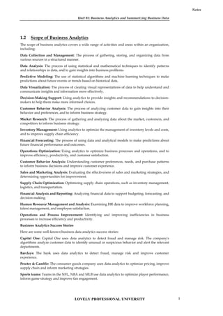
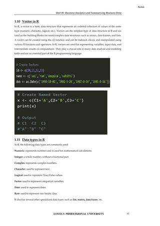
![Unit 01: Business Analytics and Summarizing Business Data
Notes
2. The R language is a dialect of which of the following programming languages?
A. SAS
B. MATLAB
C. C
D. S
3. Which is the R command for obtaining 1000 random numbers through normal distribution
with mean 0 and variance 1?
A. norm(1000, 0, 1)
B. rnorm(0, 1, 1000)
C. rnorm(1000, 0, 1)
D. qnorm(0, 1, 1000)
4. For the population y<-c(1,2,3,4,5), write the R command to find the mean?
A. mean{y}
B. means(y)
C. mean(y)
D. mean[y]
5. It is an encompassing and multidimensional field that uses mathematics, statistics,
predictive modeling and machine learning techniques to find meaningful patterns and
knowledge in recorded data.
A. Big Data
B. Analytics
C. Normal Data
D. Analytics Process
6. It is a term applied to a dataset that exceeds the processing capacity of conventional
database systems, or it doesn’t fit the structural requirements of traditional database
architecture.
A. Big Data
B. Business Analytics
C. Analytics
D. Normal Data
7. The first step in the process is _____________. Data relevant to the applicant is collected. The
quality, quantity, validity, and nature of data directly impact the analytical outcome. A
thorough understanding of the data on hand is extremely critical.
A. Results
B. Put Into Use
C. Data Collection
LOVELY PROFESSIONAL UNIVERSITY 15](https://image.slidesharecdn.com/businessanalytics-251007054430-38981bd6/85/Chapter-1-Introduction-to-Business-Analytics-19-320.jpg)
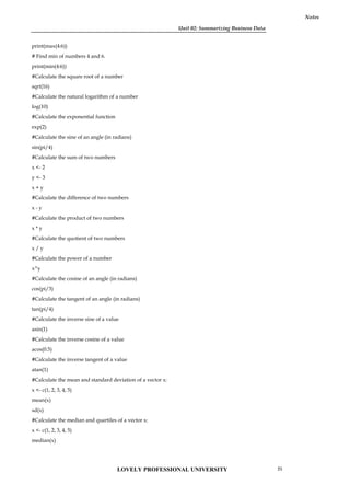
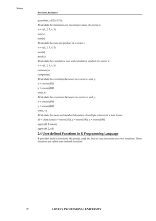
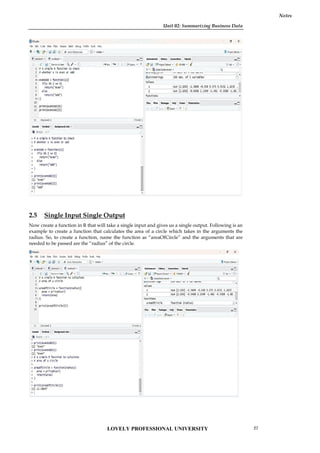
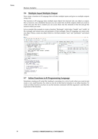
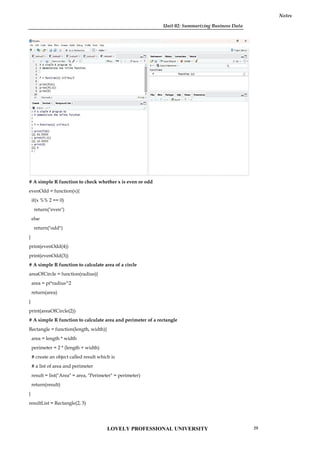
![Business Analytics
Notes
print(resultList["Area"])
print(resultList["Perimeter"])
# A simple R program to demonstrate the inline function
f = function(x) x^2*4+x/3
print(f(4))
print(f(-2))
print(0)
2.8 Functions to Summarize Variables- Select, Filter, Mutate &
Arrange
What is the select() function in R?
The select() function is used to pick specific variables or features of a DataFrame or tibble. It selects
columns based on provided conditions like contains, matches, starts with, ends with, and so on.
Syntax
select(.data,….)
Example
iris <- as_tibble(iris) # so it prints a little nicer
select(iris, starts_with("Petal"))
select(iris, ends_with("Width"))
# Move Species variable to the front
select(iris, Species, everything())
df <- as.data.frame(matrix(runif(100), nrow = 10))
df <- tbl_df(df[c(3, 4, 7, 1, 9, 8, 5, 2, 6, 10)])
select(df, V4:V6)
select(df, num_range("V", 4:6))
# Drop variables with -
select(iris, -starts_with("Petal"))
# The .data pronoun is available:
select(mtcars, .data$cyl)
select(mtcars, .data$mpg : .data$disp)
What is the filter() function in R?
The filter() function is used to produce a subset of the data frame, retaining all rows that satisfy the
specified conditions. The filter() method in R programming language can be applied to both
grouped and ungrouped data. The expressions include comparison operators (==, >, >= ) , logical
operators (&, |, !, xor()) , range operators (between(), near()) as well as NA value check against the
column values. The subset data frame has to be retained in a separate variable.
Example : R program to filter rows using filter() function
library(dplyr)
# sample data
df=data.frame(x=c(12,31,4,66,78),
y=c(22.1,44.5,6.1,43.1,99),
z=c(TRUE,TRUE,FALSE,TRUE,TRUE))
LOVELY PROFESSIONAL UNIVERSITY
30](https://image.slidesharecdn.com/businessanalytics-251007054430-38981bd6/85/Chapter-1-Introduction-to-Business-Analytics-34-320.jpg)
![Unit 02: Summarizing Business Data
Notes
# condition
filter(df, x<50 & z==TRUE)
Output:
x y z
1 12 22.1 TRUE
2 31 44.5 TRUE
# create a vector of numbers
x <- c(1, 2, 3, 4, 5, 6)
# filter elements that are greater than 3
result <- filter(x, x > 3)
# print the filtered result
print(result)
# Output:
# [1] 4 5 6
In this example, the filter() function is applied to the vector x with the condition x > 3, which
returns a new vector containing only the elements of x that are greater than 3.
# Creating a vector of numbers
numbers <- c(1, 2, 3, 4, 5, 6, 7, 8, 9, 10)
# Using filter function to extract only even numbers
even_numbers <- filter(numbers, function(x) x %% 2 == 0)
# Printing the filtered numbers
even_numbers
#Output
[1] 2 4 6 8 10
filter(starwars, species == "Human")
filter(starwars, mass > 1000)
# Multiple criteria
filter(starwars, hair_color == "none" & eye_color == "black")
filter(starwars, hair_color == "none" | eye_color == "black")
# Multiple arguments are equivalent to and
filter(starwars, hair_color == "none", eye_color == "black")
# Load library dplyr
library(dplyr)
# Load iris dataset
data(iris)
# Select only Sepal.Length and Species columns
iris_select <- iris %>% select(Sepal.Length, Species)
# View the first 6 rows
head(iris_select)
# Load library dplyr
library(dplyr)
LOVELY PROFESSIONAL UNIVERSITY 31](https://image.slidesharecdn.com/businessanalytics-251007054430-38981bd6/85/Chapter-1-Introduction-to-Business-Analytics-35-320.jpg)
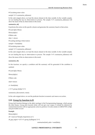
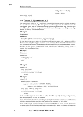
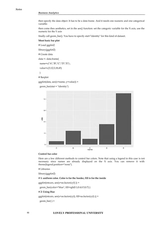
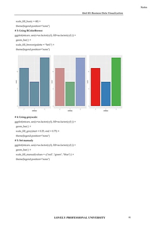
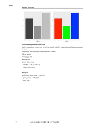
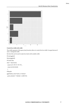
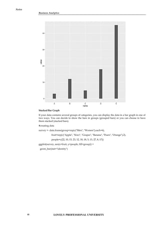
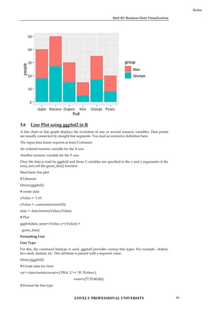
![Business Analytics
Notes
ggplot(data=val, aes(x=course, y=num, group=1)) +
geom_line(linetype = "dotted")+
geom_point()
Line Color
The command color is used and the desired color is written in double quotes [” “] inside geom_line(
).
library(ggplot2)
# Create data for chart
val <-data.frame(course=c('DSA','C++','R','Python'),
num=c(77,55,80,60))
# Format the line color
ggplot(data=val, aes(x=course, y=num, group=1)) +
geom_line(color="green")+
geom_point()
Business Analytics
Notes
ggplot(data=val, aes(x=course, y=num, group=1)) +
geom_line(linetype = "dotted")+
geom_point()
Line Color
The command color is used and the desired color is written in double quotes [” “] inside geom_line(
).
library(ggplot2)
# Create data for chart
val <-data.frame(course=c('DSA','C++','R','Python'),
num=c(77,55,80,60))
# Format the line color
ggplot(data=val, aes(x=course, y=num, group=1)) +
geom_line(color="green")+
geom_point()
LOVELY PROFESSIONAL UNIVERSITY
50](https://image.slidesharecdn.com/businessanalytics-251007054430-38981bd6/85/Chapter-1-Introduction-to-Business-Analytics-54-320.jpg)
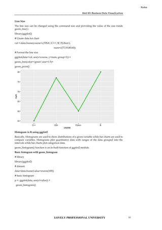
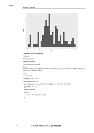
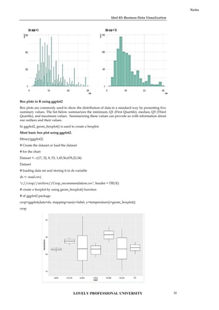
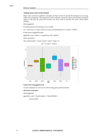
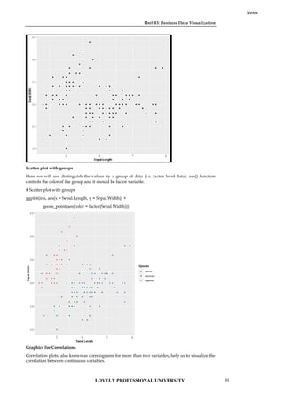
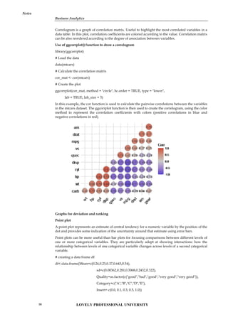
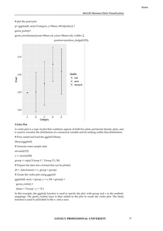
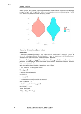
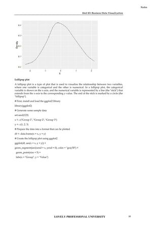
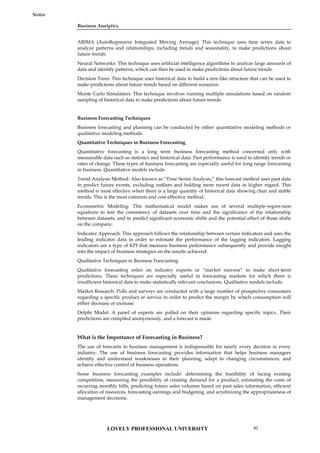
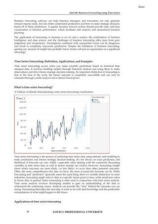
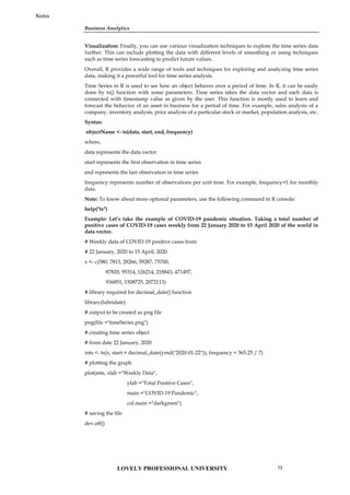
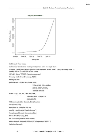
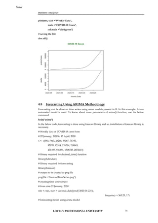
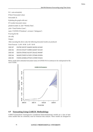
![Unit 04: Business Forecasting using Time Series
Notes
*---------------------------------*
Conditional Variance Dynamics
-----------------------------------
GARCH Model : sGARCH(1,1)
Mean Model : ARFIMA(0,0,0)
Distribution : norm
Optimal Parameters
------------------------------------
Estimate Std. Error t value Pr(>|t|)
mu 27.60041 0.042660 647.008 0.00000
omega 0.06801 0.003504 19.419 0.00000
alpha1 0.10222 0.010072 10.153 0.00000
beta1 0.88577 0.006254 141.543 0.00000
Robust Standard Errors:
Estimate Std. Error t value Pr(>|t|)
mu 27.60041 0.031563 874.836 0.00000
omega 0.06801 0.004074 16.691 0.00000
alpha1 0.10222 0.010039 10.183 0.00000
beta1 0.88577 0.008246 107.388 0.00000
LogLikelihood : 2321.214
Information Criteria
------------------------------------
Akaike -13.979
Bayes -13.952
Shibata -13.979
Hannan-Quinn -13.969
Weighted Ljung-Box Test on Standardized Residuals
------------------------------------
statistic p-value
Lag[1] 0.525 0.468736
Lag[2*(p+q)+(p+q)-1][4] 1.705 0.074600
Lag[4*(p+q)+(p+q)-1][8] 2.396 0.001582
d.o.f=0
H0 : No serial correlation
Weighted Ljung-Box Test on Standardized Squared Residuals
------------------------------------
statistic p-value
Lag[1] 0.007 0.933987
Lag[2*(p+q)+(p+q)-1][4] 2.710 0.244550
LOVELY PROFESSIONAL UNIVERSITY
78](https://image.slidesharecdn.com/businessanalytics-251007054430-38981bd6/85/Chapter-1-Introduction-to-Business-Analytics-82-320.jpg)
![Business Analytics
Notes
Lag[4*(p+q)+(p+q)-1][8] 4.084 0.193941
d.o.f=2
Weighted ARCH LM Tests
------------------------------------
Statistic Shape Scale P-Value
ARCH Lag[3] 0.1691 0.500 2.000 0.6806
ARCH Lag[5] 0.2474 1.440 1.667 0.9982
ARCH Lag[7] 0.8799 2.315 1.543 1.0000
Nyblom stability test
------------------------------------
Joint Statistic: 1.4489
Individual Statistics:
mu 0.3925
omega 0.0495
alpha1 0.6311
beta1 0.3752
Asymptotic Critical Values (10% 5% 1%)
Joint Statistic: 1.58 1.88 2.54
4.10 Forecasting Using VAR Methodology
VAR (Vector Autoregression) is a statistical methodology for time series analysis that allows for
modeling the interdependencies between multiple time series variables. Here are the key steps
involved in using VAR for time series analysis:
Data preparation: Make sure your data is in a time series format with a consistent frequency. You
should also make sure your data is stationary by checking for trends, seasonality, and non-
stationary behavior.
Model specification: Specify the number of lags (p) that you want to include in the model and
whether you want to include a constant term. You can also specify different types of VAR models,
such as VARX (VAR with exogenous variables) or VEC (Vector Error Correction).
Estimation: Estimate the parameters of the VAR model using techniques such as OLS (Ordinary
Least Squares) or maximum likelihood estimation.
Diagnostics: Conduct diagnostic tests to evaluate the goodness of fit of the model, such as residual
diagnostics, serial correlation tests, and ARCH tests.
Forecasting: Use the estimated VAR model to generate forecasts for future time periods.
There are different software packages and programming languages that can be used to implement
VAR methodologies for time series analysis, such as R, Python, MATLAB, and EViews. Each of
these tools has their own syntax and functions for implementing VAR models, so it's important to
consult the relevant documentation for the software you are using.
Example
Load the necessary libraries:
library(vars)
library(tidyverse)
Prepare your data:
For this example, we will use the built-in R dataset "economics", which contains monthly U.S.
economic time series data from 1967 to 2015. We will use the variables "unemploy" (unemployment
rate) and "pop" (total population).
LOVELY PROFESSIONAL UNIVERSITY 79](https://image.slidesharecdn.com/businessanalytics-251007054430-38981bd6/85/Chapter-1-Introduction-to-Business-Analytics-83-320.jpg)
![Unit 04: Business Forecasting using Time Series
Notes
data("economics")
data_ts <- ts(economics[, c("unemploy", "pop")], start = c(1967, 1), frequency = 12)
Before estimating the VAR model, let's plot the data to visualize any trends or seasonality.
autoplot(data_ts) +
labs(title = "Unemployment Rate and Total Population in the US",
x = "Year",
y = "Value")
plot
From the plot, we can see that both variables have a clear upward trend, so we will need to take
first differences to make them stationary.
data_ts_diff <- diff(data_ts)
Now that our data is stationary, we can proceed to estimate the VAR model.
Estimate the VAR model:
We will estimate a VAR model with 2 lags and a constant term using the VAR() function from the
vars library.
var_model <- VAR(data_ts_diff, p = 2, type = "const")
We can use the summary() function to view a summary of the estimated VAR model.
summary(var_model)
The output will show the estimated coefficients, standard errors, t-values, and p-values for each lag
of each variable in the VAR model.
Evaluate the VAR model:
To evaluate the VAR model, we can perform a serial correlation test and an ARCH test using the
serial.test() and arch.test() functions from the vars library, respectively.
serial.test(var_model)
arch.test(var_model)
If the p-value of the serial correlation test is less than 0.05, it indicates the presence of serial
correlation in the residuals, which violates the assumptions of the VAR model. Similarly, if the p-
value of the ARCH test is less than 0.05, it indicates the presence of conditional heteroskedasticity
in the residuals.
Forecast using the VAR model:
To forecast future values of the variables, we can use the predict() function from the vars library.
var_forecast <- predict(var_model, n.ahead = 12)
This will generate a forecast for the next 12 months, based on the estimated VAR model. We can
visualize the forecast using the autoplot() function from the ggfortify library.Copy code
autoplot(var_forecast) +
labs(title = "Forecast of Unemployment Rate and Total Population in the US",
x = "Year",
y = "Value")
plot
This plot shows the forecasted values for the next 12 months for both variables in the VAR model.
We can see that the unemployment rate is expected to decrease slightly over the next year, while
the total population is expected to continue increasing.
LOVELY PROFESSIONAL UNIVERSITY
80](https://image.slidesharecdn.com/businessanalytics-251007054430-38981bd6/85/Chapter-1-Introduction-to-Business-Analytics-84-320.jpg)
![Unit 05: Business Prediction Using Generalised Linear Models
Notes
accuracy <- mean(preds == mtcars$am)
In this example, we are using the entire dataset for both training and testing purposes. However,
it's important to note that this is not best practice, and we should split the data into training and
testing sets to avoid overfitting.
Overall, logistic regression is a useful technique for modeling binary response variables in R, and
the built-in "glm()" function makes it easy to specify and fit models. By following the steps of data
preparation, model specification, model fitting, model evaluation, and model improvement, we can
build a model that accurately captures the relationship between the response variable and the
predictor variables and can be used for prediction or inference.
5.5 Statistical Inferences of GLM
Suppose we have a dataset containing information on the age and income of individuals, as well as
whether or not they own a car (a binary variable). We want to model the relationship between car
ownership and age and income using a logistic regression model.
Model Specification and Fitting: First, we need to specify and fit the logistic regression model
using the glm function in R:
car_model<- glm(own_car ~ age + income, data = car_data, family = "binomial")
In this code, "own_car" is the response variable (binary variable indicating whether or not the
individual owns a car), and "age" and "income" are the predictor variables. The family argument
specifies the type of GLM to be fitted, in this case a binomial family for binary data.
Hypothesis Testing: We can test the significance of the predictor variables by performing
hypothesis tests on their coefficients. For example, to test the hypothesis that the coefficient for
"age" is zero, we can use the t.test function in R:
t.test(car_model$coefficients[2], alternative = "two.sided", mu = 0, conf.level = 0.95)
This code will perform a two-sided t-test with a null hypothesis that the coefficient for "age" is zero,
and an alternative hypothesis that it is not zero. The conf.level argument specifies a 95% confidence
interval.
Confidence Intervals: We can calculate confidence intervals for the model parameters using the
confint function in R:
confint(car_model, level = 0.95)
This code will output a table of confidence intervals for each of the model parameters with a 95%
confidence level.
Goodness-of-Fit Tests: We can perform goodness-of-fit tests to assess how well the model fits the
data. For example, to perform a deviance goodness-of-fit test, we can use the following code:
pchisq(deviance(car_model), df = df.residual(car_model), lower.tail = FALSE)
This code calculates the p-value for the deviance goodness-of-fit test using the chi-square
distribution. If the p-value is less than the significance level (e.g., 0.05), we can reject the null
hypothesis that the model fits the data well.
Residual Analysis: We can analyze the residuals to assess the appropriateness of the model. For
example, we can plot the residuals against the predicted values using the plot function in R:
plot(car_model, which = 1)
This code will plot the residuals against the predicted values. We can examine the plot to look for
any patterns or trends in the residuals that might indicate that the model is not capturing all the
important features of the data.
Overall, performing statistical inferences on a GLM involves testing the significance of predictor
variables, calculating confidence intervals for model parameters, performing goodness-of-fit tests,
and analyzing residuals. These inferences help us assess the validity of the model and draw valid
conclusions from the model.
LOVELY PROFESSIONAL UNIVERSITY 91](https://image.slidesharecdn.com/businessanalytics-251007054430-38981bd6/85/Chapter-1-Introduction-to-Business-Analytics-95-320.jpg)
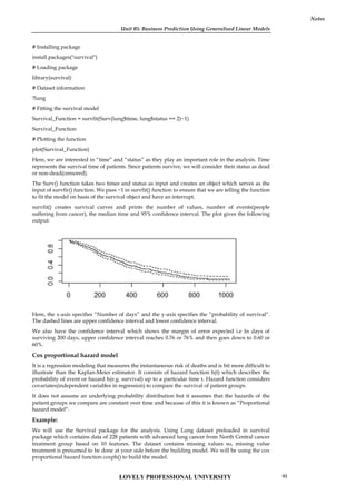
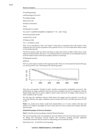
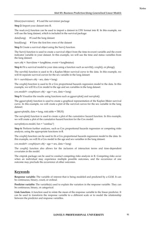
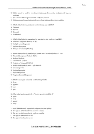
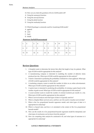
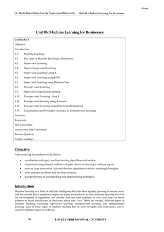
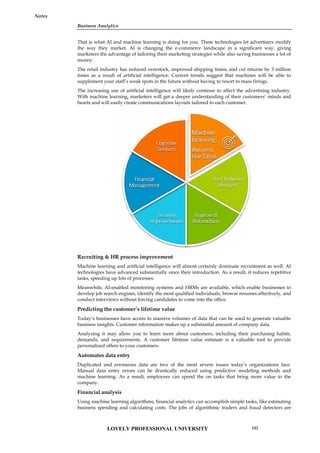
![Unit 06: Machine Learning for Businesses
Notes
xgboost: A package for building gradient boosting models, which are a type of ensemble learning
method.
keras: A package for building deep learning models using the Keras API.
nnet: A package for building neural network models using the backpropagation algorithm.
ranger: A package for building random forest models that are optimized for speed and memory
efficiency.
gbm: A package for building gradient boosting models, which are a type of ensemble learning
method.
rpart: A package for building decision trees, which are a type of classification and regression tree
method.
These are just a few of the many packages available in R for supervised learning. The choice of
package will depend on the specific problem being solved and the characteristics of the data.
6.6 Supervised Learning using KNN
K-Nearest Neighbors (KNN) is a popular supervised learning algorithm used for classification and
regression problems. In KNN, the model predicts the target variable of a data point by finding the
K nearest data points in the training set and taking the majority vote of their class labels (in
classification) or their average value (in regression).
Example-1
In R, there are many built-in datasets that can be used to demonstrate the use of KNN for
supervised learning. One such dataset is the "iris" dataset, which contains measurements of the
sepal length, sepal width, petal length, and petal width of three different species of iris flowers.
Here's an example of how to use the "iris" dataset for KNN supervised learning in R:
# Load the "iris" dataset
data(iris)
# Split the data into training and testing sets
library(caret)
set.seed(123)
trainIndex <- createDataPartition(iris$Species, p = 0.8, list = FALSE)
trainData <- iris[trainIndex, ]
testData <- iris[-trainIndex, ]
# Preprocess the data by normalizing the features
preprocess <- preProcess(trainData[,1:4], method = c("center", "scale"))
trainData[,1:4] <- predict(preprocess, trainData[,1:4])
testData[,1:4] <- predict(preprocess, testData[,1:4])
# Train the KNN model with K=3 and Euclidean distance metric
library(class)
predicted <- knn(trainData[,1:4], testData[,1:4], trainData$Species, k = 3, metric = "Euclidean")
# Evaluate the model's accuracy
library(caret)
confusionMatrix(predicted, testData$Species)
In this example, we first load the "iris" dataset and split it into training and testing sets using the
createDataPartition() function from the caret package. We then preprocess the data by normalizing
the features using the preProcess() function from the same package.
LOVELY PROFESSIONAL UNIVERSITY
106](https://image.slidesharecdn.com/businessanalytics-251007054430-38981bd6/85/Chapter-1-Introduction-to-Business-Analytics-110-320.jpg)
![Unit 06: Machine Learning for Businesses
Notes
In Decision Tree, the tree structure is built based on information gain or entropy reduction, which
measures the reduction in uncertainty about the target variable that results from splitting the data
using a particular attribute. The attribute with the highest information gain is chosen as the
splitting criterion at each node.
The algorithm continues to split the data into subsets until a stopping criterion is met, such as
reaching a maximum tree depth, a minimum number of samples in a leaf node, or when all the
samples in a node belong to the same class.
Once the tree is built, it can be used to make predictions by traversing the tree from the root node
down to a leaf node that corresponds to the predicted class. The class of a new sample is
determined by following the path from the root node to the leaf node that the sample falls into.
To implement Decision Tree in R, we can use the "rpart" package, which provides the "rpart()"
function to build a Decision Tree model. The package also provides functions for visualizing the
tree structure and making predictions on new data.
Example-1
Let's demonstrate how to use the "rpart" package to build a Decision Tree model using an inbuilt
dataset in R. We will use the "iris" dataset, which contains measurements of the sepal length, sepal
width, petal length, and petal width of three different species of iris flowers.
Here is an example code that builds a Decision Tree model on the "iris" dataset:
library(rpart)
data(iris)
# Split the dataset into training and testing sets
set.seed(123)
ind <- sample(2, nrow(iris), replace = TRUE, prob = c(0.7, 0.3))
trainData <- iris[ind == 1, ]
testData <- iris[ind == 2, ]
# Build the Decision Tree model
model <- rpart(Species ~ ., data = trainData, method = "class")
# Visualize the Decision Tree
plot(model)
text(model)
# Make predictions on the testing set
predicted <- predict(model, testData, type = "class")
# Evaluate the model performance
confusionMatrix(predicted, testData$Species)
In the code above, we first load the "rpart" package and the "iris" dataset. We then split the dataset
into a training set and a testing set, with a 70-30 split.
Next, we build the Decision Tree model using the "rpart()" function, where we specify the target
variable "Species" and the other variables as the predictors using the formula notation "Species ~ .".
We also specify the method as "class" to indicate that this is a classification problem.
After building the model, we can visualize the Decision Tree using the "plot()" and "text()"
functions.
We then use the "predict()" function to make predictions on the testing set and specify the type of
prediction as "class" to obtain the predicted class labels.
Finally, we evaluate the performance of the model using the "confusionMatrix()" function from the
"caret" package, which computes the confusion matrix and other metrics such as accuracy,
sensitivity, and specificity.
LOVELY PROFESSIONAL UNIVERSITY
108](https://image.slidesharecdn.com/businessanalytics-251007054430-38981bd6/85/Chapter-1-Introduction-to-Business-Analytics-112-320.jpg)
![Unit 06: Machine Learning for Businesses
Notes
Overall, K-means is a popular clustering algorithm used in unsupervised learning. The process
involves choosing the number of clusters, initializing centroids, assigning data points to clusters,
recalculating centroids, and repeating until convergence. The results can be evaluated by
calculating the WCSS or by visualizing the clusters.
Example-1
# Load the iris dataset
data(iris)
# Select the relevant features
iris_data <- iris[,1:4]
# Scale the data
scaled_data <- scale(iris_data)
# Perform K-means clustering with 3 clusters
kmeans_result <- kmeans(scaled_data, centers = 3)
# Plot the clusters
library(cluster)
clusplot(scaled_data, kmeans_result$cluster, color = TRUE, shade = TRUE, labels = 2, lines = 0)
# Calculate the within-cluster sum of squares
wss <- sum(kmeans_result$withinss)
# Print the WCSS
cat("WCSS:", wss)
In this example, the iris dataset is loaded and the relevant features are selected. The data is then
scaled using the scale function. K-means clustering is performed with 3 clusters using the kmeans
function. The clusters are then visualized using the clusplot function from the cluster package. The
within-cluster sum of squares (WCSS) is calculated using the kmeans_result$withinss variable and
printed using the cat function.
The output of this code will be a plot of the clusters and the WCSS value. The plot will show the
data points colored by their assigned cluster and the WCSS value will indicate the sum of the
squared distances between each data point and its assigned cluster center.
Output
The output of the example code using K-means clustering on the iris dataset in R includes a plot of
the clusters and the within-cluster sum of squares (WCSS) value.
The plot shows the data points colored by their assigned cluster and separated into three clusters.
The clusplot function from the cluster package is used to create the plot. The horizontal axis shows
the first principal component of the data, while the vertical axis shows the second principal
component. The data points are shaded to show the density of the points in each region. The plot
shows that the data points are well-separated into three distinct clusters, each containing data
points that are similar to each other.
The WCSS value is a measure of the goodness of fit of the K-means clustering model. It measures
the sum of the squared distances between each data point and its assigned cluster center. The lower
the WCSS value, the better the model fits the data. In this example, the WCSS value is printed to the
console using the cat function. The WCSS value for this model is 139.82.
Overall, the output of this example demonstrates how to use K-means clustering on the iris dataset
in R. The plot shows the clusters in the data, while the WCSS value indicates the goodness of fit of
the model.
6.12 Unsupervised Learning using Hierarchical Clustering
Hierarchical clustering is another unsupervised learning technique that is used to group similar
data points together based on their distances from each other. The basic idea of hierarchical
LOVELY PROFESSIONAL UNIVERSITY
112](https://image.slidesharecdn.com/businessanalytics-251007054430-38981bd6/85/Chapter-1-Introduction-to-Business-Analytics-116-320.jpg)
![Business Analytics
Notes
clustering is to build a hierarchy of clusters, starting with each data point in its own cluster and
then merging the most similar clusters together until all of the data points are in a single cluster.
Example-1
In R, we can use the hclust function to perform hierarchical clustering on a dataset. Here is an
example of using hierarchical clustering on the iris dataset in R:
# Load the iris dataset
data(iris)
# Select the relevant features
iris_data <- iris[,1:4]
# Calculate the distance matrix
dist_matrix <- dist(iris_data)
# Perform hierarchical clustering with complete linkage
hc_result <- hclust(dist_matrix, method = "complete")
# Plot the dendrogram
plot(hc_result)
In this example, we first load the iris dataset and select the relevant features. We then calculate the
distance matrix using the dist function. The hclust function is used to perform hierarchical
clustering with complete linkage. The resulting dendrogram is plotted using the plot function.
The output of this code will be a dendrogram that shows the hierarchy of clusters. The dendrogram
shows the data points at the bottom, with lines connecting the clusters that are merged together.
The height of each line indicates the distance between the merged clusters. The dendrogram can be
used to identify the number of clusters in the data based on the distance between the clusters.
Output
The output of the example code using hierarchical clustering on the iris dataset in R is a
dendrogram that shows the hierarchy of clusters.
The dendrogram is a plot that displays the hierarchy of clusters, with the data points at the bottom
and the merged clusters shown as lines that connect the points. The height of each line indicates the
distance between the merged clusters. The dendrogram can be used to determine the optimal
number of clusters in the data based on the distance between the clusters.
In this example, we used the hclust function to perform hierarchical clustering with complete
linkage on the iris dataset. The resulting dendrogram shows that there are three main clusters of
data points in the dataset, which is consistent with the known number of classes in the iris dataset.
By analyzing the dendrogram, we can see that the first split in the data occurs between the setosa
species and the other two species. The second split separates the remaining two species, versicolor
and virginica. The dendrogram can also be used to identify the distance between clusters, which
can be useful for determining the optimal number of clusters to use for further analysis.
Overall, the output of this example demonstrates how to use hierarchical clustering to analyze a
dataset in R and visualize the results using a dendrogram.
6.13 Classification and Prediction Accuracy in Unsupervised Learning
Classification and prediction accuracy are not typically used as metrics to evaluate the performance
of unsupervised learning algorithms. This is because unsupervised learning is not focused on
making predictions or classifying new data points based on their features, but rather on finding
underlying patterns and relationships within the data itself.
In unsupervised learning, we don't have labeled data to compare the results of the algorithm to, so
we cannot measure accuracy in the traditional sense. Instead, we use other metrics such as within-
cluster sum of squares (WCSS) and silhouette score to evaluate the quality of the clusters formed by
the algorithm.
LOVELY PROFESSIONAL UNIVERSITY 113](https://image.slidesharecdn.com/businessanalytics-251007054430-38981bd6/85/Chapter-1-Introduction-to-Business-Analytics-117-320.jpg)
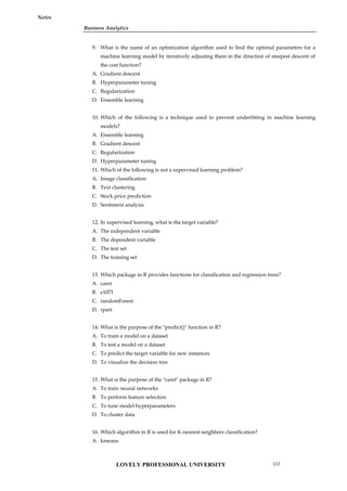
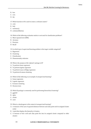
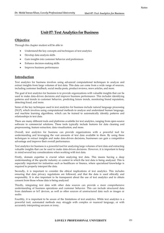
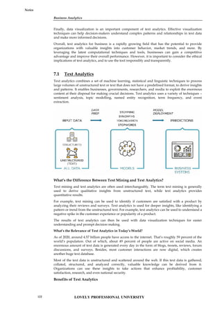
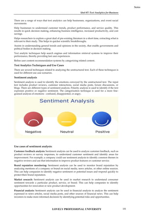
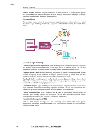
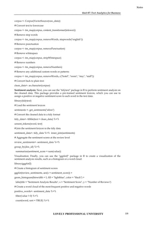
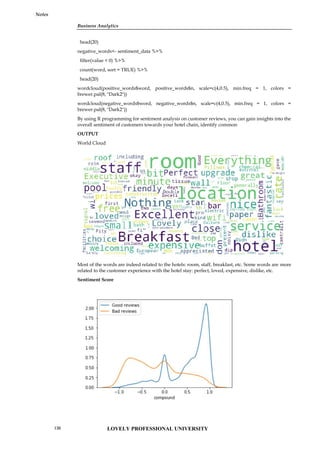
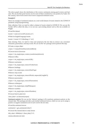
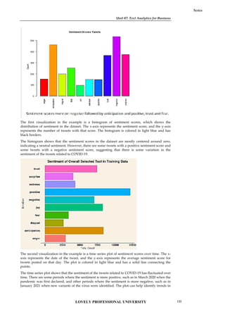
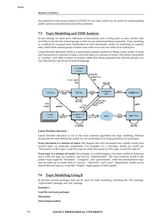
![Unit 07: Text Analytics for Business
Notes
Loading data and text preprocessing
# load data
textdata<- base::readRDS(url("https://slcladal.github.io/data/sotu_paragraphs.rda", "rb"))
# load stopwords
english_stopwords<- readLines("https://slcladal.github.io/resources/stopwords_en.txt", encoding
= "UTF-8")
# create corpus object
corpus <- Corpus(DataframeSource(textdata))
# Preprocessing chain
processedCorpus<- tm_map(corpus, content_transformer(tolower))
processedCorpus<- tm_map(processedCorpus, removeWords, english_stopwords)
processedCorpus<- tm_map(processedCorpus, removePunctuation, preserve_intra_word_dashes =
TRUE)
processedCorpus<- tm_map(processedCorpus, removeNumbers)
processedCorpus<- tm_map(processedCorpus, stemDocument, language = "en")
processedCorpus<- tm_map(processedCorpus, stripWhitespace)
Convert the text data into a document-term matrix
dtm<- DocumentTermMatrix(corpus)
Perform topic modeling using the LDA algorithm
lda_model<- LDA(dtm, k = 5, method = "Gibbs", control = list(seed = 1234))
In the above code, we specified k=5 to indicate that we want to extract 5 topics from the text data.
We also set the seed value to ensure reproducibility.
Print the top words in each topic
terms <- terms(lda_model, 10)
for (i in 1:5) {
cat(paste("Topic", i, ": ", sep = ""))
print(terms[, i])
}
This will print the top 10 words in each topic.
There are many other options and variations available for topic modeling in R, but this should
provide a basic introduction to the process.
OUTPUT
Unit 07: Text Analytics for Business
Notes
Loading data and text preprocessing
# load data
textdata<- base::readRDS(url("https://slcladal.github.io/data/sotu_paragraphs.rda", "rb"))
# load stopwords
english_stopwords<- readLines("https://slcladal.github.io/resources/stopwords_en.txt", encoding
= "UTF-8")
# create corpus object
corpus <- Corpus(DataframeSource(textdata))
# Preprocessing chain
processedCorpus<- tm_map(corpus, content_transformer(tolower))
processedCorpus<- tm_map(processedCorpus, removeWords, english_stopwords)
processedCorpus<- tm_map(processedCorpus, removePunctuation, preserve_intra_word_dashes =
TRUE)
processedCorpus<- tm_map(processedCorpus, removeNumbers)
processedCorpus<- tm_map(processedCorpus, stemDocument, language = "en")
processedCorpus<- tm_map(processedCorpus, stripWhitespace)
Convert the text data into a document-term matrix
dtm<- DocumentTermMatrix(corpus)
Perform topic modeling using the LDA algorithm
lda_model<- LDA(dtm, k = 5, method = "Gibbs", control = list(seed = 1234))
In the above code, we specified k=5 to indicate that we want to extract 5 topics from the text data.
We also set the seed value to ensure reproducibility.
Print the top words in each topic
terms <- terms(lda_model, 10)
for (i in 1:5) {
cat(paste("Topic", i, ": ", sep = ""))
print(terms[, i])
}
This will print the top 10 words in each topic.
There are many other options and variations available for topic modeling in R, but this should
provide a basic introduction to the process.
OUTPUT
LOVELY PROFESSIONAL UNIVERSITY 135](https://image.slidesharecdn.com/businessanalytics-251007054430-38981bd6/85/Chapter-1-Introduction-to-Business-Analytics-139-320.jpg)
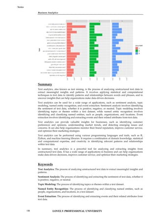


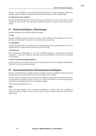
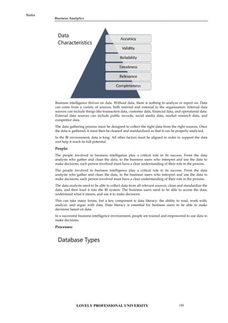

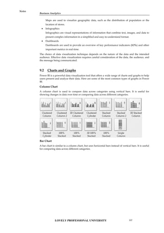
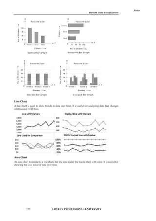
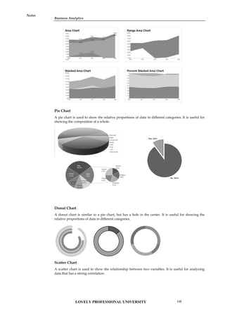
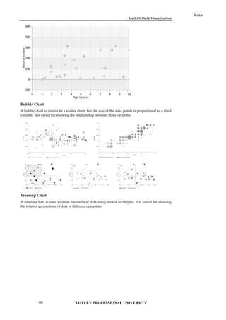
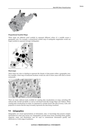
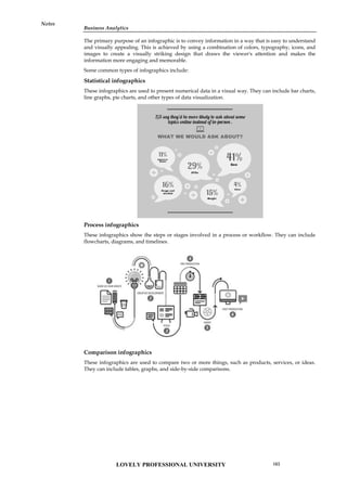
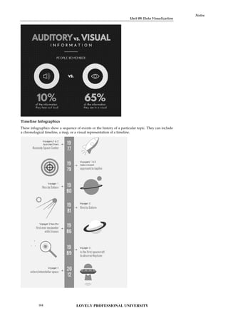
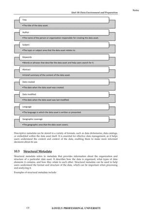
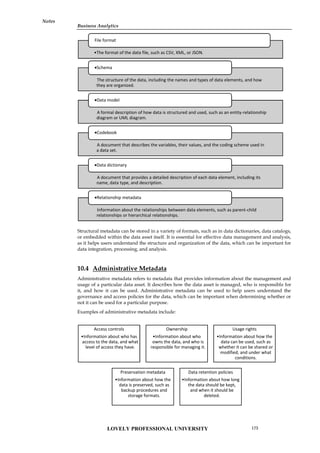
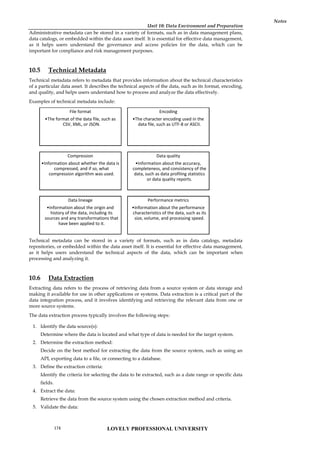
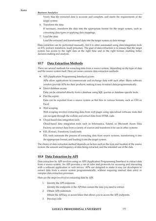
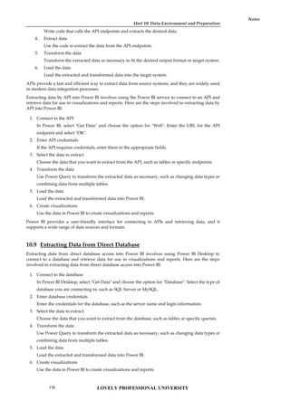

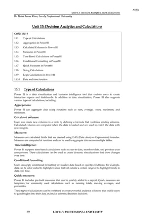
![Unit 13: Decision Analytics and Calculations
Notes
Aggregation is an important feature in Power BI that allows users to gain insights into their data
quickly and efficiently. It enables users to identify patterns, trends, and relationships that may not
be immediately apparent in the raw data.
13.3 Calculated Columns in Power BI
Calculated columns in Power BI are columns that are created by defining a formula that combines
values from other columns in a table. The formula used in a calculated column is similar to the
formula used in Excel, and it is written using the DAX (Data Analysis Expressions) language. The
result of the formula is computed for each row in the table and is stored in the calculated column.
Calculated columns can be used to enrich the data in a table with new insights. For example, a
calculated column can be used to compute a discount rate based on the quantity of items sold, or it
can be used to categorize data based on a specific condition. Once a calculated column is created, it
becomes a permanent part of the table, and it can be used in any visual or calculation in the report.
Example:
Here's an example of a DAX formula for a calculated column that computes the total cost of an
order:
TotalCost = [Quantity] * [UnitPrice]
In this formula, [Quantity] and [UnitPrice] are columns in the table. The formula multiplies the
quantity of items sold by the unit price to compute the total cost of the order. Once this calculated
column is created, it can be used in any calculation or visual in the report.
To create a calculated column in Power BI, follow these steps:
13.4 Measures in PowerBI
Power BI is a data visualization tool that provides a variety of measures that can be used to
calculate, aggregate, and analyze data. Measures are calculations that are created based on the data
in your dataset. They allow you to summarize and analyze your data in different ways.
Here are some common measures in Power BI:
Select the table in which you want to create the calculated
column.
Click on the "Modeling" tab in the ribbon at the top.
Click on "New Column" in the "Calculations" group.
Enter a name for the calculated column.
Enter a DAX formula that defines the calculation for the
column.
Press Enter to create the calculated column.
Unit 13: Decision Analytics and Calculations
Notes
Aggregation is an important feature in Power BI that allows users to gain insights into their data
quickly and efficiently. It enables users to identify patterns, trends, and relationships that may not
be immediately apparent in the raw data.
13.3 Calculated Columns in Power BI
Calculated columns in Power BI are columns that are created by defining a formula that combines
values from other columns in a table. The formula used in a calculated column is similar to the
formula used in Excel, and it is written using the DAX (Data Analysis Expressions) language. The
result of the formula is computed for each row in the table and is stored in the calculated column.
Calculated columns can be used to enrich the data in a table with new insights. For example, a
calculated column can be used to compute a discount rate based on the quantity of items sold, or it
can be used to categorize data based on a specific condition. Once a calculated column is created, it
becomes a permanent part of the table, and it can be used in any visual or calculation in the report.
Example:
Here's an example of a DAX formula for a calculated column that computes the total cost of an
order:
TotalCost = [Quantity] * [UnitPrice]
In this formula, [Quantity] and [UnitPrice] are columns in the table. The formula multiplies the
quantity of items sold by the unit price to compute the total cost of the order. Once this calculated
column is created, it can be used in any calculation or visual in the report.
To create a calculated column in Power BI, follow these steps:
13.4 Measures in PowerBI
Power BI is a data visualization tool that provides a variety of measures that can be used to
calculate, aggregate, and analyze data. Measures are calculations that are created based on the data
in your dataset. They allow you to summarize and analyze your data in different ways.
Here are some common measures in Power BI:
LOVELY PROFESSIONAL UNIVERSITY
206](https://image.slidesharecdn.com/businessanalytics-251007054430-38981bd6/85/Chapter-1-Introduction-to-Business-Analytics-210-320.jpg)
![Business Analytics
Notes
How to create measures in PowerBI
To create a measure in Power BI, you can use the following steps:
Example:
Here's an example of a simple DAX formula that calculates the sum of a column of numbers:
Total Sales = SUM(Sales[Amount])
calculates the sum of a column of numbers.
Sum
calculates the average of a column of numbers.
Average
counts the number of rows in a table or column.
Count
counts the number of distinct values in a column.
Distinct Count
finds the smallest value in a column.
Minimum
finds the largest value in a column.
Maximum
finds the median value in a column.
Median
finds the value at a specified percentile in a column.
Percentile
calculates the variance of a column of numbers.
Variance
calculates the standard deviation of a column of numbers
Standard Deviation
1. Open your Power BI Desktop
file and navigate to the "Fields"
pane on the right-hand side of the
screen.
2. Select the table that you want to create a measure
for by clicking on the arrow next to the table name.
3. Click on the "New Measure"
button on the "Modeling" tab of
the ribbon menu.
4. In the "Formula Bar" that appears
at the top of the screen, enter a name
for your measure and start typing
your DAX formula.
5. As you type your formula, Power BI will
provide suggestions and auto-complete options
for you to choose from. Use these suggestions to
help you create your formula.
6. Once you have finished
your formula, press the
Enter key to create your
measure.
Your measure will now appear in the "Fields"
pane under the table that you created it for.
LOVELY PROFESSIONAL UNIVERSITY 207](https://image.slidesharecdn.com/businessanalytics-251007054430-38981bd6/85/Chapter-1-Introduction-to-Business-Analytics-211-320.jpg)
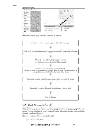
![Unit 13: Decision Analytics and Calculations
Notes
Select the "Quick Measures" option from the "Fields" pane.
Choose the calculation you want to create from the list of available options.
Enter the required fields for your calculation, such as the data field, aggregation, and any
filters.
Click "OK" to create the Quick Measure.
Once you have created a Quick Measure, you can use it like any other measure in Power BI.
You can add it to charts, tables, and other visuals, and you can also modify it or delete it if
necessary.
Quick Measures are a great way to speed up your report development in Power BI and reduce the
time you spend writing complex DAX expressions.
13.8 String Calculations
Power BI provides various built-in functions to perform string calculations on text data.
Function Description
COMBINEVALUES Joins two or more text strings into one text string.
COMBINEVALUES(<delimiter>, <expression>,
<expression>[, <expression>]…)
CONCATENATE Joins two text strings into one text string.
CONCATENATE(<text1>, <text2>)
CONCATENATEX Concatenates the result of an expression evaluated for each
row in a table.
CONCATENATEX(<table>, <expression>[, <delimiter> [,
<orderBy_expression> [, <order>]]...])
EXACT Compares two text strings and returns TRUE if they are
exactly the same, FALSE otherwise.
EXACT(<text1>,<text2>)
FIND Returns the starting position of one text string within
another text string.
FIND(<find_text>, <within_text>[, [<start_num>][,
<NotFoundValue>]])
FIXED Rounds a number to the specified number of decimals and
returns the result as text.
FIXED(<number>, <decimals>, <no_commas>)
Unit 13: Decision Analytics and Calculations
Notes
Select the "Quick Measures" option from the "Fields" pane.
Choose the calculation you want to create from the list of available options.
Enter the required fields for your calculation, such as the data field, aggregation, and any
filters.
Click "OK" to create the Quick Measure.
Once you have created a Quick Measure, you can use it like any other measure in Power BI.
You can add it to charts, tables, and other visuals, and you can also modify it or delete it if
necessary.
Quick Measures are a great way to speed up your report development in Power BI and reduce the
time you spend writing complex DAX expressions.
13.8 String Calculations
Power BI provides various built-in functions to perform string calculations on text data.
Function Description
COMBINEVALUES Joins two or more text strings into one text string.
COMBINEVALUES(<delimiter>, <expression>,
<expression>[, <expression>]…)
CONCATENATE Joins two text strings into one text string.
CONCATENATE(<text1>, <text2>)
CONCATENATEX Concatenates the result of an expression evaluated for each
row in a table.
CONCATENATEX(<table>, <expression>[, <delimiter> [,
<orderBy_expression> [, <order>]]...])
EXACT Compares two text strings and returns TRUE if they are
exactly the same, FALSE otherwise.
EXACT(<text1>,<text2>)
FIND Returns the starting position of one text string within
another text string.
FIND(<find_text>, <within_text>[, [<start_num>][,
<NotFoundValue>]])
FIXED Rounds a number to the specified number of decimals and
returns the result as text.
FIXED(<number>, <decimals>, <no_commas>)
LOVELY PROFESSIONAL UNIVERSITY
210](https://image.slidesharecdn.com/businessanalytics-251007054430-38981bd6/85/Chapter-1-Introduction-to-Business-Analytics-214-320.jpg)
![Business Analytics
Notes
FORMAT Converts a value to text according to the specified format.
FORMAT(<value>, <format_string>[, <locale_name>])
Egs:
= FORMAT( dt"2020-12-15T12:30:59", "mm/dd/yyyy", "en-
GB" )
= FORMAT( 12345.67, "Currency")
LEFT Returns the specified number of characters from the start of
a text string.
LEFT(<text>, <num_chars>)
LEN Returns the number of characters in a text string.
LEN(<text>)
LOWER Converts all letters in a text string to lowercase.
LOWER(<text>)
MID Returns a string of characters from the middle of a text
string, given a starting position and length.
MID(<text>, <start_num>, <num_chars>)
REPLACE REPLACE replaces part of a text string, based on the
number of characters you specify, with a different text
string.
REPLACE(<old_text>, <start_num>, <num_chars>,
<new_text>)
REPT Repeats text a given number of times.
REPT(<text>, <num_times>)
RIGHT RIGHT returns the last character or characters in a text
string, based on the number of characters you specify.
RIGHT(<text>, <num_chars>)
SEARCH Returns the number of the character at which a specific
character or text string is first found, reading left to right.
SEARCH(<find_text>, <within_text>[, [<start_num>][,
<NotFoundValue>]])
Eg: SEARCH ( "cycle", 'Reseller'[Reseller], 1, BLANK ()
SUBSTITUTE Replaces existing text with new text in a text string.
SUBSTITUTE(<text>, <old_text>, <new_text>,
<instance_num>)
TRIM Removes all spaces from text except for single spaces
between words.
TRIM(<text>)
UNICHAR Returns the Unicode character referenced by the numeric
value.
UNICHAR(number)
LOVELY PROFESSIONAL UNIVERSITY 211](https://image.slidesharecdn.com/businessanalytics-251007054430-38981bd6/85/Chapter-1-Introduction-to-Business-Analytics-215-320.jpg)
![Unit 13: Decision Analytics and Calculations
Notes
UNICODE Returns the numeric code corresponding to the first
character of the text string.
UNICODE( <Text> )
UPPER Converts a text string to all uppercase letters.
UPPER (<text>)
VALUE Converts a text string that represents a number to a
number.
VALUE(<text>)
13.9 Logic Calculations in PowerBI
Power BI supports logic calculations through the use of DAX (Data Analysis Expressions) formulas.
DAX is a formula language used to create custom calculations in Power BI, Excel, and other
Microsoft products.
To perform logic calculations in Power BI, you can use DAX functions such as IF, SWITCH, AND,
OR, and NOT, among others. These functions allow you to create conditional statements, logical
comparisons, and other calculations based on the values in your data.
Various Logic functions in PowerBI are:
Function Description
AND Checks whether both arguments are TRUE, and returns TRUE if
both arguments are TRUE.
AND(<logical1>,<logical2>)
FALSE Returns the logical value FALSE.
FALSE()
IF Checks a condition, and returns one value when TRUE, otherwise it
returns a second value.
IF(<logical_test>, <value_if_true>[, <value_if_false>])
IFERROR Evaluates an expression and returns a specified value if the
expression returns an error
IFERROR(value, value_if_error)
NOT Changes FALSE to TRUE, or TRUE to FALSE.
NOT(<logical>)
OR Checks whether one of the arguments is TRUE to return TRUE.The
function returns FALSE if both arguments are FALSE.
OR(<logical1>,<logical2>)
SWITCH Evaluates an expression against a list of values and returns one of
multiple possible result expressions.
SWITCH(<expression>, <value>, <result>[, <value>, <result>]…[,
<else>])
TRUE Returns the logical value TRUE.
TRUE()
LOVELY PROFESSIONAL UNIVERSITY
212](https://image.slidesharecdn.com/businessanalytics-251007054430-38981bd6/85/Chapter-1-Introduction-to-Business-Analytics-216-320.jpg)