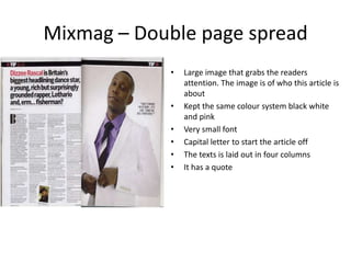
This document provides a case study analysis of the dance and clubbing magazine Mixmag. It examines conventions used on the magazine's cover page, content page, and a double page article spread. These include the use of mastheads, puffs, images, fonts, colors, and column layouts. The document also notes how these conventions from Mixmag could influence the layout and design of the author's own magazine, such as using multiple images and including free promotional items.