Downloaded 81 times


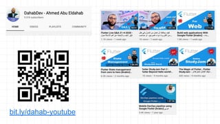


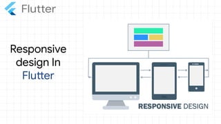
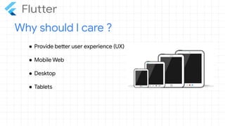
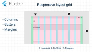
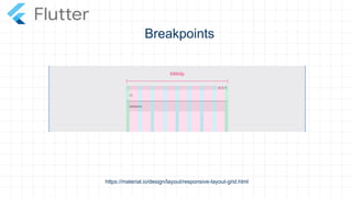
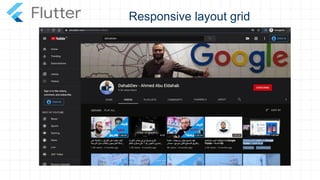
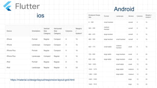
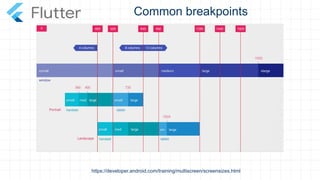
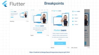

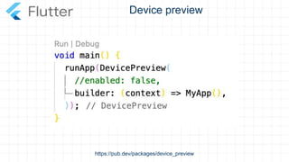
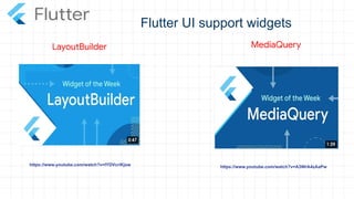
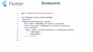
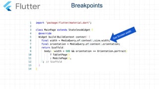
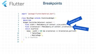
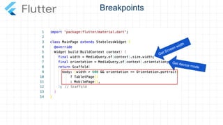
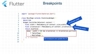
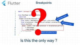
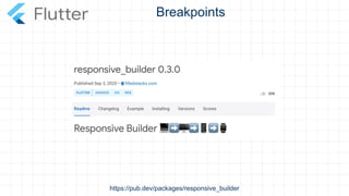
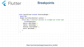
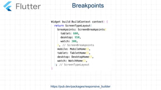

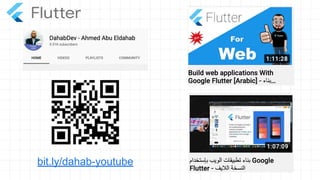
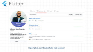
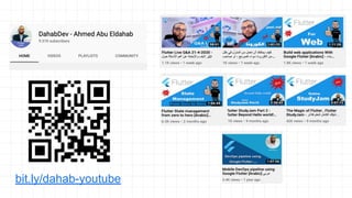


The document discusses responsive design in Flutter applications. It provides information on building responsive layouts that adapt to different screen sizes by using techniques like breakpoints, columns, gutters and margins. It also mentions the ResponsiveBuilder and MediaQuery widgets that can help determine screen width and device mode to update the UI based on breakpoints. The last part encourages attendees to check Ahmed's YouTube channel and GitHub for more resources on building responsive Flutter web applications.

![[Alexandria Devfest] the magic of flutter](https://cdn.slidesharecdn.com/ss_thumbnails/egyptdevfestthemagicofflutter-181114115455-thumbnail.jpg?width=640&height=640&fit=bounds)