This document contains the notes from a presentation on data visualizations given by Brian Suda at Webdagen 2014 in Oslo, Norway. The presentation covered different types of charts and graphs used to visualize data including bar charts, area charts, line charts, scatter plots, maps and more. It discussed best practices for design principles like reducing non-data ink, highlighting changes through attributes like color and position, and improving accessibility. The presentation emphasized using data visualization as a tool rather than just making things look pretty.
MediaEval 2016: An adaptive clustering approach for the diversification of im...Maia Rohm
In this talk, we explore the application of an adaptive clustering approach for the diversification of image retrieval results in the context of the MediaEval 2016 Retrieving Diverse Social Images Task. The proposed approach exploits available textual descriptions, the visual content of the images, and a set of common clustering techniques to select the best combination for each image query individually and in an unsupervised manner.
Targeting Your Audience: Data Visualization to Communicate Data InsightsRandy Krum
Global Big Data Conference presentation Sep 1, 2016 in Santa Clara, CA
No one wants to see your raw data, but they do want to understand the learnings from the data. Once you have made the discoveries hidden in your data, use the power of data visualization to convey actionable insights to your audience. Make your data clear and memorable by showing your target audience what the data means. - See more at: http://globalbigdataconference.com/70/santa-clara/4th-annual-global-big-data-conference/speaker-details/41205/randy--krum.html#sthash.zI6BWbSc.dpuf
Presentation to the NY Data Visualization Meetup Dec 9, 2019
Links from the presentation are all available here: http://www.coolinfographics.com/nycmeetup
Description: Clicking the chart button isn’t enough. Good DataViz Design means going beyond the charting templates and designing visualizations that reveal insights and tell stories to your audience. Data visualizations are used in dashboards, websites, mobile applications, presentations, reports, infographics and more. There are hundreds of ways to visualize data, and once you have chosen an appropriate visualization style for your data, you should customize the design to make sure your audience quickly and easily understands your message. You need your own data visualization toolbox of applications and websites to create different kinds of visualizations, and all of your dataviz designs will benefit from these core principles of Good DataViz Design:
• Communicate a key message
• Avoid false visualizations
• Make your insight memorable with the Picture Superiority Effect
• Use pre-attentive attributes to focus your audience’s attention
• Reduce visual noise and clutter
• Build your credibility with data transparency
Thanks to social media, consumers are even more powerful than advertisersAdNerds
The alumni of Plantijn College's communication division, organized a meet & greet event. AdNerds were invited to show the communication professionals, aged 25 up to 50, the power of social media.
We presented two recent cases that showed how consumers are more powerful than ever before: Domino's Pizzas and JetBlue Airways. We pointed out how advertisers can use social media to their benefit and leverage their inherent viral power: our Pepsi Max It case of April-May 2009.
What Is Good DataViz Design? Presented at the Big Design 2016 conference in Addison, TX.
Good DataViz Design means going beyond the charting templates and designing visualizations that reveal insights and tell stories to your audience. There are hundreds of ways to visualize data, and once you have chosen an appropriate visualization style for your data, you must customize the design to make sure your audience quickly and easily understands your message. You need your own toolbox of applications and websites to create different visualizations and charts, and they will all benefit from these core principles of good dataviz design.
Links from the presentation are all available here: http://www.coolinfographics.com/bigd16
Visualizing your results accurately can reveal hidden insights, catch errors, and inspire your audience to investigate further. During this workshop, we’ll cover types of data visualizations and when they’re most effective, different JavaScript charting libraries such as D3, Google Charts, and Dygraphs, and how to get started on a simple dashboard.
Visual Management: Leading with what you can seeRenee Troughton
Produced and presented by Craig Smith and Renee Troughton at the Agile Australia 2013 20 June.
Using task boards or story walls is a key Agile practice, but are you making the most of it? Visual Management is more than just putting cards on a wall, it is a growing style of management that focuses on managing work only by what you can see rather than reports or paper being shuffled around. Visual Management allows you to understand the constraints in the system, mitigate risks before they become issues, report on progress from the micro to the macro. Visual Management can also be used to demonstrate to customers and clients where the work they care about is at. This presentation is all about taking the management of your work to the next stage of transparency.
Discover:
How to identify when your story wall isn't telling you everything and how to adjust it
* What the three different types of story walls are and which one is more suitable to certain circumstances
* Different ways to visualise your product backlog
Why queue columns and limiting work in progress is so important regardless of whether you are using Scrum or Kanban
* How symbols and tokens can be used to give more information
* What else can you use other than story walls to visualise information
* How to ingrain Visual Management into both the team and management structures of your organisation
* Visualising Your Quality, Testing and Team
* What is systemic flow mapping and why is it important
Visual Management: Leading With What You Can SeeCraig Smith
Presentation by Craig Smith and Renee Troughton delivered at Agile Australia 2013 on 20 June 2013. Using task boards or story walls is a key Agile practice, but are you making the most of it? Visual Management is more than just putting cards on a wall, it is a growing style of management that focuses on managing work only by what you can see rather than reports or paper being shuffled around. Visual Management allows you to understand the constraints in the system, mitigate risks before they become issues, report on progress from the micro to the macro. Visual Management can also be used to demonstrate to customers and clients where the work they care about is at. This presentation is all about taking the management of your work to the next stage of transparency.
PowerPoint Data Driven Area Chart Pitch Deck Slide
Professional and Clean PowerPoint slides. Fully editable, perfect to impress your audience on your next presentation.
1. FULL HD Aspect Ratio: 16:9 (1900×1080)
2. Fully animated
3. Quickly, Easy and Fully Editable in PowerPoint (All Graphic Resizable and Editable)
4. Drag and Drop Images
5. Print Version Included (A4 Handouts Ready)
6. Retina Ready
7. Data charts (Editable via Excel)
8. Sync in SharePoint
9. Based on Master Slide
10. Pictures Placeholder Ready
11. PPTX and PPT Files
12. Vector icons as Shape
Note: Not need Photoshop – All Photos not included
The Large Hadron Collider (LHC) is estimated to produce 15 petabytes of data per year. This is difficult to store let alone understand!
With connected devices quickly out numbering connected people, we are soon going to be swamped with data. Visualising the constant stream of information we are collecting so that it can be better understood is going to be a critical task.
In this presentation, I’ll walk you through a quick overview of some basic chart and graph design, then look at how easy it is to write some quick scripts in your favourite language to produce beautiful graphics. SVG is an under-rated technology, but it can be created programmatically and quickly to visualise data.
Even though exploring data visually is an integral part of the data analytic pipeline, we struggle to visually explore data once the number of dimensions go beyond three. This talk will focus on showcasing techniques to visually explore multi dimensional data p 3. The aim would be show examples of each of following techniques, potentially using one exemplar dataset. This talk was given at the Strata + Hadoop World Conference @ Singapore 2015 and at Fifth Elephant conference @ Bangalore, 2015
Webinar: The Whys and Hows of Predictive Modelling Edureka!
Predictive analytics is a great technology that can help in identifying the origin of a problem before it actually happens. It involves the collective experience of an organization that helps in taking better decisions in the future. It has many strategic advantages as it allows a company in becoming the leader when the changes actually happen. Predictive Analytics is considered a boon for the organizations to grow in the highly competitive market.
Topics covered:
1. Beyond OLS: What real life data-sets look like!
2. Decoding Forecasting
3. Handling real life datasets & Building Models in R
4. Forecasting techniques and Plots
Justin Kropp: Process, Tools & the Future of Our Practice [Feb 2014]Code & Creativity
Tools are an essential part of our discipline. They afford us the opportunity to execute our work in the ways that we intended. However, the landscape of what is available to carry out our work has changed rapidly over the last decade—from the applications we use to strategize and design, to the frameworks and methodologies we use to build and deploy. These tools have not only influenced our processes, but also the way we approach our discipline. In this presentation, I'll explore the evolution of the design practice and the tools we use to craft our work.
This is an intro talk about data visualization, focused on showing few basic concepts on data visualization.
Presented during 1st Machine Learning Meetup - Porto Alegre - 1st June 2016
Presenter - Roberto Silveira
Similar to Brian Suda: Designing with data (Webdagene 2014) (20)
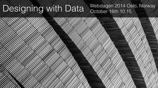
14. jan
feb
mar
apr
may
jun
jul
aug
sept
oct
nov
dec
02014
w
s
s
t
t
s
t
f
m
w
s
m
t
s
s
w
f
m
w
s
t
t
s
t
f
m
m
t
s
t
t
s
w
f
m
w
s
t
t
f
s
w
f
m
t
s
t
t
s
w
w
s
m
t
s
t
f
s
w
f
m
t
t
s
t
f
s
w
s
m
t
s
t
f
f
m
w
s
m
t
s
t
f
s
4
11
18
25
3
10
17
24
31
2
9
16
23
30
1
8
15
22
29
6
13
20
27
5
12
19
26
7
14
21
28
jan
feb
mar
apr
may
jun
jul
aug
sept
oct
nov
dec
02015
t
s
s
w
f
m
w
s
t
t
s
t
f
m
m
t
s
t
t
s
w
f
m
w
s
t
t
f
s
w
f
m
t
s
t
t
s
w
w
s
m
t
s
t
f
s
w
f
m
t
t
s
t
f
s
w
s
m
t
s
t
f
f
m
w
s
m
t
s
t
f
s
w
s
s
t
t
s
t
f
m
w
s
m
4
11
18
25
3
10
17
24
31
2
9
16
23
30
1
8
15
22
29
6
13
20
27
5
12
19
26
7
14
21
28
25. Matrix
Luxury
Commodity
Expensive
Inexpensive
Limos and
lounges
1p deals
No compeition for
expensive seats!
Hard to pay for
luxury with cheap
tickets
Competition
Competition
42. Data to Ink Ratio
A large share of ink on a graphic should
present data-information, the ink changing as
the data change. Data-ink is the non-erasable
core of a graphic, the non-redundant ink
arranged in response to variation in the
numbers represented.
!
Tufte, 1983
43. Data to Ink Ratio
Data to
ink Ratio
Data Ink
Total Ink
=