Download to read offline

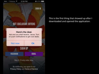


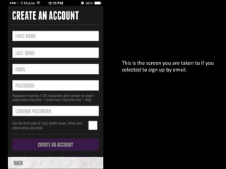
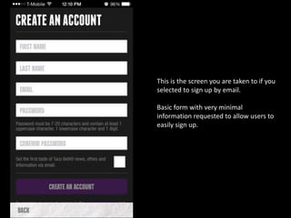


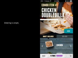


The document provides a review of the Taco Bell mobile app experience. It describes the app's sign up process, menu browsing and ordering features, and checkout process. The review concludes that the app makes online ordering easy, pick up transactions are quick, and a key feature is being able to customize orders by modifying ingredients.


