Branding Case Study - England Netball
•
1 like•865 views

Coachwise were given the opportunity to redesign England Netball's branding and a wide range of resources. For more case studies see www.coachwise.ltd.uk/case-studies

Recommended
Recommended
More Related Content
More from Coachwise
More from Coachwise (16)
Recently uploaded
Recently uploaded (20)
Branding Case Study - England Netball
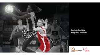
- 1. Coachwise Case Study: England Netball © Action Images Limited/Reuters
- 2. Client: England Netball The Job Knowing that our design function is one of the best in the sector, England Netball initially approached us to discuss the graphic design of its Coach Development Model and Talent Identification programme. From these early discussions, the brief expanded to all areas of England Netball’s branding and resource development. © www.SWpix.com
- 3. Client: England Netball The Solution Coachwise researched England Netball’s market, studying media their target audience might consume, and creating mood boards to find patterns in design, colours and typography. From this research we began to update and modernise the existing England Netball branding, better targeting the sport’s audience.
- 4. Client: England Netball The Solution A new strapline that reflected the England Netball brand, ‘Be The Team’, was created and rolled out to great acclaim throughout the organisation.
- 5. Client: England Netball The Results England Netball can now portray a consistent image C=0 Pantone 704 M = 90 to all stakeholders, with Y = 72 K = 29 strong, modern and relevant branding. CEL CEL+ Club Development Volunteering All communications and Pantone 1375 C=0 Pantone C = 100 M=0 resource materials now clearly E E M = 45 Process Y = 91 Cyan Y =0 K =0 K =0 ‘belong’ to the brand, which has led to an increase in brand pride and association. Pantone 2597 C = 85 Pantone 158 C=0 youth M = 100 Y =0 Officiating Coaching Excel M = 70 Y = 100 K =0 C = 41 Pantone 2593 C = 67 M = 91 Pantone C = 93 M=0 K =0 C=0 England Netball’s brand Pantone 375 Hexachrome Pantone 485 youth M=0 Y = 78 Y =0 K =0 Green Y = 100 K =0 Excel + M = 95 Y = 100 recognition has been K =0 K =0 enhanced exponentially, resulting in increased Competition Back to Netball exposure for the sport. Pantone 123 C=0 Pantone 1925 C=0 M = 24 M = 100 Y = 94 Y = 55 K =0 K =0
- 6. Client: England Netball The Results Coachwise has designed a wide range of collateral for England Netball, including resources, business cards, PowerPoint templates and competition branding. It has enjoyed the significant financial benefits offered by our print management solution, saving considerable costs in the process. © Action Images Limited/Reuters
- 7. 1 Example England Netball Official Netball Rules
- 8. 2 Example England Netball On the Ball resource
- 9. 3 Example England Netball Umpiring resource and Coaching DVD Cover
- 10. 4 Example England Netball Excel Framework document
- 11. 5 Example England Netball Roller Banners
- 12. 6 Example England Netball Workshop promotional flyer
- 13. 7 Example England Netball Superleague Programme
- 14. 8 Example England Netball U14s Club Programme