Downloaded 23 times


![Any questions? - Thank you for letting us tell our story! www.nimblepartners.com [email_address] [email_address] A special thank you to Leah Buley at Adaptive Path who inspired us to free ourselves from the tyranny of PowerPoint bullet slides.](https://image.slidesharecdn.com/bosupanimblefinal-100612040452-phpapp01/85/Establishing-Qualitative-Criteria-for-IA-and-UX-in-One-Fell-Swoop-How-to-Conduct-a-Card-Sort-with-Storytelling-35-320.jpg)

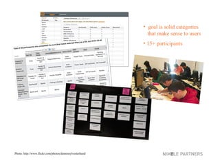
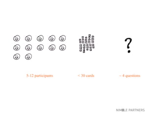
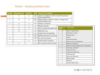
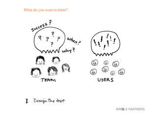
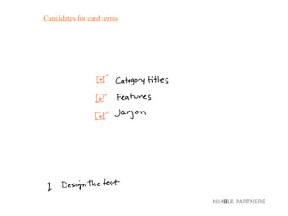
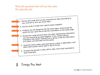
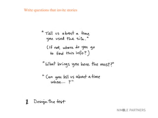
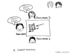
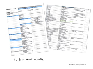
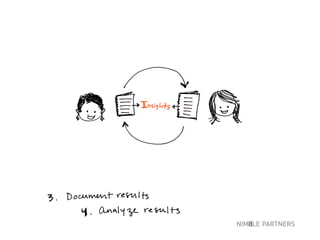
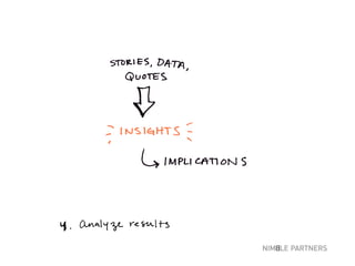
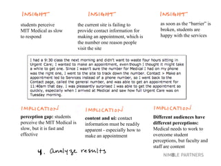
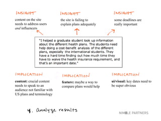
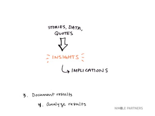
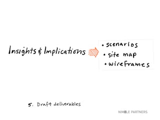
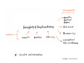
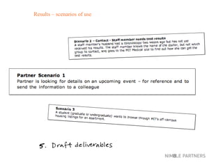
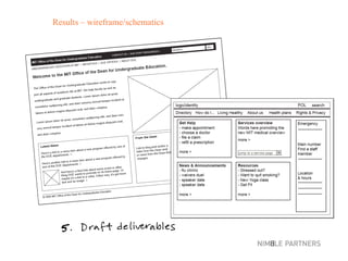
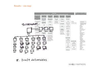
The document discusses best practices for conducting card sorting usability tests with 5-12 participants using fewer than 30 cards and around 4 questions. The tests provide limited quantitative data but qualitative insights like quotes, stories of use, specific issues, scenarios of use, and implications. Results could include wireframes, site maps, or insights about how a current site is failing users and how content, UI, features need to be improved to address different audiences' perceptions.


