Recommended

Recommended
More Related Content
What's hot
What's hot (10)
Viewers also liked
More from Anand Chokshi
More from Anand Chokshi (20)
Book2
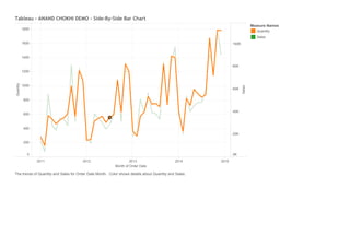
- 1. 2011 2012 2013 2014 2015 MonthofOrderDate 0 200 400 600 800 1000 1200 1400 1600 1800 Quantity 0K 20K 40K 60K 80K 100K Sales Tableau-ANANDCHOKHIDEMO-Side-By-SideBarChart MeasureNames Quantity Sales ThetrendsofQuantityandSalesforOrderDateMonth.ColorshowsdetailsaboutQuantityandSales.