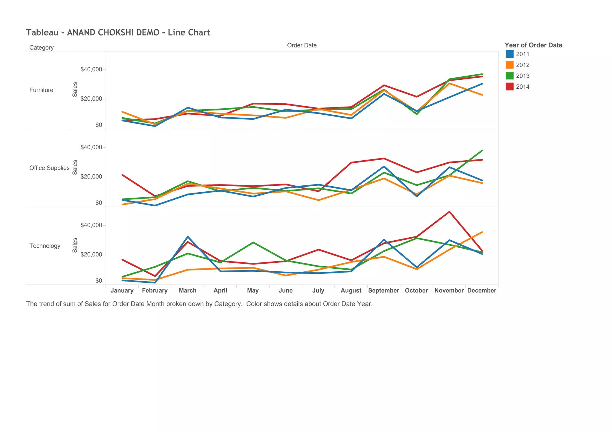
This line chart shows the total monthly sales from 2011 to 2014 broken down by category (Furniture, Office Supplies, Technology) with each category displayed in a different color. Sales data is listed by month on the x-axis with the corresponding dollar amount on the y-axis, demonstrating trends in monthly sales over the years for each category.