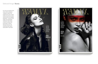
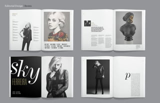
Austin Johnson | Work
PORTFOLIO 2016
I’ve always enjoyed making art — from the day I
first set pen to paper and realized that images in
my head could live outside it until today, where
any dull moment is still filled with compulsive
doodling in one of the crowd of sketchbooks I
have lying around. But drawing segued into fine
art in only a marginal capacity; I’ve never been
too enthusiastic about sharing my feelings with
people through painting or sculpture or most
other traditional mediums. I prefer to have an
objective, a problem to solve, a message to get
across that comes from more than just myself.
This is why I love graphic design.
My favorite way to describe design is the art of
visual communication. The concept comes first
and the medium second, or as the great architect,
Louis Sullivan stated: ‘form ever follows function.’
Graphic design at its best sticks to a clearly
defined agenda, is easily understood but provokes
intrigue and introspection. It engages people’s
intellect by leading them through a narrative and
arriving at a conclusion that persuades them to
reevaluate a currently held notion and reach a
more enlightened conclusion.
Fingers crossed I’ve achieved something along
those lines here. I appreciate the time taken to
look through my modest body of work and I hope
you enjoy it!
Foreword
E M P L O Y M E N T
EKR Agency, Provo UT
Entry-level Graphic Designer
07/2015 – Present
Johnson & Johnson, Chelsea NYC
Design Intern
05/2014 – 08/2014
Student Auxiliary Services, BYU
Student Sr. Graphic Designer
06/2012 – 04/2014
Champion Safe Company, Provo UT
In-house Graphic Designer
01/2011 – 04/2012
C O N TA C T
Email:
austinblake1989@gmail.com
Mobile:
(503) 989 6926
Behance:
behance.net/austinblakejohnson
R E F E R E N C E S
Stephanie Bird
Art Director, EKR / Micro Focus
(801) 310 5394
Stephaniejae.design@gmail.com
Adrian Pulfer
Professor, Mentor at BYU
(801) 231 0023
adrian@a3design.com
E D U C AT I O N
BYU, Provo UT
BFA, Graphic Design
Class of 2015
S K I L L S
Branding / Identity
Web Design
Editorial Design
Illustration
Iconography
Poster design
Data Visualization
Packaging / Labeling
Advertising
Photography
Illustrator
Photoshop
Indesign
Sketch
I N T E R E S T S
I’m interested in branding, editorial design,
poster design, web design, advertising,
icon design, data visualization and
illustration. That’s what I’m most well-
versed in, but I am excited to learn new
skills and develop interests in avenues
that are unfamiliar to me. In particular I
would jump at the chance to expand my
photography skills or learn the secret to
filmmaking, but the guns I stick to revolve
around graphic design.
Resumé | Austin Johnson
G R A P H I C D E S I G N E R
Editorial Design | Remix
For one of my projects from
school, Remix magazine,
I wanted to refocus the
original work from a casual
cultural overview to a more
sophisticated and engaging
publication. I strived to find
images and typographic
treatments that evoked
a sense of contrast and
provocation; a theme I
derived from how I felt
something titled ‘Remix’
would pattern itself after.
Editorial Design | Remix
Web Design | Micro Focus
When companies require
sophisticated solutions
for their technology
infrastructures, Micro
Focus has their back. As
EKR’s highest profile client,
I’ve been happily working
there as a contractor for
the last few months. Here
is an example of some
web pages I designed for
a campaign to encourage
visitors to download a survey
and register for a webinar
centered around Identity and
Access challenges the tech
industry faces today.
Iconography | Micro Focus
Following several recent
business acquisitions, Micro
Focus has incorporated
numerous products into
its portfolio from tech
companies such as Novell,
Attachmate, Borland and a
few more. Each new product
needs a branding update to
fit in with the style of the
rest of Micro Focus’ icons,
and presented here are a
handful of my favorites that I
got to design.
Additionally, the company
launched a new website in
2016 that I was privileged
to take part in designing. At
right are a few of the icons
and illustrations I created to
highlight product features.
Identity | Equality Collective
An acquaintance of mine
mentioned her interest in co-
founding a feminist activist
group based in Salt Lake
City, Utah, but lamented the
logo provided for them by
a fresh student designer.
Seeing an opportunity to
contribute to a worthwhile
cause, I told her I’d whip up a
basic identity system.
Branding Applications | Equality Collective
1 2
3
7
4
8
5
9
6
10
131211
Identity Presentation | Equality Collective
Identity | Various Logos
Editorial Design | Objekt
Objekt magazine was one
of the first major projects
I worked on after I was
accepted into the BFA
program at school, and I
look back fondly on the
assignment. I chose to
redesign an architectural
periodical because I wanted
to focus on the composition
of the piece rather than
find myself distracted by
worrying about overly-flashy
visuals, like how I imagined
I would’ve been had I
chosen a more culturally-
driven editorial. I enjoyed
the challenge of designing
it to be both rational and
engaging, instead of cold
and boring.
Editorial Design | Objekt
Thank You!

Austin johnson-portfolio 2016

  • 1.
    Austin Johnson |Work PORTFOLIO 2016
  • 2.
    I’ve always enjoyedmaking art — from the day I first set pen to paper and realized that images in my head could live outside it until today, where any dull moment is still filled with compulsive doodling in one of the crowd of sketchbooks I have lying around. But drawing segued into fine art in only a marginal capacity; I’ve never been too enthusiastic about sharing my feelings with people through painting or sculpture or most other traditional mediums. I prefer to have an objective, a problem to solve, a message to get across that comes from more than just myself. This is why I love graphic design. My favorite way to describe design is the art of visual communication. The concept comes first and the medium second, or as the great architect, Louis Sullivan stated: ‘form ever follows function.’ Graphic design at its best sticks to a clearly defined agenda, is easily understood but provokes intrigue and introspection. It engages people’s intellect by leading them through a narrative and arriving at a conclusion that persuades them to reevaluate a currently held notion and reach a more enlightened conclusion. Fingers crossed I’ve achieved something along those lines here. I appreciate the time taken to look through my modest body of work and I hope you enjoy it! Foreword E M P L O Y M E N T EKR Agency, Provo UT Entry-level Graphic Designer 07/2015 – Present Johnson & Johnson, Chelsea NYC Design Intern 05/2014 – 08/2014 Student Auxiliary Services, BYU Student Sr. Graphic Designer 06/2012 – 04/2014 Champion Safe Company, Provo UT In-house Graphic Designer 01/2011 – 04/2012 C O N TA C T Email: austinblake1989@gmail.com Mobile: (503) 989 6926 Behance: behance.net/austinblakejohnson R E F E R E N C E S Stephanie Bird Art Director, EKR / Micro Focus (801) 310 5394 Stephaniejae.design@gmail.com Adrian Pulfer Professor, Mentor at BYU (801) 231 0023 adrian@a3design.com E D U C AT I O N BYU, Provo UT BFA, Graphic Design Class of 2015 S K I L L S Branding / Identity Web Design Editorial Design Illustration Iconography Poster design Data Visualization Packaging / Labeling Advertising Photography Illustrator Photoshop Indesign Sketch I N T E R E S T S I’m interested in branding, editorial design, poster design, web design, advertising, icon design, data visualization and illustration. That’s what I’m most well- versed in, but I am excited to learn new skills and develop interests in avenues that are unfamiliar to me. In particular I would jump at the chance to expand my photography skills or learn the secret to filmmaking, but the guns I stick to revolve around graphic design. Resumé | Austin Johnson G R A P H I C D E S I G N E R
  • 3.
    Editorial Design |Remix For one of my projects from school, Remix magazine, I wanted to refocus the original work from a casual cultural overview to a more sophisticated and engaging publication. I strived to find images and typographic treatments that evoked a sense of contrast and provocation; a theme I derived from how I felt something titled ‘Remix’ would pattern itself after.
  • 4.
  • 5.
    Web Design |Micro Focus When companies require sophisticated solutions for their technology infrastructures, Micro Focus has their back. As EKR’s highest profile client, I’ve been happily working there as a contractor for the last few months. Here is an example of some web pages I designed for a campaign to encourage visitors to download a survey and register for a webinar centered around Identity and Access challenges the tech industry faces today.
  • 6.
    Iconography | MicroFocus Following several recent business acquisitions, Micro Focus has incorporated numerous products into its portfolio from tech companies such as Novell, Attachmate, Borland and a few more. Each new product needs a branding update to fit in with the style of the rest of Micro Focus’ icons, and presented here are a handful of my favorites that I got to design. Additionally, the company launched a new website in 2016 that I was privileged to take part in designing. At right are a few of the icons and illustrations I created to highlight product features.
  • 7.
    Identity | EqualityCollective An acquaintance of mine mentioned her interest in co- founding a feminist activist group based in Salt Lake City, Utah, but lamented the logo provided for them by a fresh student designer. Seeing an opportunity to contribute to a worthwhile cause, I told her I’d whip up a basic identity system.
  • 8.
    Branding Applications |Equality Collective
  • 9.
  • 10.
  • 11.
    Editorial Design |Objekt Objekt magazine was one of the first major projects I worked on after I was accepted into the BFA program at school, and I look back fondly on the assignment. I chose to redesign an architectural periodical because I wanted to focus on the composition of the piece rather than find myself distracted by worrying about overly-flashy visuals, like how I imagined I would’ve been had I chosen a more culturally- driven editorial. I enjoyed the challenge of designing it to be both rational and engaging, instead of cold and boring.
  • 12.
  • 13.