Analyzing A Magazine Cover
ANCHORING TEXT
MASTHEAD
BUZZ NUMBER/
COVER LINE
COVER LINES
MAIN
IMAGE
BARCODE
Masthead is the title of the magazine which is at the
head of the first or editorial page. In this ‘Rolling
Stone’ is the masthead. It is written in a retro style
and is red in colour with an outline with white, a
normal colour palette. The masthead is hidden
which tells us that it is a popular magazine and can
be recognized even when half of its name cannot be
seen. The writing style of the logo is always the
same in all rolling stones magazines however, the
color may change.
MASTHEAD
Main Image
The main image is a close shot of a
known rapper, Eminem. The angle is low and
the picture is taken in low-key lighting which
tells us that Eminem may have a hidden
personality. He is looking straight into the
camera with a stern expression almost as if he
knows something we are unaware of. In the
picture he’s wearing a grey - black
Hood, a casual attire, which, again, matches
his facial expressions; mysterious and stern.
This basically represents the
stereotypical look of rappers and
also what tone their songs have. The colour
palette used is basic and goes well with the
personality of the rapper as well as the genre.
Anchoring Text
It is giving us an insight
of the magazine and
informing us that the
magazine will show us
the best albums and
songs of 2012. It is
boldly written in white
to make it more visible
to the eyes.
Buzz Number/s
Buzz numbers are
numbers written in
relatively larger
font
than others just to
draw attention and
make the magazine
more appealing.
Cover Line/s
Cover lines are written boldly in white
so that they stand out from its grey
background. The color, yellow, can
also be seen to add a pop of color.
There are light grey, almost white,
dividers between cover lines to keep
them separated..
The bottom right corner has
the name of the celebrity on
the cover, that is, as said in
the 2nd slide, Eminem.
Below the name, there is an issue date, it shows
when the magazine was published. The price is also
written and at the end there is a standard barcode
which carries the details of the magazine.
Celebrity Name, Issue Date and Barcode
MASTHEAD
MAIN
IMAGE
MAIN COVER
LINE
COVER LINES
The picture above is the actual picture used for the magazine, it
had to be cropped to fit the standard size of the cover page. It is a
mid long group photo taken in a warm subtle light, it also looks
like a studio shot. It shows women of different races, sizes and
religion which signifies diversity.
It breaks the stereotype that women need to be skinny or belong
to a certain background to be a part of the fashion world. Fashion
is for everyone. They all carry a serious expression on their faces
which shows their strong personality and they aren’t being
objectified as sexual beings. The colour palette used consists of
beige, green and khaki, which turned out to be quite appealing
for the eyes.
MAIN IMAGE
The masthead is on the top right corner written boldly in a
serif font and in red so that it is
eye-catching and different than other cover lines. It is
written in the same font
which VOGUE uses in all of their magazines. This specific
font is now associated
with VOGUE. As VOGUE is a well known magazine the
masthead is partly hidden
but is still kept readable for people who aren’t familiar
with this magazine.
MASTHEAD
Main Cover Line
The main cover line is usually big and bold and so
NEW FRONTIERS is the main cover line on this
magazine.
Beneath it, there is an explanation of the cover
line. It
Shows how fashion all around the world is
changing and
Involving all races, religions and sizes.
Cover Lines
The bottom right corner shows the names
of the models on the front cover.
Model Credits
STRIP
TAGLINE
PUG/ PUFF
MAIN
IMAGE
MAIN COVER
LINE
BUZZ
NUMBER
PUG/PUFF
PUG/ PUFF
BARCODE
STRIP
MASTHEAD
COVER LINES
MAIN IMAGE
The main image is an
extreme long shot of Mont
Saint-Michel, an island in
Normandy, France. The
colour palette which mainly
consists of blue, white and
yellow is very vibrant. We
can also see its reflection in
the water below it, giving it
a more life-like effect. The
yellow puff can also be
considered to be
representing a bright sun. It
is promoting tourism and
the culture of France.
MASTHEAD AND TAGLINE
The masthead/ title of this magazine is FRANCE
written boldly in a serif font and in white with a
shadow alongside, the same as all FRANCE
magazines. The title is self explanatory and it
tells us that this magazine is all about France.
The white color beautifully stands out on the
blue giving it a resemblance of the sky.
ISSUE DATE AND
NUMBER
The issue date
tells us that this
magazine was
published in
October 2014 and
it is the 193rd
issue.
The tagline, usually below the
masthead, tells us what to expect from
the magazine. By reading the tagline
shown above we know this magazine is
about travel food culture and history of
France.
STRIPS
Strips, usually in the form of
a bar, contains the items that
feature in the magazine.
Strips can be across the top
or bottom and sometimes,
they are diagonally placed
too. In this magazine you can
see two, at the top and
bottom. The font is narrow, a
way to save space on the
cover page.
BARCODE
As mentioned
before, the
barcode contains
the details of the
magazine.
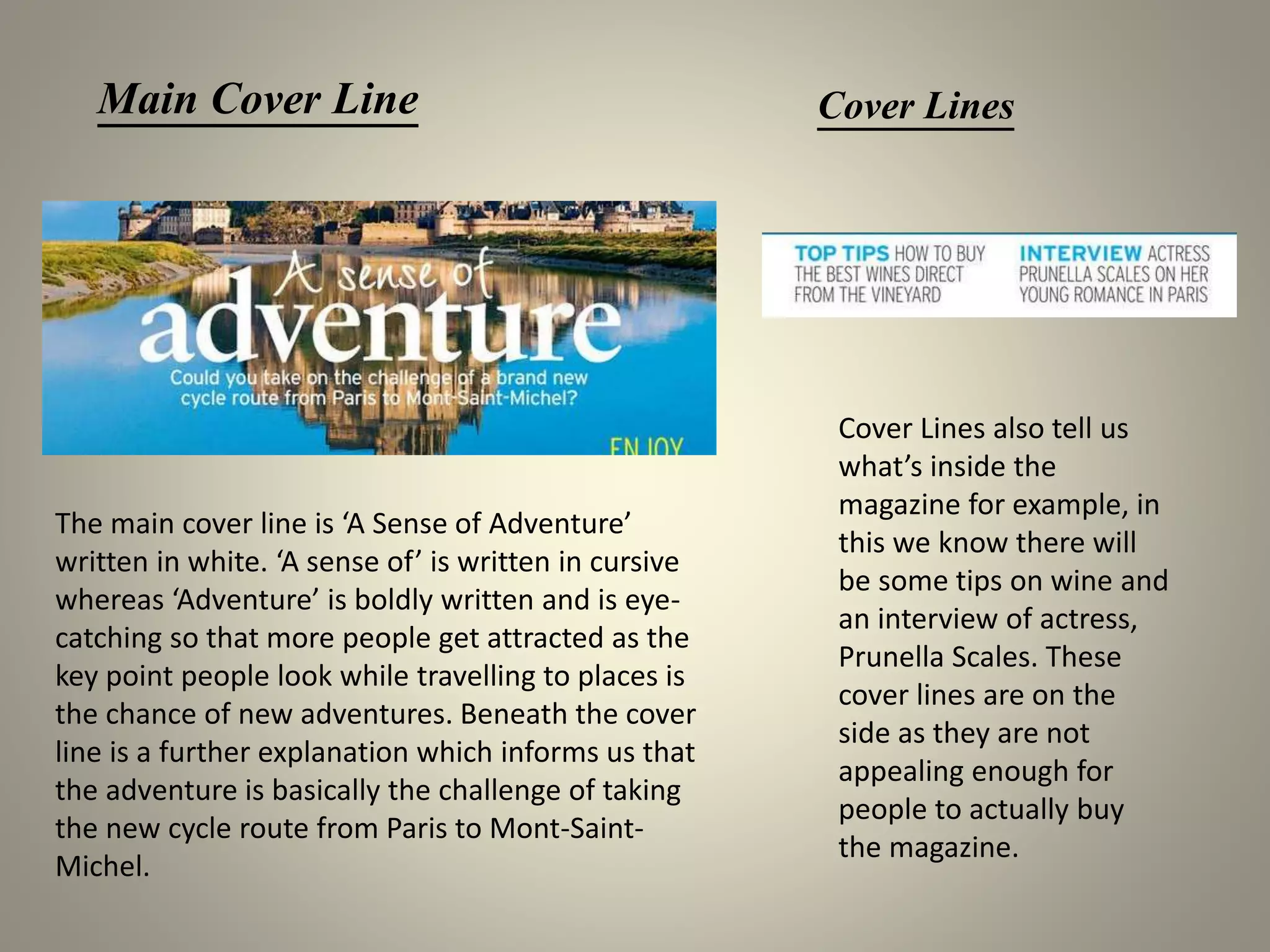
Main Cover Line Cover Lines
The main cover line is ‘A Sense of Adventure’
written in white. ‘A sense of’ is written in cursive
whereas ‘Adventure’ is boldly written and is eye-
catching so that more people get attracted as the
key point people look while travelling to places is
the chance of new adventures. Beneath the cover
line is a further explanation which informs us that
the adventure is basically the challenge of taking
the new cycle route from Paris to Mont-Saint-
Michel.
Cover Lines also tell us
what’s inside the
magazine for example, in
this we know there will
be some tips on wine and
an interview of actress,
Prunella Scales. These
cover lines are on the
side as they are not
appealing enough for
people to actually buy
the magazine.
PUFF BUZZ WORD/ NUMBER
A Puff, which can also be called
a pug, are basically small
incentives for people to buy
the magazine. They are usually
round but in this you can see
they can simply be written in a
highlighted font. Their aim is to
catch the reader’s attention. In
this the small yellow round puff
can be a way to represent the
sun.
Previously, we saw buzz numbers, which,
again, are there to attract attention.
Similarly, buzz words also have the same
function, they are just in a written form.
The words, plus, exclusive, and new are
fairly more popular.

Analyzing A Magazine Cover

  • 1.
  • 2.
    ANCHORING TEXT MASTHEAD BUZZ NUMBER/ COVERLINE COVER LINES MAIN IMAGE BARCODE
  • 3.
    Masthead is thetitle of the magazine which is at the head of the first or editorial page. In this ‘Rolling Stone’ is the masthead. It is written in a retro style and is red in colour with an outline with white, a normal colour palette. The masthead is hidden which tells us that it is a popular magazine and can be recognized even when half of its name cannot be seen. The writing style of the logo is always the same in all rolling stones magazines however, the color may change. MASTHEAD
  • 4.
    Main Image The mainimage is a close shot of a known rapper, Eminem. The angle is low and the picture is taken in low-key lighting which tells us that Eminem may have a hidden personality. He is looking straight into the camera with a stern expression almost as if he knows something we are unaware of. In the picture he’s wearing a grey - black Hood, a casual attire, which, again, matches his facial expressions; mysterious and stern. This basically represents the stereotypical look of rappers and also what tone their songs have. The colour palette used is basic and goes well with the personality of the rapper as well as the genre.
  • 5.
    Anchoring Text It isgiving us an insight of the magazine and informing us that the magazine will show us the best albums and songs of 2012. It is boldly written in white to make it more visible to the eyes. Buzz Number/s Buzz numbers are numbers written in relatively larger font than others just to draw attention and make the magazine more appealing.
  • 6.
    Cover Line/s Cover linesare written boldly in white so that they stand out from its grey background. The color, yellow, can also be seen to add a pop of color. There are light grey, almost white, dividers between cover lines to keep them separated..
  • 7.
    The bottom rightcorner has the name of the celebrity on the cover, that is, as said in the 2nd slide, Eminem. Below the name, there is an issue date, it shows when the magazine was published. The price is also written and at the end there is a standard barcode which carries the details of the magazine. Celebrity Name, Issue Date and Barcode
  • 8.
  • 9.
    The picture aboveis the actual picture used for the magazine, it had to be cropped to fit the standard size of the cover page. It is a mid long group photo taken in a warm subtle light, it also looks like a studio shot. It shows women of different races, sizes and religion which signifies diversity. It breaks the stereotype that women need to be skinny or belong to a certain background to be a part of the fashion world. Fashion is for everyone. They all carry a serious expression on their faces which shows their strong personality and they aren’t being objectified as sexual beings. The colour palette used consists of beige, green and khaki, which turned out to be quite appealing for the eyes. MAIN IMAGE
  • 10.
    The masthead ison the top right corner written boldly in a serif font and in red so that it is eye-catching and different than other cover lines. It is written in the same font which VOGUE uses in all of their magazines. This specific font is now associated with VOGUE. As VOGUE is a well known magazine the masthead is partly hidden but is still kept readable for people who aren’t familiar with this magazine. MASTHEAD
  • 11.
    Main Cover Line Themain cover line is usually big and bold and so NEW FRONTIERS is the main cover line on this magazine. Beneath it, there is an explanation of the cover line. It Shows how fashion all around the world is changing and Involving all races, religions and sizes. Cover Lines
  • 12.
    The bottom rightcorner shows the names of the models on the front cover. Model Credits
  • 13.
  • 14.
    MAIN IMAGE The mainimage is an extreme long shot of Mont Saint-Michel, an island in Normandy, France. The colour palette which mainly consists of blue, white and yellow is very vibrant. We can also see its reflection in the water below it, giving it a more life-like effect. The yellow puff can also be considered to be representing a bright sun. It is promoting tourism and the culture of France.
  • 15.
    MASTHEAD AND TAGLINE Themasthead/ title of this magazine is FRANCE written boldly in a serif font and in white with a shadow alongside, the same as all FRANCE magazines. The title is self explanatory and it tells us that this magazine is all about France. The white color beautifully stands out on the blue giving it a resemblance of the sky. ISSUE DATE AND NUMBER The issue date tells us that this magazine was published in October 2014 and it is the 193rd issue. The tagline, usually below the masthead, tells us what to expect from the magazine. By reading the tagline shown above we know this magazine is about travel food culture and history of France.
  • 16.
    STRIPS Strips, usually inthe form of a bar, contains the items that feature in the magazine. Strips can be across the top or bottom and sometimes, they are diagonally placed too. In this magazine you can see two, at the top and bottom. The font is narrow, a way to save space on the cover page. BARCODE As mentioned before, the barcode contains the details of the magazine.
  • 17.
    Main Cover LineCover Lines The main cover line is ‘A Sense of Adventure’ written in white. ‘A sense of’ is written in cursive whereas ‘Adventure’ is boldly written and is eye- catching so that more people get attracted as the key point people look while travelling to places is the chance of new adventures. Beneath the cover line is a further explanation which informs us that the adventure is basically the challenge of taking the new cycle route from Paris to Mont-Saint- Michel. Cover Lines also tell us what’s inside the magazine for example, in this we know there will be some tips on wine and an interview of actress, Prunella Scales. These cover lines are on the side as they are not appealing enough for people to actually buy the magazine.
  • 18.
    PUFF BUZZ WORD/NUMBER A Puff, which can also be called a pug, are basically small incentives for people to buy the magazine. They are usually round but in this you can see they can simply be written in a highlighted font. Their aim is to catch the reader’s attention. In this the small yellow round puff can be a way to represent the sun. Previously, we saw buzz numbers, which, again, are there to attract attention. Similarly, buzz words also have the same function, they are just in a written form. The words, plus, exclusive, and new are fairly more popular.