Download to read offline
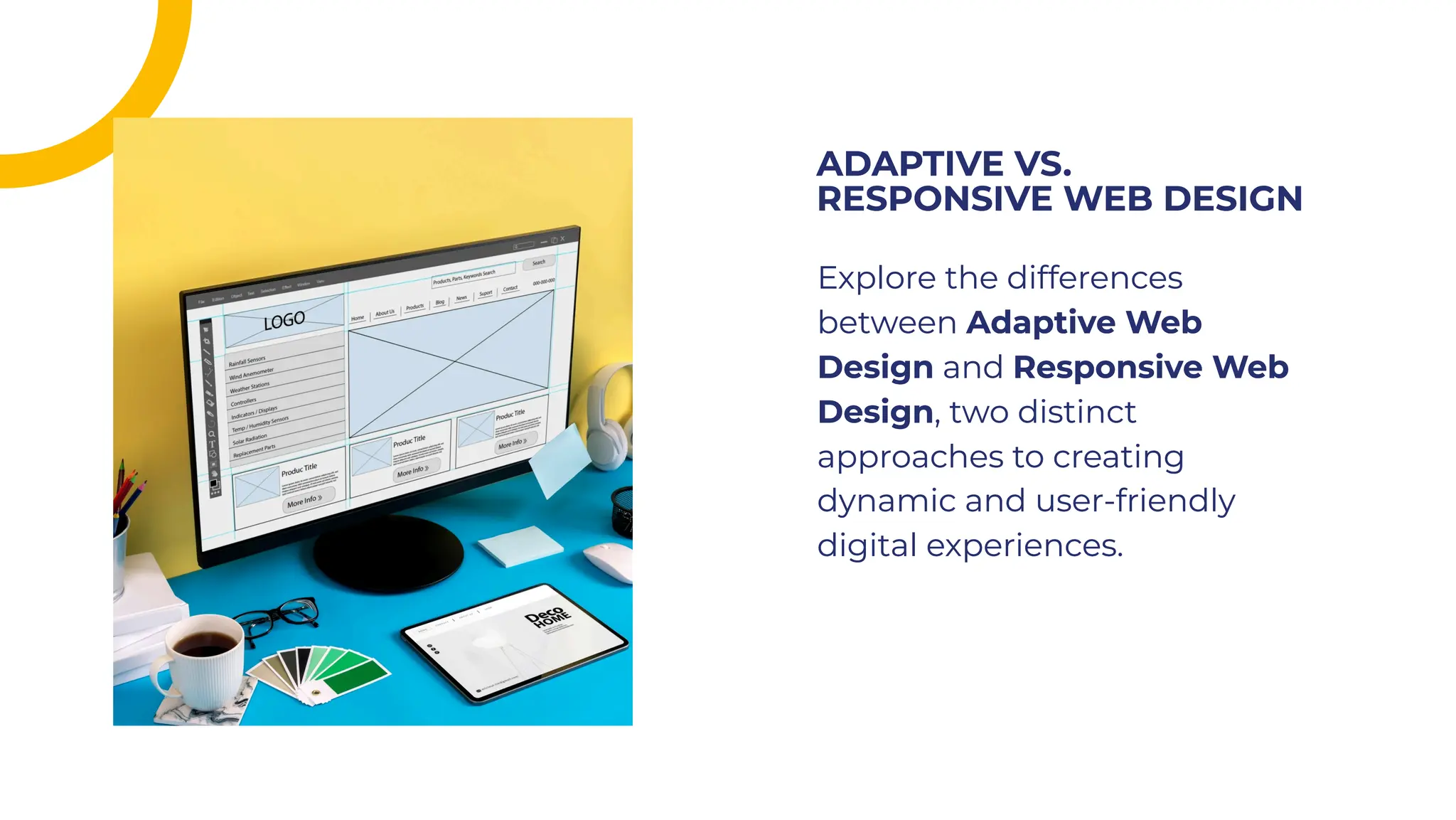


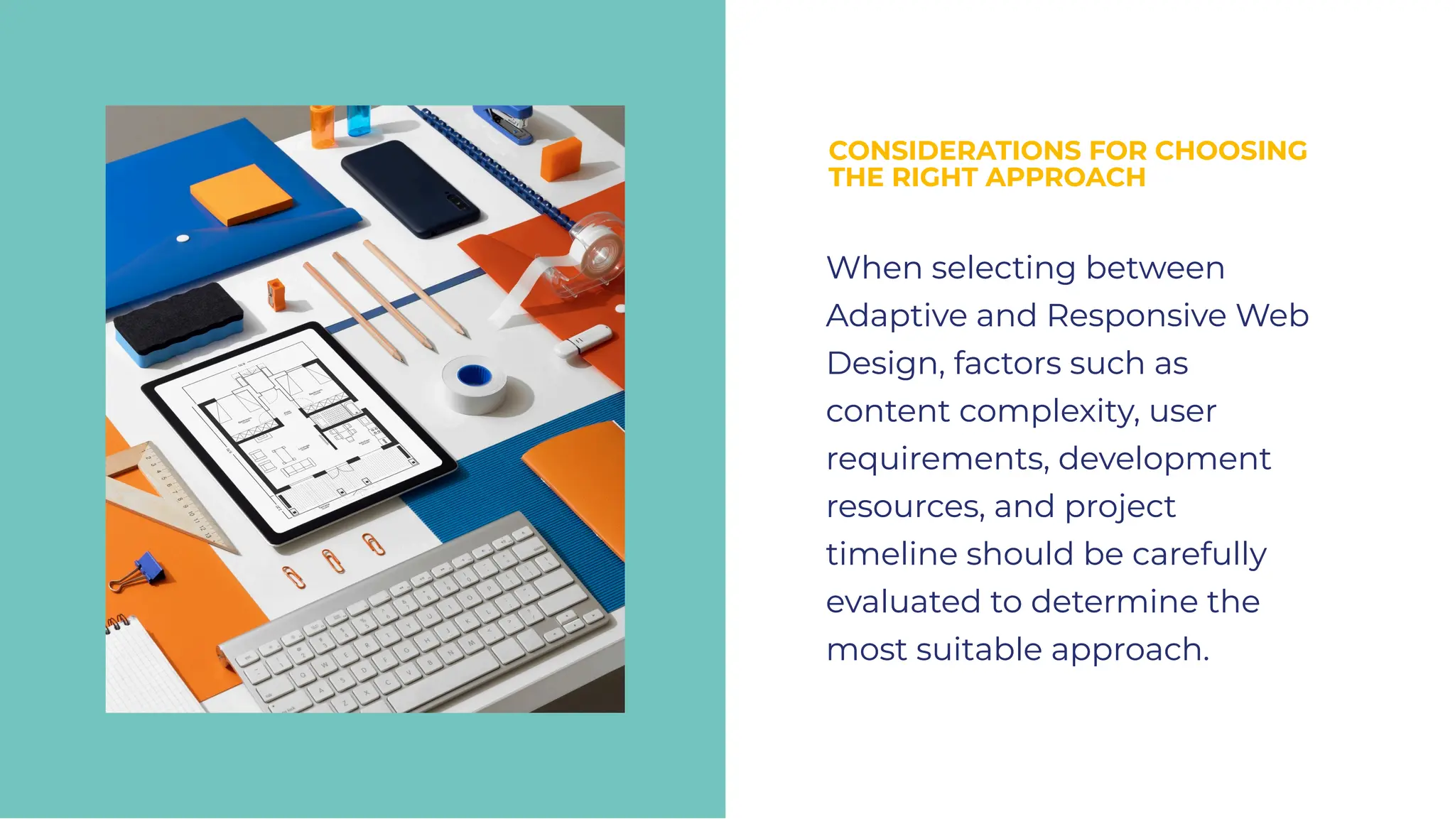


The document explores the differences between adaptive and responsive web design, outlining their unique approaches in creating user-friendly digital experiences. Adaptive design, introduced by Aaron Gustafson in 2011, utilizes fixed layout sizes, while responsive design, coined by Ethan Marcotte, dynamically adjusts based on device characteristics. Choosing the right approach involves evaluating factors such as content complexity, user needs, and project resources to balance user experience with development efficiency.


