Looking back at your preliminary task, what do you feel you have learnt in th...amyrobb7
The student learned several important skills when progressing from their preliminary magazine analysis task to creating their full magazine product. They learned how to use design programs like Photoshop and InDesign, gaining confidence in using them. They also improved their understanding of magazine conventions and audience research through analyzing sample magazines and collecting audience feedback. The preliminary work helped them apply these skills when creating a magazine that would appeal to their target audience.
Here I have asked three people from my target audince to evaluate my magazine and pick out the good and not so good points. I used females and a male to give a fair view from both genders
Evaluation: Reflection on audience feedbackamyrobb7
The document provides feedback on different elements of a music magazine called "UP BEAT".
For the front cover, feedback was positive about the title, use of bold purple color, and graffiti-style text which grabbed attention. However, the price text was noted as too small.
Feedback on the double-page spread liked how the title spanned two pages for dramatic impact and how the article was formatted. However, the pull quote did not stand out well.
For the contents page, feedback was positive about the clear section divisions, images providing insights, and personal editor's note. However, page numbers were missing from images.
5) how did you attract your target audience?amyrobb7
The document discusses techniques used to attract a target audience to a magazine. These techniques include using slang and informal language that the target audience would use, a sans-serif font for a less formal look, and images of models the target audience could identify with. Color choices like purple were meant to appeal more to the intended female readership. Market research found preferences for pricing, content types, and layout that were then applied to the magazine design.
2) how does your media product represent particular social groupsamyrobb7
The document summarizes how a magazine was designed to attract a target social group of "townies" aged 15-21 who enjoy hip-hop and R&B music. The magazine uses colloquial language, informal fonts and layout, photos of models and musicians styled like the target group, and scenes from urban locations to represent and appeal to the lifestyle and aesthetics of its young, urban readership.
Film case study- Fantastic Beasts and Where to Find Them Steph2000
Fantastic Beasts and Where to Find Them had a budget of $180 million and grossed $607.9 million worldwide. It was produced by Heyday Films and distributed by Warner Bros. Pictures. Warner Bros. used various marketing techniques like trailers and publicity photos to promote the film. Modern technologies like social media, streaming services, and IMAX were integral to the film's production, distribution, and consumption by audiences.
Production: manipulation of original photographyamyrobb7
The document discusses the manipulation of several original photographs for use in a magazine. The photographs were edited by [1] adjusting colors, brightness, contrast and cropping to make subjects stand out; [2] cutting out backgrounds around subjects using selection tools; and [3] using smudge tools to blend colors and remove unwanted elements like grass. The goal of the edits was to make the photographs more dramatic, professional-looking and well-sized for the intended magazine layouts.
Here I have analysed the results from the continued audience feedback. I commented on what they said and stated the ways I could improve when I create my magazine.
The document provides feedback from 3 people (ages 15-20) on draft designs for the front cover, contents page, and double page spread of a magazine. For the front cover, 2 people preferred draft 3 for its prominent main image and skyline, while 1 preferred draft 1. For the contents page, 2 preferred draft 3 for its clear layout and use of an editor's note and image page numbers, while 1 preferred draft 1. For the double page spread, all 3 preferred draft 2 for its balanced text and images, article title spanning the pages, and large photos, but suggested moving the pull quote out of the middle of the text. The feedback will help improve the magazine designs.
Here is the audience feedback, three people in my target audience have been used to give their opinions on the drafts and choose which one they prefer. I have then looked at the results and analysed them to find what I need to improve on..
Three teenagers provided feedback on draft designs for the front cover, contents page, and double page article spreads for a magazine. For the front cover, they preferred designs with large prominent images and minimal text that catches the reader's attention. For the contents page, they liked designs that clearly displayed the articles and page numbers through a combination of images and captions. For the double page spreads, they responded best to a layout with balanced text and large images, a title spanning both pages, and pull quotes placed outside the main text. Overall, they found designs that presented content in a clear, visually interesting manner to be the most appealing.
The document outlines the tasks involved in analyzing existing magazines, conducting research on audiences, planning and creating mock issues of a music magazine. It provides the task, due date, whether it was completed on time, and an explanation. Some of the key tasks included analyzing magazine covers and content, conducting audience research through questionnaires, planning photo shoots and designs, creating covers, spreads and evaluating the process. Several tasks ran over deadline due to underestimating time or being delayed by previous overdue tasks, but most work was completed on schedule through planning and prioritizing effort.
The document outlines the tasks involved in analyzing existing magazines, conducting research on audiences, planning and creating mock issues of a music magazine. It provides the task, due date, whether it was completed on time, and an explanation. Some of the key tasks included analyzing magazine covers, content, and spreads, creating audience questionnaires and mood boards, planning photo shoots and magazine layouts. Several tasks ran over deadline, including creating the front cover, contents page, and final evaluations, as these took significant time and required reviewing past work and research. Overall the process involved iterative research, planning, creation and evaluation over several weeks.
The document discusses two drafts of a contents page layout. The first draft has the contents in one column, uses three images, and places the editor's note at the bottom. The second draft places the contents across the top of the page in an atypical layout, uses fewer images to be less distracting, and also places the editor's note at the bottom which is not priority for readers. Both drafts are evaluated as having simple yet effective designs.
The document discusses different layout options for a double page magazine spread. It provides feedback on three different draft layouts. For the first layout, it likes the unusual top and bottom images and use of pull quotes. For the second layout, it likes the title along the top and large subtitle but not the amount of copy. For the third layout, it dislikes the straight copy but likes the title along the top and large bottom image.
The document discusses different layout options for a double page magazine spread. It provides feedback on three different draft layouts. For the first layout, it likes the unusual top and bottom images and use of pull quotes. For the second layout, it likes the title along the top and large subtitle but not the amount of copy. For the third layout, it dislikes the straight copy but likes the title along the top and large bottom image.
The document discusses two draft designs for a contents page. The first draft has the contents in one column, images to build expectations, and an editor's note at the bottom. The second draft places the contents across the top to be the first thing seen, uses fewer images to be less distracting, and again places the editor's note at the bottom which readers may not read. Both drafts are evaluated as having simple yet effective designs.
The document discusses three draft magazine cover designs. For the first draft, the author likes the skyline image but not the many images at the bottom. For the second draft, it is simple with a cover line to attract readers but has many distracting images. For the third and best draft, it is simple and effective with a skyline, masthead at the top, one dramatic image, and sidebar text to entice readers to buy.
The document outlines the tasks, deadlines, and status of completing a school project to design a music magazine. It includes analyzing existing magazines, conducting audience research through questionnaires, planning photoshoots, creating layouts and designs, and evaluating the process. Most tasks were completed on time through organization and prioritizing easier tasks first. A few tasks ran over deadline including reflecting on analyses, front cover creation, and organizing props which required more time than anticipated. Overall the project was largely completed on schedule through time management and flexibility to catch up if needed.
This part of the planning includes the mood board (colour scheme, mast head designs, flashes, camera shots, mode of address and images used). It also includes the flat plan of my magazine.
Model 1's name is Katie Robb. Her contact number is 01628525344 and email is Woollcotts@aol.com. A photo shoot was scheduled for May 3, 2011. An email was sent to Katie Robb asking if she would be interested in being a model for the magazine. Katie replied to the offer. The photo shoot included various shot types.
The document summarizes the key learnings from analyzing various magazine covers, contents pages, double-page spreads, and conducting audience research. Some of the main techniques identified for effective design include using large images of famous artists on covers to draw attention, sectioning contents pages clearly, balancing images and text on double-page spreads, and incorporating a variety of music genres and interests to attract a wide audience. Market research revealed that the target audience prefers magazines monthly with a price of £2-3 focusing on music news, reviews, and interviews.
EMAP is a British media company that focuses on business-to-business magazines. They publish 20 magazines covering various industries such as architecture, broadcasting, construction, fashion, and automotive. IPC is a UK-based digital publisher that sells around 350 million magazine copies annually, producing 60 brands across genres like fashion, music, and home. Future PLC is an international media group and the sixth largest publisher in the UK, putting out over 150 magazines monthly in areas like film, cycling, games, and technology, selling 3.2 billion copies. Bauer Media offers 300 magazines across 15 countries as part of the Bauer Media Group, Europe's largest private publisher, covering topics from women, men's lifestyle, gardening, football
Uses and gratifications theory posits that media consumers actively seek out media to fulfill personal needs such as identifying with characters, being entertained, facilitating social interaction, and escaping reality. Audiences take an active role in interpreting and using media to meet needs like learning about themselves, entertainment, and conversation.
Elevate Your Nonprofit's Online Presence_ A Guide to Effective SEO Strategies...TechSoup
Whether you're new to SEO or looking to refine your existing strategies, this webinar will provide you with actionable insights and practical tips to elevate your nonprofit's online presence.
A Visual Guide to 1 Samuel | A Tale of Two HeartsSteve Thomason
These slides walk through the story of 1 Samuel. Samuel is the last judge of Israel. The people reject God and want a king. Saul is anointed as the first king, but he is not a good king. David, the shepherd boy is anointed and Saul is envious of him. David shows honor while Saul continues to self destruct.
Philippine Edukasyong Pantahanan at Pangkabuhayan (EPP) CurriculumMJDuyan
(𝐓𝐋𝐄 𝟏𝟎𝟎) (𝐋𝐞𝐬𝐬𝐨𝐧 𝟏)-𝐏𝐫𝐞𝐥𝐢𝐦𝐬
𝐃𝐢𝐬𝐜𝐮𝐬𝐬 𝐭𝐡𝐞 𝐄𝐏𝐏 𝐂𝐮𝐫𝐫𝐢𝐜𝐮𝐥𝐮𝐦 𝐢𝐧 𝐭𝐡𝐞 𝐏𝐡𝐢𝐥𝐢𝐩𝐩𝐢𝐧𝐞𝐬:
- Understand the goals and objectives of the Edukasyong Pantahanan at Pangkabuhayan (EPP) curriculum, recognizing its importance in fostering practical life skills and values among students. Students will also be able to identify the key components and subjects covered, such as agriculture, home economics, industrial arts, and information and communication technology.
𝐄𝐱𝐩𝐥𝐚𝐢𝐧 𝐭𝐡𝐞 𝐍𝐚𝐭𝐮𝐫𝐞 𝐚𝐧𝐝 𝐒𝐜𝐨𝐩𝐞 𝐨𝐟 𝐚𝐧 𝐄𝐧𝐭𝐫𝐞𝐩𝐫𝐞𝐧𝐞𝐮𝐫:
-Define entrepreneurship, distinguishing it from general business activities by emphasizing its focus on innovation, risk-taking, and value creation. Students will describe the characteristics and traits of successful entrepreneurs, including their roles and responsibilities, and discuss the broader economic and social impacts of entrepreneurial activities on both local and global scales.
How to Setup Default Value for a Field in Odoo 17Celine George
In Odoo, we can set a default value for a field during the creation of a record for a model. We have many methods in odoo for setting a default value to the field.
6) what have you learnt about technologies from the process of constructing this product?
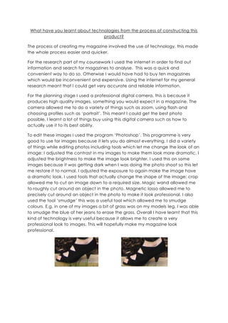
1. What have you learnt about technologies from the process of constructing this product?<br />The process of creating my magazine involved the use of technology, this made the whole process easier and quicker. <br />For the research part of my coursework I used the internet in order to find out information and search for magazines to analyse. This was a quick and convenient way to do so. Otherwise I would have had to buy ten magazines which would be inconvenient and expensive. Using the internet for my general research meant that I could get very accurate and reliable information.<br />For the planning stage I used a professional digital camera, this is because it produces high quality images, something you would expect in a magazine. The camera allowed me to do a variety of things such as zoom, using flash and choosing profiles such as ‘portrait’. This meant I could get the best photo possible. I learnt a lot of things buy using this digital camera such as how to actually use it to its best ability. <br />897255348107031064203481070To edit these images I used the program ‘Photoshop’. This programme is very good to use for images because it lets you do almost everything. I did a variety of things while editing photos including tools which let me change the look of an image: I adjusted the contrast in my images to make them look more dramatic. I adjusted the brightness to make the image look brighter. I used this on some images because it was getting dark when I was doing the photo shoot so this let me restore it to normal. I adjusted the exposure to again make the image have a dramatic look. I used tools that actually change the shape of the image: crop allowed me to cut an image down to a required size. Magic wand allowed me to roughly cut around an object in the photo. Magnetic lasso allowed me to precisely cut around an object in the photo to make it look professional. I also used the tool ‘smudge’ this was a useful tool which allowed me to smudge colours. E.g. in one of my images a bit of grass was on my models leg, I was able to smudge the blue of her jeans to erase the grass. Overall I have learnt that this kind of technology is very useful because it allows me to create a very professional look to images. This will hopefully make my magazine look professional. <br />23507702719070For creating my magazine I used a mixture of InDesign and Photoshop. In Photoshop I was able to edit images so they look professional so then I could import them into InDesign. In InDesign I was able to use a variety of techniques to create a professional looking magazine. For example I was able to design my text boxes so they look like a proper article style. I was able to insert images and move them around and position them in the correct places. I was able to import text from ‘DaFont’, these fonts look professional ideal for my magazine. I was able to adjust the size and colour to make it suit my audience. I was also able to insert text from a word document. This was very convenient because I was able to write it up in ‘Word’ and simply press ‘insert’ so it is imported. I found these programs very useful because they allowed me to create a professional looking magazine. I learnt the best way to create magazines is on professional programs not ones like publisher as I would not be able to get a good result.<br />1905031115<br />DaFont is the website in which I found and designed my font for my magazine. I wanted to find the right style which would suit my target audience and found ‘Coolvetica’. I imported the text into Photoshop where I was able to adjust the colour, I changed it from black to purple with the ‘fill’ tool. This was very useful as it was a fast way to do so.<br />18478505715<br />For creating my college magazine I used the programme ‘Publisher’, this allows you to create basic designs for magazines. I found that I was limited in what the programme allowed me to do. However this technology did allow me to have an insight into how to create a magazine. It also let me do useful things such as ‘wrap’ text and ‘bring objects forward’ so the title is at the front. Overall I have learnt how to set out magazine designs and order objects in priority. <br />I used ‘Microsoft Word’ to produce all of my work. This was because it is an easy way to write up my findings and insert images. I then uploaded this work to my blog via ‘slide share’. Slide Share transformed my documents into a slide show so it can be uploaded to blogger. It was a fast was of doing so and was easy to upload.<br />Blogger is the place I uploaded all of my work. It is a webpage in which you can post ‘posts’ on. This was a good programme because it clearly shows each post allowing people to comment on it.<br />416750522288500345440015684500274383515621000210502512573000144081560960006483356223000<br />Overall I have learnt that technology is a very important aspect in creating a professional looking magazine. I have learnt that without these technologies no professional designs can be made. Photoshop is a very good technology as it lets you do almost anything to an image to suit your needs. The use of the professional camera is a huge advantage to constructing the product as it provides high quality images.<br />