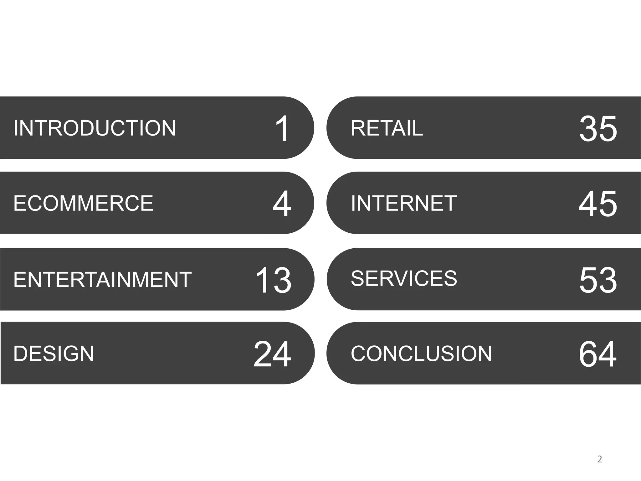
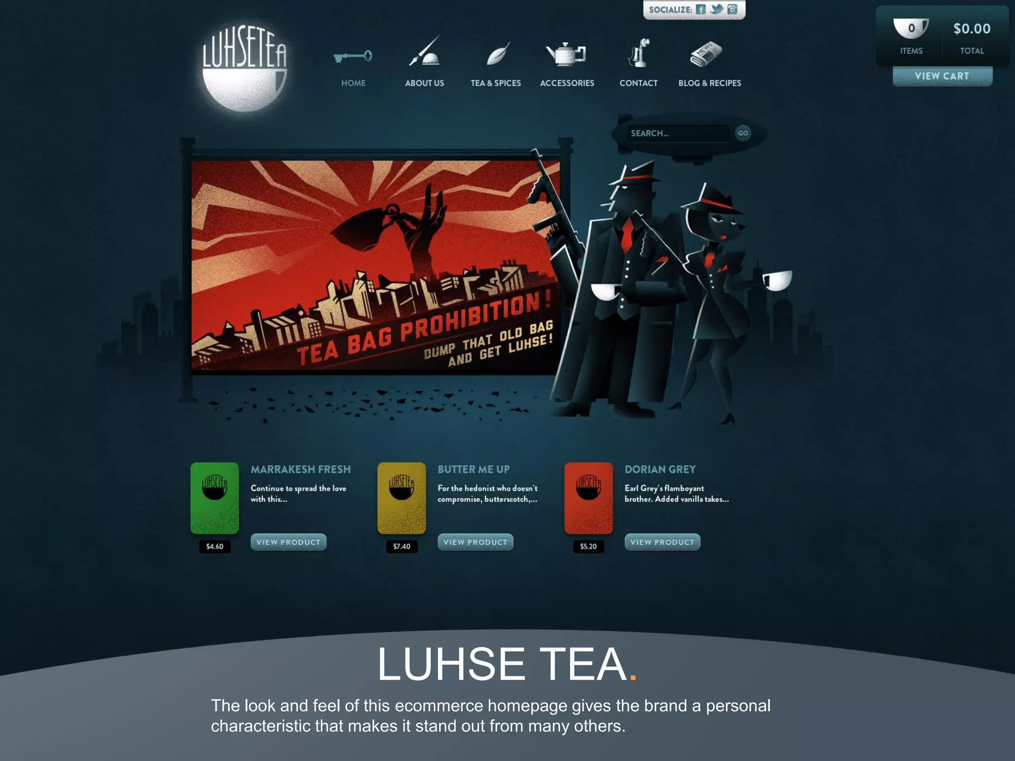
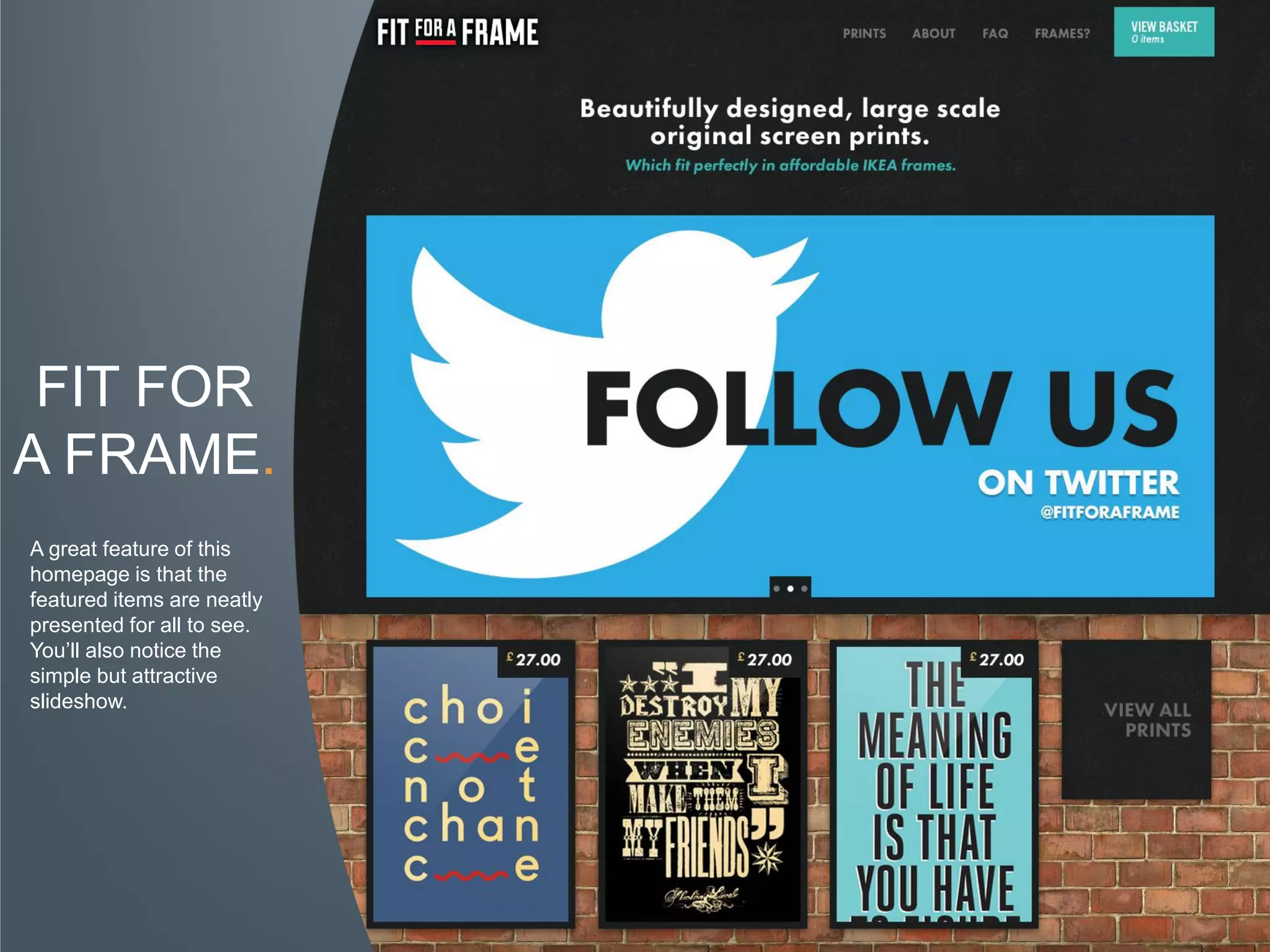
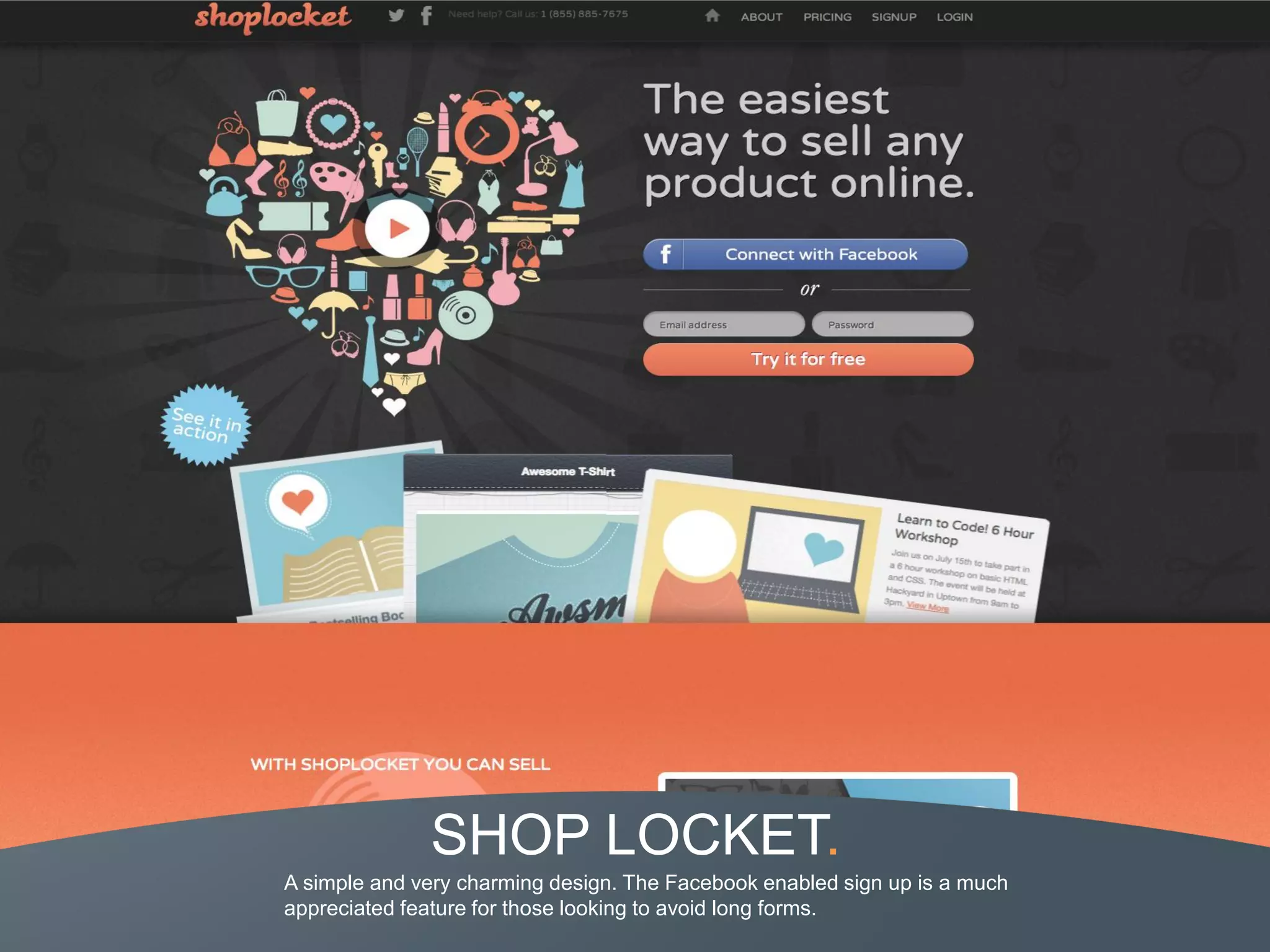
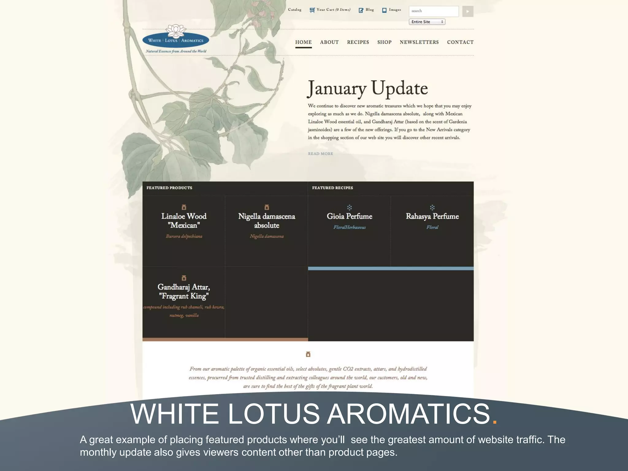
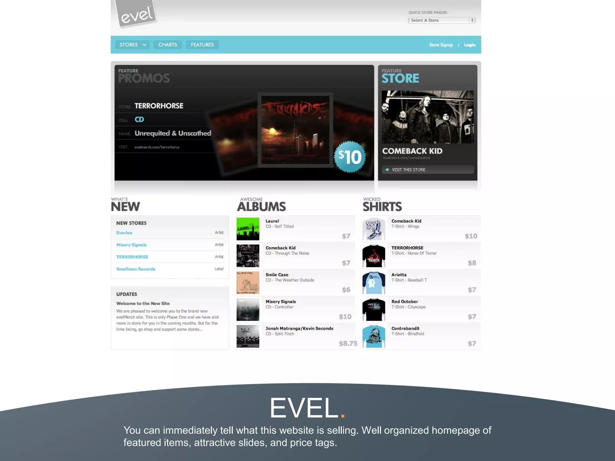
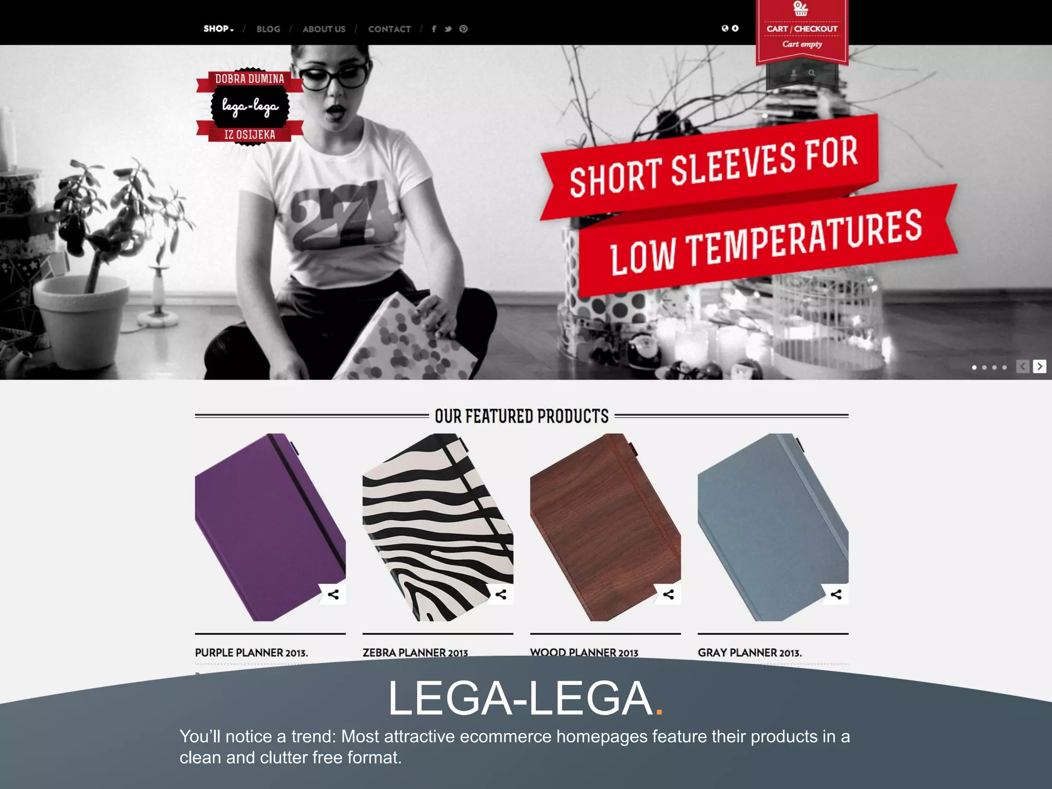
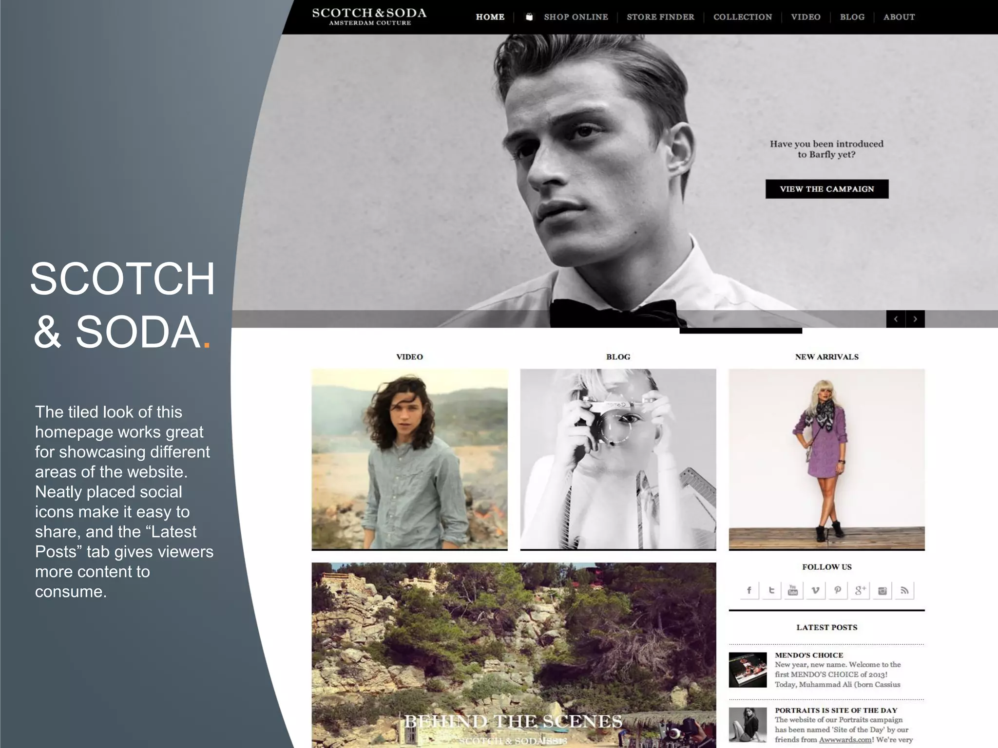
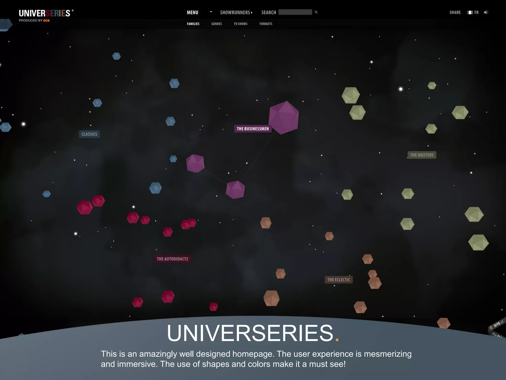
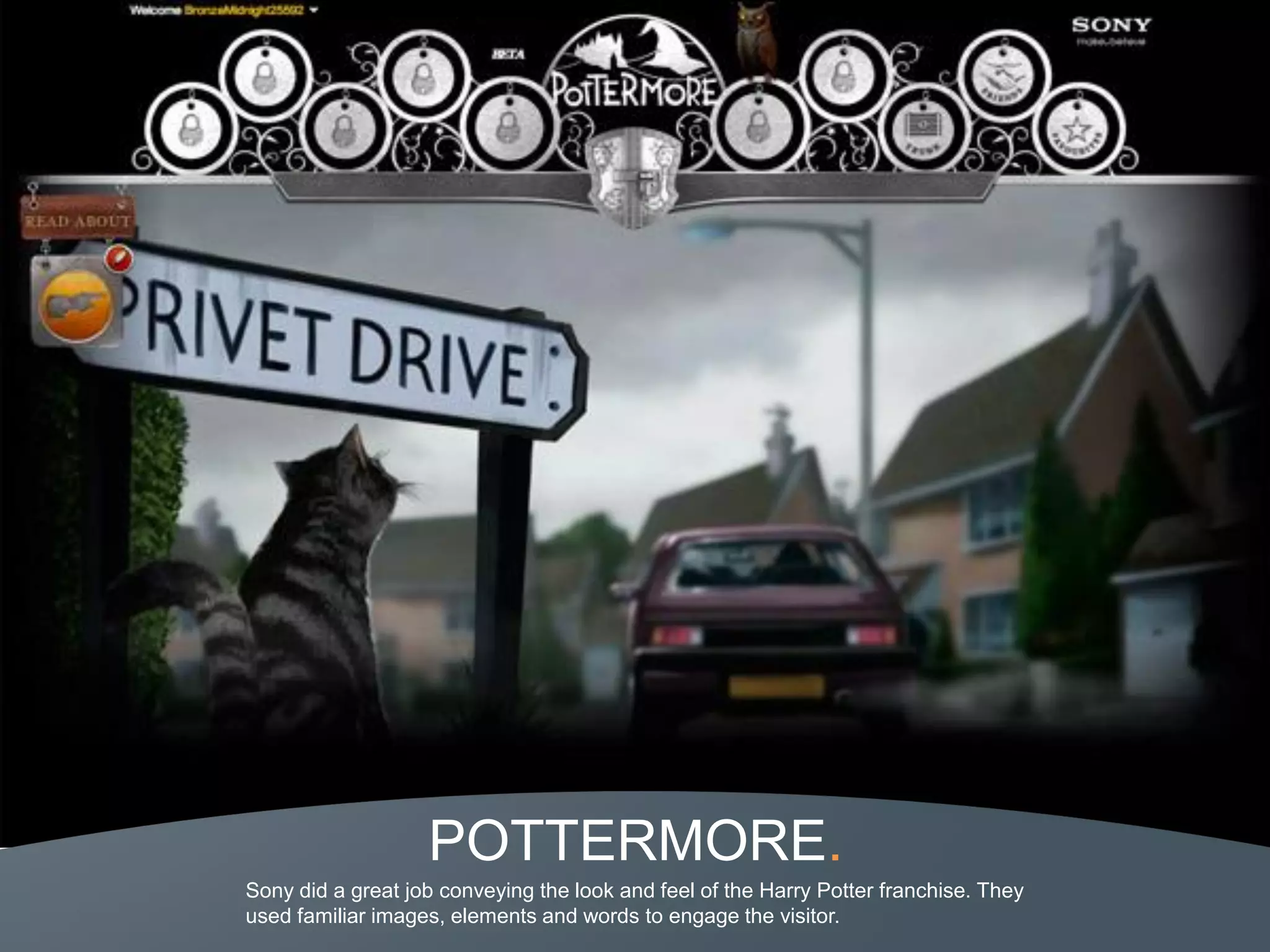
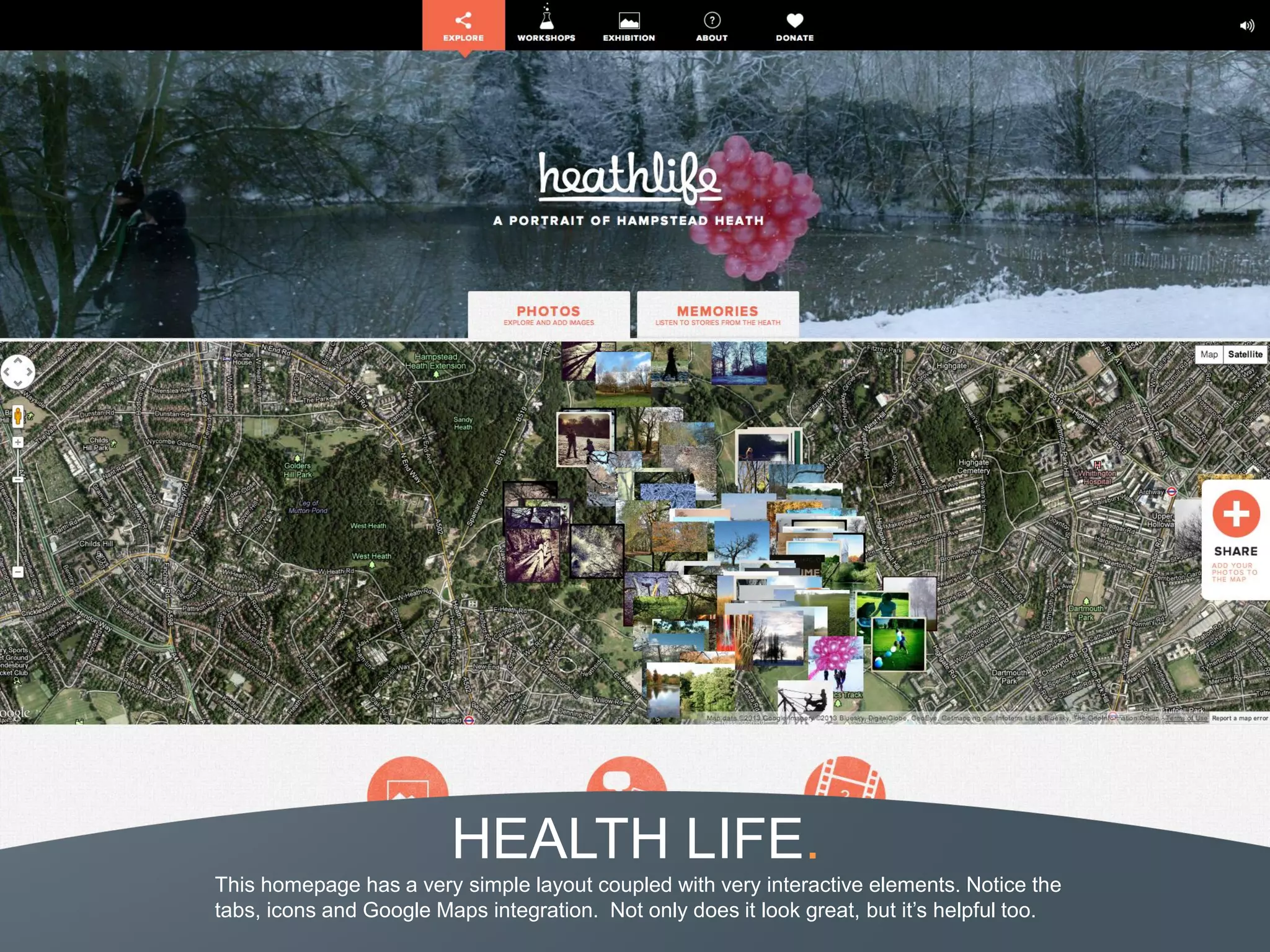
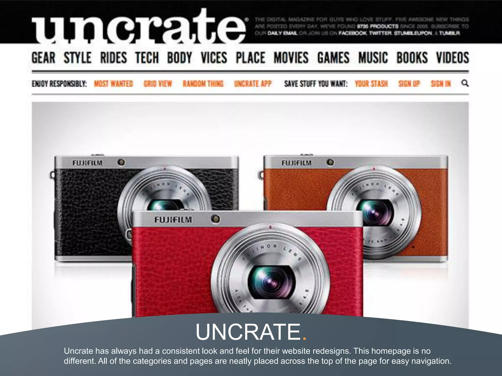
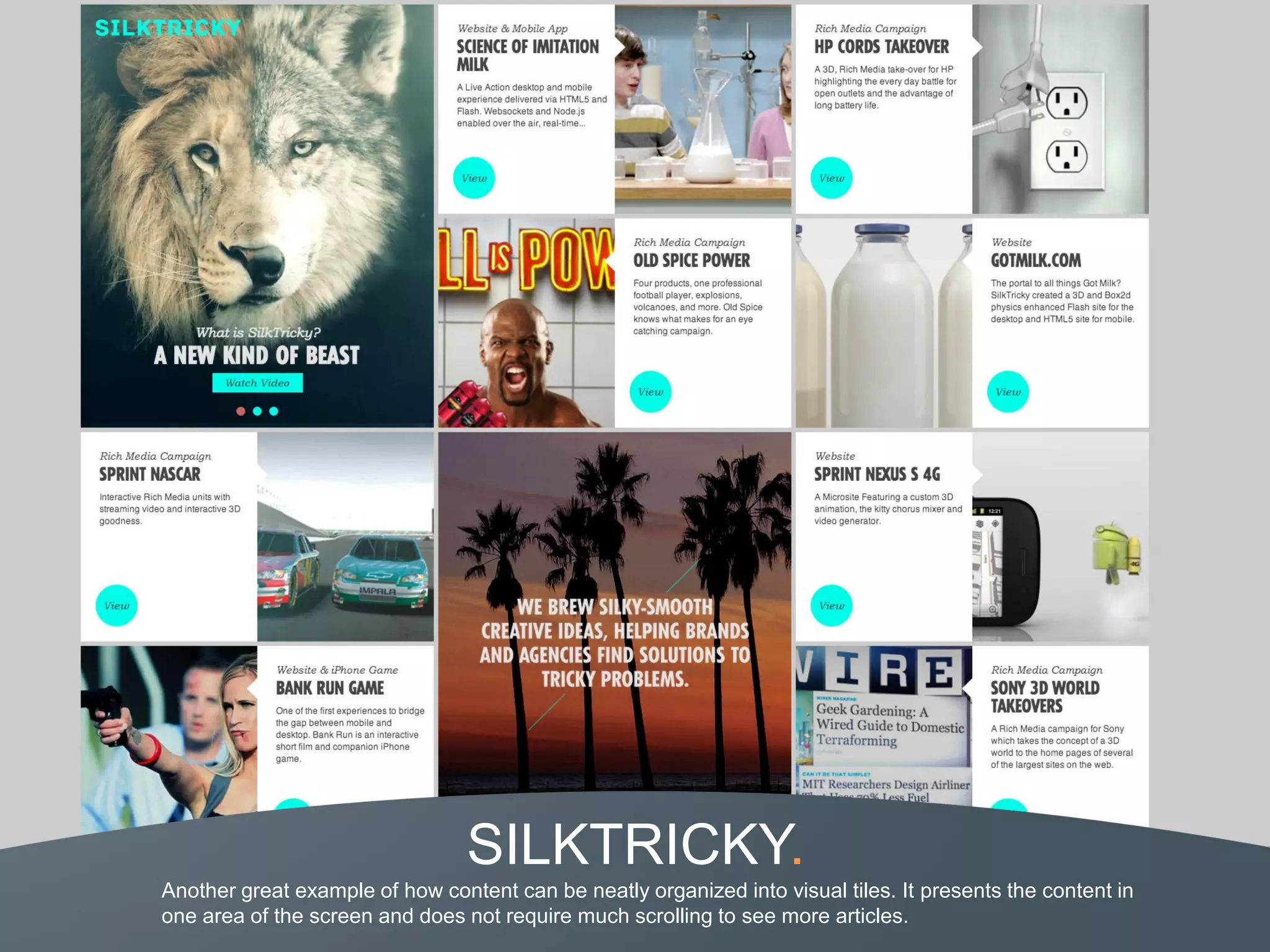
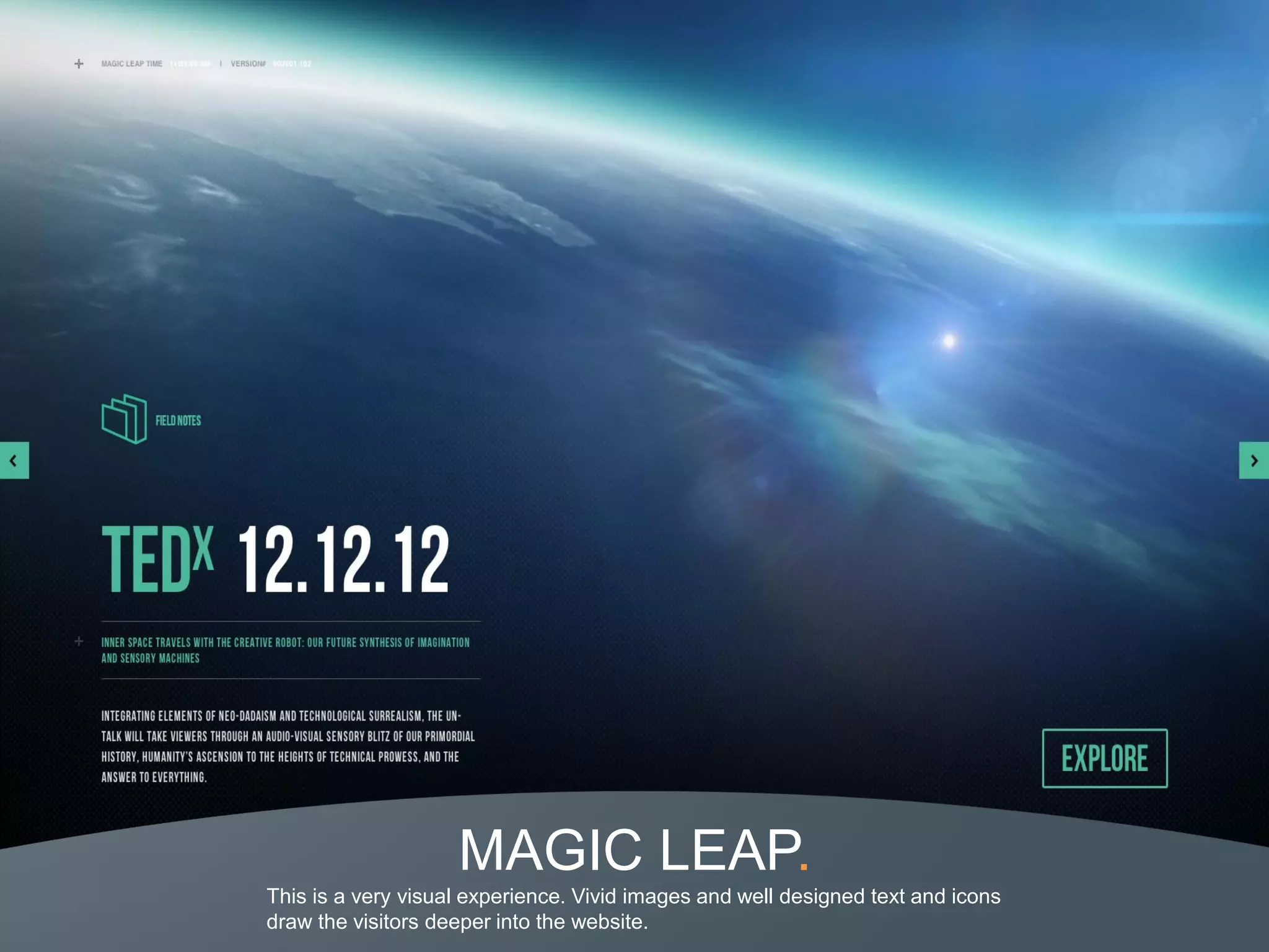
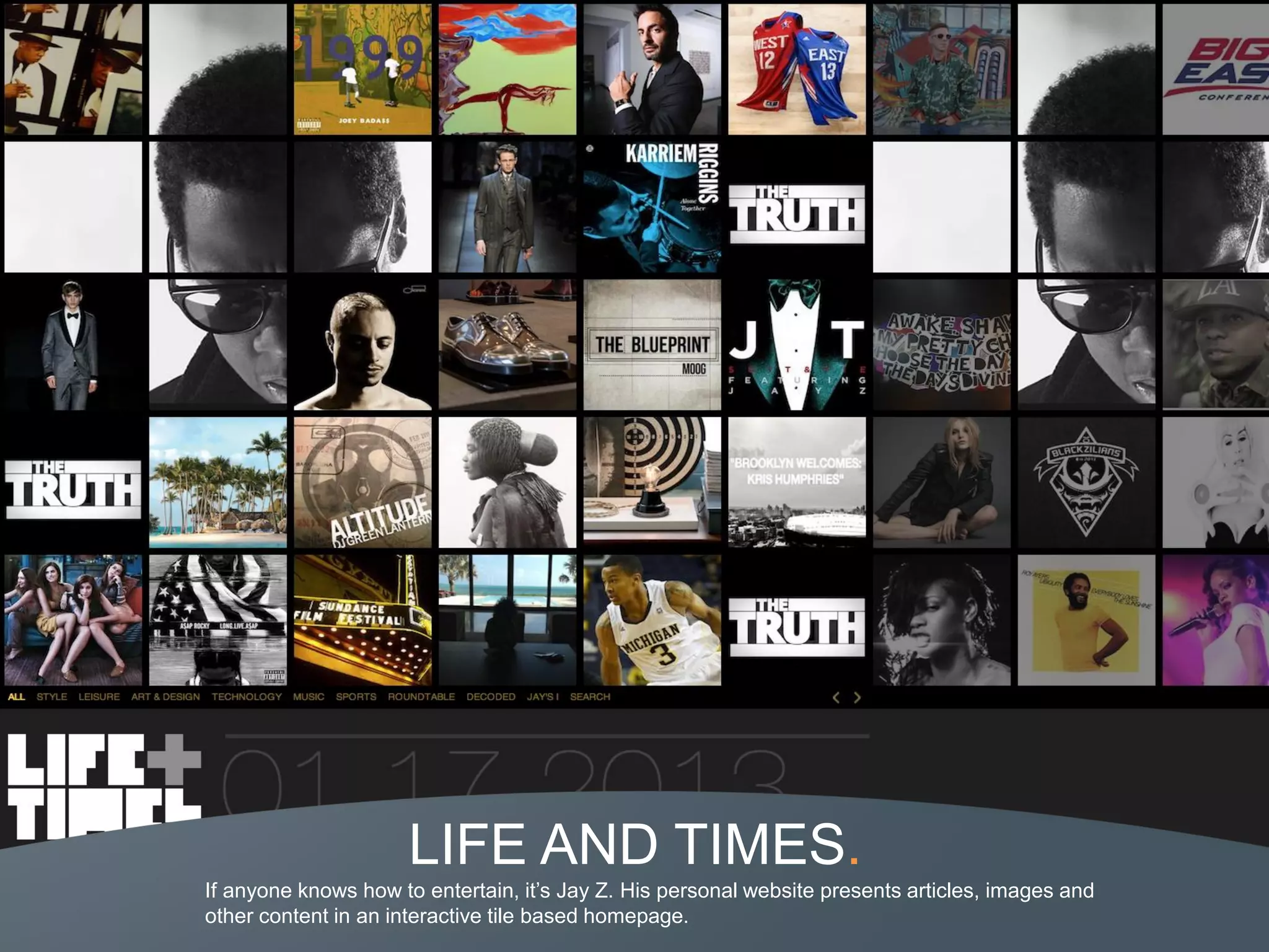
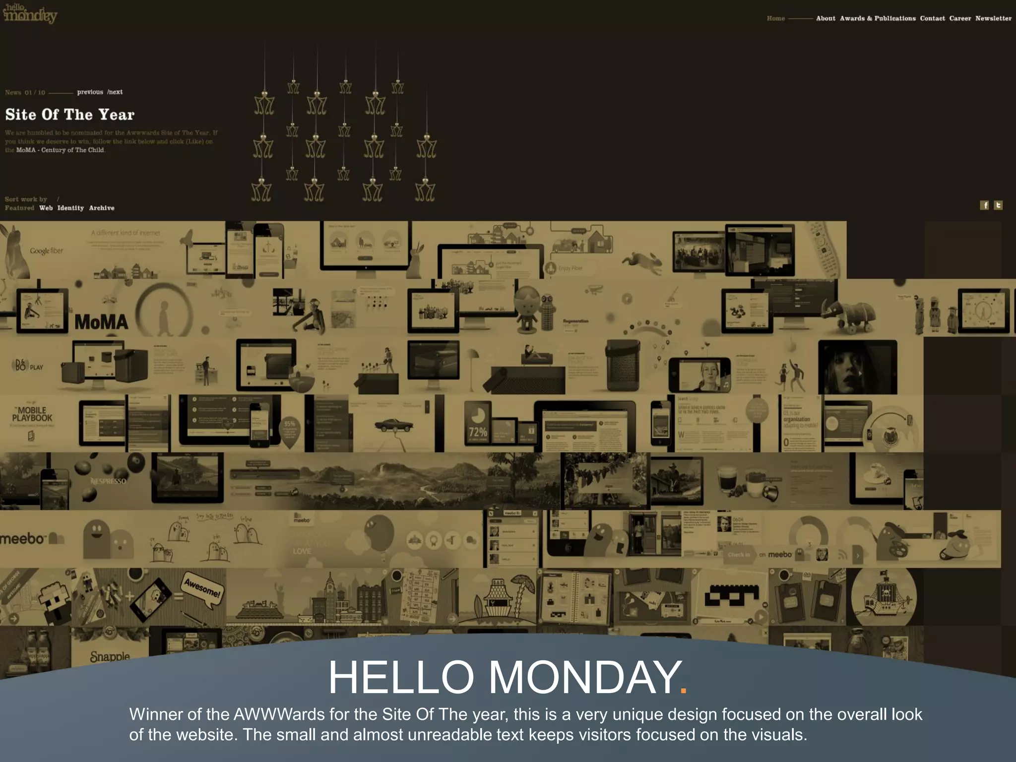
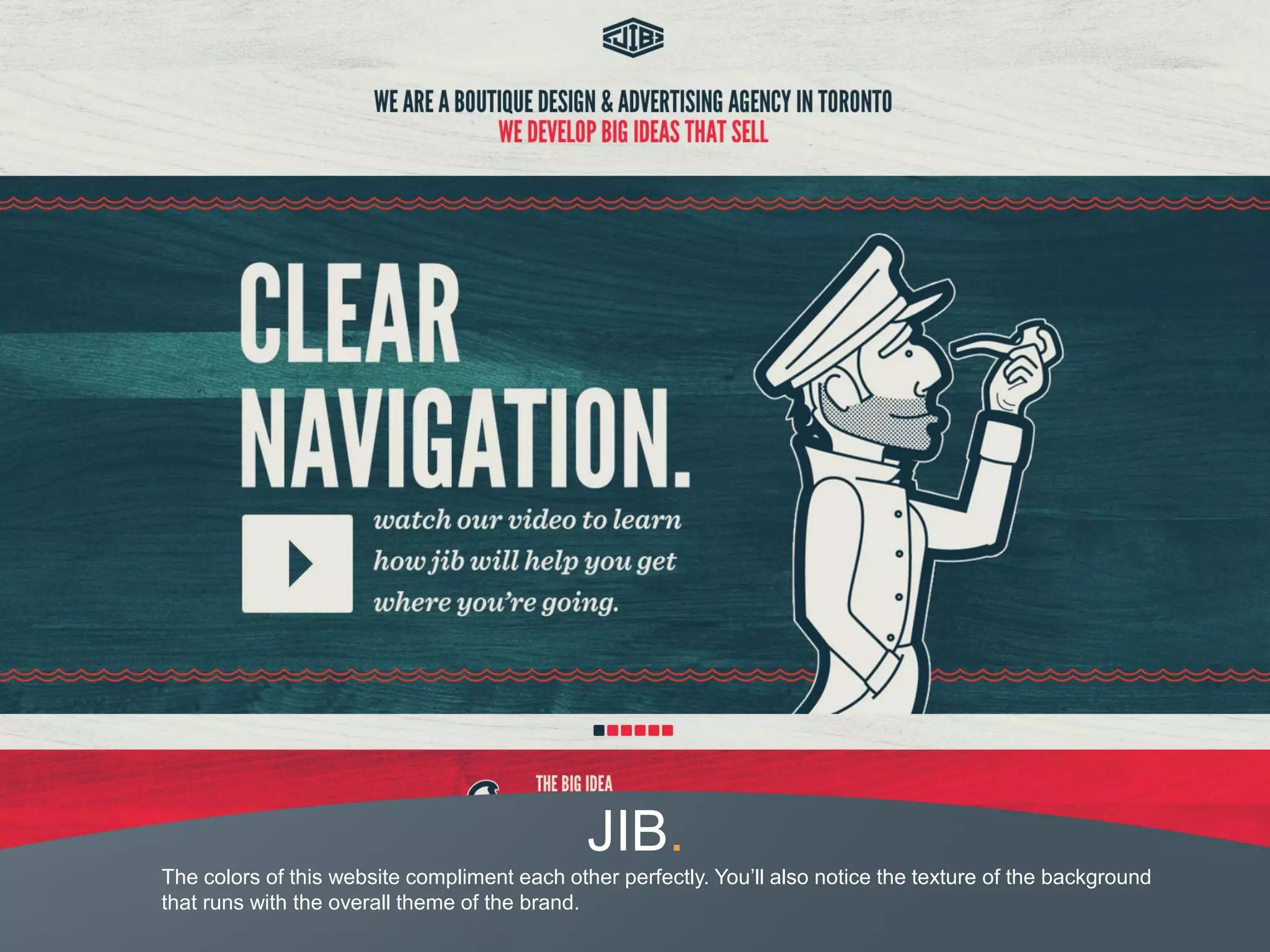
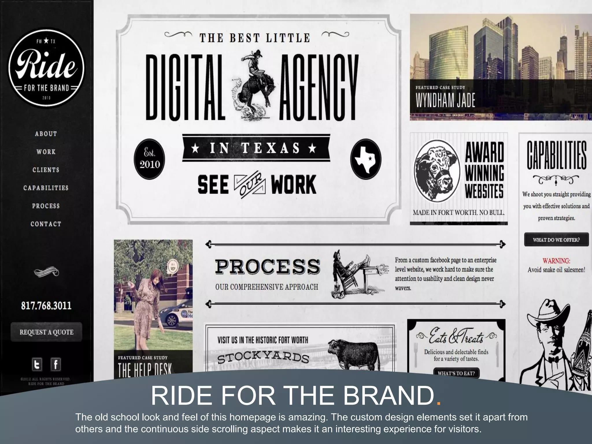
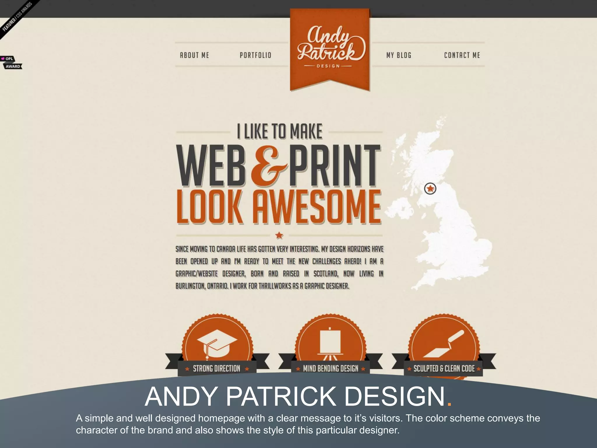
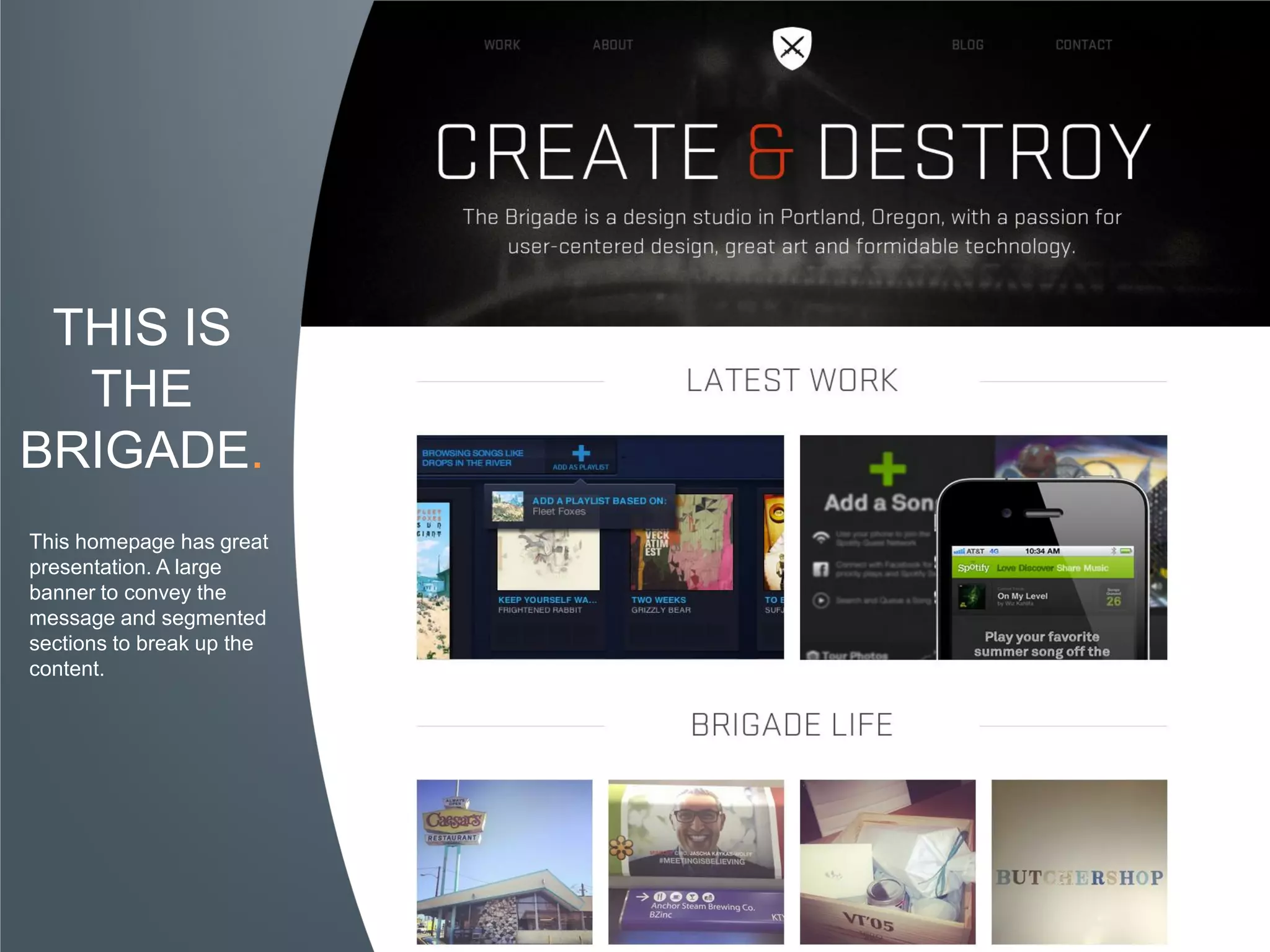
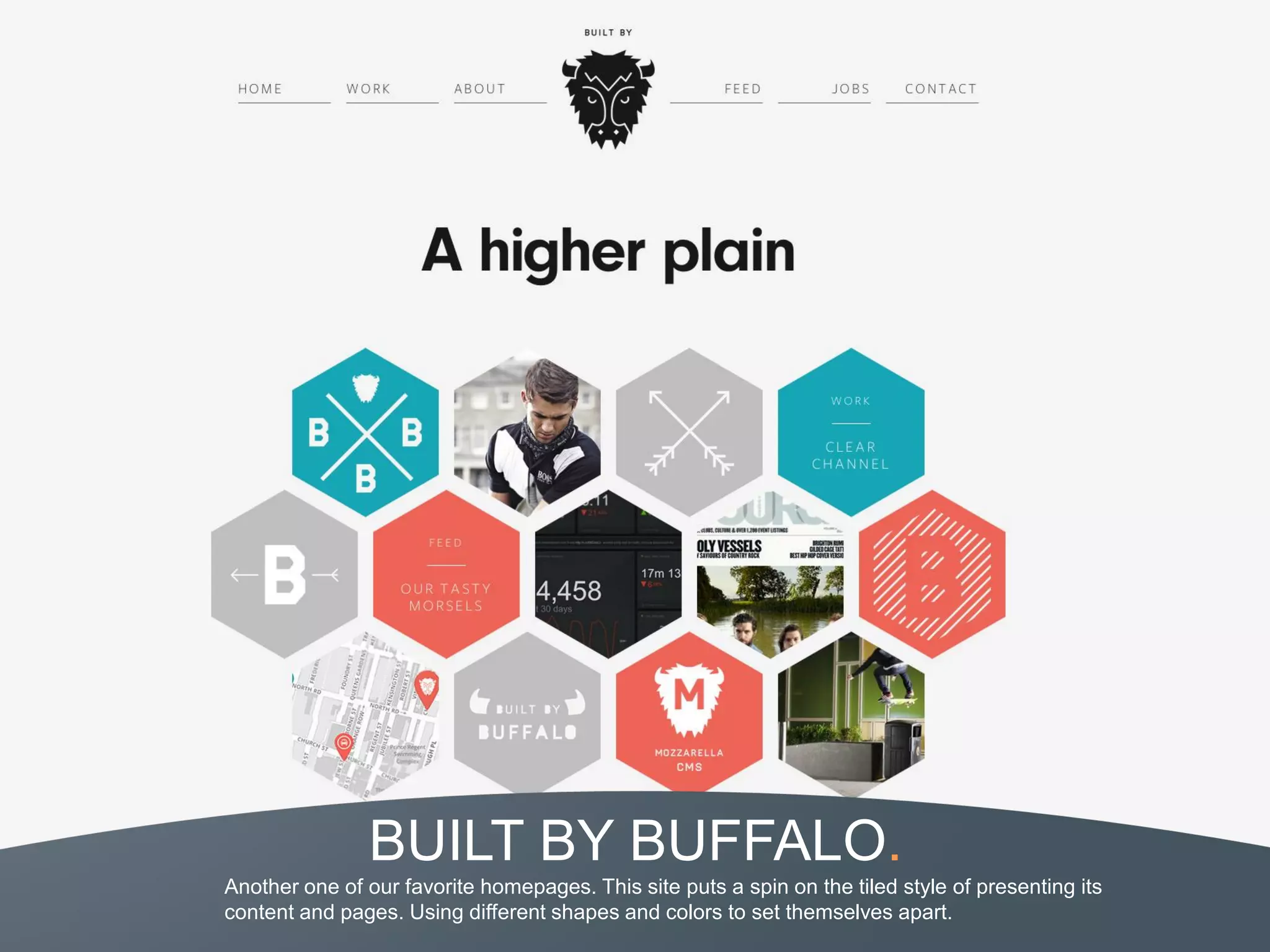
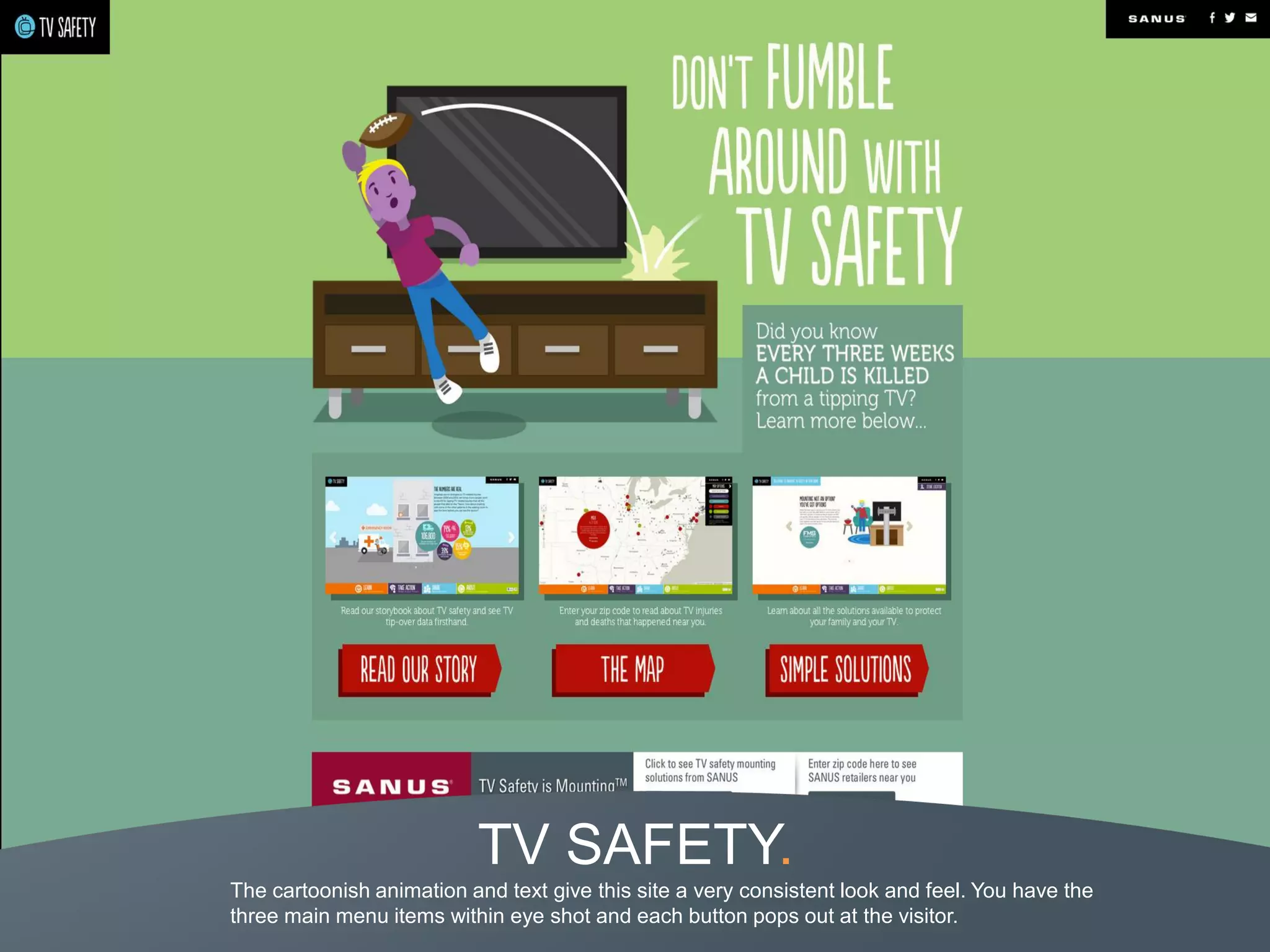
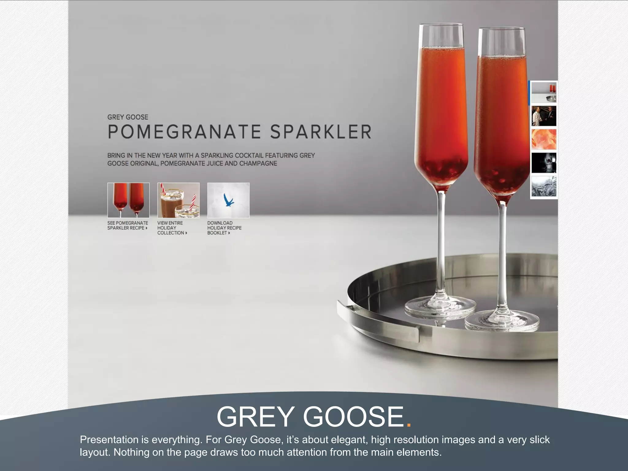
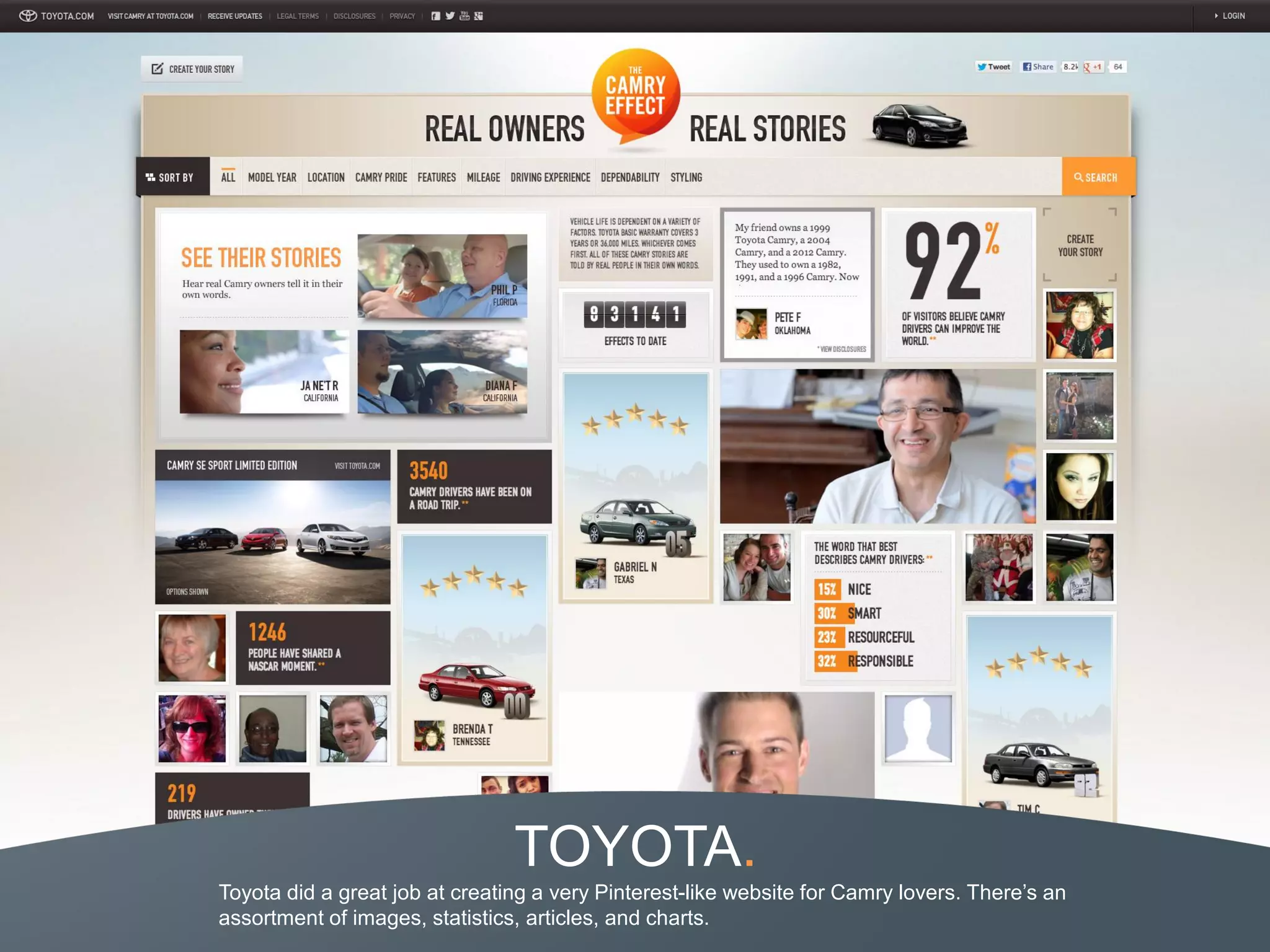
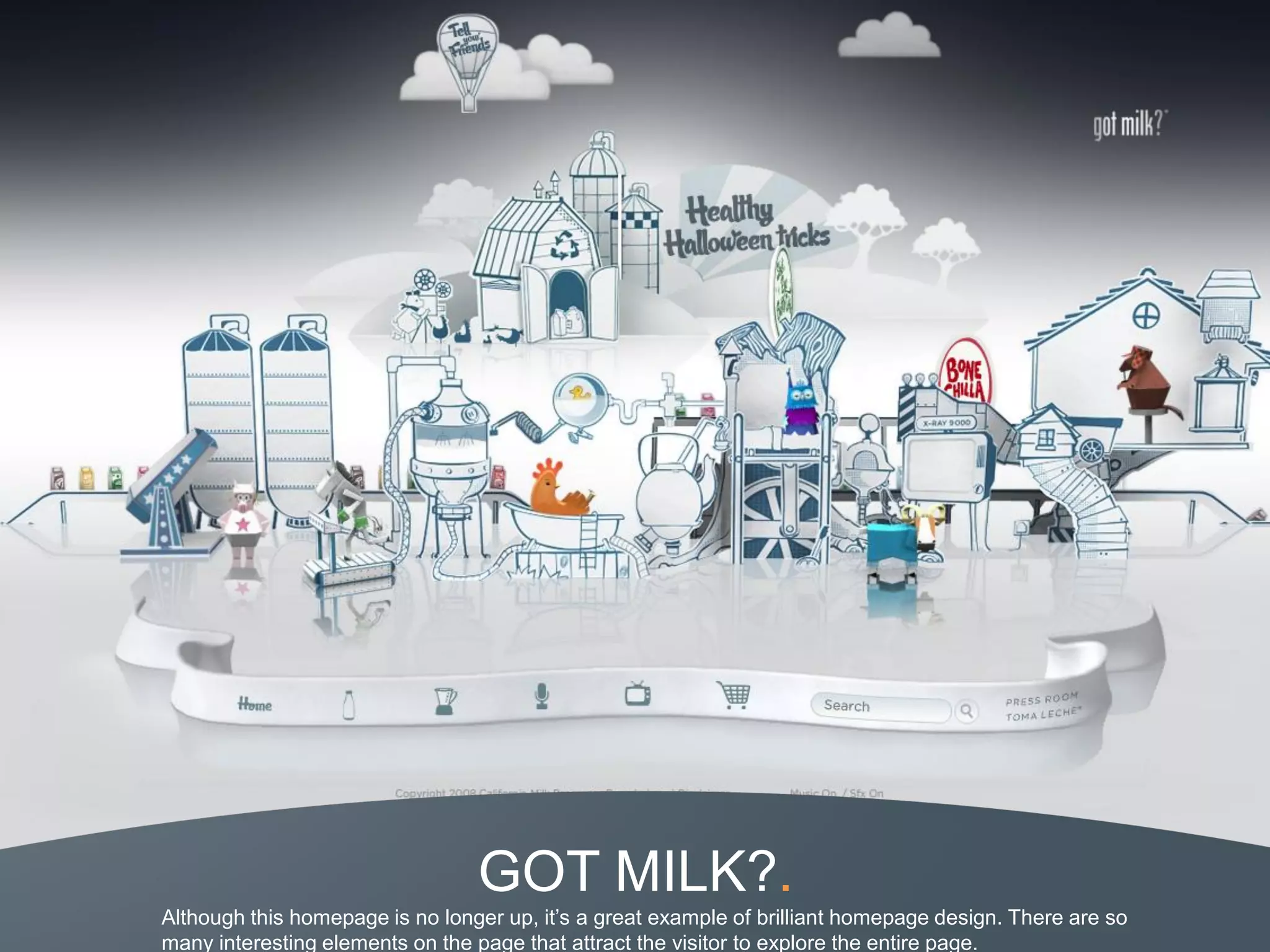
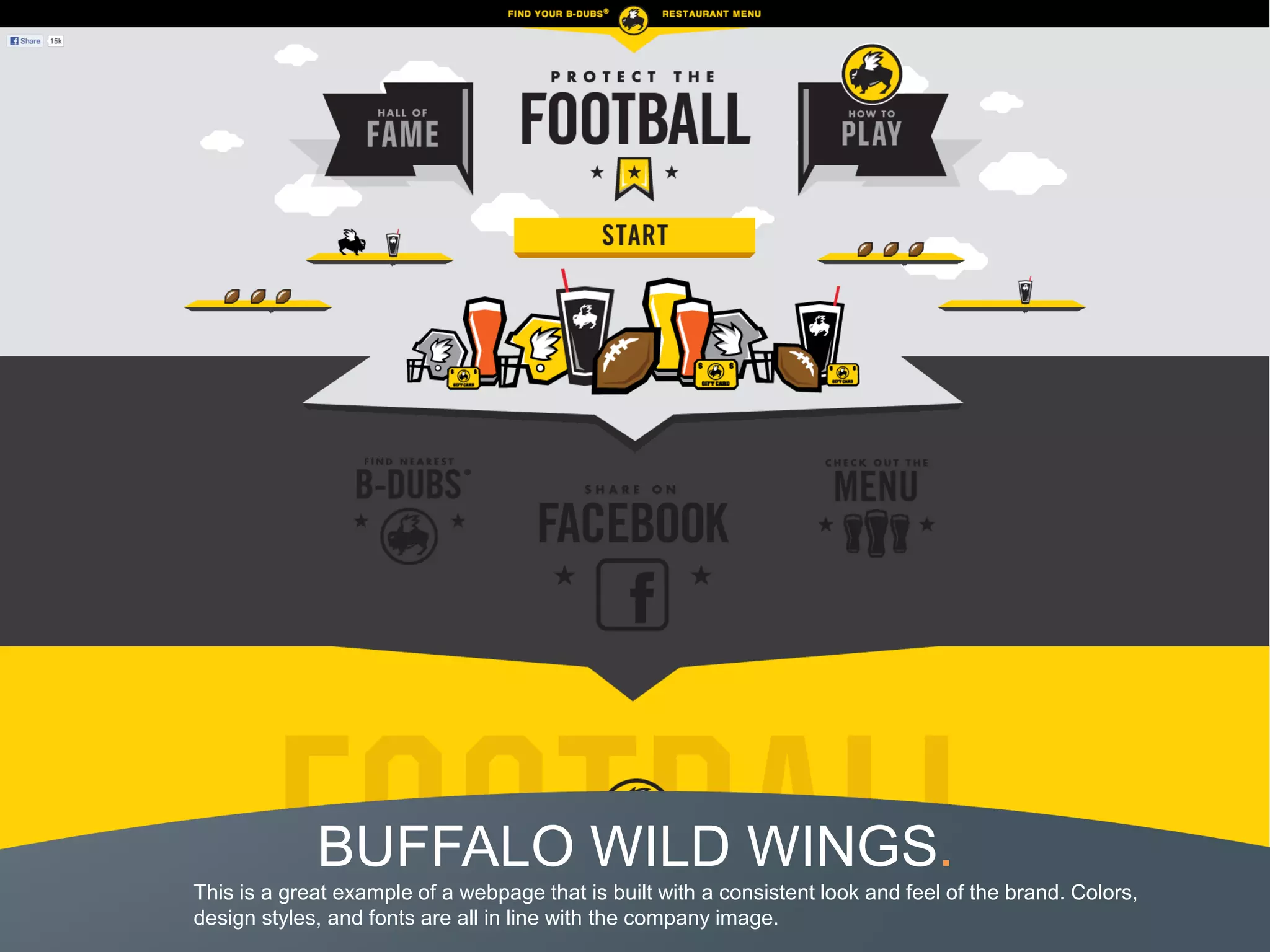
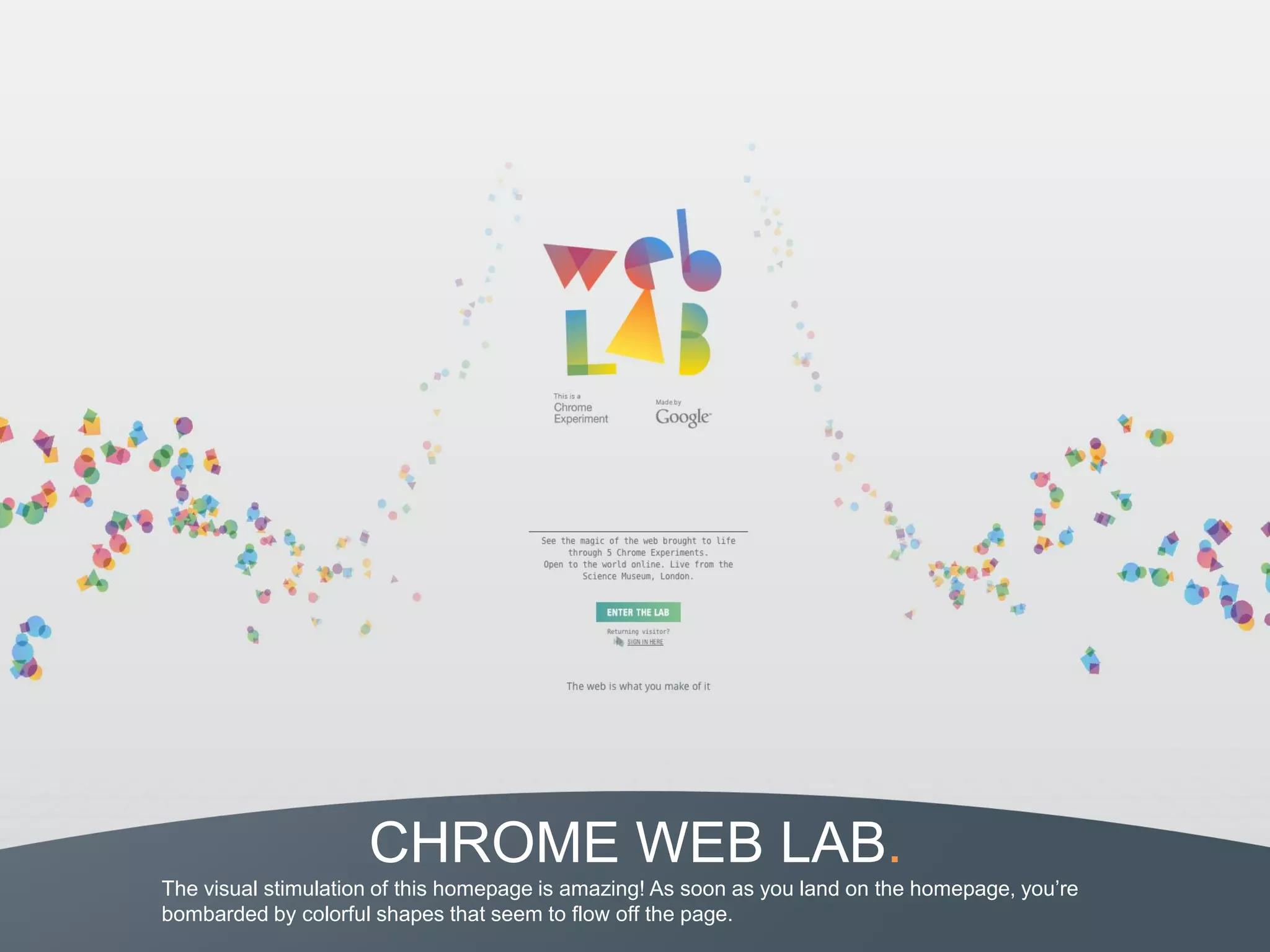
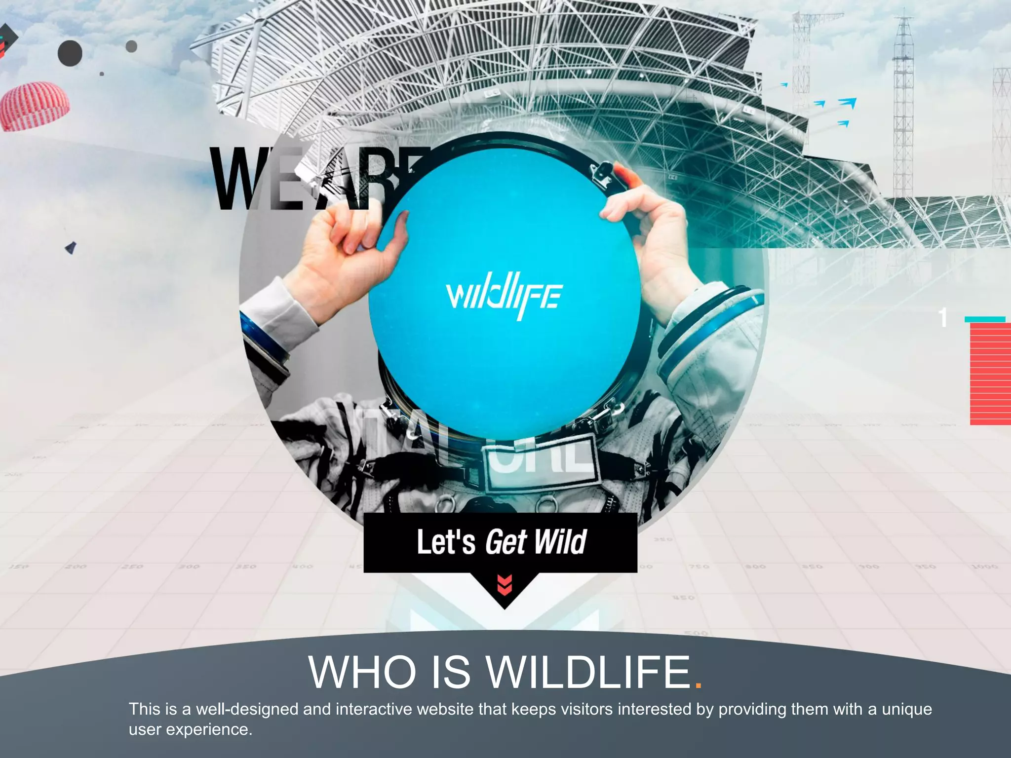
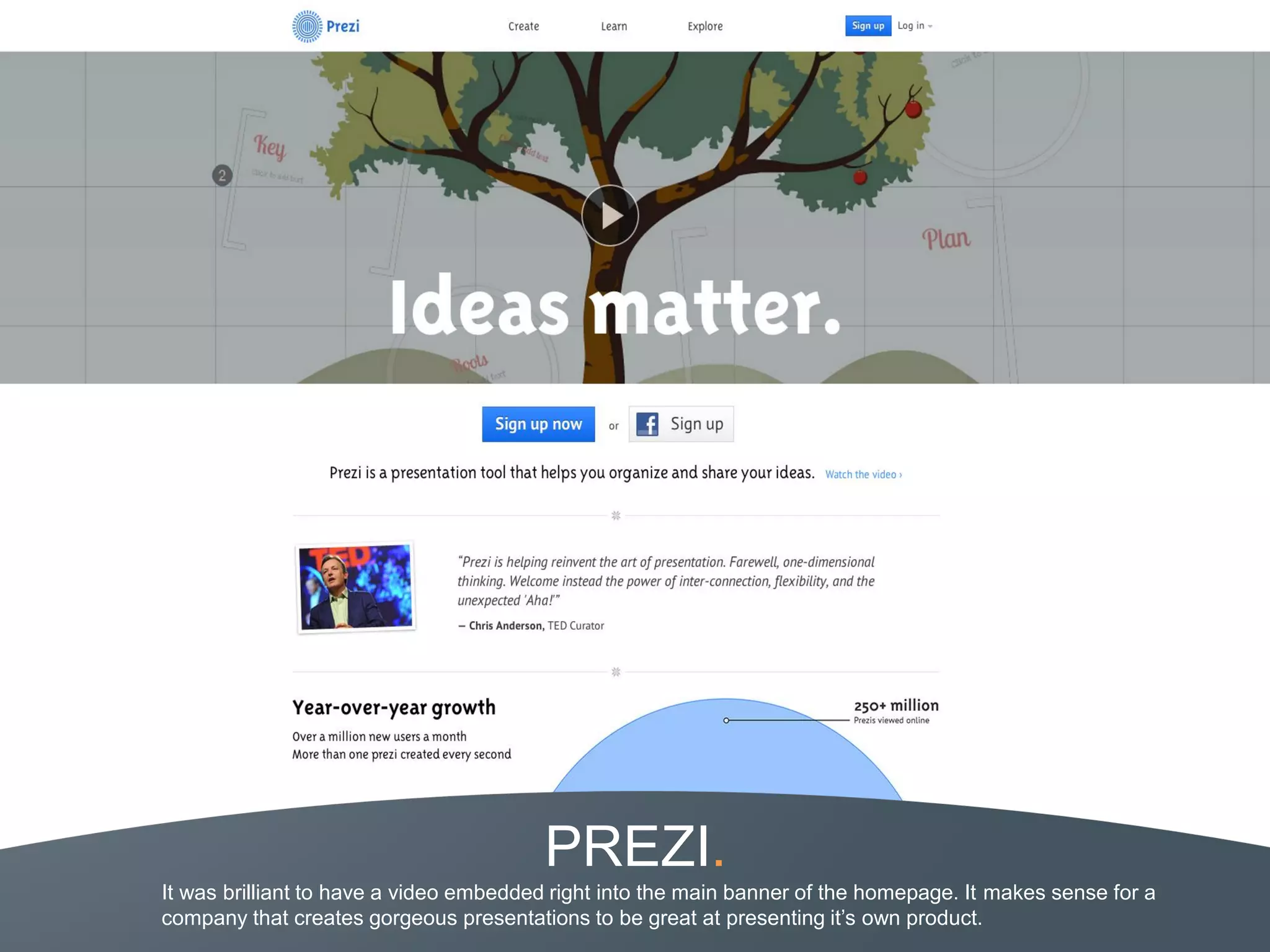
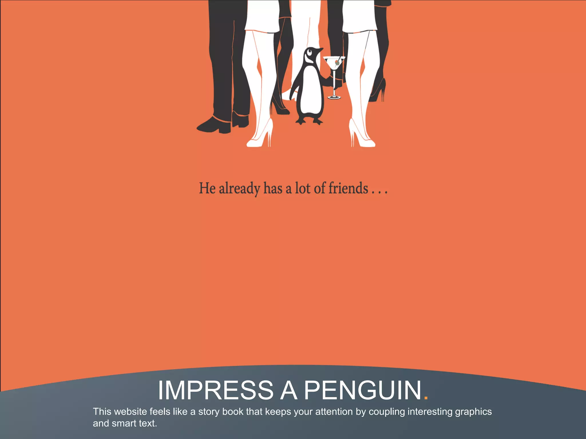
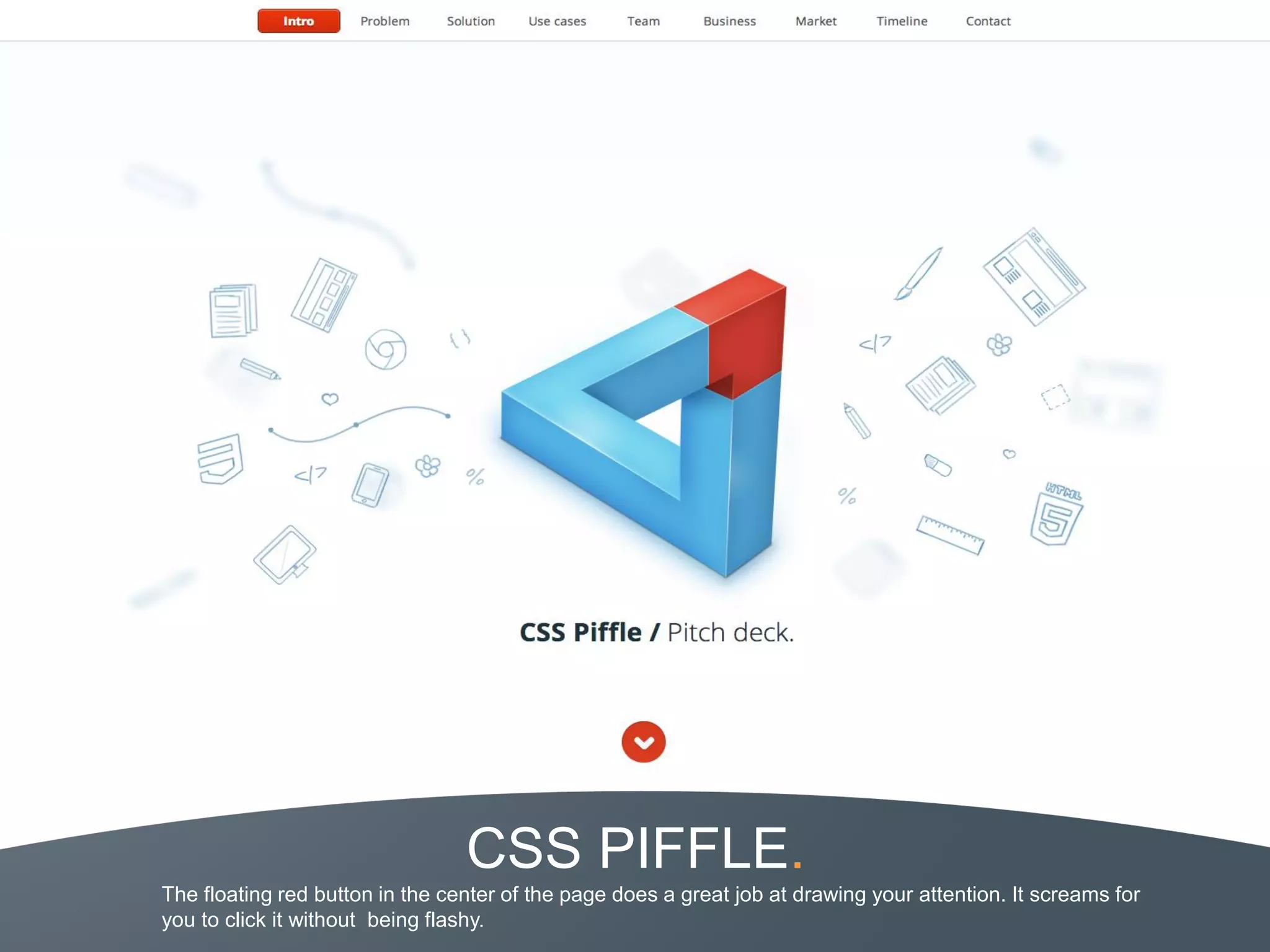
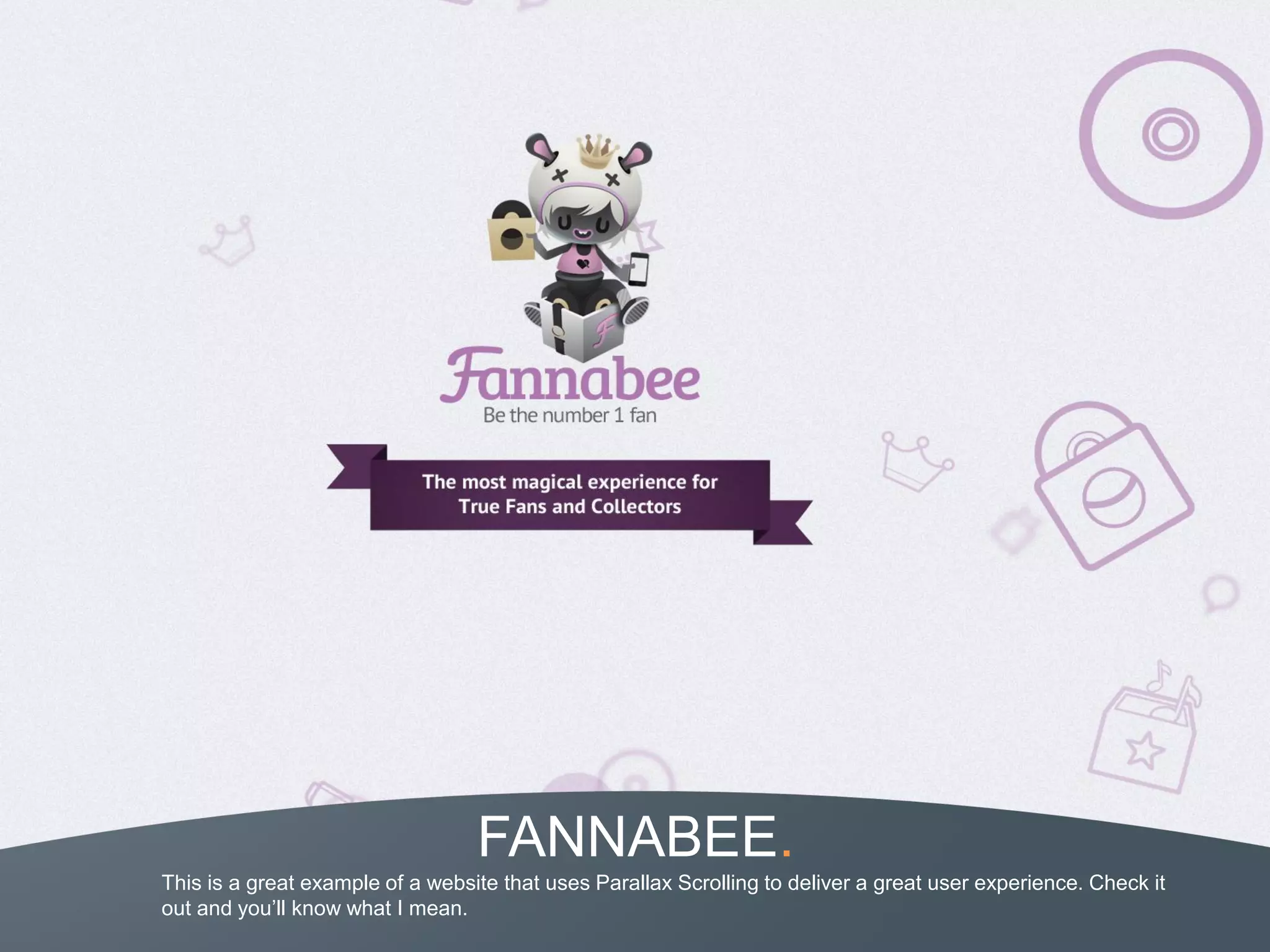
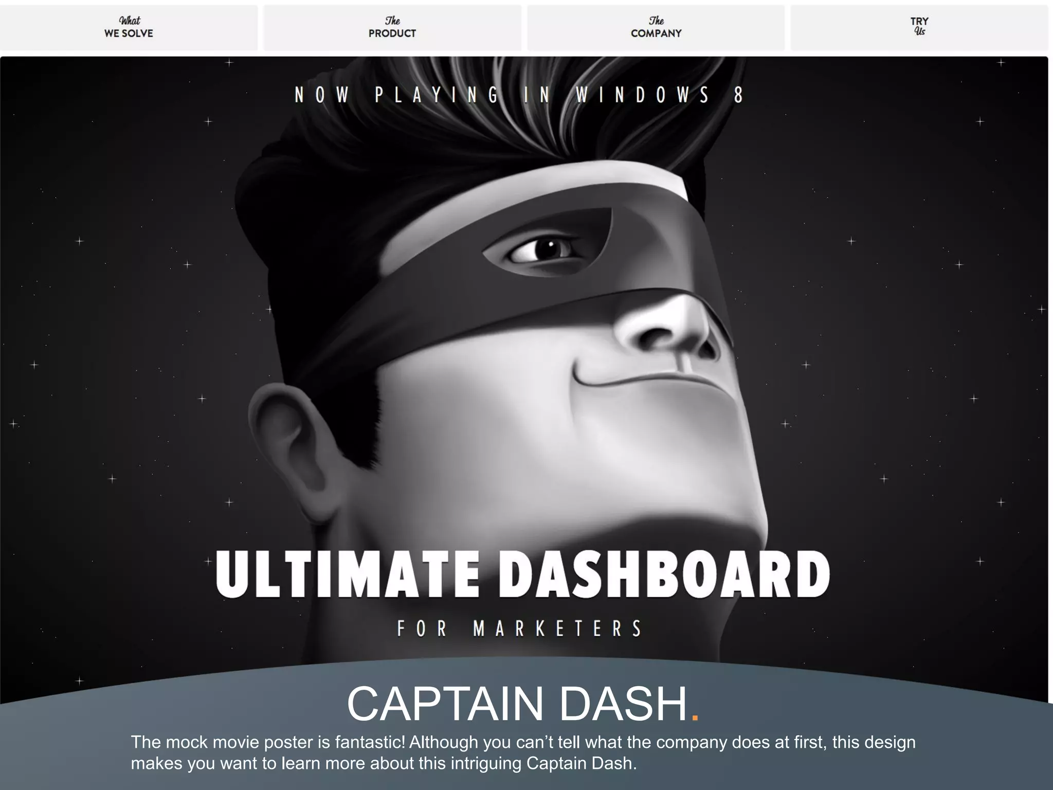
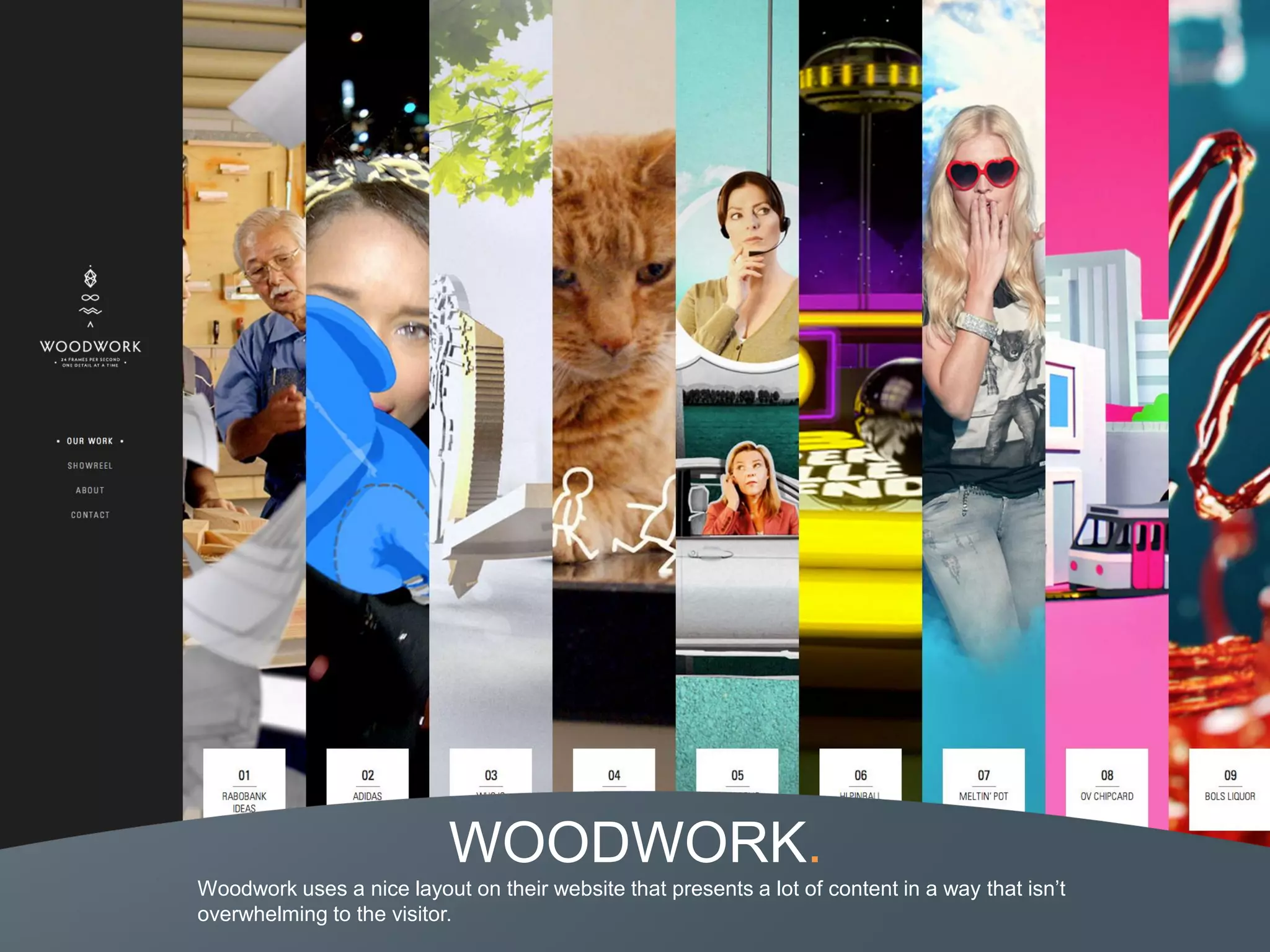
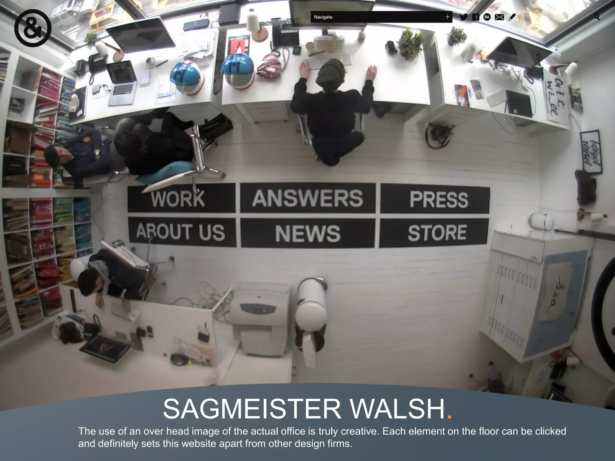
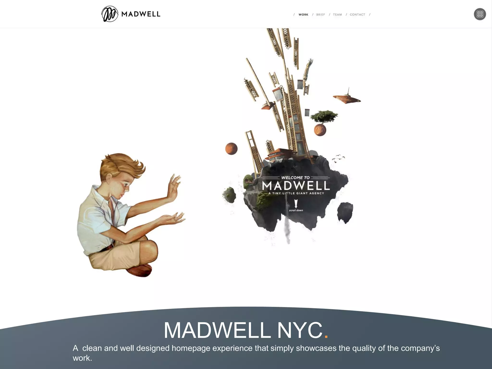
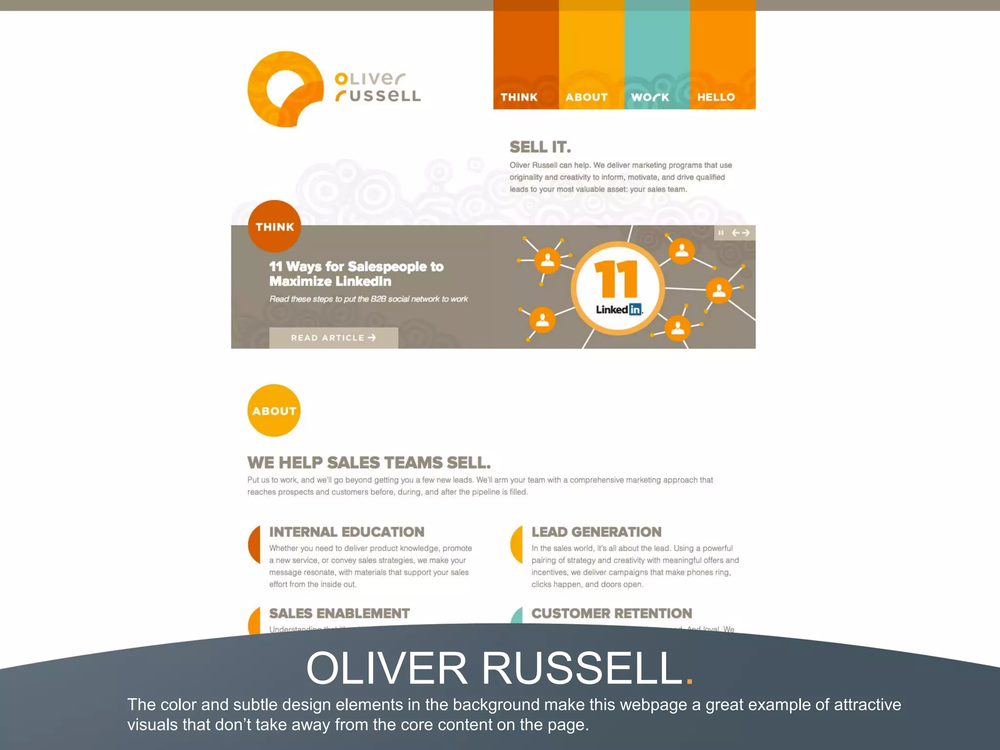
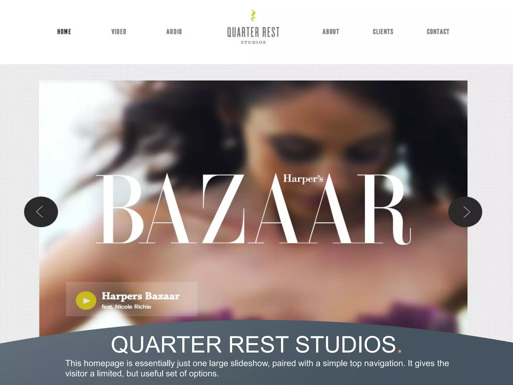
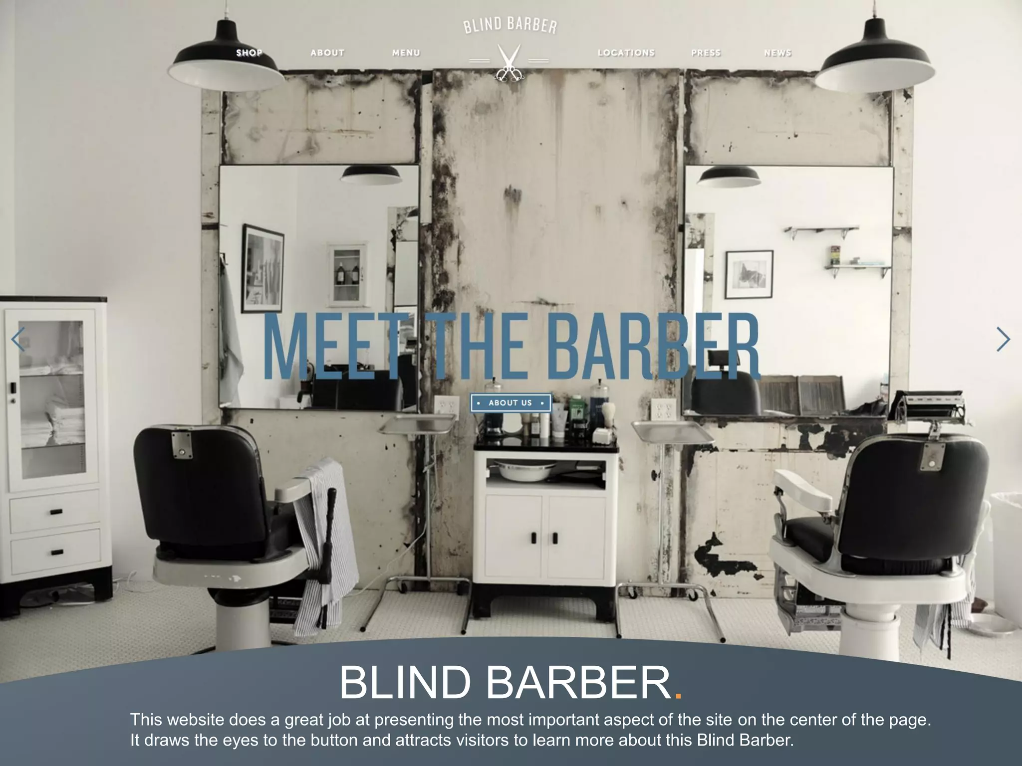
This document provides examples of effective homepage designs from 50 different websites. It is organized into sections for ecommerce, entertainment, design, retail, internet, and services examples. Each example includes an image of the homepage and a brief description highlighting effective design elements like clean layouts, prominent displays of featured products or content, and interactive features. The conclusion emphasizes researching your target audience and creating an aesthetically pleasing and user-friendly experience tailored to their needs.
In business, first impressions are everything. Whether it's a simple greeting from a team member when you walk into a store or a beautiful and easy-to-use homepage welcoming visitors to your site, it can be the difference between a one-time visitor and a customer for life.
A person visiting your website is identical to one visiting a brick and mortar store. Without an inviting and easy-to-use appearance that supports simple navigation and customer service, you run the risk of losing a potential customer.
In this slide deck, we've collected 54 stunning examples of effective website pages from real companies.
This document provides 50 examples of effective homepage designs from various industries including ecommerce, entertainment, design, retail, internet, and services. Each section highlights 3-6 homepages with descriptions of the key design elements that make them engaging. The conclusion emphasizes researching brand-appropriate styles and creating an aesthetically pleasing and user-friendly experience focused on the target audience's needs.
30 Website Homepage Designs to Benchmark in 2018unfunnel
It's probably not the best way to evaluate a company, but... well, it's what people do.
In case you missed it, here's your chance to check out one of our most popular ebooks of the year, 30 Examples of Brilliant Website Homepage Design - and see how dozens of small-to-midsize businesses have put their best feet forward.
DOWNLOAD THE COLLECTION NOW:
https://unfunnel.com/website-homepage-designs/
For any given company, the homepage is its virtual front door...
• If a new visitor doesn't like what they see, their first reaction is to hit the "back" button. Don’t let that happen!
• That’s why your homepage is undoubtedly one of the most important pages on your website.
• Flip through these 30 examples of brilliant website homepage design to inspire your own homepage design strategy
Are you interested in minimalistic web design? Reach out to Simplemachine today for more information on the key characteristics of minimalist web design!
The document provides examples of homepage designs from different industries, including agencies, entertainment, food/drink, nonprofits, software/tech, and big brands. It analyzes 50 homepage designs, highlighting elements like the use of video backgrounds, parallax scrolling effects, grids of images and content, and illustrations. Each section examines 3-5 examples, noting creative ways they engage visitors and represent their brand through visual design.
This document is Sherri Casarez's design portfolio, which includes summaries and screenshots of various design projects she has completed. The portfolio includes websites, posters, packaging, book designs, newsletters and other print and digital media. Sherri's projects cover a wide range of clients and industries, and demonstrate her skills with programs like Photoshop, InDesign, Dreamweaver and WordPress. The portfolio is intended to showcase Sherri's design experience and abilities to potential clients and employers.
Create digital moodboards with SampleBoard.comrostebbutt
SampleBoard.com presents a new and innovative way to create and present your ideas and vision by using the web-based interactive editor. It enables designers from different design disciplines (graphic, web, interiors, landscape, fashion and wedding planning) and backgrounds to collaborate on design projects, share their creative portfolio online and get exposure for business opportunities through the public design directory.
The document discusses the redesign of the Fitchburg Art Museum website by a student group from Fitchburg State University. The group redesigned the site to be more user-friendly, interactive, and give the museum its own identity. Key changes included adding interactive slideshows, a header that follows scrolling, simplifying tabs, and using a teal color scheme. Photos and dimensions were also improved for clearer viewing. The redesign aims to modernize the site and better represent the museum's history and exhibitions through its new design and features.
Prophets presents the 2012 trends in interactive design on http://www.prophets.be/DesignTrends
Our vision of where interactive design is going in the near future and how to respond to it. An inspiring presentation filled with real life examples of top-advertisers with a vision.
More info on www.prophets.be/DesignTrends
The document proposes redesigning the website and digital presence for The Arts Barge Project. It analyzes the current website and identifies weaknesses in attracting a younger audience. The proposed redesign includes updating the logo, simplifying pages like events and contacts, integrating social media promotion, and designing a mobile app and additional advertising materials. Mockups are presented of the new website, app, posters, and leaflets with a cleaner, more visually appealing and easily navigable design.
AGCO has one of the best Facebook pages for a B2B company. They keep their profile picture updated with relevant branding images. They also answer fan questions, encourage fan photos and engagement, and attend trade shows to interview customers and partners to share on Facebook. AGCO leverages Facebook tabs to feature new products, contests, blog posts, and videos. Their page is an excellent example of how to engage fans and mirror other marketing efforts on Facebook.
The document discusses setting up a business Facebook page. It provides instructions on creating a Facebook business page, including filling out basic information, adding a profile photo, filling out hours and contact details, uploading photos, and customizing the page with tabs. It also provides examples of customized Facebook pages and tips on using the page to promote your local business.
Andrea Zehender Design Presentation - TBEX North America 2018TBEX
This document provides tips and guidelines for building an amazing brand on a budget. It discusses the importance of logos, color palettes, typography, photography and using these branding elements consistently across a website and social media. Specific advice includes using vector logo files, limiting the color palette, choosing readable fonts, hiring a designer for the logo, and treating blogs and brands like businesses by investing in their design and promotion. Guest speakers provide examples from their own branding journeys and emphasize creating brand style guides to maintain consistency.
Evaluation of a2 students media websiteLarelleShay
The document evaluates an A2 student band's website called "The XYZs" that was created using WiX website builder software. The evaluator found that the website demonstrated professional design principles through features like consistent page layout, color scheme, and logo placement. Most pages provided clear and detailed information through creative elements like news feeds and merchandise designs. However, the watch page lacked the effort seen on other pages. Overall, the website effectively promoted the band and will influence the evaluator's future website design work.
ABOUT THE CLASS
This class, taught by SMU Advertising Lecturer Dev Gupta, will walk you through the design process for building better products. This class is for the non-designer, to understand the importance of creating great user experiences. Learn how to lead a design team to stay focused on the greater vision of your company through clear communication, business goals and ease of use.
THE TAKEAWAYS
To establish a clear understanding of the product value proposition before diving in to the design process.
To learn how to build a functional spec and business requirements through product roadmaps and wireframes.
To establish strategies for building out content strategy - both internal and external.
To discuss and demonstrate the importance of wireframing, user flow and prototyping before going into the actual visual design and development.
To walk away with a better understanding as to why better designed products succeed, and learn how to set the bar higher for your own product design.
ABOUT THE INSTRUCTOR, Dev Gupta
Dev Gupta teaches creating advertising art direction and copywriting. Before joining SMU, he worked as an art director and freelance interactive designer at various New York and Dallas agencies. He holds a Masters in Advertising and Bachelors of Finance from The University of Texas. His work has been featured in and honored by Wired Magazine, GQ, The One Club, Mashables and TechCrunch. When he is not teaching he consults with agencies, tech start-ups and fortune 500 companies.
PRESENTED BY, The Dallas Entrepreneur Center
The Dallas Entrepreneur Center (DEC) is an entrepreneurial support system dedicated to bringing together the resources, support and opportunities that Dallas-area entrepreneurs need to start, build and grow their businesses. Launched in 2013, the DEC believes investment in entrepreneurs is investment in the community. Learn more at thedec.co.
Nanci Kaesemeyer is a graphic designer with over 15 years of experience. She has expertise in corporate communications, branding, graphic design, and photography. Some of her past projects include catalogs, packaging design, branding identity work, and website concepts. She is proficient in programs like Adobe Illustrator, Photoshop, and InDesign. She is seeking new opportunities to apply her creative problem-solving skills.
This document is a graphic design portfolio for Brittany Olhoeft that summarizes her education, experience, skills, and a selection of design work from 2012-2015. It includes branding and logo designs, book covers, packaging, posters, illustrations, newsletter and magazine layouts. The portfolio demonstrates her proficiency with Adobe Creative Suite applications and her ability to create visual identities, print collateral, and digital media across multiple industries.
This document discusses visual design basics and principles. It defines visual design as focusing on aesthetics through strategic use of colors, fonts, images and other elements. It provides examples of good and bad design, highlighting important design considerations like color palette, typography, media use, hierarchy, white space and layout. Gestalt principles of perception and using design to enhance engagement are also covered. The document aims to educate on scientific and user-centered approaches to visual design.
Healthy Office Exercises that don't require you to leave your desk. All steps are clearly presented that will help you do exercise at your desk easily and quickly.
1. Neil Patel founded 9 companies, most of which failed and lost him $1 million, but he learned from his mistakes.
2. Some of the biggest mistakes entrepreneurs make include spreading themselves too thin, not choosing the right business structure, getting ahead of themselves with unrealistic expectations of profits, and not being careful about who they trust with their business.
3. Other common mistakes are not holding employees accountable, not collecting money owed in a timely manner, not paying attention to details, being too cautious and afraid to try new things, making emotional rather than logical decisions, and thinking that more money will solve problems rather than potentially cause new ones. The most important lesson is to learn from mistakes rather than repeat
This document summarizes 13 common business mistakes that can seriously harm a business. It discusses mistakes the author made in his experience founding 9 companies, including spreading himself too thin across multiple ventures, not structuring the business properly for taxes, getting ahead of expectations without working, trusting the wrong people, believing hiring solves all problems, not holding employees accountable, and not collecting money owed in a timely manner. The author provides examples from his experience with each mistake to illustrate how it can negatively impact a business.
This document summarizes benchmarks for increasing traffic and leads through various marketing activities based on data from 7,000 businesses. It finds that increasing content like website pages, blog posts, and landing pages can significantly increase traffic and leads, with larger businesses seeing more impact. Specifically, businesses with over 50 employees and 1,000+ web pages see 9.5x more traffic than those with under 51 pages. Increasing social media followers, especially past thresholds of 1,000 Twitter followers or 1,000 Facebook likes, also provides sizable traffic gains.
Social media has affected the nature of online content in several ways according to marketing experts. Experts note that content needs to be solution-based and help improve communities in order to build relationships. Additionally, the best content will rise to the top as it will be excellent enough to be compellingly shared by customers across social networks. Marketers are advised to stop merely marketing and start meaningfully connecting by solving problems through content.
The document summarizes 7 principles of innovation according to Steve Jobs: 1) Do what you love and follow your passion, 2) Have a bold vision to change the world, 3) Stimulate creativity through diverse new experiences, 4) Sell dreams rather than products by connecting with customers' hopes, 5) Focus by eliminating unnecessary things, 6) Create amazing customer experiences, 7) Master persuasive messaging to inspire others. These principles guided Jobs' career and breakthrough success at Apple.
The document discusses Facebook application development. It introduces Facebook apps and their purpose of bringing existing apps and brands into Facebook. It covers the Facebook API, including FBML/XFBML for displaying data and FQL for querying additional data. Integration points like Canvas pages and asynchronous FBML are also discussed. The document then provides details on authentication, security, and getting started with Facebook application development.
This document provides a summary of an individual's education, awards, teaching experience, related experience, publications, languages, memberships, and offer to provide references. It includes the individual's name, contact information, and details of their PhD from Elm University on cross-cultural communication, MA thesis on online content accessibility, BA from Oak Tree University in English with a journalism and French minor concentration, postdoctoral fellowship from Elm University, teaching experience including developing course structures and administering grades, work as an editor and researcher, publications on cross-cultural communication and inaccessible documents, fluency in English and French, and memberships in academic societies.
This document summarizes the highlights and activities of the Rotary Club of Port Stephens for the 2013-14 year. It notes that the club raised over $75,000, welcomed 10 new members, awarded 2 scholarships, updated its website, introduced new guidelines and procedures, installed binoculars at a lookout that raised $4,000, held a record-breaking charity golf day that raised $32,000, sponsored 2 young people to attend RYLA leadership program, celebrated a long-standing member, hosted a record number of students at its RYDA road safety program, managed the food court at the local Australia Day event, recognized 13 recipients of its Pride in Workmanship awards and 1 volunteer, hosted a Christmas
This document provides examples of brilliant homepage designs from various industries including ecommerce, entertainment, design, retail, internet, and services. It analyzes key elements that make the homepages effective, such as featuring prominent products or content, using clean and simple layouts, integrating multimedia like videos or images, and ensuring the design matches the brand. The document aims to inspire new homepage design strategies by highlighting best practices from 50 example websites.
This document provides examples of well-designed blog homepages from different categories like business, design, entertainment, lifestyle, and nonprofit. Each example highlights a key design aspect like consistent color scheme, use of thumbnails, two-column layout, or clean and minimalist design. The goal is to help people design effective and visually appealing blog homepages that attract and engage readers.
This document provides examples of well-designed blog homepages across different industries including business, design, entertainment, lifestyle, nonprofit, and technology. Each example highlights key design elements such as color schemes, layouts, image placement, and content organization. The conclusion emphasizes that an effective blog design focuses on clearly presenting content in a way that meets readers' needs, rather than solely prioritizing visuals.
This document provides examples of well-designed blog homepages across different industries like business, design, entertainment, lifestyle, nonprofit, and technology. Each example highlights key design elements like consistent color schemes, balanced content presentation, use of images and thumbnails, and easy navigation. The conclusion emphasizes that an effective blog design focuses on layout that allows readers to easily access content according to their needs and interests, rather than just visual graphics.
This document provides examples of well-designed blog homepages and discusses important considerations for blog design. It begins by explaining that an effective blog design needs to balance visual design with clear content presentation. It then shares multiple examples of popular blogs with different design approaches. Key aspects highlighted include consistent color schemes, balanced layouts, prominent display of headlines and thumbnails, and easy scrolling. The conclusion emphasizes that the most important goal of design is to reflect the blog's character and ensure readers can easily access content.
This document provides examples of well-designed blog homepages and discusses important considerations for blog design. It showcases blogs from different industries including business, design, entertainment, lifestyle, nonprofit, and technology. The blogs demonstrated a variety of design approaches including consistent color schemes, balanced content presentation, use of thumbnails and images, and easy navigation. The conclusion emphasizes that an effective blog design reflects the content and ensures readers can easily access and consume the information.
The document provides examples of homepage designs from different industries, including agency & studio, entertainment, food & drink, nonprofit, software & tech, big brand, and ecommerce & retail. It introduces the examples through screenshots and descriptions, highlighting creative design elements like parallax scrolling, hover states, illustrations, animations, and use of color and photography. The goal is to inspire new homepage design ideas by showcasing brilliant designs from other companies.
The document provides examples of homepage designs from different industries, including agency & studio, entertainment, food & drink, nonprofit, software & tech, big brand, and ecommerce & retail. It introduces the examples through descriptive text and screenshots. Some highlighted design elements include parallax scrolling, hover states, illustrations, animations, and use of color and photography. The goal is to showcase brilliant homepage designs that can provide inspiration for redesigning one's own homepage.
The document provides examples of homepage designs from different industries, including agency & studio, entertainment, food & drink, nonprofit, software & tech, big brand, and ecommerce & retail. It introduces the examples through descriptive summaries and screenshots. Some highlighted design elements include parallax scrolling, hover states, illustrations, animations, and use of color and photography. The goal is to showcase brilliant homepage designs that provide inspiration for redesigning one's own homepage.
Magik New Media is a user experience designer for both web and mobile platforms in Brisbane, Australia. Having numerous numbers of design assignments under its belt, Magik New Media associates regularly distribute tactics on subjects of contemporary design developments and social media. You can review several of our work on MagikNewMedia.com portfolio page or follow twitter updates @magik_new_media.
This document summarizes the interface design project for Crabrill. The project involved researching the target audience, developing branding elements like a logo and style guide, designing a website mockup in XD, and creating publicity materials. Testing was conducted on wireframes and mockups which informed refinements. The final deliverables included a logo, style guide, functioning website, and publicity assets promoting the Crabrill brand.
This document provides a concept for the design of a new global website for Riga Black Balsam. The proposed design aims to impress visitors and influence their perception of the brand through animated visuals and an interactive experience. The structure is intended to guide visitors through various sections in a set order to expose them to moods, cocktails, and information before viewing products. A prototype demonstrates animations and interlinking of sections to provide an immersive brand experience in 3 sentences or less.
- The document discusses researching and analyzing existing webpage designs to inform the creation of a webpage prototype. Key elements like logos, images, headings, and navigation are examined across different sites.
- Mood boards and sketches are created to organize photos and visualize designs for an art-focused website. A handwritten font is selected for the logo to suit the subject matter.
- Artist websites are specifically analyzed to understand themes relevant to promoting art online, like the use of negative space and captivating images. Elements of successful sites are identified through a coding key.
The document provides guidance on designing effective websites. It discusses why design is important for usability and aesthetics. It then covers common website structures and elements like navigation, layouts, use of color and images. The key recommendations are to keep designs simple, consistent and prioritize important information above the page fold. Color contrasts and readable typography are also emphasized.
Our team observed several booths at a recent trade show and noticed some effective strategies. Small booths can stand out through well-designed graphics and minimal clutter. Unique brand colors that are uncommon in an industry help draw attention. Interactive product demonstrations and technology like VR help engage attendees. Creating an exclusive experience makes attendees feel special. Professional photography, even of small products, is important to attract visitors. White space and simple messaging can be more noticeable than crowded graphics. Appealing to multiple senses through sights, sounds, and activities engages people. Bold designs ensure your message is communicated clearly. Creative booth structures and integrated graphics promote brands in memorable ways.
The document analyzes and compares two boxing equipment websites, Sugar Ray's and Box Fit UK, in terms of their use of digital graphics and interactive media. Both sites use rollover buttons for navigation but Sugar Ray's buttons are more noticeable. Sugar Ray's also has a more illustrative and memorable banner compared to Box Fit UK's simpler one. The document evaluates elements like layout, images, and design quality between the two sites.
This document provides guidance on designing effective websites that keep readers engaged. It emphasizes simple, clean design with easy-to-read text and intuitive navigation. Key recommendations include using a small logo, latest content on the home page with no scrolling, and ensuring the design is responsive across different devices. The document outlines 10 rules for successful website design, such as focusing on the user's needs and keeping the background and menus simple.
2. INTRODUCTION 1 RETAIL 35
Current Section Title
ECOMMERCE 2
4 INTERNET 45
ENTERTAINMENT 13 SERVICES 53
DESIGN 24 CONCLUSION 64
2
3. INTRODUCTION.
You never get a second chance to make a first
impression. That’s why your homepage is undoubtedly
one of the most important pages on your website.
For any given company, the homepage is its virtual front
door -- and face to the world. If a new visitor doesn't like
what they see, their knee-jerk reaction is to hit the
"back" button.
Don’t let that happen. Check out these 50 examples of
brilliant homepage design to inspire your own
homepage design strategy.
SHARE COLLECTION
3
5. LUHSE TEA.
The look and feel of this ecommerce homepage gives the brand a personal
characteristic that makes it stand out from many others.
6. FIT FOR
A FRAME.
A great feature of this
homepage is that the
featured items are neatly
presented for all to see.
You’ll also notice the
simple but attractive
slideshow.
7. SHOP LOCKET.
A simple and very charming design. The Facebook enabled sign up is a much
appreciated feature for those looking to avoid long forms.
8. WHITE LOTUS AROMATICS.
A great example of placing featured products where you’ll see the greatest amount of website traffic. The
monthly update also gives viewers content other than product pages.
9. EVEL.
You can immediately tell what this website is selling. Well organized homepage of
featured items, attractive slides, and price tags.
10. LEGA-LEGA.
You’ll notice a trend: Most attractive ecommerce homepages feature their products in a
clean and clutter free format.
11. URBAN ORIGINALS.
This is an extremely simple and effective homepage design. A vibrant background
and a simple menu of product pages.
12. SCOTCH
& SODA.
The tiled look of this
homepage works great
for showcasing different
areas of the website.
Neatly placed social
icons make it easy to
share, and the “Latest
Posts” tab gives viewers
more content to
consume.
14. CLOUDS OVER CUBA.
Sweet and simple. This homepage has one goal; and that is for you to view the documentary.
15. UNIVERSERIES.
This is an amazingly well designed homepage. The user experience is mesmerizing
and immersive. The use of shapes and colors make it a must see!
16. JACQUI CO.
This homepage is one of our absolute favorites. The look and feel of the website is brilliantly
designed, and the interactive elements take this homepage to a whole other level.
17. POTTERMORE.
Sony did a great job conveying the look and feel of the Harry Potter franchise. They
used familiar images, elements and words to engage the visitor.
18. HEALTH LIFE.
This homepage has a very simple layout coupled with very interactive elements. Notice the
tabs, icons and Google Maps integration. Not only does it look great, but it’s helpful too.
19. UNCRATE.
Uncrate has always had a consistent look and feel for their website redesigns. This homepage is no
different. All of the categories and pages are neatly placed across the top of the page for easy navigation.
20. THE GOOD MAN.
One of the most visually attractive websites we’ve seen. The experience is fluid and
takes advantage of the power behind web and graphic design.
21. SILKTRICKY.
Another great example of how content can be neatly organized into visual tiles. It presents the content in
one area of the screen and does not require much scrolling to see more articles.
22. MAGIC LEAP.
This is a very visual experience. Vivid images and well designed text and icons
draw the visitors deeper into the website.
23. LIFE AND TIMES.
If anyone knows how to entertain, it’s Jay Z. His personal website presents articles, images and
other content in an interactive tile based homepage.
25. HELLO MONDAY.
Winner of the AWWWards for the Site Of The year, this is a very unique design focused on the overall look
of the website. The small and almost unreadable text keeps visitors focused on the visuals.
26. JIB.
The colors of this website compliment each other perfectly. You’ll also notice the texture of the background
that runs with the overall theme of the brand.
27. RIDE FOR THE BRAND.
The old school look and feel of this homepage is amazing. The custom design elements set it apart from
others and the continuous side scrolling aspect makes it an interesting experience for visitors.
28. ANDY PATRICK DESIGN.
A simple and well designed homepage with a clear message to it’s visitors. The color scheme conveys the
character of the brand and also shows the style of this particular designer.
29. THIS IS
THE
BRIGADE.
This homepage has great
presentation. A large
banner to convey the
message and segmented
sections to break up the
content.
30. BUILT BY BUFFALO.
Another one of our favorite homepages. This site puts a spin on the tiled style of presenting its
content and pages. Using different shapes and colors to set themselves apart.
31. GALPIN.
This site does a great
job at using typography
to showcase it’s
character. Notice that it
does not focus on
graphics, but more on
the text and how it
conveys its messages.
32. MADE BY VADIM.
Vadim is concise and too the point. You can see examples of his work while the homepage
provides direct access to the most important aspects of his business.
33. ART & CODE.
The use of interesting icons in a gridded layout give this website an attractive and
clean look. Sometimes, less is better.
36. REI.
One of REI’s much cooler pages. Showcases a variety of user submitted photos in a familiar tile based
layout. Scrollable from side to side with interactive elements when hovering over images.
37. AUSTIN BEERWORKS.
The colors and presentation of their product are just so inviting! Clean, white background coupled with high
resolution product images can make anyone thirsty for an Austin Beerworks beer.
38. JAQUET DROZ.
The product is in your face and isn’t trumped by any other visual elements on the page. You see it, it’s
gorgeous, and you want to buy one.
39. ITALIO KITCHEN.
It isn’t often that restaurants focus on homepage design, but this site did it right. A large attractive slideshow
across the top of the page, followed by more images of delicious food!
40. TV SAFETY.
The cartoonish animation and text give this site a very consistent look and feel. You have the
three main menu items within eye shot and each button pops out at the visitor.
41. GREY GOOSE.
Presentation is everything. For Grey Goose, it’s about elegant, high resolution images and a very slick
layout. Nothing on the page draws too much attention from the main elements.
42. TOYOTA.
Toyota did a great job at creating a very Pinterest-like website for Camry lovers. There’s an
assortment of images, statistics, articles, and charts.
43. GOT MILK?.
Although this homepage is no longer up, it’s a great example of brilliant homepage design. There are so
many interesting elements on the page that attract the visitor to explore the entire page.
44. BUFFALO WILD WINGS.
This is a great example of a webpage that is built with a consistent look and feel of the brand. Colors,
design styles, and fonts are all in line with the company image.
46. CHROME WEB LAB.
The visual stimulation of this homepage is amazing! As soon as you land on the homepage, you’re
bombarded by colorful shapes that seem to flow off the page.
47. VIDDY.
A great example of how a “Sign in with Facebook” button can simplify the registration process and increase
the number of members to your service.
48. WHO IS WILDLIFE.
This is a well-designed and interactive website that keeps visitors interested by providing them with a unique
user experience.
49. PREZI.
It was brilliant to have a video embedded right into the main banner of the homepage. It makes sense for a
company that creates gorgeous presentations to be great at presenting it’s own product.
50. IMPRESS A PENGUIN.
This website feels like a story book that keeps your attention by coupling interesting graphics
and smart text.
51. CSS PIFFLE.
The floating red button in the center of the page does a great job at drawing your attention. It screams for
you to click it without being flashy.
52. FANNABEE.
This is a great example of a website that uses Parallax Scrolling to deliver a great user experience. Check it
out and you’ll know what I mean.
54. CAPTAIN DASH.
The mock movie poster is fantastic! Although you can’t tell what the company does at first, this design
makes you want to learn more about this intriguing Captain Dash.
55. WOODWORK.
Woodwork uses a nice layout on their website that presents a lot of content in a way that isn’t
overwhelming to the visitor.
56. SAGMEISTER WALSH.
The use of an over head image of the actual office is truly creative. Each element on the floor can be clicked
and definitely sets this website apart from other design firms.
57. MADWELL NYC.
A clean and well designed homepage experience that simply showcases the quality of the company’s
work.
58. RYAN EDY.
As a website for professional photography services, the design plays well into what the visitors are looking
for. A simple navigation on the left and a series of photographs for viewers to enjoy.
59. OLIVER RUSSELL.
The color and subtle design elements in the background make this webpage a great example of attractive
visuals that don’t take away from the core content on the page.
60. QUARTER REST STUDIOS.
This homepage is essentially just one large slideshow, paired with a simple top navigation. It gives the
visitor a limited, but useful set of options.
61. FANCY RHINO.
Here’s another website that showcases their work with an embedded video on the homepage. The
navigation and sidebar are simple enough to stand out next to playing video.
62. FLINT
BOUTIQUE.
The font and colors
play quote the role in
making this a well
designed homepage.
The consistency
between the text and
the graphics make for a
great user experience.
63. BLIND BARBER.
This website does a great job at presenting the most important aspect of the site on the center of the page.
It draws the eyes to the button and attracts visitors to learn more about this Blind Barber.
64. CONCLUSION.
With all of these amazing examples on the
internet, it can be difficult finding a style that
represents your brand. Remember to do your
research and visit any websites that interest you.
Your goal is to create an aesthetically pleasing
homepage that will also provide your visitors with
a user-friendly experience. Take the time to learn
about your target audience, and create a truly
wonderful experience around their needs.
SHARE COLLECTION
64
65. HOW DOES
YOUR WEBSITE
STACK UP?
Talk to a HubSpot expert about how you
can improve your homepage today.
We’ll walk you through a step-by-step
website assessment to help you see Request a Free Consultation
homepage success.