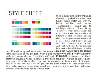
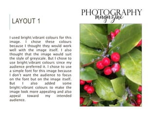
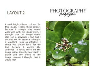
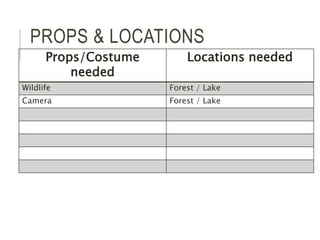
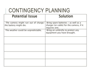
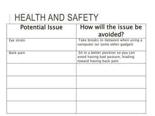
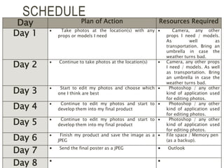
PRE-PRODUCTION Harriet Smith
STYLE SHEET When looking at the different kinds
of colours, I picked out a few that I
thought would match well with my
theme ‘wildlife and nature
(+landscapes)’. I would want to
use bright/vibrant colours. Using
colours like ‘red’ and ‘orange’ are
good since there are a variety of
different shades of those colours
which can help to create various of
ideas. I think that bright colours
like ‘red’, ‘orange’ and ‘green’
work well with my theme because
they have a lot of different shades
that I can use to make my photos
look more effective when I create
my product.
I would want to try and use a variety of colours to appeal my audience and make
them interested in my product. When doing my survey, I asked if my audience
preferred ‘greyscale’ or ‘bright/vibrant’ and 47.06% of audience said they
preferred greyscale whilst 41.18% said they preferred bright/vibrant colours. I plan
on using both of these effects so that my audience can have a mix of different
images rather than just a few images with the same effect. I will also experiment
with darker colours to see what would work best with my images but I will also
consider what my audience would like best.
LAYOUT 1
I used bright/vibrant colours for this
image. I chose these colours
because I thought they would work
well with the image itself. I also
thought that the image would suit
the style of greyscale. But I chose to
use bright/vibrant colours since my
audience preferred it. I chose to use
a simple font for this image because
I don’t want the audience to focus
on the font but on the image itself.
But I also added some
bright/vibrant colours to make the
image look more appealing and also
appeal toward my intended
audience.
LAYOUT 2
I used bright/vibrant colours for
this image. I chose these colours
because I thought they would
work well with the image itself. I
thought that this image would
also suit a greyscale effect but I
decided not to because I thought
it wouldn’t look as effective. I
chose two simple fonts for my
text because I wanted the
audience to focus more on the
image rather than the font itself. I
didn’t add any effects to my
image because I thought that it
would look
PROPS & LOCATIONS
Props/Costume
needed
Locations needed
Wildlife Forest / Lake
Camera Forest / Lake
CONTINGENCY PLANNING
Potential Issue Solution
The camera might run out of charge/
the battery might die.
Bring spare batteries / as well as a
charger (or cable) for the camera, if it
requires one.
The weather could be unpredictable. Bring an umbrella to protect any
equipment you have brought.
HEALTH AND SAFETY
Potential Issue How will the issue be
avoided?
Eye strain Take breaks in-between when using a
computer (or some other gadget)
Back pain Sit in a better position so you can
avoid having bad posture, leading
toward having back pain
SCHEDULE
Day Plan of Action Resources Required
Day 1  Take photos at the location(s) with any
props or models I need
 Camera, any other
props I need / models.
As well as
transportation. Bring an
umbrella in case the
weather turns bad.
Day 2  Continue to take photos at the location(s)  Camera, any other props
I need / models. As well
as transportation. Bring
an umbrella in case the
weather turns bad.
Day 3  Start to edit my photos and choose which
one I think are best
 Photoshop / any other
kind of application used
for editing photos.
Day 4  Continue to edit my photos and start to
develop them into my final product
 Photoshop / any other
kind of application used
for editing photos.
Day 5  Continue to edit my photos and start to
develop them into my final product
 Photoshop / any other
kind of application used
for editing photos.
Day 6  Finish my product and save the image as a
JPEG
 File space / Memory pen
(as a backup).
Day 7  Send the final poster as a JPEG  Outlook
Day 8  

5.%20 pre production (1)

  • 1.
  • 2.
    STYLE SHEET Whenlooking at the different kinds of colours, I picked out a few that I thought would match well with my theme ‘wildlife and nature (+landscapes)’. I would want to use bright/vibrant colours. Using colours like ‘red’ and ‘orange’ are good since there are a variety of different shades of those colours which can help to create various of ideas. I think that bright colours like ‘red’, ‘orange’ and ‘green’ work well with my theme because they have a lot of different shades that I can use to make my photos look more effective when I create my product. I would want to try and use a variety of colours to appeal my audience and make them interested in my product. When doing my survey, I asked if my audience preferred ‘greyscale’ or ‘bright/vibrant’ and 47.06% of audience said they preferred greyscale whilst 41.18% said they preferred bright/vibrant colours. I plan on using both of these effects so that my audience can have a mix of different images rather than just a few images with the same effect. I will also experiment with darker colours to see what would work best with my images but I will also consider what my audience would like best.
  • 3.
    LAYOUT 1 I usedbright/vibrant colours for this image. I chose these colours because I thought they would work well with the image itself. I also thought that the image would suit the style of greyscale. But I chose to use bright/vibrant colours since my audience preferred it. I chose to use a simple font for this image because I don’t want the audience to focus on the font but on the image itself. But I also added some bright/vibrant colours to make the image look more appealing and also appeal toward my intended audience.
  • 4.
    LAYOUT 2 I usedbright/vibrant colours for this image. I chose these colours because I thought they would work well with the image itself. I thought that this image would also suit a greyscale effect but I decided not to because I thought it wouldn’t look as effective. I chose two simple fonts for my text because I wanted the audience to focus more on the image rather than the font itself. I didn’t add any effects to my image because I thought that it would look
  • 5.
    PROPS & LOCATIONS Props/Costume needed Locationsneeded Wildlife Forest / Lake Camera Forest / Lake
  • 6.
    CONTINGENCY PLANNING Potential IssueSolution The camera might run out of charge/ the battery might die. Bring spare batteries / as well as a charger (or cable) for the camera, if it requires one. The weather could be unpredictable. Bring an umbrella to protect any equipment you have brought.
  • 7.
    HEALTH AND SAFETY PotentialIssue How will the issue be avoided? Eye strain Take breaks in-between when using a computer (or some other gadget) Back pain Sit in a better position so you can avoid having bad posture, leading toward having back pain
  • 8.
    SCHEDULE Day Plan ofAction Resources Required Day 1  Take photos at the location(s) with any props or models I need  Camera, any other props I need / models. As well as transportation. Bring an umbrella in case the weather turns bad. Day 2  Continue to take photos at the location(s)  Camera, any other props I need / models. As well as transportation. Bring an umbrella in case the weather turns bad. Day 3  Start to edit my photos and choose which one I think are best  Photoshop / any other kind of application used for editing photos. Day 4  Continue to edit my photos and start to develop them into my final product  Photoshop / any other kind of application used for editing photos. Day 5  Continue to edit my photos and start to develop them into my final product  Photoshop / any other kind of application used for editing photos. Day 6  Finish my product and save the image as a JPEG  File space / Memory pen (as a backup). Day 7  Send the final poster as a JPEG  Outlook Day 8  

Editor's Notes

  • #3 Explore colours, fonts and image styles similar to what you want to produce. Discuss all three elements in relation to why you chose them and where you may use them in your project. Go over as many pages as you need to
  • #4 Mock up of a potential design using the colours and fonts established in your style sheet and sourced images
  • #5 Mock up of a potential design using the colours and fonts established in your style sheet and sourced images