tre
buc
het

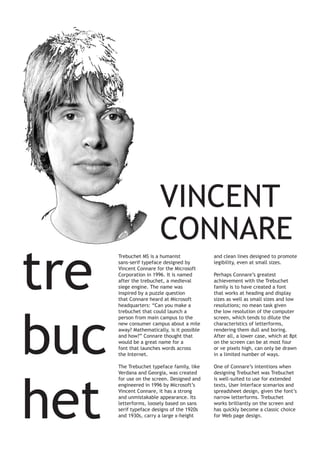
VINCENT
CONNARE
Trebuchet MS is a humanist
sans-serif typeface designed by
Vincent Connare for the Microsoft
Corporation in 1996. It is named
after the trebuchet, a medieval
siege engine. The name was
inspired by a puzzle question
that Connare heard at Microsoft
headquarters: “Can you make a
trebuchet that could launch a
person from main campus to the
new consumer campus about a mile
away? Mathematically, is it possible
and how?” Connare thought that
would be a great name for a
font that launches words across
the Internet.

and clean lines designed to promote
legibility, even at small sizes.

The Trebuchet typeface family, like
Verdana and Georgia, was created
for use on the screen. Designed and
engineered in 1996 by Microsoft’s
Vincent Connare, it has a strong
and unmistakable appearance. Its
letterforms, loosely based on sans
serif typeface designs of the 1920s
and 1930s, carry a large x-height

One of Connare’s intentions when
designing Trebuchet was Trebuchet
is well-suited to use for extended
texts, User Interface scenarios and
spreadsheet design, given the font’s
narrow letterforms. Trebuchet
works brilliantly on the screen and
has quickly become a classic choice
for Web page design.

Perhaps Connare’s greatest
achievement with the Trebuchet
family is to have created a font
that works at heading and display
sizes as well as small sizes and low
resolutions; no mean task given
the low resolution of the computer
screen, which tends to dilute the
characteristics of letterforms,
rendering them dull and boring.
After all, a lower case, which at 8pt
on the screen can be at most four
or ve pixels high, can only be drawn
in a limited number of ways.

basic layout- 3 column grid

  • 1.
    tre buc het VINCENT CONNARE Trebuchet MS isa humanist sans-serif typeface designed by Vincent Connare for the Microsoft Corporation in 1996. It is named after the trebuchet, a medieval siege engine. The name was inspired by a puzzle question that Connare heard at Microsoft headquarters: “Can you make a trebuchet that could launch a person from main campus to the new consumer campus about a mile away? Mathematically, is it possible and how?” Connare thought that would be a great name for a font that launches words across the Internet. and clean lines designed to promote legibility, even at small sizes. The Trebuchet typeface family, like Verdana and Georgia, was created for use on the screen. Designed and engineered in 1996 by Microsoft’s Vincent Connare, it has a strong and unmistakable appearance. Its letterforms, loosely based on sans serif typeface designs of the 1920s and 1930s, carry a large x-height One of Connare’s intentions when designing Trebuchet was Trebuchet is well-suited to use for extended texts, User Interface scenarios and spreadsheet design, given the font’s narrow letterforms. Trebuchet works brilliantly on the screen and has quickly become a classic choice for Web page design. Perhaps Connare’s greatest achievement with the Trebuchet family is to have created a font that works at heading and display sizes as well as small sizes and low resolutions; no mean task given the low resolution of the computer screen, which tends to dilute the characteristics of letterforms, rendering them dull and boring. After all, a lower case, which at 8pt on the screen can be at most four or ve pixels high, can only be drawn in a limited number of ways.