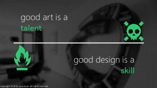
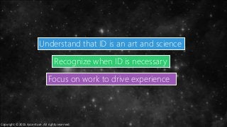
Instructional design has matured from its early days and now faces the risk of losing some of its flexibility in deference to rigid application of theory. Yet in its early days, web designers took on the challenge of creating eLearning content because they knew how to foster a good user experience—despite their lack of formal theoretical training, they built content users wanted. Recognizing the criticality of developing good content along a spectrum that blends the art and science of instructional design can help you find a compromise between tradition and creativity and develop strong content that both engages users and targets what they need to know.
When you find the optimal spot between form and function, you can react more quickly to project needs, allocate resources with greater confidence, and bring your product to users faster. Equally important, you can gain buy-in from your instructional and business stakeholders by addressing their concerns and providing a bridge between traditional theory and the power of flexibility to create a more pleasing solution for everyone.
My wife loves design, and has an exceptional knack at both interior and exterior design.
We just purchased a home, and are converting what was once the “living” room into my work-at-home office while simultaneously designing and finishing our master bedroom.
During this process recently, my wife entered my office and asked if I would like to move some of my books (currently in the office) to our bedroom.
I was enthralled at the idea, given that we try to keep work/personal separate, and reading in bed (as well as television) never was big.
After handing my wife 2-3 books to place by my bedside, she looked at each of them and replied, “well… do you have anything in more of a toupe cover?”
In her mind, she was simply going to use the books as artistic elements for the master bedroom.
She, literally, was judging each book by its cover. She wanted good looking books.
Why does one believe that form follows function, or art follows the science of design?
The form (or “art”) of good design is always dictated by the function (“science”) or purpose of the product.
http://www.smashingmagazine.com/2010/03/23/does-form-follow-function/
While sometimes attributed to sculptor Horatio Greenough, the phrase “form follows function” was coined by American architect Louis Sullivan. In his 1896 article, “The Tall Office Building Artistically Considered,” Sullivan wrote:
“It is the pervading law of all things organic and inorganic, of all things physical and metaphysical, of all things human and all things superhuman, of all true manifestations of the head, of the heart, of the soul, that the life is recognizable in its expression, that form ever follows function. This is the law.”
Good and bad examples design (too much science without art, and, too much art without science)
Show good and bad example of form and function in graphic design.
The art and science of instructional design is no different. Instructional Design IS a type of design that has both elements.
Be aware of Instructional Design bias (going too far considering the science) and eye-candy (going too far on the design side)
The science of instructional design dates back to John Dewey and is refined by ideas from Clark, Merrill, Gagne, etc…
In fact, when I went into college, my goal was to become an architect, because I loved beautiful design, loved art of the possible, and loved the ability to imagine and create something that I think is beautiful.
I’m a perfectionist like that, I really am. What I had a hard time believing was that my art could be “graded”, and that there were certain aspects of creation that were objective and that I couldn’t get people to buy into my idea of beauty and art. In other words, I hated the idea that there were levels of talent in art.
I always thought that if you put the time in, art was in the eye of the beholder.
What I realized was that there were principles and elements of artistic design that you would absolutely measure against, and potentially need to explain their involvement in each piece that was created.
After a few semesters of soul-searching, I landed on the major of math education, partly because I loved the idea of designing something that I could control, and math was an objective science that allowed me to focus on the design of the delivery and execution, instead of focusing on the interpretation of the subject matter. Math, in my eyes, was black/white… it was the delivery that needed to be designed. And, my teacher education program helped me understand the nuances of design.
To return to my initial story, my wife and I were finally able to come to a compromise between which books “looked” the best for our bedroom, yet, were functional enough (the content was interesting and it was something I wanted to read) where they were there for a purpose other than eye-candy.
It wasn’t until then that adding loads of colors/animations/interactions became apparent, and there was no set of guidelines to use that suggested any type of learning implications.
You remember this time, right? When sparkling rainbow gradients, comic sans, and spinning entrance animations polluted the many presentations that we saw.
It was the wild-west of visual learning design simply because we didn’t know.
[maybe use these sites to generate some feedback and questions--- https://infogr.am/PowerPoint-usage-and-Marketshare, http://powerpointinfo.blogspot.com/2012/02/powerpoint-usage-statistics-and-market.html]
After a several years of teaching at the high school and university level, and around 2003, I was hired at Element K (now Skillsoft) into the role of “instructional designer”.
Now, when you first hear this title, it became apparent to me that I would be designing instruction. In other words, I would be designing instructional experiences. Now, Element K at the time was building a format in which you could design both ILT and digital learning (“eLearning”, at the time) at the same time, the same structure.
My role was not only to design instructionally the experience, with assistance from senior instructional designers, but also author the content. So, in essence, because the technology was available for me to write directly into the tool that would output into the final experience, my role was to not only design the instruction but also author the content. In essence, due to technology, there were two systems of design that I had to learn… instructional and information design and architecture. The good thing was that there was research to base this on… we used research-based theory and approach by Clark and Merrill to create a unified design approach to the instructional design for both ILT and digital.
After teaching awhile as a teacher and professor, I moved to a private learning solutions company named Element K.
I started as an instructional designer, fresh off of the heals of them wondering whether or not it should be called a “technical writer”
Basically, I worked with senior instructional designers in working with the content, and designing it, molding it in a way that promoted retention. In essence, we were creating formal instructor led training for the classroom and self-paced elearning at the same time using an instructional design methodology that was a hybrid of research and practice from Ruth Clark and David Merrill.
Here is where I really started to blossom, given that the first technology I started to learn was XML and it was the technology that we were using to deploy these learning experiences.
We worked hand-in-hand with graphic designers, multimedia designers and something called a “MID” (Multimedia Instructional Designer).
Their role was to interpret what the instructional designer wanted to convey into a visual language for the graphic designer, the graphic designer would then create the overall layout of the animation or digital interaction, to create the multimedia (which, at the time, was audio + animation).
You need all of these, but they must come in the form of talented individuals or you having enough knowledge to be dangerous