A Critique of the Proposed National Education Policy Reform
Editing
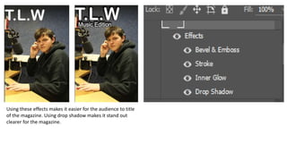
1. Using these effects makes it easier for the audience to title
of the magazine. Using drop shadow makes it stand out
clearer for the magazine.
2. For all the different cover lines I used different fonts to
make different ones stand out. I used the same effects
as the title as it was the easiest way to make sure the
text can be seen.
Placing the barcode here makes
it look out of the way and
makes everything else look
more important.
I made sure the main cover line had different font from
the rest of the cover lines to prove that it is more
important. Doing this means that the audience knows
which the image relates to.