[2024]Digital Global Overview Report 2024 Meltwater.pdf
Names for mag in different fonts
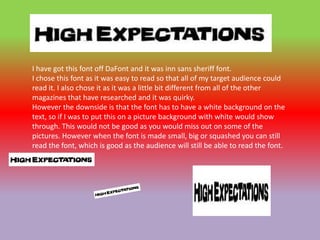
1. I have got this font off DaFont and it was inn sans sheriff font.
I chose this font as it was easy to read so that all of my target audience could
read it. I also chose it as it was a little bit different from all of the other
magazines that have researched and it was quirky.
However the downside is that the font has to have a white background on the
text, so if I was to put this on a picture background with white would show
through. This would not be good as you would miss out on some of the
pictures. However when the font is made small, big or squashed you can still
read the font, which is good as the audience will still be able to read the font.
2. I have got this font off cool text and it was in I text font. I chose this font as it
was easy to read so that all of my target audience could read it. I also chose it
as it looks fun and inviting as other magazines that have researched the
mastheads was very boring. I loved this font as you could manipulate it and it
still be readable. You can have it quite small and quite big and the message still
get across. I have chosen red as it could represent passion, love and devotion
for school. However it could also portray anger fear and
However the downside is that the font has to have a white background on the
text, so if I was to put this on a picture background with white would show
through. This would not be good as you would miss out on some of the
pictures.
3. I have got this font off cool text and it was in the simple font. I chose this font
as it was easy to read so that all of my target audience could read it. I chose the
colour as it was in my house style and looked fun. The font makes me think of
simple things like lighting. This could suggest that there is light at the end of
the tunnel and that if you do well I school then it will light up the way to the
future. However, the font maybe a little bright and some people may not like
the font. If the font was put onto a picture background the font may be too
skinny to show through.
4. I have got this font off DaFont and it was in chick flick font. I chose this font as
it was easy to read so that all of my target audience could read it. I like the font
as it had a couple of colours that relates to my house style. Also the outline of
the font is thick so it would show up on the front of my magazine. You can also
manipulate the text so that it can be squished up and still be able to read it.
This is good as the mast head has to stand out from the rest of the text and this
one does. I cannot find any faults with this font and am going to use this on my
magazine. This font looks quite fancy and looks quite nice to read.
5. I have got this font off DaFont and it was inn sans sheriff font.
I chose this font as it was easy to read so that all of my target audience could
read it. I also chose it as it was a little bit different from all of the other
magazines that have researched and it was quirky.
However the downside is that the font has to have a white background on the
text, so if I was to put this on a picture background with white would show
through. This would not be good as you would miss out on some of the
pictures
6. I have got this font off DaFont and it was inn sans sheriff font.
I chose this font as it was easy to read so that all of my target audience could
read it. I liked the fact that all of the colours related to my house style. This is
good as it keeping to the colour scheme. I also liked the fact the font looked
like it came from the programme recess. This makes you think that school is
fun and cool.
However the font has a white box around it , so when I put this on a pictured
background, some of the picture will be lost.