Download to read offline


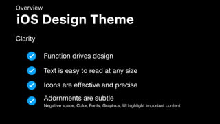


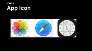


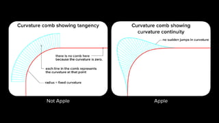
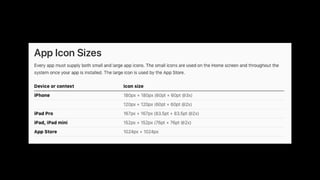
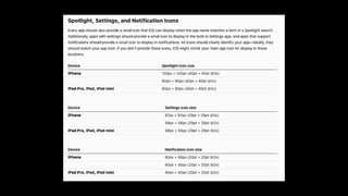


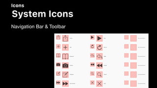
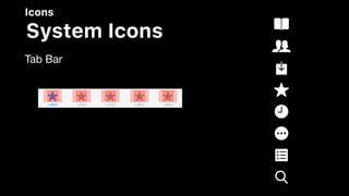
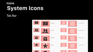

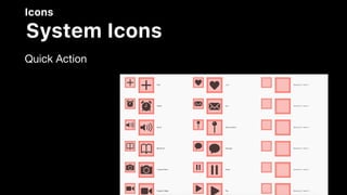


The document provides comprehensive guidelines for designing user interfaces on iOS, emphasizing principles like clarity, depth, and aesthetic integrity. It covers components of user interaction, visual design, typography, and system capabilities, outlining best practices for icons and branding. Central to the guidelines is the idea of enhancing user experience through thoughtful design that prioritizes content while enabling intuitive user control.


