
Recommended
More Related Content
More from sammieharris
More from sammieharris (20)
Recently uploaded
Recently uploaded (20)
Analysis of Inbetweeners 2 and Frozen film posters.
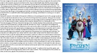
- 1. The main image on the poster includes all of the main characters and they are placed in the centre of the poster as this is where your eyes are drawn to first. You can tell straight away that the primary target audience for the film is children as it is an animation film and Disney is associated with children's films. The background and theme of the poster gives away the background and storyline about the film. The background setting has a magical theme to it again displaying the story line, everything in the background is either white or light blueish sticking to a colour scheme making it look more professional and appealing. The iced ‘tree’ like things in the background look like a curtain presenting the characters as if in the theatre and behind this is a waterfall which looks appealing and inviting, so therefore it is inviting us in to watch the film etc. Having the animal in the middle of the poster is effective as it would appeal more to the younger audience as they would find it desirable as this is one of the first things that they would see. Sitting on the reindeer is a snowman ‘Olaf’, the snowman’s facial expressions are very happy and he is holding his hands up in the air sort of welcoming the viewer. Having a alive snowman displays that it is a fantasy genre film. The body language of the two characters leaning on the reindeer displays there personality as they are less mature and are portrayed as a younger character whereas the ‘Prince’ is standing in the background further away from the rest of the characters as he is seen as the villain in this film, he is standing with his hands behind his back with a good posture displaying how a stereotypical prince would be seen to stand, also the ‘magical’ sister is standing in background holding her arm out to display her magical powers- which would intrigue the audience as they would find it fascinating- she is standing more maturely. The characters are making direct eye contact with the viewer which would make the reader feel involved. The title ‘Frozen’ is placed underneath the characters, which has a effect on it which makes it look frozen linking it to the film, the use of different colours within the title gives it more character. Underneath the title is the date in which it is released in the cinema, which is written in blue keeping to the colour scheme again making it look more appealing. The film is released in December which links in with the theme of winter and would make it more popular with the audience as they would want to see it as they would be able to relate as most people would go and see it when it is first released. Underneath the date release is the web address for the social media site Facebook which would widen there campaign and create a more popular fan base. The tag like “from the creators of ‘tangled’ and ‘Wreck it ralph’” is written at the top of the poster, and stands out against the background but sticks to the colour scheme. This would appeal to the audience as these are two very popular films that Disney has produced.
- 2. The actors are placed in the centre of the front cover displaying that they are the main purpose and displays there significance. You are able to see there facial expressions clearly and you can tell that there expressions are confused and worried which links in with the genre of the film which is comedy. The models dress sense displays the characters personality e.g. the second from left is wearing smarter clothes than the others displaying he is more mature than the rest. Also there dress sense indicates that they're on a summer vacation as they are mostly in shorts etc. their colour of clothes stands out against the background again making the people stand out. The body language of the actors are how teenage boys usually stand/ walk e.g. The boy on the left has his hands in his pockets The background symbolises the background of the story line as it displays a beach and a hot country indicating that they are abroad on holiday making the audience connect to the film as they would be able to relate to it as the primary target audience is for ages 15-20 year olds. The background colour contrasts each other and blend in well together making the models stand out more, as they are placed in the white area of the poster. This film was also released in the summer which would appeal more to the audience as they again are going to be able to relate. You can tell by the background that they are on a beach without reading the text because of the mise-en-scene of the water of the sea in the background. The title of the film is in a sort of cartoon font. And is also the same font as the last films font and the TV programmes title font this is effective as the fans or audience would be able to recognise it more easily and know that it was the real thing. The title also blends in with the sky of the background keeping the poster within a colour scheme but it stands out/ contrasts against the colour of sand making it one of the first things the audience sees. The tagline “four reasons to get out of Australia” is placed above the four actors displaying that this is talking about them creating a humours effect displaying the genre of the film, comedy. The tagline also stands out against the background and it is giving the audience an idea of what the story line is going to be about but still leaves them asking questions e.g. What happens? (Roland Barthes enigma code theory). There is nothing within the background on the beach so it doesn't draw attention away from the actors but it also links in with the tagline suggesting that everyone has “got out of Australia”. There is a second part of the tagline “soz, oz.” which is placed underneath the actors which they would read after they have looked at the first part of the tagline again adding comedy to display the genre. The slang ‘soz’ used displays the target audience which is young adults, whom use this language quite frequently on social networking sites etc. It also suggests that the film is quite ‘Immature’. The institution information- within the institution information it includes the cast, and everything that was needed to produce the poster. It is placed underneath/ with the title of the poster, this keeps the poster looking professional and it also makes it visible to the audience and not hidden away, this is effective as it gives the audience extra information. Included within the institution information there is the web address for there social media page ‘Facebook’ creating a wider campaign for the film. There is also the logo of the companies used which helped create the film. I think that there unique selling point is that the film was premiered and shown in summer, as the film is about a summer abroad, this would relate to a lot of the audience.