The document discusses the author's evaluation of various fonts for use in a poster and digital package (digipak). The author's favorite font, Dumbnerd, was selected for its edgy yet not too sharp look. Other fonts considered were Crackvetica, Dirtee Box, Impacted, iCrack, Chapaza, Morva, Bodoni XT, Subway, Apalu, and Antro Vectra. The author ultimately chose Antro Vectra for the artist's signature on the digipak because it resembled handwriting and looked more natural.
Beginners Guide to TikTok for Search - Rachel Pearson - We are Tilt __ Bright...
Font for poster and digipak s
1. I likedthis‘Black’font,because itwasthick,whichmakesitcleartosee.I didn’tlike it,because Ifelt
that itwas too simple andIwantedsomethingabitmore differentandsuitable formyposterand
digipak.
The font ‘Abandon’isquite adifferentfont,whichiswhyIlikedit.Ifeltthateventhoughitwas
different,itwouldnotfitwiththe appearance of myartist. The bottomof the font lookedtoosharp
and I feltthatit wasmore suitable forrock or metal music.
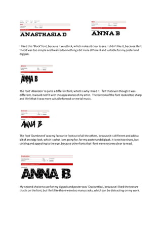
The font ‘Dumbnerd’wasmyfavourite fontoutof all the others,because itisdifferentandaddsa
bitof an edgylook,whichiswhatI am goingfor,for my posteranddigipak.Itisnot too sharp,but
strikingandappealingtothe eye, because otherfontsthatIfontwere notveryclear to read.
My secondchoice touse for mydigipakandposterwas ‘Crackvetica’,becvauseIlikedthe texture
that ison the font,but I feltlike there weretoomanycracks,whichcan be distracting onmy work.
2. Comparingthisfont(‘Dirtee Box’) to‘Crackvetica’Ilikedthe factithad lesscracks onthe font,but
the outline of the fontdidn’treallyappeal tome.Ifeltlike itwouldmake myworklookabit messyif
I usedit.
The font ‘Impacted’ hasa nice structure andI likedthe texture usedonthe inside of the font,butif
the structure was a bit more differentlikethe ‘Dumbnerd’font,itwouldhave beenanice fontto
use for mywork.
‘iCrack’wasa nice font,butI feltlike the fonthadtoomuch goingon. I thinkitwastoo thick,there
are toomany cracks and the structure was too simple.
‘Chapaza’wasone of the fontsI was consideringtouse forotherbitsof my work(the new album,
renaissance of reflection, etc.)because itwasnice,butif Iusedtoo muchof it,it wouldlook
unappealingforthe audiencetolookat.
3. The ‘Morva’ fontwas more suitable touse onthe posterinmy opinion,becauseitwasa bitthinner
than the font‘Chapaza’.Frommy researchonposter,I couldsee that otherpostershadthissimilar
fontusedon theirproductand itlookedappealing.
The ‘Bodoni XT’font was alsomore suitable touse onthe posterinmy opinion,because itisabit
similartothe ‘Morva’ font.
I likedthisfontformore importantdetailsformydigipakandposter.Thisfontalsogave me a variety
of the same fontto choose from.
I alsolike the ‘Subway’font,because itisnicelystructuredformyworkand I alsolikedthatitgives
youthe 2 main differentcoloursyoucouldchoose from.
4. I usedthe star circledto create the star rating onmy poster.
I wanteda nice fontfor myartist’ssignature onthe inside coverof mydigipak,butI feltthatthis
fontwas notveryclear to read.
I likedthe font‘Apalu’,becauseitlookednice touse formyartist’ssignature,butIthinkit wasa bit
too structured.
I likedthe font‘Antro Vectra’because thislookedlikeaperson’shandwritingmore thatthe font
‘Apalu’.Itlooksmore appealingandnatural anditwouldlooksuitable formydigipak.