
Recommended
Recommended
More Related Content
What's hot
What's hot (20)
Similar to Question 1 evaluation
Similar to Question 1 evaluation (20)
More from rebeccapollen2405
More from rebeccapollen2405 (14)
Recently uploaded
Recently uploaded (20)
Question 1 evaluation
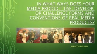
- 1. IN WHAT WAYS DOES YOUR MEDIA PRODUCT USE, DEVELOP, OR CHALLENGE FORMS AND CONVENTIONS OF REAL MEDIA PRODUCTS? REBECCA POLLEN
- 2. In answering this particular question I had to know the original theories and conventions to existing music videos similar to my own; as well as website advertising the artists and the promotional digipak. Only then could I evaluate whether or not my products were consistent with those conventions.
- 3. GENERAL THEORY The first theory I looked at was the GENERAL THEORY on music videos. This is where the lyrics establish a general feeling and sense of subject rather than a meaning. The tempo of the music often drives the editing. The GENRE might be reflected in types of mise-en-scene, themes, performance, camera and editing styles. CAMERAWORK, has a major impact on meaning, the movement, angle and shot distance all play a part in the representation of the artist/band (for example the use of close-ups will show inferiority and importance). EDITING, is the most common form is fast-cut montage, rendering many images impossible to grasp on first viewing, so ensuring multiple viewing. Often enhancing the editing are digital effects, which play with the original images to offer a different type of pleasure t the audience. INTERTEXUALITY, not all viewers will recognise a reference which would not detract them from theory pleasure in the text itself, but if the viewer was to realise the reference it should increase the audiences engagement regarding the product. Lastly EXHIBITIONSIM, this is where the powerful independent female artists portray a image where the women is being sexually provocative and apparently in control of, and inviting a sexual gaze.
- 4. When looking at the GENERAL THEORY and comparing my conventions to the lyrics, I believe that my music video does follow the General Theory. LYRICS: ‘Wine to the left, sway to the right, drop it down low, and take it back high. No I don’t need introduction, follow my simple instruction.’ These lyrics already create a sense of ownership, independence and have sexual connotations – representing exhibitionism. The audience can already get a sense of what type of music video it will be because of the lyrics and general, tempo of the song. MUSIC: When watching the video it is obvious that the music tempo resulted in the way in which I edited the product. As the music was fast and the beats where dominant within scene changes, and ranges between shots.
- 5. GENRE: From reading the lyrics and listening to the song to the audience it is apparent that the mise-en- scene has to also fit in with what the song and lyrics already represent. In order to do this I made sure that after looking at conventions that it fitted in with other examples of the same style music production. However this was proven difficult due to the time of year we were shooting. Because filming took place in winter time it was difficult to use revealing and stereotypical ‘girls’ summer clothes. Nevertheless within current fashion trends the costuming of my band was appropriate. The plain joggers with a stripe down the side are very ‘in’ with the fashion hemisphere so therefore helped bring a sense of ‘strong, independent and sexy’ women to my video. CAMERAWORK: I had to create a sense of power and independence within the way I used the camera, varying between long, mid and close-up shots which made the video unpredictable and changing throughout so that it wasn’t deemed ‘boring.’ Unfortunately due to the camera being extremely heavy and having a very large lense on the end it was difficult to get a range of close-up and moving shots without the footage being of a worse quality which would make the overall product look less professional. I wanted to use a range of tilting as well as moving shots of me going around the girls dancing capturing them one by one, using slow-motion and fastening effects was also something that I was keen on using within my production in order to make it look more powerful.
- 6. EDITING: Because the music is fast paced and the beast are dominant, I made sure that the shots went with the beats, and changed on time. At the end of each phrase, whether it being an entire section or short phrase I was keen to make the scene change on the beat to make the production look even more professional. This made editing very tight, but had to be precise in order to make the final piece look good. INTERTEXTUALITY: I didn’t really base my video on any specific references of previous media, however I believe that the engagement of the audience was increased as the music video was constantly moving, and attention wasn’t lost trying to follow a storyline, as there wasn’t a specific narrative.
- 7. EXHIBITIONISM: Out of all of the conventions I believe that this was the most apparent one when watching my music video. This is because the direct eye contact made from the artists when mouthing the lyrics directly to the camera do seem to be controlling of the audience. Not only does this grab the attention of the viewers, it helps them create a relationship with the audience and get them to really understand the meaning of the song. I personally think that it is these scenes that increases the audiences curiosity and make them want to see more.
- 8. ANDREW GOODWIN’S THEORY This theory explains that the conventions of a music video are: VISUALS which either illustrate, amplify or contradict the lyrics and music. GENRES often have their own music style/iconography. CLOSE-UPS should always be included. The ARTIST/BAND might want to develop their own star iconography, which becomes their star image. VOYEURISM is a common theme within music videos. INTERTEXTUAL REFERENCE are also popular. Goodwin argues that the female performer is frequently objectified principally for display purposes, often through a combination of camerawork and editing with fragmented body shots emphasising a sexualised treatment of the star.
- 9. GOODWIN AND FEMALE THEORY One of Goodwin’s theories stated that the use of camera angles and editing techniques can objectify female performers with fragmented body shots emphasizing as well as sexualising certain aspects of the individual. I believe that within my music video production as well as my digipak I conformed to this element of Goodwin’s theory. The main individual as well as the back up dancers and singers are objectified in this way. In my digipak this image of one of the girls is very provocative insinuating flexible talent which in a sense objectifies her as a female performer. As well as this in the music video within the second verse on the lyrics ’Step1, 2, 3, 4’ the specific more used in also quite provocative and sexualized. Many dance moves throughout also carry sexual connotations. One particular way in which camerawork is used to objectify my main female performer is a couple of scenes where the camera pans from her breasts to her mouth, putting all attention onto these parts of her body. Another example of this is on the lyrics ‘all my ladies’ where all the individuals backsides are facing the camera.
- 10. When comparing my video against this theory it is difficult to establish the similarities. Just like before I have stated that the lyrics in the song help to illustrate the characteristics which I have tried to replicate from other pieces of similar media. It does consist of an iconography of some sort as each person who watched the video interpreted it in their own personal ways. We did include close-ups however due to a weakness in time management skills and timing we did not have enough time to shoot more close-ups which was planned from the start. However I do not think a star image was created. Voyeurism was no portrayed and it is very hard to make an intertextual reference when watching this video because many people interrupt it in different ways.
- 11. HERE IS MY DIGIPAK
- 12. The front cover for my digipak was created using Photoshop; the front cover is a mixture of all the common images and layouts I have used throughout my website and my digipak. I used the common conventions of my digipak as a whole to make sure that continuity ran throughout. I used the contrast of the black and white background against the city and text in colour to keep the continuity of the colour scheme running through my production. In comparison to the previous digipaks that I had researched the front cover was pretty unique as the changing colour of the background was a particular feature which I haven’t come across in other R&B digipak designs. So here I have challenged the codes and conventions of similar media products. This helped to create a strong link between all three products and emphasise the ‘brand identity.’ The image is very dark however fitted in well with the rest of the tone of my digipak as well as the costuming of my music video. In Photoshop I dropped the image of the city in and played around with the colouring of it to make it keep continuity with the rest of the colours in my house colours: pinks, white, grey and black. I was able to edit it in order to get my black background with the ‘X’ involved within my productions. Mise-en-scene is also extremely effective creating a sense of ‘brand identity’ using the colours which I had used throughout the rest of my production.
- 13. WITHIN THE CODES & CONVENTIONS OF COMMON DIGIPAKS I believe that my digipak does follow most of the codes and conventions that I researched within my type of music production. In most of the digipaks I observed bright colours were used with natural lighted images; as well as this the CD designs were normally simple, with not too much going on, but enough to make the brand recognisable. However my inside two pages are unique in comparison to ones that I evaluated within my research and planning. Here are some of the inside images I evaluated in comparison to my final inside image production.
- 14. UNIQUENESS OF MY INSIDE IMAGES I wanted to make my inside images unique because although the blurb and front cover format of my digipak followed the common conventions of similar digipaks the colour scheme was a lot darker which is why I really wanted to make my inside images stand out against other products of similar conventions to mine; this would enable me to make the most sales in the real media industry. I also wanted to feature some images of the band in my digipak production because they hadn’t featured on the front or back page. I also wanted to use some naturalistic images of the band to make sure that they followed the general theory of media production; I also wanted to do this to create an intimate relationship between band and audience.
- 15. HERE IS MY WEBSITE https://rebeccapollen24.wixsite.com/m isfits-uk
- 16. DOES MY WEBSITE OBEY ITS CODES&CONVENTIONS? I believe that the characteristics of my website do reflect some of those which I had researched within my research and planning. Most of them used bright colours, attention grabbing photographs and unique layouts. I believe that the layout of my front page is eye grabbing as it features many different singular and group photographs; this would attract the target audience because they are interested in the band from previously seeing them elsewhere which would have led them to the website. The bright pinks used also obey ‘girly’ stereotypes; as well as this the eye grabbing colours which obey similar conventions of bright colours used on websites such as The Vamps, Fifth Harmony and Little mix. The way in which my website is easily navigatable also conveys the same features as those that I had researched. As well as this the writing and information involved is minimal and simplistic, this makes the website more exciting and not boring. The different hyperlinked pages are also commonly seen throughout the other websites that I researched. The style and iconography used also helps to promote my music video as there is continuity within my different products. This obeys Andrew Goodwin's theory of genres displaying the conformative norms of current media within the R&B industry.
- 17. After researching band websites such as fifth harmony, the vamps and Little Mix, I realised that they all have their own set of unique conventions. In the production process, I knew I had to create a website which looked realistic and professional, following and including conventions such as: • Band name, • Band bio, • Image gallery, • New album release information, • News, • Social media connections, • Tour information, • Latest music video and • Information about the band.
- 18. OVERALL OPINION OF DIGIPAK&WEBSITE I think that, in my opinion the final production of my website, digipak and music video cover all of the particular conventions I had previously researched prior to production. Making the website look incredibly professional. Like any other home music page, and other hyperlinked pages; I personally feel that the strongest element of my production is the continuity within my products, the combinations of the background, colour schemes and text fonts make sure that the ‘brand’ of my band is recognisable.