Download as PDF, PPTX


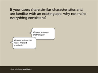
![Meta-principles: personality
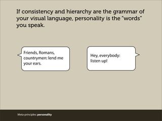
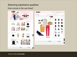
Personality: characteristics that affect interpretation
“[P]erceptions of interface aesthetic are closely
related to apparent usability and thus increase
the likelihood that aesthetics may considerably
affect system acceptability.”
- Noam Tractinsky](https://image.slidesharecdn.com/chifoo0514v3public-140514113934-phpapp02/85/Speaking-the-Language-of-Meta-Principles-Consistency-Hierarchy-and-Personality-18-320.jpg)


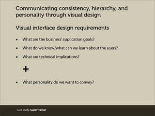
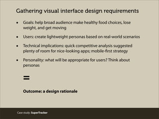

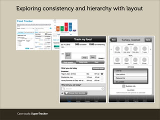
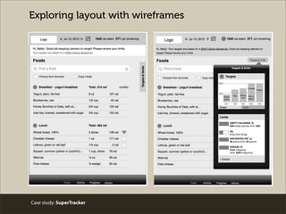
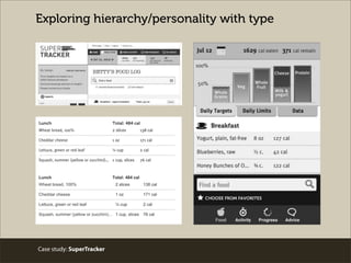
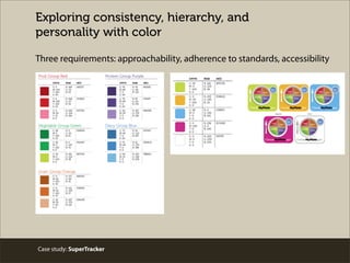

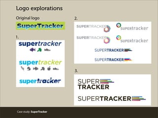
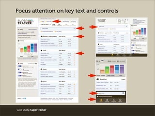


This document discusses the principles of consistency, hierarchy, and personality as meta-principles for designing user interfaces. It provides examples of how these principles can be applied when designing interfaces. Consistency establishes patterns to manage user expectations. Hierarchy indicates differences in importance to guide users. Personality involves expressive qualities to communicate appropriately for the context and users. The document also summarizes a case study where these principles were applied when redesigning the SuperTracker interface to help users make healthy choices.


