My matrix ui suggestions
•Download as PPS, PDF•
0 likes•85 views

My Matrix UI Suggestions

Recommended
More Related Content
Similar to My matrix ui suggestions
Similar to My matrix ui suggestions (20)
More from Venkatarajan Govindarajan (CUA Student from HFI)
More from Venkatarajan Govindarajan (CUA Student from HFI) (20)
Recently uploaded
Recently uploaded (20)
My matrix ui suggestions
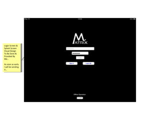
- 1. Login Screen & Splash Screen Visual Design To Be Done & Provided By Me… Login Screen & Splash Screen Visual Design To Be Done & Provided By Me… As soon as early I will be sending it… As soon as early I will be sending it…
- 2. I would like to share some comments regarding on going development of MyMatrix UI (iOS). I have gone through step by step screen flows and I have compared with our approved visual designs as well. I could be understand, its very beginning development stage. But, still we are not into our base level UI (look and feel), so I would like to bring some UI points to our development team what I have noticed. 1.Login Screen Visual Design to be sent by me… 2.Taping area should be minimum 44px (Retina Display 88px)… 3.All the icons to be used like UI style guidelines (.png) … 4.Left – expandable and collapse menu items should be as per the Visual Design… 5.Please check the UI style guidelines and then develop it each elements… 6.Settings pages both left and right getting big empty space, the UI should be same like visual design… 7.In BI-Metrics area expand icon for expanding the are is missing… 8.Clicking Pie chart, in drilldown view showing different value and colors… I would like to share some comments regarding on going development of MyMatrix UI (iOS). I have gone through step by step screen flows and I have compared with our approved visual designs as well. I could be understand, its very beginning development stage. But, still we are not into our base level UI (look and feel), so I would like to bring some UI points to our development team what I have noticed. 1.Login Screen Visual Design to be sent by me… 2.Taping area should be minimum 44px (Retina Display 88px)… 3.All the icons to be used like UI style guidelines (.png) … 4.Left – expandable and collapse menu items should be as per the Visual Design… 5.Please check the UI style guidelines and then develop it each elements… 6.Settings pages both left and right getting big empty space, the UI should be same like visual design… 7.In BI-Metrics area expand icon for expanding the are is missing… 8.Clicking Pie chart, in drilldown view showing different value and colors…
- 3. Please change the menu button like real look and feel, because currently its showing like used by image menu with black background… Please change the menu button like real look and feel, because currently its showing like used by image menu with black background… Could you please check over all Taping area, it should be 44px (Retina display 88px) as per the iOS standard Could you please check over all Taping area, it should be 44px (Retina display 88px) as per the iOS standard As per approved visual design, icons (.png ) to be replaced… Menu button to be created by coding with as per approved style (look & feel), not an image… MyMatrix DASHBOARD header background as per the approved design…
- 4. Pie Chart segments value should not overlap with other segments… My Organizer & My Stocks to be matched with as per the design… Taping area should be minimum 44px (Retina Display 88px)…
- 5. Pie Chart segments value should not overlap and should be readable with other segments… Note: In drilldown view, enlarged widgets should be exactly what we have tapped from the home page, but currently we are getting different widgets, colors & values… If there are too many segment in pie chart, then the overlap will definitely happen, to avoid that we can have pointers for segment. Please check the example below… Example
- 6. Expanded menu container width and the menu items list should be as per approved design…
- 7. Tapped row color should be as per approved design…
- 8. In Settings pages both left and right has big empty space, the UI should be same like visual design…
- 11. Version box shadow should be thin…