
Recommended
More Related Content
More from nicolgonzalezcruz
More from nicolgonzalezcruz (7)
Recently uploaded
Recently uploaded (20)
Chart data comparison analysis
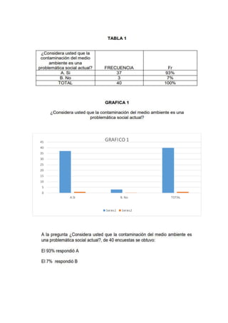
- 1. 0 5 10 15 20 25 30 35 40 45 A.SI B. No TOTAL GRAFICO 1 Series1 Series2
- 2. 0 5 10 15 20 25 30 35 40 A.SI B. No TOTAL GRAFICO 2 Series1 Series2
- 3. 46% 4% 50% GRÁFICO 3 A.SI B. No TOTAL
- 5. 0 5 10 15 20 25 30 35 40 45 A B C TOTAL GRAFICA 5 Series1 Series2