Salford City College Eccles Centre AS Media Studies Foundation Portfolio
•Download as DOCX, PDF•
1 like•149 views


Recommended
More Related Content
What's hot
What's hot (14)
Viewers also liked
Viewers also liked (16)
Similar to Salford City College Eccles Centre AS Media Studies Foundation Portfolio
Similar to Salford City College Eccles Centre AS Media Studies Foundation Portfolio (20)
More from Nicole Greenhalgh
More from Nicole Greenhalgh (20)
Salford City College Eccles Centre AS Media Studies Foundation Portfolio
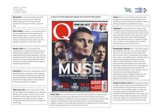
- 1. Salford City College Eccles Centre AS Media Studies Foundation Portfolio MastheadThis is the primary optical area of the Comment on how the design of the magazine cover attracts the target audience: magazine and is also the area that catches the viewers/publics eye first. This means that the masthead must be easy to remember, unique and bold. ColourThere are 3 colours that are continuously used throughout this magazine cover: black, white and red. These three colours contrast with one another as they are all harsh, very bold and are all dominant colours. TypefacesThe fonts used within this magazine cover and has photographed the band members from 3 different angles. There is a use of direct mode of address from the front man and this is due to him seeming to look directly into the viewer’s eyes. This signifies his importance as he also seems taller. are all fairly simple and therefore portray a simple layout and format, making it easy for the viewer to take in all the given information. The fonts are also very easy to read in comparison to other fonts used in different magazine covers. The name of the artist is in a separate and larger font in comparison to the remainder of the text which therefore makes the name stand out more. Model credit‘Muse’ is in the centre of the Photography LightingThere is a use of both high and magazine cover in a bold white font which stands out, especially when compared to the remainder of the magazine (dark black and blue background). The band name becomes faint the further to the right of the text it reaches. This creates a fading effect and therefore contributes to the space element that the magazine is potentially trying to portray. low key lighting in this cover. The use of low key lighting used on the front male makes him look shadowed and with this it seems as if he is looking down on the audience which creates a sense of dominance on his behalf. The use of high and low key lighting used against each other creates a contrast and therefore creates a very three dimensional effect and highlights the facial features of each person involved in the cover. Due to the background of the magazine being space themed, it denotes the cheesy quote that the band is ‘out of this world’. Since the front man seems to be looking downwards, a representation of power is brought into play as the fact that he is photographed as higher than the audience suggests that he is dominant and in power. Main imageThe image is a 3-shot medium close up CoverlinesThe cover lines in this magazine cover are placed differently in comparison to other magazines that I have analysed and therefore do not agree with the Guttenberg design as they are placed below and above the main image instead of around it, which is the normal presentation of a magazine. Design Principles Used?Guttenberg design principle Main cover lineThe main cover line links closely with the background of the magazine as it is purposely intending to link to space. This font is also in a sans serif plain font which means the viewer’s eye is not taken away from the image of the band, meaning all/most of the viewers eyes are set on the large main central image. House StyleThree colours (red, white and black) are used throughout the magazine and this is the same for the majority of the magazines and this therefore means the house style is consistent throughout. The NME logo is in the same place as it is usually found in all of the NME magazines and this therefore shows that the house style is constantly used within every magazine. In addition to this, the barcode is also found in the right hand corner of the magazine which is the same position that it is found in every other cover. has been used to an extent as the weak fallow area is the area which holds the majority and the most important information. This is an effective design as it makes sure the primary optical area, weak fallow field and the terminal area are all filled with either text or images. This makes the magazine look full and busy, but not too busy to look over crowded. This corresponds with the ‘indierock’’ theme that Florence Welch creates in the image.