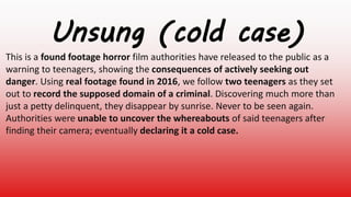
1. Unsung (cold case)
This is a found footage horror film authorities have released to the public as a
warning to teenagers, showing the consequences of actively seeking out
danger. Using real footage found in 2016, we follow two teenagers as they set
out to record the supposed domain of a criminal. Discovering much more than
just a petty delinquent, they disappear by sunrise. Never to be seen again.
Authorities were unable to uncover the whereabouts of said teenagers after
finding their camera; eventually declaring it a cold case.
2. This is a poster from the 2020 horror film ‘the lodge’ with a high advertising budget, from the first glance at
this poster you can tell this has a younger target audience. We know this because of the graphic of a white
snowflake (which is usually associated with youth and innocence) and the dark twist of adding a upside down
cross made of blood at the bottom.
This competitor has used an unusual image of the snowflake not usually associated with the horror genre to
make the poster stand out, adding the dark colour scheme, the “you’re not welcome here” and most
importantly the cross, makes a great juxtaposition. Adding a youthful connotation and mixing it with what is
considered symbols of the antichrist in pop-culture is an indicator that this competitor is trying to appeal
specifically to teenagers/people in their 20s, younger people specifically with a reformer or struggler mindset
would appreciate this contrasting and diversion from what is typical for horror posters.
For Hall’s reception theory, I believe the preferred reading of this poster would be that the audience are able
to look at this poster and understand the small amount of the narrative being conveyed. They will be able to
look at the graphics, address and tone and be able to understand it is a horror film. They may appreciate the
simplicity the creator has used for this poster and find this interesting enough to decide to do more research
into this film.
The mediated reading may look at this poster and decided that while they may look at this and understand that
this is a horror film, they may not like the fact that the creator has used such a simplistic design or that the
graphic is mostly just a snowflake instead f something related to the actual narrative more. They understand
the message conveyed by the competitors poster but may not find it compelling enough to do further
research about the film.
The oppositional reading of this could be that they find that this design doesn’t tell them much about the
narrative, they may not like that the poster doesn’t show any of characters or key parts of the film. It could be
that they audience doesn’t feel the use of the upside down cross is completely inappropriate, that using a
religious symbol is offensive to be used in a poster and reject the producer’s intended reading completely.
3. What I will take away from this research is that posters with simplistic designs are likely to be the most
effective method of persuading my target audience. With the competitors using this to attract younger
demographics successfully it is clear that if I want my own hypothetical film to be successful I should
use posters also. This product can convey large amounts of information in a short amount of time.
This film ended up making $3,155,858
Worldwide. Therefore I know that using this method for a younger audience can have very successful
results, ones I should try to mirror for my own products.
4. Question 1:
The first question required people to state their age and gender, which
confirms that they belong to the demographics I’m targeting in my
campaign. The split between genders is relatively equal, with 60% being
male and 40% being female. Age-wise, everyone who took this survey was
between 16 and 18. These results confirm that my primary research will be
an accurate reflection of my target audience, so I can successfully plan my
advertising campaign to interest them.
Question 2:
This question asked people how they usually found out about upcoming
films or interacted with new posters, which indicates which platforms I
should use so that the T.A will hear about my film. The most frequent
answers given were Social media and advertisements online. This data
shows that the platforms my target audience usually use to discover film
posters are all accessible online, therefore if I want my posters to be
successful mine should be too.
Question 3:
When asked which genre of film my target audience usually enjoyed the most
answers typically included Horror, Action, Comedy, Drama and Adventure. It is
worth noting that one person stated they only enjoy Crime films if they like the cast
and graphics. Even though my film is Horror, I think this specific answer tells me
that I should advertise my cast. Furthermore, the genre of my film (Horror) was one
of the most mentioned. Meaning that there is demand for my kind of film,
increasing the likelihood of success. other genres mentioned such as action and
adventure would probably have similar psychographics in their target audience as
horror. I should take this into consideration.
Question 4:
Question four asked my target audience whether or not they had ever been
convinced to go see a film they weren’t initially interested in, and if so what
changed their mind. 60% of people stated that they had in fact went to see a
film they didn't like at first, answers as to why mostly consisted of:
• Posters and the presentation of these products.
• Social media posts.
• Friends/family.
This data shows me that my target audience is heavily influenced be other
people’s opinions, whether it is online or face to face. If my advertisements are
memorable enough and talked about, it could influence my target audience to
see my film (which is the point of a film print advertisements).
Question 5:
The fifth question asked if people liked horror films in order to get an actual
mathematical number, and 70% of people stated that they did. Which shows me
that there is a market for my film, so a large portion of my target audience is
likely to pay attention to my advertisements. However, 30% said that they
didn't’t enjoy the Horror genre. Despite this, 60% of people said previously that
they had been convinced to see a film they weren’t initially interested in.
Survey results:
To do some primary research on my audience I
carried out a survey asking a range of people I
feel would interact with my film poster the most,
unfortunately I can’t provide screenshots of the
original surveys because I had lost them shortly
after gathering the results. This acted as
audience feedback of sorts, giving me a solid idea
on what demographics would be the best to
target with a horror film.
5. Audience profile:
Demographics:
Age: The age range I am going to be targeting with my three posters is 16-19, I chose this age range based on a piece of
primary research I did from a survey of similarly aged teenagers (average was 16 to 18) where 70% of them said they
enjoyed horror films. It makes sense to market your film to an age range you have found enjoy that genre. Furthermore,
the narrative of the film I’m advertising in these posters is intended as warning directed towards that age demographic.
Many teenagers have a habit of being impulsive and disregarding danger when it comes to seeking fame online.
Gender: The horror genre of film is not typically masculine or feminine, it has been known to widely appeal to all
genders. Knowing this, it would improve the effectiveness of my horror film posters to target all genders according to the
conventions of its genre.
Psychographics and social grade:
The social grades my audience will most likely belong to are D and E, based on the age range I have already determined
my audience will be students or working. At that age they will likely be either a unskilled manual working or relying off of
welfare to support themselves through education or their lifestyle.
In terms of psychographics, Aspirers and explorers are the most likely to interact with the narrative of my advertised
film. Aspirers are appearance orientated, seek status and tend to belong to a younger age demographic. Similarly,
explorers also tend to be younger, these people seek discovery and value adventure. Given that we’ve already established
the narrative and demographics of the audience, I believe that a poster advertising the idea that exploring somewhere
dangerous just for social status is a bad idea would be the most intriguing to them. These people are exactly the teenagers
my narrative is warning, deep down they probably know that.
7. Both of these sources of secondary information prove to me that the
style and genre of film I am aiming to advertise has potential to be
successful, taking into consideration how the psychology of why horror
appeals to younger people was explained in the article and how
successful the Blair Witch Project was and is to this day. That film is the
same genre as my own, therefore I know that the preferred reading of
my print advertisements will resonate with my teenage target audience
and have the hypothetical potential to be a success. Overall, this
secondary research was not only useful in validating my claims in the
audience profile, but it has taught me a lot about why a found footage
horror film would be successful with my target audience.
8. I believe this is the most appropriate colour scheme for my 3 print advertisements, this is because the red
has connotations of blood and danger, these have made it synonymous with the horror genre to the point
where it is almost a convention for it to be featured In advertisements/promotions. The black and white
have connotations of good and evil, which reveals part of the narrative where we have two protagonists
and a villain. The contrast between these colours will make each other and the red stand out to the
audience’s eye as they view these posters in passing.
I don’t believe that this colour scheme is appropriate for use in advertising a horror film because
they do not of the appropriate connotations. Firstly, yellow and orange are often associated with
happiness and warmth which is not at all related to my own film. Blue has connotations of the
sea, once again this colour will not set the right tone in the advertisements. If I were to use these
colours the audience would not be able to understand the poster in the way I intended, possibly
struggling to identify even the genre.
Finally, this colour scheme is similar to the last one in the sense that it will not fulfil the
purpose of standing out to the audience. Using pinks, whites and greys have more soft and
feminine connotations that would not help the audience to easily understand that I am
advertising a horror film. Overall, the last two colour schemes would not be nearly as
successful if used in my three print advertisements for a found footage horror film.
9. One benefit of this font is how bold it is, a serif font would be effective in catching my target audience’s
eyes when they view the poster in passing. Which I extremely important when producing a print
advertisement. However, the rounded style of this font gives it a friendly and light hearted tone that
would be inappropriate for a horror film poster, the text is what the audience notice so I want the font I
use to connote the genre correctly.
This font, unlike the last does connote the horror genre of my film, the audience would be able to look at
my poster and immediately understand this (which is the preferred reading of these advertisements.
However, this font could pose an issue when the audience try to view the posters from a distance without
their full attention. Having the title of my film be warped like this font would be a bad decision because of
that, therefore this font is not suitable.
What I like about this option is that it is both bold and legible, easy to read and understand even when
paying very little attention in the short viewing time. However, the style of this font gives me more wild
west/cowboy film tones with the rounded letters and lines combined together. And therefore, for the
same reason as the first this font option would have the desired affect on my target audience and is
unsuitable for this.
What makes this font the most appropriate for my posters is how easy it is to read while also immediately
telling the target audience that this is a horror film. The harsh lines of this font, almost make it appear as
if it were carved by a knife into the poster design. A knife is a key prop in my film, for all of these reasons
the ‘Another Danger’ font is what I will be using in all three of my print advertisements.
10. Slogan ideas
“Viral videos aren’t worth dying for”
“Downfall of the reckless youth”
“Dead men tell no tales”
“Some risks aren’t worth taking”
I believe this slogan is the most appropriate to be used in my three print advertisements, having this feature is significant
because it can reveal a part of the narrative in the form a short catchy phrase easy to remember for the audience. It creates a
sense of branding, they associate that small phrase with the film and so whenever they’re reminded of it (particularly if they
read it in another advertisement) they also remember other content about that film making them more likely to go watch it. So
when my audience read this slogan they understand that the film is about a viral video that ends in danger, which is an
extremely brief summary that creates enough intrigue to persuade them to research more.
I don’t believe this slogan option is as suitable for use in my print advertisements primarily because it uses
sophisticated vocabulary, something that wouldn’t resonate with my young target audience. The demographic
my audience belong to would generally prefer more straightforward phrasing they could remember.
Furthermore, this slogan is kind of vague, there isn’t much about it that suggests the horror genre.
I believe that this slogan option wouldn’t be successful in my advertisements because it is misleading, this has
strong connotations of action genre films. Your slogan needs to strongly convey both the genre and narrative of the
film, that way it will be remembered by association when the audience think of it. Unfortunately I don’t think this
one does either of those things.
Similar to the last two I don’t believe this conveys the storyline or genre of my film as well as the first, it seems very
generic to me so nothing about it really links well.
11. My idea for this project was to have the three posters reveal three
different parts of the film’s narrative, for example the location and
genre. This makes them cohesive, informative and interesting to the
audience. Spreading the narrative of the film being advertised stops
the posters being overwhelming, given that they will be viewed for a
short period of time in passing, revealing information in short bursts
like this ensures the information is conveyed and memorable. In
advertising, success is determined by how simplistic and memorable it
is for the target audience.
For this poster I want the main concept to be conveying the genre of
the film, which is a found footage horror film. Because of this I want to
use an overlay on top of an camera display, for the dominant image I
want to use a key location from my film which is the pathway
surrounded by two rows of trees on either side. If I use a dominant
image of a symmetrical pathway the picture will be engaging to the
audience, with reference to the layout of the poster this image would
them draw the audience will pay attention to the text (which will be
the title and slogan of the advertised film).
Film title
Slogan
Dominant image
Camera display design
Camera display design
12. For these three posters I want to use the same colour scheme and font, this
creates what is known as a house style. House styles are part of an
advertising technique where you use colours/fonts to establish a
memorable branding. This means all of the print advertisements will
resemble each other, using similar design features that indicate to the
audience these adverts are part of the same series. For colour schemes I
have decided that red, black and white are the most appropriate. These
colours will be used for all three, I want to have black and white images and
red and white text. This makes the text contrast nicely with the background
to be eye catching, but it also conveys the genre too.
For this second poster, I want to reveal the setting of the film which will be a
graveyard. Therefore, I will have the dominant image be a picture of
gravestones. This will be the second piece of the narrative, the audience will
be able to recognise the connotations of a graveyard/gravestones and
connect it with the genre of the film. This is conventional of horror films,
using something so iconic from the genre will be what the audience expect,
something familiar to them is easy to understand in the short viewing time.
On top of the image I would like to use a glitching overlay, to connect with
the last poster and convey the found footage element. Along with this will
be the title and slogan repeated in the same font.
Dominant
image
Film title
Slogan
13. For the font I will use, the Another Danger font has been
deemed the most appropriate. It uses sharp jagged lines that
look as if they have been carved with a knife, which is a key
prop in the narrative. Using a font like this conveys the genre
once again.
For the final poster, I want to represent the police’s role in the
film narrative. With the concept being that the film was
released by the authorities, I feel that adding this into the
advertisement would intrigue the audience into learning more
about the film.
To symbolise the police force, I would like to include the iconic
police tape which has connotations of death and crime scenes.
However, despite the fact that it’s typically yellow I want to edit
it’s colour in photoshop during production to match the house
style. It will contain the police tape, the title and slogan as well
as the dominant image within the same cemetery as the other
poster’s images.
Dominant image
Film Title
Slogan
14. For the original images I chose to use long shots, this is becuase I wanted my images to emphasise the lack
of characters in my poster. This will defy conventions of horror film posters just enough to set mine apart
and stand out, while still following them enough that the audience are able to read the product in the
intended way. All of them take place in key locations of my film and establish the tone I want my poser to
have, the audience see the emptyness and the graveyard and understnad the genre which is important in
such a short viewing time.
15. Secondary sourced images
Because I have included the use of police tape in the flat plan of my second print advert, I decided to use a secondary
sourced image and to discuss the options as well as the ethics of using another person’s image. This option makes the
poster look more professional, considering it would be hard to take actual images of police tape in a photoshoot myself
(it may lead to confusion with passer-by’s, and I’d have trouble positioning it right). However, it is important to give
credit to the actual owner of whichever image I intend to use, not only do I have an ethical obligation to not take credit
for another’s hard work, but claiming it as my own opens up the possibility of a lawsuit in the actual media industry.
This image is from freepik.com, however I don’t think this should be used for
my poster because it would cover up quite a lot of the page. With the amount
of police tape in this image It would leave very little of the dominant image
left visible, which defies the plans I have in place for this poster. Also, the
design isn’t consistent throughout the image, which would be distracting to
the audience and stop them from reading this advertisement In the intended
way.
This image is available for download on the dreamstime.com website, this one is more suitable
for my poster because the about of the police take is more spread out and organised. However it
still looks disorganised, with multiple strands in different directions I believe it would be more
difficult to navigate and discourage the audience from reading on.
16. Glitch effect overlays:
https://pngio.com/PNG/a29969-viewfinder-png.html
https://www.alamy.com/stock
-photo-camera-viewfinder-
transparent-background-
134274963.html
While this does resemble a viewfinder, which indicates the
genre as part of the preferred reading, this image isn’t portrait.
Which means there will be a risk during production of the image
quality lowering when I manipulate it to fit the portrait orientation
of my print advertisements. I don’t want to use blurry/pixelated
images in my advertisement, this may give the audience the
impression that the product im trying to sell isn’t high quality
itself.
Similar to the last option, this image isn’t portrait and so I would face similar issues.
However, I do like the detail of the viewfinder display I think it embodies the genre of the
film well and would be a good way to encode that information into my poster. My main
concern with this is that I worry the detail could distract from the rest of my poster design
and therefore the other pieces of information I wish to encode in. Print advertisements
are viewed for very short periods of time, I don’t want to have that time focused solely
on one section. Each feature in my poster designs has pieces of vital information for my
film, the audience are supposed to be able to view and decode each section in order to
have the preferred reading. This is essential so they understand the genre and narrative
of the film.
17. What I find suitable about this overlay option is that it is subtle the design isn’t complex and
isn’t overbearing. This may prove helpful during production because it fits the layout I had in
mind so I don’t have to change any features to warp around this, my plans were made to
ensure I used the optimal layout and features to encode the correct information about my film
properly. A simple design like this that complies makes these plans easier to carry out.
I like how this is subtle, it easily conveys the glitching
concept and would likely look clear and high quality
when I manipulate its size and opacity. Furthermore, it
will not distract the audience from looking elsewhere in
the poster too. Meaning they get to view and decode each
message embedded into the poster.
https://pixers.uk/canvas-prints/police-tape-2-
30492253#configurator
What makes this image appropriate for my poster is the layout and
distribution, the diagonals would guide the audience's attentions
through the poster subtly, so they take in each piece of information
encoded into the product. It isn't crowded enough so that it would
cover the original image, this could have impacted the audience's
ability to understand the preferred reading.
18. These are the two extra
glitch overlays I added in
the second draft of
my third poster, I cannot
find the original owners
but I have a moral and
legal obligation to state
that I do not own them.
19. 1) I started out by opening the
original image and using the size
control tools to fit it onto an A4
photoshop document, this was
necessary as i’m making print
advertisements. If they were
printed out it would be best for
them to look right on the average
A4 print paper.
2) The next step was to use the
adjustment settings to invert the
image, this gave it the
unusual/unsettling tone I wanted
but still had too much of a blue
hue to it. I didn’t like this result,
while the inverted trees suit the
design I had in mind I now knew I
needed to use another
adjustment setting.
3) To make sure the image
matched the colour scheme I had
planned for, I used to black and
white option in the adjustments. I
greatly prefer this to the way it
was before, I believe it sticks to
the horror poster conventions
well.
4) I then brightened the image to
make the white sections more eye-
catching by manipulating the levels.
This makes the image much more
eye-catching, the contrast between
the black and white in the image
automatically draws the audience in.
In a print advertisement its
imperative that the image can catch
attention quickly, as it will most likely
be viewed in passing without much
thought.
5) Next in the production was to
add the found footage element
into the poster, to do this I found
an overlay from a secondary
source and lowered the opacity
until only the details were visible.
4) The next step was to add the title
and tagline, using the 'Another
Danger' font I chose in planning. For
the title, i formatted it to red into
the 100pt size. For the tagline, I
formatted it into white in a smaller
font size. I used these colours not
only to connote the genre, but to
also make them stand out. The two
pieces of text contrasting makes
them both stand out a lot more.
20. 1) The first step was
to open the original
image into an A4
canvas, uploading it
to photoshop and
ensuring it fits and
isn’t distorted.
2) Secondly, I went to the adjustment settings and inverted the image. Similarly to the
last process, this turned the green hues blue ( which doesn’t match my planned colour
scheme). Inverting the image is an exaggerated graphic, this isn’t how the audience
would typically see this setting portrayed. adding suspense because It goes against
their expectations. This will create intrigue within the audience and disorientation, they
know something is unusual. Overall I believe this would help them understand that this
is a horror film, making my posters more successful and impactful.
3)Therefore, I once again
used the black and white
adjustment and level
settings to create the
desired monochrome
unsettling effect that
would catch attention
and embody the chosen
house style.
4) In planning I decided I
wanted the second poster
to symbolise the police
force, who play a large role
in the narrative of my film.
To do this I chose an image
of police tape from a
secondary source online
and used the selection and
Hue & Saturation tools to
change the yellow in the
image to red. This allowed
me to follow my planning,
house style and appeal to
the audience.
5) Finally, I used the text
tool to add the title of
the film to the poster. I
decided to position the
title on the bottom left
to create a pleasing
layout. The diagonal
police tape guides the
audience’s attention
through the poster,
meaning that the title
would be the last piece
of information the take
in. making it the most
memorable.
21. 1) To begin with, I
opened the image in
an A4 document and
adjusted the size
when appropriate.
2) Next I used the
adjustment settings to invert
the image, something I have
repeated throughout the
production of each poster.
This is so the audience will
easily recognise each poster
as being part of the same
advertisement campaign.
3)Once again, I removed
any blue hues from the
image of the graveyard
by using the black and
white adjustment feature
on photoshop, allowing it
to match its counterparts.
4) For this step, I wanted to
carry out the planning idea I
had previously which stated
that this poster would also
embody the found footage
element of my film’s narrative.
To carry this out I used a glitch
effect overlay and placed it on
top of my poster’s layers,
lowering the opacity until it
blended well with the main
image.
5) Finally, I used the text tool
to add in the title and tagline.
Using the same font and
colours as I had done in the
production of the two
previous posters.
22. This is the first draft of my
first poster
This is the first draft of my
second poster
This is the first draft of my
third poster
23. ”It’s really easy to tell what genre of
film these are representing”
“you can definitely see these are all for the
same movie”
”There should be more of a glitch on the third poster
in the graveyard, if they’re going to be viewed from far
away it needs to be really visible”
“Maybe use a drop shadow on the film name and tag line to make
it eye-catching”
“I feel like if these were for a real film I’d research more
online and go to watch it, with how simple the designs are
you have to connect the dots yourself. Its interesting to
see how they narrative would actually be in the film..”
“I feel like the first poster should give us a bit more information
on the film? Like the release date or something… I understand
what it’s trying to say but it looks like it should have more”
Peer feedback:
“If you want these to all link then you should add the
slogan on to the second one too”
I reached out to both close and extended acquaintances, there are some key
quotes from those conversations. I asked a range of people fitting my target
audience so I could get honest accurate feedback to improve. Not filming them
in groups on camera allowed the people to feel more comfortable giving me
feedback and voicing their opinions was easier.
24. What my peer feedback has taught me is that the simplistic concept and house style are
successful with the demographics I am targeting, they were able to recognise them as part
of the same film campaign as well as the basic logistics of the narrative and the genre.
Overall this tells me that my concept idea is solid, I now know my advertisements have
the potential to be successful with my target audience.
What I have learned for how to improve is that I need to make slight adjustments to the
graphics in each poster, this includes matching the shade of red in the title of each poster.
As well as adding drop shadows to the text to make them more visible, finally I would like
to add a little more information on the first poster. They said that I should add more info
about my film, this was important feedback to receive. I now know that I need to encode
more of my intentions into the advertisement so that the audience can fully understand
my preferred reading. Because even though I like the simplistic idea and it has been
proved to work mostly, the audience should know the release date and a famous actor
involved. The peer feedback was incredibly beneficial to me, it has provided valuable
information on what I have done well and how I need to improve.
25. This is the final draft of my
second poster
This is the final draft of my
first poster
This is the final draft of my
third poster
26. When I set off to produce the final drafts of my three print advertisements, I took into consideration both my own
creative opinions as well as the feedback of others in my target audience. This meant that I had a clear understanding of what
would and wouldn’t work in these designs ,because I had specific tips from said target audience members on what they felt
needed to be added, in order to fully understand the preferred reading of my products. For the first poster this meant adding
more information, this combined with my want for a simplistic design and in the end I decided to add in the names of key actors
in my film as well as the release date. After completing the editing process for this final design I realised how beneficial that
honest feedback was, because when I put the first and second drafts side by side people unanimously agreed that my second
draft gave them a much clearer understanding of the concept of my film.
“I feel like the first poster should give us a bit more information on the
film? Like the release date or something… I understand what it’s trying
to say but it looks like it should have more”
For the second poster my improvements were more drastic, it started with me using the 'CMD & +' keys to zoom in on the police tape image and
use the background eraser tool to remove the white outline surrounding each strip. This wasn’t mentioned in peer feedback but it was a personal
creative decision that believe makes the final product look at lot higher in quality. The second improvement of this was included in the audience
feedback, this was adding the film slogan, formatting each part of the text to have drop shadows and the title to be the same shade of red as the
others. When I set the two drafts side by side, like I did previously, and people stated that they thought the improvements I made left a
better impression on them than the first. Stating that the graphics/visuals appeared more professional. They approved of the resemblance
between the posters and the linked graphics, compared to the first time they were fully able to understand the preferred reading of the print
advertisement.
“Maybe use a drop shadow on the
film name and tag line to make it
eye-catching”
27. For the final poster my improvements focused mainly on the feedback given to me by my audience, which
started with me finding another glitch overlay from a secondary source. This is in response to the
comment from my feedback telling me that the glitch needs to be very visible when being viewed from a
distance. When I got feedback again after completing this second draft someone told me that I should
move the second overlay upwards on the poster so the image of the graveyard could be clearer, because
I want my poster to be enjoyed by people of similar demographics to the person who gave this feedback, I
listened and revisited the poster to make these changes. Finally, I matched the shade of red on the title to
the other poster. This was to ensure the house style was consistent throughout all three. The last change
was to add drop shadows to the text and lower the lighting levels.
Overall I am extremely pleased with how these three print advertisements have turned out, I believe that they each use
the right imagery, colour schemes and fonts so that the audience can decode them and understand the narrative of my
film. Said colours and fonts are very conventional of the genre, following these increases the chances of my audience
understanding the genre in a short amount of viewing time, conventions for genre are something the audience will be
able to recognize. There is a clear preferred reading that will likely emerge when my target audience will view this
image. Combining this with the simplistic design of my advertisements I believe my products have the potential to be
very successful advertisements. They embody my film and its narrative/genre very well. These posters would be
distributed on billboards or posted on social media, it is likely that these would only be viewed in passing so it was
important to make sure my posters were eye-catching. I believe I have achieved that.
”There should be more of a glitch on the third poster in
the graveyard, if they’re going to be viewed from
far away it needs to be really visible”
28. Distribution:
Posters were the best platform to advertise my product to the chosen demographic, this because of the short time
they need to be viewed to consume this media as well as how effective they can be with younger people. When
you’re trying to market a product to a person bombarded with media content every second, you need something
they don’t need to focus on for long. Something visual focused and simplistic to evoke curiosity while also
conveying key information, this can be character names, film titles, the narrative and the release date. After
viewing it half heartedly for 10 seconds the audience will at least know what the film is called and the genre. All of
this supports the statement that posters were the most effective advertising platform to use, my audience’s
consumption habits and mindset are perfectly compatible with this style.
To optimise access for audience consumption, my posters need to be placed in areas my audience frequently visit.
This means that they would be effective on busses, bus stops and billboards because my younger age demographic
will likely not drive and will see the posters often while commuting. Furthermore, my audience have a lot of
disposable income so outside of the current covid predicament it would be likely for them to spend money on trips
to the cinema (where a lot of film posters are often displayed). The final location would be online, posters can be
uploaded to social media platforms. All of these areas compliment the low viewing time we discussed previously,
all placed in locations the target audience are likely to see them frequently. It would be an extremely effective way
to advertise my film, because even if the audience aren’t actively paying attention to their surroundings, if they
view these posters often enough in places they visit the information becomes more memorable.