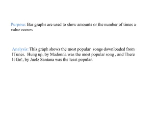
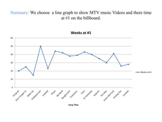
Choosing the Right Graph


     by: Brad Bishop and
Summary:
We chose a scatter plot to show how many people attended the X GAMES.


                            300000
                                                  # of people in attendance
# of people in attendance


                            250000

                            200000

                            150000

                            100000

                            50000                                                     # of people in attendance

                                 0
                                     0   1        2       3        4          5   6    7


                                             X GAMES
Purpose: Scatter plots are mostly used to show trends in data.


Analysis: In this graph, it showed how many people attended the X
GAMES. It shows that X Games Five had the highest amount of
people in attendance.
Summary:
         We chose a bar graph to show the most popular songs downloaded from
        ITunes.


                                                     FREQUENCY
           There It Go!, Juelz Santana


Sugar, We're Going Down, Fall Out Boy


              Gol Digger, Kanya West


           Dance, Dance, Fall Out Boy


                      Laffy Taffy, D4L


         Stickwitu, The Pussycat Dolls                                                      FREQUENCY


              Photograph, Nickleback


          My Humps, Black Eyed Peas


                  Run it!, Chris Brown


                  Hung Up, Madonna


                                         0   5,000      10,000   15,000   20,000   25,000
Purpose: Bar graphs are used to show amounts or the number of times a
value occurs


Analysis: This graph shows the most popular songs downloaded from
ITunes. Hung up, by Madonna was the most popular song , and There
It Go!, by Juelz Santana was the least popular.
Summary: We choose a line graph to show MTV music Videos and there time
                         at #1 on the billboard.


                               Weeks at #1
60


50


40


30


20
                                                                 Weeks at #1


10


 0


                             Song Titles
Purpose: The purpose of a Line Graph is to plot changes and data over time.


Analysis: This graph show how long the popular
MTV music videos stayed on top in 1st place.
Gwen Stefani’s Hollaback Girl Stayed in 1st the
longest, the on that stayed the least amount of
time was Wake Up by Hillary Duff.
Summary: This is a pie chart graph of popular comic books their
             issue, publisher, price, and estimated sales.

                                                                                          Batman 651 2.5 DC
                                   Ultimate Spider-   Est. sales                                 4%
                                  Man 92 2.5 Marvel
                                         4%
              Ultimate X-Men 68 2.5 Marvel
                          4%
            Ms Marvel 1 2.99 Marvel                         Infinite Crisis 5     New Avengers 17 2.5 Marvel
                      4%                                        3.99 DC                     7%
                                                                  11%
                   Ultimate Spider-
                  Man 91 2.5 Marvel
                         4%
                                                                                       All Star Superman 3 2.99 DC
 X-Men Deadly Genesis 5 3.5                                                                         6%
         Marvel
           4%
       Wolverine 40 2.99 Marvel                                                         New Avengers Illuminati
                 4%                                                                       Sp N/A 3.99 Marvel
         Ultimate Extinction 3 2.99                                                               6%
                  Marvel
                    4%                                                                Superman Batman 24(Res)
    Uncanny X-                                                                               2.99 DC
     men 471     X-men 184 2.5 Marvel
                                                                                                6%
    2.5 Marvel             4%
        4%                                                                     Ultimates 2 10 2.99 Marvel
                                Infinite Crisis                                            5%
Uncanny X-men 470 2.5          Secret Files 2006                                               Amazing Spider-Man
       Marvel                    470 5.99 DC                   Green Lantern 10 2.99 DC           530 2.5 Marvel
         4%                           4%                                 4%                             5%
Purpose: A pie chart is used to show what percent a particular item represents
                               of the data series


Analysis: We choose the pie chart to represent
our data, it shows the highest and lowest of
comic books and their estimated sales. Infinite
Crisis 5 being the highest.

Choosing the right graph

  • 1.
    Choosing the RightGraph by: Brad Bishop and
  • 2.
    Summary: We chose ascatter plot to show how many people attended the X GAMES. 300000 # of people in attendance # of people in attendance 250000 200000 150000 100000 50000 # of people in attendance 0 0 1 2 3 4 5 6 7 X GAMES
  • 3.
    Purpose: Scatter plotsare mostly used to show trends in data. Analysis: In this graph, it showed how many people attended the X GAMES. It shows that X Games Five had the highest amount of people in attendance.
  • 4.
    Summary: We chose a bar graph to show the most popular songs downloaded from ITunes. FREQUENCY There It Go!, Juelz Santana Sugar, We're Going Down, Fall Out Boy Gol Digger, Kanya West Dance, Dance, Fall Out Boy Laffy Taffy, D4L Stickwitu, The Pussycat Dolls FREQUENCY Photograph, Nickleback My Humps, Black Eyed Peas Run it!, Chris Brown Hung Up, Madonna 0 5,000 10,000 15,000 20,000 25,000
  • 5.
    Purpose: Bar graphsare used to show amounts or the number of times a value occurs Analysis: This graph shows the most popular songs downloaded from ITunes. Hung up, by Madonna was the most popular song , and There It Go!, by Juelz Santana was the least popular.
  • 6.
    Summary: We choosea line graph to show MTV music Videos and there time at #1 on the billboard. Weeks at #1 60 50 40 30 20 Weeks at #1 10 0 Song Titles
  • 7.
    Purpose: The purposeof a Line Graph is to plot changes and data over time. Analysis: This graph show how long the popular MTV music videos stayed on top in 1st place. Gwen Stefani’s Hollaback Girl Stayed in 1st the longest, the on that stayed the least amount of time was Wake Up by Hillary Duff.
  • 8.
    Summary: This isa pie chart graph of popular comic books their issue, publisher, price, and estimated sales. Batman 651 2.5 DC Ultimate Spider- Est. sales 4% Man 92 2.5 Marvel 4% Ultimate X-Men 68 2.5 Marvel 4% Ms Marvel 1 2.99 Marvel Infinite Crisis 5 New Avengers 17 2.5 Marvel 4% 3.99 DC 7% 11% Ultimate Spider- Man 91 2.5 Marvel 4% All Star Superman 3 2.99 DC X-Men Deadly Genesis 5 3.5 6% Marvel 4% Wolverine 40 2.99 Marvel New Avengers Illuminati 4% Sp N/A 3.99 Marvel Ultimate Extinction 3 2.99 6% Marvel 4% Superman Batman 24(Res) Uncanny X- 2.99 DC men 471 X-men 184 2.5 Marvel 6% 2.5 Marvel 4% 4% Ultimates 2 10 2.99 Marvel Infinite Crisis 5% Uncanny X-men 470 2.5 Secret Files 2006 Amazing Spider-Man Marvel 470 5.99 DC Green Lantern 10 2.99 DC 530 2.5 Marvel 4% 4% 4% 5%
  • 9.
    Purpose: A piechart is used to show what percent a particular item represents of the data series Analysis: We choose the pie chart to represent our data, it shows the highest and lowest of comic books and their estimated sales. Infinite Crisis 5 being the highest.