Data + Excel = Analytics
•Download as PPTX, PDF•
0 likes•86 views

This slide deck covers and introduction to using Excel in machine learning. Specifically, it reviews supervised learning with categorical data and continuous data.

Recommended
More Related Content
More from Michael Levin
More from Michael Levin (14)
Recently uploaded
Recently uploaded (20)
Data + Excel = Analytics
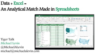
- 1. Data + Excel = An Analytical Match Made in Spreadsheets Tiger Talk Michael Levin @MichaelALevin michael@michaelalevin.com
- 2. My Interest in Data and Excel Auto Scrappage Brand Nostalgia Training
- 3. Differing Forms of Machine Learning Supervised Unsupervised Categorical Data Classification Association Analysis Continuous Data Regression Clustering & Dimension Reduction
- 4. Understanding Data Date Time Name Device Type Last Point of Contact Number of Items Revenue Jan. 4 8:37 A Fred Smith iOS Organic Search 10 $132.81 Apr. 13 1:16 P David De Gea Android Paid Search 7 $49.38 Sep. 24 5:23 P Gareth Bale iOS Email 24 $643.17 Nov. 11 11:00 A AntonioValencia iOS Facebook 16 $291.76
- 5. Understanding Data Date Time Name Device Type Last Point of Contact Number of Items Revenue 4 8:37 Fred 1 1 10 $132.81 104 13:16 David De Gea 2 2 7 $49.38 268 17:23 Gareth Bale 1 3 24 $643.17 316 11:00 AntonioValencia 1 6 16 $291.76
- 6. If We Can Count It, We Can Analyze It Day Action 1 Monday 2 Tuesday 3 Wednesday 4 Thursday 5 Friday 6 Saturday 7 Sunday
- 7. We Can Conditionally Count It Excel Command Results =countif(a2:a220, 1) Returns count of cells that contain Monday where 1=Monday =countif(a2:a220, ,6)+countif(a2:a220,7) Returns count of cells that contain Saturday and Sunday where 6=Saturday and 7=Sunday =countif(a2:a220, ”<6”) Returns count of weekday cells =countif(a2:a220, “*”) Returns count of any cells that contain text.
- 8. We Can Conditionally Count It Revenue ($) Bins Output Description 78.43 40 2 Number of revenue less than or equal to $40 89.71 59 3 Number of revenue between $41-59 29.55 79 4 Number of revenue between $60-79 77.92 3 Number of revenue greater than or equal to $80 43.24 37.64 Formula 84.68 =Frequency(A2:A13,B2:B4) 51.17 82.01 40.69 78.92 70.84
- 9. Pivot for Count Relationships Count of Device Category Column Labels Row Labels Desktop Mobile Tablet GrandTotal (Other) 503 658 531 627 Direct 366 366 366 1098 Display 365 366 365 1096 Email 25 14 2 41 Organic Search 366 366 366 1098 Paid Search 351 362 338 1051 Social 365 366 355 1086 GrandTotal 2341 2498 2323 7162
- 10. Every Value Appears and Possible Time Money People
- 11. Describing Continuous Data Statistic Excel Function Mean =average(range) Median =median(range) Mode =mode.sngl(range) Standard Deviation =stdevp(range) Minimum =min(range) Maximum =max(range) Skewness =skew(range) Kurtosis =kurt(range)
- 12. Looking for Continuous Relationships High Value Low Value Interpretation 1.00 0.80 Danger 0.79 0.60 Strong 0.59 0.40 Moderate 0.39 0.20 Weak ~0.20 +0.20 Crud ~-0.20 -0.39 Weak -0.40 -0.59 Moderate -0.60 -0.79 Strong -0.80 -1.00 Danger
- 13. Seeing Continuous Relationships Units Households Price/Unit Promo Amt Product Size Units 1.00 Households 0.99 1.00 Price / Unit -0.33 -0.29 1.00 Promo Amt 0.48 0.50 -0.24 1.00 Product Size 0.20 0.20 -0.37 0.04 1.00 Frozen Pizza Category
- 14. Seeing Continuous Relationships Units Households Price/Unit Promo Amt Product Size Units 1.00 Households 0.99 1.00 Price / Unit -0.21 -0.21 1.00 Promo Amt 0.47 0.46 -0.34 1.00 Product Size -0.04 -0.07 0.17 -0.13 1.00 Cold Cereal Category
- 15. Predicting Continuous Relationships Adjusted R2 0.29 Coefficients Std. Error t Stat P- value Lower 95% Upper 95% Intercept 10.05 0.27 37.29 0.00 9.52 10.58 Price/Unit -1.67 0.03 -63.82 0.00 -1.72 -1.62 PromoAmt 7.46 0.04 168.24 0.00 7.38 7.55 Product Size 0.29 0.01 43.98 0.00 0.27 0.30 Unit = 10.05 -1.67*(Price/Unit) + 7.46*(PromoAmt) + .29*(Product Size) Frozen Pizza Category
- 16. Predicting Continuous Relationships Adjusted R2 0.23 Coefficients Std. Error t Stat P- value Lower 95% Upper 95% Intercept 33.92 0.74 45.99 0.00 32.48 35.57 Price/Unit -4.01 0.17 -23.48 0.00 -4.35 -3.68 PromoAmt 57.21 0.35 162.89 0.00 56.52 57.89 Product Size 0.37 0.04 9.15 0.00 0.29 0.45 Unit = 33.92 -4.01*(Price/Unit) + 57.21*(PromoAmt) + .37*(Product Size) Cold Cereal Category
- 17. Diving into Excel Websites http://www.marketingprof.me/excel.html http://wak2.web.rice.edu/bio/WagnerKamakuraDownloads.htm YouTube channels https://www.youtube.com/user/ExcelCampus/videos https://www.youtube.com/channel/UCqVk1NO2dx2OiG2GJxGfWsw https://www.youtube.com/user/MIS204Channel/videos
- 18. Data + Excel = An Analytical Match Made in Spreadsheets Tiger Talk Michael Levin @MichaelALevin michael@michaelalevin.com
Editor's Notes
- Thank you for spending an hour with me while I talk about two of my favorite things: analysis and Excel. In this hour, I am going to introduce myself before discussing a couple of key terms, machine learning and analysis, and data. I will then show how we can analyze two types of data, count and continuous, using Excel. My goal for this hour is to spark your curiosity and interest in analyzing data using Excel.
- Have analyzed data from a variety of sources including purchase behavior from a major professional league and auto sales data related to cash for clunkers. Have written and collected data from surveys on technology use by employees and on brand nostalgia. Have done training and development with retail managers as part of a leadership program with the National Association of College Stores.
- Supervised – we need a teacher or analysis to make decisions about the model. Train the data. Regression – predict value of a house or price willing to pay Classification – is this email spam or not I am simplifying here. Unsupervised – algorithm makes the decision Association – people who buy X also buy Y. Basket analysis Clustering – grouping items, observations, people based on variables. Other forms besides clustering such as preference or perceptual maps and factor analysis
- Before we jump into Excel, we need to understand data. We can see a table of customer behavior that would get generated from an e-commerce site. All of these columns can be analyzed.
- We are going to convert date into a number. We are going to assign numerical values to device type and last point of contact. What we have created are two types of data – categorical, continuous Date, Device type and Last point of contact would be categorical Number of items and Revenue would be continuous We can work with both for analysis. The type of data that we have influences what analysis we can perform
- Find frequency and percent with categorical data. We can see how many people used a laptop to access our site compared to mobile and tablet. Similarly, we can determine percent of our users came to our site from social or email or search. In Excel, =mode function will tell us the most popular answer. Count function fairly handy. Besides =count, we can conditional counts
- Count function fairly handy. Besides =count, we can conditional counts through the countif function If we want to count a specific word then place inside the quote marks. The astrik will return any text, which can be helpful with cleaning data. If we have a column that should contain numerical values, then we can quickly determine if there is a problem with a missing value or a corrupted value.
- =Frequency function looks up values in column A and assigns them to range values under column B This function would come in handy if I am looking for customers who order by revenue amount or frequency. Also, if I am looking for just a range of values. Highlight the formula, click <shift> <control> <return> simultaneously.
- Pivot tables are really handy here. We can see the relationship between two variables. In looking at this relationship, we should ask. Is the relationship due to something meaningful or is it due to luck, randomness? Neil, when we can return to being in a physical location, I can walk you through how to determine if this relationship is meaningful or due to luck. If you cannot wait until that point, then you can look for chi square test in Excel. Videos and website on topic.
- Continuous data means that every value is possible. I can double it. I subtract it. Time measured by number of days in a year, year, or minutes or hour, age can be continuous. Money as measured by revenue, expenses, profit People such as population, visitors to my store, booth, website, number of customers in my store.
- We can use these formula to describe our continuous data. Except for Mode, none of these measures should be used on categorical data. I can also use the Data Analysis by clicking on Data between Formulas and Review on the ribbon. From there, I can select Descriptive Statistics. That will produce everything I want.
- Beyond descriptive statistics, I can find the relationship between two continuous variables. This relationship is known as correlation. The values range from +1 to -1 with zero indicating no relationship. The interpretation of the correlation is of more interest. In this slide, I provide an interpretation of the correlation value. In Excel, I can create a table of correlation values using the Data Analysis feature. Instead of Descriptive Statistics, I am going to select Correlation.
- Here is my correlation value between Units and Visits is greater than .8, which means I measuring the same thing twice. I need to get rid of one of my variables.
- In addition to household problem, I see that size looks problematic. It is a crud or nonsensical relationship.
- I can find the relationship between two continuous variables, or correlation in Excel using =correl function I can predict or forecast an output based on one or more variables, or regression in Excel using =reg function Alternatively, I can use the regression routine through the Data Analysis button in Excel As shown in the output, I get the adjusted r square value, which gives me an idea of close my model predicts reality. It also reports significance level for the model and the variables. So, I get the same output in regression from Excel as I would from other statistics packages.
- I can find the relationship between two continuous variables, or correlation in Excel using =correl function I can predict or forecast an output based on one or more variables, or regression in Excel using =reg function Alternatively, I can use the regression routine through the Data Analysis button in Excel As shown in the output, I get the adjusted r square value, which gives me an idea of close my model predicts reality. It also reports significance level for the model and the variables. So, I get the same output in regression from Excel as I would from other statistics packages.
- Thank you for spending an hour with me while I talk about two of my favorite things: analysis and Excel. In this hour, I am going to introduce myself before discussing a couple of key terms, machine learning and analysis, and data. I will then show how we can analyze two types of data, count and continuous, using Excel. My goal for this hour is to spark your curiosity and interest in analyzing data using Excel.