Download as PDF, PPTX
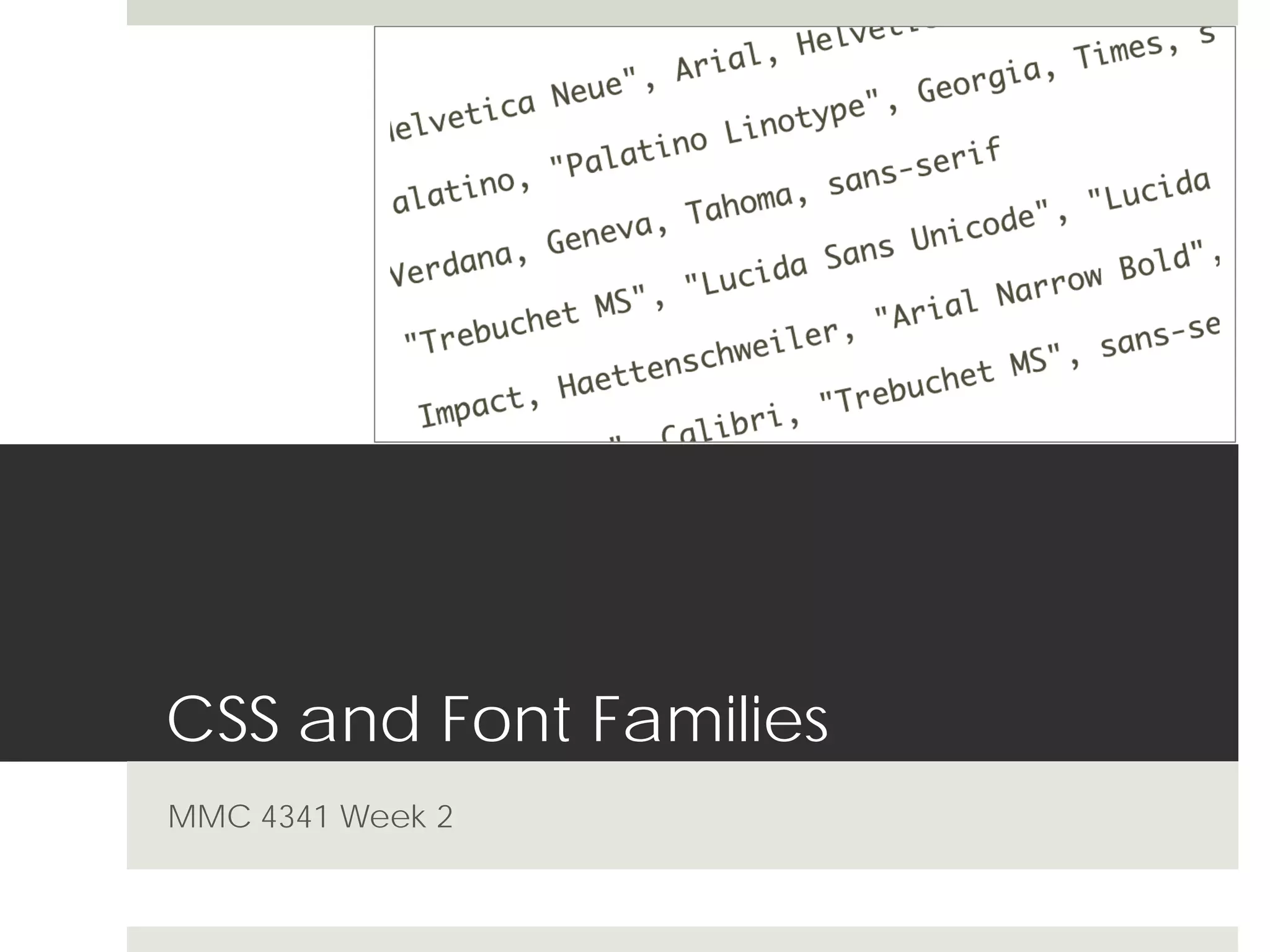
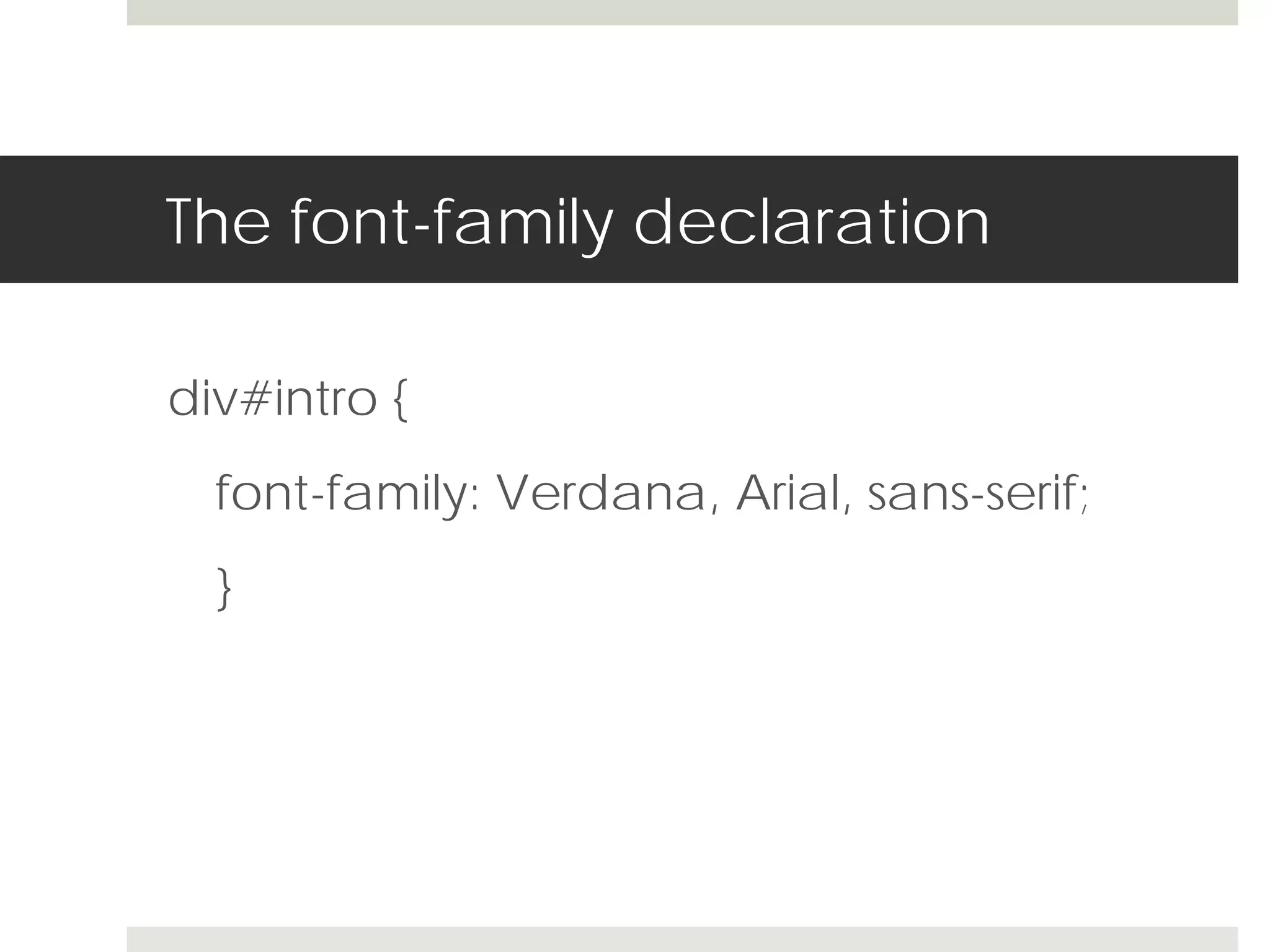
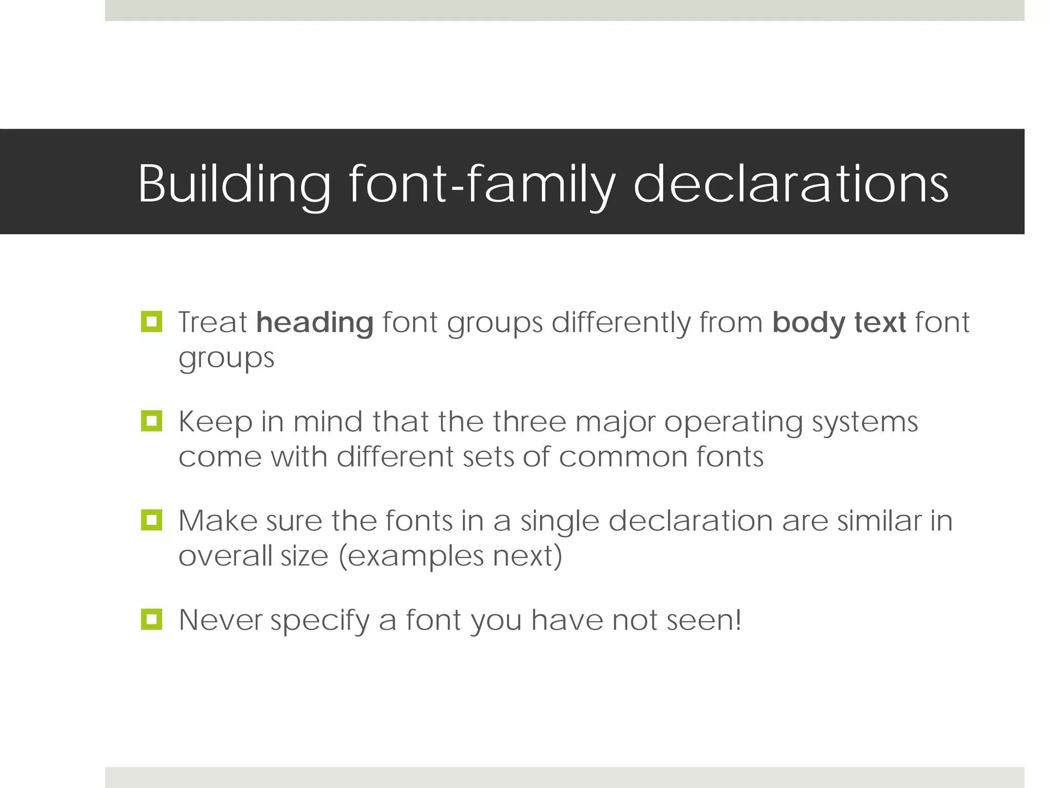
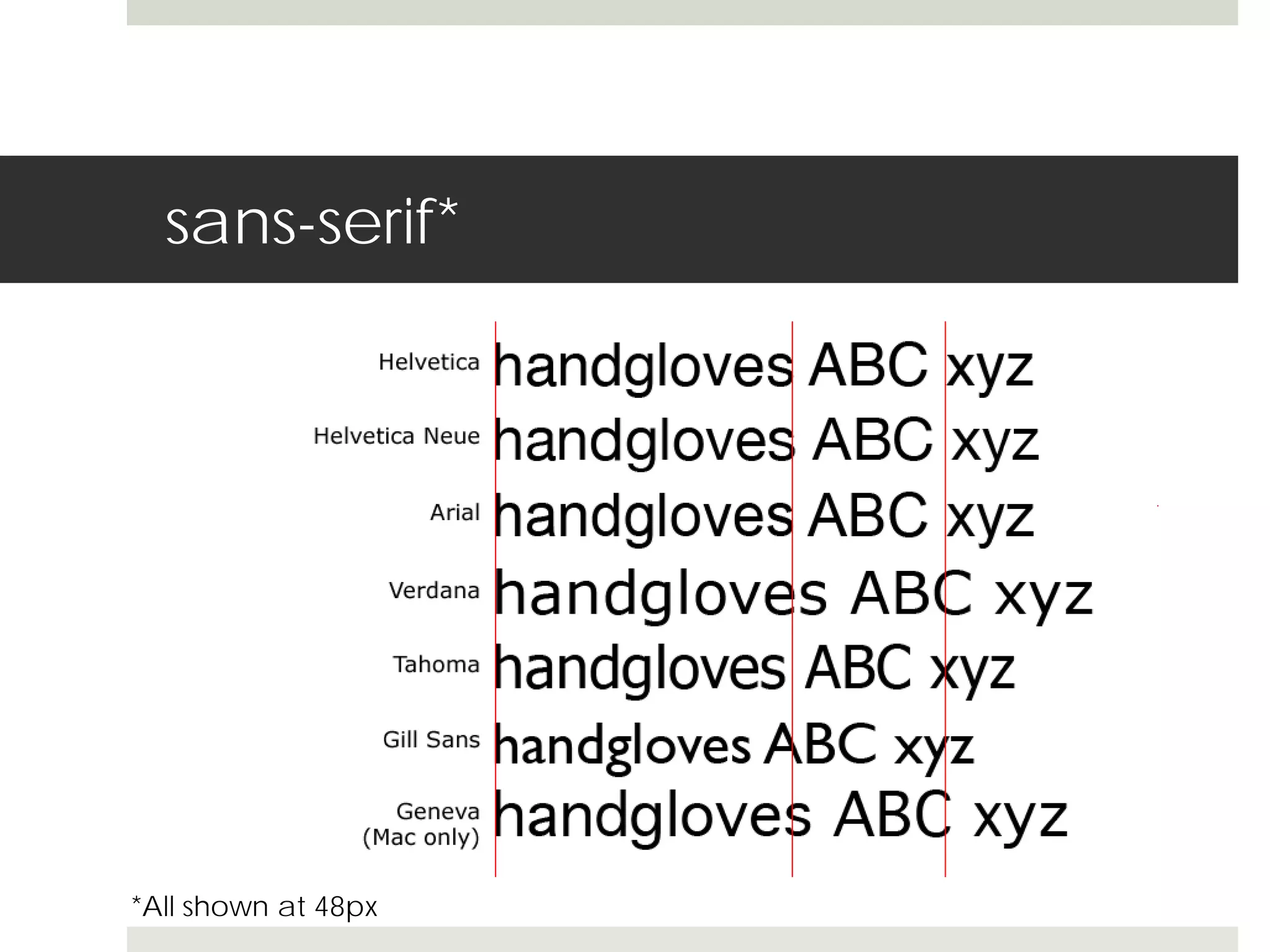
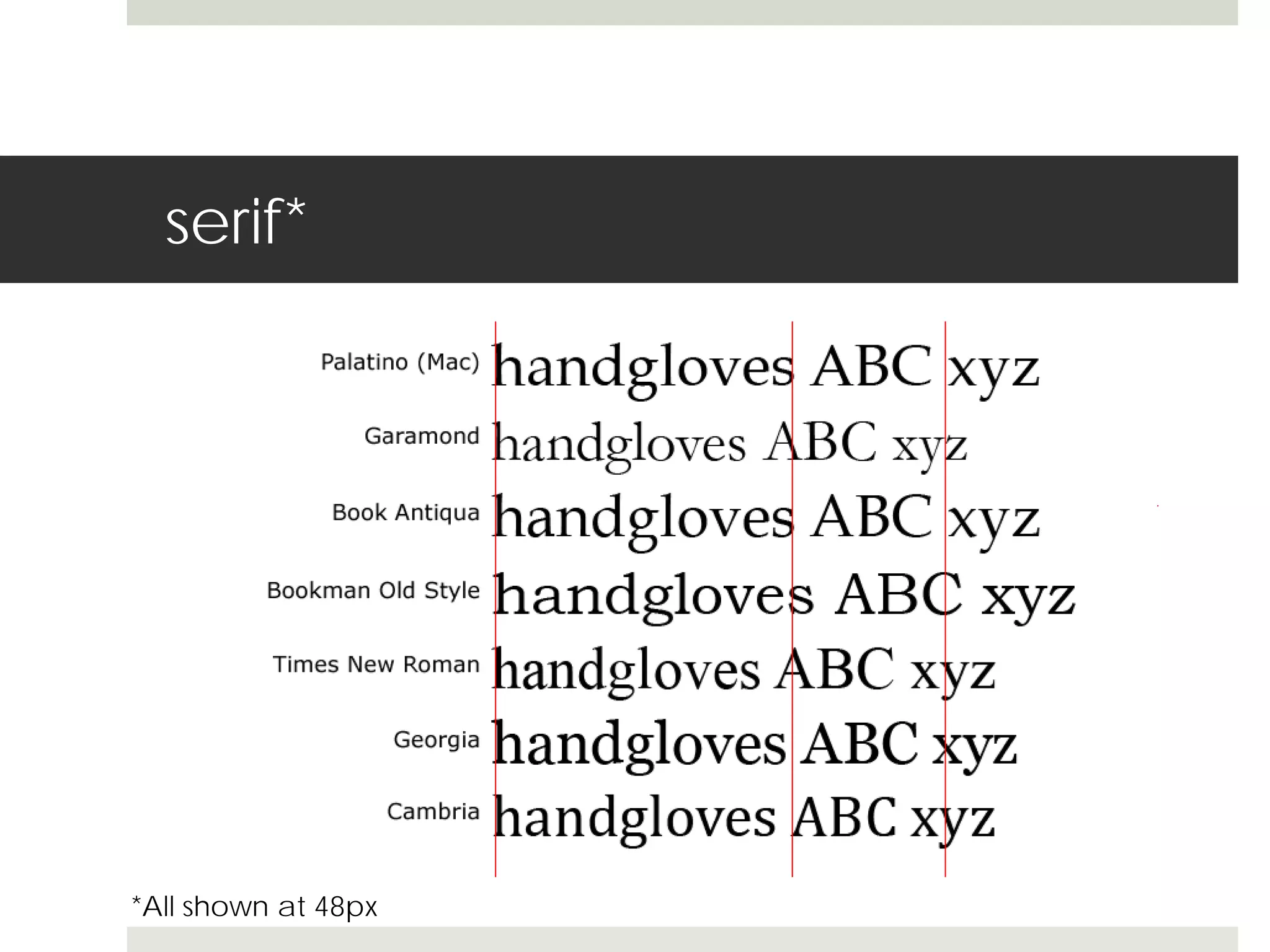
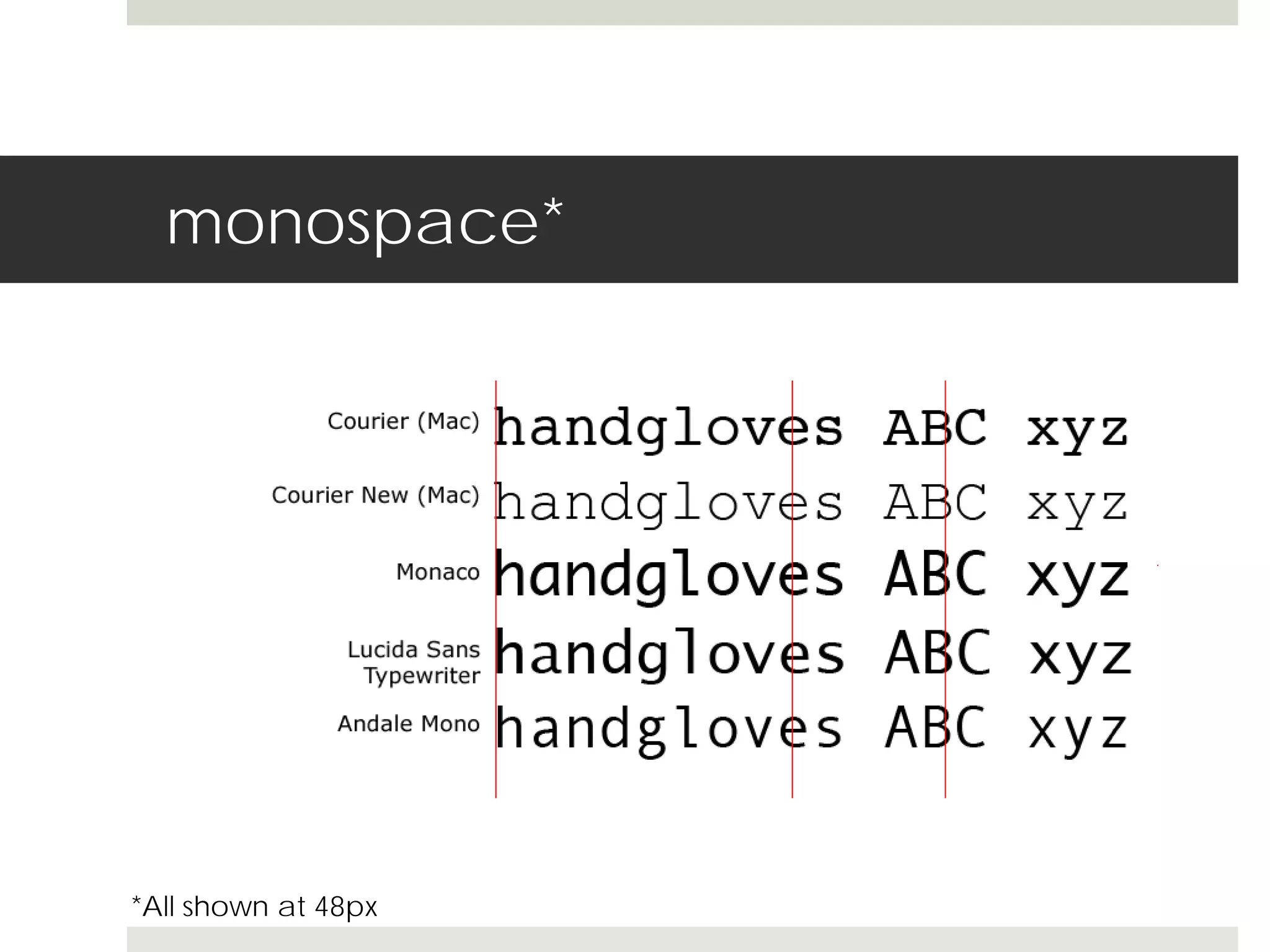
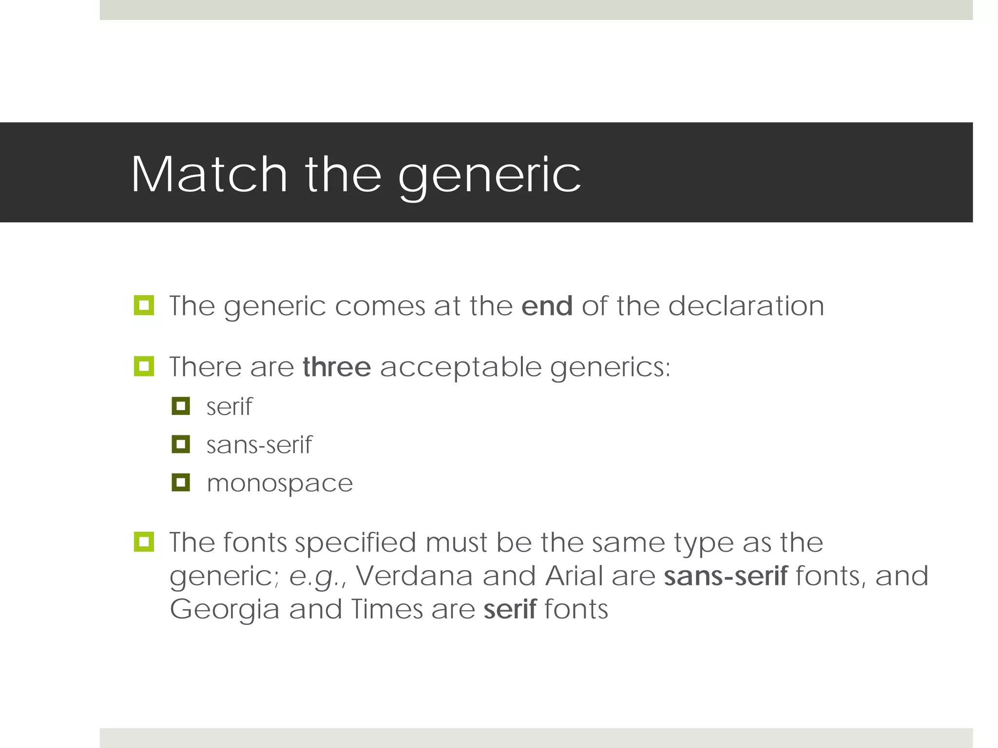
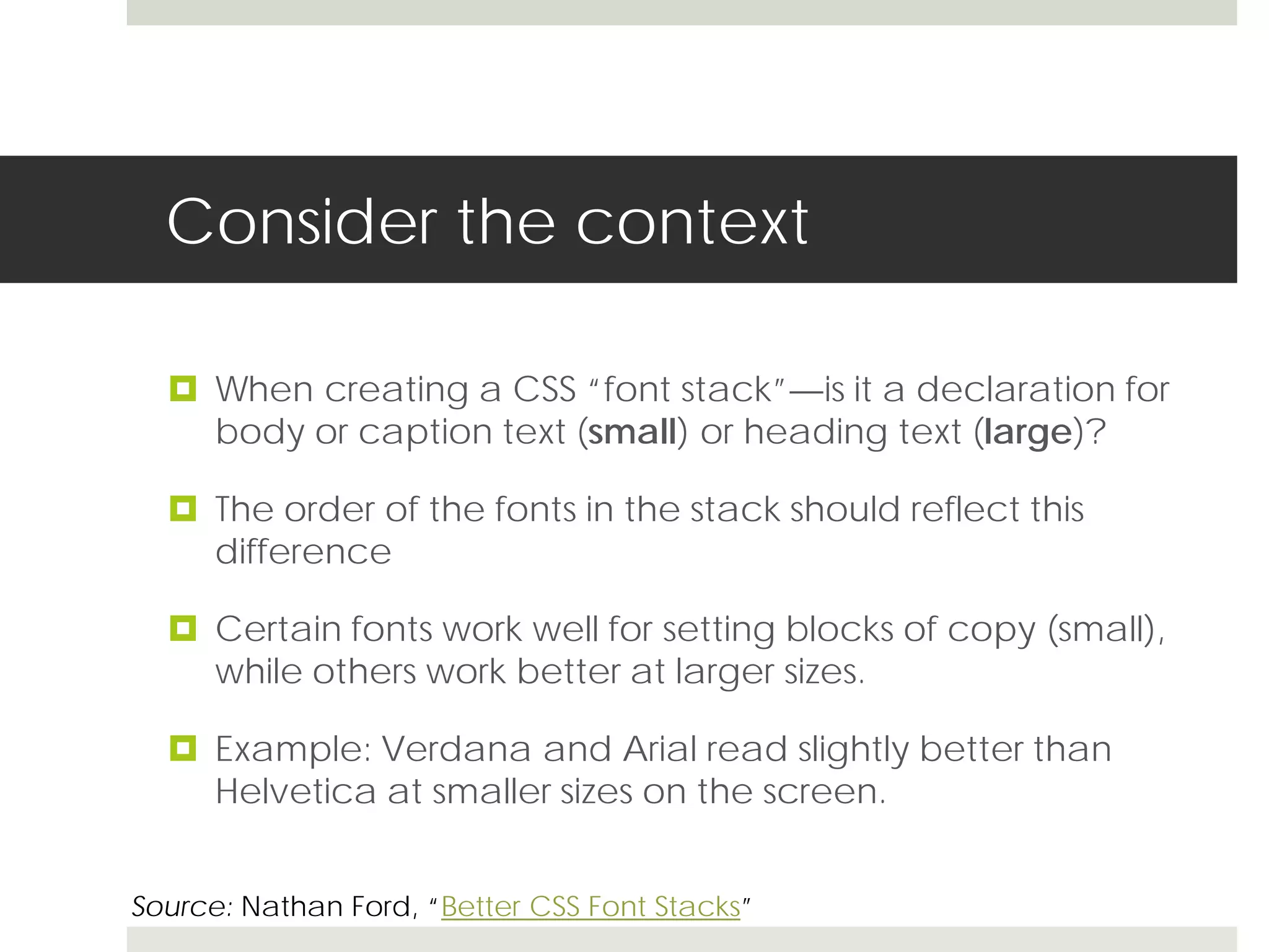
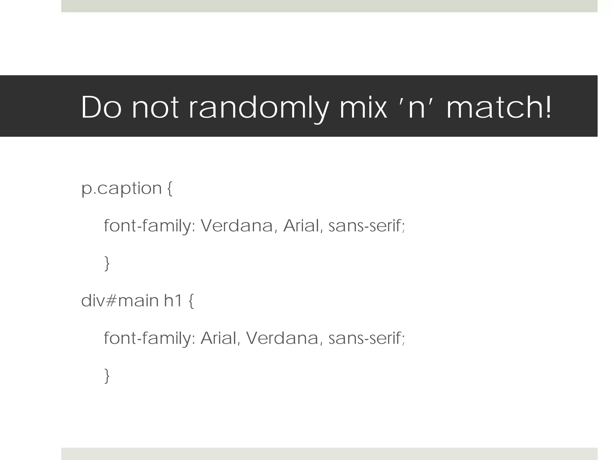
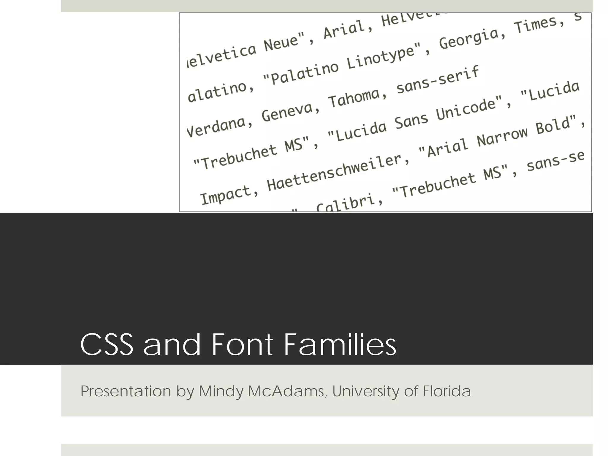

The document provides guidelines for using CSS font families, emphasizing the importance of selecting fonts that are appropriate for their context, avoiding obscure options, and limiting the number of different typefaces used on a page. It suggests treating heading and body text differently and recommends using no more than three typefaces, ideally combining serif and sans-serif fonts for contrast. Additionally, it advises checking font legibility and compatibility across different platforms.