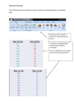
1. This information acts as evidence on how I created my chart/graphs for my collected data.<br />To create my chart I clicked on ‘Insert’ then I chose the charts for my data.<br />You will have to highlight before inserting and choosing the chart/graph.This is my highlight for the quantities that I got from the questionnaires.<br />To find out the average I of all the percentages in my questionnaire I clicked on Formulas and find the Average then click on it.This process should be done after you’ve done the highlighting of the percentages that you collected.<br />You will have to highlight before inserting the average of the percentages of yes and no.This is my highlight for the percentages that I got from the questionnaires.<br />You will have to highlight before inserting and choosing the chart/graph.This is my highlight for the percentages that I got from the questionnaires.<br />This is the result from the data and as you can see the difference is very obvious.<br />I chose Bar Chart to show the quantity of the answers from the questionnaires because it shows the difference better and it is labelled with numbers so that the readers won’t be confused on where to look at for each question.<br />This is the result from the data and as you can see the difference is so obvious.<br />I chose Pie Chart to show the percentage of yes’ or no’s for my questionnaires because the results are very obvious and you can see in the pie chart which of the two has more percentage.<br />