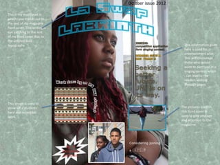
1. This is my masthead in
which case stands out to
the rest of my magazine
front cover. This writing is
eye catching to the rest
of my front cover due to
the unfilled bold
typography. This information given
here is used for
entertainment wise.
This will encourage
those who would
want to part take in a
singing contest which
, can lead to the
readers looking
through pages.
This image is used to
show off a students The pictures used in
hard and incredible this front cover is
work. used to give courage
and attention to the
magazine.
2. This is the October
This is the heading of my title. issue magazine. so far
I changed the coloring because that comes out every
I didn’t want to clash the colors with fortnight
the front cover. Also the writing is in
an arc , its in an arc because I didn’t
want the writing to cover my models
These images are
Faces.
familiar students that
attend La Swap. So
this may want to
prompt students to
This is my contents read on.
typography which stands
out because it is bigger
than the rest.
The number 10 and
others are written in
larger writing so that
it could stand out.
This writing is a
contrast between the
whole page. This is This is a subheading
because the typography that is a trace of the
and colour is different. models body
This gives the position. The word
impression that this success is a contrast
part of the content with the
page is more serious background, this is so
and holds effective that the word
information. ‘success’ can stand
out.