
Recommended
More Related Content
What's hot
What's hot (12)
Improvements for Music Magazine
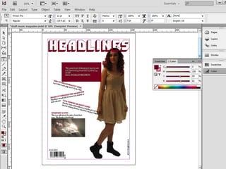
- 2. What I will improve: • I will add a background to cover up the white space • I will add more pictures to make the front cover look more like a music magazine and to make it more attractive
- 4. What I will improve: • For the contents page, I will add something to the bottom left corner to make it more appealing than just plain black and white • For the interview page, I will add a picture of ‘Kara Coleman’ to the page, possible in the middle of the page to link to the main article and to break up the writing so it isn't so plain
- 6. What I will improve: • I will either add some quotes, some more questions, some more pictures of a background to fill in the white space and to make it look more like a real music magazine