(NEHA) Call Girls Ahmedabad Booking Open 8617697112 Ahmedabad Escorts
colour
1. Colour
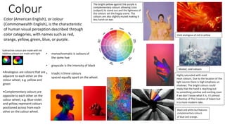
The bright yellow against the purple is
complementary colours allowing Lizzo
(subject) to stand out and the lightness of
the colours set the happy scene. The
colours are also slightly muted making it
less harsh on eye.
Vivid analogous of red to yellow
Muted, cold colours
Highly saturated with vivid
neon colours. Due to the location of the
light source there is high emphasis on
shadows. The bright colours could
imply that the hand is reaching out
to something positive and exciting even
if we don’t know what it is. It's almost
reflective of The Creation of Adam but
in a more modern take.
Color (American English), or colour
(Commonwealth English), is the characteristic
of human visual perception described through
color categories, with names such as red,
orange, yellow, green, blue, or purple.
Subtractive colours are made with ink
Additive colours are made with light
•Analogous are colours that are
adjacent to each other on the
colour wheel, e.g. yellow and
green
•Complementary colours are
opposite to each other on the
colour wheel, e.g. Blue-violet
and yellow, represent colours
positioned across from each
other on the colour wheel.
• monochromatic is colours of
the same hue
• grayscale is the intensity of black
• triadic is three colours
spaced equally apart on the wheel.
Black and white but features
complementary colours
of blue and orange.
2. William Eggleston
William Eggleston is an American photographer. He is widely
credited with increasing recognition for color photography as
a legitimate artistic medium. Eggleston's books include
William Eggleston's Guide and The Democratic Forest.
He was born in Memphis, Tennessee in 1939 and this clearly
influnces a lot of his work since lots of his shots feature very
american domestic life in the 60s and 70s . For example
his series on supermarkts scream 70s nosastalgia and the
muted colours help to give it that older feel.
However his Red Ceiling greatly contrasts that with
the overpowering red tones in high saturation. I chose his
work since I found the way he uses colour to make everyday
situations less dull inspiring. I also find the variety in his work
imprssive since it ranges from almost still life to street. His
images have influenced my work since I plan to now go to on a
shoot outside the studio and look for bright primary colours
(specifically red).
The white wires contrast the red
walls providing leading lines
towards the lightbulb which
seems to be the subject,
however there is no obvious
subject allowing the saturation
of the red to be the main focus
“I had the attitude that I would work with this present-day material
and do the best I could to describe it with photography”
“Not intending to make any particular comment about whether it
was good or bad or whether I liked it or not. It was just there, and I
was interested in it.” - William Eggleston on the nature of his work.
The artist’s use of colour film during the 1960s challenged the
conventions of photography, since at the time, dye-transfer
photography was considered beneath serious photographers, only
used for commercials.
His picture here uses leading lines (in the wires and roof) to bring you to a faded shop sign.
The use of complementary colours with the faded red/orange in the sign against the blue
gradient in the sky. The rubbish on the left and the faded, peeling paint give the image an
empty, eerie feeling, this is contrasted by the soothing blue sky and muted red tones.
3. contact sheets
I used a Sony Nex - 5 to shoot these at a local
fair. I chose this location because I knew it
would have lots of bright colours. I also knew
it would have some old fashioned elements
reflecting Egglestones work. His work
influenced me here because I looked out for
bright primary colours especially red and
yellow. This helped my stay focused since
there was such an abundance of subjects
and a great risk of overcrowding the shot.
4. I chose this shot sice it features the
contrasting primary colours of yellow and
light blue. This as well as the flags
and old fashioned subject
shows that the shot was heavily
influenced by Eggleston. I also kept the
subject central to the shot as did Eggleston
a lot.
I chose this shot because I
liked the gradient in the
sky and the contrast of the
blue sky againt the white . It is
based off
Eggleston's "Peaches" photo
where he has a the warm tones
of the sign contrasting the blue
sky.
This shot features
monochromeactic pink
candyfloss central to the shot. I
chose this shot since I
wouldn’t change the
compsotion of the piece at all. It
also reminds me of Egglestone
since it is a simple food subject in
the centre.
To me, these images don’t
have an as strong link
the Eggleston's work as the
others, however I really like
the light patterns against the
black of the night. The main
colour featured is a
light yellow that does
reflect Eggleston's work.
This shot doenst relate to
Eggleston's work as much
as the others either
however I really liked the
vivid, bright patterns. The
image is still of an
everyday item/scene but
in editing I would turn up
the brightness.
I don’t like the composition of
this since the plastic roof and
the sky take up too much
room of the shot when I
want the pattern of the red
and yellow analogous colours
to be the main focus since
they are colours often
featured in Egelston's work.
This shot is way too
underexposed making the
colours almost muted. This
shot features
monochromatic blues
which I think with editing
could be very bright and in
keeping with the vividness
of Eggleston's work.
This shot features a lot
of different colours and
subjects however using
the rule of thirds the
sign is placed perfectly
in the shot giving your
eyes something to
follow. It links to my
artist since there is a
lot of primary colours
as there is in his work.
six best images:
images that need
improvement:
Image selection and
reflection:
5. Editing 1:
Firstly I made the image a little darker by bringing
the RGB curve down. I then changed the levels a
little to emphasise some of the colours. I then made
the image slightly more red to give the impression that
the sun was setting when I took the shot.
Editing 2:
I firstly I cropped the image down using
the golden ratio I then put the general
curve into the S shape to up
the brightness and contrast.
Finally I heightened the magenta to make
the pink of the candyfloss stand out.
Editing 3:
Firstly made a slight tweak to the
colour curve and then I changed the
contrast and brightness bringing them
both up a lot. I finally brought up
the saturation on all hues to give it
an overpowering effect.
In all of these I changed the contrast and colour
to reflect Eggleston's work. I think they do a good job of this
since they all picture everyday scenes and they were taken
close to where I live. They all feature bright colourds
and high contrast. One difference is that Egglestons work
featured less subjects and therefore were less crowded.
Editing
6. Editing 4:
Firstly I made the image brighter and more contrasted
to reflect Eggleston's work and to make it
clearer. I then made the hue slighlty more green. I
finally blurred the bottom of the image a little since it
made the contrast with the sky and the top of the
wheel more prominent.
Editing 6:
Firstly I changed the changed the curve
slightly to balnce the exposure then I
made the blue lighter, red darker and
both more saturated. I did this to reflect
the high saturation in Eggleston's work
digitally. Finally I brought the contrast
up a lot to get rid of a lot of
the highlights that arent the lights that I
wanted to focus on e.g the reflection on
the metal.
Editing 5:
Here I upped the contrast drastically to
emphasize the colours and structure I
also made the tones warmer through changing
the curves - however I didn’t get a
screenshot for that – I did this the bring out the
red to replicate Eggleston's work
Editing
7. Editing
Editing 7:
I first fixed the underexposure by bringing
up the curve where the light source was coming
from. This allowed form a lot more visibility
and the colours to be shown in the best
way. I then made the blue darker and pulled the
saturation up making a very dramatic final
result. I prefer this since the blue tones
are much richer and bold.
Editing 8:
I first cropped the image so that the pattern filled
the whole frame. This was important since I
wanted the focus to only on the complementary
colours and the pattern of the
lights. I then edited the colour, brightness and
contrast to make colours stand out.
Reflection:
I think that all the shots capture the theme of
colour well however I think that in the future I need
to make sure my exposure levels are right. I also
think that my shots relate to Martin Parr just as
much, if not more, than Eggleston. I think this since
Parrs shots are often more busy and less planned
than Eggleston's and so are mine. He also shoots in
the UK and has a more street style of work. I like his
use of colour since it seems more naturally
occurring and I like the way he seeks it out in a
world with a lot of grayscale.