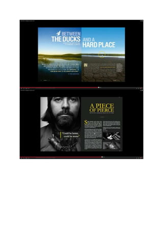
2. I have chosen these double page spreads because of the use of pictures. I think they have a big
effect on catching the reader’s attention. The typography, the use of colour helps to make the text
stand out and the black and white works well with one colour making it stand out. The use of large
text helps to attract the reader to the DPS making them want to read what it is saying. The negative
space helps attract the reader as it makes them focus more on the image and also they will want to
read the text.