SlideShare a Scribd company logo
1 of 1
• The Masthead on this school magazine is                                                                  • The Masthead on this school magazine is at
                                                    situated nearer the bottom of the page, whereas                                                            the top just like the two magazines at the
                                                    on each of the other magazines the masthead is at                                                          bottom of the page. However the font choice
                                                    the top.                                                                                                   makes this magazine seem unprofessional and
                                                                                                                                                               child like.

                                                    • The font of the masthead on this magazine is very
                                                    sophisticated and simple which could suggest that                                                          • The main picture uses an effect where only
                                                    this magazine is either for parents or a private                                                           certain aspects of it are in colour. However, this
                                                    school that are trying to make there magazine                                                              is something that teenagers commonly do when
                                                    appear a certain way.                                                                                      editing pictures which makes it seem that this
                                                                                                                                                               magazine was made to appeal to teenagers.
                                                    • The simplicity of this magazine along with the
                                                    limited pictures can also suggest that this magazine
                                                    is for adults.                                                                                             • Contrasting colours of blue and pink along
                                                                                                                                                               with the pink text boxes could make the
                                                                                                                                                               assumption that this magazine is for female
                                                                                                                                                               teenagers as the colours chosen are not unisex.
                                                    • The watermarked image makes the magazine
                                                    look professional unlike the other 3 magazines.


                                                    • In my opinion this magazine is my favourite
                                                    because it looks the most professional.


• The masthead font of this magazine looks as if
it is aiming for college students as it is very                                                            • The font choice of this magazine is informal.
preppy and typical of an American style college.                                                           However, the colour black suggests that it is a
                                                                                                           unisex magazine.

                                                                                                           • The location of the main photo is in a school
• However, the blue outline of most of the text                                                            which is appropriate as it is for a school
on the front cover can be seen as childlike                                                                magazine although the photo angle and where
because of the fact it is used all over.                                                                   the model is situated looks unprofessional. The
                                                                                                           model is not giving the reader eye contact and is
                                                                                                           at medium close up.
• The main picture on this magazine doesn’t look
professional because of the location of the
photo and the facial expression of the model.                                                              • The page is set out in a circular format with
                                                                                                           different font, sizes and colours to attract the
                                                                                                           eye.

• The layout of the magazine is not symmetrical
nor circular but to the left which again makes it
look unprofessional.

More Related Content

Viewers also liked

Tarea 1 general_sociedad_informacional(1)
Tarea 1 general_sociedad_informacional(1)Tarea 1 general_sociedad_informacional(1)
Tarea 1 general_sociedad_informacional(1)nino182
 
Cruces capital gold resources
Cruces capital gold resourcesCruces capital gold resources
Cruces capital gold resourcesfirstsearchblue
 
Saf sulphur profile
Saf sulphur profileSaf sulphur profile
Saf sulphur profilehore Maroc
 
Striking Features of Web Load Testing Tools
Striking Features of Web Load Testing ToolsStriking Features of Web Load Testing Tools
Striking Features of Web Load Testing ToolsReflective Solutions Ltd
 
Geografía Economica (Ada)
Geografía Economica (Ada)Geografía Economica (Ada)
Geografía Economica (Ada)Tallergeo Geo
 
Doppler guitars presentation
Doppler guitars presentationDoppler guitars presentation
Doppler guitars presentationdopplerguitars
 
The mistery of mona lisa
The mistery of mona lisaThe mistery of mona lisa
The mistery of mona lisamajowonder
 
Presentación sin título
Presentación sin títuloPresentación sin título
Presentación sin títuloGranTushi
 

Viewers also liked (15)

Tarea 1 general_sociedad_informacional(1)
Tarea 1 general_sociedad_informacional(1)Tarea 1 general_sociedad_informacional(1)
Tarea 1 general_sociedad_informacional(1)
 
Cruces capital gold resources
Cruces capital gold resourcesCruces capital gold resources
Cruces capital gold resources
 
Exam
ExamExam
Exam
 
Informe Filipinas 2014
Informe Filipinas 2014Informe Filipinas 2014
Informe Filipinas 2014
 
Saf sulphur profile
Saf sulphur profileSaf sulphur profile
Saf sulphur profile
 
Striking Features of Web Load Testing Tools
Striking Features of Web Load Testing ToolsStriking Features of Web Load Testing Tools
Striking Features of Web Load Testing Tools
 
Geografía Economica (Ada)
Geografía Economica (Ada)Geografía Economica (Ada)
Geografía Economica (Ada)
 
Doppler guitars presentation
Doppler guitars presentationDoppler guitars presentation
Doppler guitars presentation
 
адвайзер как не заблудиться
адвайзер как не заблудитьсяадвайзер как не заблудиться
адвайзер как не заблудиться
 
Yl15 cyber 10
Yl15 cyber 10Yl15 cyber 10
Yl15 cyber 10
 
The mistery of mona lisa
The mistery of mona lisaThe mistery of mona lisa
The mistery of mona lisa
 
Presentación sin título
Presentación sin títuloPresentación sin título
Presentación sin título
 
FINETUNE complaince iss1
FINETUNE complaince iss1FINETUNE complaince iss1
FINETUNE complaince iss1
 
งาน
งานงาน
งาน
 
Tarta de chocolate
Tarta de chocolateTarta de chocolate
Tarta de chocolate
 

Similar to Comparison of 4 school magazines

Presentation for resit of mediaaaaaaaaa
Presentation for resit of mediaaaaaaaaaPresentation for resit of mediaaaaaaaaa
Presentation for resit of mediaaaaaaaaasophieroberts
 
Research into target audience primary
Research into target audience primaryResearch into target audience primary
Research into target audience primarySoulfed947
 
Textual analysis
Textual analysisTextual analysis
Textual analysisAmyDoyle_
 
Music magazine analysis
Music magazine analysisMusic magazine analysis
Music magazine analysisrebeccairedale
 
College Magazines Powerpoint
College Magazines PowerpointCollege Magazines Powerpoint
College Magazines Powerpointbanesybaby
 
Presentation for resit of media
Presentation for resit of mediaPresentation for resit of media
Presentation for resit of mediasophieroberts
 
Media Coursework - Preliminary Task
Media Coursework - Preliminary TaskMedia Coursework - Preliminary Task
Media Coursework - Preliminary TaskEloisekb
 
Media Coursework - Preliminary Research & Task
Media Coursework - Preliminary Research & TaskMedia Coursework - Preliminary Research & Task
Media Coursework - Preliminary Research & TaskEloisekb
 
Media coursework music magazine
Media coursework music magazineMedia coursework music magazine
Media coursework music magazineEloisekb
 
Annotation of two magazines front cover’s
Annotation of two magazines front cover’sAnnotation of two magazines front cover’s
Annotation of two magazines front cover’sJessieGee14
 
Music magazine Evaluation 1
Music magazine Evaluation 1Music magazine Evaluation 1
Music magazine Evaluation 1Dariusazadeh
 
As preliminary task school magazine front cover
As preliminary task school magazine front coverAs preliminary task school magazine front cover
As preliminary task school magazine front coverJordan Williams
 
As preliminary task school magazine front cover
As preliminary task school magazine front coverAs preliminary task school magazine front cover
As preliminary task school magazine front coverJordan Williams
 
Magazine cover analysis nme
Magazine cover analysis  nmeMagazine cover analysis  nme
Magazine cover analysis nmeadamtimms22
 

Similar to Comparison of 4 school magazines (20)

College Magazine Analysis
College Magazine AnalysisCollege Magazine Analysis
College Magazine Analysis
 
Presentation for resit of mediaaaaaaaaa
Presentation for resit of mediaaaaaaaaaPresentation for resit of mediaaaaaaaaa
Presentation for resit of mediaaaaaaaaa
 
Research into target audience primary
Research into target audience primaryResearch into target audience primary
Research into target audience primary
 
Textual analysis
Textual analysisTextual analysis
Textual analysis
 
Music magazine analysis
Music magazine analysisMusic magazine analysis
Music magazine analysis
 
Preliminary Task
Preliminary TaskPreliminary Task
Preliminary Task
 
College Magazines Powerpoint
College Magazines PowerpointCollege Magazines Powerpoint
College Magazines Powerpoint
 
Pitch presentation1
Pitch presentation1Pitch presentation1
Pitch presentation1
 
Presentation for resit of media
Presentation for resit of mediaPresentation for resit of media
Presentation for resit of media
 
Media Coursework - Preliminary Task
Media Coursework - Preliminary TaskMedia Coursework - Preliminary Task
Media Coursework - Preliminary Task
 
Media Coursework - Preliminary Research & Task
Media Coursework - Preliminary Research & TaskMedia Coursework - Preliminary Research & Task
Media Coursework - Preliminary Research & Task
 
Media coursework music magazine
Media coursework music magazineMedia coursework music magazine
Media coursework music magazine
 
Annotation of two magazines front cover’s
Annotation of two magazines front cover’sAnnotation of two magazines front cover’s
Annotation of two magazines front cover’s
 
Music magazine Evaluation 1
Music magazine Evaluation 1Music magazine Evaluation 1
Music magazine Evaluation 1
 
Magazine Analysis
Magazine AnalysisMagazine Analysis
Magazine Analysis
 
As preliminary task school magazine front cover
As preliminary task school magazine front coverAs preliminary task school magazine front cover
As preliminary task school magazine front cover
 
As preliminary task school magazine front cover
As preliminary task school magazine front coverAs preliminary task school magazine front cover
As preliminary task school magazine front cover
 
Themes
ThemesThemes
Themes
 
Magazine cover analysis nme
Magazine cover analysis  nmeMagazine cover analysis  nme
Magazine cover analysis nme
 
Eval 1
Eval 1Eval 1
Eval 1
 

Comparison of 4 school magazines

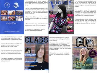
  • 1. • The Masthead on this school magazine is • The Masthead on this school magazine is at situated nearer the bottom of the page, whereas the top just like the two magazines at the on each of the other magazines the masthead is at bottom of the page. However the font choice the top. makes this magazine seem unprofessional and child like. • The font of the masthead on this magazine is very sophisticated and simple which could suggest that • The main picture uses an effect where only this magazine is either for parents or a private certain aspects of it are in colour. However, this school that are trying to make there magazine is something that teenagers commonly do when appear a certain way. editing pictures which makes it seem that this magazine was made to appeal to teenagers. • The simplicity of this magazine along with the limited pictures can also suggest that this magazine is for adults. • Contrasting colours of blue and pink along with the pink text boxes could make the assumption that this magazine is for female teenagers as the colours chosen are not unisex. • The watermarked image makes the magazine look professional unlike the other 3 magazines. • In my opinion this magazine is my favourite because it looks the most professional. • The masthead font of this magazine looks as if it is aiming for college students as it is very • The font choice of this magazine is informal. preppy and typical of an American style college. However, the colour black suggests that it is a unisex magazine. • The location of the main photo is in a school • However, the blue outline of most of the text which is appropriate as it is for a school on the front cover can be seen as childlike magazine although the photo angle and where because of the fact it is used all over. the model is situated looks unprofessional. The model is not giving the reader eye contact and is at medium close up. • The main picture on this magazine doesn’t look professional because of the location of the photo and the facial expression of the model. • The page is set out in a circular format with different font, sizes and colours to attract the eye. • The layout of the magazine is not symmetrical nor circular but to the left which again makes it look unprofessional.