This document analyzes an advertisement in a magazine for a band called "Little Hell". The summary is:
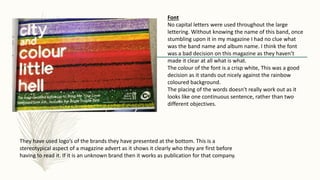
1) The advertisement contains only text with a rainbow background but no image of the band. Additional information like the record company and release date are in small print at the bottom.
2) The font used does not have any capital letters, making it unclear what the band and album names are. However, the white font stands out against the colored background.
3) The analysis concludes the advertisement could be improved by using clearer font with capitalization, separating the band and album names, and including the band's logo.