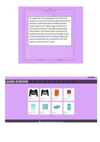
1. Thispage hada shortparagraph on the artist’slife.
However,aswe wentonwe were able to developthe
character’sprofile more whichenabledustoalso
make changesto her“about” page and add more
information onthe text. The page wasdeveloped
witha border;I feel thatthiswasa nice touchas it
made the textstand outmore from the page.It also
relateswell withthe artistasit showshergirlyside
more and showsthat she isa fan of the finerlittle
details- itrepresentsherinaway.
2. As youcan see the ‘about’page on the website wentfrombeingblankto
containingafewpicturesof our artist.Thispart of the website isnotyet
done as we are hopingtoadd more picturesof our artist sothat the
audience feelmore connectedwithherandwhatshe doesoutside of her
line of work.
3. As youcan see,I wasunsure of whichfontto use.I startedoff withthe
“cookie”font.Thiswas because I feltthatit wouldbe appealingtoour
female targetaudience.However,Ifeltthatitwas a bittoo girlyand
the swirlsonthe lettersmade itunreadable attimes.SothenI
decidedtochange itto the “Americantypewriter”font. Thiswas
because Ifeltthat itwas easilyreadable,itstoodout andit wasbold.
Hence whyI changedthe fontbecause I feel thatitmakesthe writing
standout fromthe page ina simple butboldway.
4. WhenI firststartedcreatingthe website,the maincolourchosen
was aquagreen. Thiswas because Ifeltthatour artistshould be
able to appeal toboth girlsandboys as it has been proventhatBlue
isthe favourite colourof more thanhalf of the world'spopulation,
and the leastdislikedcolourbymostcultures. Asmy groupand I
developedthe artist’s profile,we realisedthatthe traitsandher
storyis one that a lot of femalescanrelate toand sympathise with
on differentthings. Forthisreason,Ichangedthe colourto lilac so
that she wouldmainlybe able toappeal togirlsbutit doesn’tstop
boysfrom beingfan.