1. Evaluation Of Foundation Portfolio
This is an evaluation of my media project, creating a music magazine. I have created a front
cover, contents page and a double page spread for my own magazine. In the following
evaluation I will be talking about how my magazine reflects the genre R&B and how I have
followed conventions.
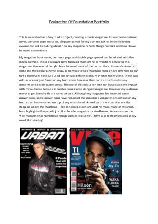
My magazine front cover, contents page and double page spread can be related with the
magazine Vibe. This is because I have followed most of the conventions similar to this
magazine. However although I have followed most of the conventions, I have also inverted
some like the colour scheme because normally a Vibe magazine would have different colour
fonts. However I have just used one or two different colour schemes for my font. These two
colours are not just found on my front cover however they can also be found on my
contents and double page spread. The use of this colour scheme can have a positive impact
with my audience because it creates consistence along my magazine. However my audience
may also get bored with the same colours. Although my magazine has inverted some
conventions, some conventions have remained the same for example the masthead on my
front cover has remained on top of my artists head. As well as this we can also see the
strapline above the masthead. Text can also be seen around the main image of my artist. I
have highlighted key words just like the vibe magazine located below. As we can see the
Vibe magazine has highlighted words such as ‘exclusive’, I have also highlighted a main key
word like ‘starring’
2. On my contents page I have followed many conventions found on a Vibe magazine. Such as
the name contents to show that this page is a contents page and a main image that takes up
most of the contents page. As well as this I have also included text which can be found on
one side of my contents page. A mini logo of my magazine name can also be found on this
page which shows that you are reading my magazine. It is located on the top left corner of
my page because this is not that important.
My Double page spread follows many conventions of a standard music magazine, including
the Vibe magazine which I was inspired by. I have placed a main image on one side of my
double page spread along with a title that reflects the image. On the other side of the page
we can see a small logo of my magazine located on the top right corner with the word
exclusive next to it. This shows that this page can only be found on my magazine and that it
is an exclusive interview. The main text can also be found on this side of the page, including
a quote that stands out the most along with key questions that are easily readable, from a
long distance.
3. My three pieces are aimed at a male target audience; however a female audience may also
be interested with the magazine. All of my three pieces create a representation of youth,
because my magazine contains pictures of young males on all of my pages that I have
created. This is why I believe my magazine will influence a young adult or teenager. My
double page spread tells a story about how two artists turned their lives around from an
area of criminal activity. If people read this page then it should show that teenagers should
not be represented in a negative way and it should also change people’s perspective of
teenagers and show that most teenagers aren’t that bad. I have decided to represent
teenagers in a different way which is not typical. This is because I believe teenagers can be
seen in many ways and not just in a typical stereotype negative way.
The following is a link to a news article: http://www.independent.co.uk/news/uk/this-
britain/behind-the-stereotypes-the-shocking-truth-about-teenagers-421295.html (MONDAY
23 OCTOBER 2006) - From what we can see here teenagers are not all to blame for most
crimes caused during this modern age and yet they are seen in a negative way. Although this
article was written in 2006, it still makes a point during this modern day.
A media institution is a media company that creates markets or distributes media. I would
like my music magazine to be owned by InterMedia Partners, this is because they are a
private equity investment firm focused on leveraged buyout and growth capital investments
in the media sector. The company was found by Leo Hindery Jr; during the year 1988, and
there headquarters are located in New York, United States. They have invested in cable
television, broadcast television, print, programming, and broadband opportunities, as well
as this they own the music magazine Vibe, whom I was inspired by.
I believe this media institution would be perfect for owning my magazine; this is because
they come up with strategies and investments on regular bases to help smaller businesses
grow such as Vibe, as well as these their senior partners have over 50 years of operating
experience. I believe they can deliver my magazine to its correct target audience because
they have had experience helping Vibe deliver their magazine to their correct target
audience who are young, urban followers of hip-hop culture. The audience of Vibe are
similar to the audience of my magazine.
4. My target audience are people who are between the age of 14-26 years. Although my
magazine is aimed at a male audience, females who are interested in the R&B genre will
also enjoy it. The readers should be inspired by the lives of modern R&B artists. As well as
that they should also be confident and believe in their own ways and ideas/values. They
should also adopt their own fashion trends that suit their personality.
A hard working student to a university graduate, the reader should use R&B music as an
inspiration for their wonderful work and it should inspire them to work harder. They should
have big ambitions of being successful and can be single or in a casual relationship. During
their leisure time they should listen to Hip-Hop and R&B music and enjoy going out with a
couple of friends maybe to the cinema to watch an action or a sci-fi, as well as having a bit
of fun. As well as that they should also enjoy life and live it to the fullest. They should also
be interested in keeping up with friends and enjoy buying new clothes every now and then.
The reader could also an active internet user and spends time online browsing, purchasing &
downloading music & films, as well as socialising with friends via Facebook &Twitter.
Music is essential in their life and they should listen to it on a regular basis or even every
day. Songs change to suit what they are doing at a given time. There could be some times
where they would like to go old school Hip-Hop and R&B or listen to modern artists such as
Drake, Chris Brown, Nicki Minaj, Kanye West and Rihanna. They should find these artists
appealing and be inspired by them to become confident and energetic.
My magazine will be suitable for my target audience because it will suit their needs and will
offer them freedom when required. This can be achieved because my audience should have
a particular page that they enjoy when an issue comes out. This is a reason why I will keep
my pages similar when a new issue comes out.
My magazine draws in my audience because it is eye-catching as well as attractive to R&B
fans. This is because my artist on my front cover makes direct address towards the
audience. This should draw them in and make them have a look around my front cover and
read the text such as the main sell-lines and the ordinary sell-lines surrounded by the artist.
The masthead is bold and showy as well as flashy and attention grabbing, this supports the
fact that my magazine is aimed for a male audience.
My contents page also draws in my audience because it yet again features another artist
who looks strong and in control. He is a male artist and gives direct address to the audience.
This should intimidate my audience, especially males because they will be strongly inspired
by my artist. Another key feature that will appeal to the audience is the small text
underneath the name of each sub title, because this gives a little detail about what is
featured within my magazine.
5. My double page spread addresses my audience because the masthead stands out the most
along with the main image that features two artists who look like they have had an
interesting past. We can see this by the way they are making direct address towards the
audience. By looking at these two artists, you can instantly tell that these are R&B artists.
This can be seen by the clothes they are wearing and the convention of a cap being worn by
one of the artists. The text should also appeal to the audience, especially the quote that can
be found on the second page because this is the second biggest text on that page and it is a
quote that has been said by the artists. The text on this page is not much so that my
audience don’t get bored.
My magazine will satisfy my audience for many reasons. Firstly, there aren’t that many R&B
magazines sold in England, especially the outer cities. Secondly this is a magazine aimed at
older teens and not many teens read a music magazine because there aren’t that many to
satisfy their needs. This is what my magazine should accomplish while it keeps them
entertained. This is a reason as to why my audience will buy it.
http://arunjoshiasmedia.blogspot.co.uk/2012/12/questionnaire-analyse.html - This is a link
to my questionnaire analyse. It contains information about what my target audience would
like in a music magazine and what type of music do they listen to such as Rap, Rock and
R&B. Other questions that I have asked are also featured within this.
6. During this project I have learnt many technological skills; I have learnt how to use blogger
and how to upload documents such as Microsoft word and PowerPoint. I have also used a
website called slideshare which makes my work tidy before I upload them to blogger
however, I did not know about this website until I started this project. For slideshare I had to
create an account just like I had to create a blogger account. Although this was simple, it
took me a while to get use to both blogger and slideshare. I struggled for a bit uploading
stuff to blogger however; I finally managed to get the hang of it.
As well as learning new technological skills, I have also improved in a couple like how to use
digital cameras for example; I have learnt that for a magazine a4 size, a picture must be
taken portrait. This is because if it is taken landscape then your magazine will look funny
because you might have to stretch a picture to make sure that it looks correct. Photoshop is
another software that I have also improved in. This is because a new version of Photoshop
has recently come out and some key features have changed since I last used it. As well as
this I have learnt a couple features that I didn’t know before like how to transfer stuff such
as shapes to other open Photoshop documents.
Ever since the preliminary task, I have progressed in so many different ways. I’ve developed
new skills like how to make a magazine look more effective. As well as this I have also had a
good understanding about magazines and have understood the main key conventions of a
front cover, contents page and a double page spread.
My preliminary task, mission statement and target audience profile are not as detailed like
my primary ones. This is because I have had more to say about my primary task and have
completed more work to do with my primary task. In addition to this my preliminary mock
ups are not as detailed like my primary ones. We can see this because I have outlined the
lines on my primary mock ups and have gone over my text in pen. Although my colouring
skills are not that good, we can see an improvement in my primary mock ups. This is
because I have included more colours.
I have learnt many new things since starting this project like how to describe an overview
and analyse in detail. As well as this I have also learnt how to create a case study and make a
PowerPoint about codes and conventions of a music genre. I have also learnt many new
media words such as Institution, brand identity and voyeurism.