
Recommended
More Related Content
What's hot
Viewers also liked
Similar to Evaluation question 1
Similar to Evaluation question 1 (20)
Recently uploaded
Recently uploaded (20)
Evaluation question 1
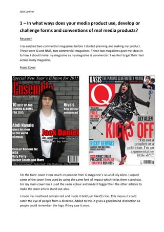
- 1. Jack Lawlor 1 – In what ways does your media product use, develop or challenge forms and conventions of real media products? Research I researched two commercial magazines before I started planning and making my product. These were Q and NME, two commercial magazines. These two magazines gave me ideas in to how I should make my magazine as my magazine is commercial. I wanted to get their feel across in my magazine. Front Cover For the front cover I took much inspiration from Q magazine’s issue of Lily Allen. I copied some of the cover lines used by using the same font of Impact which helps them stand out. For my main cover line I used the same colour and made it bigger than the other articles to make the main article stand out also. I made my masthead contain red and made it bold just like Q’s too. This means it could catch the eye of people from a distance. Added to this it gives a good brand distinction so people could remember the logo if they saw it once.
- 2. Jack Lawlor I used a banner just like Q too. This helped give a special feel to my magazine and made it unique as it was a new year’s edition. This would help intrigue more people and make them want to buy it more. I added a banner at the bottom too so I could showcase more acts in the magazine making more people want to buy the magazine. I didn’t show it as much but I used a comedian named Abdi Nayale just like Q used Ricky Gervais yet again to entice more people to the magazine. Contents Page The inspiration I took from NME’s contents page is that I divided the features into sections like ‘regulars’. I also used similar numbering on the left hand side which is reflected if you compare both content pages.
- 3. Jack Lawlor I took inspiration from the contents page of Q also although it is a double paged contents page. The style of the numbering I tried to replicate in another way but still similar. I did this through the colouring of my cover story and special story with the comedian I added to the magazine. Added to this I took inspiration from the Q Contents logo and changed it up slightly. I did this by using the same layout but with different fonts, colour and obviously the logo of the magazine. Double Page Spread
- 4. Jack Lawlor Lily Allen was the younger artist in Q compared to NME where they had Noel Gallagher as it so therefore I tried to get ideas from the Q double page spread as it was more like mine, with a young artist. I thought the colour scheme of grey, black and white was nice so I thought it would fit nicely in my double page spread especially when my contents page logo has grey, black and white in it. However, it also had red in it and that is why the name of my artist is in red to follow my colour scheme. I also liked the idea of having a quote. Therefore I added it next to my picture not as the main eye catching text because I liked the idea of having the name as that. Although it isn’t as big the first letter of my text is big and I took that idea of this Q double page spread as I thought it would give it a more professional feel to it. I put the photo to the left of the double page spread and the text to the right just like Q’s double page spread. I liked the idea of having the text on its own so it’s clear so people could read it easier rather than having someone or something behind it, potentially making it harder to read. I added the text under the masthead explaining the double page spread article like Q also to help give that professional feel even more.
- 5. Jack Lawlor The last bit of inspiration I took was from the page numbers where the date and logo is also shown. Although I didn’t use the official logo I used the name of the magazine next to the date and page number yet again giving it that professional feel. I didn’t use the official logo because I thought it wouldn’t look right because it would stand out from the rest of the text.