escort service sasti (*~Call Girls in Prasad Nagar Metro❤️9953056974
Type standards[1]
1. National Park Service
U.S. Department of the Interior
How to use the new standard NPS typefaces
Typography is fundamental to graphic design standards. condensed versions makes it suitable for applications
Using consistent typefaces ensures that the public will ranging from signs and exhibits to publications and maps.
readily recognize National Park Service products. The
Unigrid publication system introduced in the 1970s New NPS sign standards feature NPS Roadway, a
provides a solid foundation for extending consistent variation of NPS Rawlinson optimized for reading at
typographic standards to other NPS products. a distance.
The new NPS graphic design standards introduce two Frutiger replaces the type family (Helvetica) previously
typefaces for all NPS graphics: the serif face, NPS used in many NPS applications. Its open letter forms
Rawlinson, and a complementary sans-serif face, make it more readable on signs and maps. Its clean,
Frutiger. NPS Rawlinson was designed specifically for the modern forms complement NPS Rawlinson.
National Park Service. Its full range of weights, italics, and
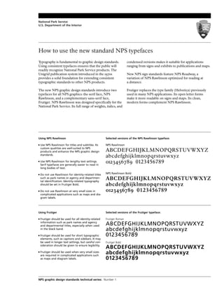
Using NPS Rawlinson Selected versions of the NPS Rawlinson typeface:
■ Use NPS Rawlinson for titles and subtitles. Its NPS Rawlinson
custom qualities are well-suited to NPS
products and enhance the NPS graphic design ABCDEFGHIJKLMNOPQRSTUVWXYZ
standards.
abcdefghijklmnopqrstuvwxyz
■ Use NPS Rawlinson for lengthy text settings.
Serif typefaces are generally easier to read in
0123456789 0123456789
long bodies of text.
■ Do not use Rawlinson for identity-related titles NPS Rawlinson Bold
such as park names or agency and departmen-
tal identification. Identity-related typography
ABCDEFGHIJKLMNOPQRSTUVWXYZ
should be set in Frutiger Bold. abcdefghijklmnopqrstuvwxyz
■ Do not use Rawlinson at very small sizes in 0123456789 0123456789
complicated applications such as maps and dia-
gram labels.
Using Frutiger Selected versions of the Frutiger typeface:
■ Frutiger should be used for all identity-related Frutiger Roman
information such as park names and agency
and departmental titles, especially when used ABCDEFGHIJKLMNOPQRSTUVWXYZ
in the black band. abcdefghijklmnopqrstuvwxyz
■ Frutiger should be used for short typographic 0123456789
elements, such as captions and sidebars. It may
be used in longer text settings, but careful con- Frutiger Bold
sideration should be given to ensure legibility.
ABCDEFGHIJKLMNOPQRSTUVWXYZ
■ Frutiger should be used when very small sizes
are required in complicated applications such
abcdefghijklmnopqrstuvwxyz
as maps and diagram labels. 0123456789
NPS graphic design standards technical series: Number 1
2. Some basic guidelines to typesetting
Text line style
Type that is set flush left distributes Type that is set flush left distributes
Flush left, ragged right text excess space at the end of the lines, excess space at the end of the lines
settings are recommended for
resulting in an irregular pattern that resulting in an irregular pattern that
most all NPS materials. With
a flush left, ragged right setting, enhances ease in reading. Type set enhances ease in reading. Type set jus-
normal word spacing is ensured. justified, centered, or flush right may tified, centered, or flush right may be
be more difficult to read. more difficult to read.
Upper and lower case
Avoid the use of all capital letters. We read words by their shapes. WE READ WORDS BY THEIR SHAPES.
All-capital text settings may slow The shapes of all-capital settings THE SHAPES OF ALL-CAPITAL SETTINGS
reading speed by as much as 13
percent and take up to 30 percent provide fewer shape clues than PROVIDE FEWER SHAPE CLUES THAN
more space. upper- and lower-case settings. UPPER- AND LOWER-CASE SETTINGS.
Leading
Even smaller text settings can be made Even smaller text settings can be made
Leading is the amount of space more legible by adding the proper more legible by adding the proper
between lines of type. Adding amount of space between the lines of
amount of space between the lines of
space between lines helps to type. Longer lines of type also require
improve legibility of smaller text
type. Longer lines of type also require more space to make them easier to
sizes and longer line lengths. more space to make them easier to read.Tightly set lines tire the eyes and
Typically 2 points of leading is read. are more confusing to the reader.
appropriate for most text settings.
Line length
Long lines of type can be difficult to read, especially when the lines are very close together. Short column width,
Text lines that are too long inhibit increased leading, and flush left alignment can all help to improve the legibility of the text. Long lines of type
can be difficult to read, especially when the lines are very close together. Short column width, increased lead-
readability. The total number of
ing, and flush left alignment can all help to improve the legibility of the text. Long lines of type can be difficult
letters and spaces per line should to read, especially when the lines are very close together. Short column width, increased leading, and flush left
be between 40 and 70. Lines that alignment can all help to improve the legibility of the text. Long lines of type can be difficult to read, especial-
are too long often cause the same ly when the lines are very close together. Short column width, increased leading, and flush left alignment can
line to be read twice. all help to improve the legibility of the text.
Bolds and italics
The use of bold type in lengthy The use of italic type in lengthy text set-
Bolds and italics should be used text settings should be avoided. tings should be avoided. Italic text
only to provide emphasis. Lengthy Bold text takes up more room and takes up less room than regular text,
amounts of text in either style
reduce legibility. often creates legibility problems. but often creates legibility problems.
Limited use of bold text is an effec- Overuse of italics defeats its purpose.
tive means of providing emphasis.
Paragraphs
For most typographic settings, Paragraph indentation should be used
For certain texts (brochures, bul- a complete line return can be used to in long text settings to clearly indicate the
letins, websites, etc.) paragraphs separate paragraphs. beginning of a new paragraph.
may be distinguished by skipping The amount of indentation usually
one line. For others (books and This uses more space, but results equals the height of the type size. 8 pt.
other lengthy texts) indentations in more clear alignment and organiza- type is indented 8 pts., for example
are more appropriate.
tion.
Contrast
Use care when setting lengthy amounts of text over colored or tinted backgrounds.
Generally, anything that reduces contrast reduces legibility. Also, body copy reversed
Anything that reduces contrast
out of black or a strong color may cause annoying visual “noise” that reduces legibility.
reduces legibility. Text over a tint
or color background will decrease
Use care when setting lengthy amounts of text over colored or tinted backgrounds.
legibility and should be used with
Generally, anything that reduces contrast reduces legibility. Also, body copy reversed
discretion. Lengthy amounts of text
out of black or a strong color may cause annoying visual “noise” that reduces legibility.
reversed out of a black background
can cause eye strain. 10% 20% 35% 60%