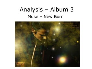
2. The font is clear
and makes sure
the audience can
see both the artist Album Cover
and album name.
As the font is in a
white box this is The images on
emphasised. the album cover
The background are of telephone
stands out with poles or some
its bright and electricity device
bold colours which suggests
making sure that that
the audience will metaphorically
be aware of the speaking Muse
product. Also the are stimulating
use of the sky they are well
being orange known for the
instead of blue way they use the
emphasises the rock genre.
contrast in the
way the band
Muse are in
songs.
3. Album Back
The album back cover,
is bland in some ways
with it being black font
with a white background
and nothing of interest
in the background.
However, some could
argue this technique is
used to make the album
back clear and in some
ways stand out as most
album covers will be
bright and colourful this
back cover can stand
out in its own way.