
Recommended
More Related Content
What's hot
What's hot (16)
Similar to Eval q 4
Similar to Eval q 4 (20)
More from herbielewis1998
Recently uploaded
Recently uploaded (20)
Eval q 4
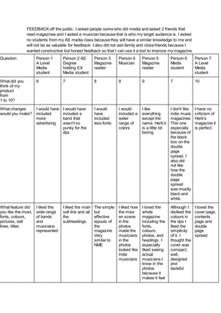
- 1. FEEDBACK off the public. I asked people some who did media and asked 2 friends that read magazines and I asked a musician because that is who my target audience is. I asked no students from my AS media class because they will have a similar knowledge to me and will not be as valuable for feedback. I also did not ask family and close friends because I wanted constructive but honest feedback so that I can use it a tool to improve my magazine. Question Person 1 A Level Media student Person 2 AS Degree holding EX Media student Person 3 Magazine reader Person 4 Musician Person 5 Magazine reader Person 6 Media student Person 7 A Level Media student What did you think of my product from 1 to 10? 8 7 8 8 9 7 10 What changes would you make? I would have included more advertising I would have included a band that wasn't so punky for the dps I would have included less fonts I would included a wider range of colors I like everything except the name. Herb’s is a little bit boring. I don't like indie music magazines This one especially because of the black box on the double page spread. I also did not like how the double page spread was mostly black and white. I have no criticism of Herb’s magazine it is perfect. What feature did you like the most, fonts, colours, pictures, sell lines, titles I liked the wide range of bands and musicians represented I liked the main sell line and all the subheadings. The simple but effective layouts of the magazine Very similar to NME I liked how the mise en scene in the photos made the musicians in the photos looked like indie musicians I loved the whole magazine including the fonts, colours, photos, and headings. I especially liked seeing actual musicians I know in the photos because it makes it feel Although I disliked the colours in the dps I liked the simplicity of it. I thought the cover was compact, well, designed and tasteful I loved the cover page, contents page and double page spread
- 2. more real than some magazines available. Was there a wide range of text fonts and colours Yes/No? If not why? Yes Yes Yes Yes Yes No I have seen magazines such as Q magazine with a wider range of fonts. There is a range it's just not as wide as some other magazines I have seen ranges of fonts. Yes Do the models in the pictures look like musicians and why. They just look like musicians. Yes because the brunette model on the cover is holding a pair of drumsticks. I did not notice at 1st but one of the models is holding drumsticks If I guessed I would have said yes because they just look like the music type Yes because I know 2 of the musicians personally I noticed mise en scene decisions such as drumsticks and clothes that make the models look like musicians They looked like musicians because they of how they were dressed.
- 3. Was the magazine in a similar style to NME,Kerrang, both or neither